

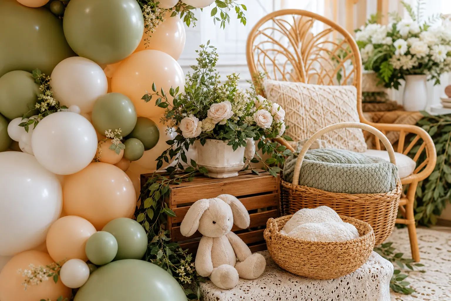
Girl baby shower decorations do not have to mean a room drowning in bubblegum pink. The showers that photograph well, and feel genuinely put-together, treat pink as one player in a larger palette: a dusty rose against sage, a blush against warm wood, a coral softened by cream. That shift from single-colour to considered combination is the whole trick.
The thirteen palettes below each have a second tone doing real work. Some lean warm, some lean muted, and one goes deliberately deep. All of them read as intentional rather than accidental, which is exactly what a styled shower needs. For the wider planning picture, start with the hub on baby shower theme decorations and come back here for the colour direction.
Once you have the palette, the games matter too. Baby shower games for a girl and the full set of free printable baby shower games are already sorted and ready to print.
This post contains affiliate links. If you buy through them, I may earn a small commission at no extra cost to you.
Two-Tone Muted Palettes
Muted palettes age well in photographs and feel calm in a room rather than chaotic. These three combinations keep pink present but never dominant, pairing it with a tone that has its own weight.
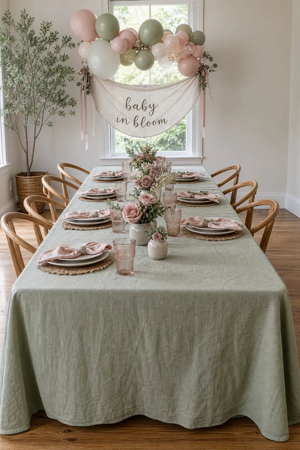
Dusty Rose with Sage
Dusty rose and sage share the same muted undertone, which means they settle beside each other without competing. Use sage on the largest surfaces: a linen table covering, eucalyptus stems laid flat, or a simple paper banner in deep sage. Let the dusty rose appear in blooms, napkins and a single ribbon tied around glassware.
The key is to buy into the muted quality of both tones. A bright pink will break the palette immediately, so check swatches in daylight before committing to florals. Dried pampas or bunny tail grass in its natural cream colour works as a neutral bridge between the two.
🛍 Shopping guide
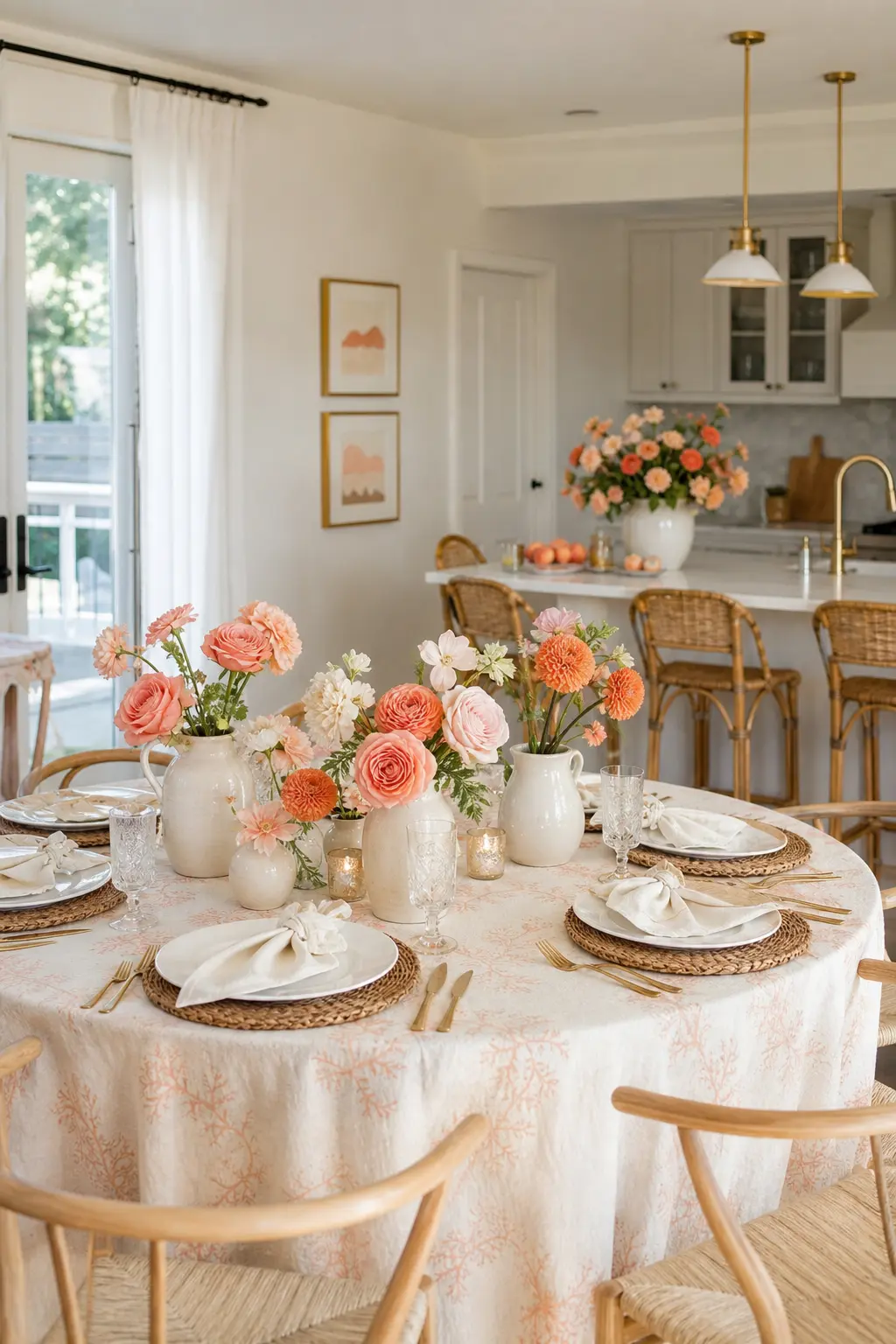
Soft Coral and Cream
Coral sits between pink and orange, which gives it a warmth that true pink lacks. Against cream it reads as sunny rather than saccharine, making it a strong choice for a spring or summer shower. Use cream on every surface, tablecloth, napkins and backdrop, and let coral appear only in the flowers and a few paper elements.
This palette is the easiest to explain to a florist or market vendor: coral garden roses, marigolds with orange edges, or ranunculus in peach all work. It is also a natural fit with simple baby shower decorations because the warmth of the colour does the visual lifting even when the layout is spare.
🛍 Shopping guide
Warm and Earthy Pairings
Earthy tones pull pink away from sweet and toward something more grounded. Terracotta, mustard and warm wood all do this without making the room feel like a different occasion entirely.
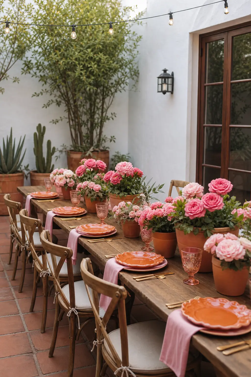
Pink Paired with Terracotta
Terracotta shifts pink away from nursery and toward something that could live in a design-forward home. Use terracotta in the vessels and surfaces: unglazed clay pots, a terracotta-coloured tablecloth or a few thrown ceramic dishes. Pink then appears only in flowers and in one or two paper elements, like cocktail napkins or a short banner.
This palette suits an outdoor or patio shower particularly well because the earthy tones echo what is already in the garden. Indoors, balance it with plenty of cream or white so the room does not read as too dark. Dried florals in warm peach or apricot bridge the two tones naturally.
🛍 Shopping guide
Rose and Mustard
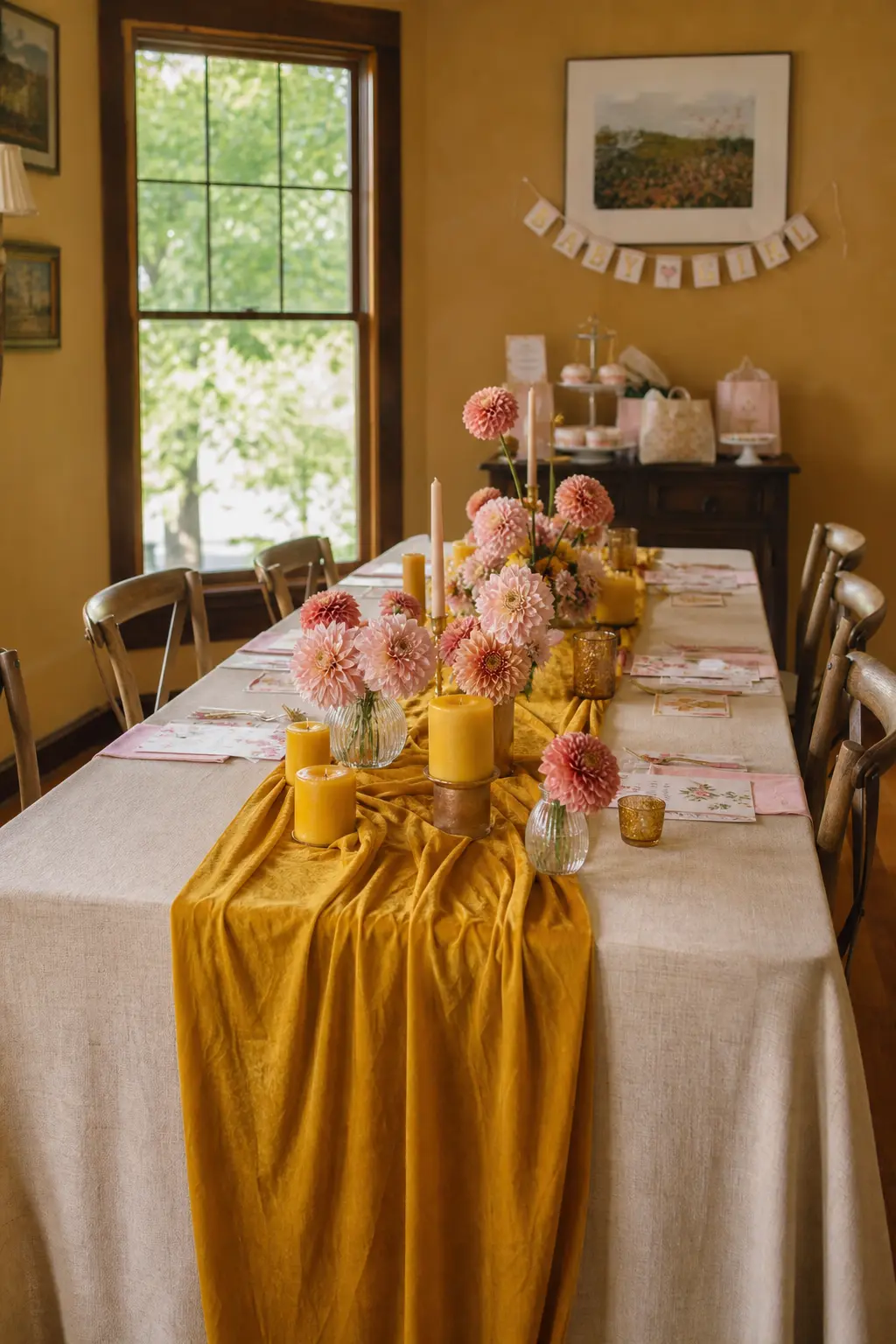
Mustard is a warm yellow with enough depth to stand up to rose rather than be washed out by it. Use mustard as a background tone: a mustard velvet table runner, a few pillar candles in deep yellow, or a cluster of mustard-toned dahlias. Rose then appears in the tableware and florals, keeping the mustard as a grounding note rather than a competing one.
This palette photographs beautifully in autumn light and works indoors with warm artificial lighting. It is also one of the most budget-friendly combinations because dahlias and marigolds, which read as mustard, are inexpensive and widely available.
🛍 Shopping guide
Blush with Warm Wood Tones
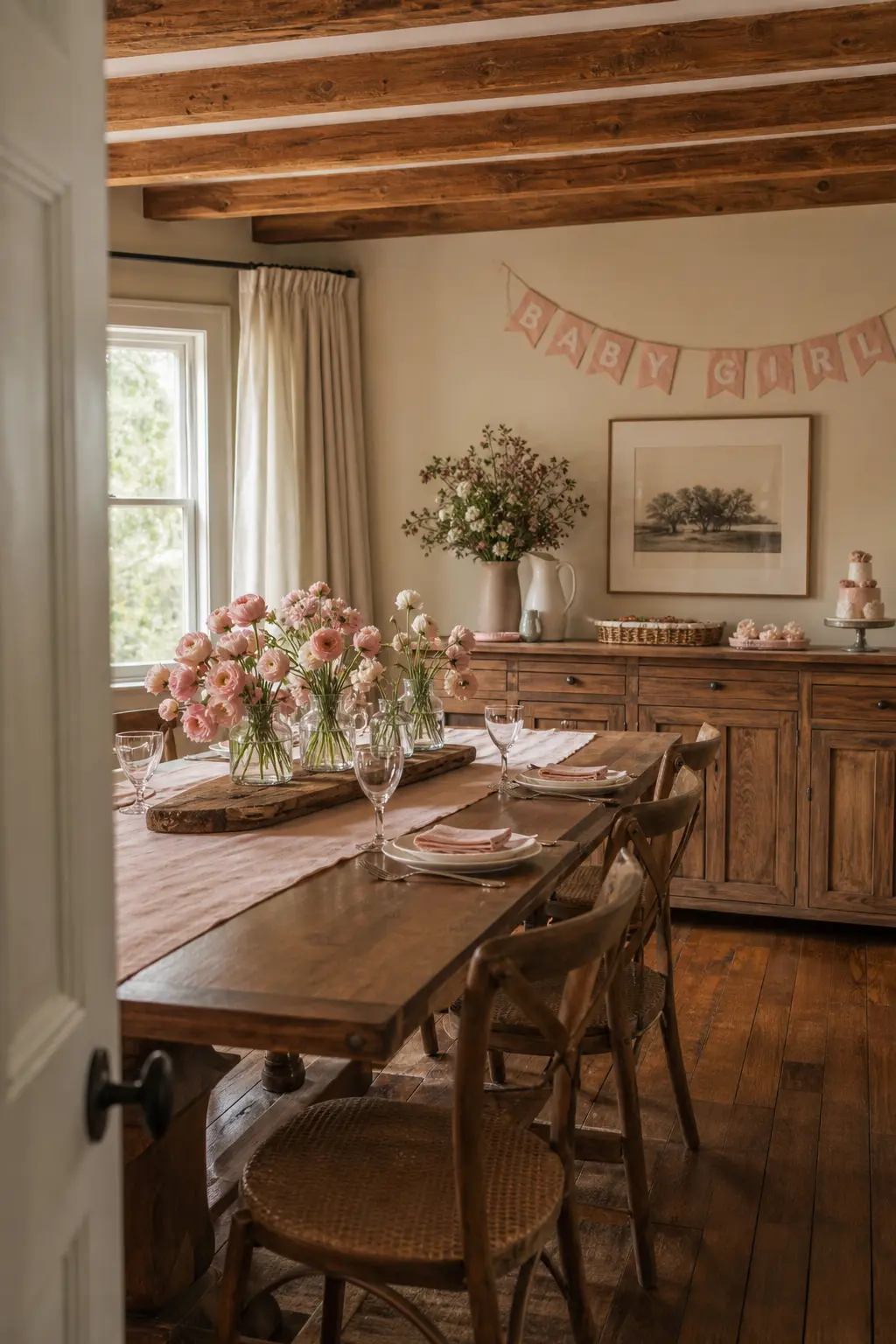
Warm wood does the same job for blush that brass does for cream: it adds a material warmth that prevents the palette from floating off into shapelessness. Work with whatever wood is already in the room rather than against it. A wooden serving board, a raw wood slice under a floral arrangement, or a rattan charger plate all count.
Blush florals in simple glass or clear acrylic vessels let the wood read clearly rather than competing for attention. This palette suits a home venue better than almost any other because it uses the existing character of the space rather than papering over it with a hired backdrop.
🛍 Shopping guide
Soft Contrast Palettes
Contrast does not have to mean bold. A soft dusty blue beside blush, or lavender beside blush, creates visual interest without any single colour shouting. These palettes suit smaller spaces well because the contrast does the work that volume cannot.
Pink and Dusty Blue
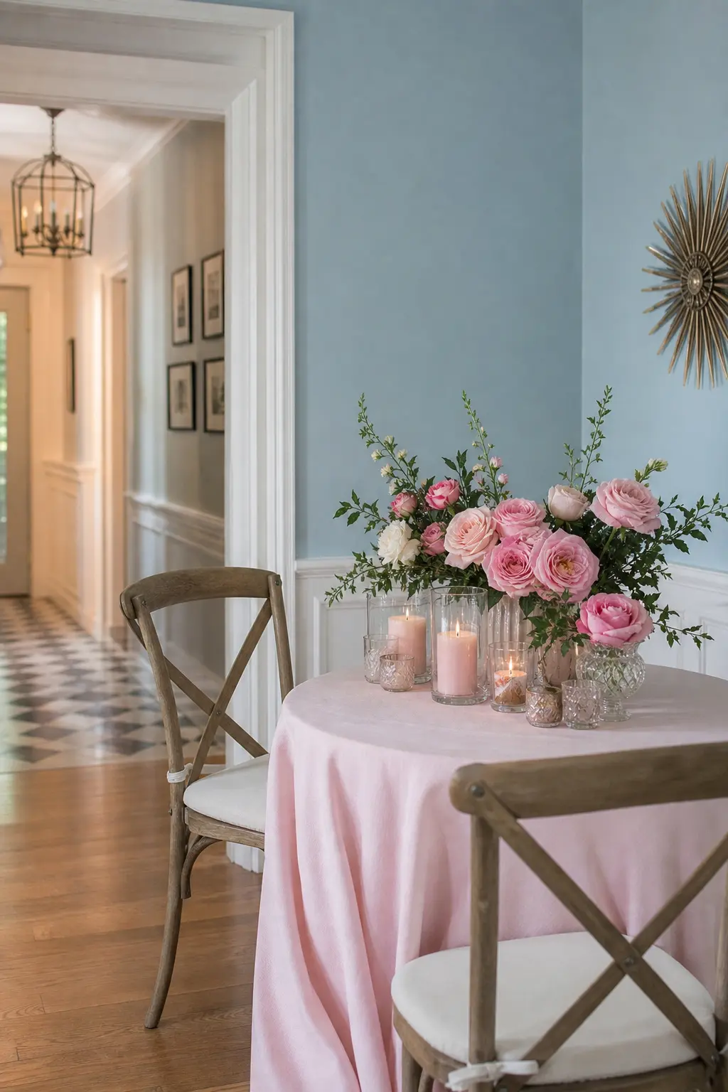
Dusty blue beside pink reads as unexpected in the best way, skirting the gender-neutral zone without losing its femininity. Keep both tones muted: a chalky, almost grayed blue rather than a saturated sky blue, and a soft blush rather than a bright pink. Use the blue in the backdrop, a paper installation or a cloth, and let pink hold the florals.
This combination works particularly well for a second baby shower or one where the host wants the event to feel grown-up. It is also the most versatile palette here because baby shower decorations for boys lean into the same dusty blue, so shared pieces are easy to source for families expecting one of each.
🛍 Shopping guide
Blush Paired with Lavender
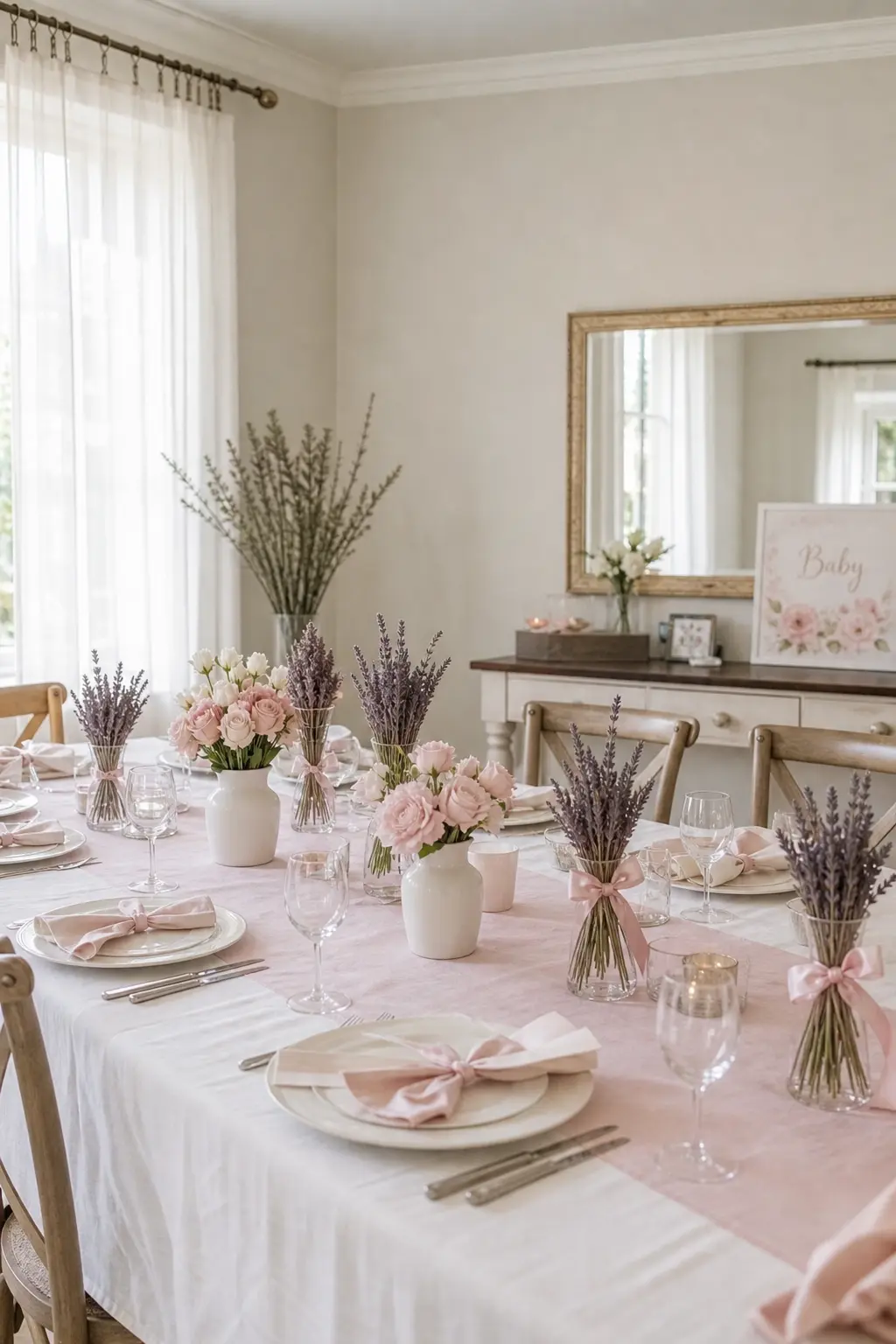
Lavender brings a coolness that stops blush from reading as overly sweet. Together they suggest a garden in early summer without requiring a single real flower if the budget is tight. Dried lavender bundles tied with blush ribbon count as both decor and scent, which is an efficient use of spend.
Keep the lavender tone muted rather than bright purple: a pale dusty lavender or silver-lavender rather than a saturated violet. The distinction matters in person and in photographs. Paper straws, ribbon and candles in the lavender tone alongside blush florals and cream dishes create a table that feels complete with very little effort.
🛍 Shopping guide
Metallic and Textured Accents
Brass, gold and warm-toned metals read as a colour in their own right when they appear consistently. Use them on vessels, frames and cutlery rather than scattered randomly and the effect feels considered rather than decorative-shop leftover.
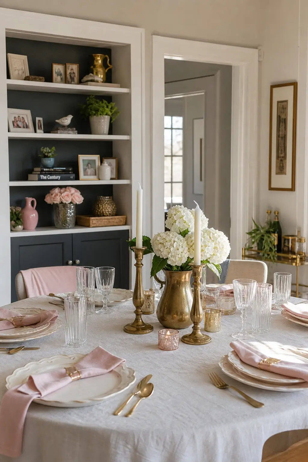
Blush and Cream with Brass Details
Blush and cream on their own can feel under-dressed. Brass pulls the combination into something that reads as a deliberate choice. Concentrate the brass in vessels: a pitcher holding white ranunculus, a cake stand, small frame place cards. Let the blush appear in napkins and a few garden roses, and keep the cream as the dominant background tone on the tablecloth and wall backdrop.
Brass flatware rented or bought inexpensively lifts a simple table more than almost any other single decision. It photographs warm rather than clinical, which matters when the guest of honour wants pictures she will frame.
Rose and Gold
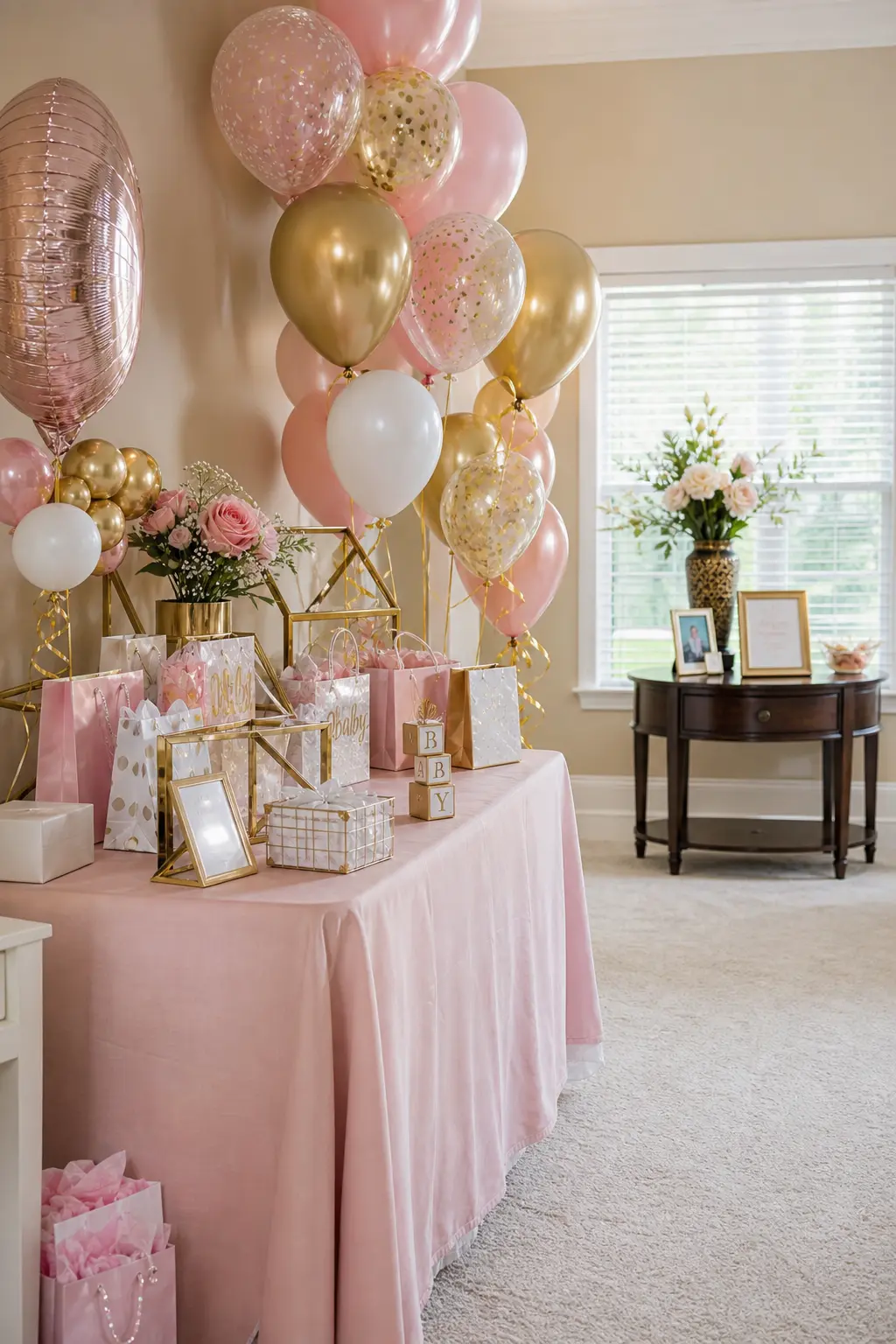
Rose and gold is the most classic pairing on this list and the easiest to source, which makes it a strong choice for a host working quickly. The version that reads as styled rather than generic keeps the gold very warm and the rose very muted. Avoid cold champagne gold or bright pink: the palette works when both tones are in the same warm register.
Use gold in geometric shapes rather than scattered glitter: a gold hexagon frame, a gold wire card holder, a single gold-rimmed hurricane vase. The geometry gives the metallic something to anchor to rather than letting it scatter visually across the table.
🛍 Shopping guide
Deep and Rich Accent Pairings
One deep colour alongside pink stops the room from feeling washed out. Burgundy and deep olive each bring enough contrast to make every other element snap into focus.
Pink Paired with Burgundy
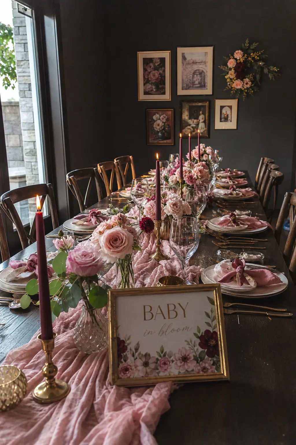
Burgundy is a high-contrast partner for pink and the most dramatic option on this list. Use it sparingly: a single burgundy velvet ribbon, a few stems of deep wine ranunculus among blush blooms, or a burgundy taper candle at intervals along the table. Let blush hold the volume and burgundy hold the eye.
This palette suits an evening shower or a winter one, where the deeper tone feels seasonally appropriate. It also makes the floral budget go further: a few expensive burgundy stems read as a deliberate decision among cheaper blush flowers, rather than filler.
🛍 Shopping guide
Pink with Olive Green
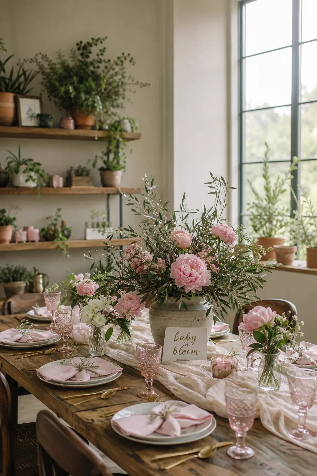
Olive is darker and more complex than sage, which makes it a stronger counterweight to pink. It suits a host who finds sage too predictable. Use olive in foliage: preserved olive branches, olive-coloured eucalyptus or even a potted olive tree as a centrepiece that the guest of honour takes home afterward.
Pink in this palette should lean warm, a peachy-pink or a coral-tipped blush rather than a cool rose. The olive reads as genuinely botanical beside it rather than simply green-adjacent. For anyone who loves the floral direction, floral baby shower decorations builds an entire event around this kind of plant-forward approach.
🛍 Shopping guide
Tonal and Monochrome Approaches
A single colour family in three depths reads as sophisticated rather than lazy when the depths are genuinely distinct. This approach suits hosts who want simplicity in sourcing but complexity in the result.
Monochrome Pink in Three Tonal Depths
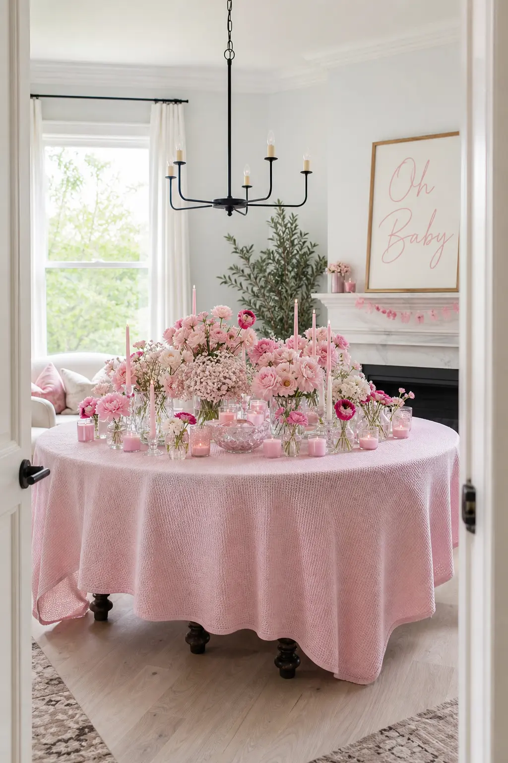
A monochrome palette earns its place when the three depths are genuinely distinct: a pale blush, a true mid-tone dusty rose, and a deep antique rose. Put the palest tone on the largest surface, the mid-tone in the florals, and the deepest shade as a deliberate accent in candles, ribbons or a single statement vessel.
The risk here is flatness, and the fix is texture. Mix matte, glazed and waxy surfaces so the eye has something to travel across even when the colour is constant. A waffle-weave cloth, a glazed ceramic vase and matte paper blooms together in the same pink family create enough variation to hold interest.
🛍 Shopping guide
Neutral-Led Rooms with Pink as an Accent
Sometimes the most effective move is restraint. A mostly cream room with pink appearing only in flowers, napkins and ribbon is the version that earns the most compliments, because it never tips into excess.
Pink as Accents in a Cream Room
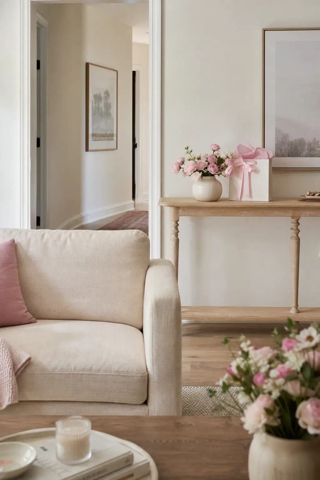
This is the version where restraint is the whole strategy. The room reads as cream: cream tablecloth, cream backdrop, cream candles. Pink appears in three places only, the flowers, the ribbon on the gift table and the napkins, and nowhere else. The effect is that every pink element looks deliberate because it is surrounded by breathing room.
This approach suits a host working in a space that is not her own, a venue or a relative’s home, because cream plays with any existing furnishing. It also leaves the most room for the food and gifts to read visually. For anyone who wants to pull this off on a tight budget, DIY baby shower decorations shows exactly which elements are worth making and which are worth buying.
🛍 Shopping guide
Frequently Asked Questions
How do you decorate a baby shower without balloons?
Lean on florals, paper installations and textiles instead. A paper fan wall, a dried flower arch or a garland of greenery above the table gives the same visual height that balloons provide. Candles, layered table linens and a styled gift table fill the room without a single balloon in sight.
What is a popular baby shower theme this year?
Botanical and garden-inspired palettes continue to lead, alongside anything that pairs a soft tone with an earthy or metallic accent rather than relying on a single colour. Dried flowers, rattan, warm wood and muted tones in dusty rose, sage or terracotta are consistently popular across styled showers this year.
How much should baby shower decorations cost?
A complete table setting with florals, linens and a backdrop for around twenty guests typically runs between 80 and 200 dollars when sourced carefully. Buying reusable linens and vases keeps cost down across the whole event. Single-use paper elements such as napkins, straws and a banner account for most of the lower-cost spend.
Can baby shower decorations work for a gender neutral shower?
Yes, most of the palettes here adapt easily. Dusty rose with sage, blush with warm wood, soft coral with cream, and pink with dusty blue all sit close enough to neutral territory that they suit a shower where the gender is unannounced or where the host simply prefers a palette over a declaration. Removing obviously gendered signage and leaning into the earthy or botanical tones within each palette is usually all it takes.
13 wildflower baby shower games for guests of every age: printable flower matches, a bouquet-buildin
12 baby shower card games that are low-mess, small-space friendly, and actually fun. Print, play, re
15 storybook baby shower games for a magical book-themed party — printables, keepsakes & crowd fav
Leave a Reply