

13 Baby Shower Decorations for Boys That Are Not Just Blue Everything
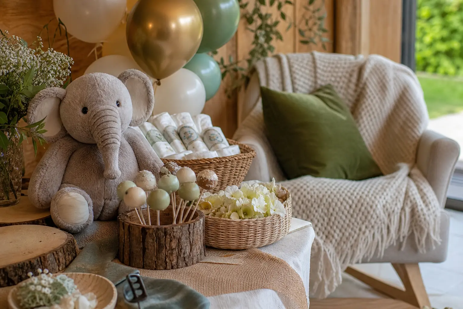
Baby shower decorations for boys do not have to mean a room drowned in one colour. Blue works best when it has company: a warm tone to ground it, a neutral to breathe around it, and maybe one unexpected accent that makes the whole thing feel like a considered choice rather than a default.
The thirteen ideas below each name the second and third tone doing the heavy lifting. Dusty blue, cream, warm brown, sage, terracotta, brass, mustard, rust, olive and warm grey all appear. Not a single cartoon character in sight. Think of them as palettes you build a room around, not a colour you apply to every surface and call it done.
If you are still deciding on a wider theme, the hub article on baby shower theme decorations is a useful place to start before you commit. And if there is any chance the palette needs to stretch to a second baby, twin baby shower ideas are worth a look too.
This post contains affiliate links. If you buy through them, I may earn a small commission at no extra cost to you.
Warm Neutrals Doing the Work
These palettes lean on brown, cream and natural wood to keep dusty blue from reading as baby-blue. The warmth is doing the styling work so the blue can be calm rather than loud.
Dusty Blue With Warm Brown Leather Details
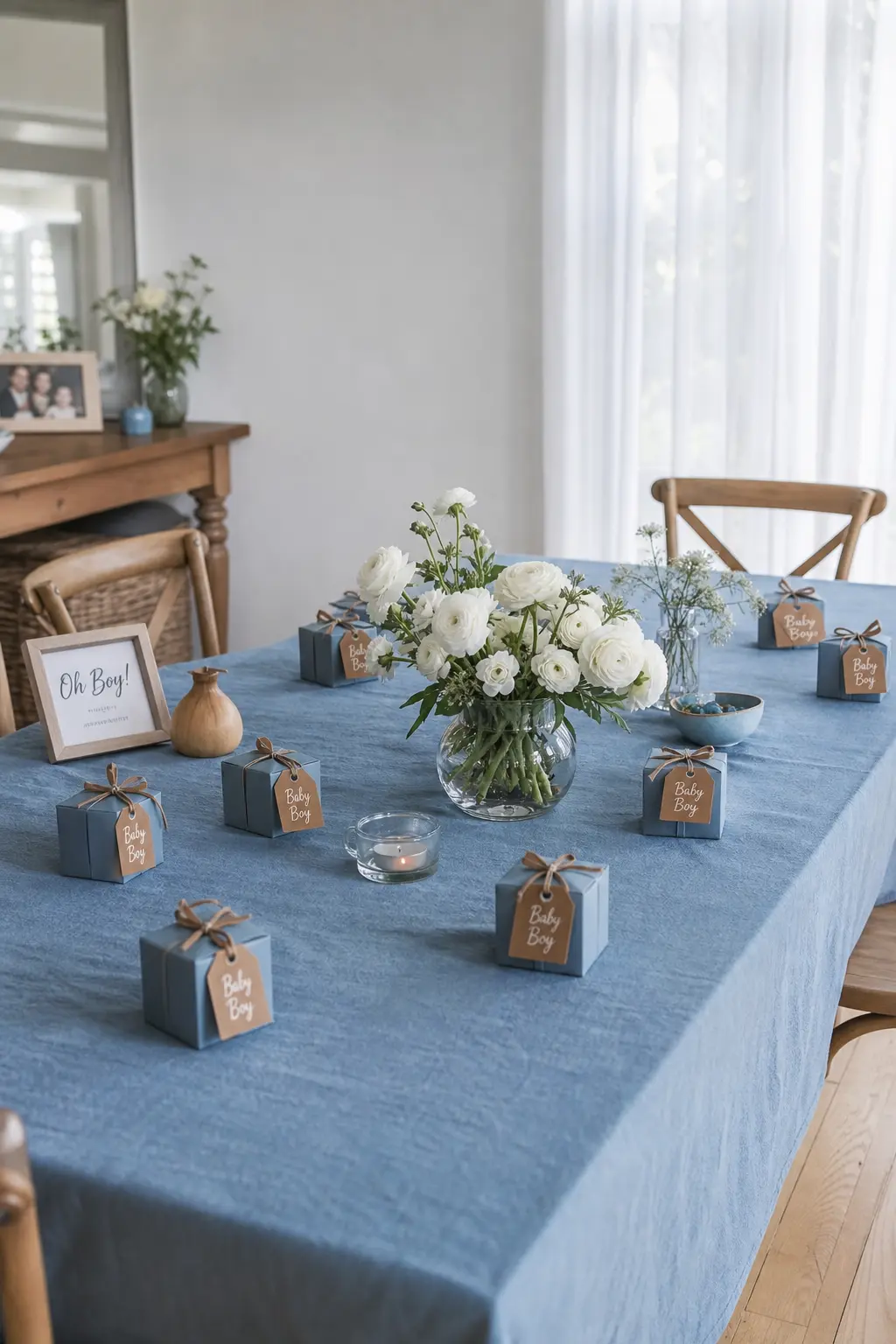
Dusty blue linen napkins, a cream table runner and two or three small leather-tag details, tied to favour boxes or looped onto kraft paper menus, shift this palette somewhere genuinely grown-up. The brown stops the blue from floating and gives the eye a place to land.
Keep the flowers simple: white ranunculus or dried pampas in a short terracotta pot. The leather does not need help competing; it just needs to repeat at least twice so it reads as a decision rather than an accident.
🛍 Shopping guide
Navy and Cream
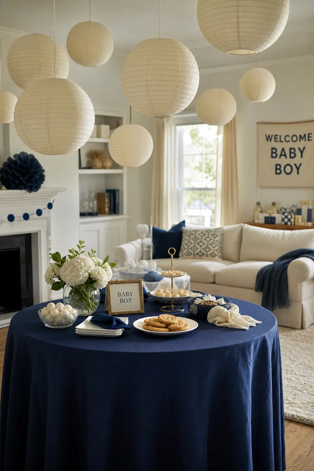
Navy reads as classic and deliberate, which is exactly what makes it useful here. Pair it with cream, not white: white next to navy can feel clinical, while cream softens the contrast and adds warmth without introducing a third colour.
Cream paper lanterns overhead, navy linen napkins folded flat, and a simple cream-on-navy banner. That is enough. Resist the urge to add a third colour; the strength of this palette is its restraint.
🛍 Shopping guide
Denim Blue Paired With Natural Wood Tones
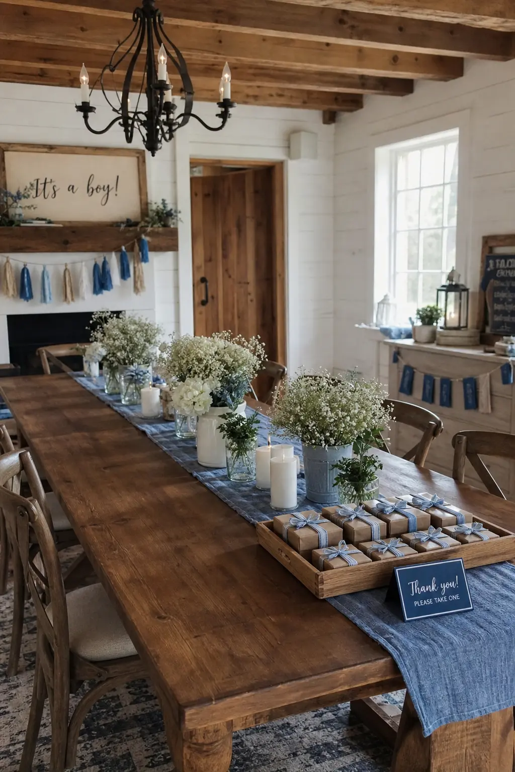
Denim blue, which sits between dusty and navy, is one of the easiest tones to work with because it already reads as casual and textured. Natural wood does exactly what warm brown does, without needing to be introduced as a separate element: the table, the floor and any wooden trays or boards are already doing the job.
Keep the textiles soft: a washed denim or chambray table runner rather than a stiff pressed cloth, linen napkins in oatmeal, and maybe a wooden tray holding the favour boxes. The whole thing looks put-together without any of it looking fussy.
Green as the Quiet Third Tone
Sage and olive sit between warm and cool, which makes them the easiest third tone to drop into a blue-and-neutral scheme. One green element, repeated two or three times, ties the room together without demanding attention.
Sage and Dusty Blue
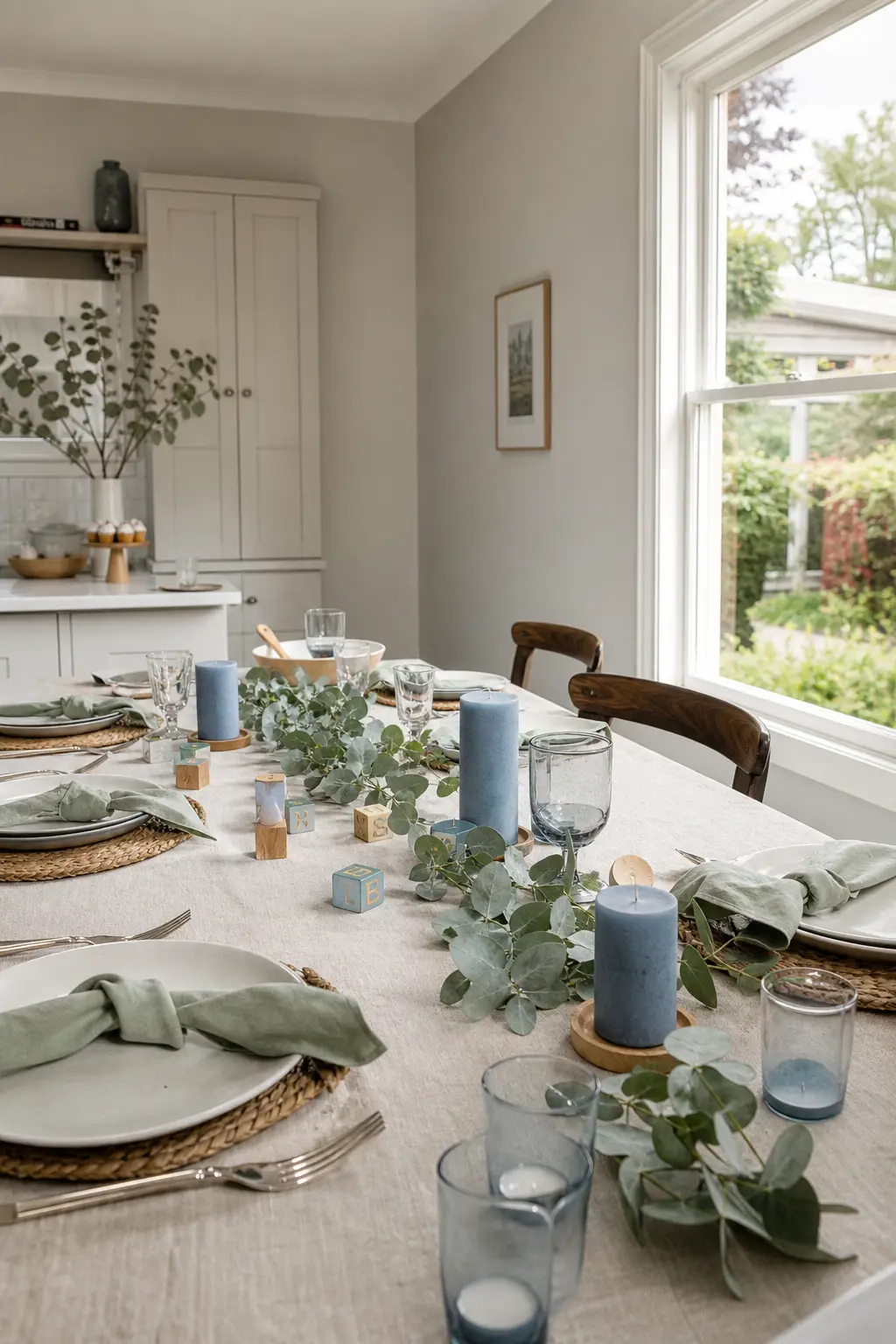
Sage is the colour that makes dusty blue look intentional without competing with it. Both are muted, both read as calm, and together they sit in a palette that feels closer to a considered interior than a party supply aisle.
Use sage in the foliage: eucalyptus stems laid along the centre of the table cost almost nothing and do a lot. Dusty blue candles in short glass holders, and cream as the background tone on the tablecloth, keep the palette from going too cool.
🛍 Shopping guide
Dusty Blue With Olive Green
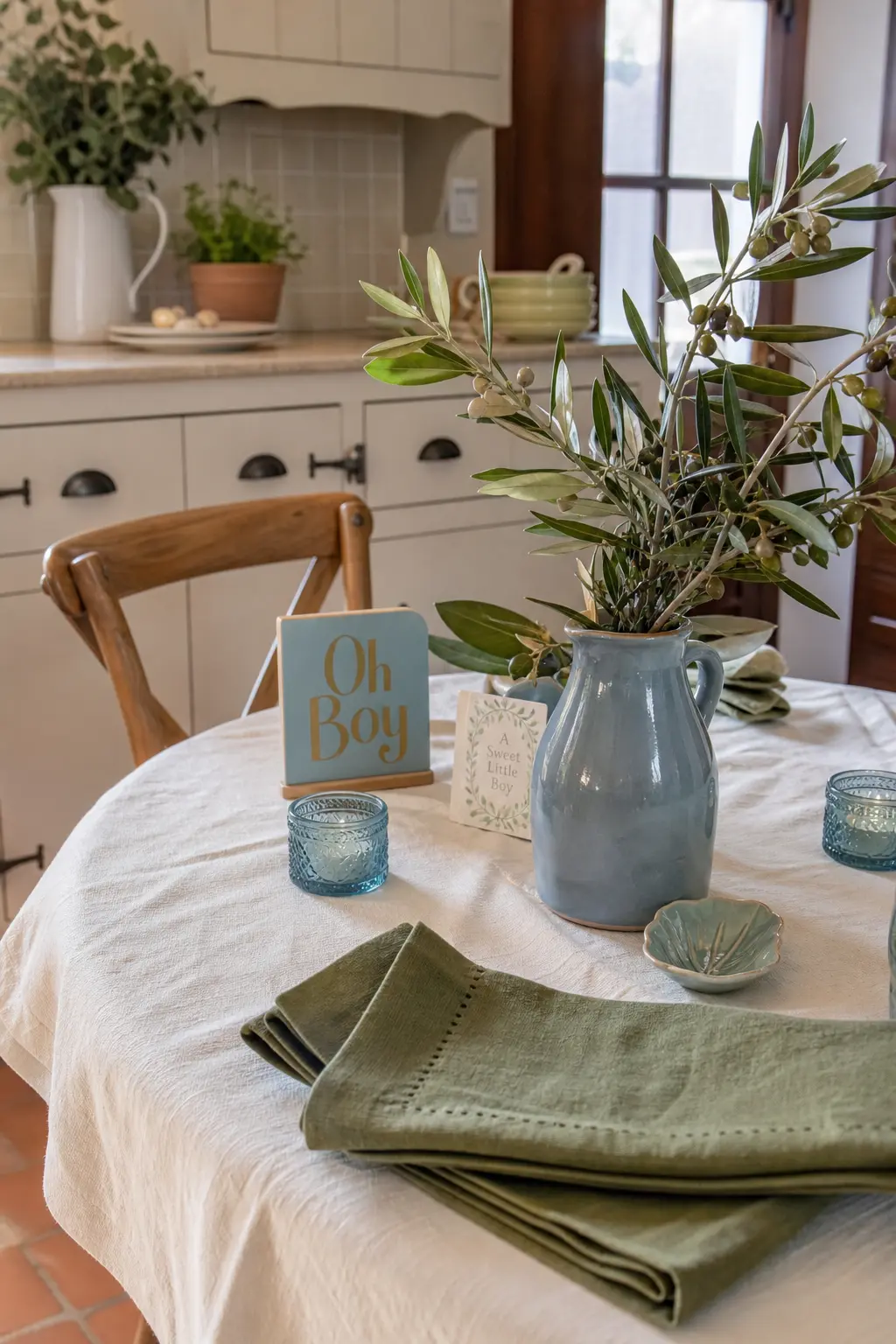
Olive is a darker, earthier relative of sage, and it pairs with dusty blue in a way that feels more autumnal and less delicate than the sage combination. It suits a room with warm timber floors or earthy walls because it agrees with them rather than fighting them.
Olive green works best in foliage and fabric: an olive linen napkin, a small olive-toned ceramic vessel, a stem of olive branch. The dusty blue comes through in the larger elements, the tablecloth, the backdrop, the paper bunting. Cream keeps the two from reading as too dark together.
🛍 Shopping guide
Earth Tones for Depth
Terracotta, rust and mustard bring the kind of warmth that reads as intentional rather than accidental. These work especially well for a late-summer or autumn due date, when the light outside is already doing some of this colour work for free.
Dusty Blue With Mustard Accents
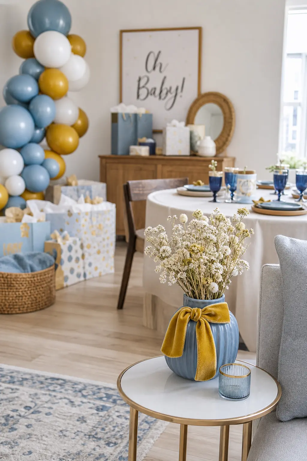
Mustard is the warmest accent you can drop into a dusty blue room without it clashing, because both colours share a slightly muted quality. One is cool, one is warm, and that tension is exactly what makes the combination look styled.
Limit the mustard to two or three objects: a mustard velvet ribbon tied around a vase, a small mustard candle, a set of mustard napkin rings. More than that and it tips from accent to second main colour, which is a different room.
🛍 Shopping guide
Dusty Blue With Terracotta Accents
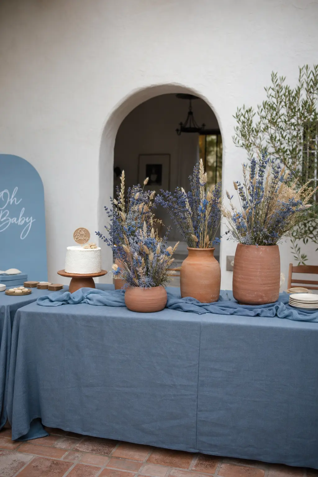
Terracotta and dusty blue are opposites on the temperature scale, which is exactly the thing that makes them work. The terracotta brings Mediterranean warmth; the dusty blue keeps it from feeling heavy.
This palette looks best when the terracotta lives in the vessels rather than the textiles: terracotta pots in two or three sizes, a terracotta-glazed jug holding dried stems, maybe a terracotta-coloured taper candle. The dusty blue comes through in the cloth and the paper goods. Switch those and the balance tips the wrong way.
🛍 Shopping guide
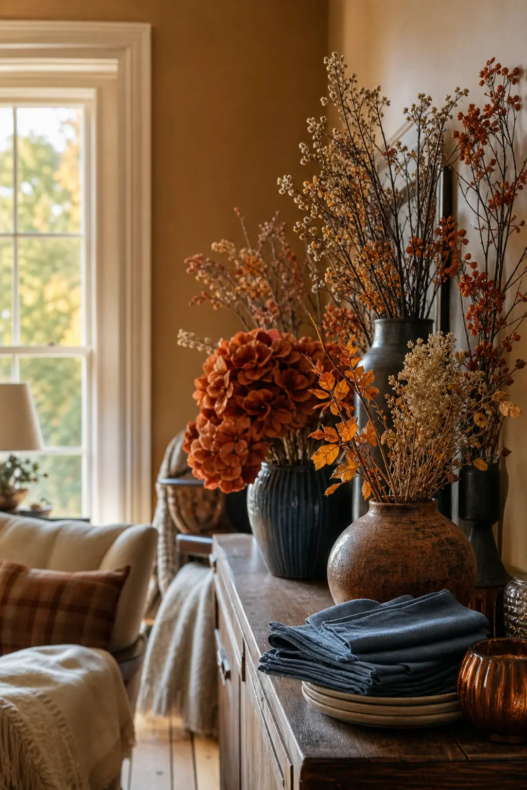
Blue Paired With Rust for an Autumn Due Date
Rust is the autumn version of terracotta: deeper, more saturated, and perfectly timed when the foliage outside is doing the same thing. A dusty or mid-toned blue next to rust reads as the colour palette of the season rather than a deliberate design choice, which is exactly why it works without effort.
Bring in dried orange and rust-coloured botanicals: dried autumn leaves, orange strawflowers, rust-toned bunny tails. Blue comes through in the linen and the paper goods. A few cream pillar candles anchor the whole thing without adding a fourth colour.
🛍 Shopping guide
Navy and Metallics
Navy is a different animal from dusty blue: it is richer and more formal, so it wants a metallic to lift it rather than a pale neutral to soften it. Cream keeps things from going too dark.
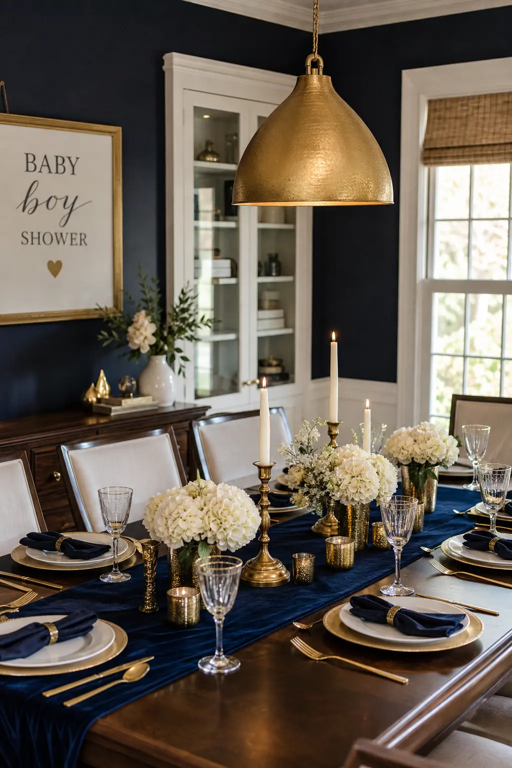
Navy and Gold
Navy and gold is the most formal combination on this list, and it earns that formality when the gold is warm and matte rather than shiny and chrome. Brushed gold or antique gold finishes belong here; mirror-finish gold belongs somewhere else.
Gold leaf candle holders, a navy velvet table runner, cream cards with gold-foil lettering on the place settings. Three elements is enough. Add a few cream or white flowers in a navy-glazed vase and the table is done. This palette photographs extremely well in low light, which matters if the shower runs into the evening.
🛍 Shopping guide
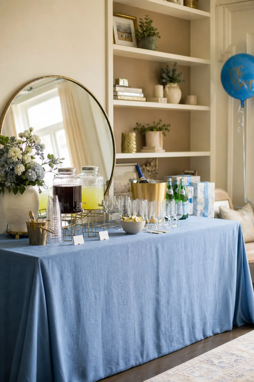
Blue and Cream With Brass Details
Brass is the metallic that sits closest to warm brown on the temperature scale, which is why it works where silver or chrome would not. Blue and cream is already a complete, calm palette; brass adds the finish that elevates it from nice to considered.
Brass wire frames as place card holders, a brass-rimmed mirror propped against the backdrop wall, small brass clip lights clipped to a cotton garland. None of these are expensive. All of them read more expensive than they are, which is the whole point.
🛍 Shopping guide
Tonal and Monochrome Plays
A single-colour room only looks sophisticated when it uses at least three tonal depths. This section covers that, plus the trick of anchoring a mono palette to one warm finish so it does not read as cold.
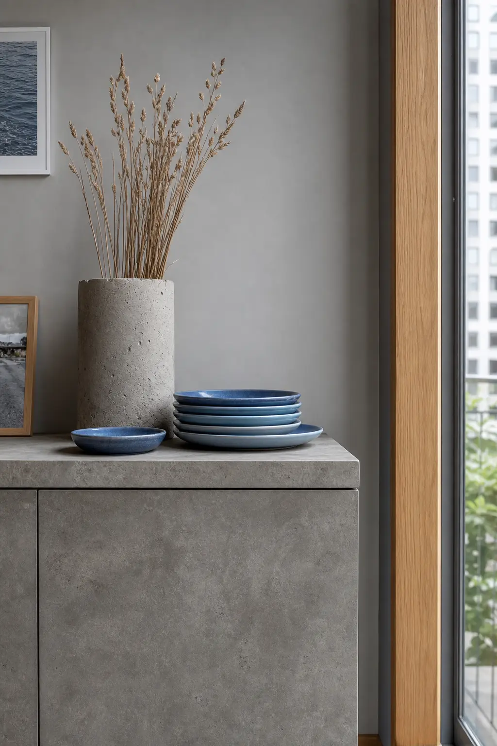
Blue and Warm Grey
Warm grey, not cool grey, is the partner that keeps blue from feeling cold. The distinction matters: a blue-and-cool-grey room can tip into feeling like a waiting room, while blue and warm grey together feel like a considered interior.
Concrete or stone-effect textures belong here: a concrete-look planter, a stone coloured candle, a warm grey linen backdrop. The blue comes in through tableware and small paper goods. Let the grey be the dominant tone and the blue the accent, which is the reverse of the obvious choice and is precisely why it looks good.
🛍 Shopping guide
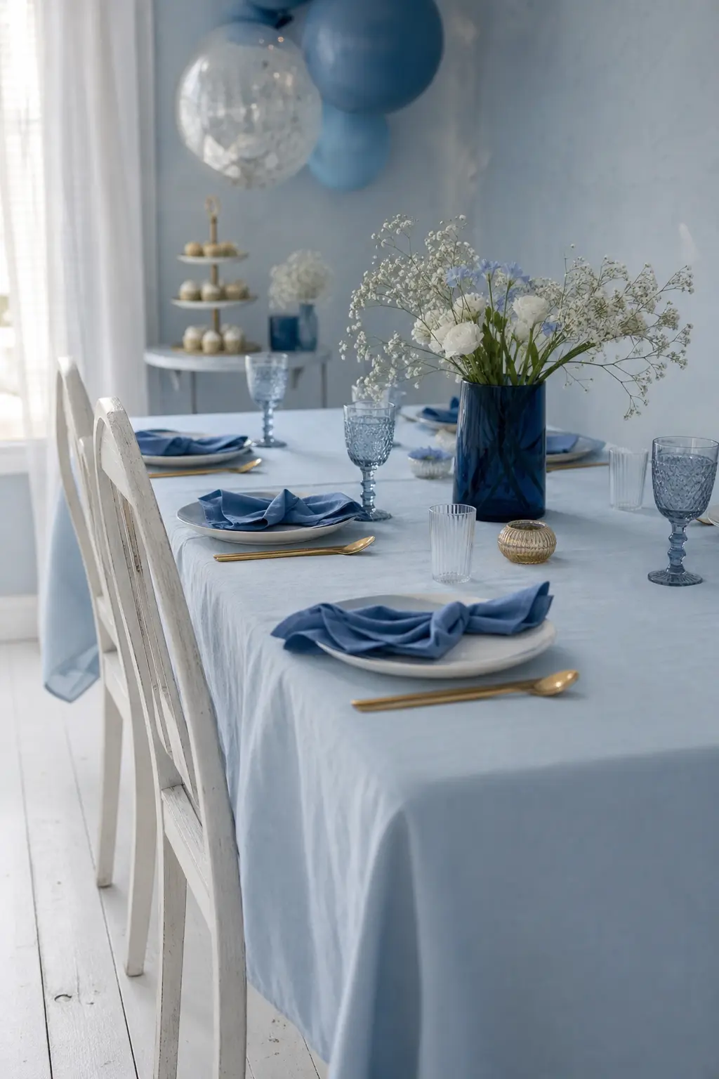
A Monochrome Blue Palette in Three Tonal Depths
A single-colour room only reads as sophisticated when it contains at least three distinct tonal values: a very pale, a mid-tone and a deep shade. For blue that means something like ice blue, dusty blue and navy, all in the same room at the same time.
The pale tone goes on the largest surface, the tablecloth or the backdrop. The mid-tone goes on the textiles and smaller vessels. The deep tone anchors: a navy candle, a navy-painted wooden letter, one dark bloom in the arrangement. Add one warm brass or timber detail so the room does not read as cold, and stop there.
🛍 Shopping guide
The Nursery-Match Approach
The smartest move a host can make is asking the parents what accent colour lives in the nursery and borrowing it for the party. The shower then feels like a preview of the room, not a separate project.
Blue Paired With the Nursery Accent Colour
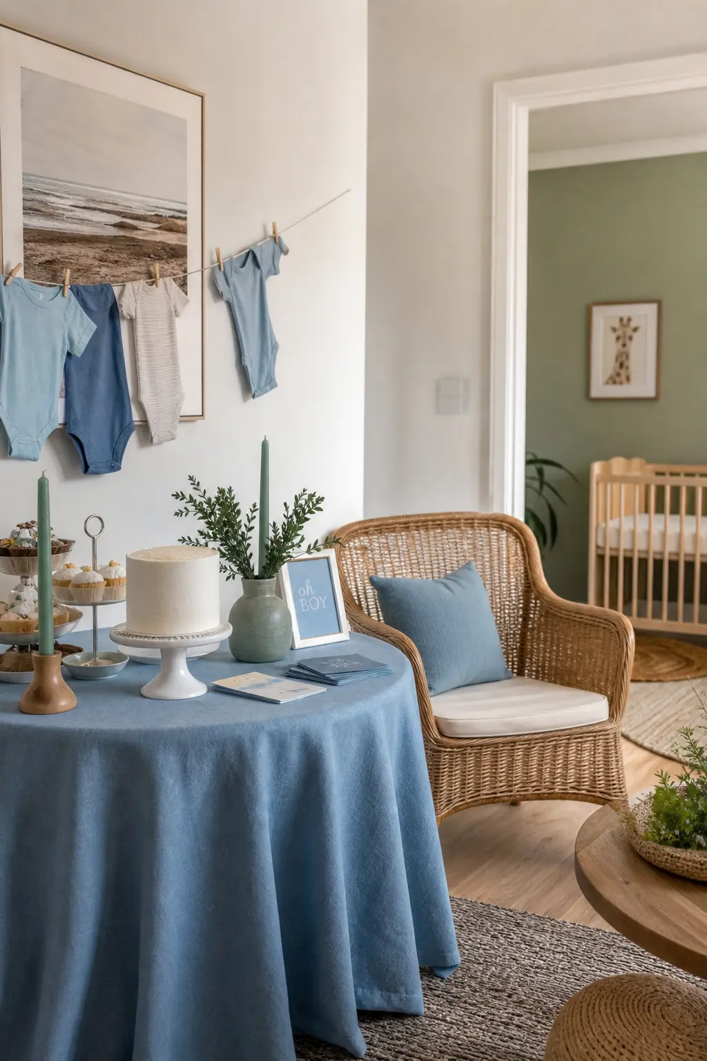
Ask the parents one question: what is the accent colour in the nursery? Then use that colour as the third tone at the shower. The room will feel like a preview of the baby’s space rather than a separate project, and the parents will notice.
This works with almost any accent because blue is a generous base. The nursery is terracotta: use terracotta pots and blue linen. The nursery has a sage green wall: pull in eucalyptus and sage napkins. The nursery uses warm yellow: one mustard ribbon per favour box. The specific colour matters less than the intention behind it.
🛍 Shopping guide
Baby Shower Decorations for Boys
Whatever palette you choose, the principle is the same: blue is one voice in the room, not the whole choir. Pick your second tone first, because that is the one that will do the most visible work. The blue will follow.
For more direction on putting a full scheme together, browse baby shower theme decorations, or narrow the search with simple baby shower decorations if the budget is tight and the timeline is short. If your crowd skews crafty, diy baby shower decorations will give you a full afternoon of options. Hosting a girl next time, or co-hosting one now? Girl baby shower decorations and woodland baby shower decorations are both worth bookmarking. And once the room looks right, baby shower games for boys will fill the hour after lunch.
Frequently Asked Questions
How do you decorate a baby shower without balloons?
Paper lanterns, fabric garlands, dried floral arrangements and paper bunting all create volume and visual interest without balloons. A tall vase arrangement or a cluster of pampas and dried stems in different heights does the work a balloon arch would do, and it photographs better. Candles and greenery running along the table centre replace the need for any hanging element at all.
What is a popular baby shower theme this year?
Earthy, nature-forward palettes continue to be the most searched direction: dusty blue with sage, warm neutrals with terracotta accents, and dried botanical arrangements rather than fresh-flower centrepieces. Themes that feel like a curated interior rather than a party-supply kit are the consistent preference, with no cartoon characters and a clear second or third tone paired with the main colour.
How much should baby shower decorations cost?
A well-styled table for twenty guests can come in under 150 dollars if you focus spending on two or three anchor pieces, a good table runner, quality linen napkins and one real floral or botanical arrangement, and fill the rest with things already in the home. Candles, wooden trays, kitchen vases and foliage cut from a garden or bought in bulk from a market all cost very little. The budget rises quickly only when every element is bought new as a set.
Can baby shower decorations work for a gender neutral shower?
Almost every palette in this list works as gender neutral with a small adjustment. Dusty blue with warm brown and cream reads as neutral the moment you remove any specifically gendered signage. Sage and dusty blue, denim blue with natural wood, and the monochrome tonal palette all sit comfortably in neutral territory. The key is leaning on the second and third tones rather than the blue, so the blue becomes a quiet part of the room rather than the whole statement.
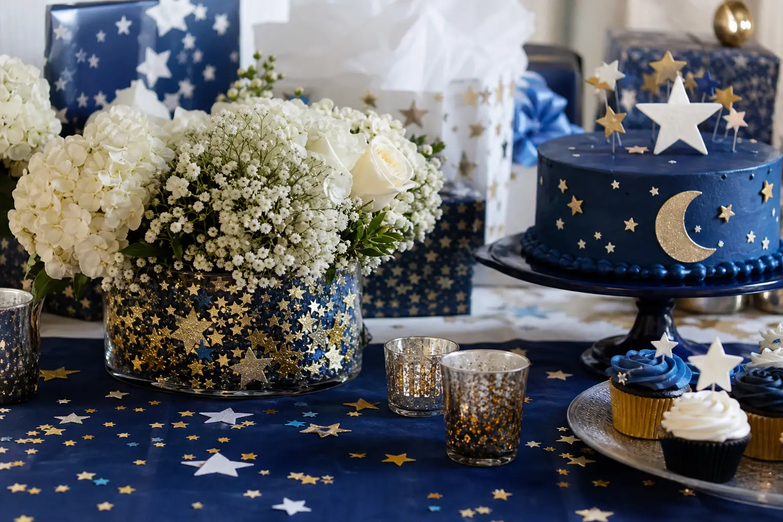
23 twinkle little star baby shower ideas for decor, dessert tables, favors and finishing touches, al
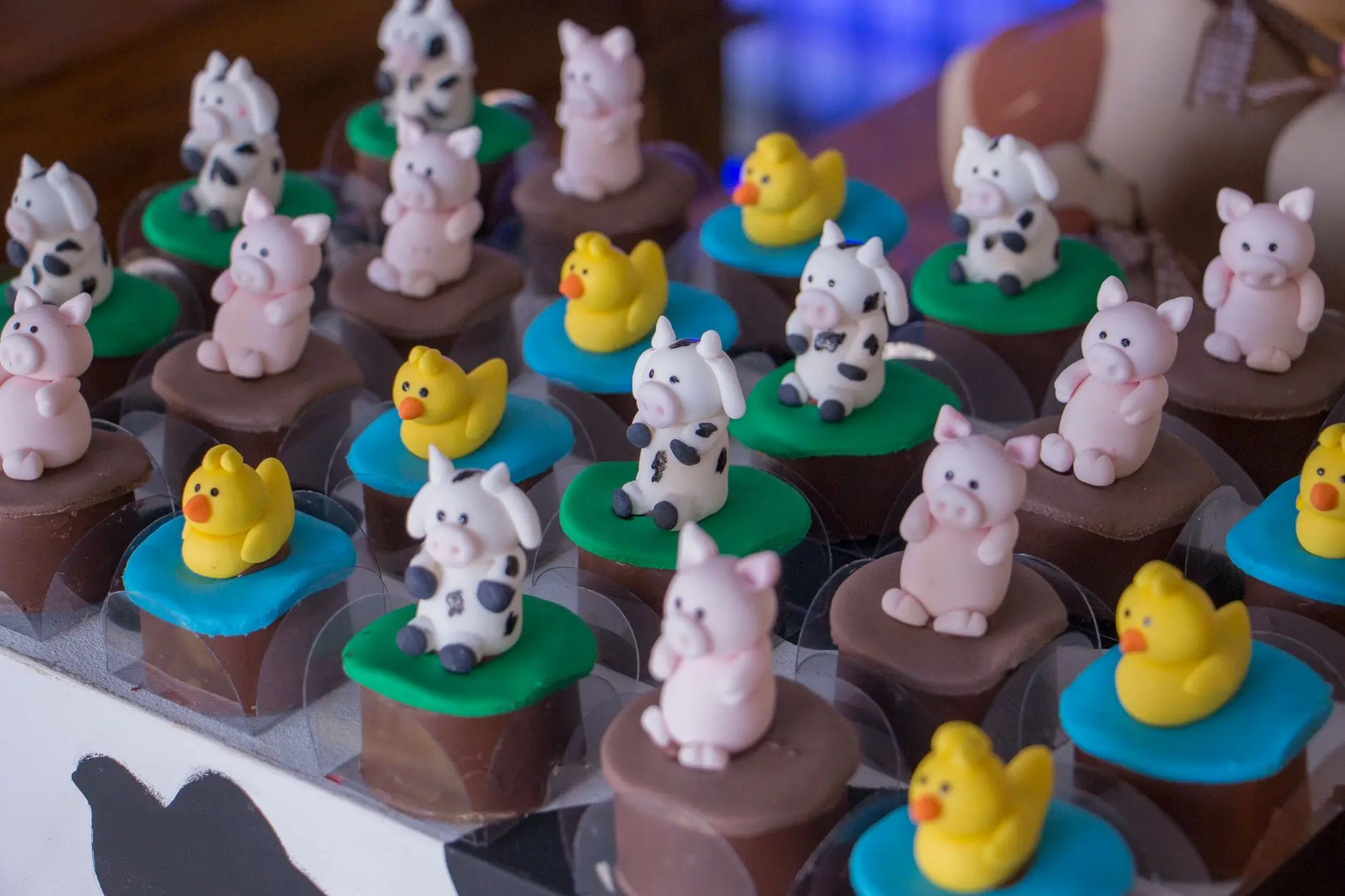
Cow-themed baby shower games that actually fit the barn aesthetic: 14 printable and active ideas for

14 Little Pumpkin girl baby shower games — printable, active & quiet — for a cozy, unforgettable
Leave a Reply