


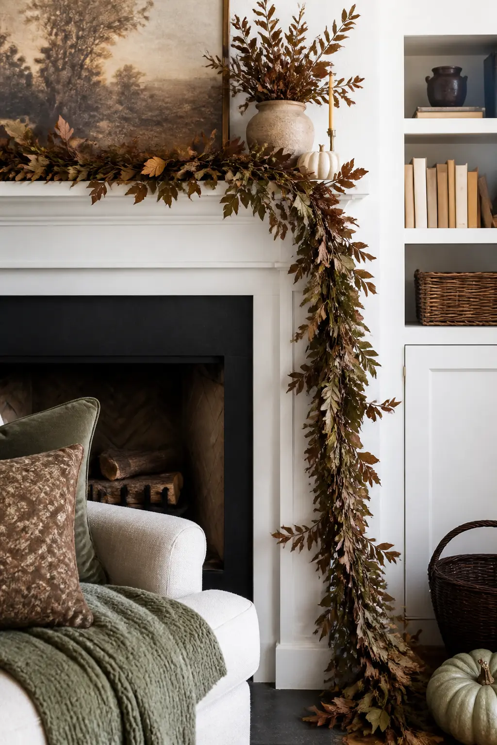
The shelf looks crowded before you have even finished. That is not a shopping problem. It is a composition problem, and the fix costs nothing except the willingness to move things around and put one or two back in the cupboard.
Every idea here follows the same logic: anchor first, layer second, edit last. Height, spacing, and repetition do the heavy lifting, so the palette stays tight and the eye knows where to go. You will find internal links to Thanksgiving decor ideas that work in every room and to Friendsgiving decor for a rented apartment if you want to carry the same principles into the rest of the space.
Forty ideas, grouped by the rule each one teaches. Pick the ones that match your mantel, ignore the rest, and step back from the doorway before you call it finished.
This post contains affiliate links. If you buy through them, I may earn a small commission at no extra cost to you.
Anchor and Off-Center Placement
Every composed mantel starts with one thing that holds the rest in place. That thing is almost never dead center. Centering divides the shelf into two equal halves and invites the eye to split its attention, which is exactly how clutter begins.
Place your anchor at roughly one third along the length, then build toward it from both sides at different heights. The tension between those two sides is what makes the arrangement feel deliberate rather than random.
The Off-Center Anchor
Choose one object that is taller or wider than everything else you plan to use. Set it at the one-third point along the mantel length, not in the middle. Everything else responds to it rather than competing with it.
A large stoneware vase, a heavy wooden candlestick, or a framed print works well here. The anchor does not need to be tall. It needs to have enough visual weight that the eye stops on it first.
The Tall-End and Low-Group Balance
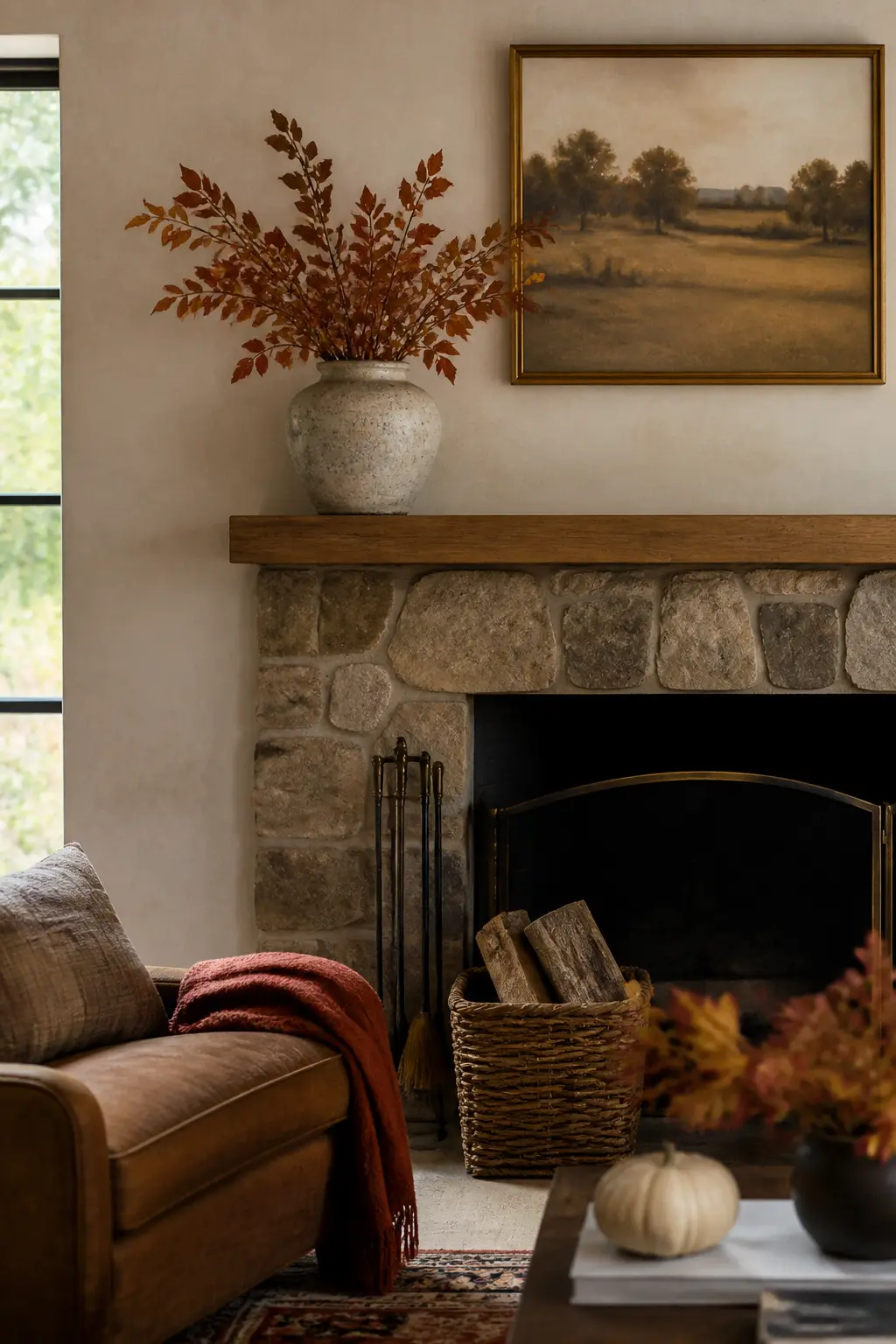
Place your tallest object, whether a vase of branches, a candlestick, or a framed print, at one end of the composition. Offset that height by placing a low cluster of small objects at the opposite end. The two ends now balance without mirroring each other.
This is a seesaw, not a symmetry. The tall single object and the low group carry similar visual weight from across the room because mass and height trade off against each other in the eye’s calculation.
The Tallest Object at the One-Third Point
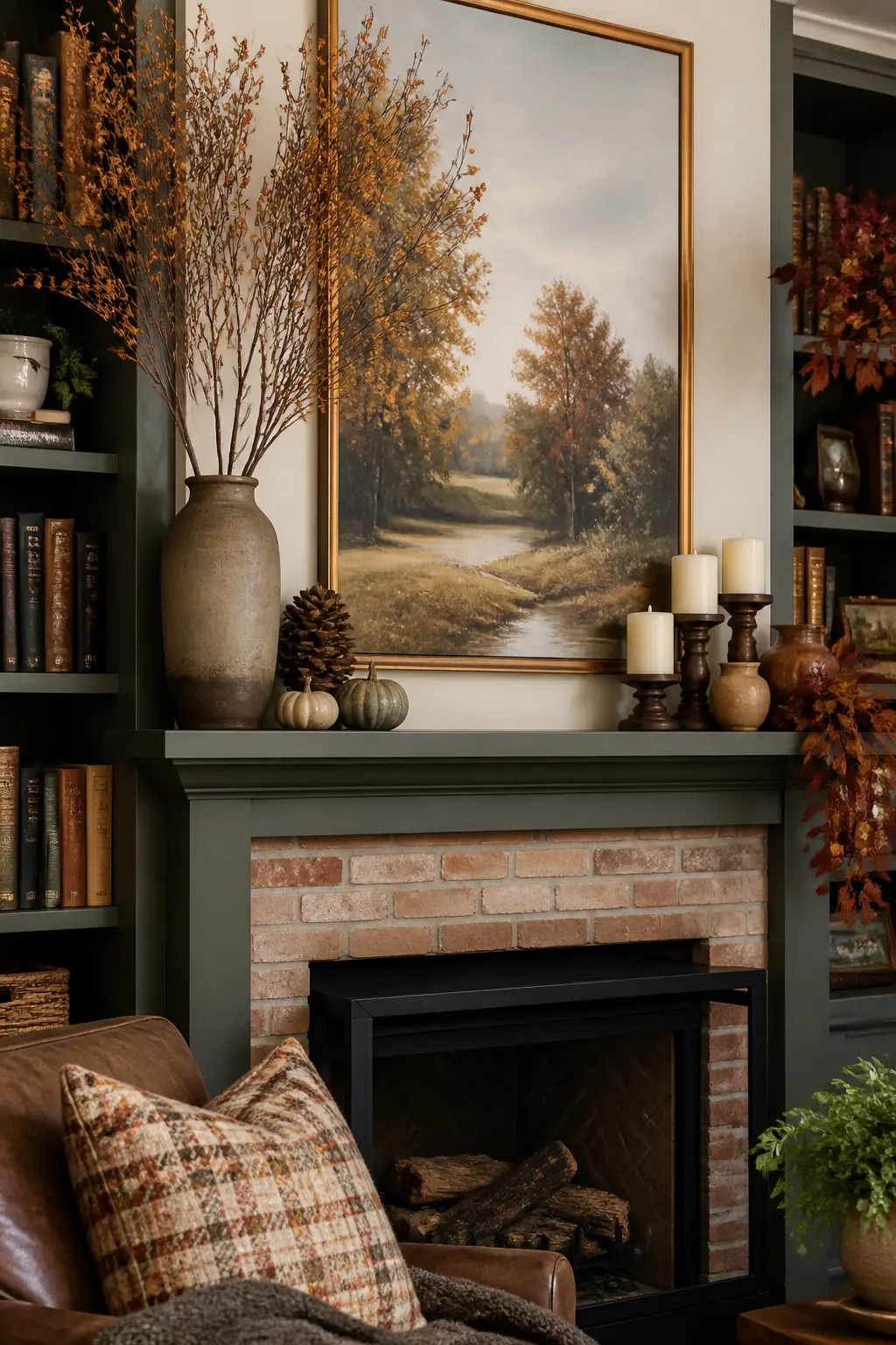
Divide the mantel into thirds mentally. Place your tallest object at the first or second third line, not in the middle and not at the end. The one-third point is the classical compositional division that feels natural to the eye without announcing itself.
The rule of thirds applies horizontally across the shelf just as it does in photography. An object placed exactly at the center or exactly at the edge creates visual discomfort. One placed at a third sits confidently, and the arrangement can grow outward from it in both directions.
🛍 Shopping guide
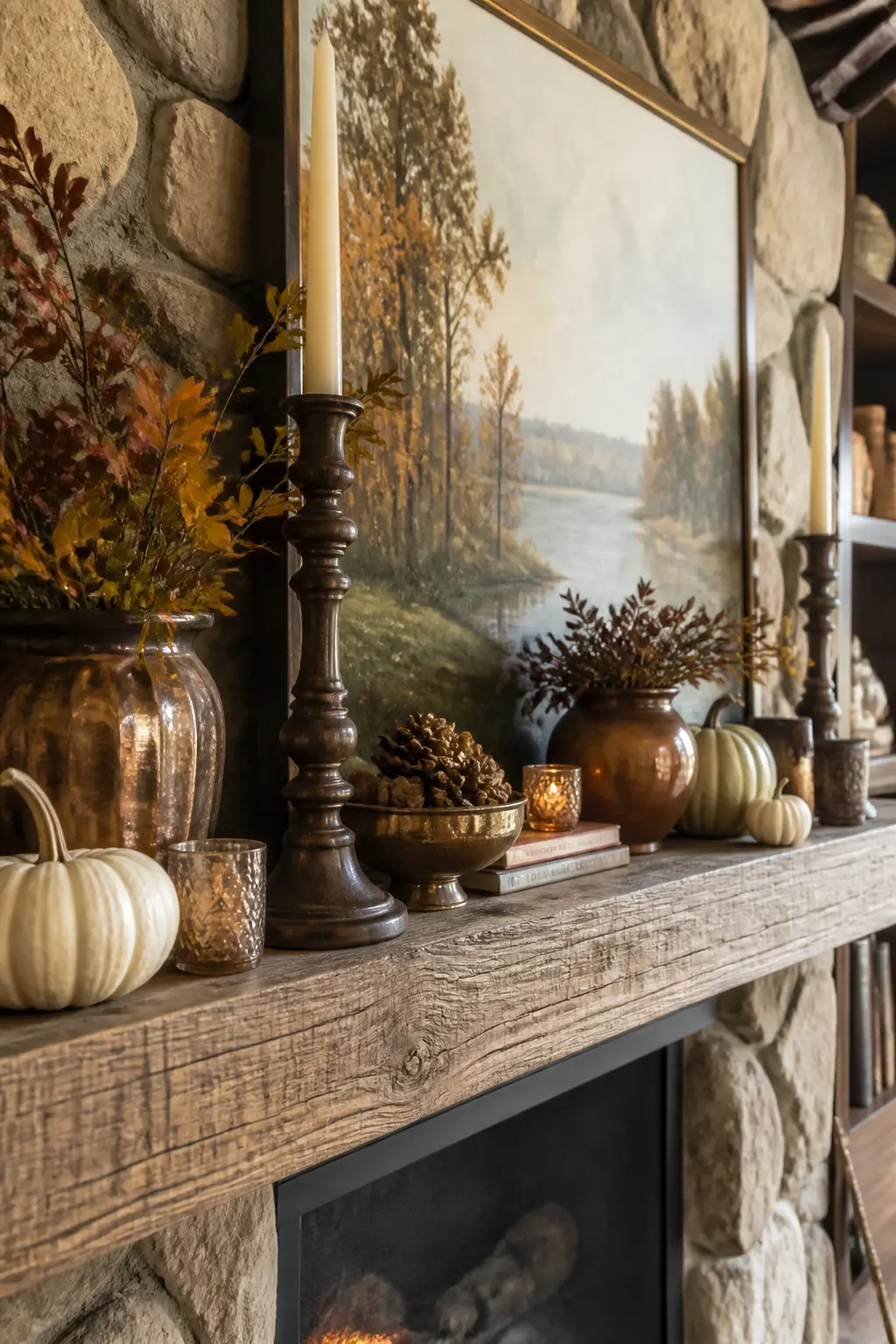
The Anchor Pulled Toward the One-Third Line
When you have both an anchor object and a tall object, move them close together at the one-third point rather than separating them. The cluster of height and weight in one zone lets the rest of the shelf breathe by contrast.
This feels counterintuitive because it leaves a lot of empty shelf on one side. That is exactly the point. A dense zone on one side and an open zone on the other creates the most dynamic composition available on a horizontal surface.
🛍 Shopping guide
Heavy Visual Weight Low and Center
Any object with visual heaviness, whether a wide dark vase, a stack of books, or a large wooden bowl, sits best when placed low and toward the center of the composition rather than high or at the edges. Heavy things that read as floating destabilize an arrangement.
Ground the heavy piece first, then build height around it. A wide shallow wooden bowl placed low at the center of a grouping lets taller, lighter objects lean or extend above it without the whole group looking top-heavy.
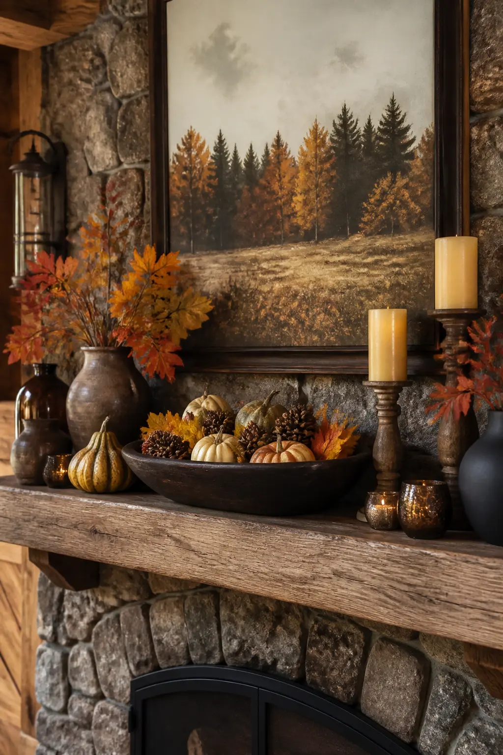
🛍 Shopping guide
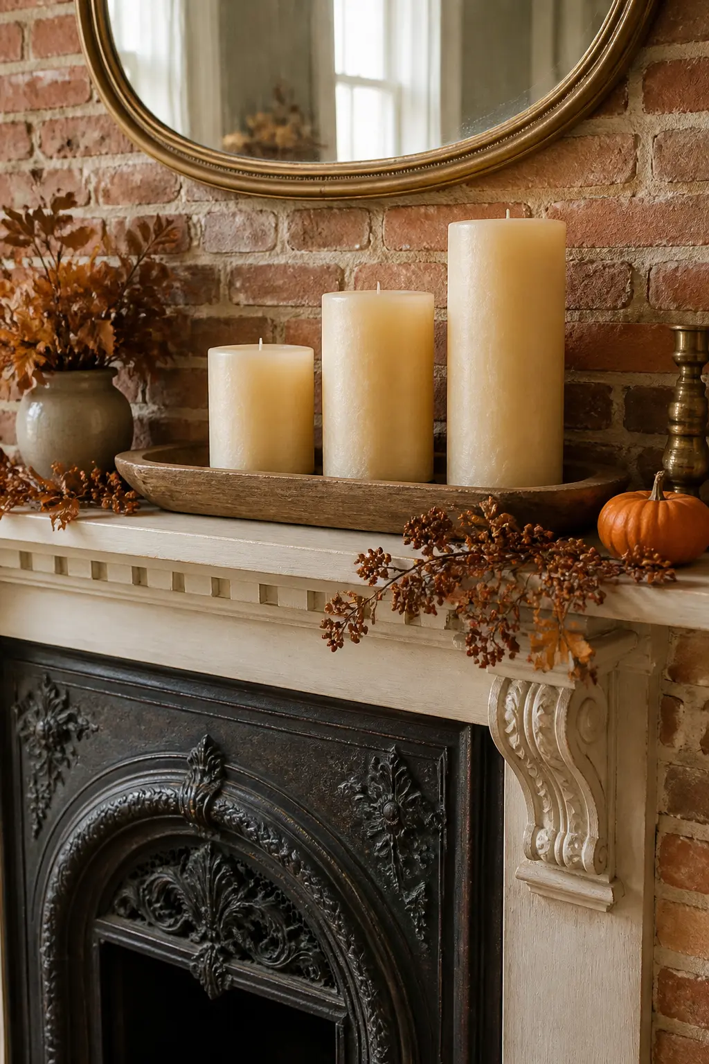
The Wide Shallow Wooden Bowl at One End
A wide shallow bowl placed at one end of the mantel acts as a low anchor that balances a taller element on the opposite side without competing with it. Fill the bowl with a few small objects, dried seed heads, pebbles, a small gourd, or leave it empty.
An empty wooden bowl reads as restrained and intentional. A bowl overflowing with objects reads as a dish you emptied your pockets into. Less in the bowl, more composition overall.
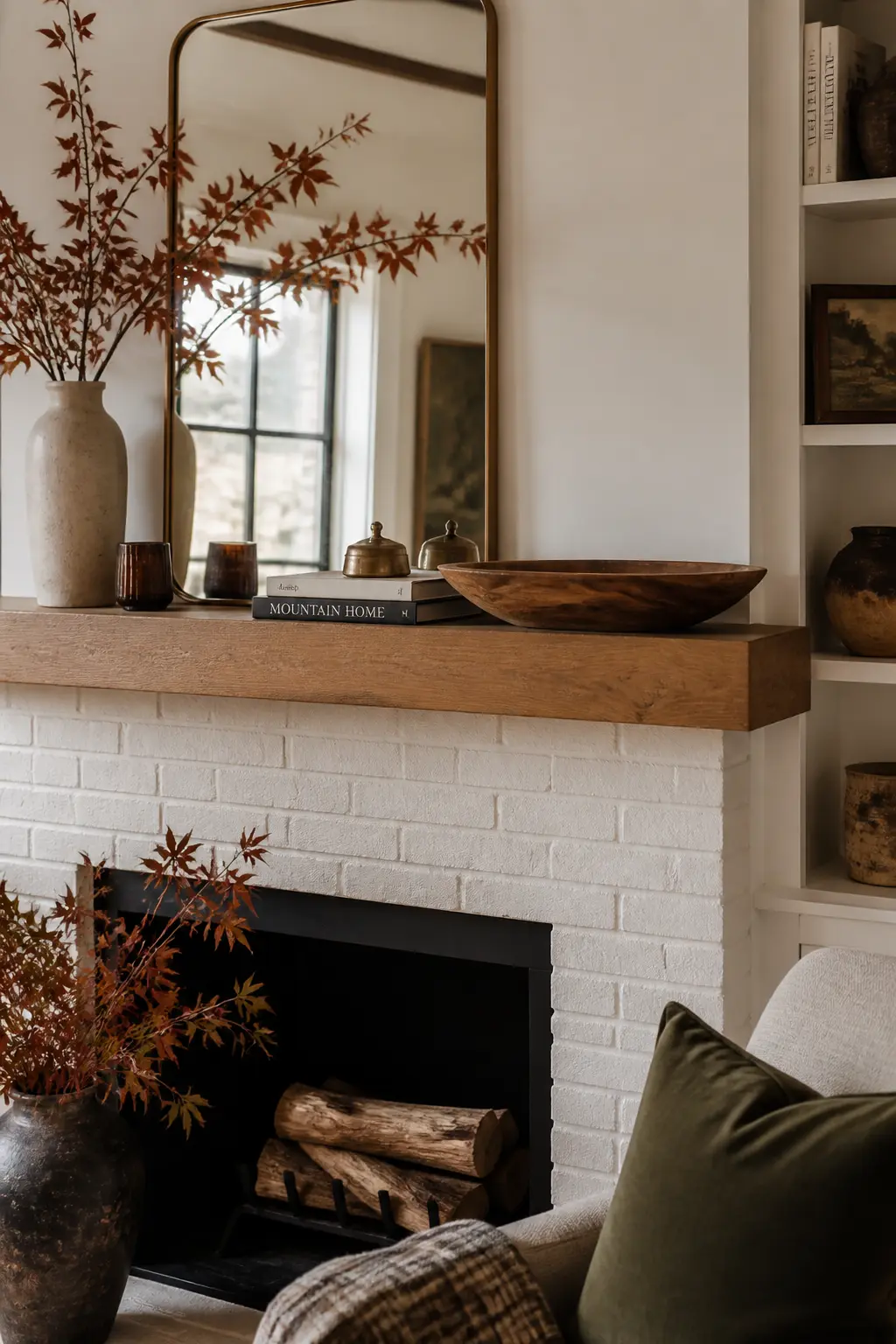
🛍 Shopping guide
The Lightest Object at the Trailing End
Visual weight, like physical weight, needs to stay stable. The trailing end of the garland, the empty end of the shelf, the side away from the anchor: this is where the lightest, most delicate object belongs. A single dried flower stem, a small sprig, a thin taper candle.
The lightest object at the trailing end completes the composition’s arc from heavy to light, from dense to open. It signals that the arrangement has a direction and a conclusion rather than simply stopping.
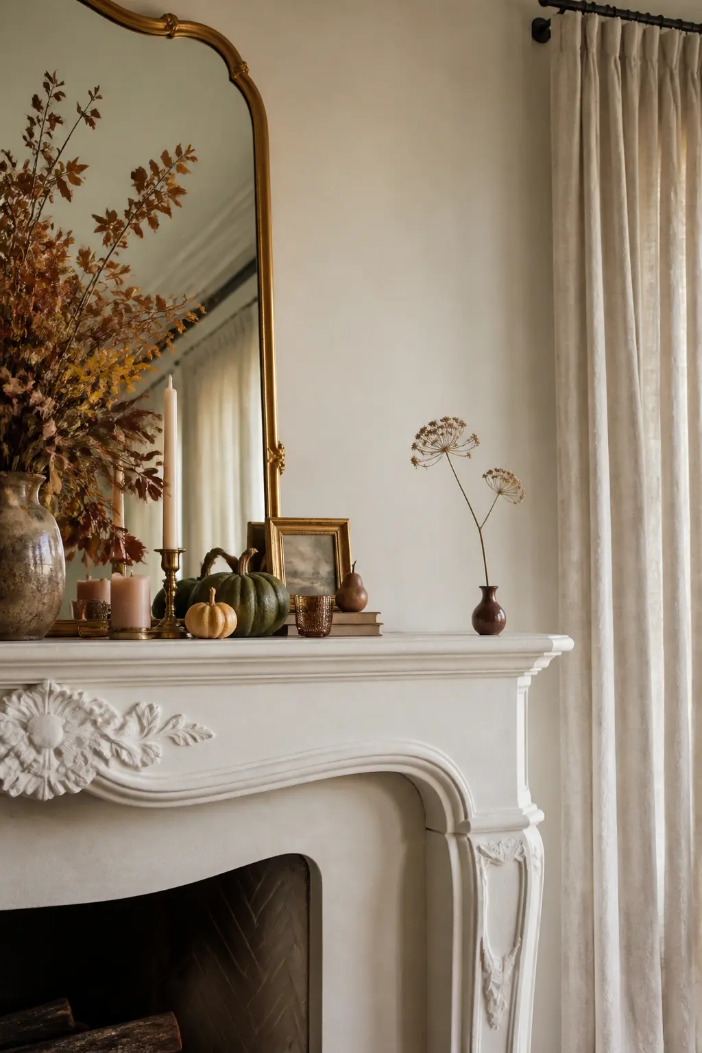
Layering and Depth
Depth is what separates a mantel that looks styled from one that looks lined up. Lean things against the wall. Let one object sit in front of another. Pull something forward so it overhangs the edge by an inch.
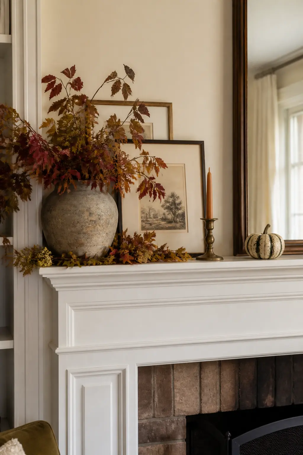
A mirror at the back doubles the depth without adding a single extra object. Two frames of different sizes leaning at slightly different angles create a layered wall before you add anything else. Vary the front-to-back position of every piece and the shelf stops reading as a single flat row.
Two Frames Leaning at Different Depths
Lean a larger frame flat against the wall first. Lean a smaller one in front of it, slightly angled, so the back frame’s edge stays visible on one side. The two frames now occupy different depths without any wall hardware.
Different depths matter more than different sizes. A thick wooden frame in front of a thin metal one creates a shadow line between them that reads as genuine layering from across the room.
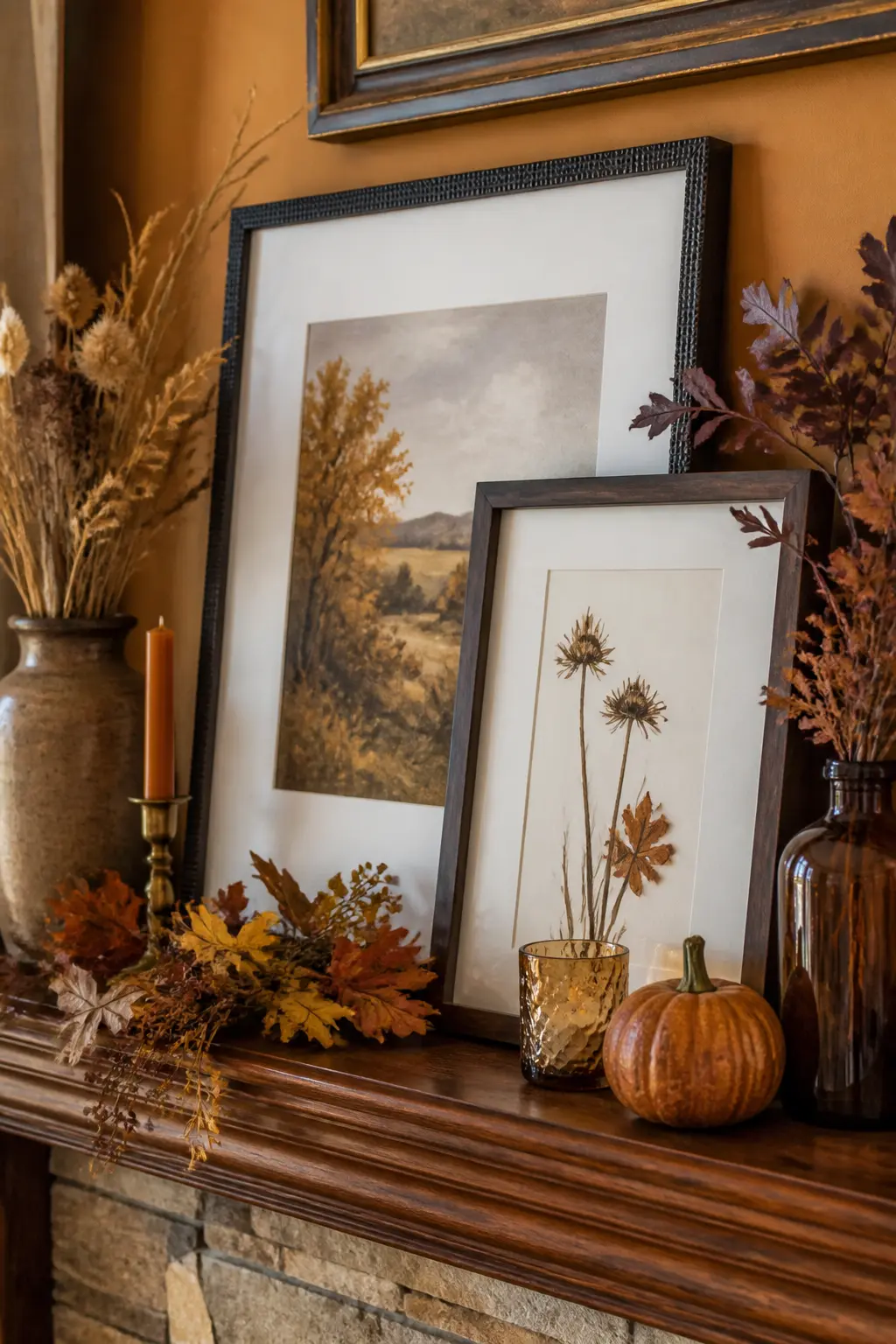
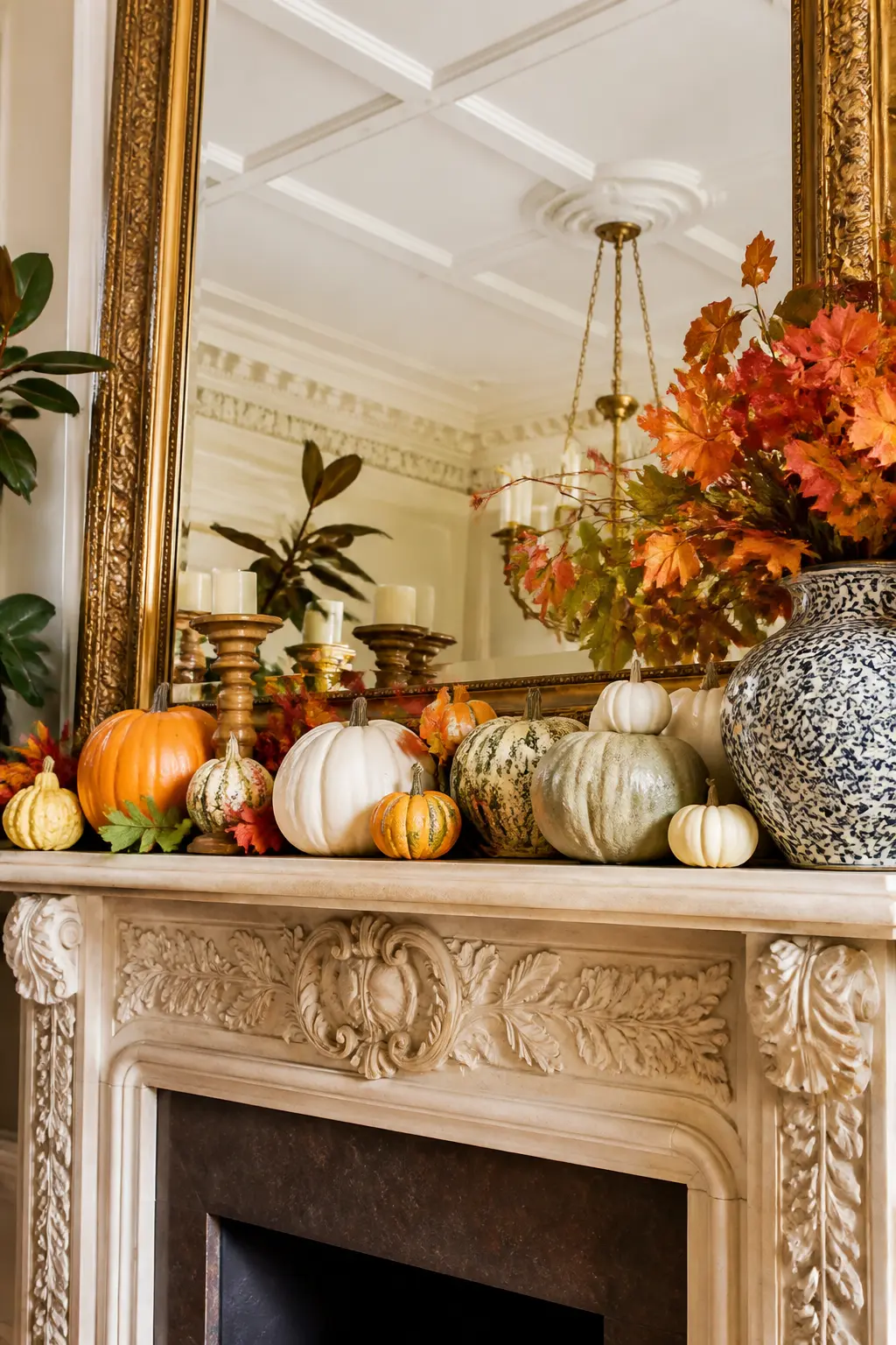
The Large Mirror Back Layer
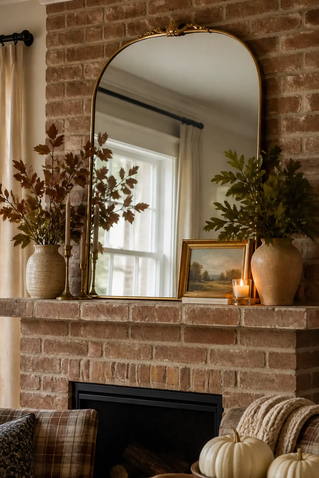
Lean a large mirror against the wall before placing any other object. It becomes the back plane of the entire arrangement and doubles the apparent depth of the shelf. Objects placed in front of it appear to float in a deeper space.
Keep everything on the shelf below the mirror’s midpoint. Anything taller breaks into the reflection and creates a busy top half. The open reflection above the objects reads as sky, and that breathing room is worth more than another object.
One Branch Crossing the Mirror
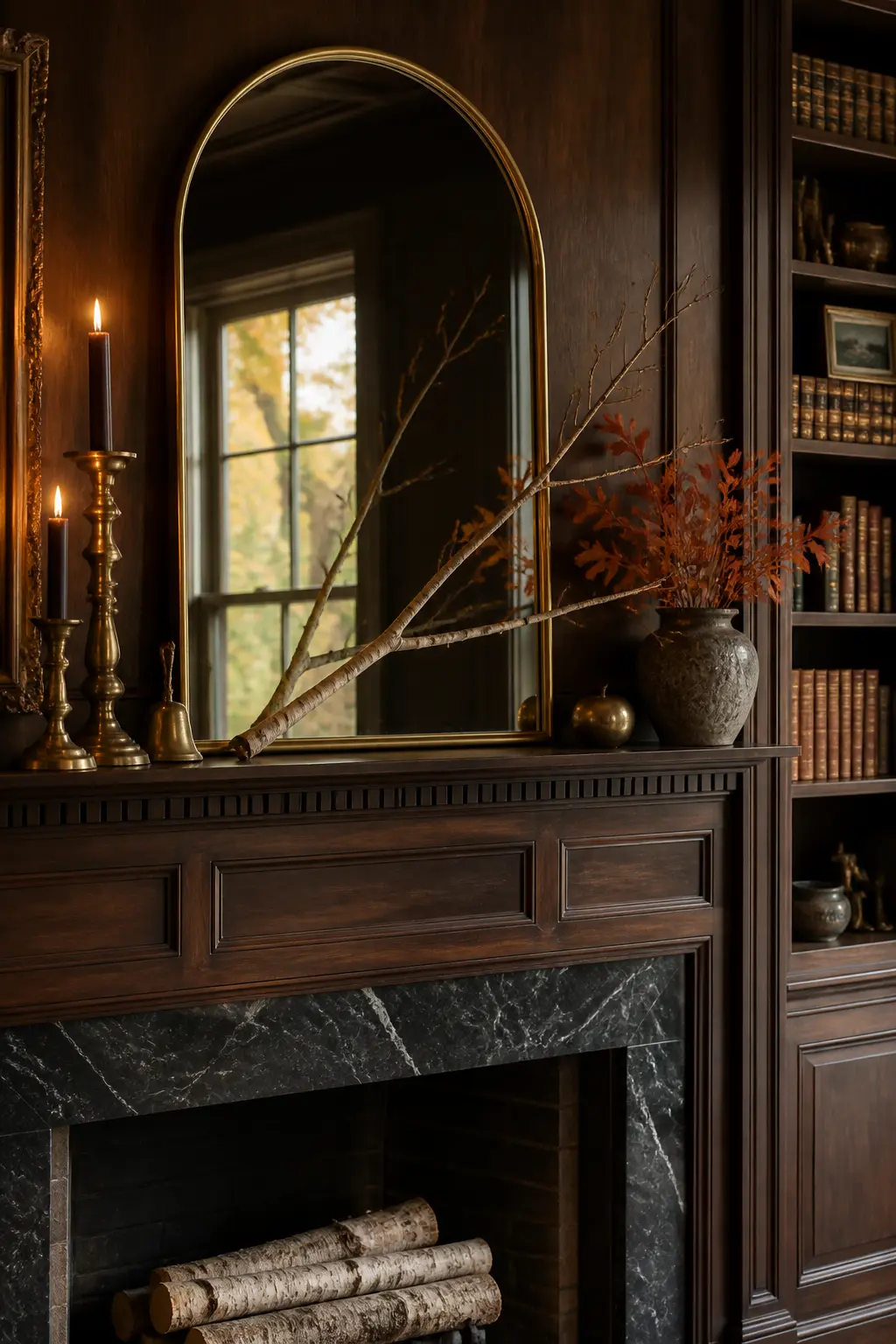
Once the mirror is in place, lean a single bare branch or eucalyptus stem so it crosses the lower corner of the mirror glass. The branch now exists in two planes at once: the real room and the reflection. That simple overlap reads as sophisticated layering.
Use one branch, not a bunch. A bunch becomes a garland and competes with the mirror rather than playing against it. One branch with an interesting silhouette is enough.
Frames at Different Forward Positions
Most people push every object to the back of the shelf. Pull one frame to the front edge so it sits an inch or two forward of everything else. That gap in depth, however small, breaks the flat-line effect that makes mantels look like window displays.
Vary the forward position of three or four items across the length. Front, middle, back, front again. The variation costs nothing and adds more visual interest than a new object would.
The Object That Overhangs the Edge
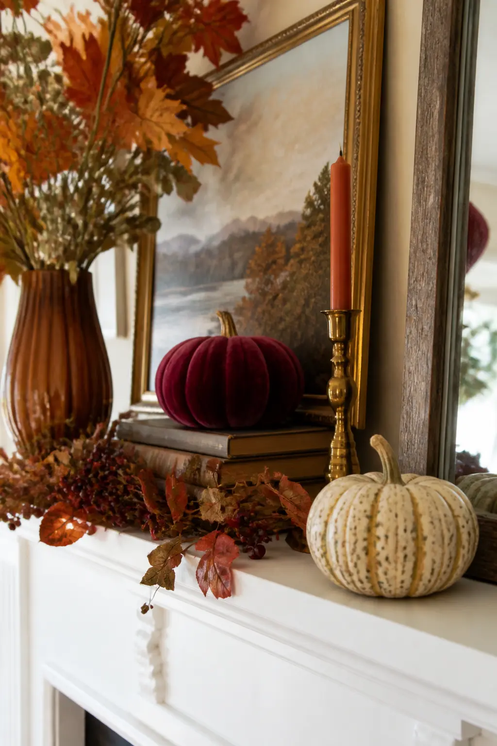
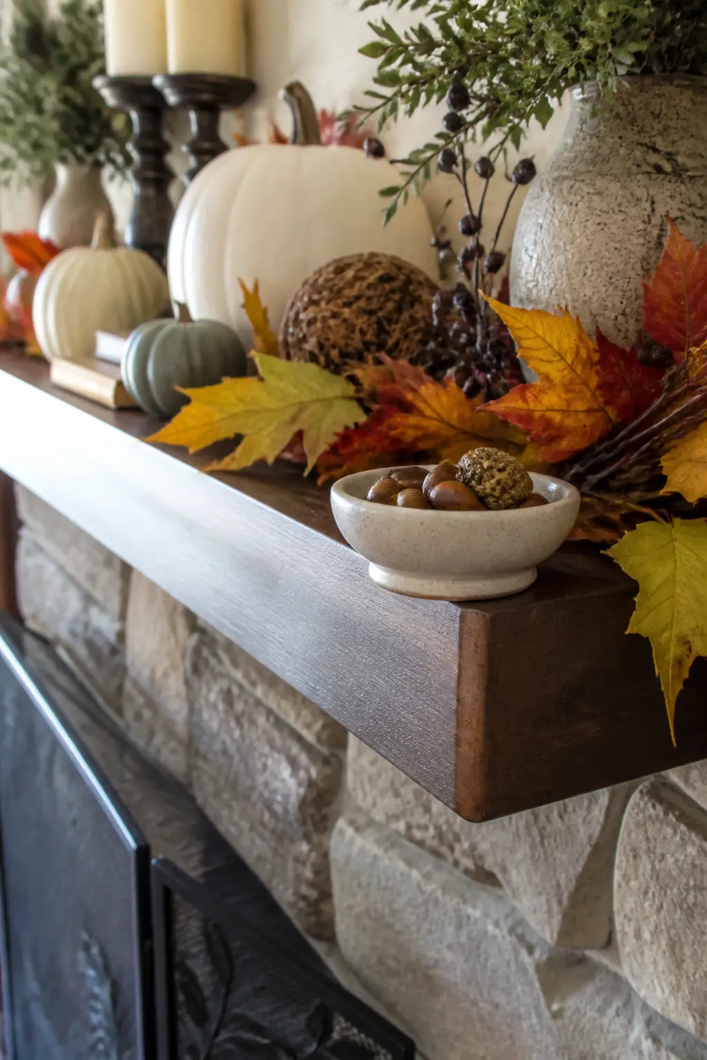
Let one object sit close enough to the front edge that it slightly overhangs, one to two inches beyond the shelf lip. A ceramic dish, the curl of a garland, or the base of a pillar candle placed just past the edge breaks the rigid horizontal line.
This one move signals that the arrangement was composed by hand rather than measured by ruler. It is a small thing that carries disproportionate visual effect, especially when viewed from slightly below the mantel height, which is where most people see it from a seated position.
🛍 Shopping guide
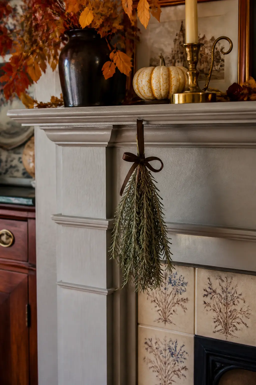
One Item Hanging Below the Mantel Line
Hang a single item from the front edge of the mantel so it drops below the shelf line. A small bundle of dried herbs on a cord, a brass ornament on a velvet ribbon, or a single fall leaf pressed and tied with twine. One item only.
The hanging object crosses the horizontal boundary of the shelf and introduces a vertical element that faces downward rather than upward. That reversed direction draws the eye to the mantel from anywhere in the room, including from seated height.
Every Item Below the Mirror Midpoint
When a large mirror sits behind the arrangement, treat the mirror’s midpoint as a strict height ceiling for everything on the shelf. Objects that rise above that midpoint compete with the reflection and make the upper half of the mirror busy with visual noise.
Keeping everything below the midpoint leaves the upper half of the mirror as open sky, reflecting the ceiling and the room beyond. That open reflection doubles the sense of space and makes the room feel taller than the objects would suggest.
🛍 Shopping guide
Candle Groupings and Light
Candles are the one element that can do both texture and height at the same time. The rule is simple: odd numbers only, and stepped heights, not matched ones. Three pillars at three different heights outperform five identical ones every time.
Set the tallest candle closest to the anchor, step down toward the trailing end, and leave at least several inches of clear shelf between the group and anything that hangs above. That gap is not wasted space. It is a fire-safety margin and a visual breath.
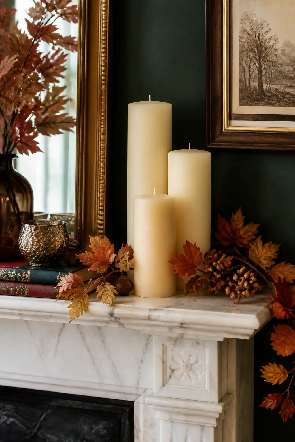
Three Candles at Staggered Heights
Set three pillar candles in a loose cluster rather than a straight row. The tallest sits closest to the anchor, the medium one slightly in front, the shortest at the outer edge of the group. Staggered heights, not matching ones.
The step between heights should be at least two inches to read from across the room. A one-inch difference disappears at distance and the three candles look like a set that does not quite match rather than a deliberate composition.
🛍 Shopping guide
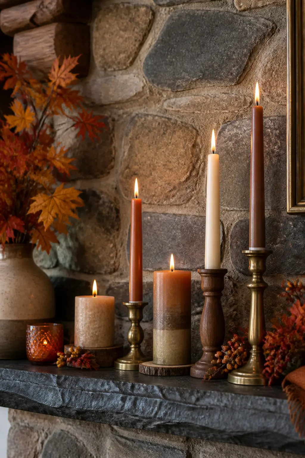
Five Candles Stepped Low to Tall
Five candles give more range than three but the rule stays the same: odd number, staggered heights, clustered loosely rather than spaced evenly. Let them sit at different forward positions too, some near the back of the shelf, one or two pulled closer to the edge.
Mix taper candles in tall holders with shorter pillars at the base of the group. The taper brings vertical line. The pillar brings mass. Both in the same group avoids the monotony of five identical cylinders.
🛍 Shopping guide
One Candle Set Far From the Garland
If a garland runs along the front edge, place every lit candle at least twelve inches from the trailing end. That clearance is not decorative, it is practical. Dried eucalyptus and preserved leaves are genuinely flammable.
Visually, the separation also helps. A candle tucked under a cascade of dried leaves disappears. One that sits in open air with a clear inch of shelf around it reads as a deliberate object rather than an afterthought.
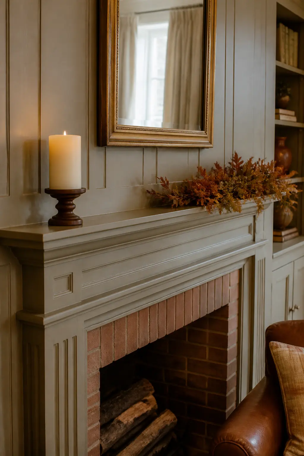
Candle Heights That Step, Not Jump
A jump in candle height, say from four inches to fourteen, creates a visual gap that the eye reads as a missing object. A step, moving from four to seven to ten, reads as a deliberate progression and holds the group together as a unit.
When choosing candles, check the increments. Each candle in the group should be roughly three to four inches taller than the next one down. If the tallest is twelve inches, the group steps: twelve, eight, five. That proportion steps comfortably across most mantel heights.
🛍 Shopping guide
Garlands and Trailing Organics
A garland that runs across the full front edge and trails off both ends reads as a frame, tidy and symmetrical. Let it trail off one end only, the side with less furniture below, and it reads as movement. That asymmetry does more compositional work than any ornament you could add.
Keep the garland at the front plane of the shelf, not pushed to the back. Tucking it behind objects buries it. Running it along the edge and letting it spill forward slightly keeps it active without overwhelming the pieces behind it.
A Garland Along the Front Edge
Lay the garland along the very front edge of the shelf, not pushed to the back where it vanishes behind other objects. Let it sit just at the lip so it is visible from below the mantel line as well as from across the room.
A front-edge garland defines the shelf boundary and gives the arrangement a ground plane to rest on. Everything behind it looks more composed because the base line is now clear.
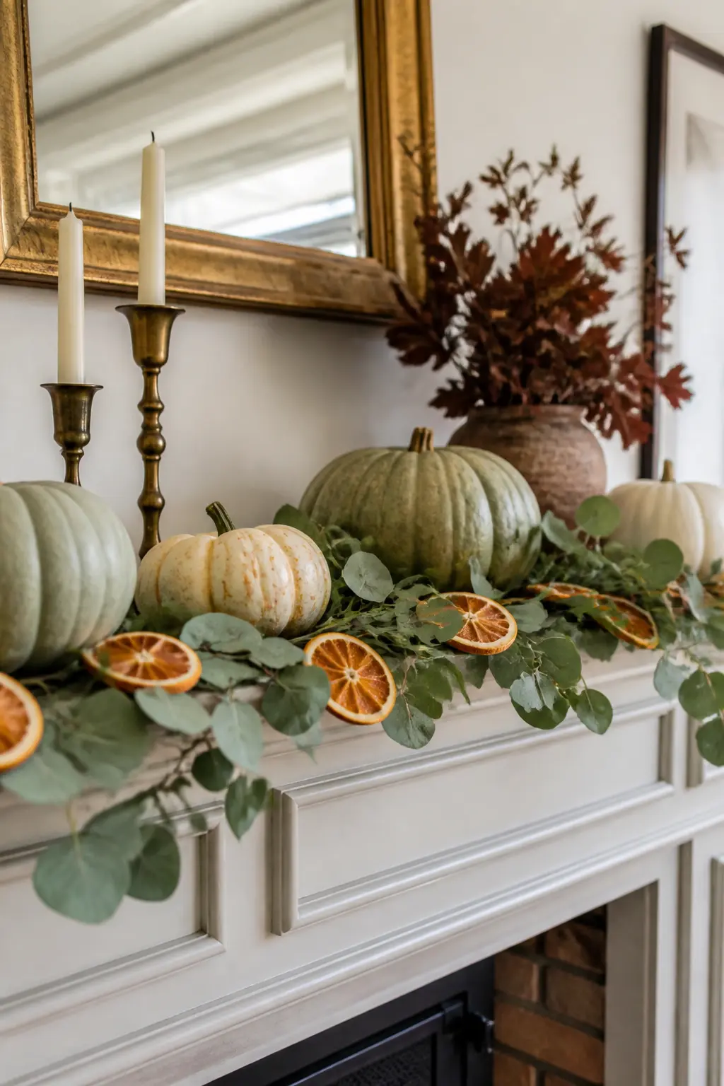
The One-End Trail
Cut or fold the garland so it trails off one end of the shelf only, the side with the least furniture below. Let it spill down that side by six to eight inches. Leave the opposite end trimmed neatly at the shelf edge.
This asymmetry moves the eye from the high trailing end across the shelf to the clean opposite edge. That movement is what keeps an arrangement from looking static. Both ends trailing equally cancels the effect entirely.
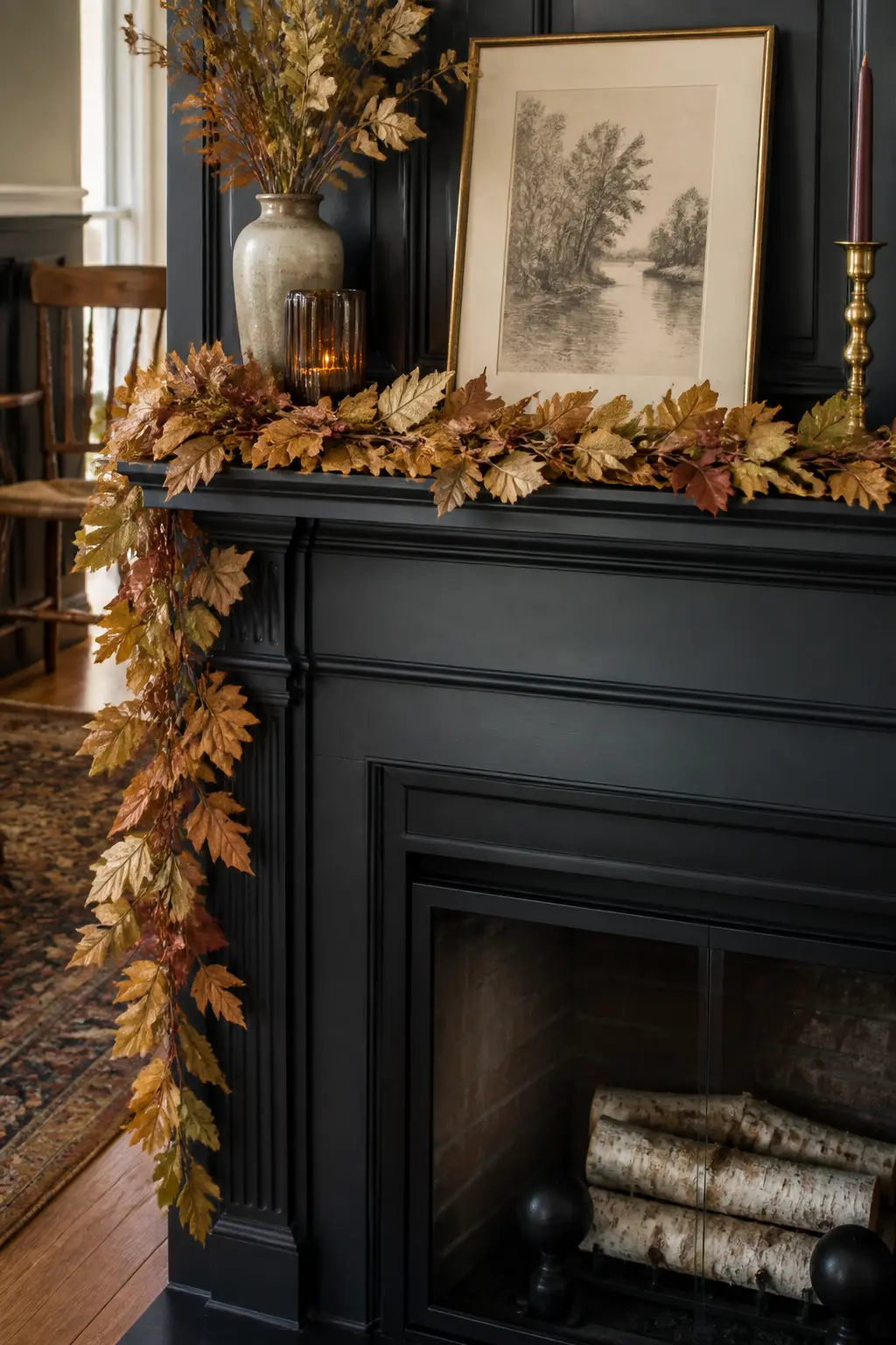
🛍 Shopping guide
Garland Trailing Longer on the Light Side
If the room has a sofa or console table on one side of the fireplace and open floor on the other, trail the garland longer on the open side. The garland visually fills the emptiness that the furniture creates on the other side and the whole composition balances without adding anything to the room below.
Read the room before you cut the garland to length. The mantel does not live in isolation, and the best fall mantle decor decisions always account for what sits below and beside the fireplace.
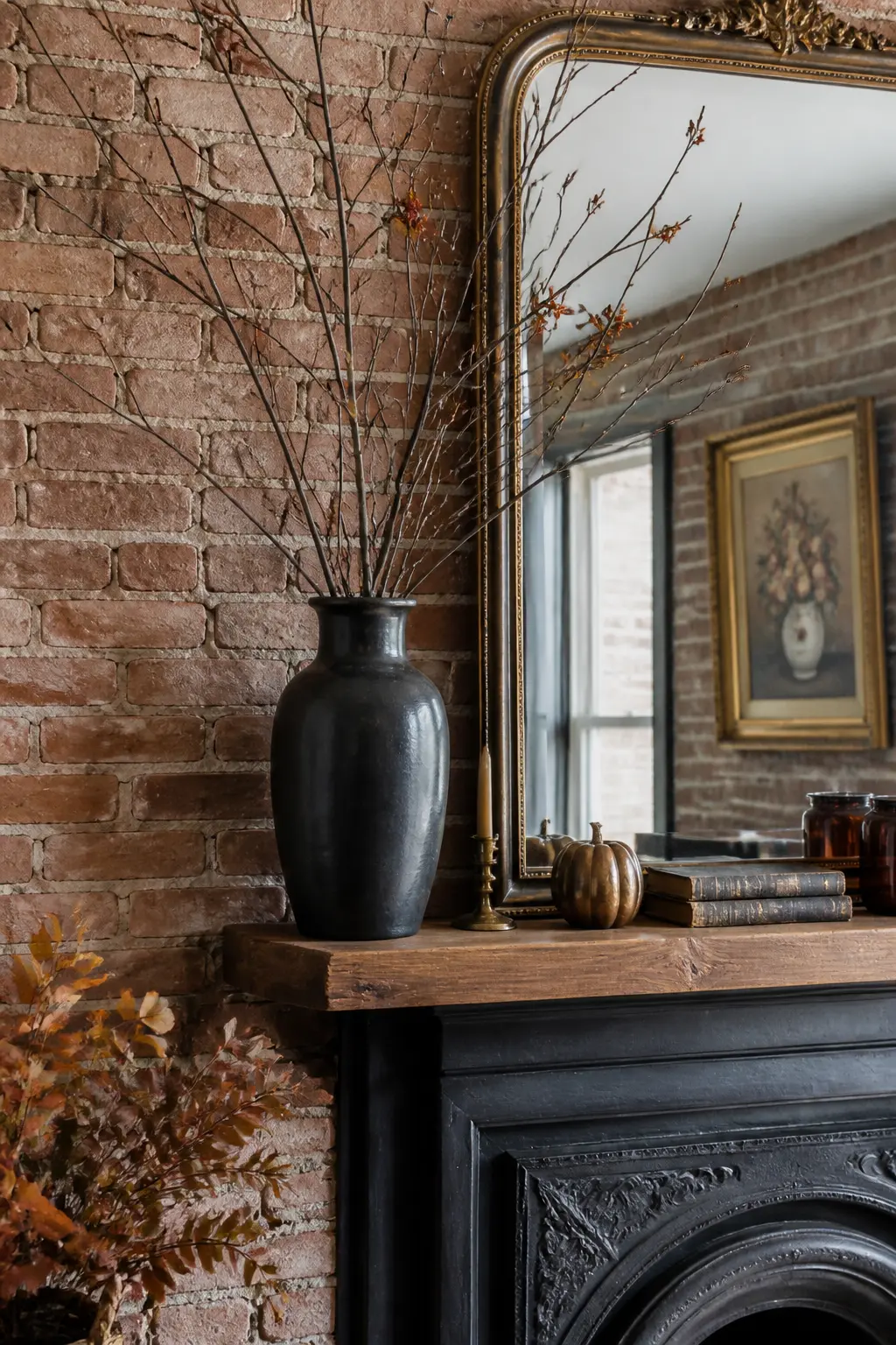
Bare Branches in a Tall Vase
A vase of bare branches is the tallest object on most fall mantels and earns its place by bringing vertical line without mass. The branches read as drawing in the air: thin, graphic, and completely uncluttered.
Place the vase at the one-third point along the shelf, toward the anchor. Let two or three branches extend above the height of anything else on the shelf, including above the top of the mirror if one is present.
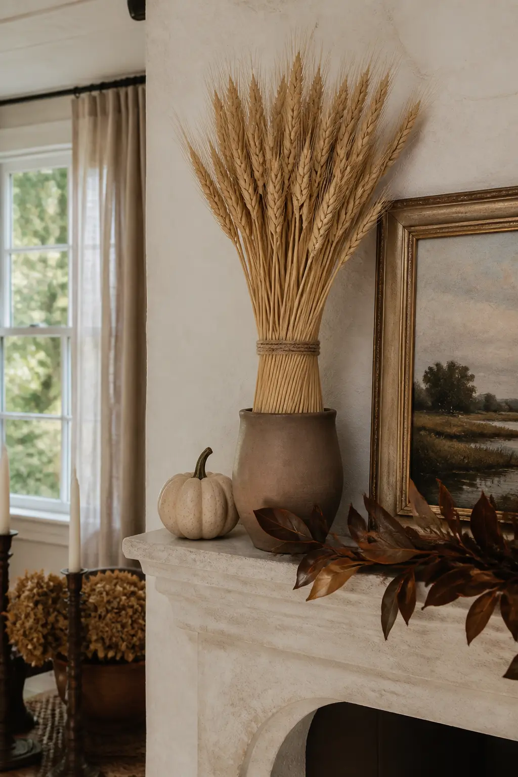
Dried Barley or Wheat Bundle
A bundle of dried barley or wheat tied with linen twine brings texture, a matte surface, and a warm golden tone in one object. Stand it upright in a narrow vessel or lean it slightly against the back layer so the seed heads fan forward.
This is the organic element that introduces rough texture against smooth ceramics and polished glass. One bundle is enough. Two becomes a theme, three becomes a harvest festival, and you are avoiding that.
Repetition and the Three-Color Rule
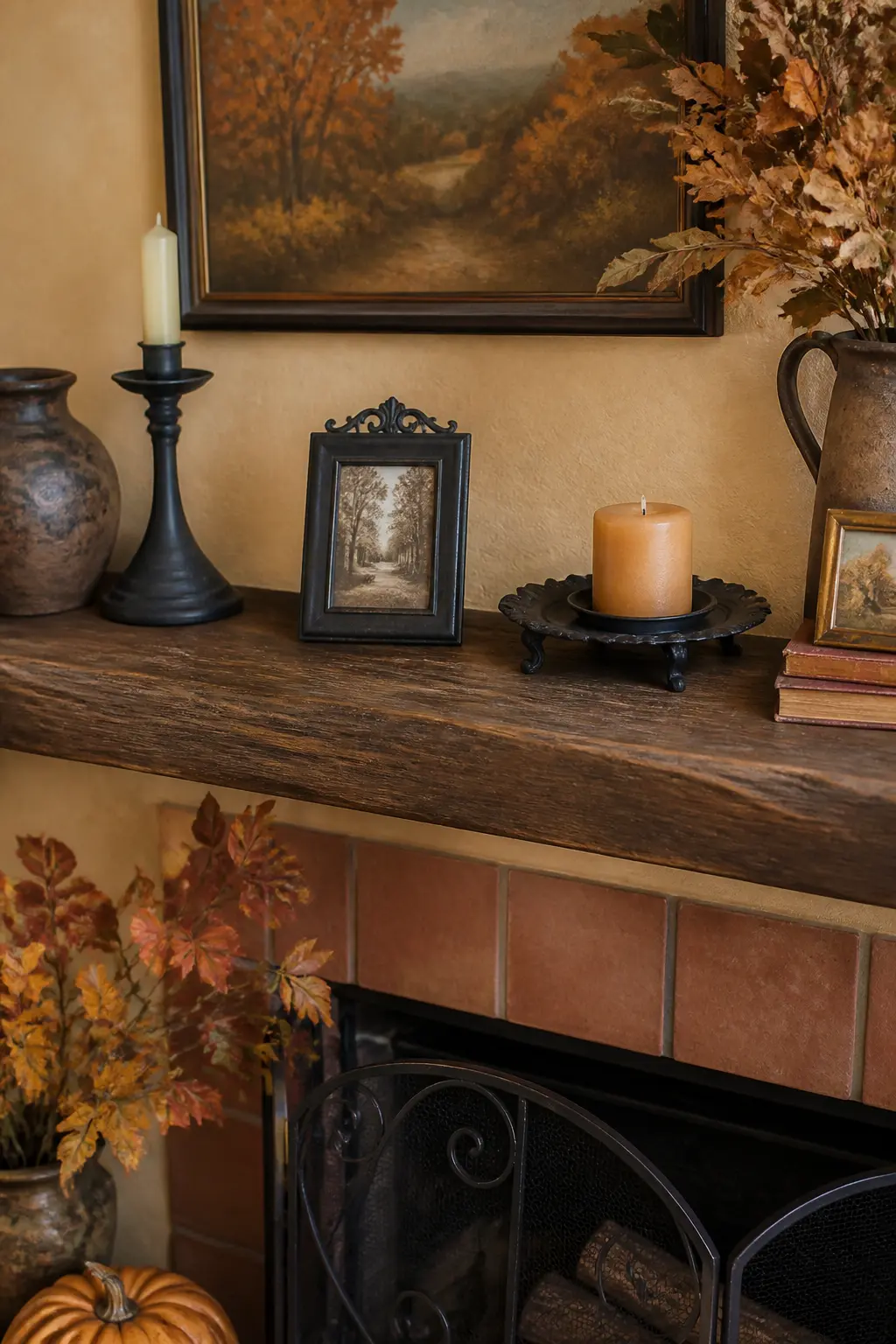
Repetition is the fastest way to make a collection look curated rather than accumulated. Repeat one material three times across the length: terracotta, linen, dark wood, raw metal. The eye picks up the pattern without being told and reads it as intention.
Hold the palette to three color families maximum. Bring in the room’s dominant wall color once on the mantel, and let your deep accent (burgundy, wine, rust) appear once or twice as a punctuation mark. More than that and the palette starts to compete with itself.
Terracotta Repeated Three Times
Choose terracotta as the repeated material. Place a terracotta pot at the anchor point, a terracotta dish as a riser at the opposite end, and a terracotta taper candle holder somewhere in the middle. Three appearances of the same material, spaced across the length.
The eye reads the pattern and understands that these objects belong to the same arrangement even if they are different shapes and sizes. Repetition of material does more compositional work than repetition of color alone.

🛍 Shopping guide
One Shape Three Times Across the Length
Pick a shape: sphere, cylinder, arch. Use that shape three times across the shelf in different sizes and materials. A large wooden sphere, a medium ceramic cylinder vase, and a small brass arch frame cover the length while the repeated shape ties them together invisibly.
Shapes repeat across a mantel the way a rhythm repeats in a song. You notice the pattern without being able to name it, and that subconscious recognition is what makes the arrangement feel designed.
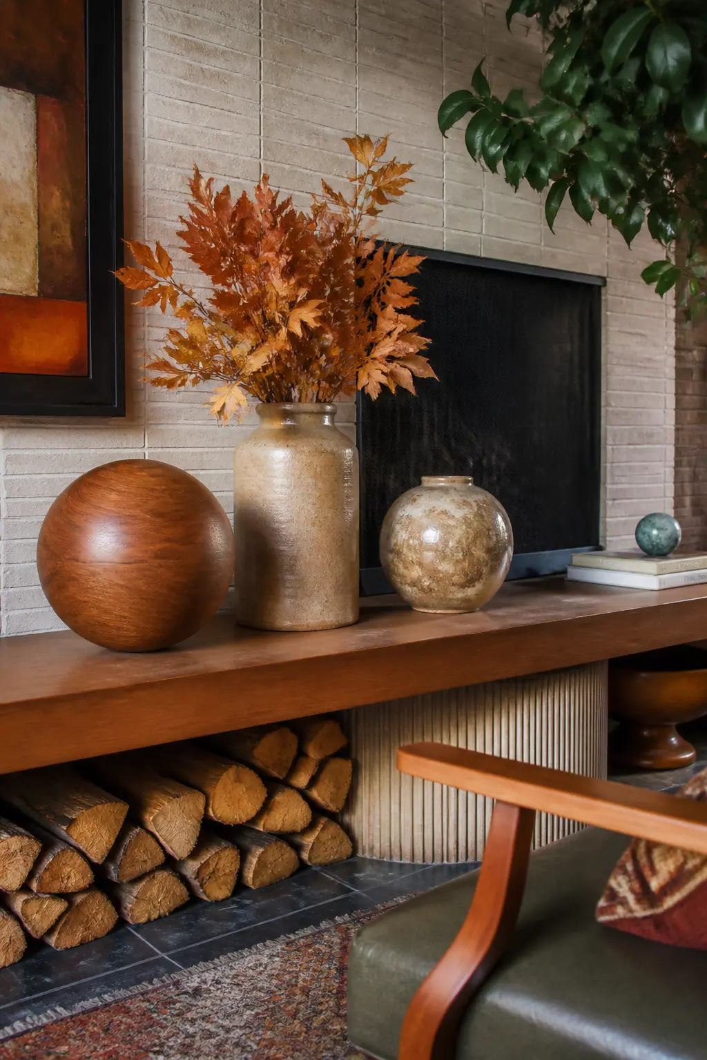
The Room’s Wall Color Echoed Once
Look at the wall behind you. Whatever that color is, find one object on the mantel that matches it closely. Not a swatch, not a rough approximation: a genuine match. A vase, a book spine, a small ceramic piece.
That single match pulls the mantel into the room rather than letting it exist as a separate display. The wall color appearing on the shelf ties the vertical plane to the horizontal one, and the room reads as one considered space.
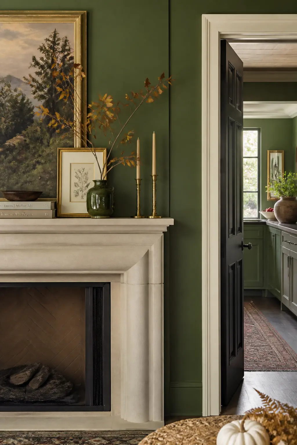
A Deep Wine Accent
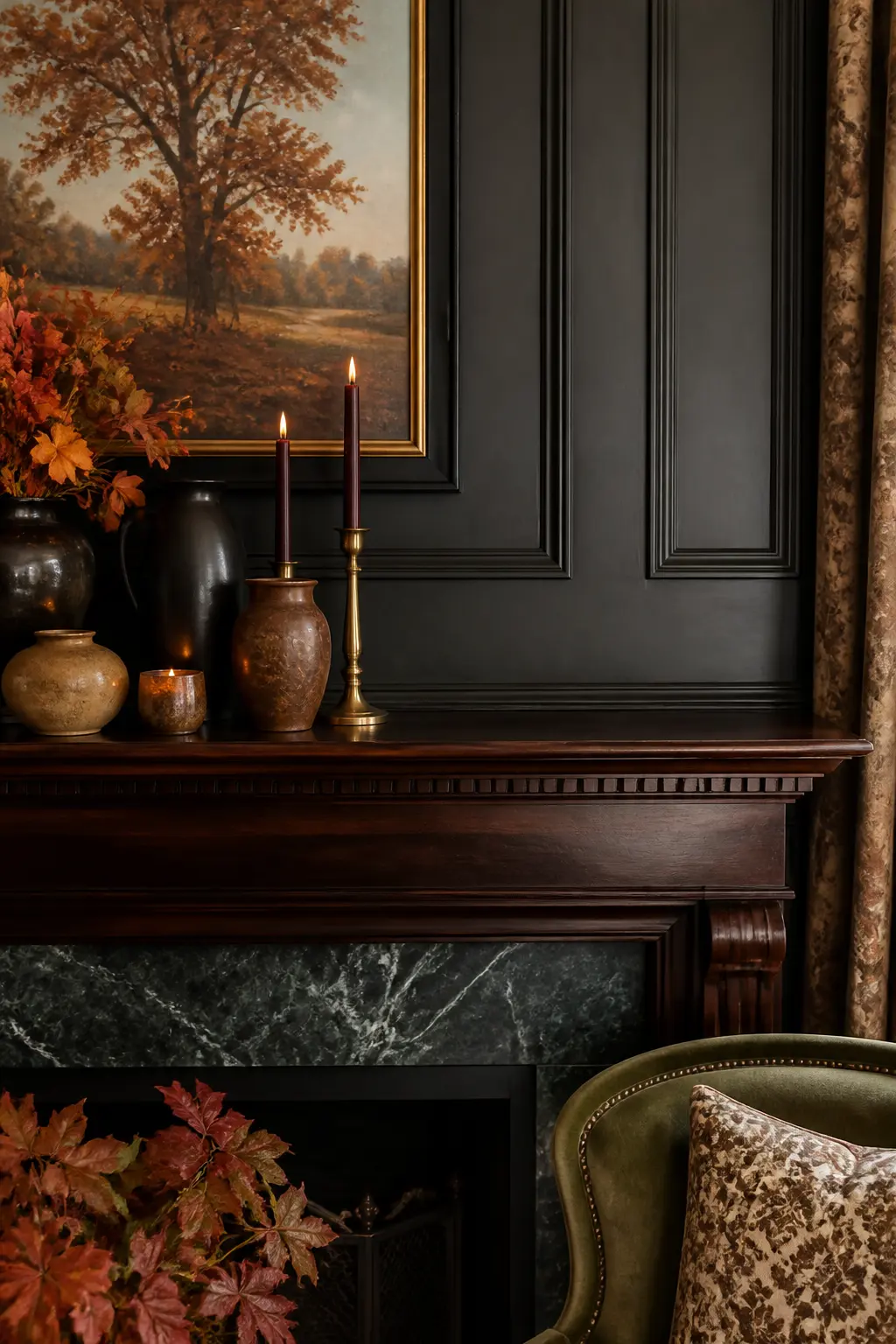
Wine, burgundy, and deep plum punch above their weight in fall palettes because they read as rich rather than heavy when used in small amounts. One object in this tone, placed near but not at the anchor point, pulls the whole palette deeper.
Use it once. A wine-colored pillar candle, a deep burgundy ceramic dish, or a single dried protea in that tone. Two objects in this color push it from accent to dominant, which breaks the three-color rule.
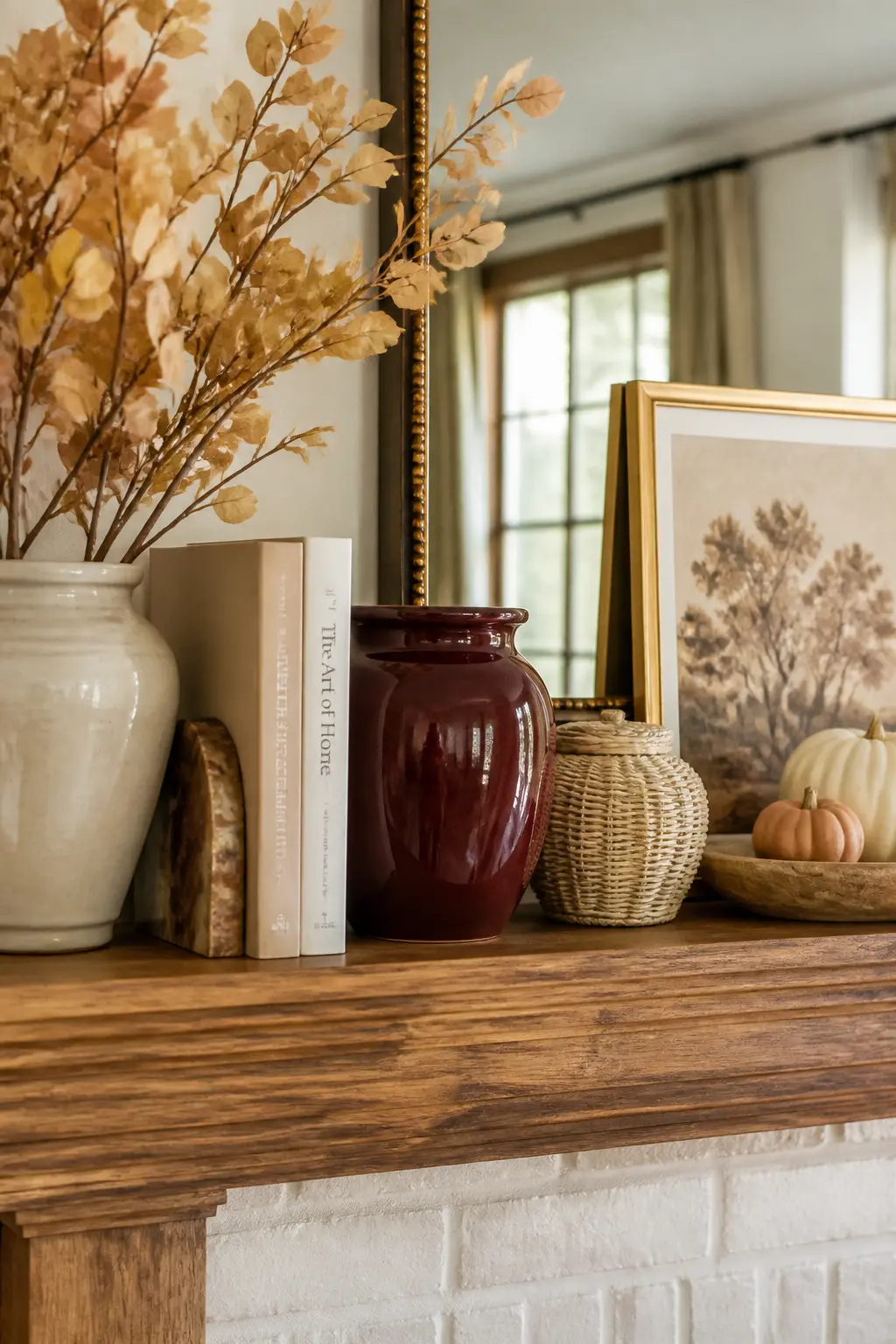
Three Colors, No More
Before adding a fourth color, name your three. For a classic fall palette: warm ivory, deep rust, and muted olive. For a cooler take: slate, cream, and dried blush. Every object on the shelf must belong to one of those three families.
When an object does not fit, set it aside. This is not precious: it is editing, and editing is the most important skill in fall mantle decor. A three-color shelf with eight objects looks better than a five-color shelf with four.
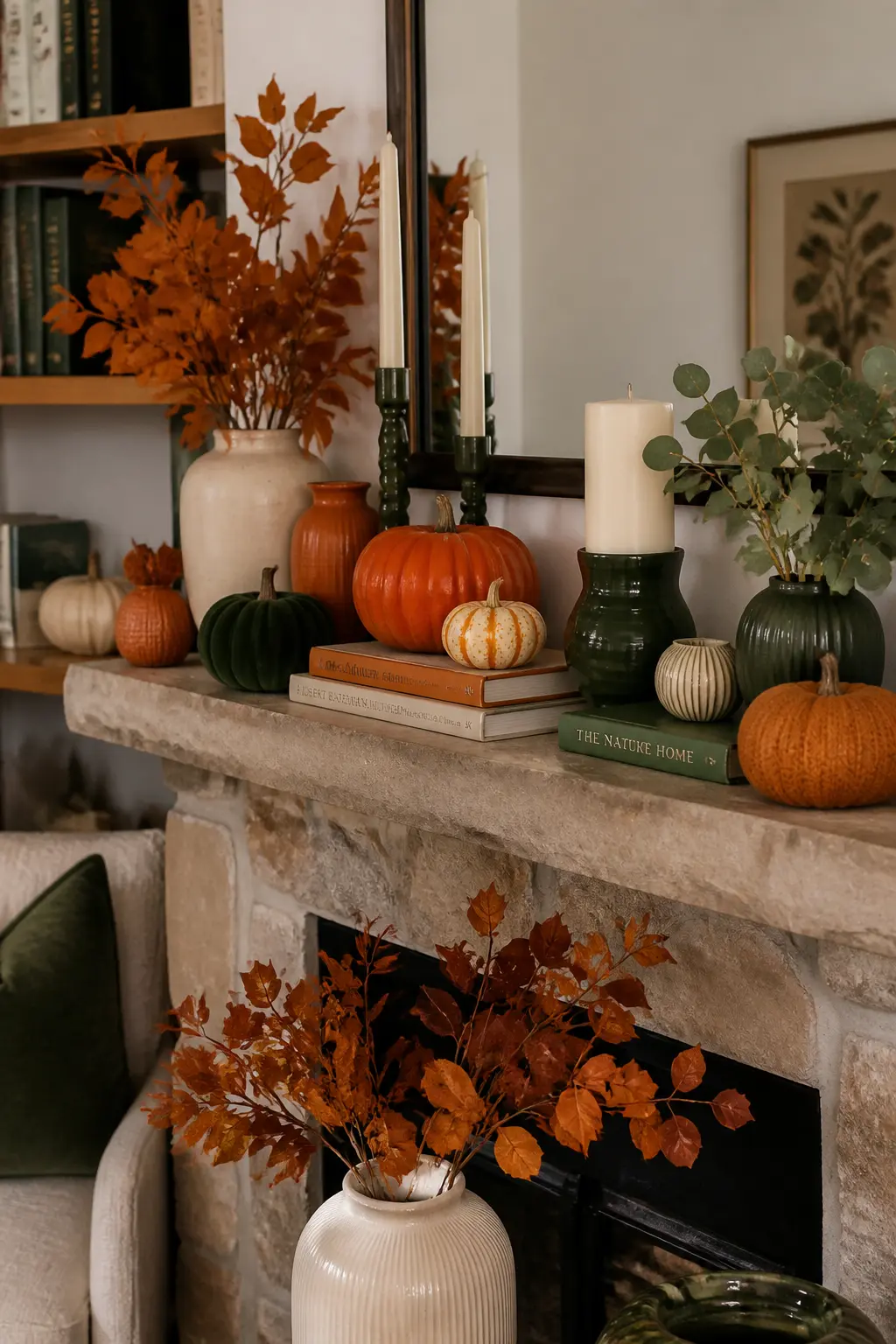
Repeating Linen Three Times
Linen is one of the most versatile repeating materials in fall decor because it appears in so many forms: a wrapped box, a runner, a book cover, a small bag filled with dried lavender. Three linen appearances across the shelf length tie a diverse group of objects into a coherent arrangement.
The linen does not need to match exactly. Undyed linen, natural linen, and off-white linen all read as the same material family from across a room, and that family recognition is what the repetition achieves.
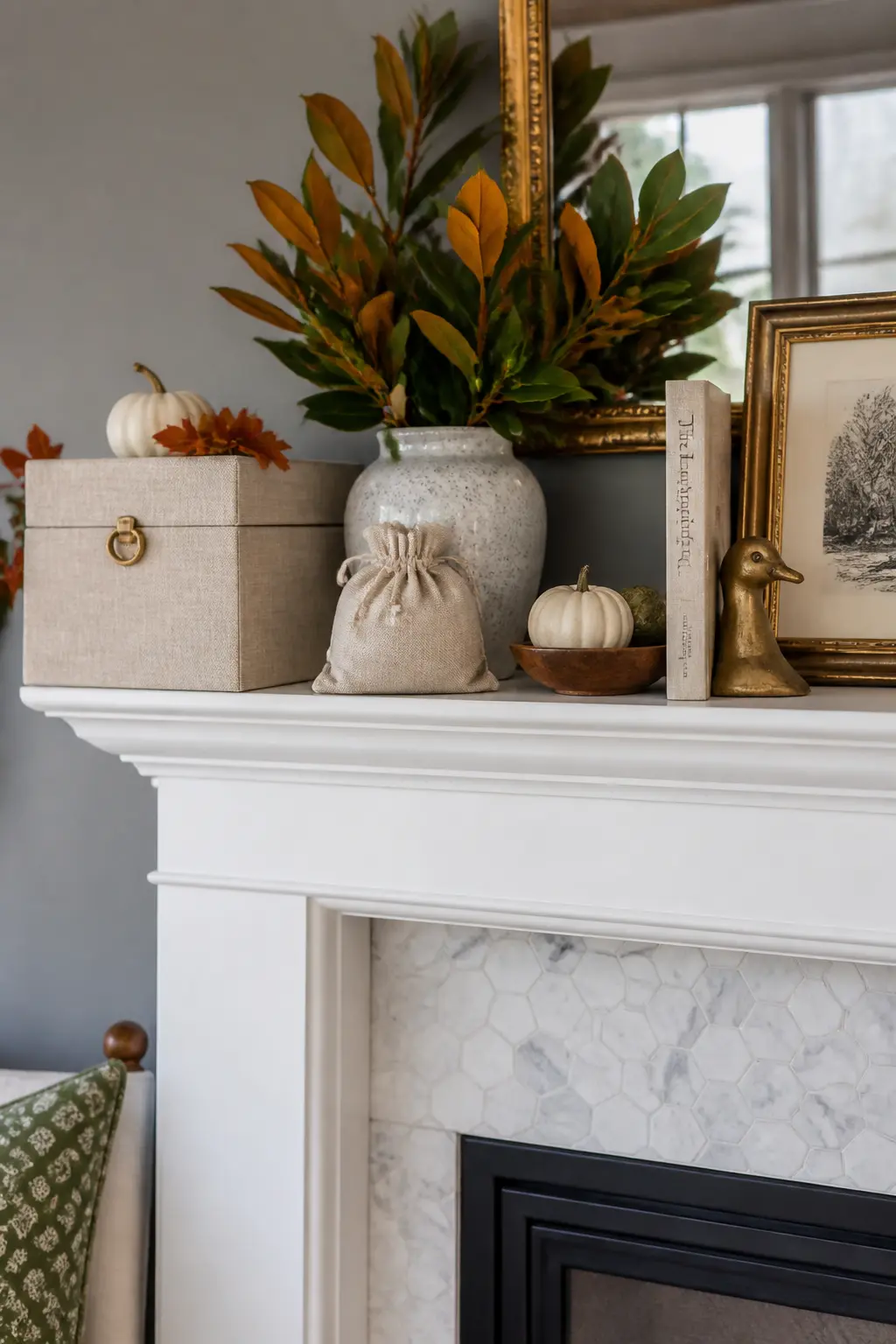
Repeating Dark Metal Three Times
Dark metal, wrought iron, aged brass, or blackened steel, appears once and looks like a mistake. Appears twice and looks like a coincidence. Appears three times and reads as the material thread that holds the whole palette together.
Use dark metal in a candlestick, a small frame, and a tray or trivet. Three objects, three different sizes, the same material family. The eye connects them across the shelf length and the arrangement reads as assembled rather than collected.
Texture, Organic Elements, and Empty Space
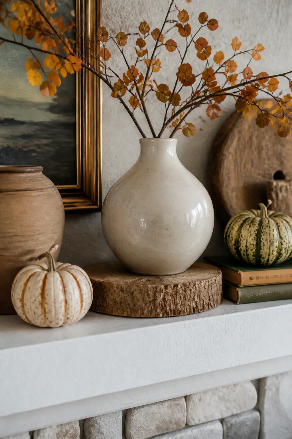
One rough surface among smooth ones draws the eye more reliably than a matching set ever will. A raw-edge wooden bowl next to glazed ceramic, a bundle of dried barley next to a polished candlestick: the contrast is the point.
Empty space works the same way. Leave one section of the shelf bare, ideally the corner nearest the door, and the negative space makes everything else feel chosen. A full shelf communicates anxiety. A shelf with breathing room communicates confidence.
One Rough Texture Against Smooth Surfaces
If every object on the shelf is glazed, polished, or smooth, the arrangement reads as flat even when the heights vary. One rough surface breaks that: raw wood, a woven vessel, a concrete object, a bundle of dried stems.
The rough piece does not need to be large. A small raw-edge wooden riser under a smooth vase introduces the contrast without dominating the palette. The eye notices the difference in surface before it notices the color, and that noticing creates visual interest.
Varying Textures Within One Color Family
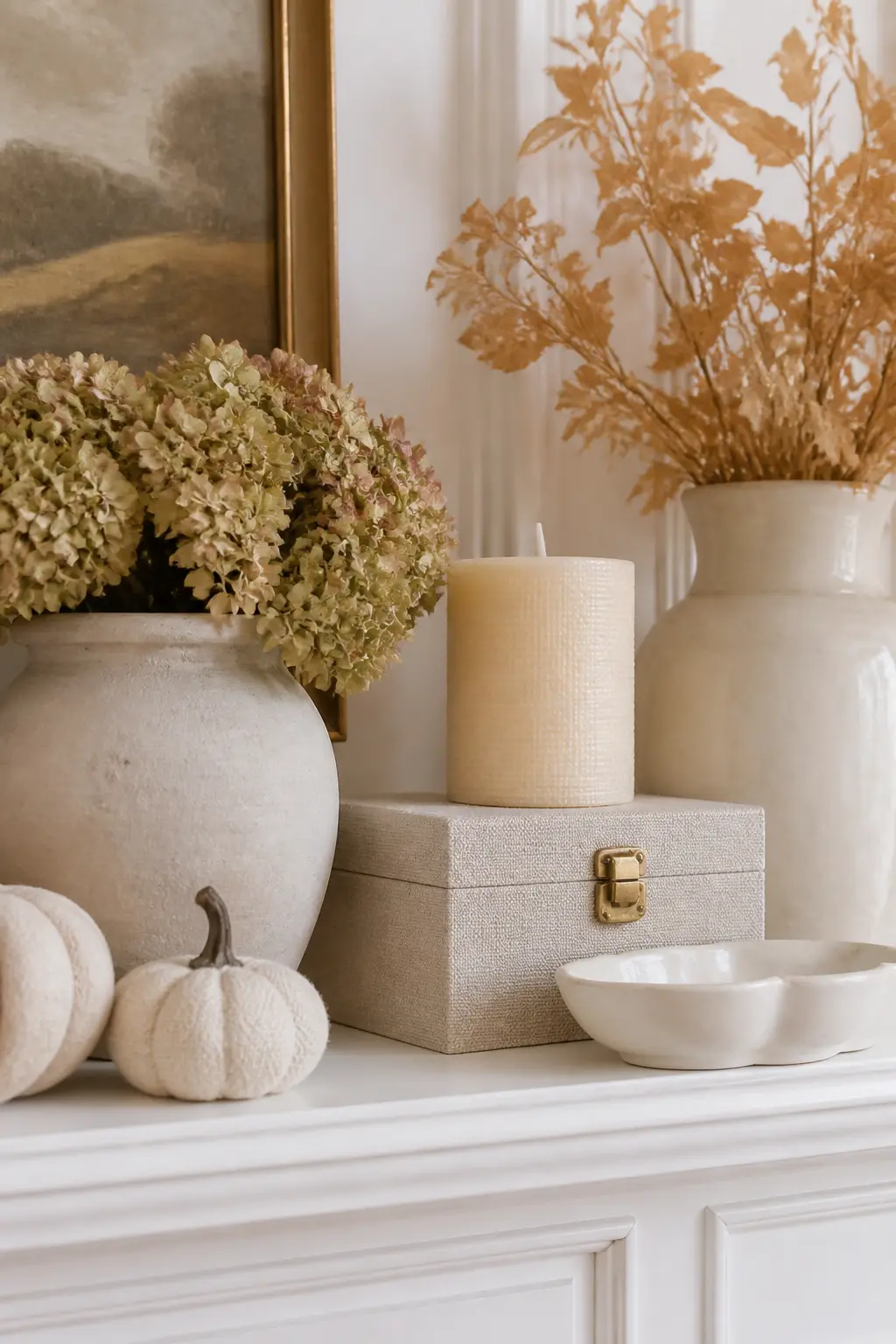
Take one color, say warm cream, and collect objects in that color with entirely different surfaces: a matte ceramic, a linen-wrapped box, a smooth pillar candle, a glossy porcelain dish. Same hue, four different textures.
This technique lets you build a monochromatic section of the mantel that still holds the eye, because the surface variation does the work that color contrast would do in a wider palette. It is particularly useful when the palette is already at its three-color limit.
The Deliberately Empty Section
Choose one third of the shelf and leave it bare. Not accidentally empty because you ran out of objects: deliberately empty, with the edge of the shelf visible and nothing placed there on purpose. This is the hardest rule to follow and the most effective one.
The empty section creates contrast against the grouped sections and makes each object in the filled areas feel more significant. A mantel where every inch is occupied gives no single object a moment of its own.
The Corner Nearest the Door Left Open
Identify which end of the mantel faces the room’s main entry door. Leave that corner empty. When a guest enters, their eye lands on open shelf, then travels inward across the arrangement. That movement creates a sense of discovery rather than confrontation.
A corner that is crowded stops the eye before it can explore. An empty corner invites it in. This is a classical compositional principle that works on every surface from a dining table to a gallery wall.
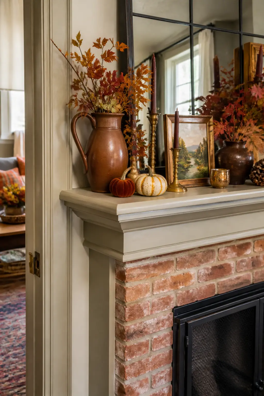
Books Stacked Flat as a Riser
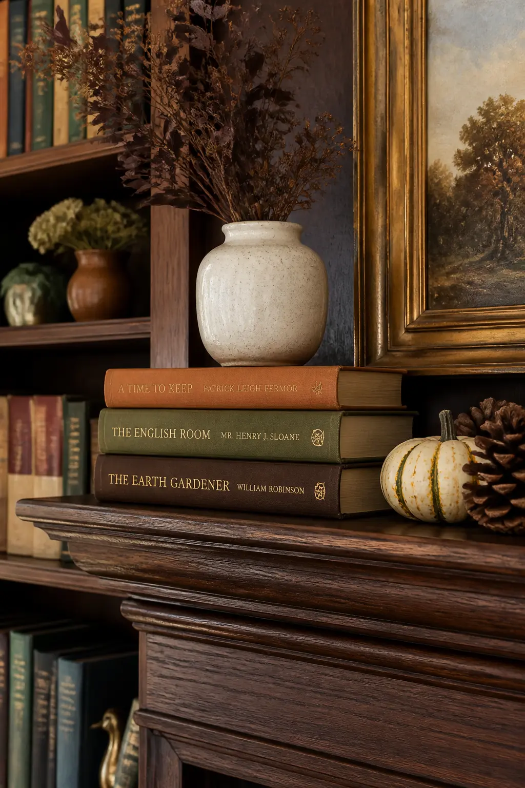
Stack two or three books horizontally and place a smaller object on top of the stack. The books lift that object by two or three inches, which is sometimes all a composition needs to correct a flat-line profile.
Choose books with spines in colors that fit the palette. Face them with the spine out if the colors work, or turn them spine-in for a uniform cream linen look. The stack itself becomes a textured object, not just a functional riser.
🛍 Shopping guide
Clustered Small Objects, Not Evenly Spaced
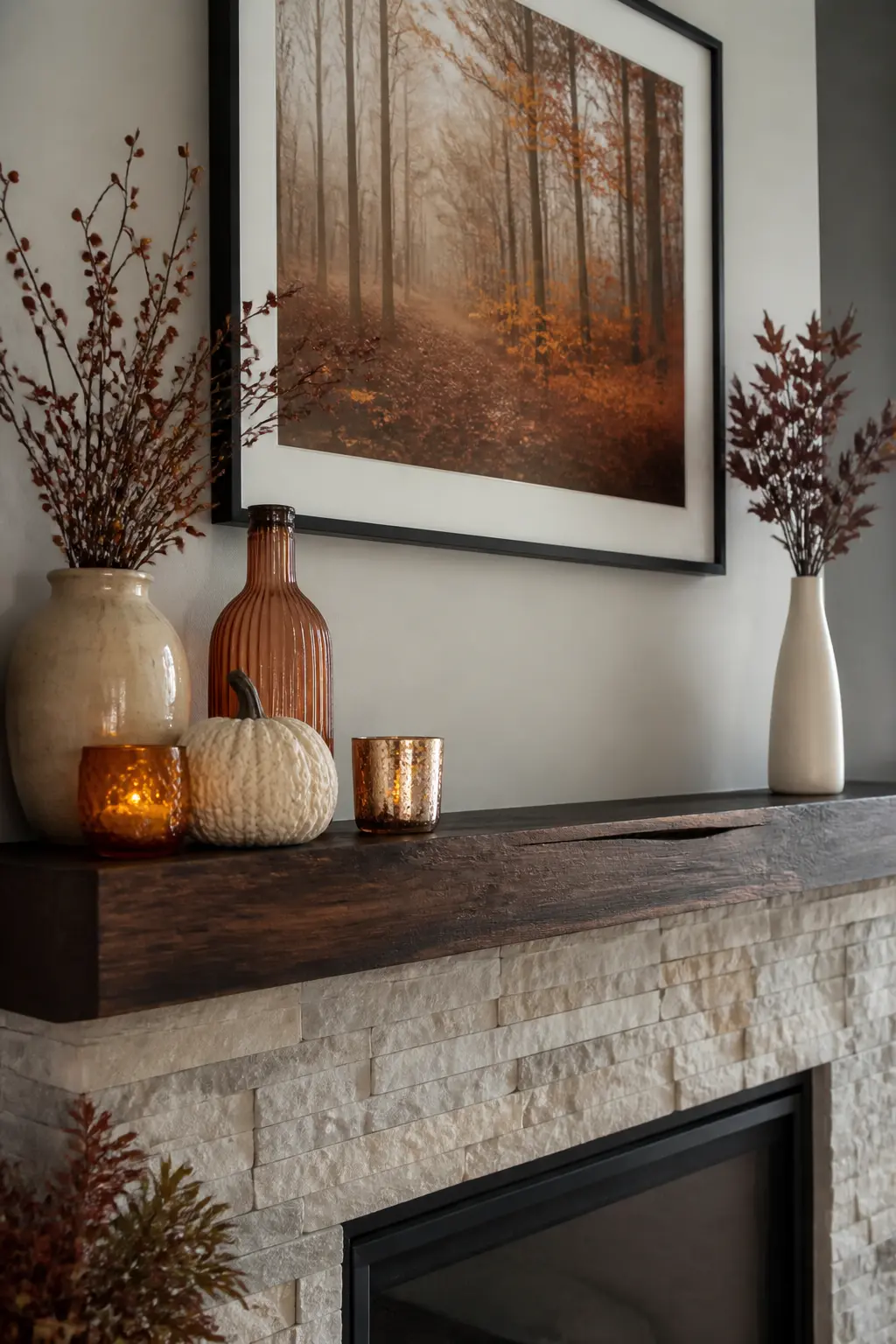
Spread five small objects evenly across a mantel and the eye sees five separate things. Cluster the same five objects together and the eye sees one composed group. The cluster reads as a single considered decision rather than five separate ones.
Allow the objects in the cluster to touch or nearly touch. Leave three to four inches of visible shelf between the cluster and the next object. That gap is the punctuation between ideas, and without it, the whole shelf reads as continuous clutter.
🛍 Shopping guide
The Mantel Edge Visible in Two Places
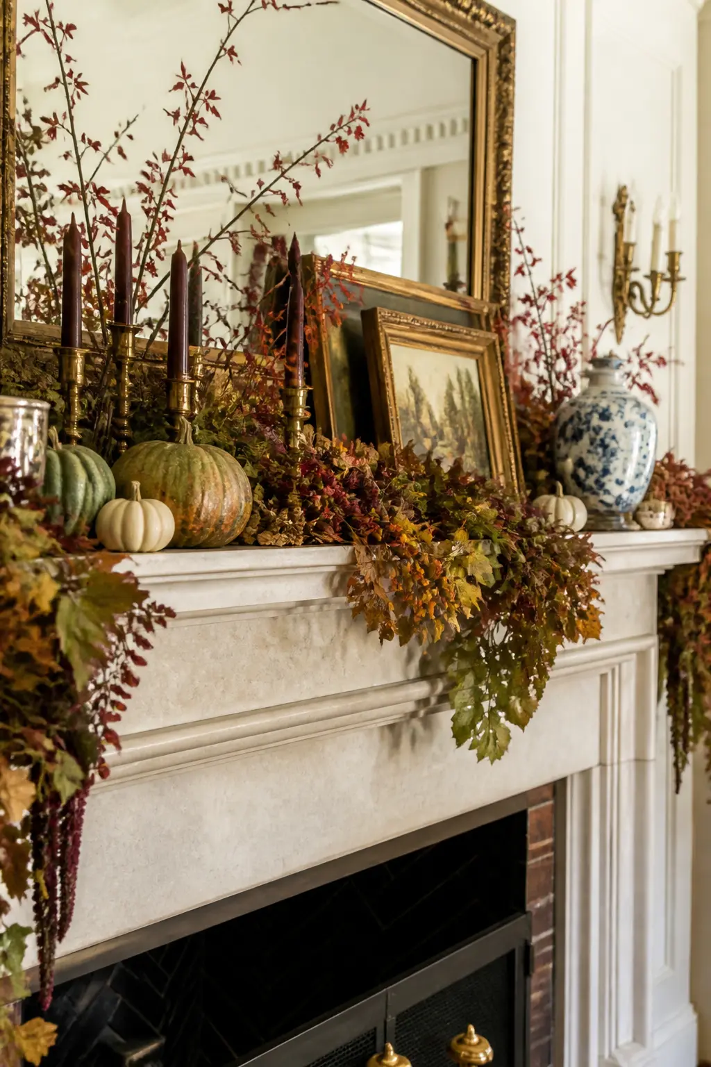
After composing the arrangement, look along the front edge of the shelf. If it disappears entirely behind objects and garland, the mantel itself has been erased. Leave at least two sections where the bare edge is visible.
A visible mantel edge provides a baseline that grounds the whole arrangement. Without it, objects appear to float in a sea of garland and surface decoration. The shelf is part of the composition, not a substrate to cover completely.
🛍 Shopping guide
Nothing in Front of the Firebox Opening
The firebox opening, the dark rectangle below the shelf, is part of the composition whether you treat it that way or not. Objects placed on the hearth directly in front of the opening block the architectural feature that gives the whole fireplace its visual reason for being.
Keep the hearth area clear or minimally dressed. A single log, a pair of fireplace tools, or bare hearth stone. The contrast between the dark firebox and the dressed mantel shelf above is the compositional engine of the whole arrangement.
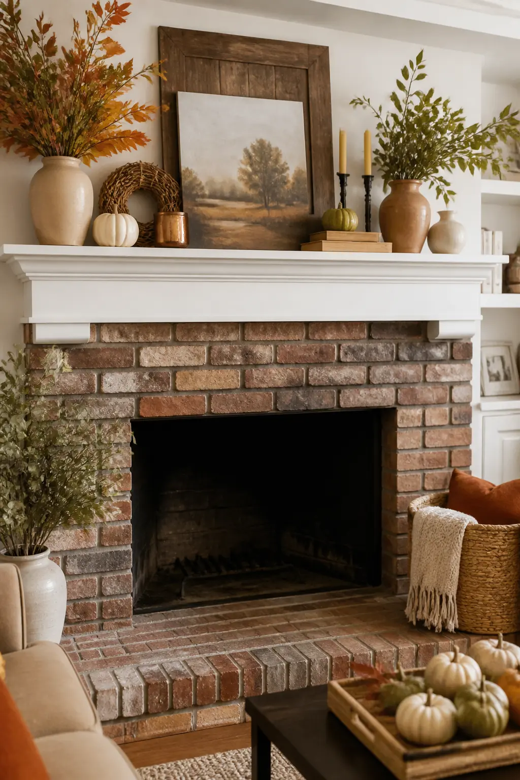
The Edit: Removing Before You Finish
Walk to the doorway. Look at the mantel from there, not from two feet in front of it. The things that catch your eye first are either doing real work or competing for attention they have not earned.
Remove one item before you call it done. This is not optional. It almost always improves the arrangement, and the piece you removed can go back on the shelf next season when the eye is fresh again.
Checking From the Doorway
Walk to the room’s entry doorway and look at the mantel from there. This is the view that matters most because it is the first view most people get, and it is the distance at which fine detail disappears and overall composition becomes everything.
From the doorway, two things become clear: whether the tallest object reads as an anchor or as an accident, and whether the empty sections feel open or just unfinished. Both questions are easier to answer from fifteen feet away than from two feet away.
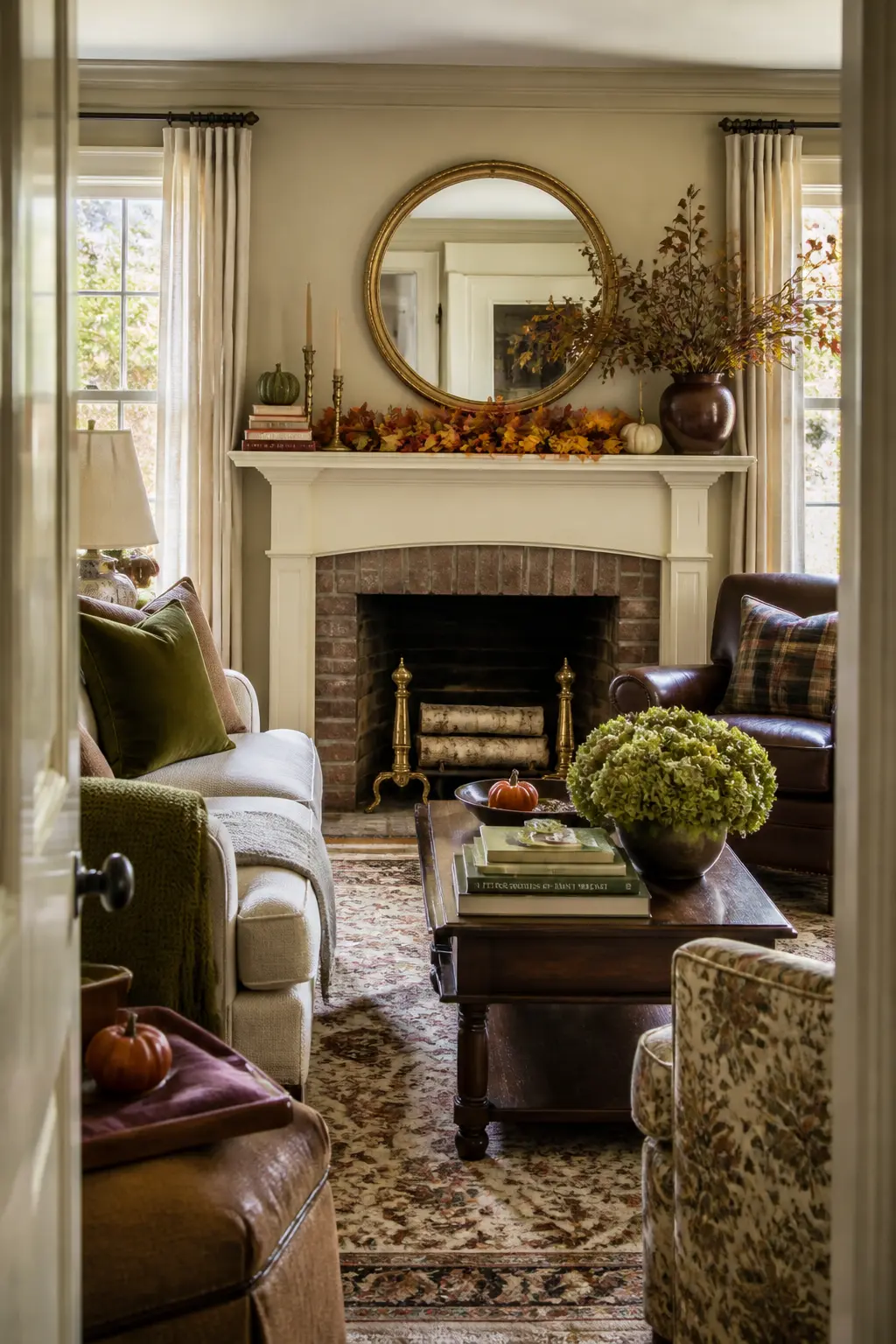
Removing One Thing Last
After the arrangement is finished to your satisfaction, remove one object. Not the one you care about least: the one the shelf could most easily survive without. That object was probably doing nothing except keeping the shelf company.
Step back after removing it. The arrangement will almost always look better: more intentional, less busy, with the remaining objects reading more clearly. The removed object goes in a drawer and comes out when the arrangement changes.
Frequently Asked Questions
How many objects should a fall mantel have?
There is no fixed number, but most mantels look their best with five to nine objects total, including any garland or frames. The composition rules matter more than the count. A three-object arrangement with good height variation and an intentional empty section reads better than twelve objects crammed across the length.
What is the best anchor piece for a fall mantel?
Anything with enough height or mass to hold visual weight: a large stoneware vase, a tall candlestick, a substantial framed print, or a branch arrangement. Place it at the one-third point along the shelf, not in the center, and build everything else in response to it.
Can you use a mirror on a mantel that already has artwork above the fireplace?
Not at the same time. One back layer is the maximum. If art is already hanging above the mantel, build the shelf arrangement in front of the wall, using the existing art as the back plane. Adding a leaning mirror in front of hung art creates a cluttered depth that cancels both pieces.
How do you keep a fall mantel from looking too Halloween-themed?
Stay within a three-color palette of warm neutrals, rust, and deep wine rather than orange and black. Use organic materials like dried stems, wooden bowls, and linen rather than novelty objects. The distinction between a fall mantel and a Halloween display is mostly restraint of color and the avoidance of representational objects like carved faces or skeletons.
Is it safe to put real candles on a mantel with a dried garland?
Only if there is at least twelve inches of clear shelf between the lit candle and any dried plant material, and only if the candle is in a stable holder that cannot tip. For anything closer, use LED candles with a realistic flicker. They photograph nearly identically to real candles in evening light and carry no fire risk near dried organics.
How do you tie the mantel decor into the rest of the room?
Two moves handle this: bring the room’s dominant wall color onto the mantel exactly once as a single object, and repeat at least one material or texture from the room’s furniture or textiles. Those two connections make the mantel feel like part of the room rather than a separate display case. For more ideas on carrying a consistent fall palette through the whole space, the room-by-room Thanksgiving decor guide covers the same principles applied to every surface.
Find the right winter games for your next party, classroom, or family night with this guide to ten t
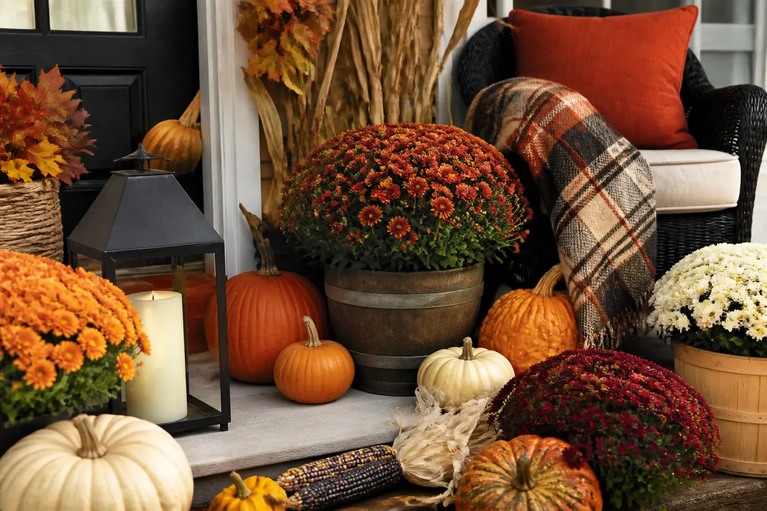
30 fall front porch decor ideas that use the door as the anchor. Perfect for small porches where the

34 fall outdoor decor ideas that dress the whole yard in zones, from driveway entrance to fire pit,
Leave a Reply