

20 Baby Shower Table Decorations for a Table People Actually Want to Sit At
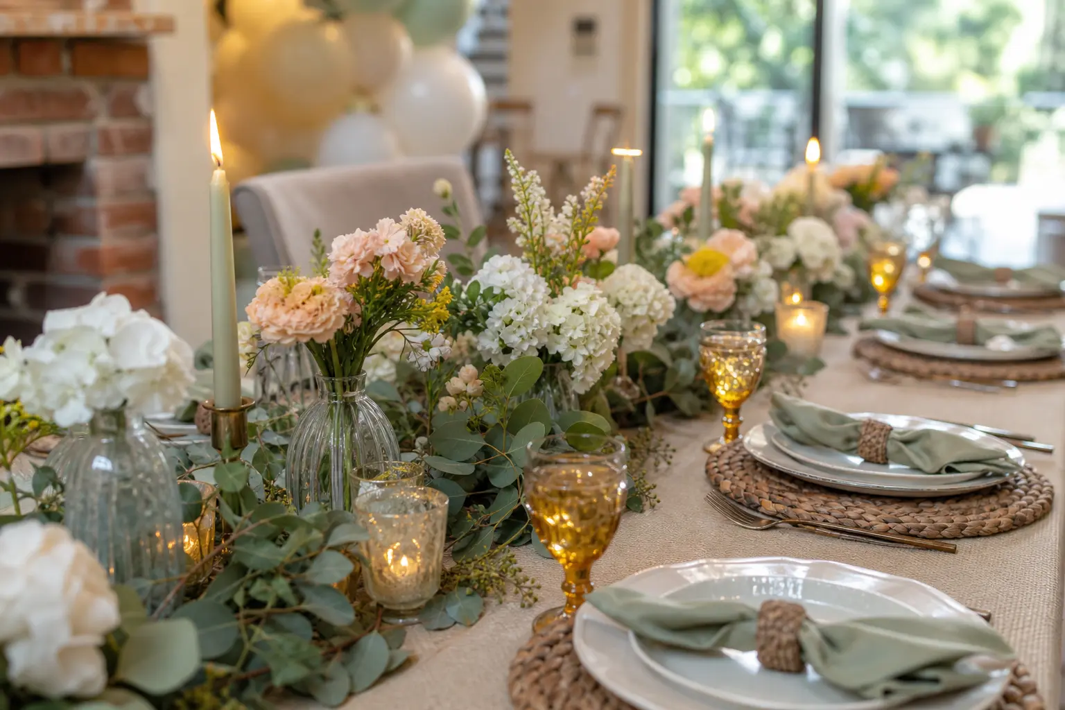
Baby shower table decorations have had a quiet revolution. The balloon wall moved to the background and the table moved to the centre, styled the way a good dinner party table would be: intentional from end to end, low enough for guests to talk across, and interesting at every seat rather than only at the middle.
The palette driving it this year is sage, cream, dusty rose, and brass. None of those colours fight each other, and all of them photograph well in a bright room. The twenty ideas below work down the length of the table rather than around a single centrepiece, so the whole surface earns its place.
If you want to pair these with a broader theme, the hub article on baby shower theme decorations is a good place to start. For the table itself, read on.
This post contains affiliate links. If you buy through them, I may earn a small commission at no extra cost to you.
The Continuous Line Down the Centre
The strongest move on a long table is something that runs its full length rather than sitting at the middle and tapering off into bare cloth. These four ideas each create that unbroken visual spine, but none of them require a florist, a foam block, or anything taller than a wine bottle.
They work on rectangular tables, farm tables, and borrowed folding tables with a good cloth over them. Choose one per table: layering two of them produces clutter, not style.
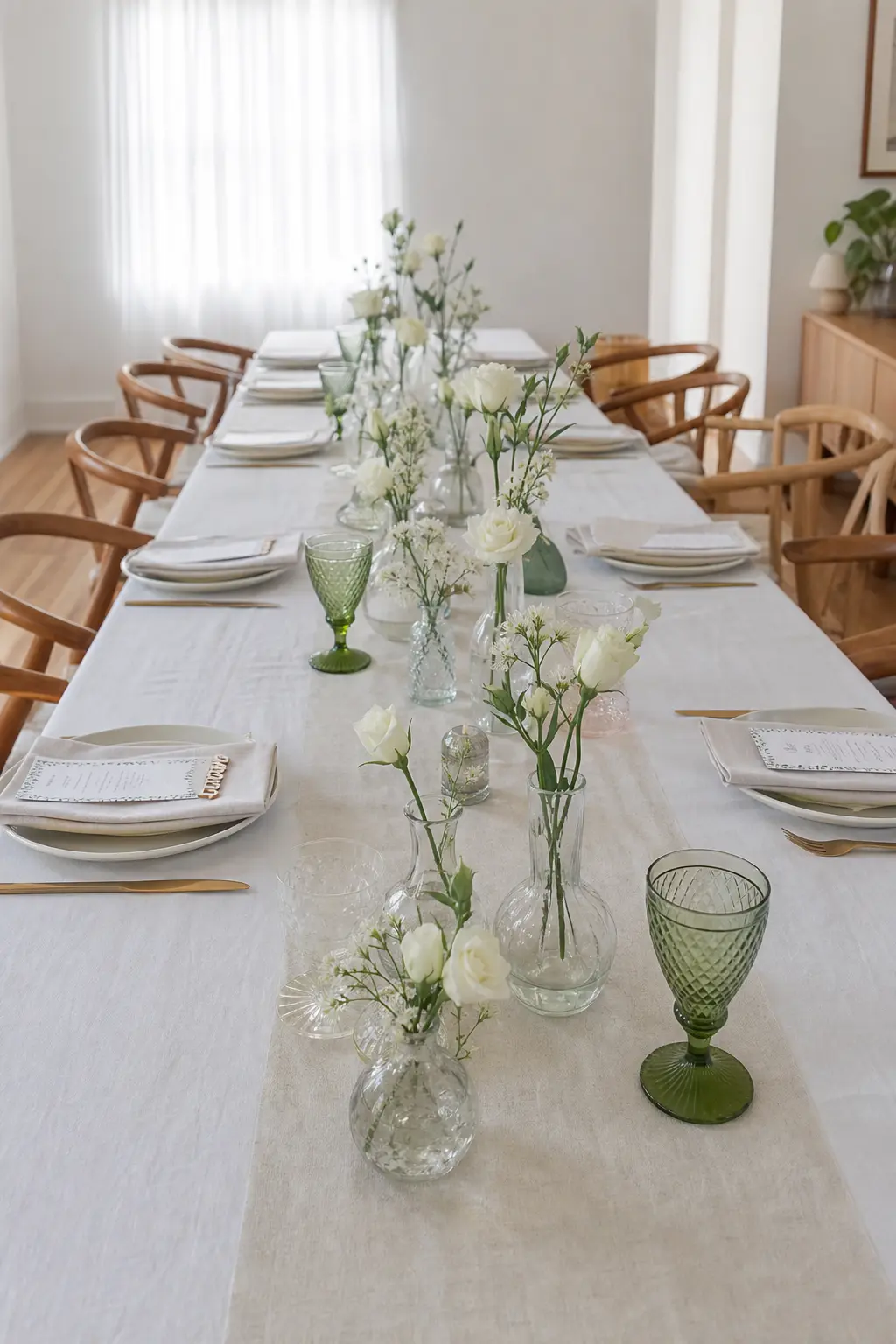
Bud Vases in a Chain Down the Table
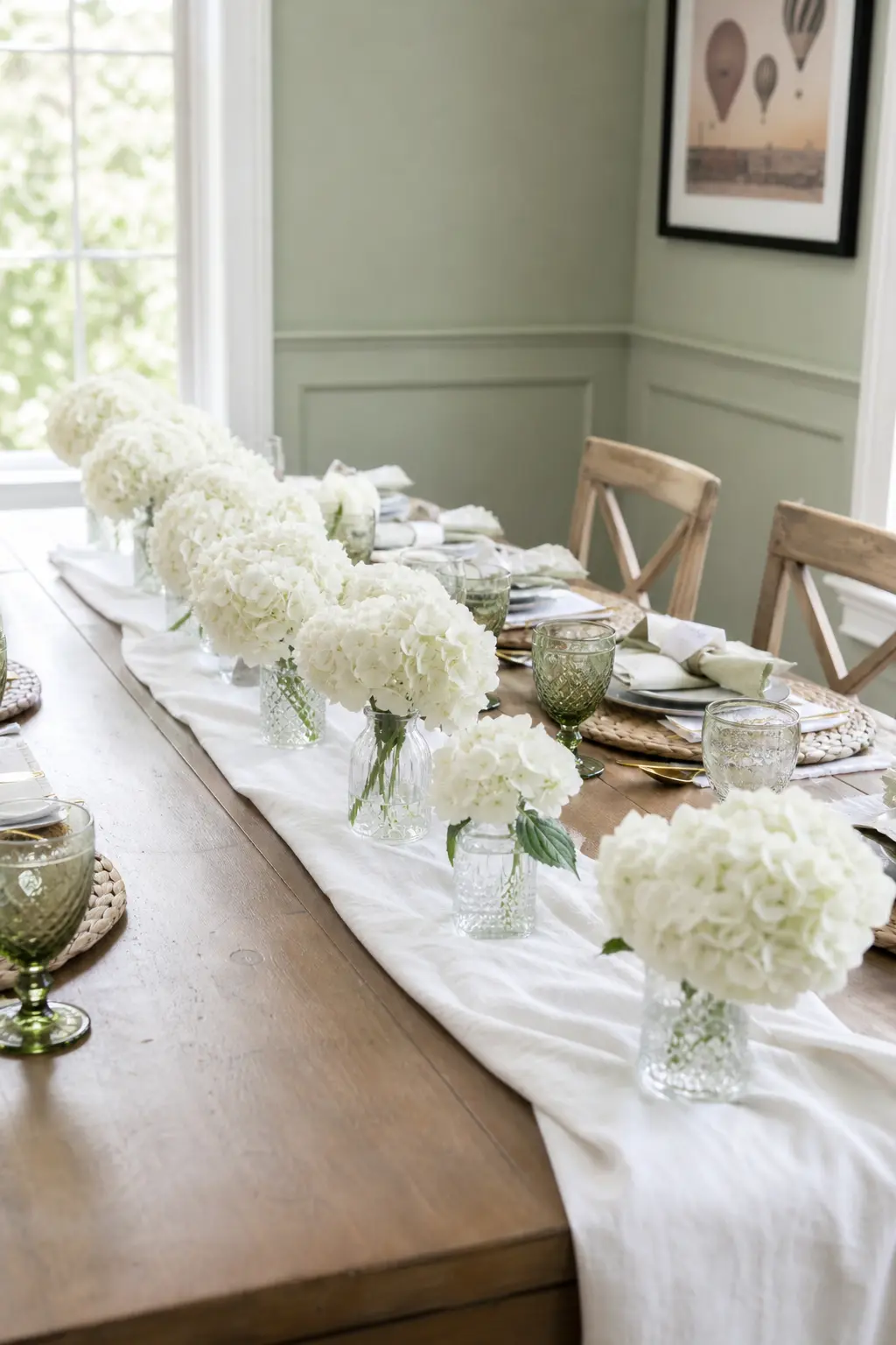
A single bud vase holds one stem. Ten bud vases placed every 30 cm down the length of the table hold ten stems and create a continuous visual line that a centrepiece never achieves. Space them loosely rather than at ruler-measured intervals so they read as styled rather than manufactured.
Use mismatched vessels of similar height: a clear glass bottle, a small ceramic jug, a brass tube vase. One flower variety throughout, such as ranunculus in cream or spray roses in dusty rose, keeps the whole run coherent even when the vessels differ.
🛍 Shopping guide
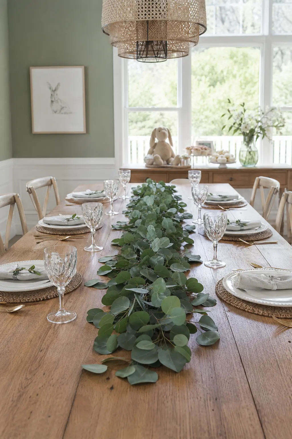
A Runner of Fresh Greenery, Nothing on Top
Lay stems of eucalyptus, olive branch, or Italian ruscus flat along the table’s centre line, overlapping at the ends so there are no bare gaps. Then stop. Nothing goes on top of it. No candles sitting in it, no vases nestled between stems. The greenery is the decoration.
The restraint is the whole move. A flat greenery runner that is not buried under other objects reads as deliberate and modern in a way that a laden garland rarely does. Trim stems with scissors the morning of the shower so the cut ends stay fresh.
🛍 Shopping guide
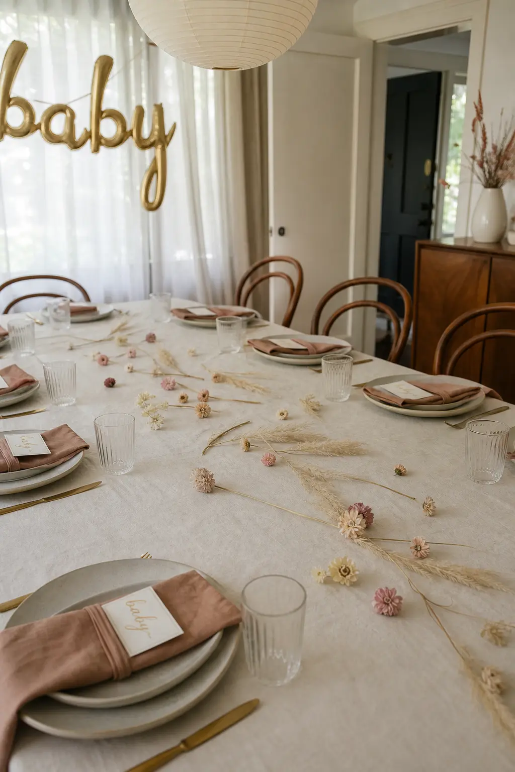
A Scatter of Dried Florals, No Runner Beneath
Dried pampas grass tips, dried strawflowers, and preserved leaves scattered directly onto the bare cloth cost almost nothing and photograph better than most arrangements. The rule is scatter, not arrange: drop them loosely along the centre third of the table and resist the urge to nudge them into a pattern.
This works best on a linen cloth in cream or dusty rose where the texture of the fabric adds a layer below the botanicals. A white polyester cloth is too flat; the botanicals need something with grain to land on.
🛍 Shopping guide
A Length of Ribbon Run the Table, Tied at Each Chair
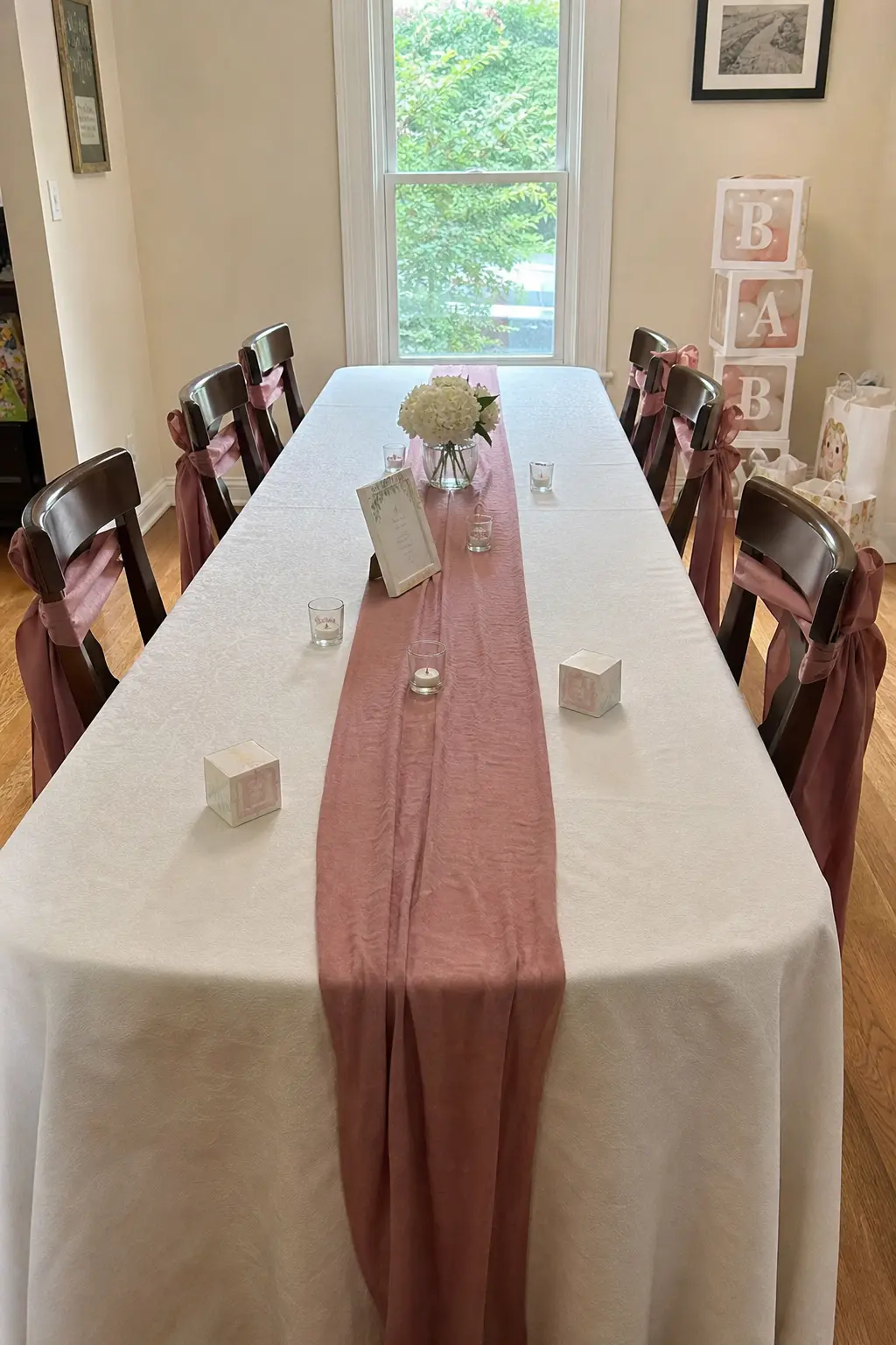
A 4 cm wide satin or grosgrain ribbon in dusty rose or sage, run from one end of the table to the other along the centre and then looped and tied at the back of each chair, costs under ten dollars and creates a continuous line that reads as considered styling.
Keep the ribbon flat on the cloth rather than raising it. Tie the chair loops loosely so they hold their shape without crushing. This works on its own on a very simple table, or as a base layer under scattered botanicals.
🛍 Shopping guide
The Place Setting as the Decoration
A thoughtfully built place setting does more decorating than most centrepieces. Every guest is looking directly at it from the moment they sit down, and it is the one surface on the table where detail at a small scale actually gets noticed.
The ideas in this section work at each seat rather than in the middle of the table. That means the visual interest is distributed evenly, which is both more generous to guests and easier to style than one elaborate focal point.
Place Settings Styled Identically at Every Seat
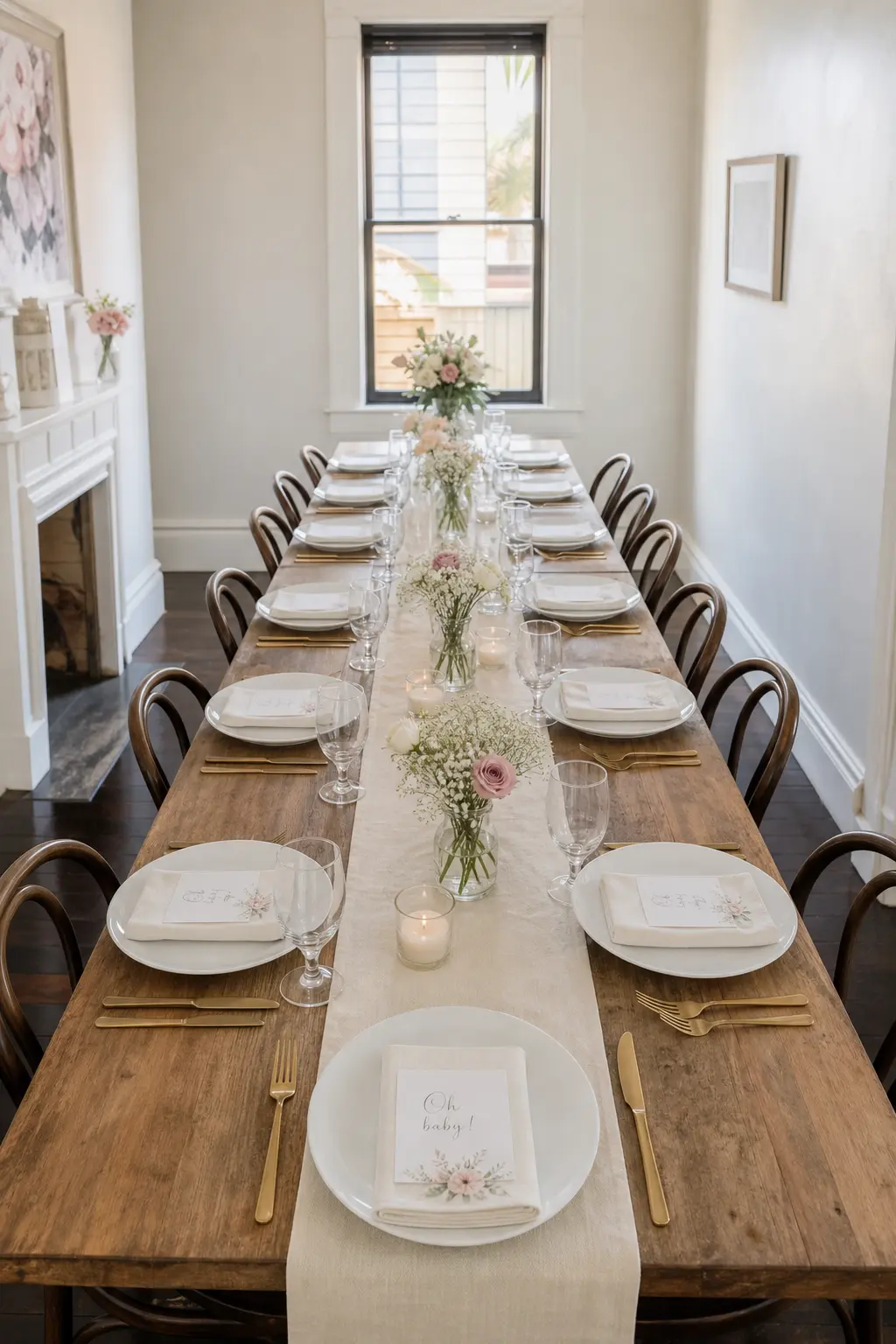
Identical place settings, every fork at the same angle, every glass at the same distance from the plate rim, every napkin folded the same way, create a table that photographs as a whole rather than as individual moments. The uniformity is the design.
Lay one setting exactly as you want it. Use it as the template. Set every other seat by comparing it to that first one rather than to the one next to it, which drifts. Take two minutes to walk the table from one end after setting it and adjust anything that has shifted.
A Stack of Two Books with a Single Bloom on Top
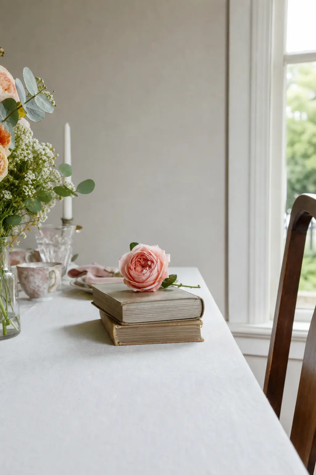
At one end of the table, two small hardback books stacked flat with a single peony or garden rose laid on top create a corner moment that anchors the table without competing with anything else on it. The books can be themed to the occasion, a child’s classic or a book of poetry, or they can simply be beautiful objects in cream or sage spines.
Place this at the end nearest the host’s seat or nearest the door guests enter from. It is the thing people see first and the thing that tells them the table was styled rather than set. One bloom, not a bouquet. The restraint matters.
Candles Done Properly
Candles belong on a shower table. They lift the room temperature by a visible degree, and unlike florals they do not wilt between setup and the end of lunch. The one rule: keep every flame below eye level when seated, usually below 25 cm from the table surface, so no guest is staring into a flame across the table.
Check venue rules on open flames before you buy. Most private homes are fine; hired halls sometimes require battery alternatives. A good flameless pillar candle is genuinely indistinguishable from a real one in a photograph and in most rooms.
A Single Candle Height at Every Place Setting
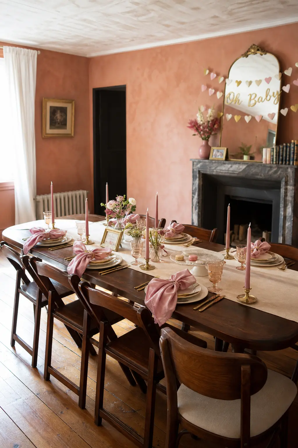
Buy taper candles of identical height, one per seat, and place each one in a small brass holder positioned at the top right of the place setting. The repetition of the same object at the same height at every seat creates a visual rhythm that reads as very deliberate and costs less than a single large arrangement.
Dusty rose taper candles against brass holders are the specific combination that works in this palette. Light them just before guests sit down so they are still tall when people arrive at the table.
A Low Candle Cluster at the Table’s Centre
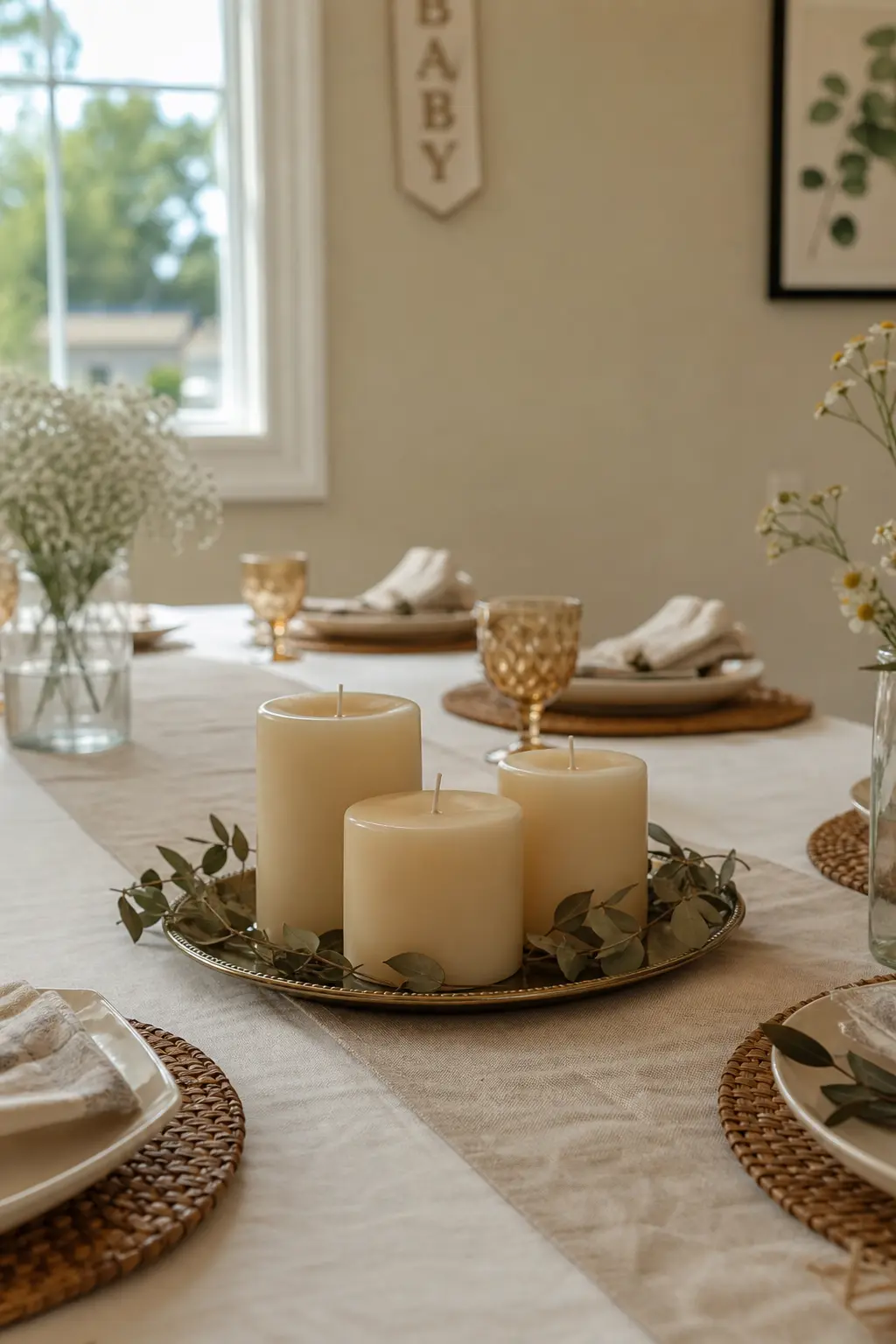
Three pillar candles of varying width but the same height, grouped tightly at the table’s middle, stay below sightline height when seated and create a focal point that is genuinely useful at dinner: it fills the centre without blocking anyone’s view of anyone else.
Set the cluster on a small brass tray or a slice of raw timber so it reads as intentional rather than randomly placed. Surround the base with a handful of dried leaves or a few loose dried florals. Nothing tall behind it.
Foliage, Botanicals, and Fruit
Fresh botanicals styled flat, meaning not arranged upright in a vase, are the fastest way to make a table look like a florist touched it without paying for one. The key is using a single variety or a single colour throughout so the eye reads it as a decision rather than an accident.
Fruit is underused on shower tables and should not be. A handful of small pears or sliced citrus tucked between place settings costs almost nothing at a grocery store and reads as considered styling, especially when it matches the palette.
A Low Arrangement Under Eye Level
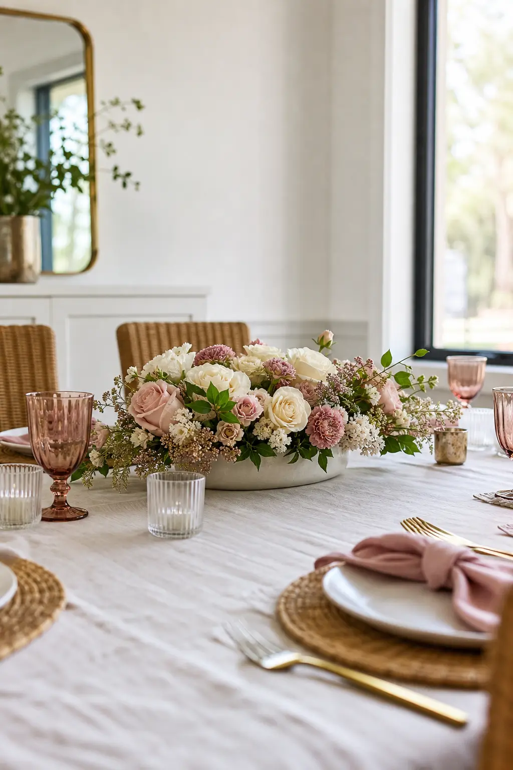
The rule for any arrangement that sits on a table where people sit opposite each other is simple: if you can see over it while seated, it belongs there. That means the top of the arrangement should clear the table surface by no more than 20 to 25 cm.
A wide, shallow compote or a low ceramic bowl packed with garden roses, ranunculus, or peonies in dusty rose and cream achieves this. Wide and low rather than tall and narrow. The guest across from you should see your face clearly over the arrangement, not through a gap in it.
A Single Fruit Scattered Loosely
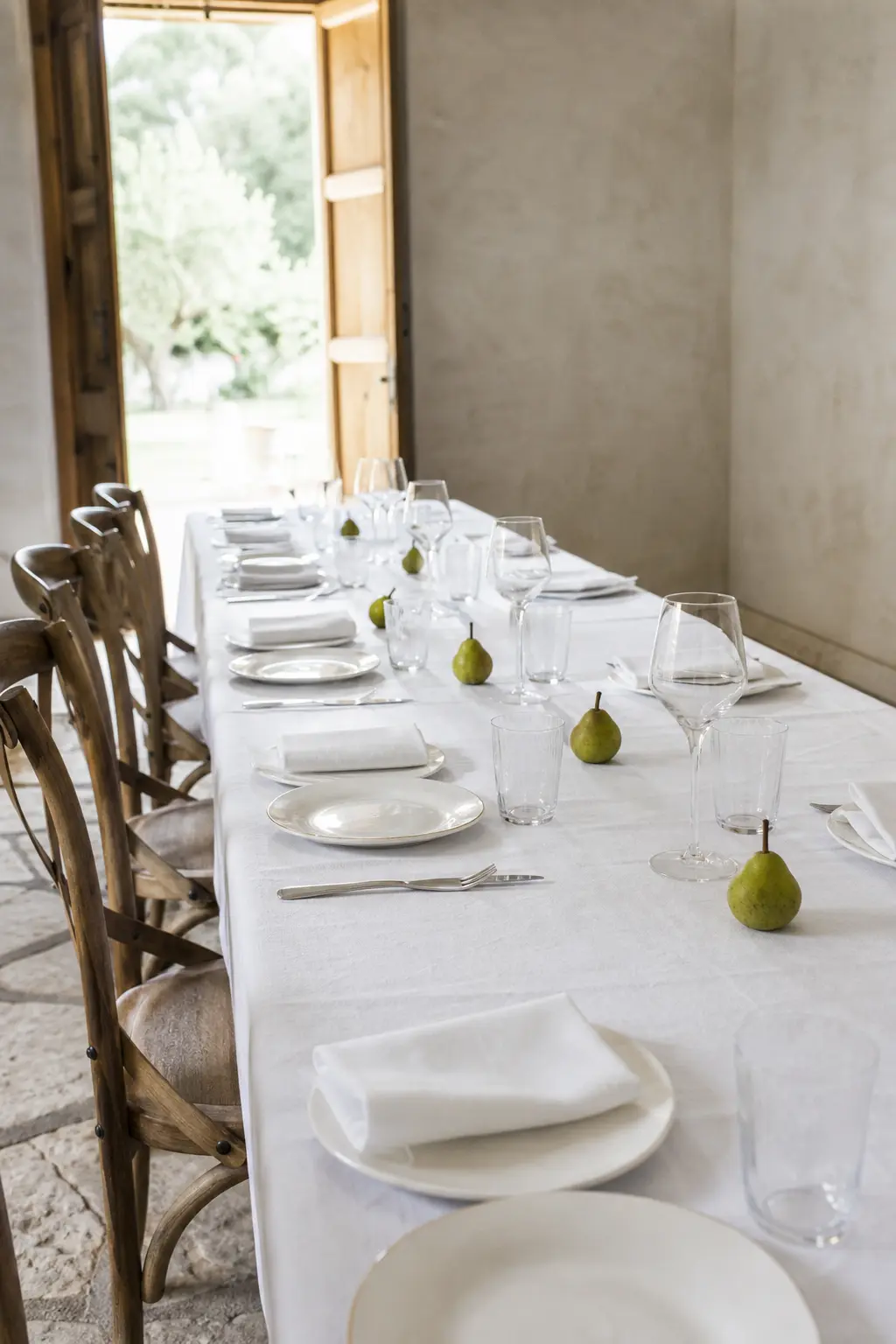
Small pears in their natural green, or whole lemons and clementines, scattered loosely between place settings cost grocery-store money and read as an editorial styling decision when they are the only element on the cloth besides the settings themselves.
Use one fruit variety throughout. Mix two and it looks like a fruit bowl accidentally tipped over. Place them in the spaces between settings rather than on the cloth’s centre line so they feel like part of the table rather than a decoration placed on it.
🛍 Shopping guide
The Favour and the Functional Detail
The small objects that serve a practical purpose, the menu, the favour, the place card, are where most shower tables lose coherence. They get set down rather than placed. Treating each one as part of the styling, not an afterthought, is the single fastest upgrade available.
Every item in this section does a job and looks good doing it. None of them require calligraphy skills or a craft afternoon; they require a decision made in advance and executed the same way at every seat.
Place Cards Written on Leaves or Dried Flowers
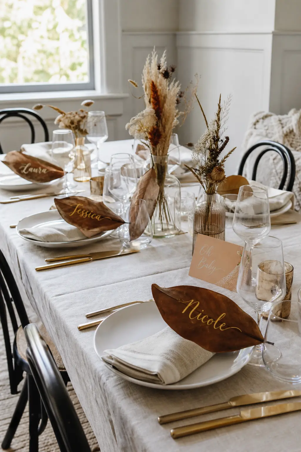
A name written in fine-tip gold pen on a dried magnolia leaf or a pressed lunaria pod is a place card that guests pick up and keep. It takes five minutes per card and costs almost nothing beyond the pen and whatever botanical you choose.
Sage leaves, eucalyptus sprigs, and dried palm spears all hold ink. Practice the lettering on a spare leaf before committing to the set. Imperfect handwriting on a real botanical reads as handmade in the best sense; printed labels on the same leaf do not.
🛍 Shopping guide
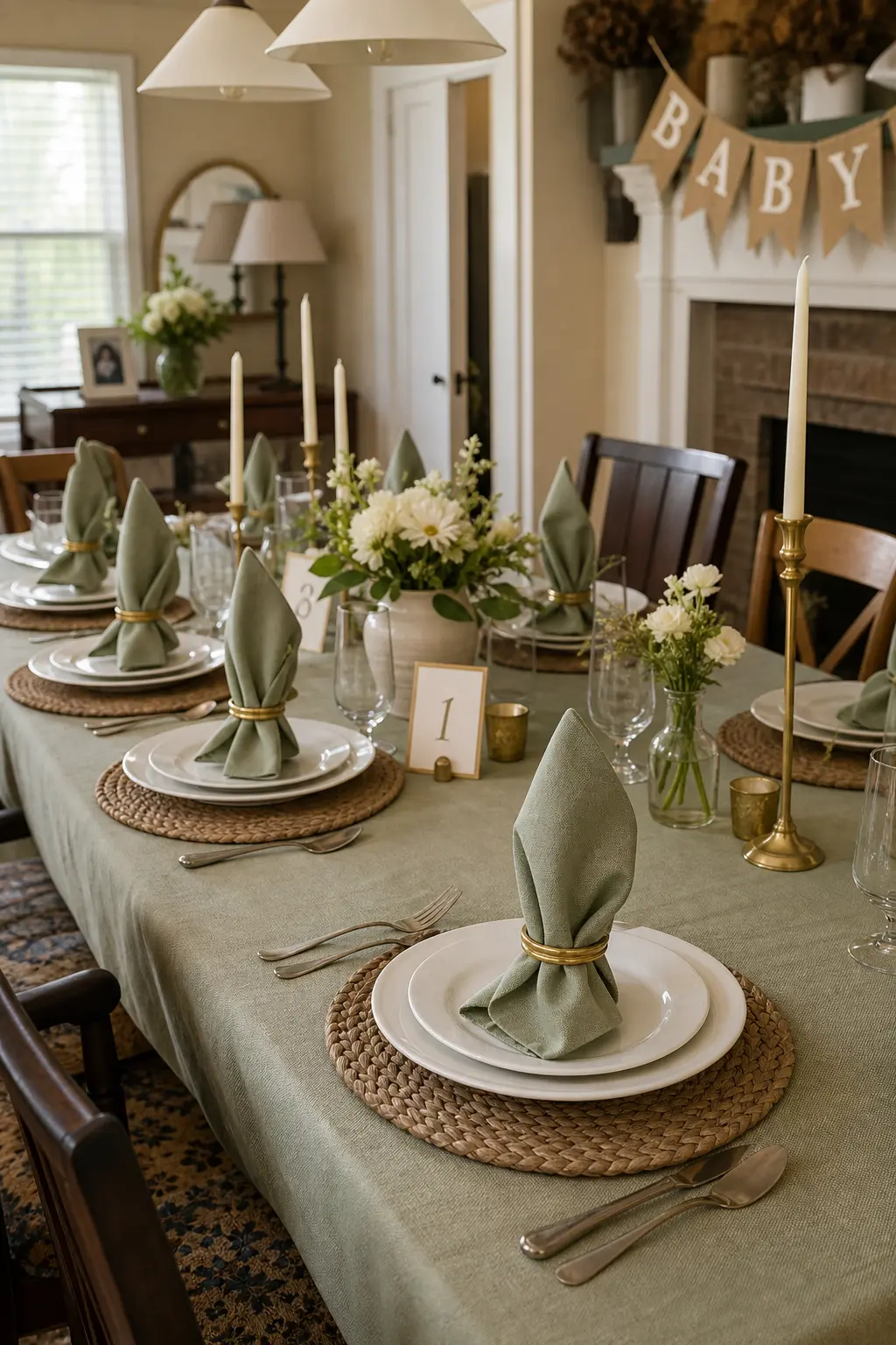
A Folded Napkin Standing at the Setting
A napkin that stands, whether folded into a simple bishop’s hat or a flat roll secured with a ring, reads immediately as a table someone set with intention. It takes three minutes per napkin and costs nothing extra if you already have napkins.
A linen napkin in sage or dusty rose, folded into a vertical form and held with a small brass ring or a loop of ribbon, fits the palette exactly. Lay it on the plate rather than beside it so it is the first thing a guest’s eye lands on when they sit down.
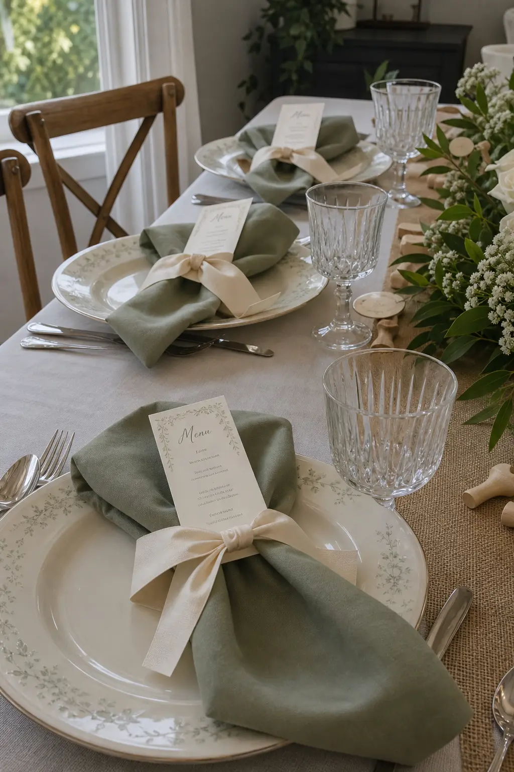
A Folded Menu Tucked Under the Same Ribbon as the Napkin
A small printed or handwritten menu card, tucked behind the napkin ribbon so both are held by the same loop, makes the table look like a restaurant that has decided to host a shower. It tells guests the food is considered, before they taste it.
Print the menu on cream card stock in a simple serif font. Trim to about 8 cm by 14 cm. The ribbon does not need to match the napkin exactly; a tonal difference, cream ribbon on a dusty rose napkin, adds depth rather than conflict.
🛍 Shopping guide
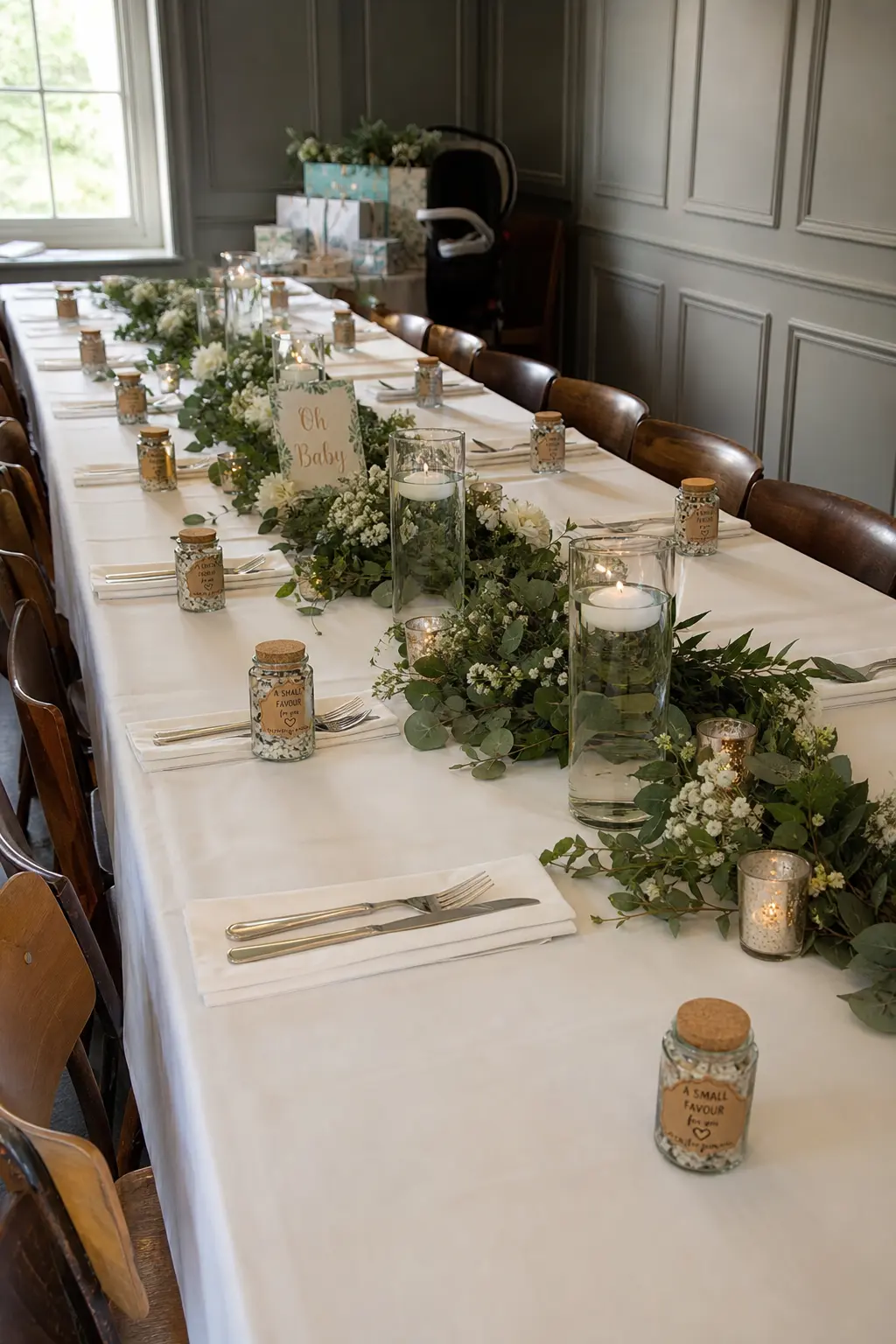
A Small Favour at Each Setting
A favour placed at each seat, rather than on a separate favour table guests may or may not reach, becomes part of the decoration. It fills the space between the place card and the napkin and gives each setting a third layer of interest.
Small favours that work in this palette: a sachet of loose-leaf tea in a kraft envelope, a mini candle in a clear glass pot with a kraft label, a handful of Jordan almonds in a small organza bag tied with thin ribbon. All three stay within a 10 cm footprint and none of them tip over.
🛍 Shopping guide
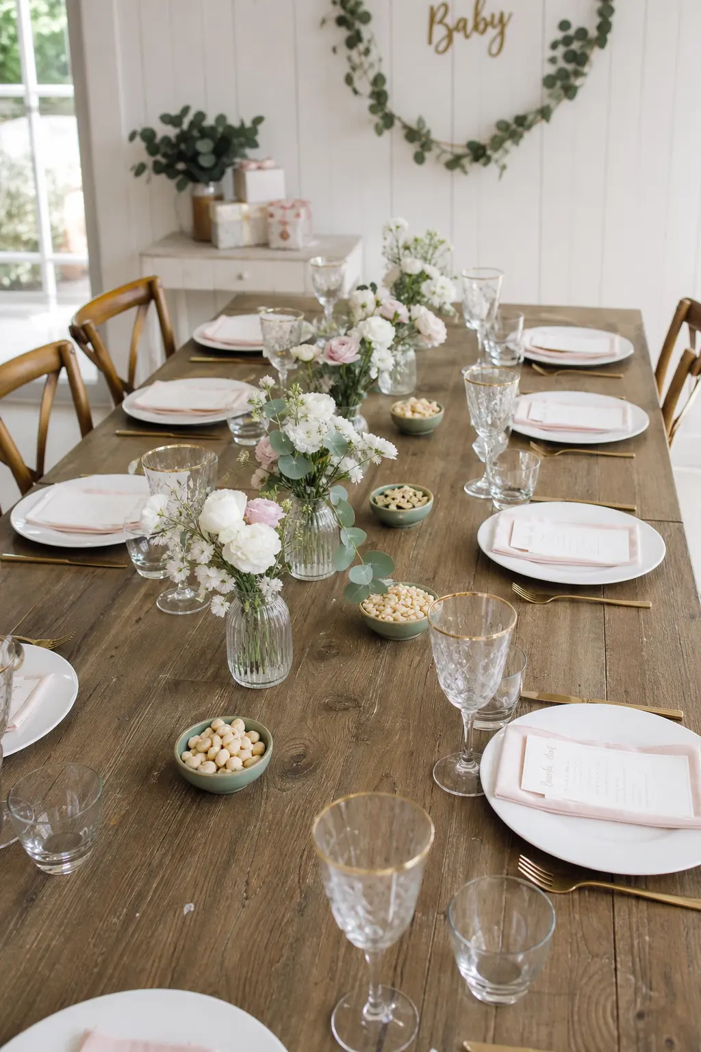
Small Dishes of Nuts or Sweets at Intervals
A small ceramic dish of salted almonds or sugar-coated fennel seeds placed between every two settings gives guests something to reach for before the food arrives and gives the table a layer of visual texture at a low height. It is both a styling decision and a hosting one.
Use the same dish at every position so the repetition reads as deliberate. A small sage green or cream pinch bowl works. Fill them the morning of the shower so the contents are fresh. Refill during the event if the table is being used for a long lunch.
🛍 Shopping guide
Texture and Fabric at the Table
A plain white cloth is a fine starting point. What goes on top of it, under the plates, or running down its length determines whether the table reads as finished or merely set. Layering two textures is the threshold: above two and it starts to compete with the food and the guests.
Charger Plates Layered Under a Woven Mat
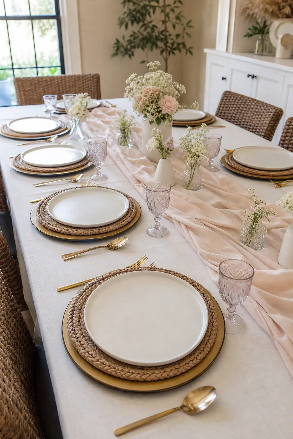
A brass or gold charger under a small round woven grass mat, with the dinner plate on top of that, gives each place setting three layers of texture and keeps the surface visual interest at the level of the guest rather than in the middle of the table.
The woven mat should be smaller in diameter than the charger so a ring of gold shows around its edge. Natural seagrass or rattan mats in a pale natural colour sit perfectly against brass. This combination replaces a runner entirely on a table where a runner would feel too much.
A Runner Made of Two Fabrics Seamed Down the Centre
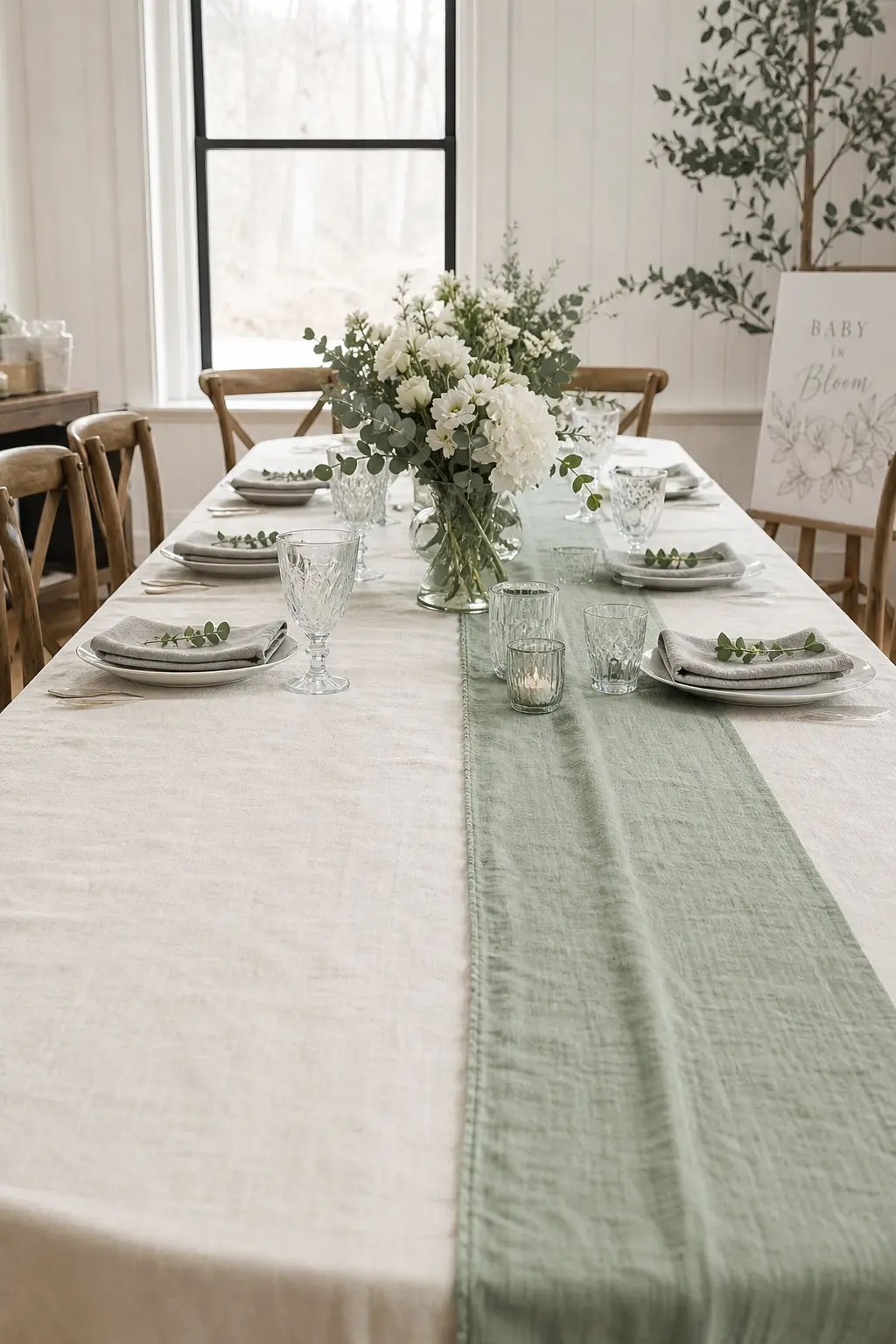
Two lengths of fabric, one in cream linen, one in sage cotton gauze, sewn or safety-pinned along their long edges and run the table’s length, create a runner that is more interesting than a single fabric and costs the price of a metre of each material from a fabric store.
The seam runs down the exact centre. Guests on the cream side see the sage half facing them and vice versa, which means both sides of the table get the contrast. Press it flat before placing it. The seam should lie flat, not ridge.
Mismatched Vintage Glassware Grouped at Every Other Setting
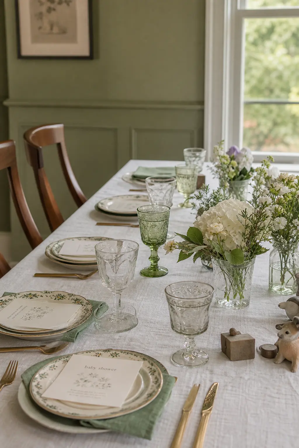
Buying a set of vintage-style coupes, pressed glass tumblers, or coloured water glasses from a thrift shop and grouping two or three at every other place setting makes the table feel collected rather than catered. The grouping at intervals creates a repeating visual beat down the table’s length.
Keep the glass colours tonal, pale green, amber, and clear rather than mixing jewel tones. Polish each glass with a lint-free cloth before placing it. Mismatched glassware that is clean and deliberately grouped reads as a styling choice; mismatched glassware that is dusty reads as an accident.
🛍 Shopping guide
The One-Element Rule
The strongest tables this year follow a discipline borrowed from minimalist interiors: choose one element and repeat it without variation. One flower variety in every small vessel. One fruit in every gap. One candle height at every seat. Repetition creates the kind of visual calm that reads as expensive even when the individual components cost very little.
The three ideas here each take a single element and use it as the entire decorating strategy. Nothing else goes on the table from that category. The restraint is the point.
A Single Flower Variety in Every Small Arrangement
Pick one flower, ranunculus or garden rose or sweet pea, and use only that flower in every vessel on the table. Different vessels, different quantities per vessel, same flower. The repetition does the work that variety would do in a busier arrangement, except it reads quieter and more resolved.
In the sage and cream palette, white ranunculus is the correct answer. In dusty rose, a pale peach sweet pea. Neither flower is expensive when bought by the bunch from a wholesale market. One bunch cut into individuals fills ten small vases.
A Single Seasonal Element Used Throughout
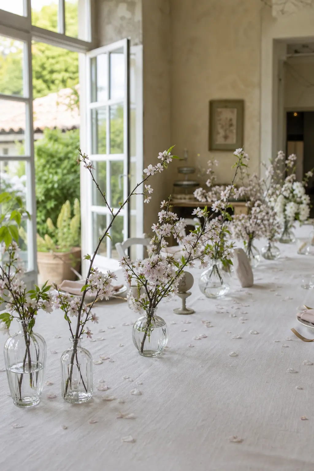
Early spring blossom, a cut branch of cherry or quince, used at every point on the table where something decorative sits, creates a table that looks like it was styled by someone who knew what they were doing. The season is doing the decorating.
One branch per bud vase, one floating petal in each water glass, a few fallen petals scattered on the cloth. The element repeats and the eye accepts it as a system. Replace blossom with whatever the season offers: fresh herbs in summer, small gourds in autumn, forced hyacinths in winter.
🛍 Shopping guide
Baby Shower Table Decorations: How to Pull It Together
The ideas above are a menu, not a checklist. Pick one thing for the centre line, one thing for each place setting, and one candle moment. That is three decisions and a finished table.
Stick to the palette: sage, cream, dusty rose, and brass. Buy in odd numbers where quantities matter. Set the table the night before and look at it the next morning before guests arrive: anything that bothers you then will bother you during the party.
For more starting points, browse simple baby shower decorations, floral baby shower decorations, diy baby shower decorations, and storybook baby shower decorations for full theme treatments that pair well with these table ideas. If the guest list is wide, gender neutral baby shower ideas covers every angle without defaulting to beige.
Frequently Asked Questions
How do you decorate a baby shower without balloons?
Focus on the table itself rather than the walls. Fresh or dried botanicals run along the table’s length, small bud vases at intervals, low candles, and intentional place settings create a room that looks completely finished without a single balloon. The shift toward dinner-party-style shower tables means the table carries the whole visual weight, which it does well when each element is chosen to work down the table’s length rather than around a single centrepiece.
What is a popular baby shower theme this year?
The palette of sage, cream, dusty rose, and brass is appearing across almost every theme this year, from garden and floral treatments to storybook and gender-neutral setups. The strongest direction is less about a named theme and more about a cohesive colour story applied consistently across the table, the food, and any small stationery details. A theme gives a starting point; the palette is what makes it look resolved.
How much should baby shower decorations cost?
A well-styled shower table does not require a large budget. Dried botanicals, a linen cloth, bud vases from a thrift store, and simple taper candles in brass holders come to well under a hundred dollars for a table of eight. The ideas that cost the most, large floral arrangements and matching sets of everything, are also the ones least likely to create the intentional, dinner-party feel that makes a table memorable. Repetition of inexpensive elements done consistently reads more expensive than one costly centrepiece surrounded by bare cloth.
Can baby shower decorations work for a gender neutral shower?
The sage, cream, and brass palette is inherently gender neutral and works for any shower regardless of whether the baby’s sex is known. Dusty rose can stay in the palette: it reads as a warm neutral rather than a gendered colour when it is paired with sage and cream rather than white and gold. For a fully gender-neutral approach, lean on cream, sage, and brass as the primary palette with dried botanicals and natural textures, and the table will suit any occasion without any adjustment.
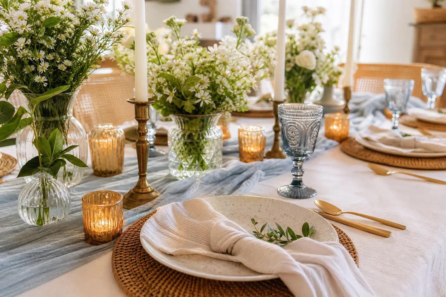
22 baby shower theme decorations that look like a dinner party, not a children's party. Soft palette
15 fun under the sea baby shower games for an ocean party — printable, active & quiet ideas your g
16 coed unique baby shower games for mixed guests — printables, active rounds & keepsakes all in o
Leave a Reply