

16 Vintage Baby Shower Decorations Sorted by Which Decade They Borrow From
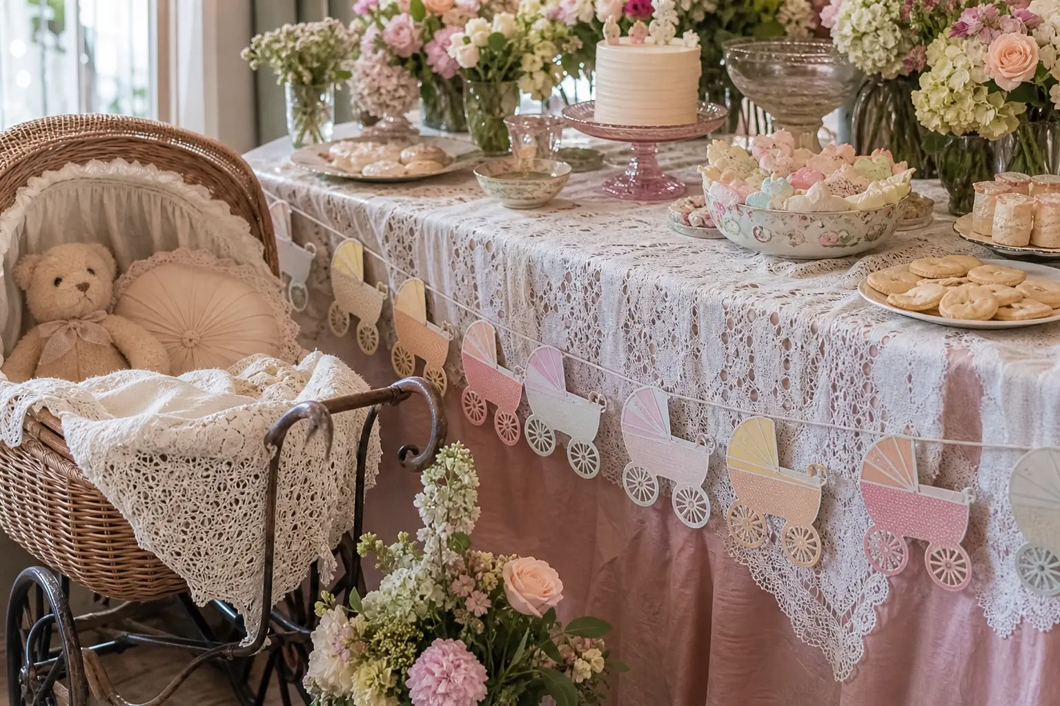
Vintage baby shower decorations work beautifully until they do not. The moment a room holds a 1950s pram, a 1970s macrame wall hanging, and a Victorian lace tablecloth, the effect collapses into costume shop rather than considered style. The fix is simpler than a full redesign: pick one decade and let every object answer to it.
Each idea below names its decade and the single detail that makes it read as that era rather than a vague idea of old. The palette stays consistent throughout: faded pastels, cream, and muted gold. Storybook baby shower decorations follow a similar logic of committing to one visual world, and the same principle applies here.
Browse by the section that matches your chosen decade, pick the pieces that work for your space, and stop there. More is not more.
This post contains affiliate links. If you buy through them, I may earn a small commission at no extra cost to you.
- 1950s: Pastel Sweetness With a Structured Edge
- 1960s: Mod Graphics, Restrained Color
- 1970s: Warm Earth Tones and Rounded Forms
- Textiles: The Detail That Sets the Era
- Vessels and Display: Where Flowers and Objects Live
- Props: The One Big Piece That Earns Its Space
- Signage and Typography: The Most Overlooked Detail
- Sound and Finishing Touches
- Frequently Asked Questions
1950s: Pastel Sweetness With a Structured Edge
The 1950s read as vintage through their particular sweetness: saturated-then-faded pastels, crisp lines, and a sense of domestic optimism. Baby pink, powder blue, and mint sit against cream rather than white. The silhouettes are rounded but neat.
Two ideas from this decade appear below. Together they hold a room without needing anything from another era.
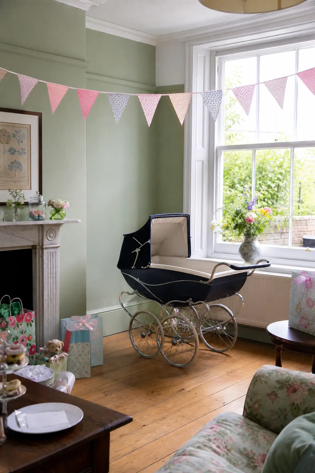
1950s Pastel Bunting and Vintage Pram Centrepiece
The pram is the anchor. A genuine mid-century pram in navy or cream, positioned where guests enter, carries the entire decade in one object. Fill it with soft blankets in chalky mint or blush rather than bright white, and tuck a small floral arrangement at one end.
Bunting above it should use the same faded pastels: triangular flags in cotton rather than polyester, spaced generously so each flag reads as a deliberate choice. This is a 1950s detail because the era loved domestic celebration made visible. The pram and the bunting together form a composition. Either alone is a prop. Together they are a scene.
🛍 Shopping guide
Heirloom China on the Dessert Table
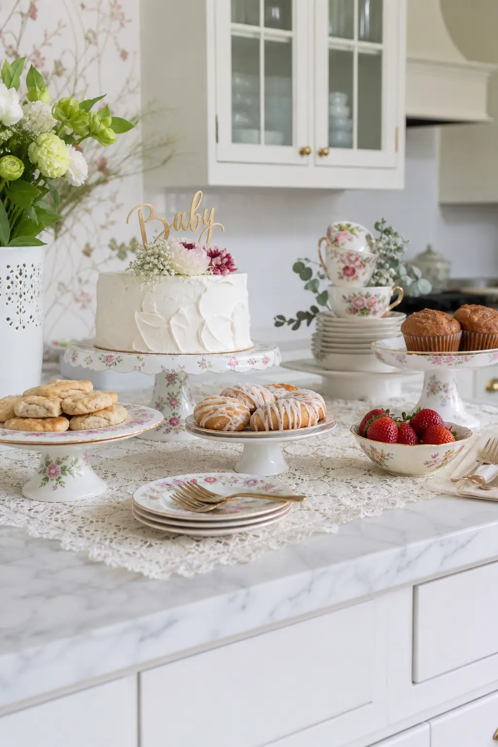
Mismatched heirloom china works because of what it shares: a thin, translucent quality, a gilt edge, and a floral motif that sits inside the faded pastel palette. Every piece should read as genuinely old. This is not the moment for reproduction chinoiserie from a party supply site.
Stack cake stands at two heights. Use the smallest plates for individual pastries and the largest for the centrepiece cake. The whole dessert table becomes a display of objects worth looking at before anyone takes a single thing from it.
🛍 Shopping guide
1960s: Mod Graphics, Restrained Color
The 1960s moment that translates best to a baby shower is not the psychedelic end of the decade but the earlier mod phase: bold geometric shapes in a limited palette, graphic lettering, and clean negative space. Avocado and mustard had not yet arrived. This era belongs to black outlines on cream and a pop of a single strong color.
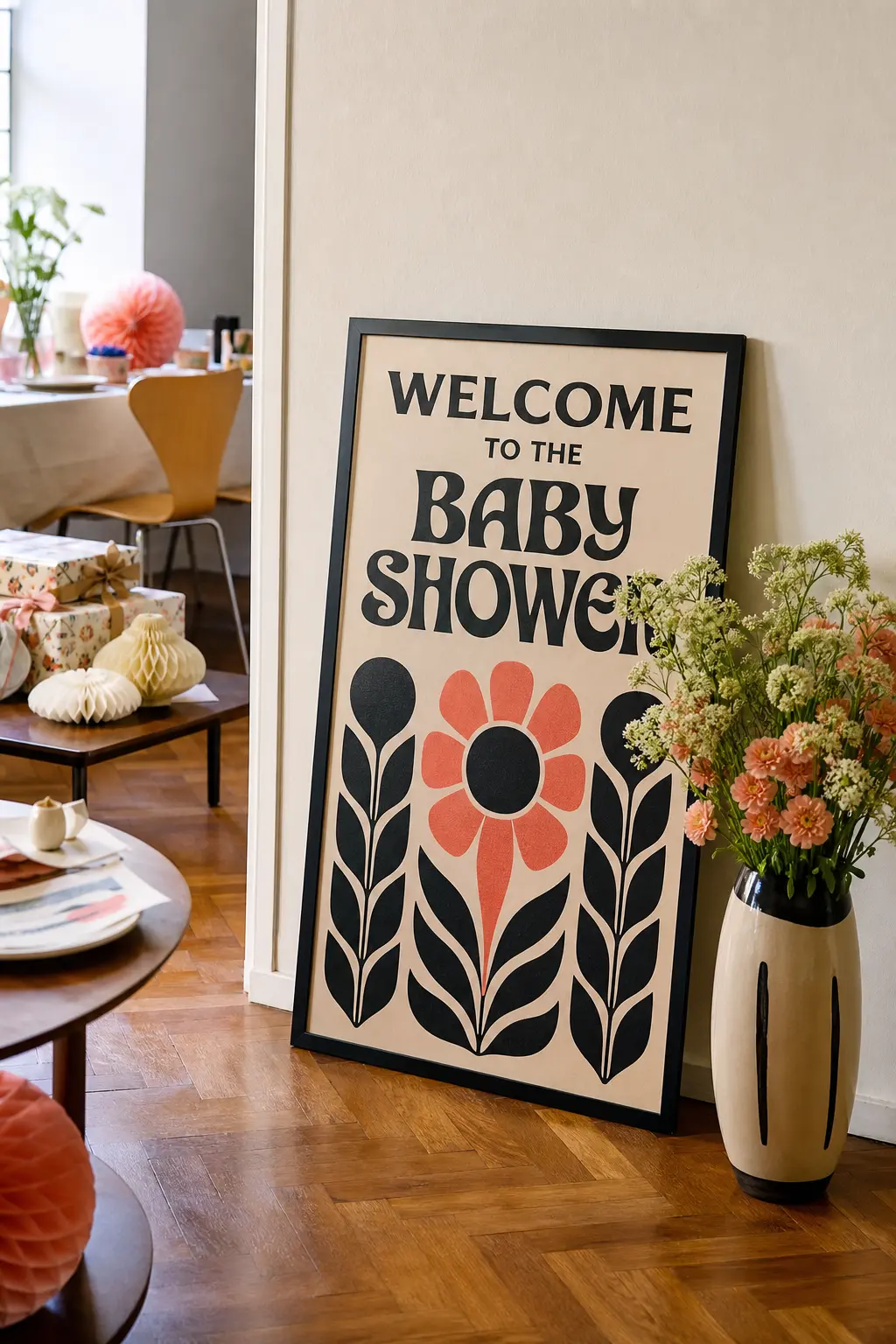
1960s Mod Graphic Signage
The 1960s mod moment belongs to geometric letterforms: think the kind of bold, optically precise sans-serif that appeared on record sleeves and boutique signage from about 1962 to 1968. Apply it to your welcome sign, your menu card, and your table numbers, and nowhere else.
The palette for this era is more restrained than people expect: cream, black, and one accent color such as a dusty coral or a faded teal. Avoid the full psychedelic rainbow, which belongs to the very end of the decade and fights with itself in a domestic setting. Two colors plus cream, one typeface, and geometric shapes as borders. Done.
🛍 Shopping guide
1970s: Warm Earth Tones and Rounded Forms
The 1970s signal immediately through color: mustard, avocado, terracotta, and warm brown. The shapes are rounded rather than angular. Signage in this era favors a friendly, bouncy letterform rather than the sleek serif of the decade before. One or two strong color choices carry the whole room.
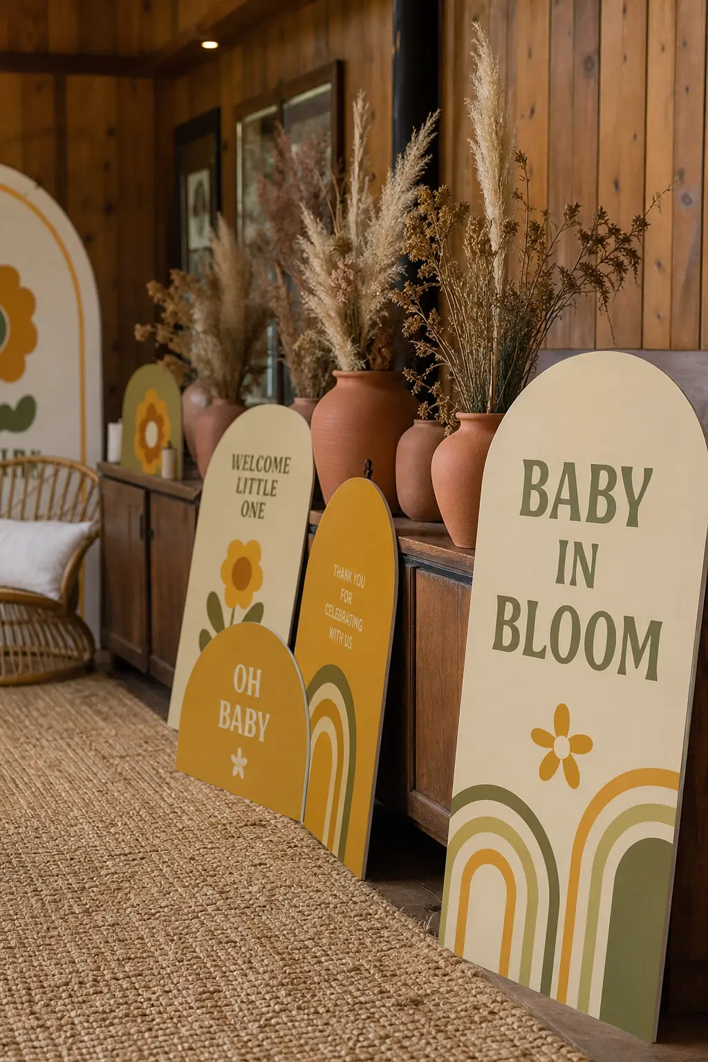
1970s Mustard and Avocado Rounded Signage
The 1970s typeface you want is the soft, rounded letterform that appeared on everything from cereal boxes to greeting cards in that decade. It has slightly inflated counters and a friendly weight. Pair it with mustard and avocado on a cream ground and every sign in the room will read as a single, decided era.
Keep the text minimal. A welcome sign, a menu card, a table number. Resist adding script as a secondary font: the 1970s mixed its own styles freely, but that reading works against coherence in a styled party room. One typeface, two colors, cream ground. The consistency is the statement.
🛍 Shopping guide
Textiles: The Detail That Sets the Era
A piece of fabric does more tonal work than almost any other decor element. Lace reads as pre-1940s when it is fine and ivory. Cotton bunting reads as mid-century when the flags are small and the colors are chalky pastels. The textile you choose anchors every other object near it.
For links to broader table styling, baby shower brunch ideas cover how to layer a table from cloth to centrepiece without overcrowding it.
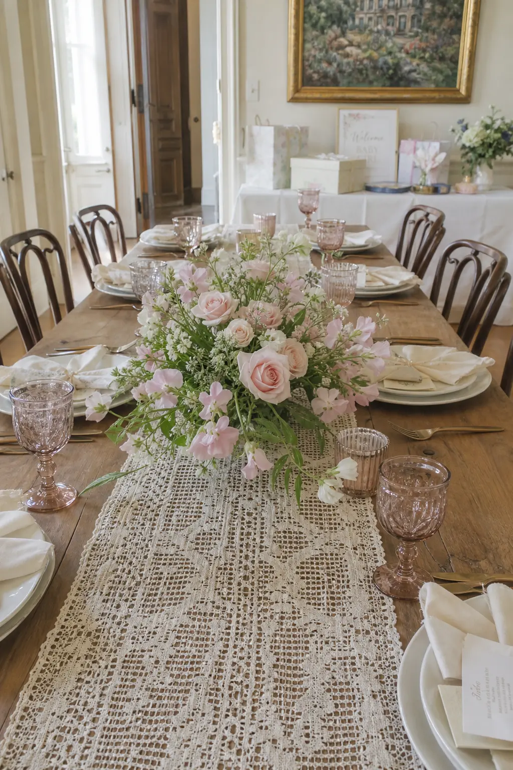
Antique Lace Runner Under a Simple Floral Arrangement
A lace runner signals the pre-war decades, specifically the 1920s through 1940s, when handmade textile work was still common on everyday tables. The finer and more ivory the lace, the further back it reads. Place it down the centre of the main table and resist the urge to layer a cloth beneath it: the table surface should show through.
On top, keep the flowers genuinely simple. Garden roses, sweet peas, or ranunculus in cream and blush, loosely arranged in a low ceramic or milk glass vessel. The lace does the decorative work. The flowers add life without competing.
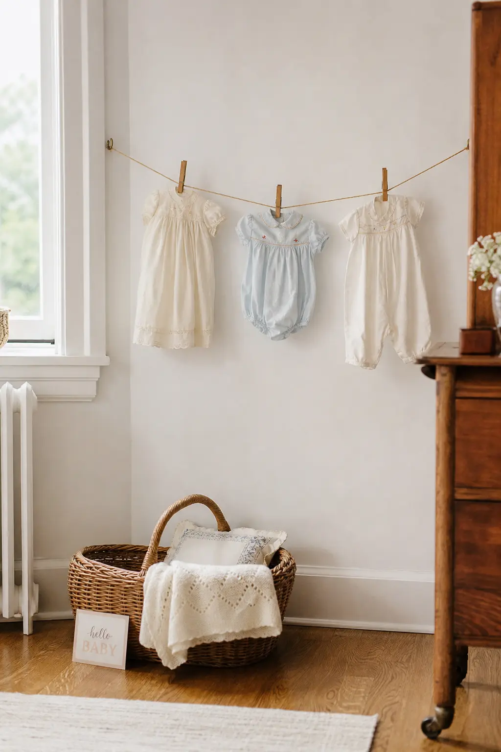
Vintage Baby Clothes on a Small Display Line
A small clothesline strung between two hooks or posts, holding three to five genuinely old baby garments, reads as domestic and sweet without any effort. The clothes do all the work. A cotton smock from the 1950s, a knitted romper from the 1960s, and a hand-embroidered bib from either decade all tell the story of the era through their cut and fabric.
Pin each garment with a vintage wooden peg rather than a plastic clip. Space them evenly. Do not crowd the line: five items maximum, and fewer if the garments are large. The negative space between each piece is part of the display.
🛍 Shopping guide
Vessels and Display: Where Flowers and Objects Live
A vessel is a quiet decision that carries a lot of weight. Milk glass reads as late 1950s to early 1960s. A Mason jar with a wire handle reads as farmhouse, which is its own era and not strictly vintage. Tins and enamel containers read as 1940s to 1950s depending on their condition and color.
Pick the vessel that belongs to your decade and use it consistently across the room. Three of the same vessel grouped at different heights looks intentional. Three different vessels in the same color family looks collected.
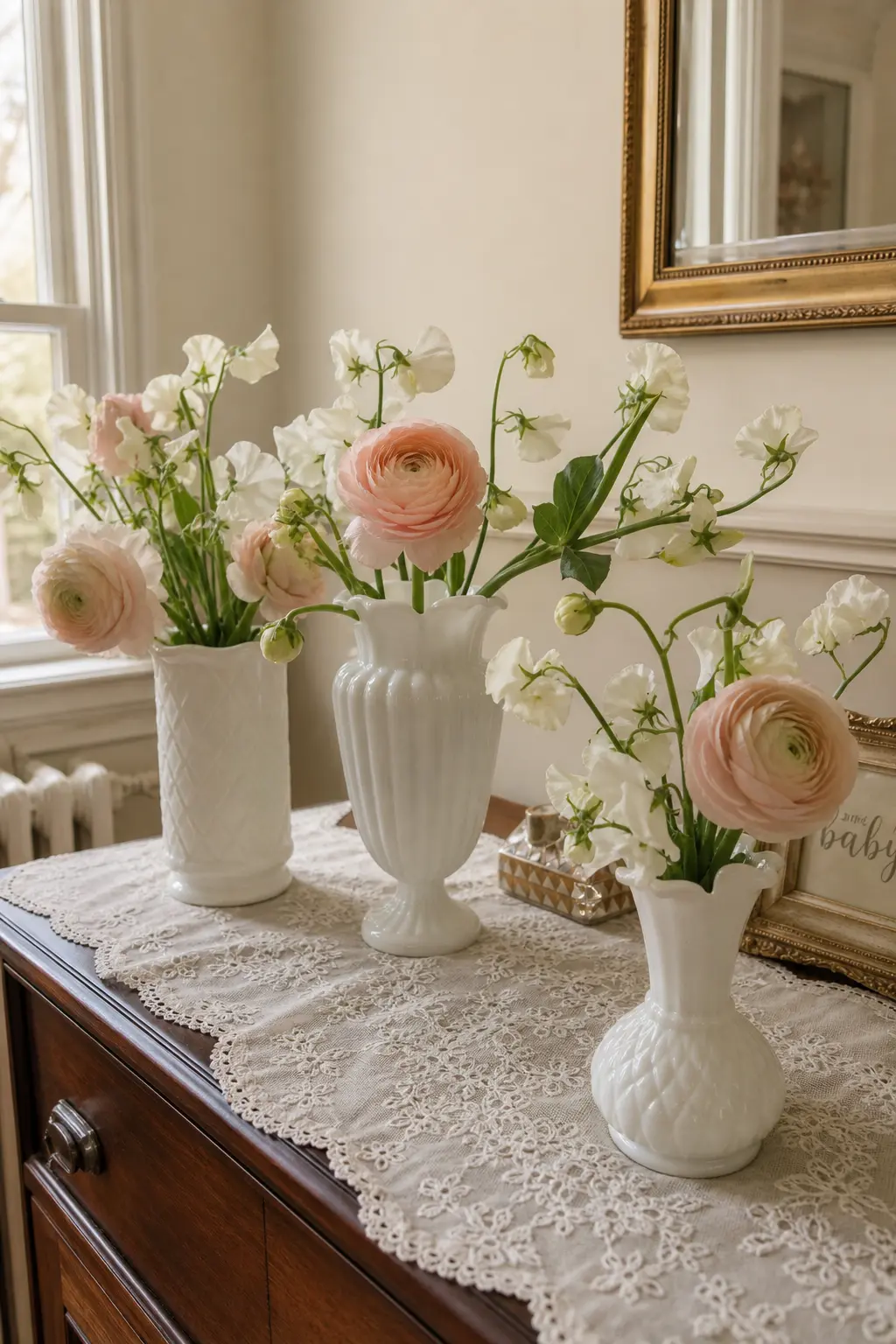
Milk Glass Vases Holding a Simple Floral Arrangement
Milk glass is the vessel of choice for the late 1950s through early 1960s. Its opaque white body and slightly wavy rim are immediately recognizable, and they group beautifully at different heights without needing any additional styling.
Use three vessels per grouping: one tall, one medium, one short. Stems should be simple and not heavily arranged: a single type of flower per vase, or at most two. Blush ranunculus, white sweet peas, or cream dahlias all work. The milk glass is the thing being displayed. The flowers are supporting it.
🛍 Shopping guide
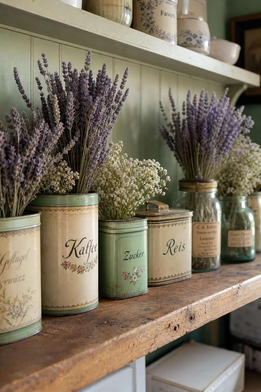
Vintage Tins and Jars as Display Vessels
A good tin or enamel jar reads as the 1940s through 1950s domestic kitchen. The signal detail is the condition: slight surface rust at the rim, faded label text, a lid that does not close perfectly. These are not flaws to hide. They are the reason the object is interesting.
Use tins for small flower stems, dried lavender, or a clutch of wooden spoons at the food table. Use jars for loose candy or as pen holders at the guestbook station. Keep every tin within the same faded color family: sage, cream, and dusty blue all coexist without fighting.
🛍 Shopping guide
Props: The One Big Piece That Earns Its Space
Every well-styled vintage room has one large prop that tells the story before anyone reads a sign. It should be genuine or, at minimum, genuinely old-looking in every material detail. It earns its floor space by being the first thing the eye finds and the last thing it leaves.
See also: baby shower gift basket ideas for how to style what guests bring so it becomes part of the display rather than a pile in the corner.
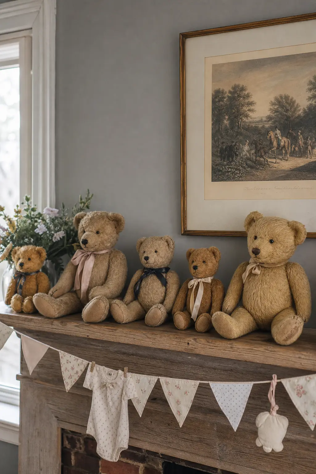
Vintage Teddy Bears Displayed in a Row
A row of vintage teddy bears on a shelf or mantel works because the objects are doing all the heavy lifting. They need to be genuinely old or genuinely old-looking in every material: mohair or distressed plush, glass eyes, a jointed body. A modern bear with a vintage-print ribbon reads as new regardless of the ribbon.
Arrange them by height, smallest at each end and tallest at the centre. Odd numbers feel more natural than even. Five or seven reads as a considered collection rather than a matched set bought all at once. Tie a single cream satin ribbon loosely around the tallest bear’s neck and leave everything else unadorned.
Vintage Suitcase as Gift Table Base
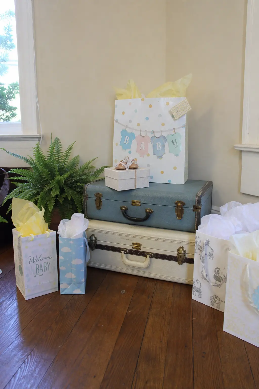
A stacked pair of vintage suitcases creates a plinth for the gift table that reads as 1950s to 1960s travel glamour. The larger case sits on the floor, the smaller on top, both closed. Gifts go on the surface beside and around the stack rather than on top of the cases themselves, which stay as decor, not furniture.
The suitcase detail that signals the era is the hardware: rounded corners, a dome lid, brass clasps, and a fabric or leather exterior in a muted color. Avoid hard-sided plastic cases from the 1980s onward, which have entirely different proportions and material qualities. The difference is visible at a glance.
Vintage Rocking Horse or Crib as the Room’s One Large Prop
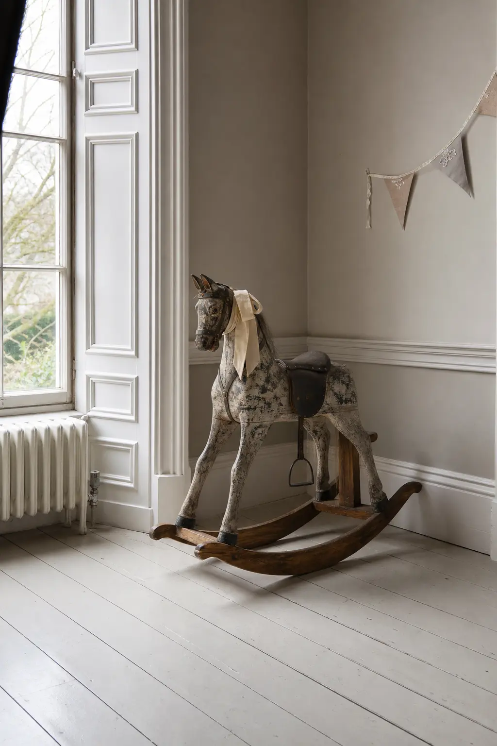
A rocking horse or a painted wooden crib positioned in an uncluttered corner does the same work as a sculpture in a gallery: it gives the eye a place to rest and the room a focal point that does not require a table underneath it. The piece should be genuinely old or restored, not reproduction.
Dress it lightly. A single folded quilt in the crib. A cream ribbon on the horse’s bridle. Resist the urge to pile stuffed animals around it or add signage to it. The object is already saying everything. Let it.
🛍 Shopping guide
Signage and Typography: The Most Overlooked Detail
Nothing breaks a vintage room faster than a modern sans-serif font on the welcome sign. Every decade had a dominant typeface style. The 1950s favored rounded script. The 1960s used geometric display lettering. The 1970s went soft and bubbly. Choose one and apply it to every piece of paper in the room.
Vintage Typewriter at the Guestbook Table
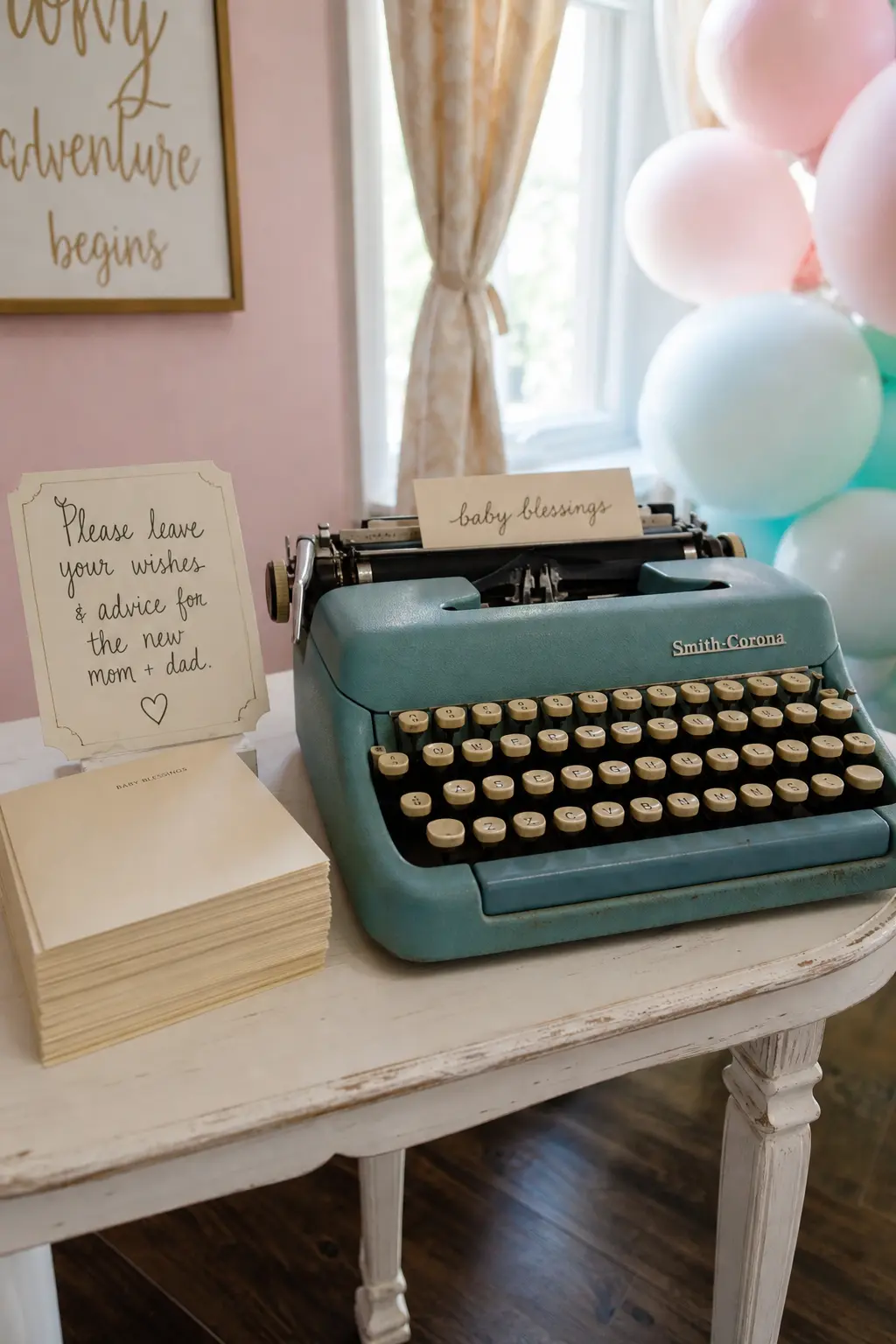
A working typewriter at the guestbook table invites guests to type their wishes rather than write them, and a typewritten note on cream paper reads as an artifact from the moment it is pulled from the machine. The typewriter itself is the decor: it needs nothing around it except a small card explaining what to do and a stack of paper cut to size.
Choose a typewriter from the decade you have committed to. A mid-century Olivetti or Hermes reads as 1950s to 1960s. An earlier black Royal reads as 1940s. The machine signals the era more precisely than any signage you could design around it.
🛍 Shopping guide
Single Decade Typeface Across All Signage
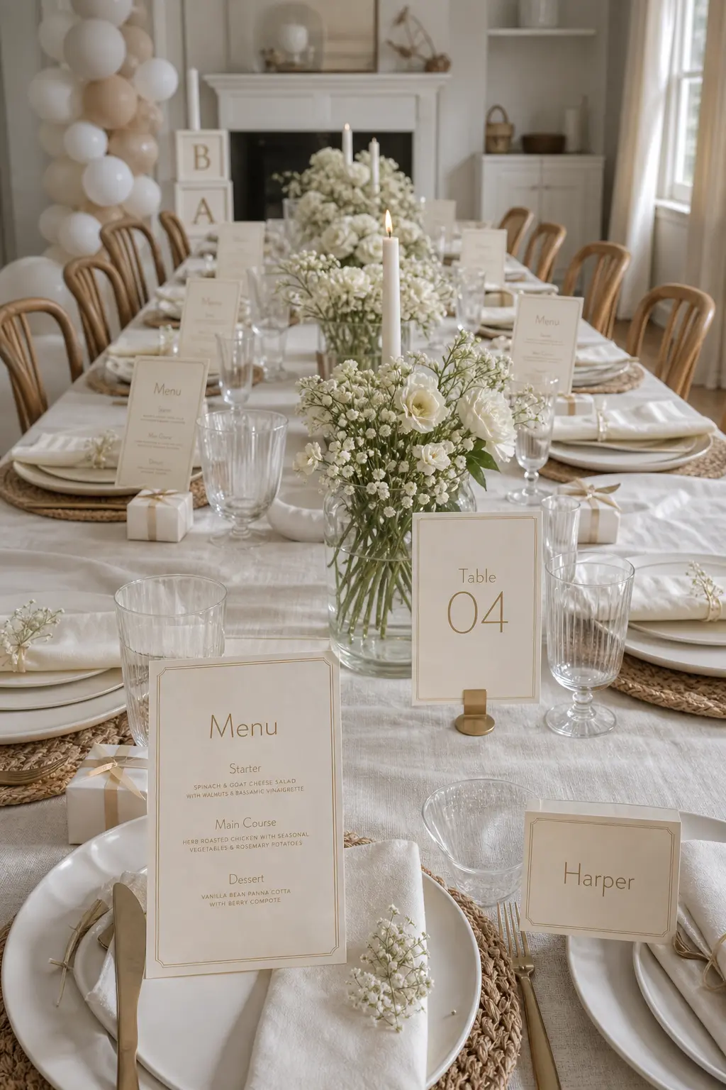
This is the detail most people overlook and the one that most often breaks a room. A 1950s welcome sign in a rounded script sitting next to a 1970s menu card in a bubbly sans-serif next to a Victorian-style place card with a serif flourish produces visual noise that cannot be resolved by adding more flowers.
Decide on one typeface family and print every piece of paper from it. Menus, table numbers, place cards, dietary labels, the welcome sign. Consistency across small pieces of paper creates the impression that someone curated the room rather than assembled it. That impression is worth more than any individual decorative object.
🛍 Shopping guide
Sound and Finishing Touches
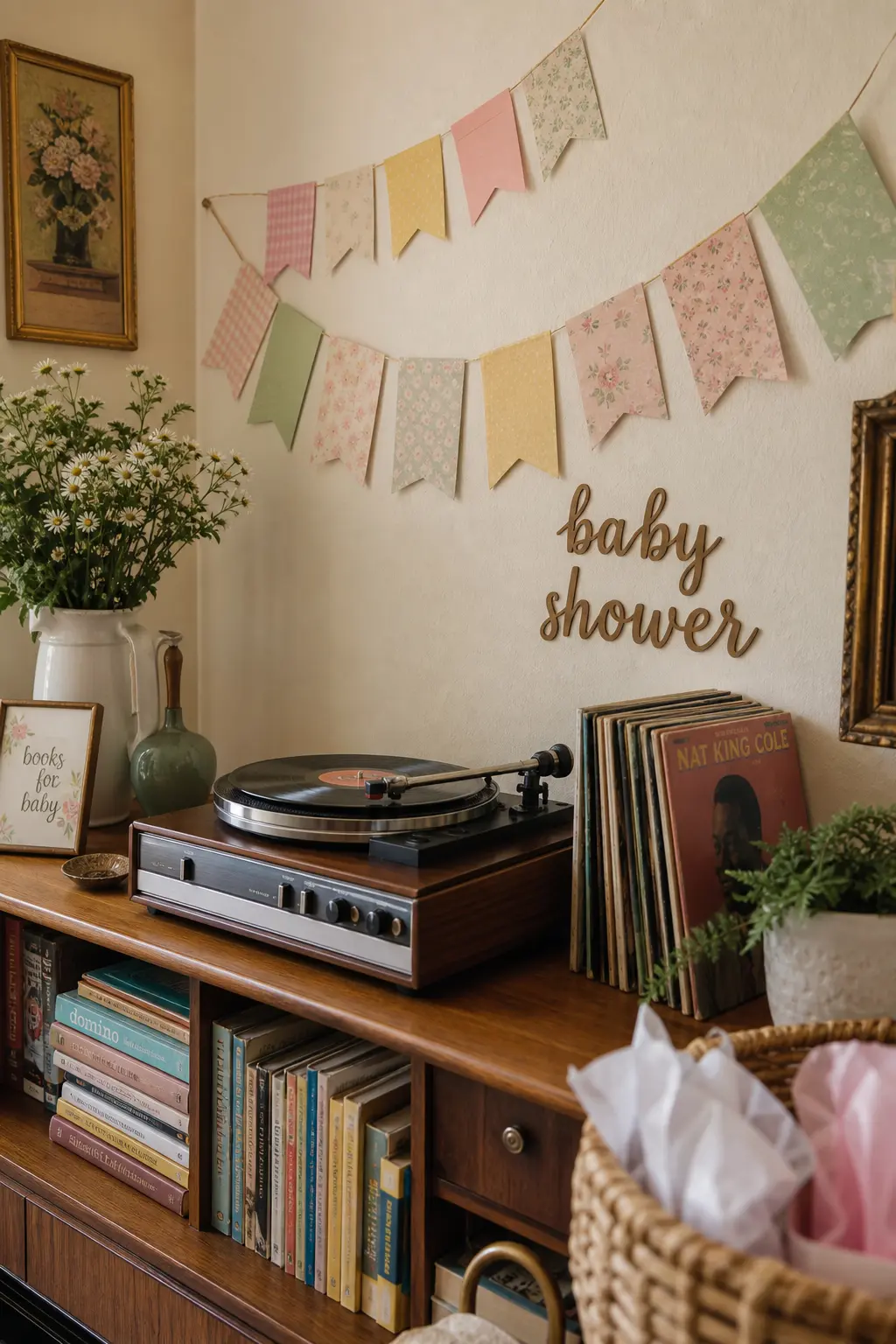
A room that looks right but sounds wrong creates friction nobody can name. A record player spinning the right decade completes the picture in a way no decoration can. Pair it with place cards, postcards, and guestbook styling that belong to the same era, and the room feels curated rather than assembled.
For games that feel right at a styled gathering, unique baby shower games offer options that do not need bright plastic equipment that fights with a soft vintage palette.
Rotary Phone Prop at the Gift Table
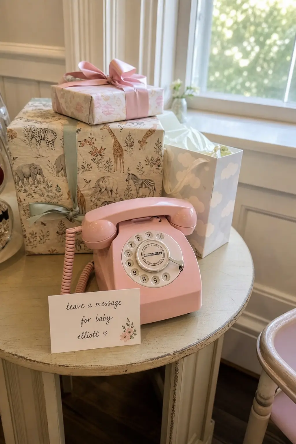
A rotary phone in working or decorative condition placed at the gift table gives guests a tactile object to interact with and a clear visual cue that this is a curated space rather than a party-supply setup. The phone reads as mid-century regardless of its exact decade, but the dial style and color narrow it down: a pastel pink or mint phone reads as 1950s, a sleek black model reads as early 1960s.
Tuck a small handwritten card into the handset holder explaining what the table is for. The card should be in the same typeface as every other piece of signage in the room. The prop is charming. The consistency is what makes it work.
🛍 Shopping guide
Vintage Postcards as Place Cards
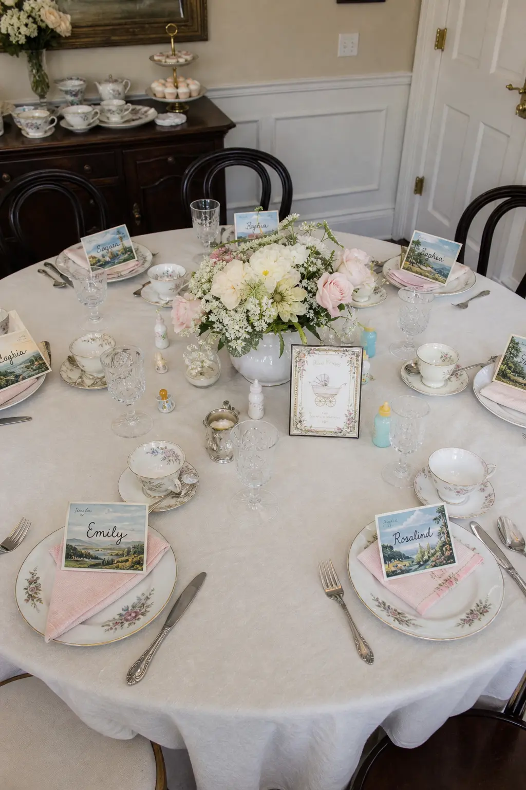
A genuine vintage postcard, written or unwritten, placed at each setting with the guest’s name in the same typeface as the room’s other signage, reads as a considered gift rather than a label. Guests take them home. The table looks better for having something with history on it rather than a folded card tent from a craft store.
Source postcards from a single decade to keep the aesthetic consistent: 1950s travel postcards share a particular illustrated style that differs clearly from 1960s photographic cards. Either works. Mixing them, predictably, does not.
🛍 Shopping guide
Record Player Spinning the Chosen Decade’s Music
Music from the chosen decade closes the loop. A room that looks 1950s but plays a current pop playlist creates a dissonance that most guests notice without being able to articulate it. A turntable playing a curated stack of 45s or a full LP from the right era resolves that tension completely.
Position the record player where it can be seen but not bumped: a dedicated corner table or a shelf works well. A visible stack of records beside it signals that the music is deliberate. Guests will look at the sleeves. The record player is not background noise in this context. It is part of the room.
🛍 Shopping guide
Frequently Asked Questions
How do you decorate a baby shower without balloons?
Replace balloons with textiles, vessels, and one large prop. A bunting of cotton flags, a row of milk glass vases, a vintage pram, or a clothesline of old baby garments each fills space and adds visual interest without a single balloon. For a vintage room, objects with genuine age do more work than any inflatable. See simple baby shower decorations for more no-balloon options.
What is a popular baby shower theme this year?
Decade-specific vintage styling has built consistent momentum, particularly 1950s pastels and 1970s earth tones. The appeal is that both palettes are gender neutral and photograph well. Storybook themes and over-the-moon themes are also strong this year.
How much should baby shower decorations cost?
A well-edited vintage room can cost very little if you source from estate sales, charity shops, and family attics. The large prop (pram, rocking horse, suitcase) is the one investment worth making. Signage, vessels, and textiles can all be found secondhand for a fraction of retail price. Budget the most for the one object that anchors the room and spend carefully on everything else. For ideas that keep costs low, DIY baby shower decorations show what you can make rather than buy.
Can baby shower decorations work for a gender neutral shower?
Vintage baby shower decorations are well suited to a gender neutral brief. The faded pastel and cream palette sits outside the pink-blue binary entirely. A 1950s theme in mint and cream, a 1970s theme in mustard and avocado, or a textile-led room in ivory lace and muted gold all read as gender neutral without effort. The decade commitment matters more than the color when it comes to coherence.
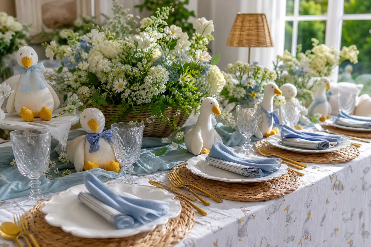
20 silly goose baby shower theme ideas: gingham tables, goose cakes, storybook keepsakes and favors,
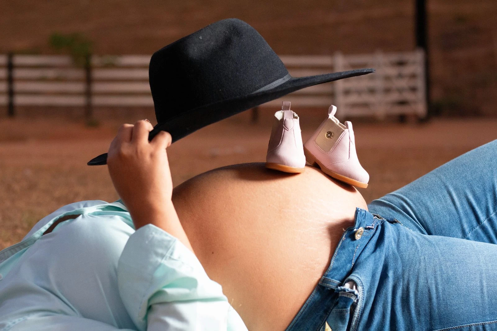
25 western baby shower ideas with free printables — rustic cowboy & cowgirl theme, games, food, fa
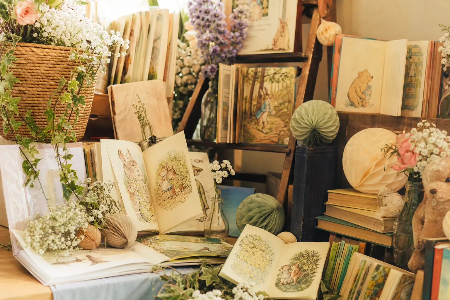
These 16 storybook baby shower decorations use real, physical books as props so the party feels lite
Leave a Reply