

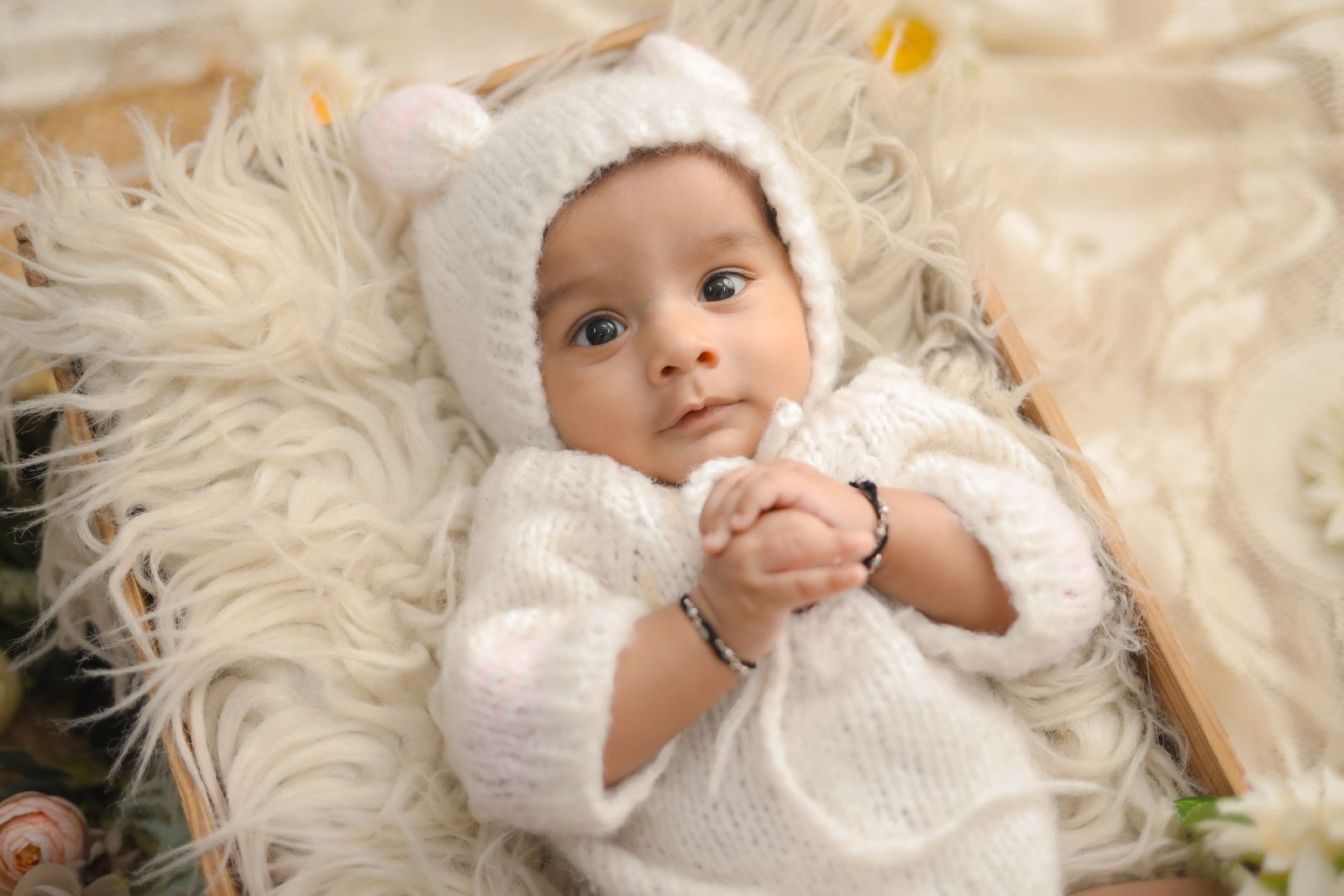
So your little one’s birthday falls smack in the middle of the snowiest, cosiest, most hot-cocoa-worthy months of the year — and honestly? Lucky them (and lucky you).
A winter first birthday is basically a gift-wrapped excuse to go all in on fairy lights, marshmallows, and invitations so beautiful your guests will genuinely keep them as mementos.
If you’ve been staring at a blank design file wondering where to even start, take a breath — I’ve been there, and I’m here to help.
Whether your vibe is icy-blue glamour, warm-kitchen cosiness, Scandi minimalism, or something totally gender-neutral, you’ll find the right design here — and then you can print it yourself at home on cardstock for a fraction of what the stationery shops charge.
Every single invite in this list comes with a ready-to-download printable sheet with blank fields for your details, so all you need to do is choose your favourite, grab some creative crafting energy, load up your home printer, and go. Let’s find your perfect winter first birthday invitation.
This post contains affiliate links — if you buy through them, I may earn a small commission at no extra cost to you.
Classic & Cool: Icy Blue and Silver Invitations
These three themes are the timeless core of the Winter ONEderland world — think frosted windowpanes, crystalline snowflakes, and that cool-toned elegance that photographs beautifully in December and January light. If you love a palette that feels genuinely wintry and a little bit magical, start here.
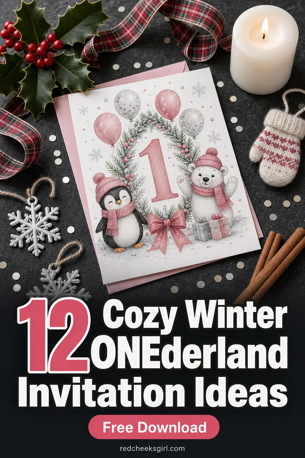
1. Classic Winter ONEderland (Icy Blue & Silver)
This is the one that started it all — and it’s still the most searched winter first birthday invitation theme for very good reason.
An icy blue and silver palette hits that sweet spot between glamorous and whimsical: it reads as elegant enough for the adults in the room but magical enough to make kids’ eyes go wide.
Think frosted serif typography, a scatter of hand-drawn silver snowflakes, and a deep midnight-blue header that anchors the whole design without making it feel heavy.
It works brilliantly for mixed guest lists (yes, the cousins AND the grandparents will love it) and suits any December-through-February birthday equally well.
Printing tip: always run a single test sheet before printing your full batch — dark backgrounds like midnight blue can look different on screen than on paper, and a 30-second test print saves a lot of wasted cardstock.
For best results with this palette, choose a bright-white cardstock rather than a warm-ivory stock, so the icy blue stays crisp and true.

2. Snowflake & Cosy Cream Neutral
If icy blue feels a touch too cool for your taste, this snowflake-and-cream version is everything you love about a classic Winter ONEderland theme — just wrapped in a warmer, softer blanket.
The palette here is creamy ivory, warm taupe, and muted silver: it photographs beautifully, it feels sophisticated without trying too hard, and it’s completely gender-neutral, which is ideal if you’re doing a joint mailing to guests who don’t know whether to expect pink or blue.
The central artwork is a large, intricate single snowflake — rendered in silver linework — that sits in the upper portion of the card like a watermark over the cream background.
This is also the easiest of the 12 designs to print beautifully on a standard home inkjet because the background is light and the ink coverage is low — no risk of ink-saturation smudging on the edges.
If you love the look of beautifully layered paper crafts, consider mounting the printed invitation on a slightly larger piece of kraft card and tying with twine for a stunning layered effect that costs almost nothing extra.

3. Cool Blue Glacier Aesthetic
Think less ‘fairy-tale snowflakes’ and more ‘dramatic Arctic landscape’ — the glacier aesthetic is a bolder, more editorial take on the winter invitation that’s been gaining serious traction in the party-planning world this year.
The palette runs from deep cobalt at the top of the card to a pale aquamarine at the bottom, mimicking the layered translucency of glacial ice.
The artwork leans abstract: jagged, angular ice-shard shapes frame the invitation text like frozen crystal formations, giving the whole card a cool, modern edge that looks right at home alongside contemporary party styling.
This one is a brilliant pick if you’re pairing your invitations with a decor scheme that includes acrylic signage, lucite balloons, or metallic blue table runners — the card will feel like a design-led extension of the party itself rather than an afterthought.
Styling small details so they feel cohesive and intentional is exactly the trick that takes a party from nice to genuinely stunning, and starting with your invitation is the smartest first move.

🛍 Shopping guide
Warm & Cosy: Hot Cocoa, Snowmen, and Polar Pals
Not every winter invite needs to feel icy — sometimes the best winter party invitation is one that makes guests feel like they’ve just wrapped both hands around a steaming mug. These three themes bring the warmth, the whimsy, and the adorable animal friends.
4. Hot Cocoa & Marshmallows Warm Theme
This is the invitation equivalent of pulling on a chunky knit sweater — warm, comforting, and immediately appealing to every single person on your guest list.
The hot cocoa theme swaps out icy blues for deep chocolate brown, rich cream, and pops of red and white, with a charming illustrated mug of steaming cocoa topped with fat marshmallows as the hero artwork.
It’s cosy-cute rather than grand-and-glamorous, which makes it the absolute perfect fit for a small home party or an intimate family gathering by the fire.
If you’re already planning a gorgeous hot drink station at the party, this invitation is the most natural preview you could send — guests will arrive already knowing exactly what kind of warm, delicious day they’re walking into.
Print on a warm-white or linen-finish cardstock rather than bright white for the best match with the chocolate-and-cream palette; the slight warmth of the paper makes the whole card feel even cosier.

5. Little Snowman Friendly & Bright
Possibly the most fun invitation in the entire collection, the Little Snowman theme is unapologetically cheerful — and it’s absolutely the one to choose if you want your guests to grin the moment they open the envelope.
The palette is a classic combination of bright white, vivid orange (think carrot nose!), sunny yellow, and a warm sky blue, with a friendly, round-faced snowman illustration front and centre.
It’s bright, it’s bold, and it hits that sweet spot between ‘cute for the kids’ and ‘genuinely charming for the adults.’
This is an especially strong choice if your baby’s first birthday falls in January or February — snowman season — when guests will be fully immersed in winter mode and ready to appreciate all the cosy wintry details.
The bright, high-contrast colour palette also means it prints with punchy, vivid results even on a standard home inkjet printer, so you don’t need to worry about investing in premium photo paper. A standard 65lb matte white cardstock will do the job beautifully here.

6. Polar Animals (Penguins & Bears, Generic)
Baby penguins and baby polar bears — honestly, name a more irresistible combination for a first birthday invitation.
This theme takes the classic winter animal palette (arctic white, slate blue, warm charcoal, and a pop of sunshine yellow from the penguin’s beak) and uses it to create a party card that is sweet without being saccharine, and playful without feeling babyish.
The illustrated polar friends sit in a little snow-dusted scene at the top of the card, looking every bit as excited about the birthday party as your actual guests will be.
This theme works wonderfully for a gender-neutral celebration, and it pairs beautifully with party decor that includes plush animal toys as centrepieces, white balloon arches, and a faux-fur table runner.
If you’re the type of host who loves to carry a theme all the way through from the invitation to the last party favour (and good for you if you are!), this is one of the easiest themes to build on — polar bear cookies, penguin cupcakes, and an igloo cake are all beautifully achievable even for a beginner baker.

🛍 Shopping guide
Rustic & Romantic: Woodland, Blush, Navy, and Globe
These four themes span the gorgeous middle ground between outdoorsy-rustic and dressed-up-romantic — perfect for parents who want something that feels a little less ‘typical winter party’ and a little more editorial. Plaid and pinecones, blush and silver, navy and glitter, and the enchanting snow-globe scene all live here.
7. Pinecone & Plaid Rustic Woodland Winter
If your party vibe is less ‘icy palace’ and more ‘cosy log cabin in the pines,’ this is unquestionably your invitation.
The pinecone and plaid theme channels everything wonderful about a rustic December-February birthday: warm red-and-green buffalo plaid, illustrated clusters of pinecones and sprigs of holly, rich forest-green typography, and a kraft-style background that makes the whole card feel like it was made with genuine love and a little woodsmoke in the air.
It’s wonderfully versatile — it reads as seasonally festive without being Christmas-specific, so it works perfectly for a January or February party too.
For the most authentic rustic effect, print this one on a natural kraft-coloured cardstock rather than bright white — many home printers handle 60–65lb kraft paper without a problem, but do check your printer’s paper-weight specifications first.
If you love working with tactile, earthy paper materials, you could also layer this printed invitation over a piece of rustic burlap ribbon for an envelope seal that feels completely on-theme.

8. Blush & Silver ‘Winter ONEderland’ for a Girl
This one is the undisputed princess of the winter invitation world — and I say that with complete affection, because it is genuinely stunning.
The blush-and-silver palette takes everything magical about the Winter ONEderland theme and wraps it in a soft, feminine warmth that feels like rose gold at a winter ball.
The hero illustration is a delicate watercolour-style arrangement of blush pink roses, silver snowflakes, and pearl-white ribbon curls in the upper section of the card, with ‘Winter ONEderland’ written in an elegant silver script across the top.
Every detail says first birthday party for a little girl born in the most beautiful season.
If you’re printing at home, this is one of the designs where the investment in a slightly higher-quality matte photo cardstock really pays off — feeding cardstock through your printer one sheet at a time (rather than loading a stack) will prevent any smudging on the blush background areas.
Once printed and trimmed, a light mist of clear craft sealant gives the card a professional, polished finish that guests will mistake for a professionally printed piece.

9. Navy & Silver ‘Winter ONEderland’ for a Boy
Deep navy and gleaming silver is one of those combinations that never fails to look expensive, and in an invitation context it is absolutely stunning.
This theme takes the Winter ONEderland concept in a more structured, typographically bold direction — think thick navy borders, silver foil-look lettering, geometric snowflake motifs, and a palette that feels simultaneously sporty and sophisticated.
It’s the ideal pick for parents who love the winter theme but want something that leans confident and striking rather than soft and dreamy.
One practical styling tip: if you’re planning to mail these invitations, pair them with a silver-lined navy envelope for maximum impact the moment your guests reach into the letterbox.
The contrast of the deep navy against the silver lining is genuinely wow-worthy, and it sets exactly the right expectation for a well-planned, beautifully styled party.
This palette also prints with beautiful depth on bright-white matte cardstock — the navy ink reads as very rich and true-to-colour, which makes it one of the most satisfying designs in the set to print at home.

10. Snow-Globe Magical Scene
This is the invitation that will make your guests actually gasp a little — in the best possible way.
The snow-globe theme places a beautifully illustrated snow globe at the centre of the card, and inside that globe lives a tiny, perfect winter birthday scene: a snowy landscape with a miniature ‘1’ candle, a little spruce tree, and falling snow swirling inside the glass.
The surrounding palette is a warm champagne gold and soft white, making the whole card feel like it belongs in a department-store window display in the very best December tradition.
Framing your event details inside (or just below) the illustrated snow-globe gives this invitation a storybook quality that is genuinely unlike anything else in this collection.
It’s perfect for parents who are going all-in on the ‘magical, once-in-a-lifetime feeling’ angle of a first birthday — and it pairs perfectly with party decor that includes real snow globes as centrepieces or table accents.
DIY handcrafted details like personalised snow-globe favours for guests are a natural extension of this theme that will delight everyone in the room.

🛍 Shopping guide
Dreamy & Modern: Sugar-Plum Pastels and Nordic Minimalism
Round out the collection with two themes that feel genuinely current — one a soft, sugary dream in lilac and gold, the other a beautifully restrained white-and-wood Scandinavian design that’s having a major moment right now. Both print stunningly on matte cardstock.
11. Sugar-Plum Pastel Winter
Lavender, dusty lilac, soft gold, and the most delicious pastel plum you’ve ever seen — the sugar-plum theme is basically a dream wrapped in an invitation, and it is one of the most show-stopping designs in this entire collection.
Much like a beautiful seasonal bouquet, the sugar-plum palette works because it layers soft, muted tones (dusky lilac, blush, cream) with just enough richness (deep plum, warm gold) to stop it from feeling washed-out.
The illustration leans whimsical and slightly Nutcracker-adjacent — think sugar-dusted plum blossoms, gold stars, and delicate frosted berries — without being tied to any specific licensed property.
This theme is a natural choice for a girl’s first birthday party that skews toward the ‘dreamy and magical’ end of the spectrum, but it’s also genuinely distinctive — you’re unlikely to see it duplicated across five other winter birthday parties this season, which is always a bonus.
For printing, a matte or satin-finish white cardstock will capture the soft lilac and plum tones most accurately; avoid glossy paper, which tends to make pastel palettes look slightly washed out under indoor lighting.

12. Nordic Minimalist (White & Wood)
If your aesthetic runs toward the calm, the considered, and the beautifully restrained, the Nordic minimalist invitation is your perfect match — and it’s arguably the most on-trend design in this entire collection right now.
The Nordic philosophy of ‘less but better’ translates perfectly into an invitation: crisp white space, a single warm honey-oak wood-grain panel, clean sans-serif typography in deep charcoal, and one perfect geometric snowflake as the sole decorative motif. Nothing unnecessary. Everything intentional.
It’s the invitation equivalent of a Scandi-design coffee-table book, and it photographs spectacularly.
This theme also has a distinct practical advantage: because the design is 90% white space and minimal colour, it uses the least ink of any card in this set — making it by far the most cost-effective to print at home in large quantities.
It also works beautifully for any gender, any family aesthetic, and any party venue from a snowy garden party to a sleek city apartment.
If you’re pairing it with the party decor, think natural wood charger plates, white linen, beeswax taper candles, and a single dramatic branch of silver birch as a centrepiece — the invitation will feel like it was designed specifically for that room.

Frequently Asked Questions
What is a Winter ONEderland first birthday theme?
Winter ONEderland is a play on the phrase ‘winter wonderland,’ used as a theme for a baby’s first birthday party during the winter months (typically December through February). It combines wintry visual elements — snowflakes, icy palettes, cosy winter scenes — with birthday celebration details, resulting in a magical, seasonally appropriate first birthday aesthetic.
What cardstock weight should I use to print birthday invitations at home?
Most party-stationery experts recommend at least 65–80 lb cardstock for a sturdy, professional-looking invitation. If your printer supports it, 100–110 lb cardstock looks the most polished and feels closest to a professionally printed card. Always check your printer’s paper-weight specifications before purchasing, and run one test sheet before printing your full batch.
How many invitations can I print from one sheet of 8.5×11 cardstock?
If your invitation design is a standard 5×7 inches (the most common birthday invitation size), you can fit two invitations on one 8.5×11 sheet of cardstock. A pack of 50 sheets would therefore yield 100 invitations — more than enough for most first birthday guest lists, and very cost-effective.
Which of these 12 winter invitation themes is best for a gender-neutral party?
Themes 1 (Classic Winter ONEderland in icy blue and silver), 2 (Snowflake and cosy cream), 3 (Cool blue glacier), 5 (Little snowman), 6 (Polar animals), 7 (Pinecone and plaid), 10 (Snow globe), and 12 (Nordic minimalist) are all designed to be fully gender-neutral.
Themes 8 (blush and silver) and 9 (navy and silver) lean toward traditional girl and boy palettes respectively.
Can I send these invitations digitally instead of printing them?
Absolutely. Each printable sheet can be exported as a high-resolution PDF or JPEG and shared digitally via email or messaging apps. For the best digital display, export at 300 DPI so the design looks sharp on any screen size.
You would simply leave the blank fields empty and ask recipients to contact you for details, or add your text digitally before sharing.
How far in advance should I send winter first birthday invitations?
For a first birthday party in winter (December through February), sending invitations three to four weeks in advance is the general recommendation. If your party falls during the holiday season in December, consider sending four to six weeks ahead, as guests’ calendars fill up quickly during this period.
📌 Save These for Later
Loved these? Pin your favorite image below so you can find this list again when you’re planning.

14 low-effort 60th birthday party ideas for women who have organised every family occasion for decad

Discover 21 transformative birthday gifts for the woman who has everything. From creative workshops

Fifteen 12th birthday party ideas for a girl that feel genuinely grown-up: no balloons, no primary c
Leave a Reply