

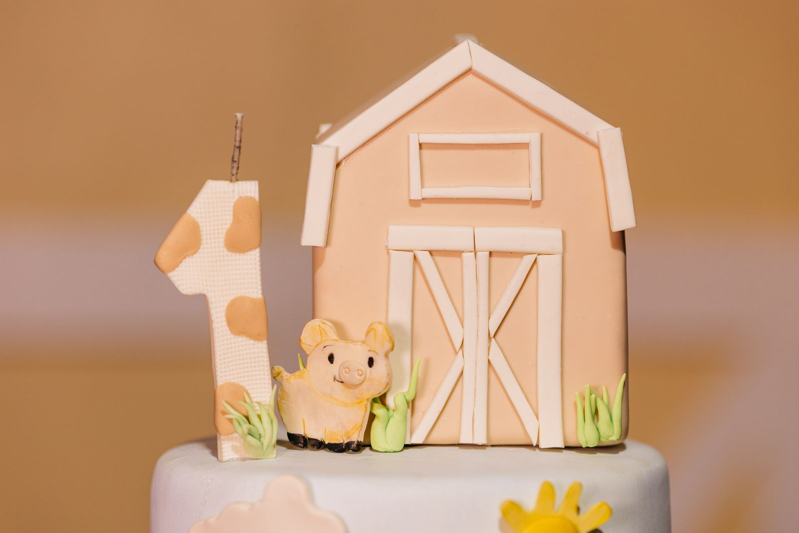
Here’s the thing nobody tells you when you’re planning a first birthday: the invitation is actually the hardest part.
Not because it’s complicated, but because it’s the first decision — and once you pick the theme, everything else (the balloons, the cake, the table, the outfit you’ll quietly agonise over for three weeks) flows from that one little card. No pressure, right?
The good news is that gender-neutral first birthday themes have never been more beautiful — or more printable.
Parents right now are gravitating toward themes that feel timeless rather than trendy, with muted palettes and flexible designs that photograph beautifully. Whether your baby is a Wild One safari adventurer, a dreamy sun-chaser, or a goose of decidedly silly disposition, there’s a theme here that fits.
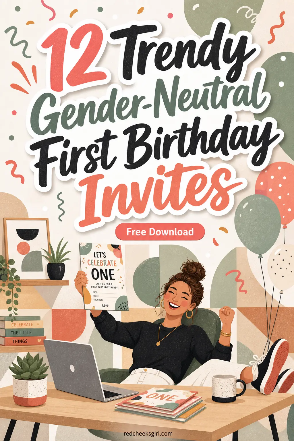
Every single design below is a printable invitation you can run off your home printer, fill in by hand, and pop into an envelope — no design skills required.
I’ve rounded up 12 genuinely distinct gender-neutral themes, sorted into four mood-based categories, so you can browse by vibe rather than wading through a wall of options.
Parents are investing more in the visual story of a first birthday, and the invitation is the opening frame of that story. So let’s make yours a good one.
Scroll through, find the theme that makes you feel something, and grab the free printable sheet below it. Your baby’s fan club will be very impressed — even if they’re coming for the cake.
This post contains affiliate links — if you buy through them, I may earn a small commission at no extra cost to you.
Nature & Adventure Themes
These three themes lean into the great outdoors — safari grass, star-dusted skies, and a wicker basket on a checked blanket — making them perfect for parents who love earthy, organic palettes that feel at home in any season.
1. Wild One Neutral Safari
There’s a reason Wild One has sat at the top of the gender-neutral first birthday charts year after year — it’s the rare theme that feels both playful and grown-up at once.
The visual aesthetic leans into soft safari animals — lions, zebras, giraffes, hippos, elephants, and monkeys — rendered in a gentle watercolor style on a sage green background, warm, modern, and gender-neutral, which makes it equally popular for boys and girls, and the sage green and tan palette photographs exceptionally well. On an invitation, this translates to a lush, illustrated card that feels like a tiny piece of art — not a party-supply-store shelf.
The sage and cream palette is about as forgiving as a colour combination gets.
The earthy mix of sage, mustard, tan, cream, and forest green can look intentional in almost any space, and the safari motif gives parents plenty of options for tableware, balloons, cake details, and play-area styling. For printing, this design rewards a slightly heavier cardstock — aim for 65–80 lb if your printer can handle it — and always do one test sheet first.
One or two test sheets will save you from ruining a whole stack later. Trim to 5×7 and slot into a kraft or cream envelope for an effortlessly styled package.

2. First Trip Around the Sun
This one tugs at the heartstrings a little — in the very best way. ‘First Trip Around the Sun’ frames the entire first year as an adventure, a complete orbit of wonder, mess, and midnight feeds.
The palette runs to soft blush, cream, dusty blue, and star and moon accents, which keeps it warmly celestial without straying into licensed character territory.
It’s the kind of theme that parents reach for when they want the invitation to feel meaningful rather than just cute, and tbh — it really delivers.
On the card, think a luminous illustrated sun surrounded by trailing gold stars and a crescent of soft watercolour clouds at the top, with blush and gold typography beneath.
This theme suits any birth season because stars are always in style (yes, I am coming for your Pinterest boards).
A beautifully designed invitation sets the mood for the party — whether digital or printed, it should include essential details like date, time, venue, and RSVP instructions to keep guests well-informed. Print on warm white or blush cardstock and pair with a gold-lined envelope if you want to feel truly fancy for approximately £1.20 extra.

3. Teddy Bear Picnic
If there was ever a theme built for a first birthday, it’s Teddy Bear Picnic — and not just because the song is now going to be stuck in your head all afternoon (you’re welcome).
This has been a beary popular theme for a while now, and it’s no surprise why — it’s sweet, gender-neutral, and perfect for a cozy, woodland-inspired celebration. The biscuit and sage gingham palette is soft enough to feel vintage-storybook but grounded enough to avoid veering into sugary-sweet territory.
On the invitation card, the magic is in the texture: a gingham border in sage and cream frames a central illustration of a plump teddy bear mid-picnic, basket open, tiny teacup in hand.
A teddy bear or woodland setup in cream, sage, and warm brown reads as intentionally neutral — no gender assumptions attached, which is exactly what you want when your guest list runs from grandparents to the neighbours’ toddler.
Print this one on matte white or natural cardstock to emphasise that biscuit-warm undertone, and consider tying the envelope with a short length of twine for an extra-charming touch. Those small details are the ones guests actually notice.

🛍 Shopping guide
Cottagecore & Whimsy Themes
Gingham, geese, and the coziest teddy bears you’ve ever seen — this trio taps the storybook aesthetic that’s been all over first birthday planning this year, soft and sweet without veering into pink-or-blue territory.
4. One Silly Goose
I cannot stress enough how much personality this theme has.
One Silly Goose is the theme you choose when your baby is, frankly, a chaotic little gremlin who has been delighting you with increasingly unhinged facial expressions for twelve months — and you want the invitation to say exactly that without saying it.
The cottagecore aesthetic continues to dominate children’s parties, making One Silly Goose one of the biggest first birthday themes right now — think soft blue gingham, delicate florals, playful geese, wicker baskets, and charming garden-inspired details. The blue gingham base keeps it firmly gender-neutral while still feeling fresh and specific.
If you’re looking for a first birthday theme that’s whimsical, timeless, and full of personality, One Silly Goose is a perfect choice — this playful yet elevated trend combines soft pastel colors, storybook-inspired details, and a touch of humor to create a celebration that’s as memorable as it is photo-worthy. On the invitation card, a round illustrated goose in a tiny floral crown sits against blue gingham, with a hand-lettered headline in deep navy.
For printing, note that gingham patterns show banding on inkjet printers if you print too fast — use the ‘high quality’ or ‘best’ setting and let each sheet dry flat for a minute before stacking.

5. Classic Neutral ‘Sweet One’
Sometimes the most confident design choice is the quietest one.
‘Sweet One’ in cream and beige is the theme for the parent who wants the invitation to feel timeless — the kind of card that looks just as beautiful printed at home as it would if you’d paid a designer twice your weekly coffee budget.
Think soft neutral decor like cream and beige mixed with sage green, dusty blue, or pale yellow — it works beautifully for both little boys and girls. This palette has longevity, which is a real consideration when you’re making something that’ll go in the baby book.
The ‘Sweet One’ invitation leans into elegant simplicity: a delicate botanical wreath illustration in warm cream and biscuit tones, with a single refined serif font and nothing superfluous.
It’s the kind of card that makes guests think you had it professionally printed, which (between us) is 50% of the goal.
For home printing, choose an invitation design with a white background to save on ink — this neutral palette genuinely looks better on a white base than a tinted one anyway, and your printer cartridges will quietly thank you.

6. Woodland Friends
Forest green, warm wood tones, and a cast of the most polite illustrated animals you’ve ever seen — Woodland Friends is the theme that rewards parents who love a rich, saturated palette without committing to anything loud.
It’s grounded, beautiful, and genuinely works for any baby. The deep forest green anchors every element, while warm amber, tan bark, and creamy mushroom tones stop it from feeling cold.
Think illustrated foxes, owls, deer fawns, and hedgehogs, all rendered in a muted watercolour style that could hang on a nursery wall.
What makes this theme work especially well on an invitation card is the depth of the colour story — the dark forest green gives you excellent contrast for deep charcoal or dark copper type, which means your printed card will be genuinely easy to read (a detail that matters more than you’d think when Uncle Dave is trying to figure out the address at arm’s length).
Lock the palette first, then let the tableware, balloons, and play space all pull in the same direction — and the invitation is the simplest way to do exactly that. Print on matte white cardstock for the richest green reproduction.

Classic & Woodland Neutral Themes
Think cream linen, a towering forest, and the kind of warm beige palette that looks just as good on a mantelpiece as it does pinned to a fridge — these three themes are the definition of understated celebration done beautifully.
7. Berry First Neutral
Berry First is one of those themes that sounds straightforwardly sweet but is actually doing something quite clever with colour.
The combination of deep berry red, warm raspberry, and clean cream on an invitation card has a graphic confidence to it — it doesn’t read as either traditionally feminine or masculine, it just reads as striking and well-considered.
Berry themes have strong visual contrast that holds up in both natural light and flash photography, which is exactly what you want when every guest is going to photograph the dessert table with their phone.
On the invitation, a loose watercolour illustration of strawberries, raspberries, and trailing leaf sprigs in red and cream against a white card gives you something that looks genuinely editorial.
This theme is particularly well-suited to parents planning a garden party or a summery outdoor celebration, but the red-and-cream palette is warm enough to work inside in any month.
Print on bright white matte cardstock to keep those reds vivid — inkjet printers can muddy berry tones on cream or off-white paper, so save the warm-toned cardstock for the sage and biscuit themes above.

8. Cabbage Patch ‘Cutest One in the Patch’
‘Cutest One in the Patch’ is possibly the most charming play-on-words in this entire list and I will not be taking questions.
The theme leans into a vegetable garden aesthetic — illustrated cabbages, leafy green patches, terracotta pots, and the general vibe of a very well-tended allotment — in a palette of deep garden green, pale sage, terracotta, and warm cream.
It’s unexpected, it’s adorable, and it will absolutely make your guests smile the second it arrives. It also works beautifully for any birth season, which is a genuine plus when you’re not planning around strawberry season.
The invitation card works best with a central illustrated cabbage in layered green watercolour as the hero element, surrounded by smaller botanical details.
For a cohesive party, you can pull the terracotta and sage palette through to your table — think terracotta-painted pots as centrepieces, green gingham napkins, and a ‘Cutest One in the Patch’ banner.
Parents are investing in the visual story of a first birthday: custom signage, coordinated balloon installations, and invitation designs that match the party aesthetic exactly. Your guests will feel the effort — and so will you when you look back at the photos.

9. One Happy Camper
One Happy Camper is the theme for parents who love the outdoors, or at least the idea of the outdoors from the comfort of a well-heated living room (solidarity).
The woodland plaid palette — rich forest green, deep navy, warm red tartan, and natural cream — gives the invitation a cosy, cabin-weekend energy that’s unmistakably gender-neutral and genuinely striking in print.
Think illustrated camping lanterns, tiny pine trees, a little canvas tent, and a perfect crescent moon peeking through clouds.
What I love about this theme is that it has real occasion flexibility — it works for a backyard party, a park gathering, or an indoor event where you’ve committed to the aesthetic regardless of the weather outside (very relatable).
Pair the printed invitation with a natural kraft envelope and a short piece of rustic twine for a finishing touch that costs almost nothing and looks like it cost a lot.
Send party invitations four to six weeks in advance so your guests can ensure they keep that day free — especially useful if you’re planning an outdoor event where guests might want to arrange transport or backup plans in case of rain.

🛍 Shopping guide
Bold & Bright Statement Themes
For the parent who wants the invitation to stop the scroll (or the fridge) with a big colour hit — these three designs bring the drama, from juicy watermelon reds to vivid citrus greens and the clean confidence of a modern balloon arch.
10. Oneder the Sea Neutral
Oneder the Sea (yes, the pun is doing a lot of heavy lifting here, and we respect it) takes the under-the-sea theme and strips out the neon coral and character-licensing risk, replacing them with a sophisticated seafoam and sand palette that genuinely reads as premium.
Illustrated sea creatures — starfish, jellyfish, seahorses, pebbled shells, and trailing seaweed — rendered in soft seafoam green, sandy beige, and pale aqua give the card an almost art-print quality.
Wild One, First Trip Around the Sun, Under the Sea, and Classic Neutral themes work well for any gender, and this neutral take on the ocean theme is one of the most versatile in the set.
The seafoam and sand palette is particularly forgiving to print at home because neither colour is highly saturated, meaning you’re unlikely to see banding or colour shift between the screen and the paper.
Print on warm white matte cardstock for the most accurate seafoam tone — glossy paper will make the aqua look slightly more blue-green than intended, which isn’t necessarily a problem but is worth knowing before you run 30 copies.
This theme also suits every birth month beautifully; there’s nothing more August about the sea than there is December, so you’re safe year-round.

11. Citrus ‘One in a Melon’
Okay, ‘One in a Melon’ — I’m just going to say it — is the most fun to say out loud of all twelve themes. It is also extremely photogenic, which is basically the second most important criterion for a first birthday theme.
The citrus palette here goes bold and fresh: vivid watermelon pink-red, bright lime green, sunny yellow, and clean white, with hand-drawn citrus slices, watermelon wedges, and tropical leaf motifs giving the card a vibrant, joyful energy.
This is the invitation you send when you want people to feel excited before they’ve even read the date.
Because the colours are saturated and bright, this design benefits most from a high-quality inkjet print at the ‘best quality’ setting — poor alignment, smudges, and washed-out colors usually come from overlooked print settings, not bad equipment, so take the extra thirty seconds to dial in the settings before you run the full batch.
The citrus theme suits a summer celebration particularly well and pairs beautifully with a lemonade stand, a fruit grazing table, or a melon-smash cake.
It’s also the one theme in this collection where a glossy cardstock actually works in your favour — the shine makes those greens and pinks practically glow.

12. Balloon ‘ONE’ Minimalist Modern
If the rest of this list is a floral arrangement, the Balloon ONE minimalist design is a single stem in a glass vase — and sometimes that’s exactly what a room needs.
This theme strips everything back to one giant, illustrated number balloon spelling ‘ONE’, rendered in a clean, modern style against a white or soft off-white background with the gentlest confetti scatter.
The palette is intentionally open: you can go classic gold-and-white, modern black-and-cream, or a single pop of a bold accent colour — dusty rose, cobalt, terracotta — to tie it to any decor scheme you choose.
The minimalist approach is genuinely the smartest choice for parents who haven’t fully locked in their party decor yet — the invitation still looks polished and intentional, and it doesn’t commit you to twenty-seven shades of sage before you’ve booked the venue.
The fastest way to lock your party palette is the invitation — it’s the first thing guests see and the reference for every purchase after. That said, the Balloon ONE design is deliberately versatile enough to work as the lead rather than the reference.
For home printing, layout two 5×7 invitations per page and cut with a straight-edge or paper trimmer — this method is easier for most home printers and gives you more margin for alignment. Clean, confident, and very, very chic.

Frequently Asked Questions
How far in advance should I send a first birthday invitation?
For a first birthday, three to four weeks’ lead time is the sweet spot for mailed paper invitations.
Paper invitations sent by mail should go out three to four weeks ahead to allow five to seven days’ delivery time each direction. If you’re inviting family from further afield or the party falls near a holiday weekend, go to six weeks to be safe. Sending invitations four to six weeks in advance gives your guests a chance to make sure they keep the day free.
What information should a first birthday invitation include?
You should always include essential details — date, time, location, and RSVP information — and follow up with non-respondents two to three days before the event. For a first birthday in particular, it’s worth adding a time window that works around nap schedules so guests know whether to come before or after the afternoon sleep.
Every printable sheet in this collection has blank fields for Name, Date, Time, Address, and RSVP — fill them in by hand after printing.
What cardstock should I use to print birthday invitations at home?
Most printers are suitable with only a few kinds of paper types and may not work well with thicker, heavier cardstock, so before printing invitations at home, check your printer’s instruction manual and look at its compatibility specifications for paper weight and thickness. A 60–80 lb matte white cardstock is the safe middle ground that handles well in most home inkjet printers. Build in time to test — one or two test sheets will save you from ruining a whole stack later.
Are these invitation themes truly gender-neutral?
Yes — every theme in this collection was chosen specifically for palette and motif neutrality. None of the 12 designs use pink-for-girl or blue-for-boy conventions; where blue appears (One Silly Goose) it’s in a gingham pattern that reads as country-style rather than gendered.
Parents are gravitating toward themes that feel timeless rather than trendy, with muted palettes and flexible designs that photograph beautifully — and every design here fits that brief.
Can I print two invitations per sheet to save paper and ink?
You can lay out two 5×7 invitations per letter-size page and cut with a straight-edge or paper trimmer — this method is easier for most home printers and gives you more margin for alignment. A paper trimmer will give you a much cleaner edge than scissors, especially on thicker cardstock.
It’s one of those small investments (usually under $20 on Amazon) that makes a noticeable difference to the finished result.
What size envelope fits a 5×7 printed invitation?
A standard A7 envelope (5¼ × 7¼ inches) is the correct fit for a 5×7 invitation card — it allows just enough room to slide the card in and out without forcing it.
All standard 5×7 paper options fit in a standard 5×7 envelope. For the Woodland Friends, Teddy Bear Picnic, and One Happy Camper themes, a kraft or natural-coloured envelope keeps the earthy aesthetic all the way to the letterbox.
📌 Save These for Later
Loved these? Pin your favorite image below so you can find this list again when you’re planning.
Thirteen formal sweet 16 birthday party ideas for the version with a dress code on the invitation an
14 small birthday party ideas where the guest list staying short is the whole point, each one tellin

13 12th birthday party ideas each built around a single activity so the afternoon has shape without
Leave a Reply