

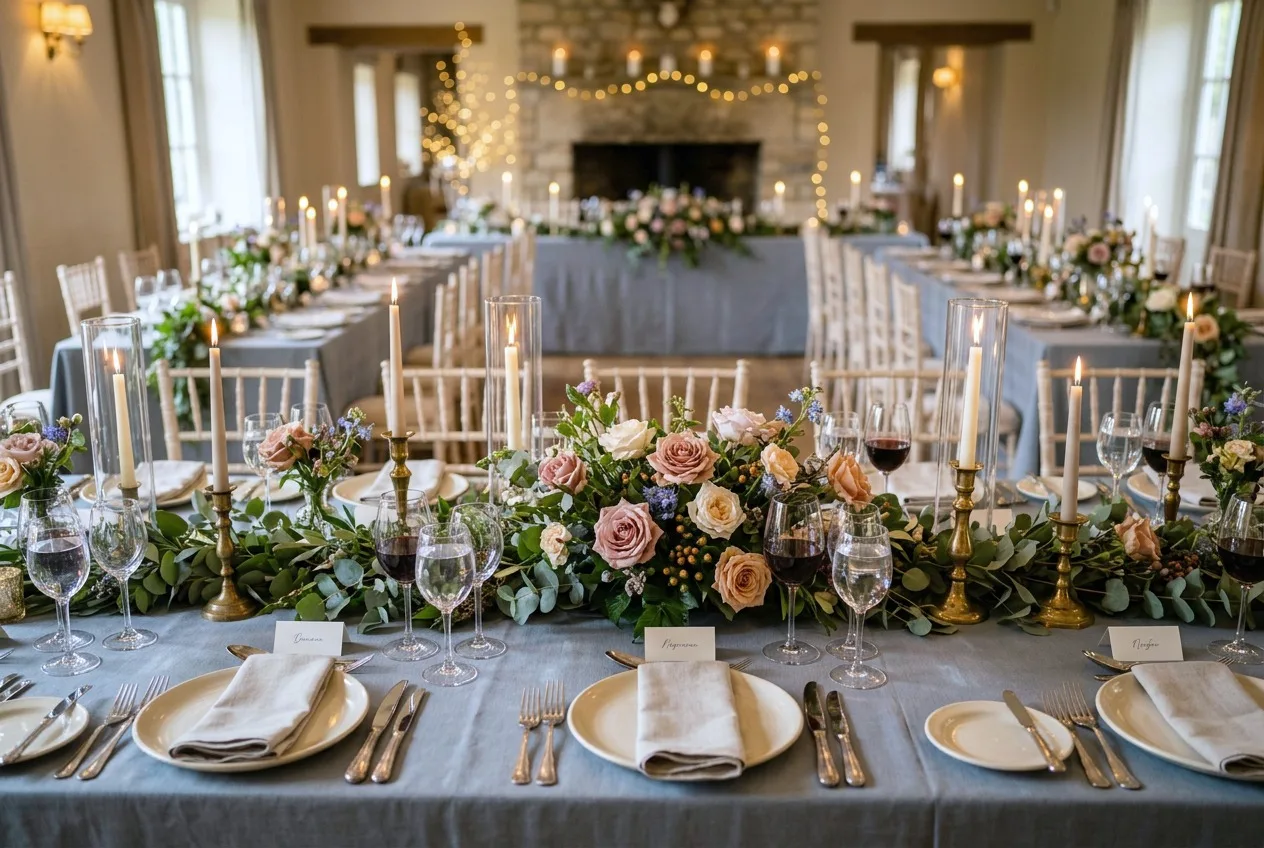
This page collects seventeen wedding color palettes, each one worked out across a real wedding day rather than shown as a single swatch. Every entry links out to its own full piece, so what’s here is the quick read: what the palette looks like, who it suits, and roughly what you’ll find when you open it.
The choice usually comes down to season and how much color you want in the room. A plum and green or olive palette reads autumn and earthy, blue and yellow reads warm-weather and bright, and an all-white or champagne palette works almost anywhere if you want a quieter look. Budget and how much building you want to do also matter, since some entries map onto buy-this lists and others lean DIY.
This is for anyone with a date and a venue but no color story yet, or anyone who already has a start — a dress, a flower, a season — and wants to see it carried through an entire day before committing to it.
Table of Contents
- A Soft Blue Palette Done Top to Bottom
- Warm Retro Blush and Chocolate Styling
- A Violet-Tinted Blue for Softer Elegance
- Deep Plum Paired With Autumn Green
- Moody Navy and Burgundy for Classic Drama
- Dusty Mauve for Vintage Romance
- Bold Cherry Red With Gold Accents
- Earthy Olive for a Mediterranean Feel
- Rich Emerald for a Jewel-Toned Reception
- Warm Chocolate Brown From Arch to Favors
- Cheerful Blue and Yellow for Summer
- Calm, Monochrome White Decor Throughout
- Sage Green Tablescapes With Gold Flatware
- Rich Jewel Tones for a Luxe Table
- Classic Black and White Contrast
- Soft Champagne Gold for Romantic Neutrals
- Timeless White and Gold Reception Style
A Soft Blue Palette Done Top to Bottom
Read the full guide19 French Blue Wedding Ideas for Couples Who Love Timeless Elegance
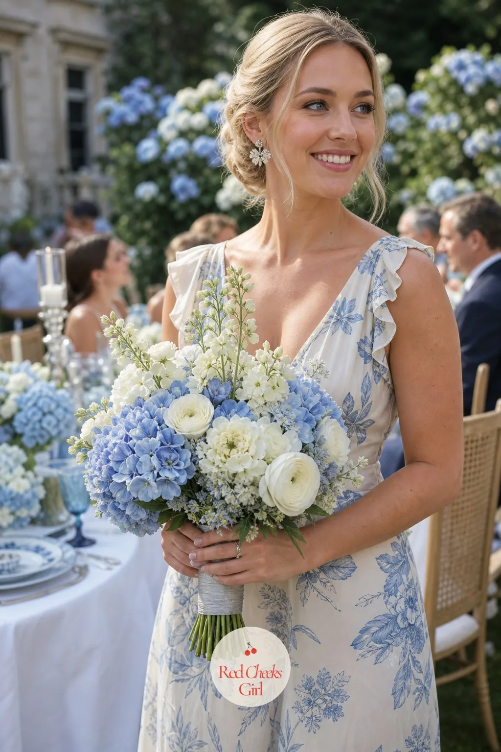
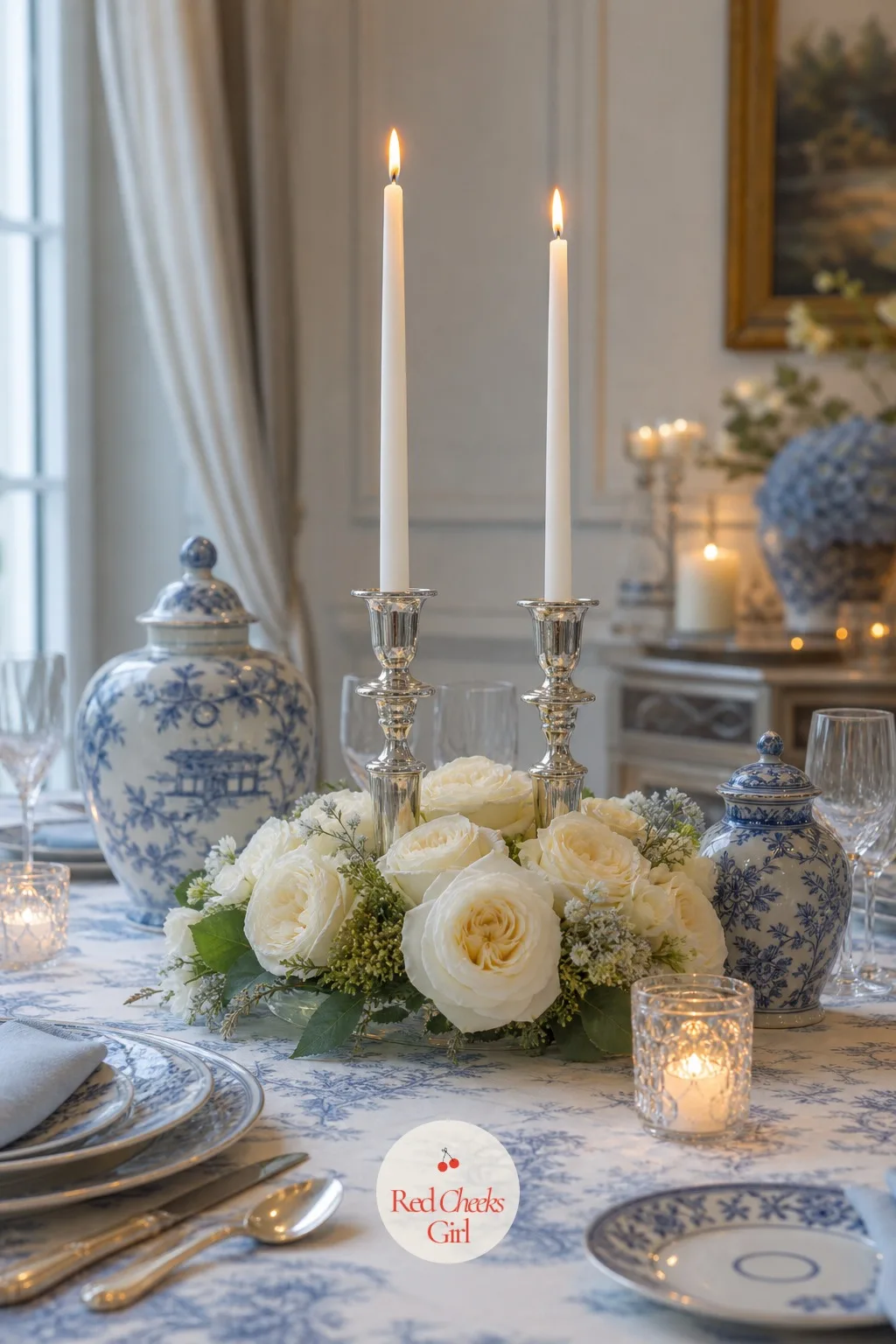
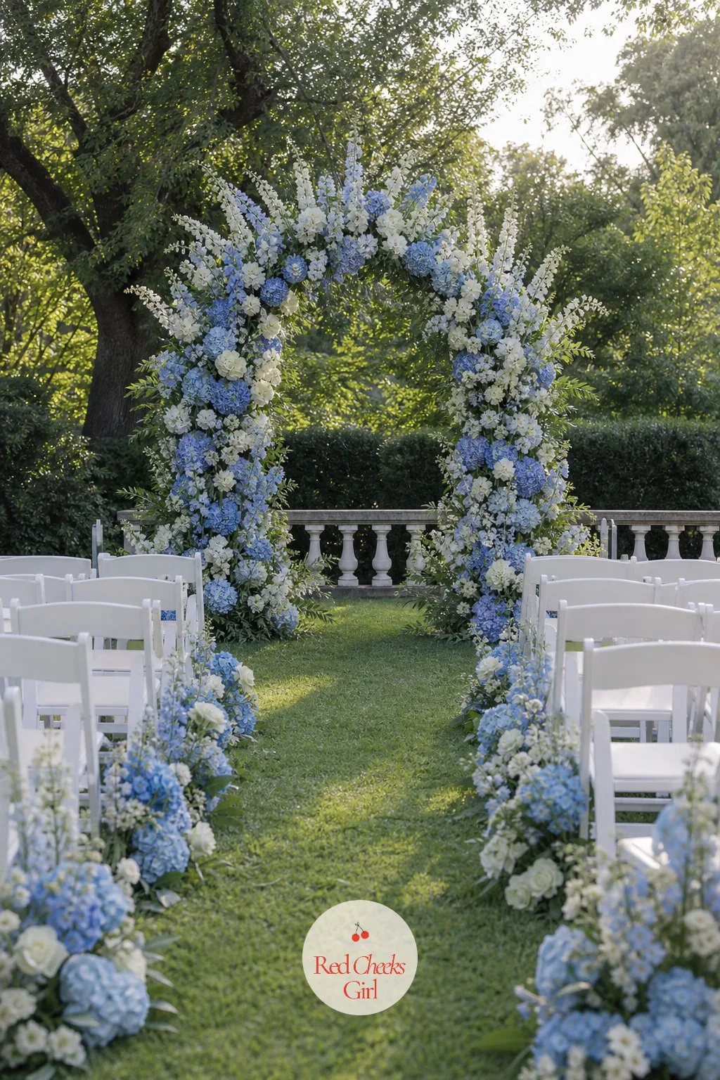
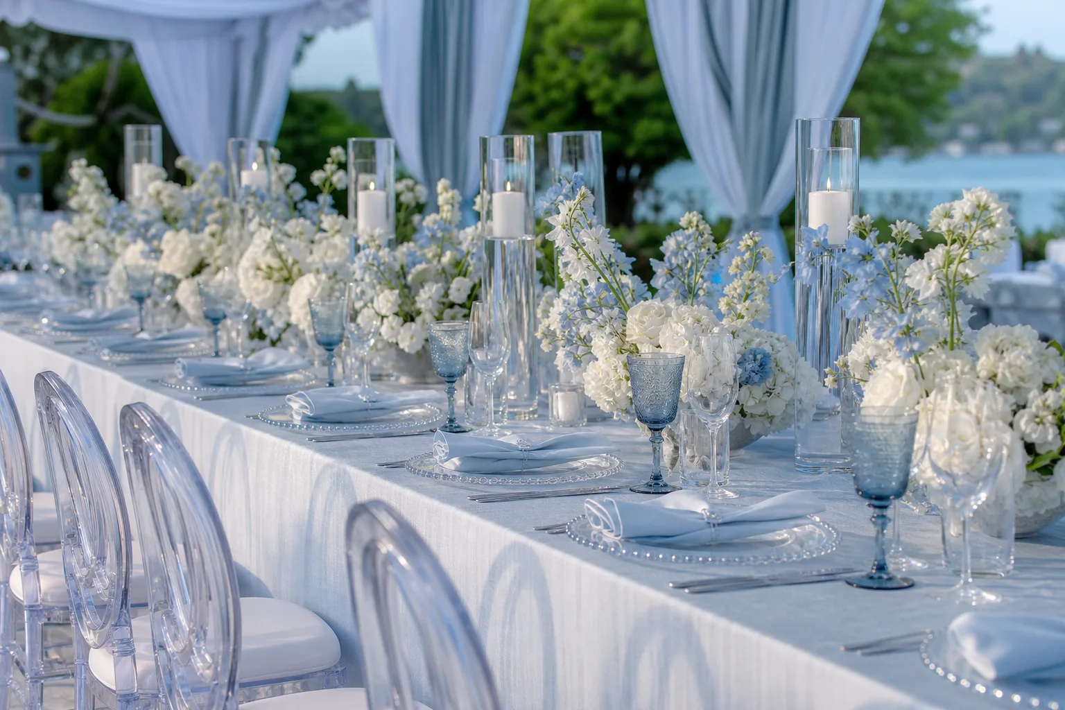
This one centers on french blue, a cool, soft shade that reads timeless rather than trendy, paired with white, cream and a touch of silver. It suits a couple who wants an elegant, slightly formal day without going stark or glossy, and it sits coolest on this page next to periwinkle and navy, which lean more violet or dark.
The piece is built in nineteen parts, moving from the biggest element down to the smallest, starting with a hydrangea arch and ending with french-blue macarons on the dessert table. I’d use it to plan big to small, ceremony backdrop first and favors last.
Warm Retro Blush and Chocolate Styling
Read the full guide22 Pink and Brown Wedding Ideas for a Retro Chocolate and Blush Look
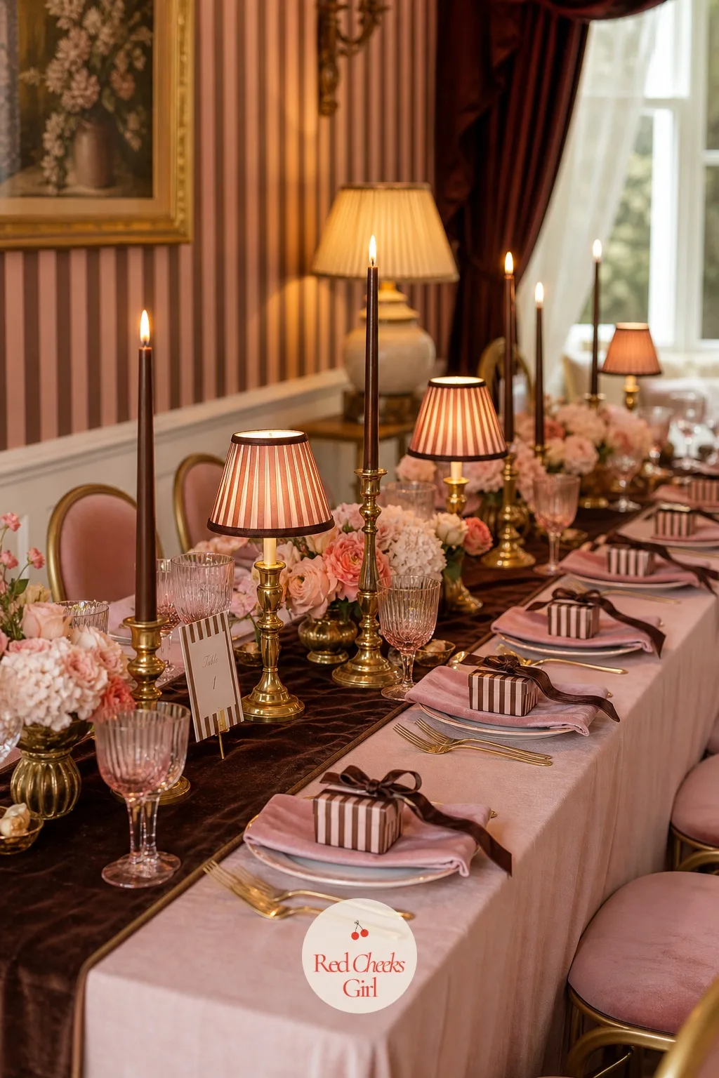
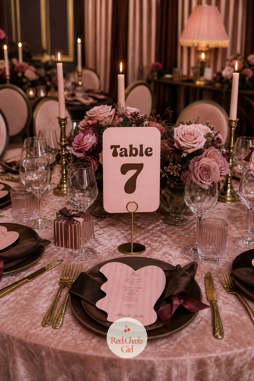
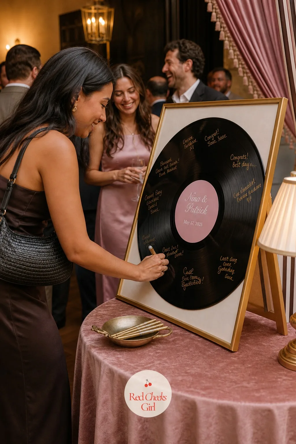
This is the retro one, pink and brown styled like a seventies reception with blush, chocolate velvet and brass instead of anything pastel-sweet. It fits a couple who wants warmth and personality over classic elegance, and it’s the only entry here mixing a neutral with pink rather than gold or cream.
Twenty-two ideas run from the backdrop at the ceremony to the printed invitation, with velvet and brass named specifically as the materials that carry the retro mood. I’d start with the backdrop since it sets the color balance for everything after it.
A Violet-Tinted Blue for Softer Elegance
Read the full guide16 Periwinkle Wedding Theme Ideas for Couples Who Love Blue With a Violet Glow
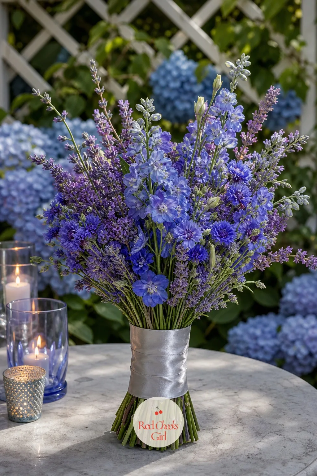
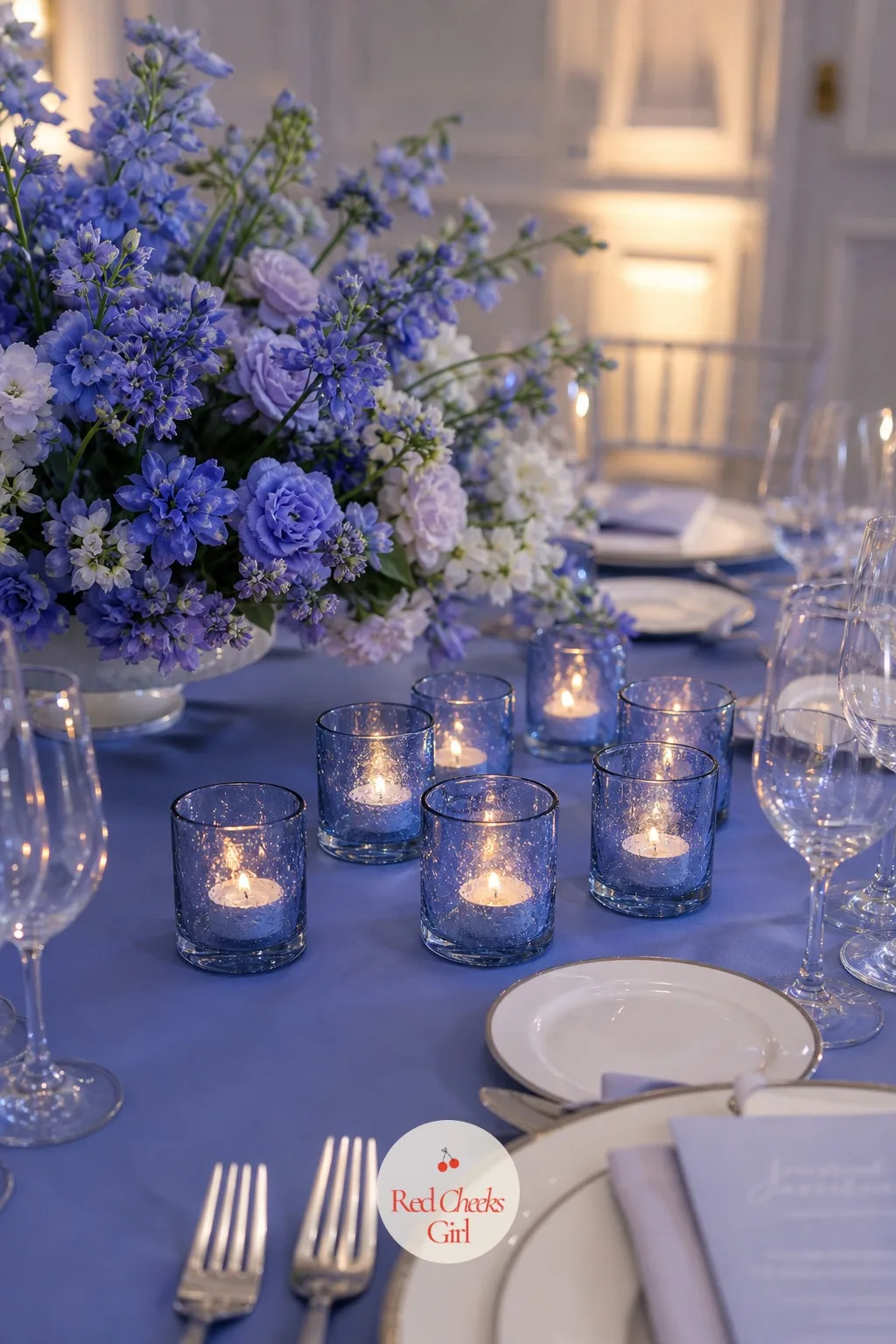
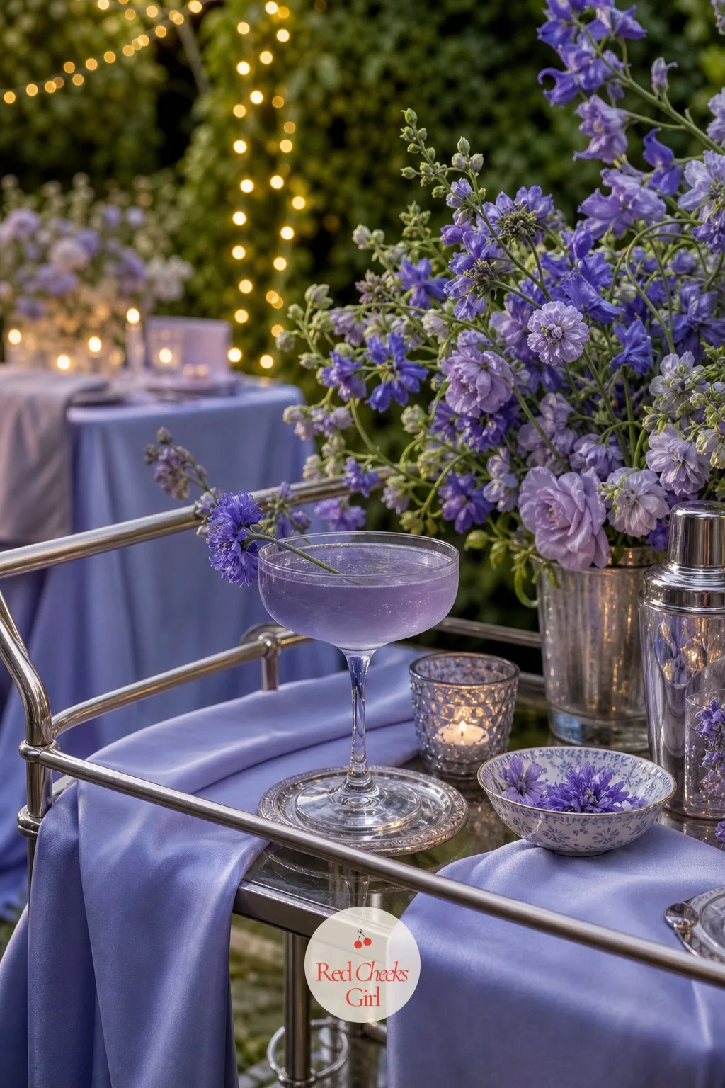
Periwinkle sits between blue and violet, so this palette reads softer and a little more romantic than straight blue, built on periwinkle, cornflower blue, lavender and silver. It’s for a couple who likes the french blue idea above but wants more warmth from a violet undertone, for a spring or garden-leaning day.
Sixteen ideas cover the detail layer of a wedding, tablecloths and invitations rather than big structural builds, so it’s the entry to use once the ceremony backdrop is already decided and the table and paper goods still need a palette.
Deep Plum Paired With Autumn Green
Read the full guide20 Plum and Green Wedding Ideas for an Autumn Palette With a Twist
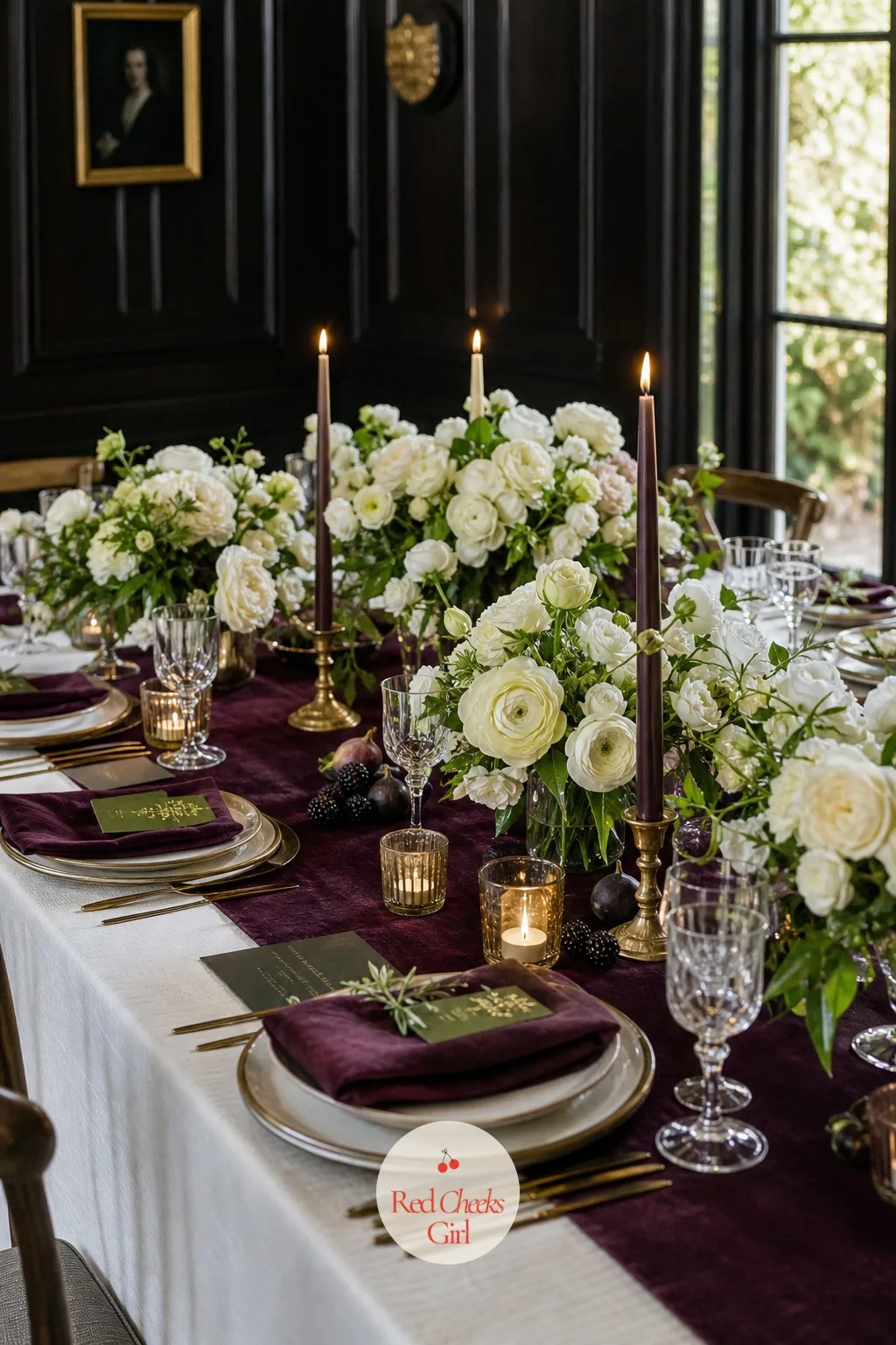
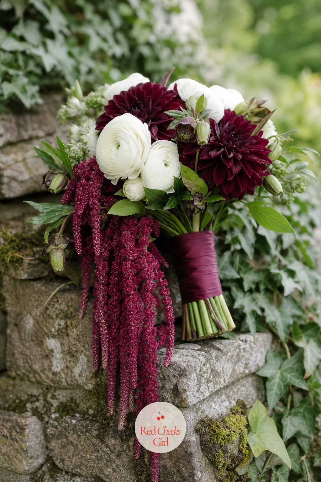
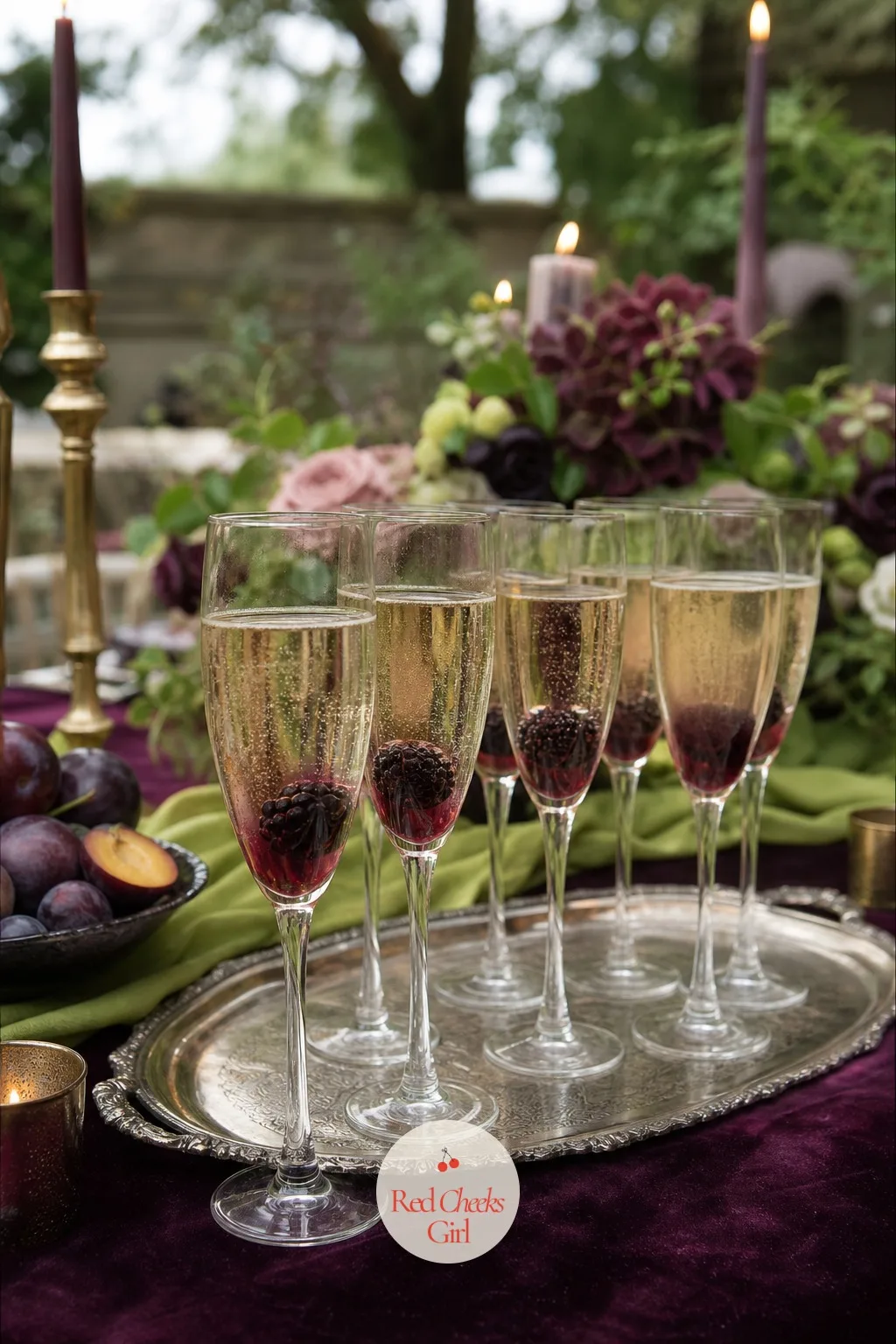
Plum and green is the autumn pairing here, a deep wine-dark purple against a working green rather than the lighter, mauve-adjacent tone further down the page. It’s for a couple marrying in fall who wants a palette with a twist, somewhere between classic and unexpected, for a day that feels considered rather than seasonal-default.
Twenty ideas run from the ceremony arch to the favors, and the article’s own language promises real build notes for every part of the day, useful if you’re handing pieces to a florist or planner one at a time rather than all at once.
Moody Navy and Burgundy for Classic Drama
Read the full guide17 Navy Blue and Burgundy Wedding Ideas for a Classic Moody Palette
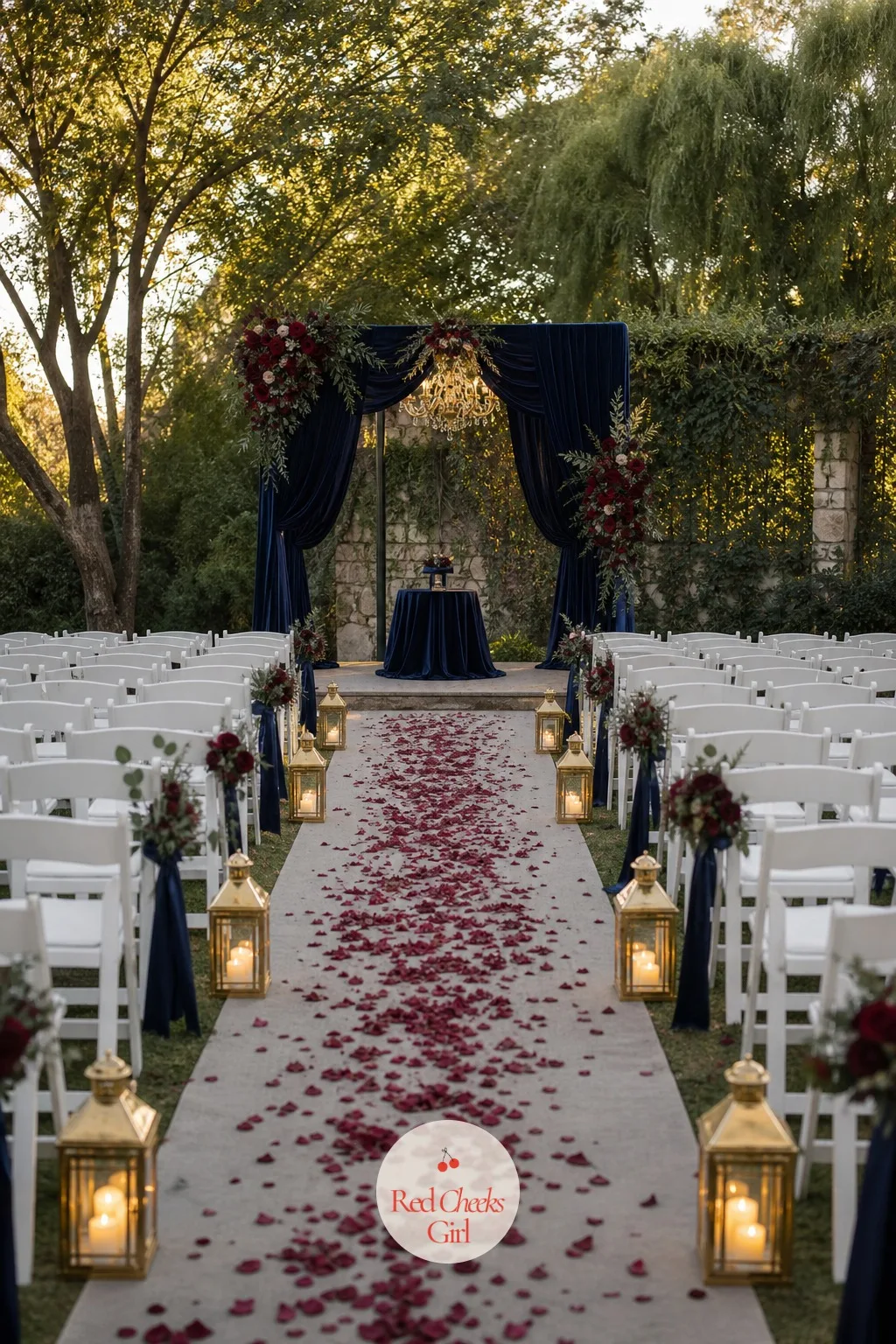
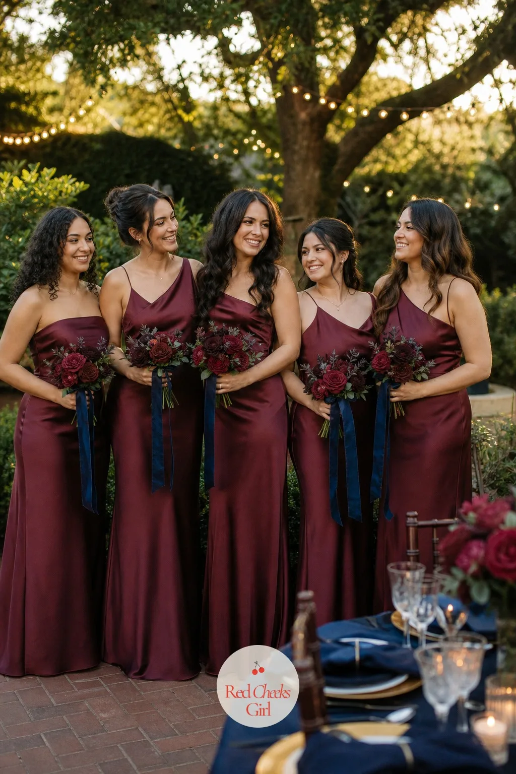
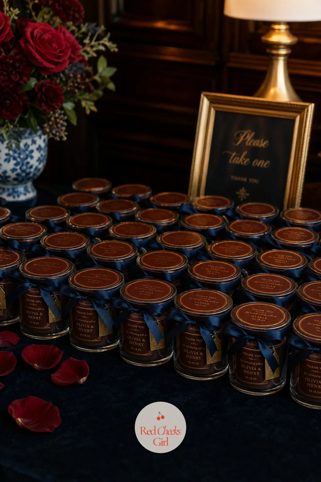
Navy and burgundy is the moodiest palette on this page, dark blue against deep red with gold lighting pulling it away from heavy and toward rich. It suits an evening reception or a couple who wants classic without pastel, and it reads more formal than the plum and green or mauve entries nearby.
Seventeen ideas move from the ceremony arch to the favors, and the piece is written as one palette you can hand straight to a vendor, which matters if you’re working with a florist or rental company who needs a single reference rather than a mood board.
Dusty Mauve for Vintage Romance
Read the full guide21 Mauve Wedding Ideas for Couples Who Love a Soft Vintage Romance
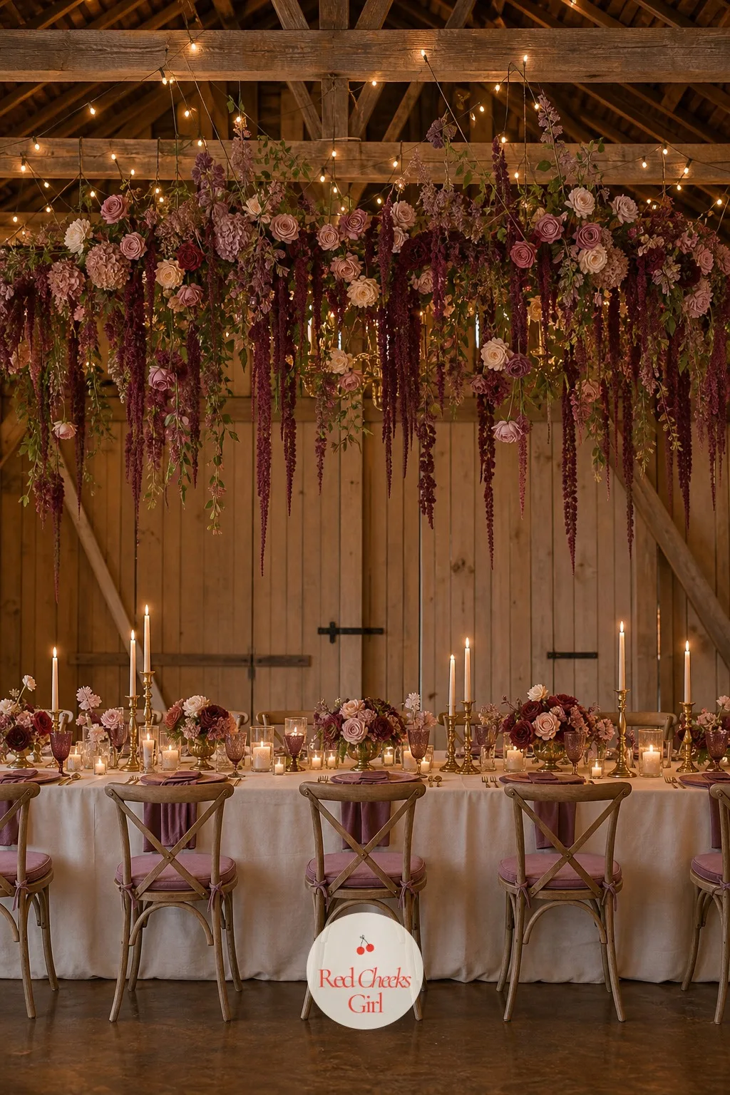
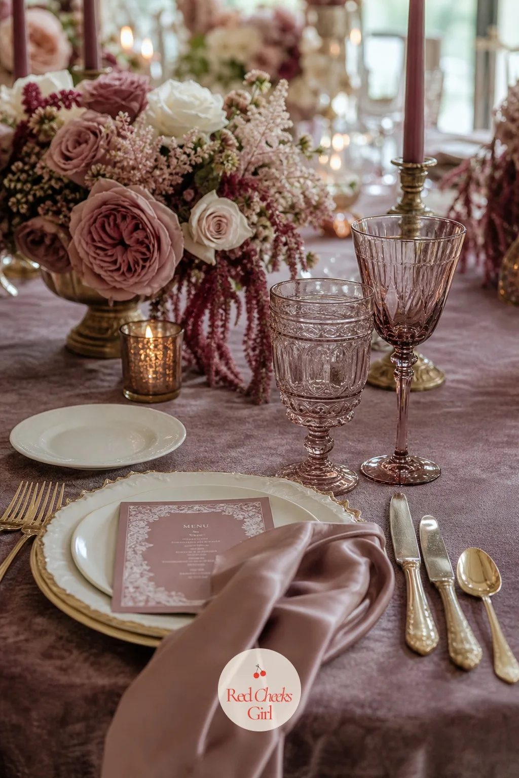
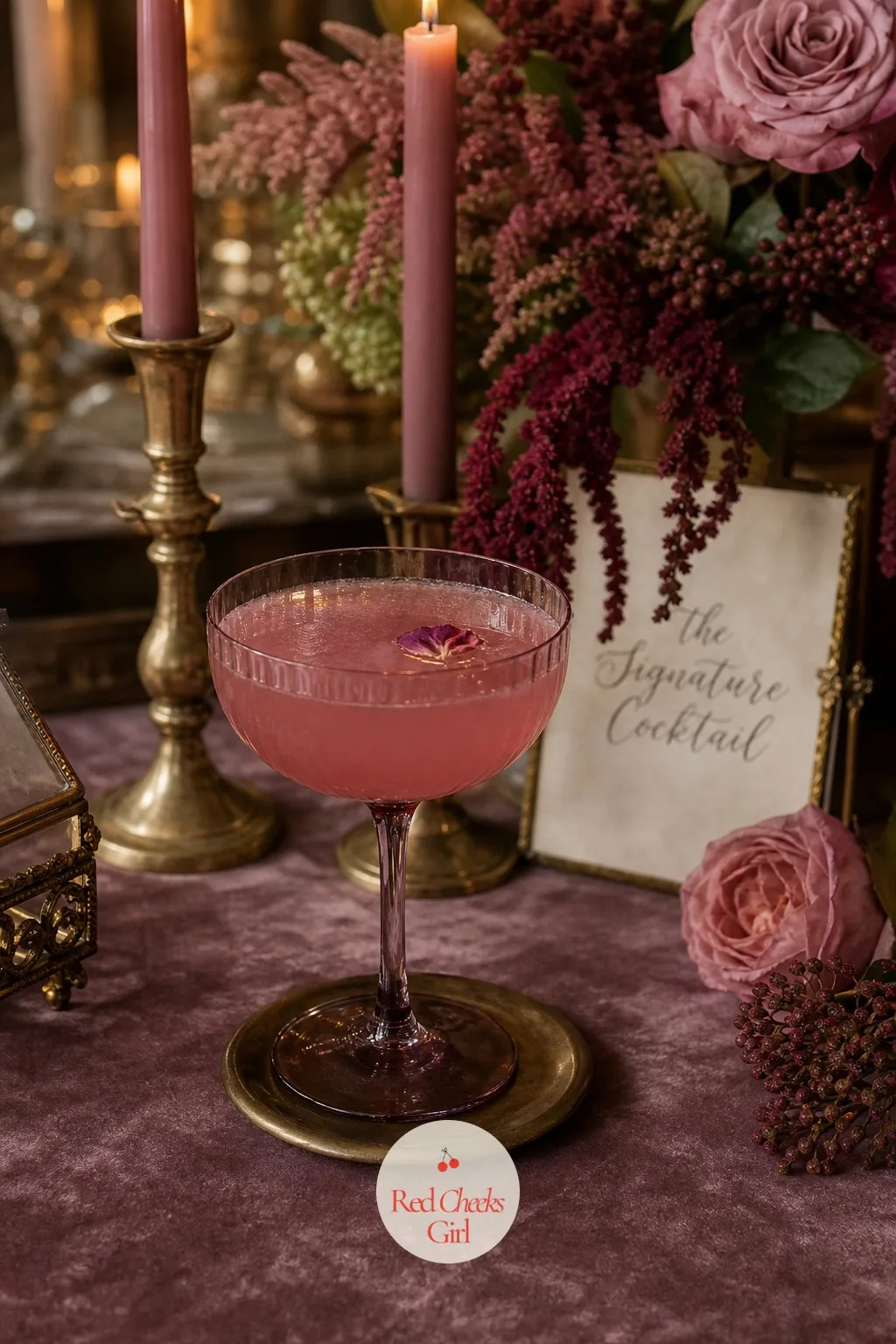
Mauve is the soft, vintage-leaning option, dusty mauve and antique rose warmed up with cream and a little burgundy for depth. It fits a couple after romance over drama, lighter and more nostalgic than the navy and burgundy palette, and less structured than the plum and green autumn pairing.
Twenty-one ideas run from the ceremony arch to the favors guests actually carry home, so the piece covers the full day rather than just the reception, useful if you want one consistent look from the first photo to the last.
Bold Cherry Red With Gold Accents
Read the full guide18 Cherry Red Wedding Ideas for Couples Who Want Bold Romantic Color
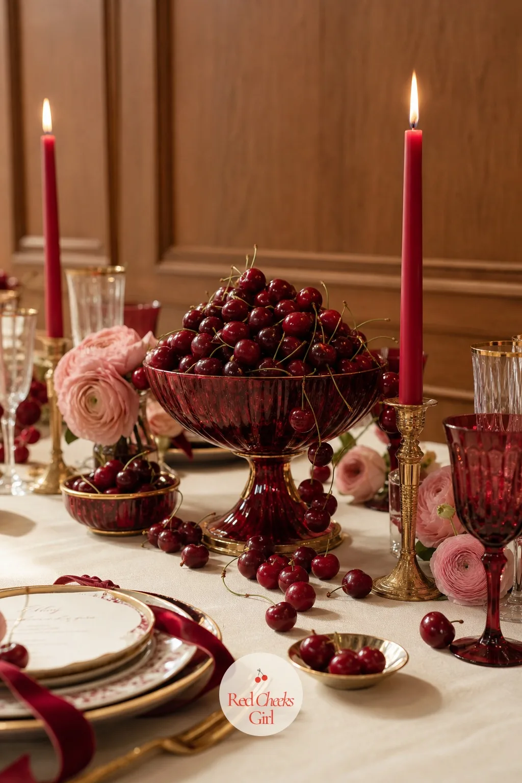
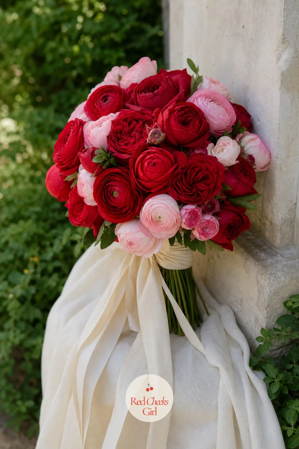
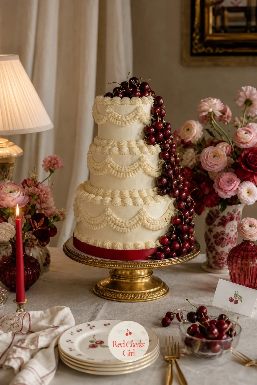
Cherry red is the bold choice here, a saturated red next to cream and soft pink with gold worked through, built for a couple who wants color to lead rather than support. It’s warmer and more playful than navy and burgundy, and less neutral than the brown or champagne entries further down.
Eighteen ideas cover the day from ceremony arch to favors, with gold named as the accent that keeps the red from feeling too heavy, which is the detail I’d take first if I were briefing a florist on this one.
Earthy Olive for a Mediterranean Feel
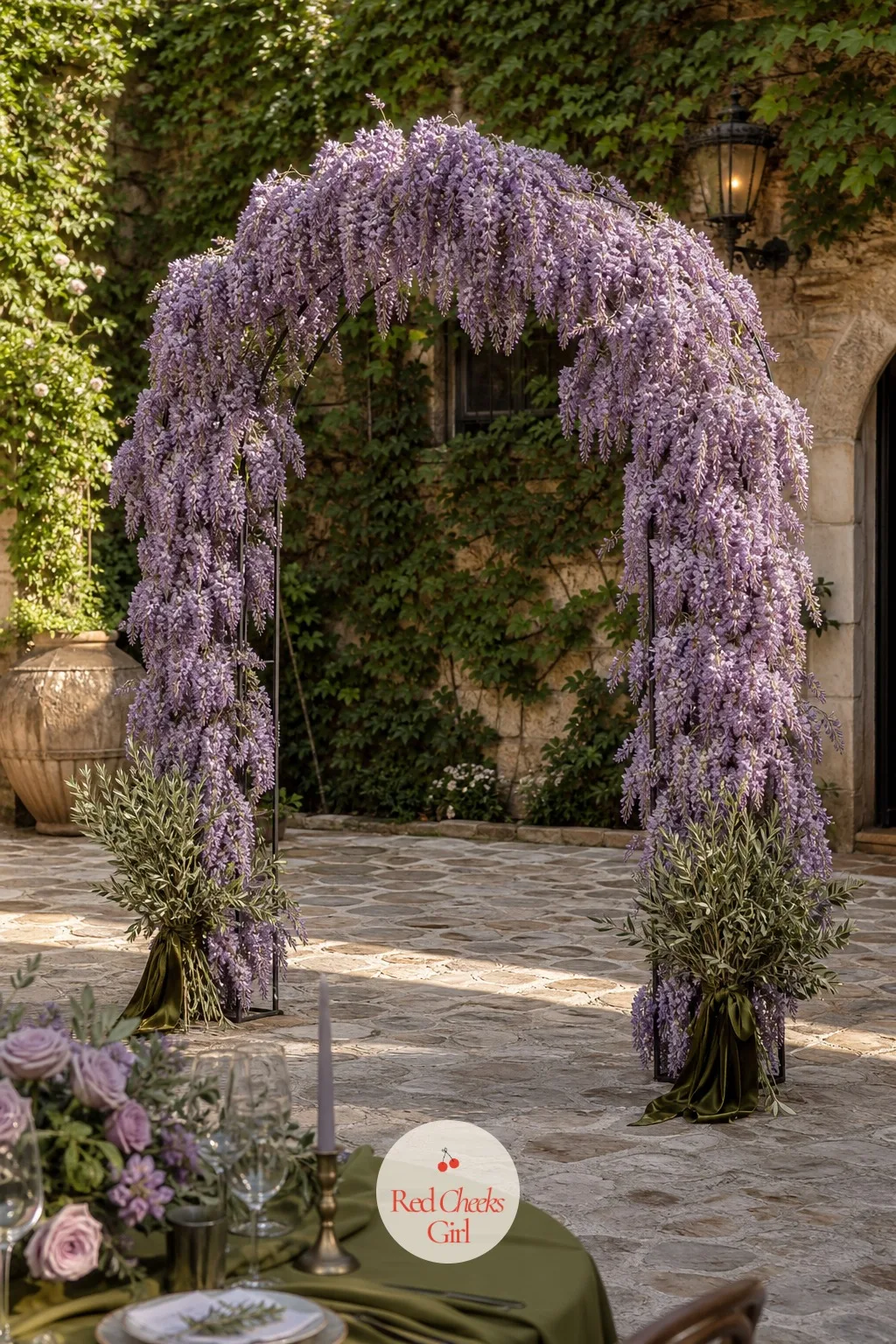
Read the full guide19 Olive Green Wedding Ideas for Couples Who Love an Earthy Mediterranean Mood
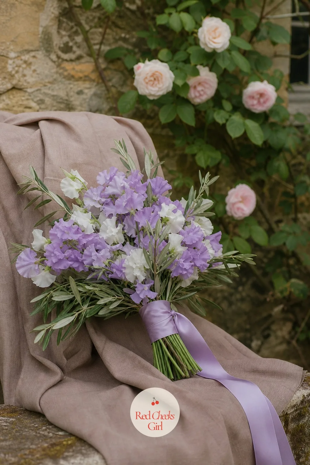
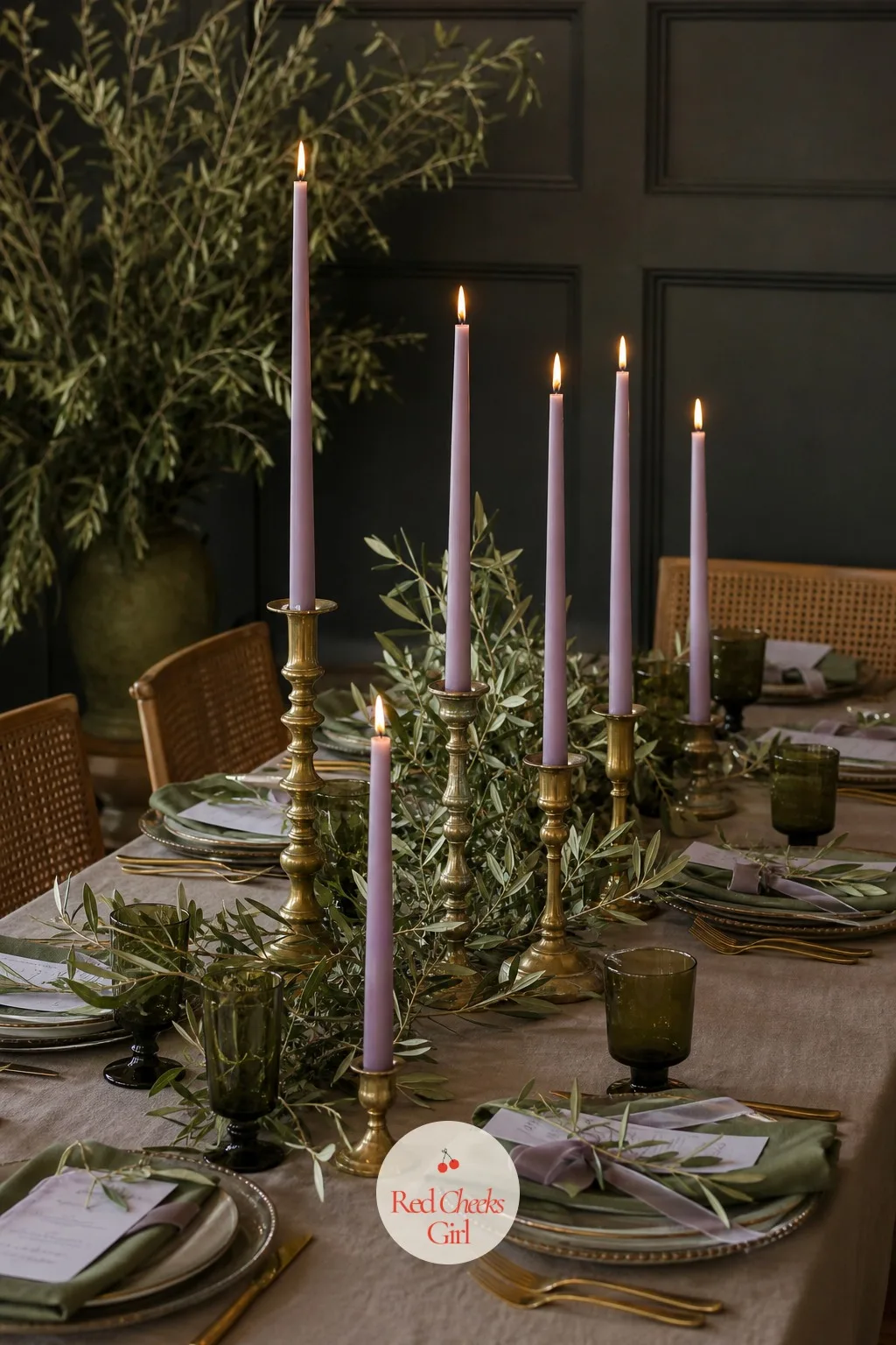
Olive green brings an earthy, Mediterranean feel, paired with French lilac and soft mocha rather than the cooler sage further down this page. It suits an outdoor or destination-style wedding, somewhere a couple wants greenery to feel grown rather than arranged, and it reads warmer and more rustic than emerald or jewel tones.
The piece runs from the ceremony trees down to the invitation, and it’s written so you can take the whole look or borrow just one table, worth knowing if you only need ideas for the reception rather than the full day.
Rich Emerald for a Jewel-Toned Reception
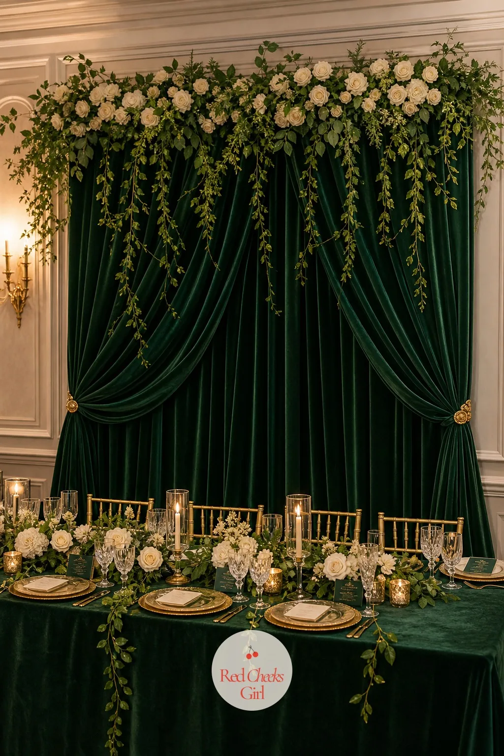
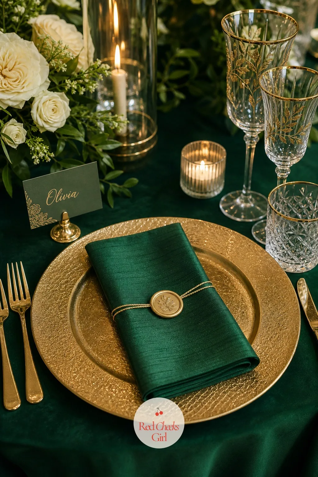
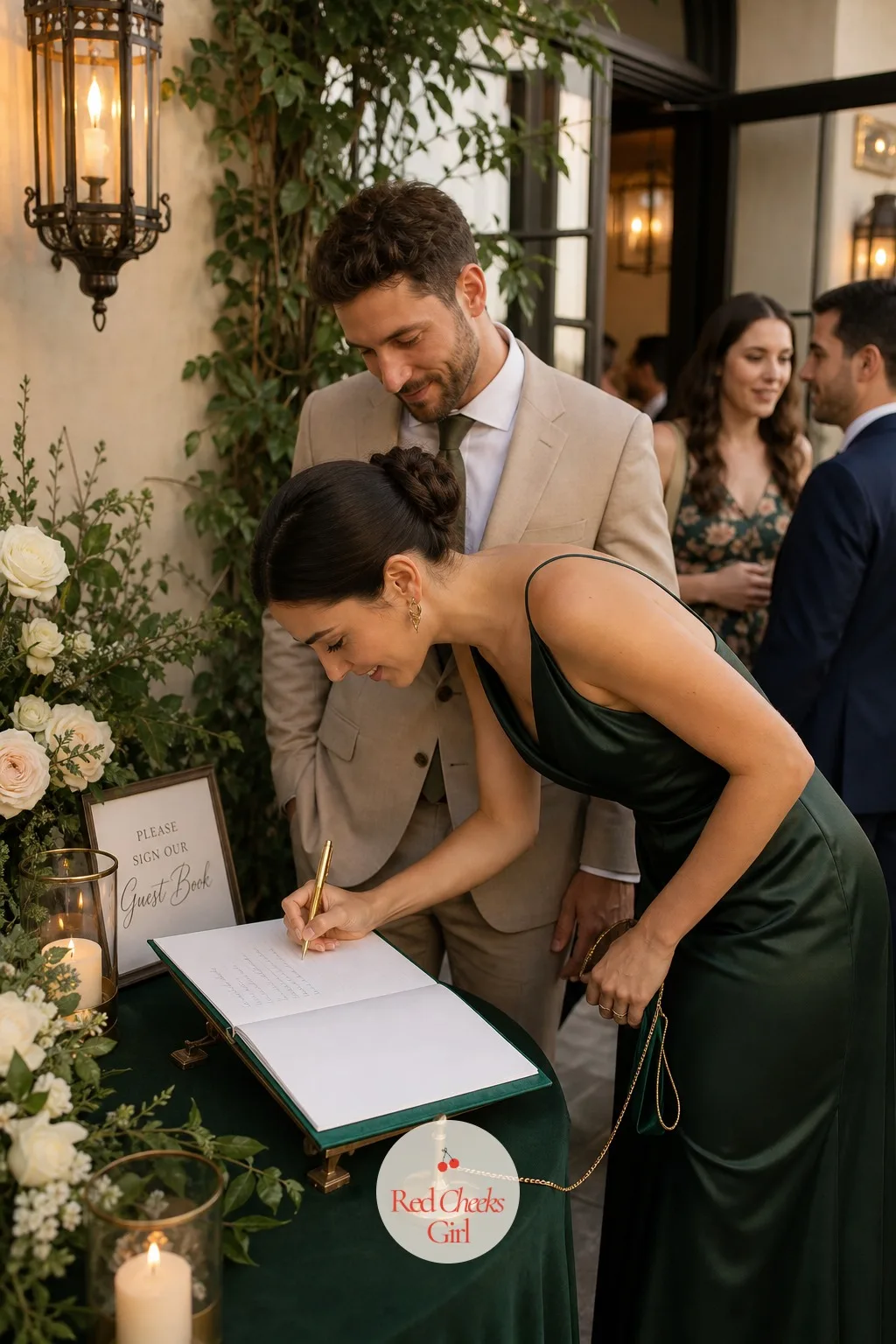
Read the full guide23 Emerald Green Wedding Theme Ideas for a Rich Jewel-Toned Celebration
Emerald green is the richest green on this page, paired with gold and ivory for a jewel-toned reception rather than olive’s earthier mood. It fits a couple who wants formal, slightly glamorous color, closer in spirit to the jewel tone entry than to sage or olive.
Twenty-three ideas move from drapery behind the head table down to the invitation and favors, so the structural, big-ticket pieces come first, which is where I’d start if drapery or backdrop is the first thing you’re booking.
Warm Chocolate Brown From Arch to Favors
Read the full guide24 Brown Wedding Theme Ideas for Couples Who Love Warm Chocolate Elegance
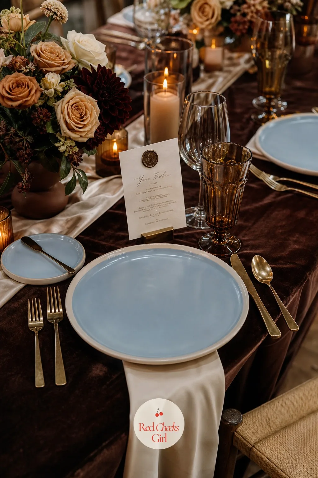
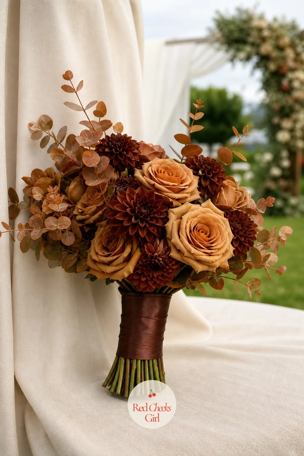
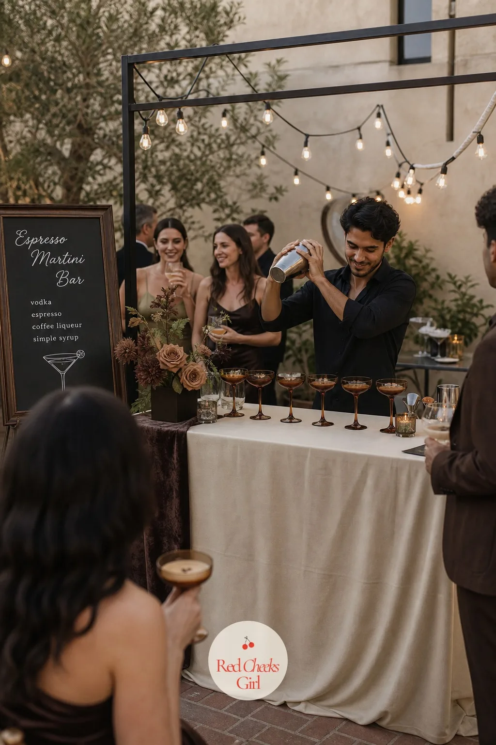
Brown is the broadest neutral-with-warmth palette here, chocolate, espresso and caramel softened with cream and a surprising touch of powder blue. It suits a couple who wants warm, grounded elegance rather than anything pastel or jewel-toned, and the powder blue accent is what separates it from the pink and brown entry above.
Twenty-four ideas run from the ceremony arch to the favor boxes, the largest count on this page after black and white, so there’s room to pull ideas for every part of the day without repeating a look.
Cheerful Blue and Yellow for Summer
Read the full guide22 Blue and Yellow Wedding Ideas for Couples Who Want Pure Summer Happiness
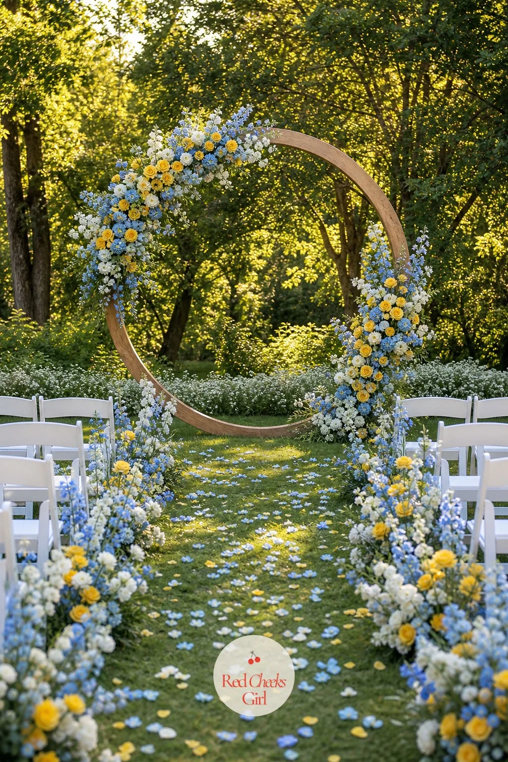
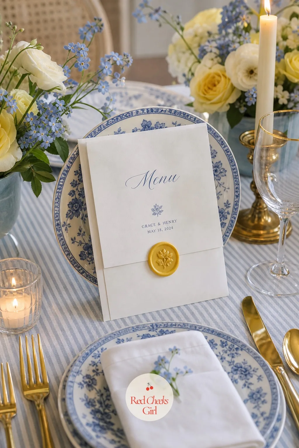
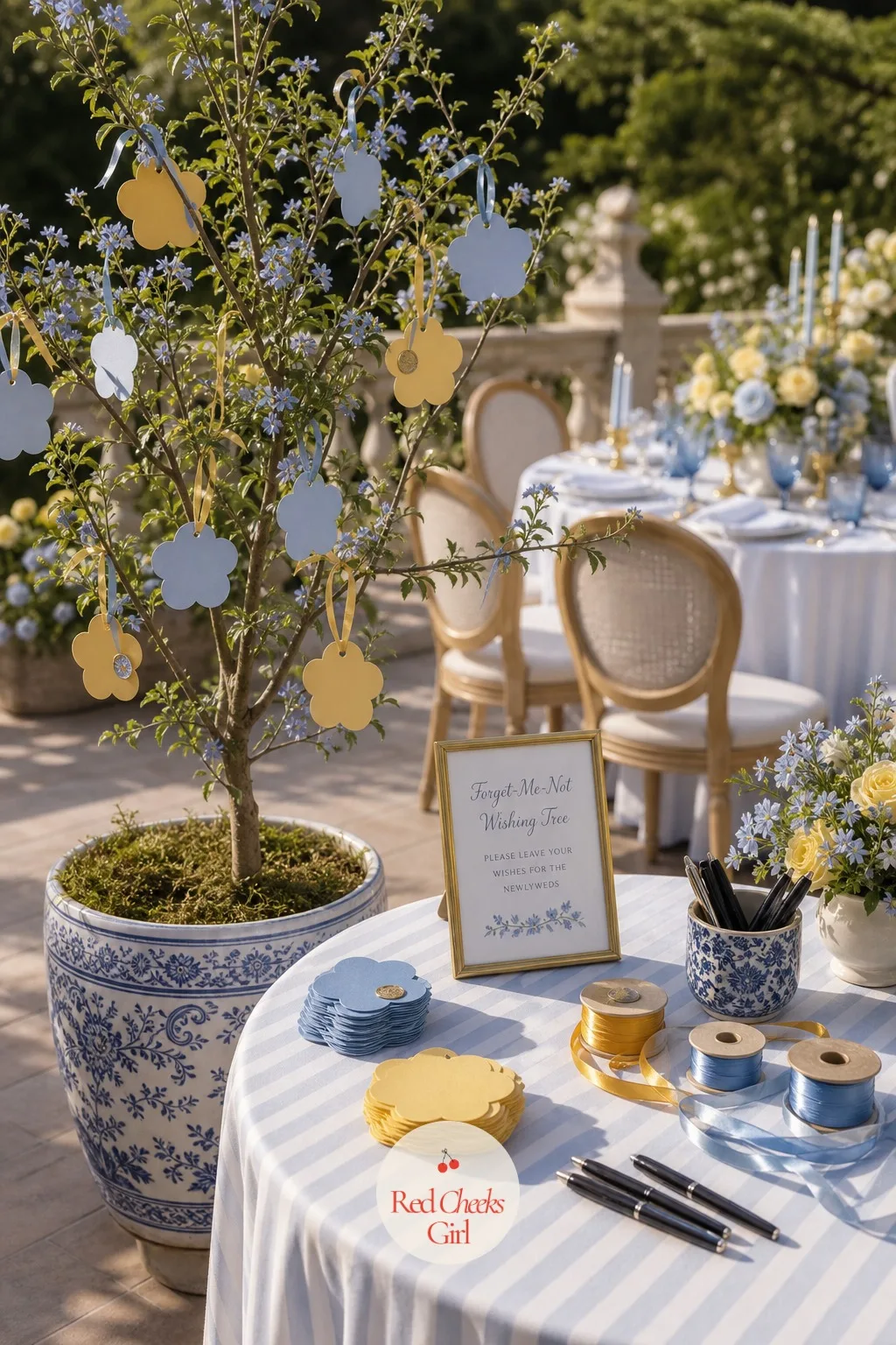
Blue and yellow is the happiest, most summery pairing here, built around a forget-me-not arch rather than anything structured or formal. It fits a couple marrying in warm weather who wants a palette that photographs cheerful, and it stands apart from every other blue entry on this page by leaning bright rather than muted.
Twenty-two ideas include a long guest table, a lemon blueberry cake and coffee bag favors, concrete pieces you could lift individually, and the invitation that the article says starts the whole look, so that’s the first thing I’d design.
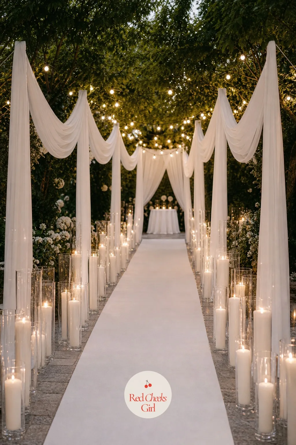
Calm, Monochrome White Decor Throughout
Read the full guide22 All White Wedding Decor Ideas That Look Calm and Luxurious
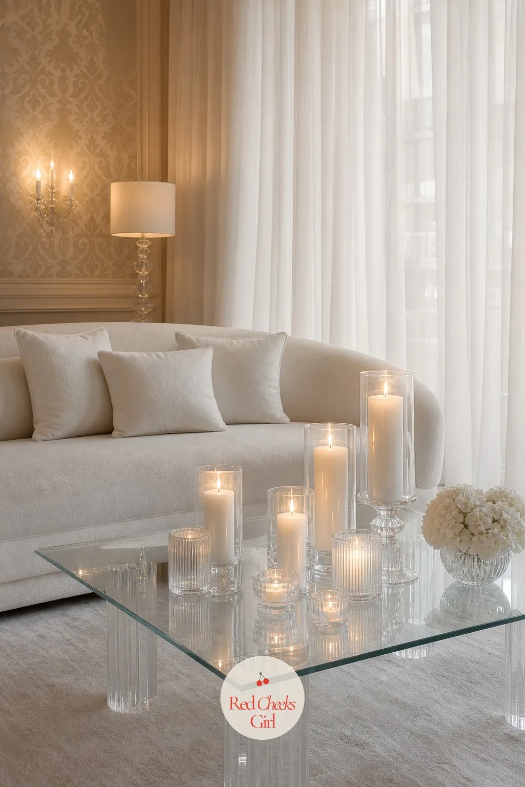
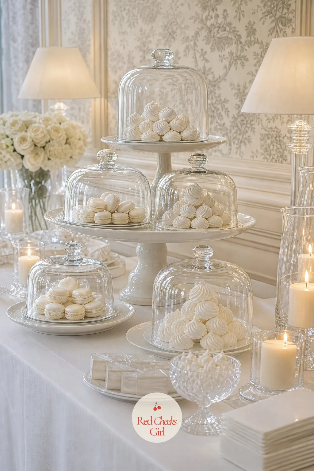
All white is the calmest option on the page, built on sheer drapery, crystal and clear glass rather than any accent color at all. It suits a couple who wants a luxurious, minimal look and doesn’t want to coordinate a second or third color, and it reads cooler and more formal than champagne or white and gold.
Twenty-two ideas run from the aisle to the invitation, and the piece specifies what to buy for each one, which matters here since an all-white room depends on texture and material rather than color contrast to avoid looking flat.
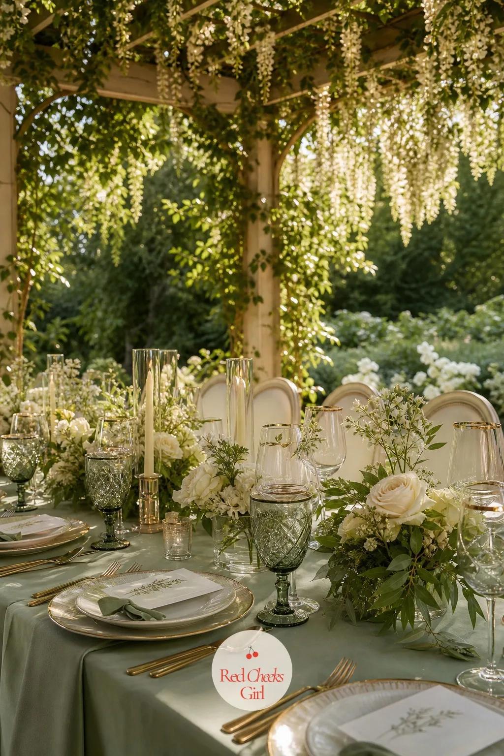
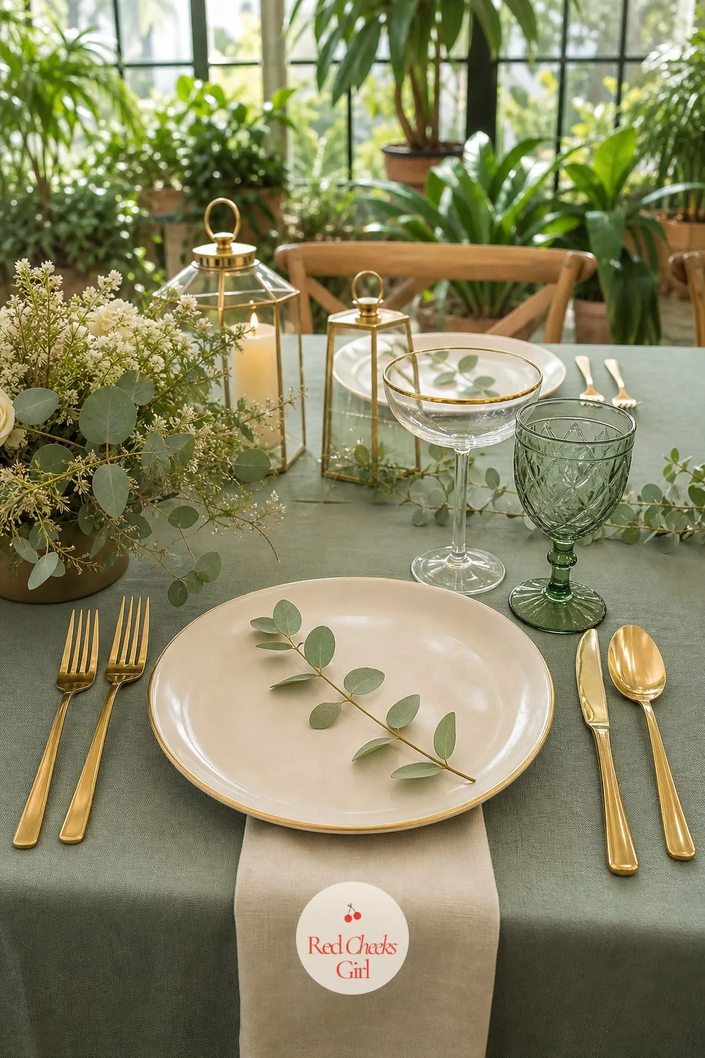
Sage Green Tablescapes With Gold Flatware
Read the full guide20 Sage Green Wedding Table Setting Ideas With Cream and Gold
This one is narrower than most entries here, a sage green table setting rather than a full-day palette, pairing cream china and gold flatware with eucalyptus. It suits a couple who already has the big decisions made and just wants the reception table to photograph well, or anyone layering sage into a different overall palette.
Twenty ideas focus on the table itself, china, flatware and greenery specifically, so it’s the entry to use once a venue and linens are booked and the place settings are the piece still undecided.
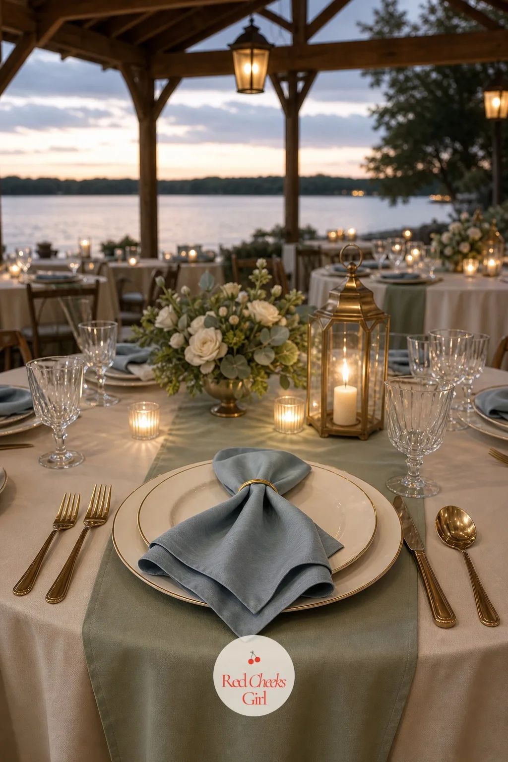
Rich Jewel Tones for a Luxe Table
Read the full guide21 Jewel Tone Wedding Decor Ideas in Emerald, Sapphire and Ruby
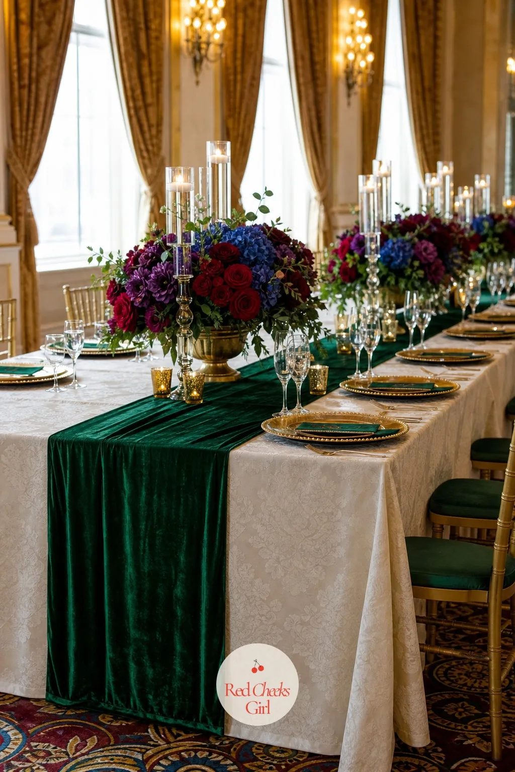
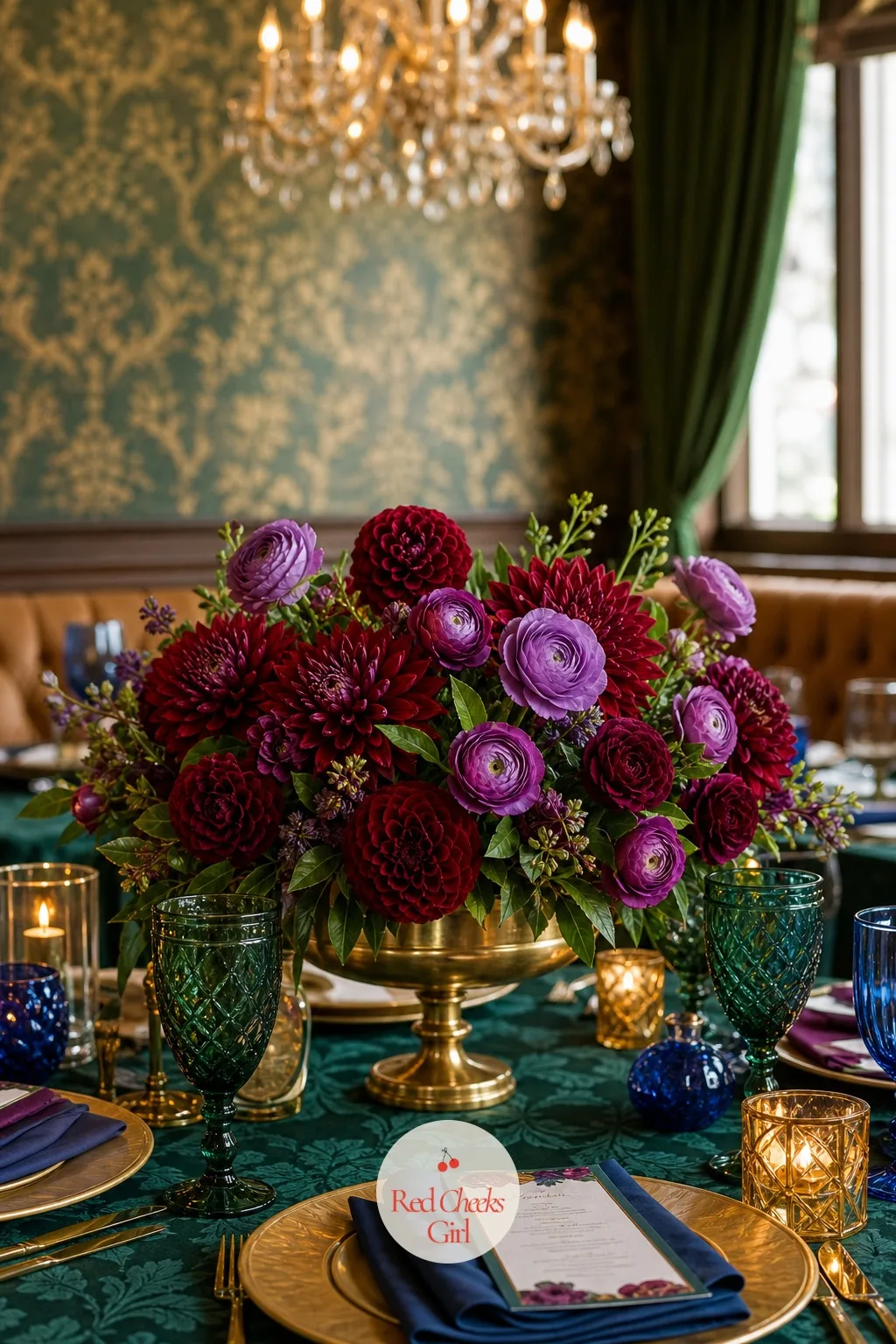
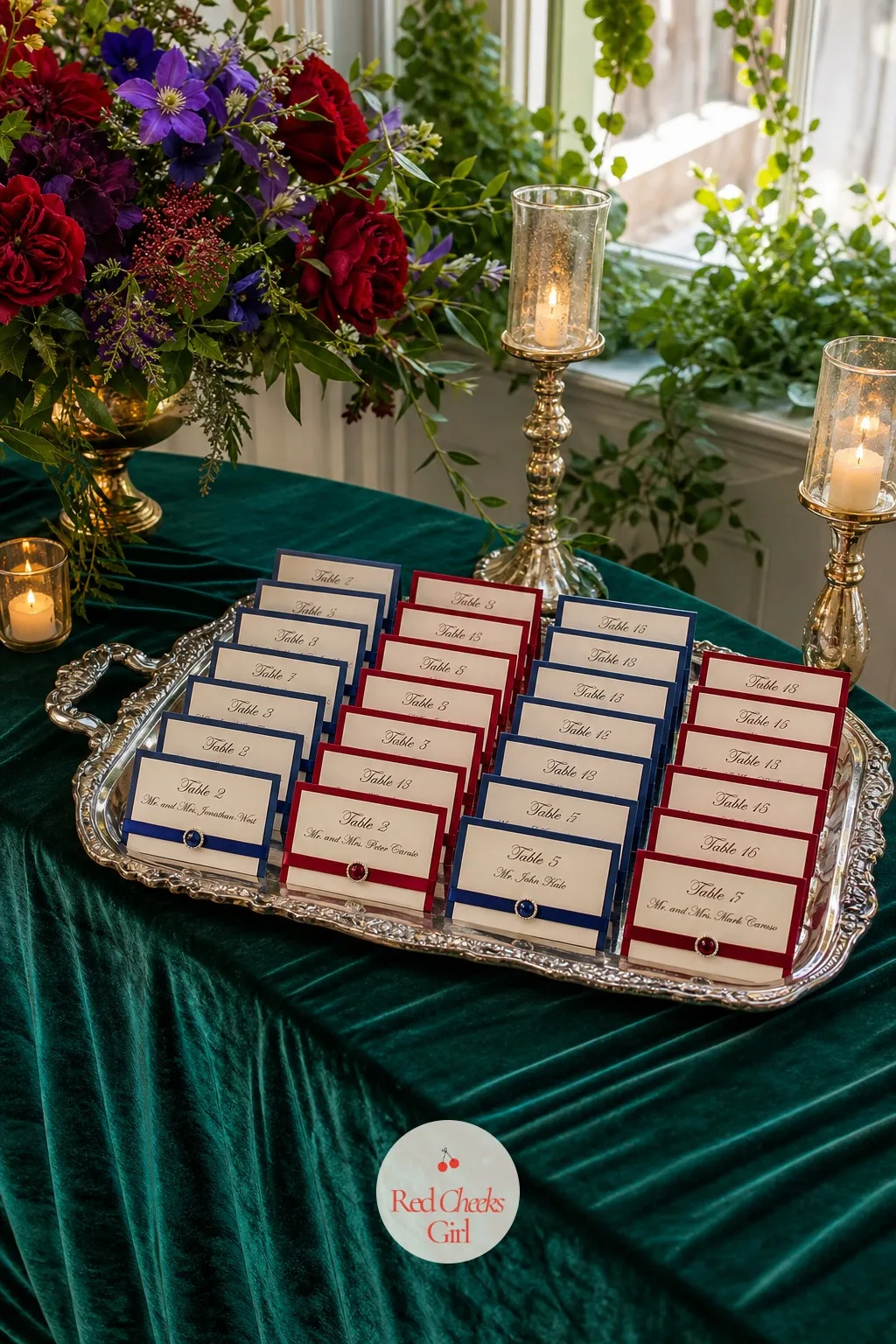
Jewel tone decor combines emerald, sapphire and ruby rather than choosing one, for a couple who wants richness and a bit of drama without settling on a single accent color. It’s bolder and more layered than the single-tone emerald or cherry red entries, closer in spirit to a formal evening reception.
Twenty-one ideas include table runners, glassware, a peacock-blue bar, cake and favors, and the piece is explicit about keeping the look rich rather than dark, which is the balance I’d watch for first when picking lighting and linens.
Classic Black and White Contrast
Read the full guide27 Black and White Wedding Decor Ideas With Classic Contrast
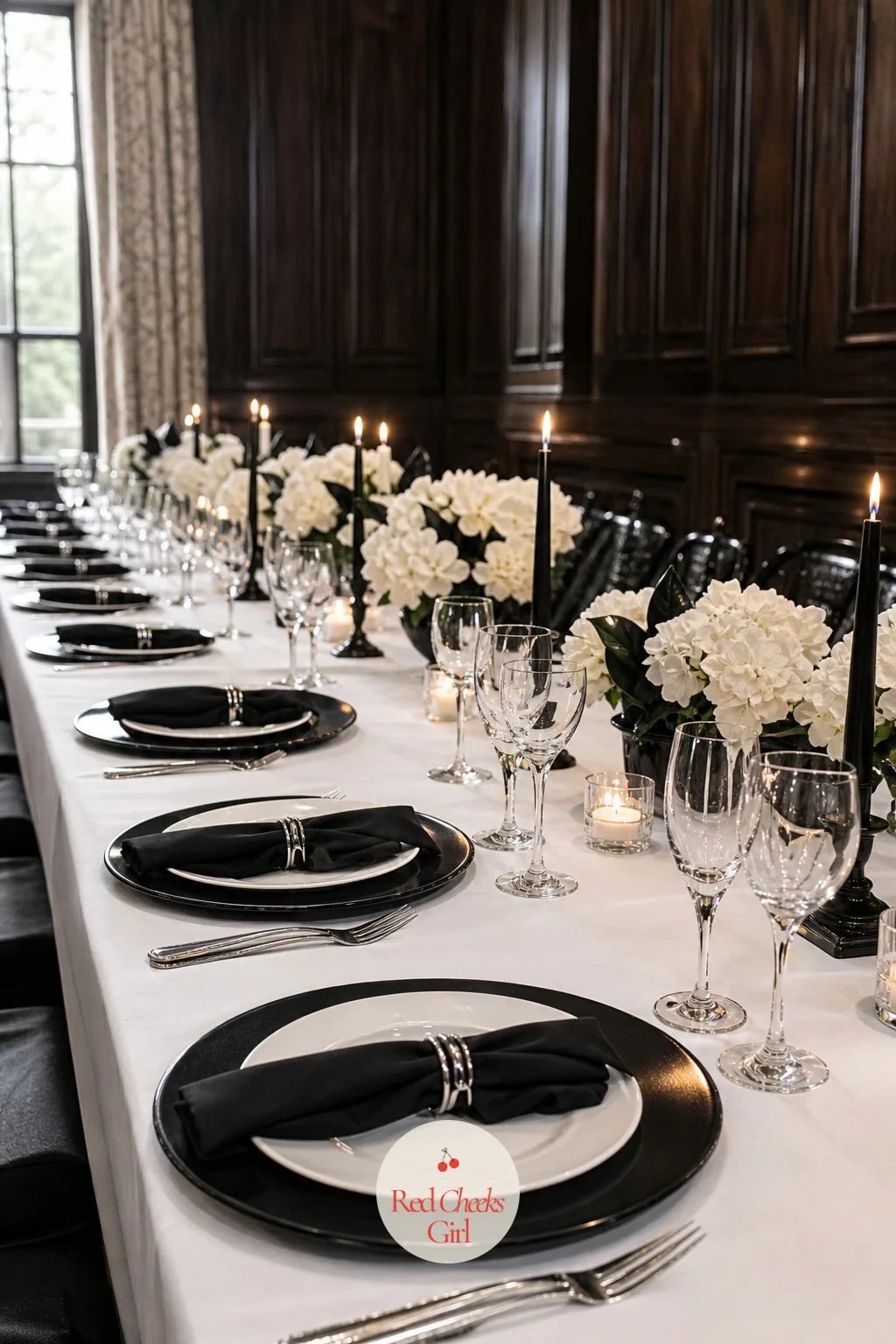
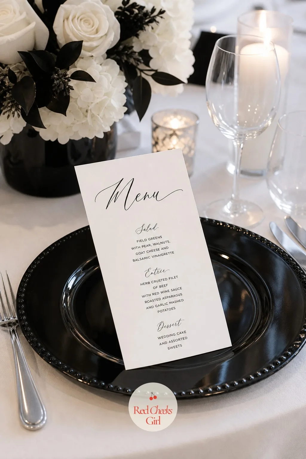
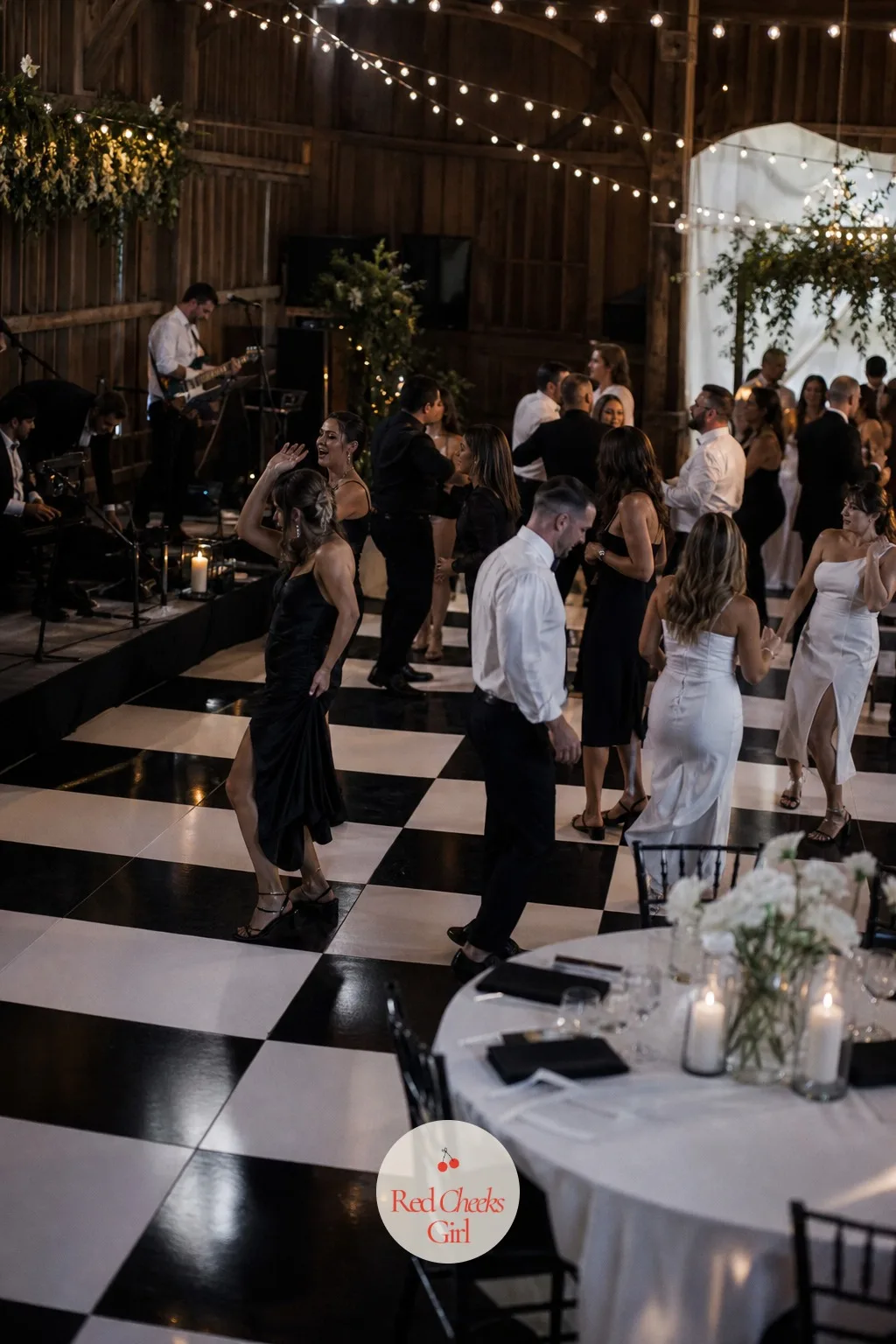
Black and white is the starkest contrast on this page, no accent color at all, built for a couple who wants classic drama that works at nearly any venue. It’s the opposite approach to the softer mauve or champagne palettes, and it photographs graphic rather than romantic.
Twenty-seven ideas, the longest list here, run from a striped tent to the send-off table, and the article says each one is built to copy at any venue or budget, which makes it a good source for single pieces rather than a full-day plan.
Soft Champagne Gold for Romantic Neutrals
Read the full guide24 Champagne Wedding Ideas in Soft Gold, Ivory and Blush
Champagne is a soft, warm neutral palette, built on champagne, ivory and blush with gold worked through, gentler than white and gold and less structured than brown. It suits a couple who wants romance without strong color, and it sits closest to the all-white entry but with more warmth.
Twenty-four ideas run from the ceremony arch to the invitation, and the piece includes what to buy and what to skip, useful if you’re trying to keep this palette on a tighter budget.
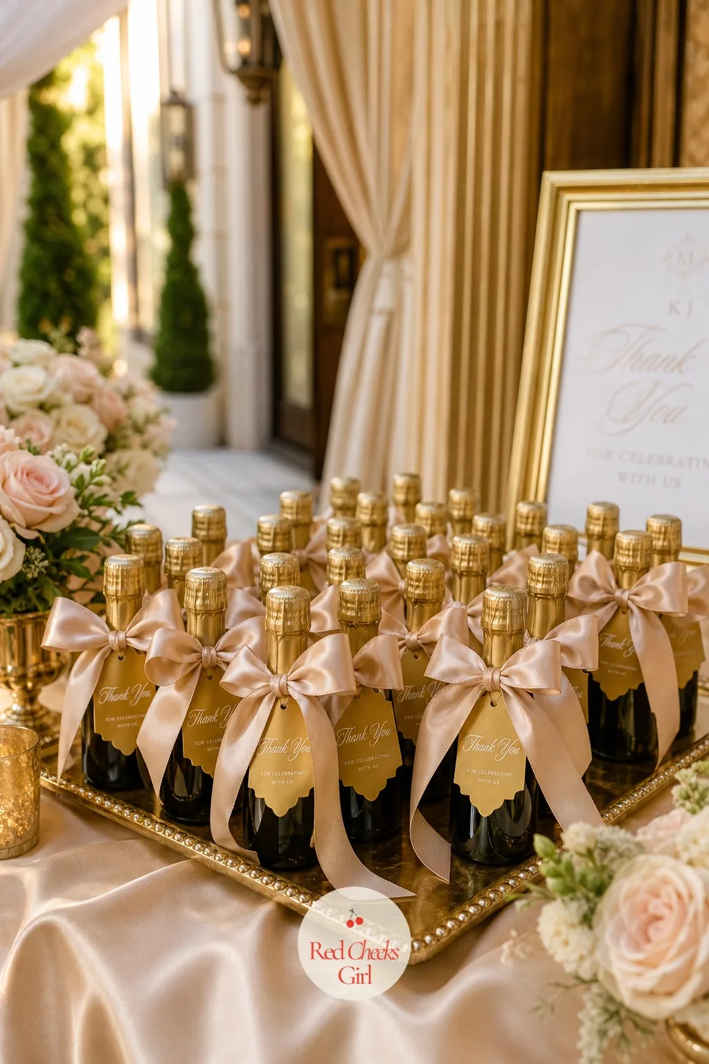
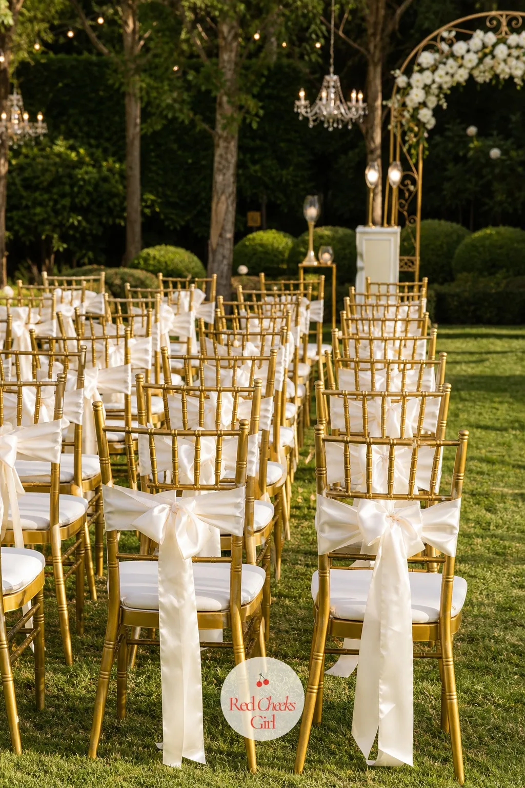
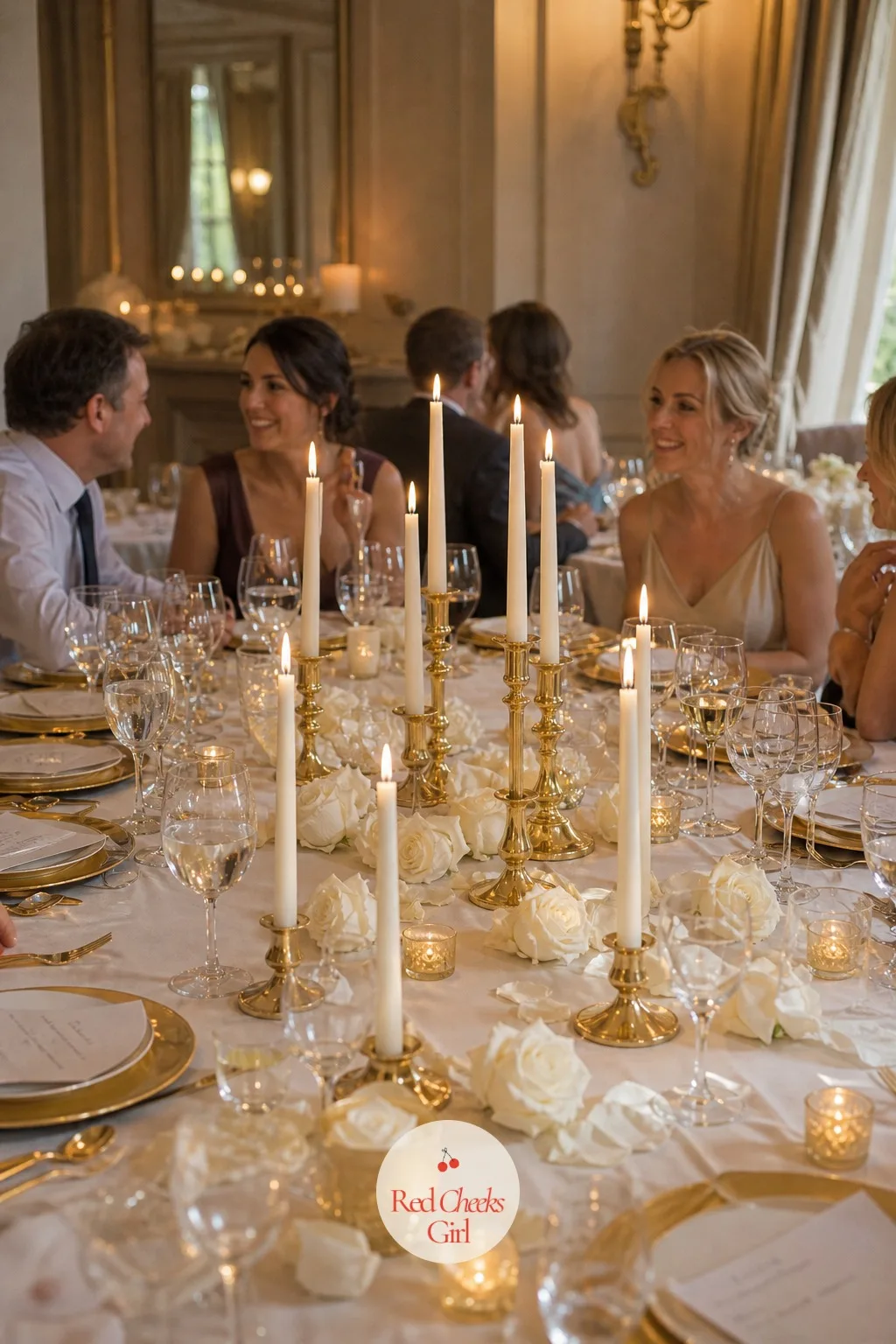
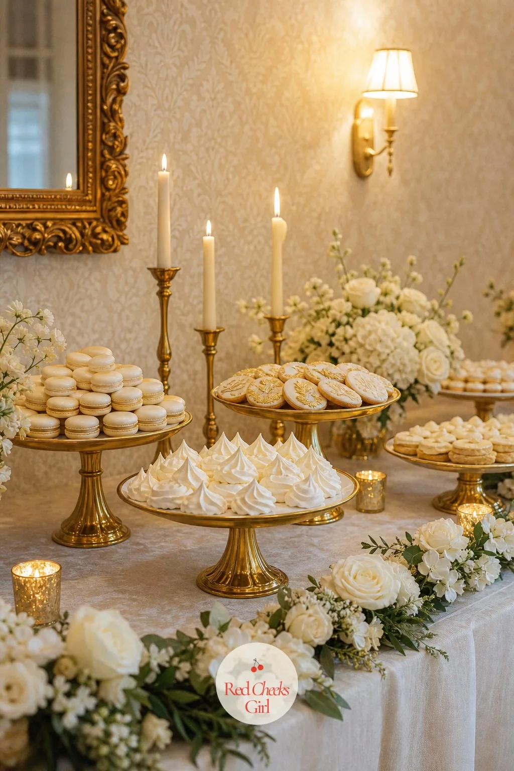
Timeless White and Gold Reception Style
Read the full guide26 White and Gold Wedding Ideas for a Classic Reception
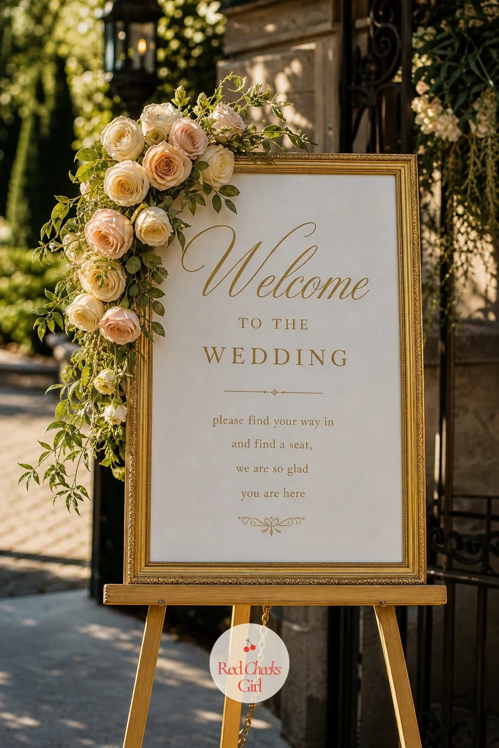
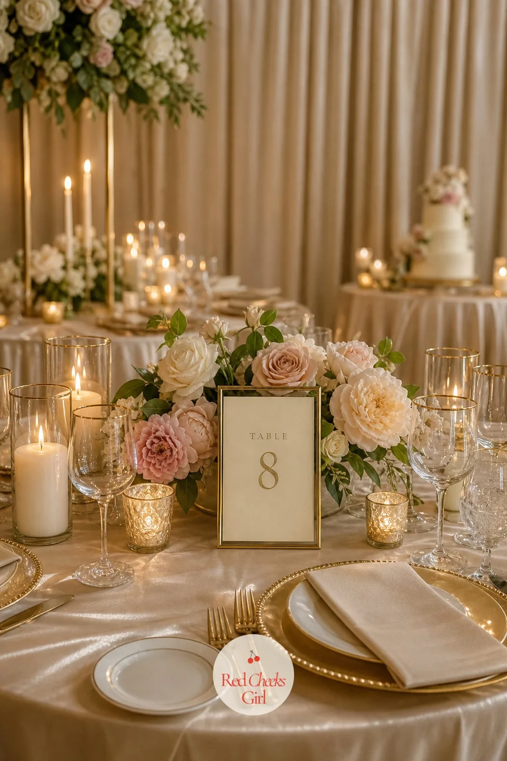
White and gold is the classic reception palette, built for a couple who wants a traditional, formal look without picking an accent color beyond metallic. It’s warmer than the all-white entry and more structured than champagne, closer to a ballroom or hotel reception feel.
Twenty-six ideas run from the ceremony arch to the invitation, and the piece gives what to order, what to DIY and a budget swap for every item, the most actionable breakdown on this page if cost is the main concern.
Engagement party games for families that actually work: bingo, trivia by side, baby photo match, rec
22 ice blue wedding theme ideas, from the ceremony arch to the favors, in ice blue, white and silver
22 Wes Anderson wedding ideas in pink, red, lilac and mint: a grand hotel welcome, Do Not Disturb pl
Leave a Reply