

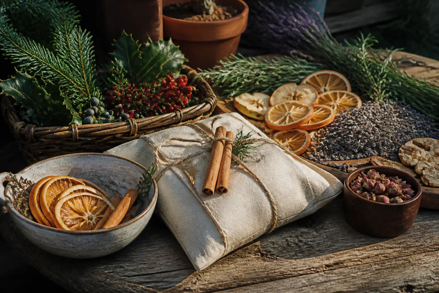
A simmer pot gift lives or dies on the first five seconds. If the recipient sees a mason jar of mixed spices with a bit of twine, the bar is low and the mood follows.
The ideas here are judged on what she holds before she opens anything: the vessel, the wrapping, the way the contents read from outside the container.
The blend itself is almost beside the point. Cinnamon and orange peel smell wonderful in every version. What changes is whether the gift looks like something she would have bought herself or something she feels obligated to display until you leave. Every entry below clears that bar in a different way.
A note on the internal logic: the 30 entries are grouped by the packaging approach, not by the scent. Skim the section headings first, find the presentation style that suits your budget and your recipient, then read the detail.
For more gift ideas that prioritise looks over effort, these baby shower gift basket ideas use the same principle: the container does the heavy lifting.
This post contains affiliate links. If you buy through them, I may earn a small commission at no extra cost to you.
- Layered in Glass So the Contents Do the Work
- Sets of Small Containers That Look Like a Collection
- Packed With the Thing It Is Used With
- Wrapped to Look Like It Came From a Shop
- Seasonal Packaging That Feels Timely
- Minimalist Packaging With One Strong Detail
- Gift-Boxed Sets Ready to Hand Over
- Frequently Asked Questions
Layered in Glass So the Contents Do the Work
When the jar itself is the display, every layer has to earn its place. The recipient sees colour and texture before she reads a single label, and that first impression is what separates a considered gift from a bag of potpourri.
Use wide-mouth glass with a clean shoulder, not a tapered jam jar, because the shoulder break makes it look like a pantry product rather than a craft project.
Sequence matters more than the ingredients. Put the largest, most visual piece at the bottom, build up in graduating colour, and finish with something fine and even at the top. A flat, flush surface at the lid line reads as factory-finished. A lumpy, uneven top reads as homemade, and not in the good way.
The Wide-Mouth Pantry Jar With Layered Botanicals
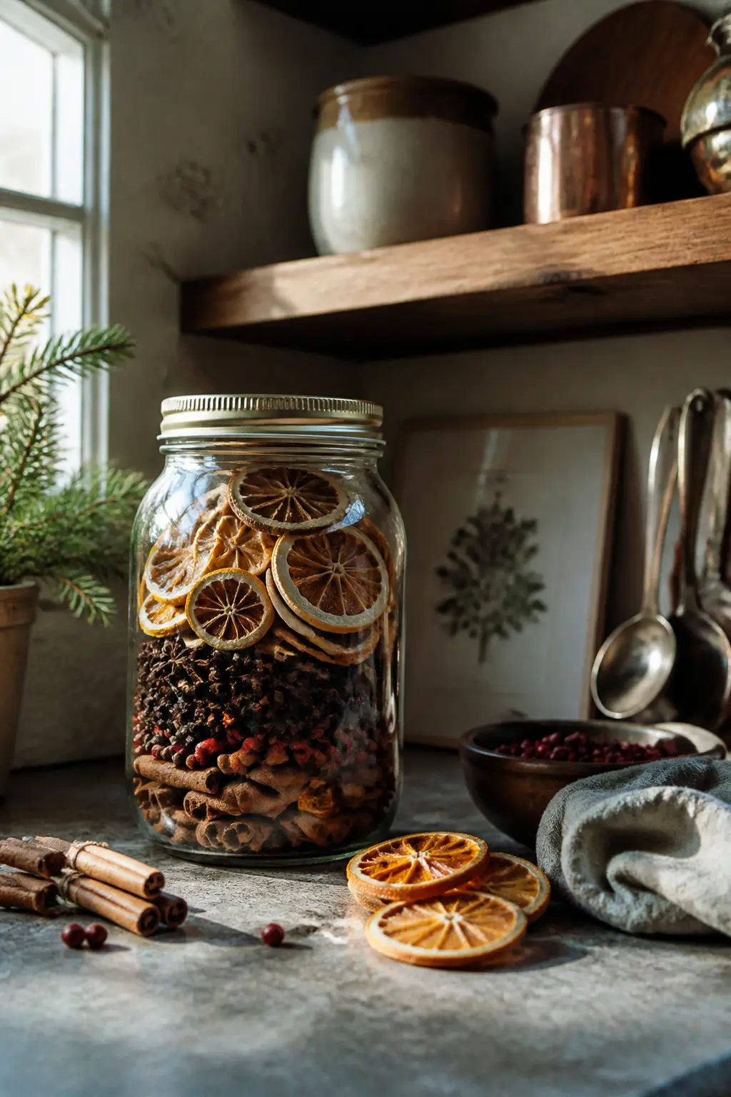
The recipient picks up a wide-mouth glass jar and sees colour before she reads anything. A base layer of dried citrus wheels, then a stripe of cinnamon sticks standing upright around the edge, then a fill of whole spices at the centre. The contents look like they belong in a specialty food shop.
What makes it feel finished: a matte black lid, a single clean label with the name of the blend in one font, and nothing else stuck to the outside. No ribbon, no tag. The label is the design.
🛍 Shopping guide
The Apothecary Jar With a Pressed Citrus Interior
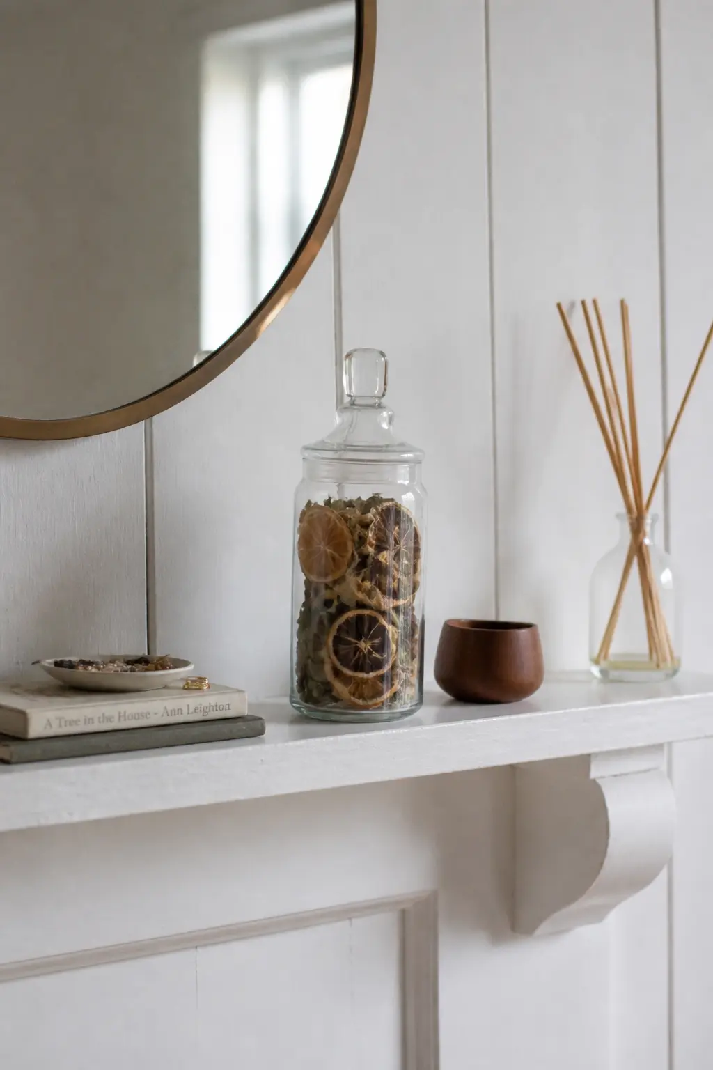
An apothecary jar with a glass stopper reads as decorative before it reads as food. Press a thin dried lemon slice against the inside of the glass from the bottom, fill with a pale spice blend, and the slice floats like a specimen. The effect is botanical and considered.
What makes it feel finished: the glass stopper stays on rather than a screw lid. Stoppers signal display, not pantry storage, and that small detail moves the gift from useful to beautiful. Tie a small linen tag around the stopper neck with one loop of natural twine.
The Tall Hex Jar With Stripe Layers
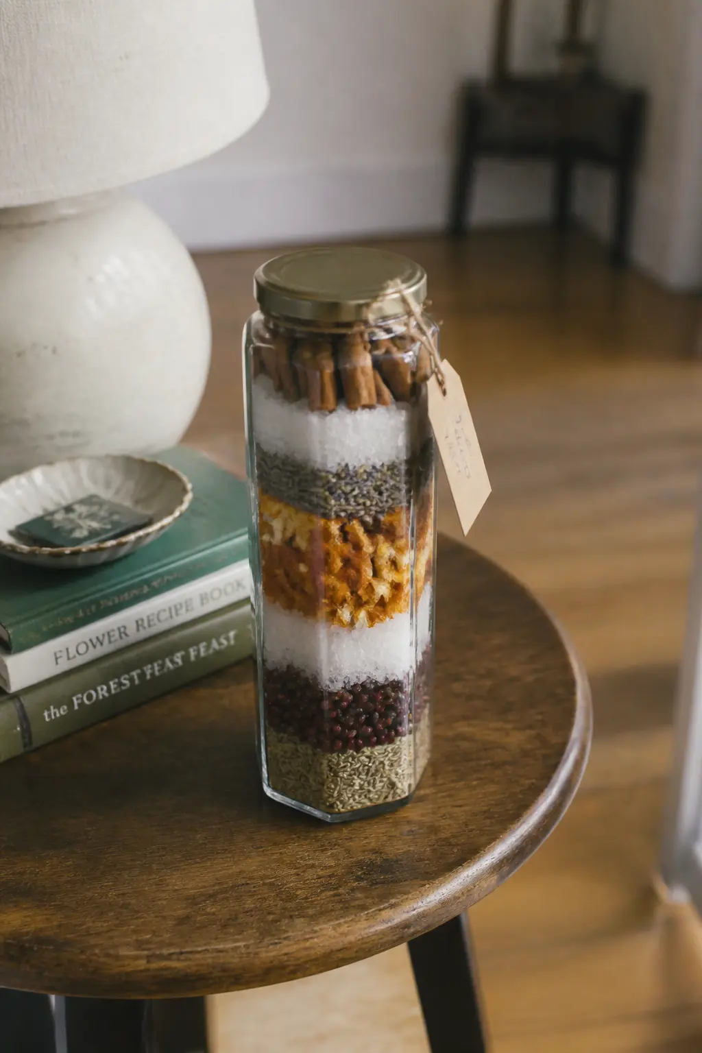
A hexagonal jar is taller than it is wide, which forces the layers to read as horizontal stripes. Start with dark cloves, then pale dried ginger, then a band of star anise, then a light-coloured finishing layer of dried cranberry. Seen from the side, it looks like a terrarium or a sand art piece, not a spice kit.
What makes it feel finished: the final layer is level and flush with the jar shoulder. A gold-lid closure and a circular label on the face are all the decoration it needs. Keep the label minimal: name only, no ingredient list cluttering the front.
🛍 Shopping guide
Sets of Small Containers That Look Like a Collection
One jar of everything mixed together is practical. Three small matching jars, each holding one ingredient, is a gift. The recipient opens a set, not a single item, and that changes the weight of what she is holding.
The containers do not need to be expensive: apothecary-style glass with cork lids, matching tins with window lids, or uniform spice jars with printed labels all read as a curated collection when they share a material and a size.
Group them in threes or fours. Two feels incomplete. Five feels chaotic unless the box is designed for five. Tie the set together with a common label, a band of ribbon that crosses all three at once, or a slim tray that holds them in a fixed arrangement. The tray especially matters: it turns three separate objects into one object.
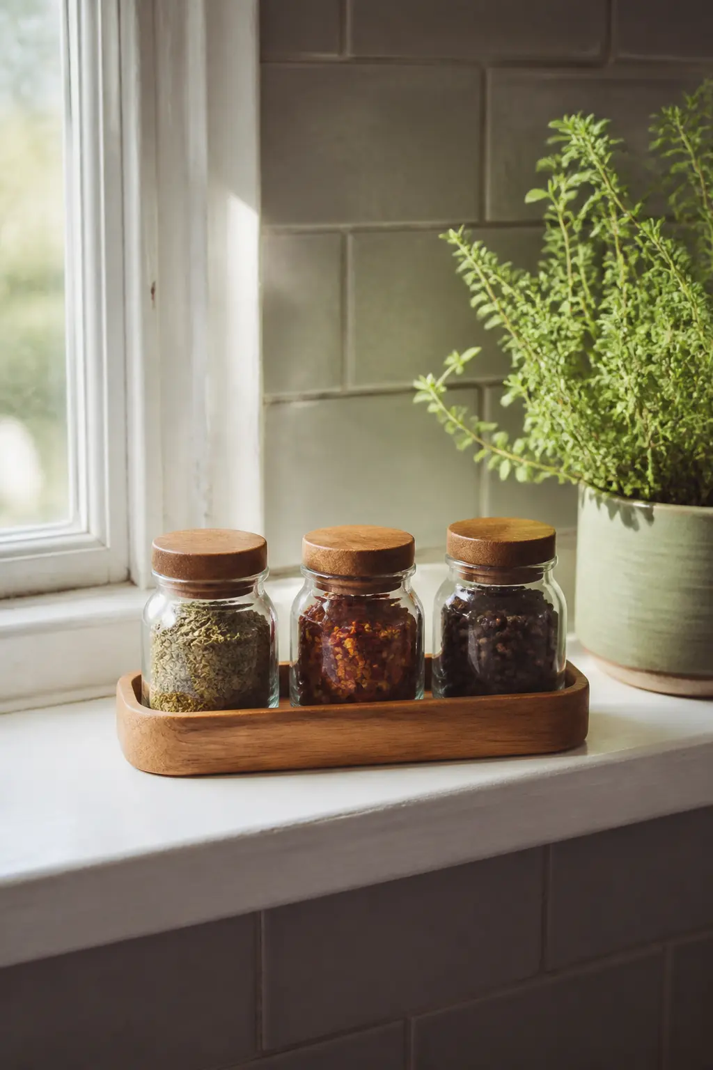
The Set of Three Matching Spice Jars in a Tray
Three identical small spice jars, each holding one ingredient, sit inside a narrow wooden tray. The recipient picks up the tray as a single object and the jars move with it. She sees a collection, not three separate things someone put together.
What makes it feel finished: uniform lids (all cork, all matte black, or all gold), matching labels printed in the same font, and a tray that fits the jars with almost no gap. The tray is the detail that turns three into one.
A small card tucked at one end of the tray gives the blend recipe without cluttering the jars themselves.
🛍 Shopping guide
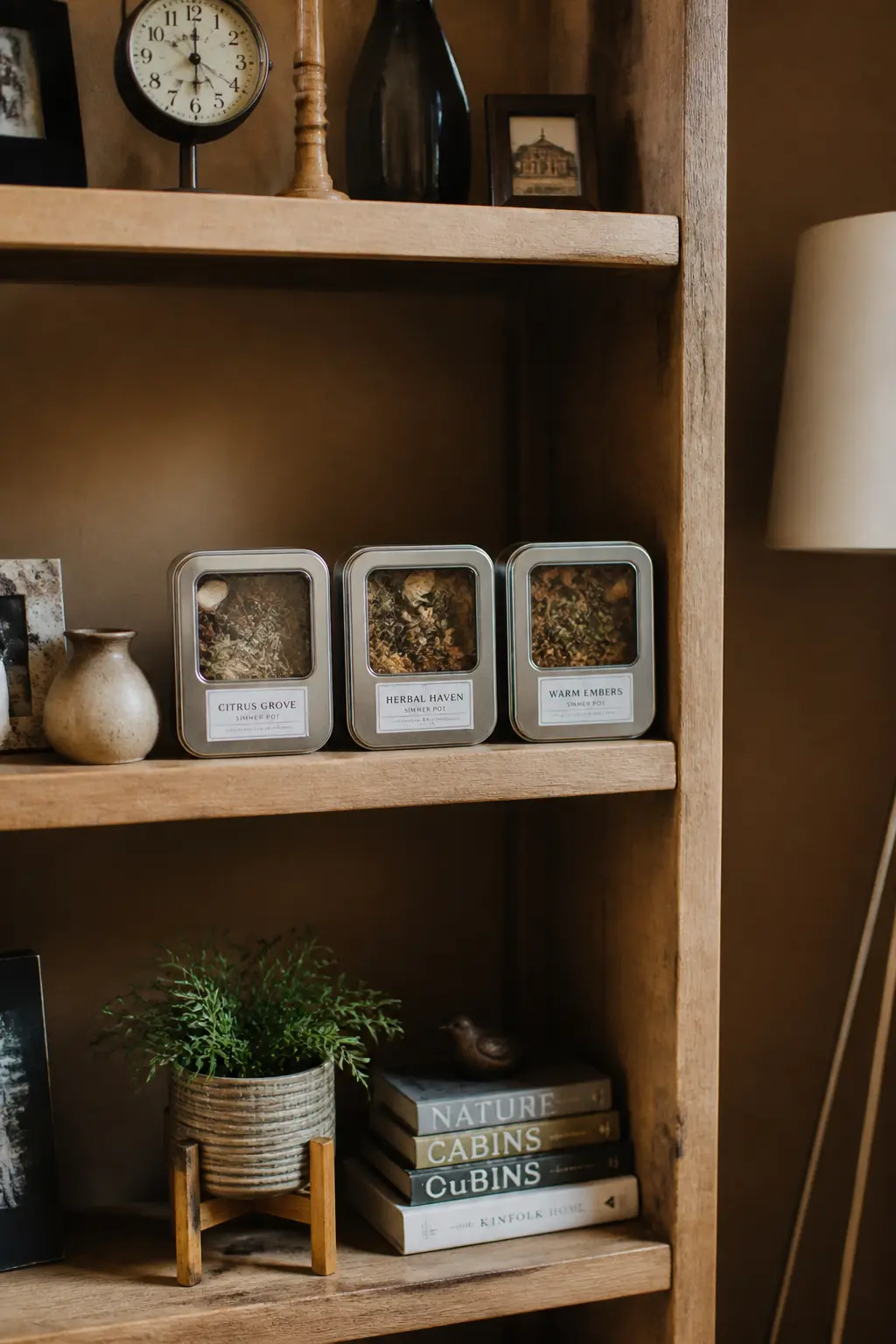
The Trio of Window-Lid Tins
Three tins with clear window lids let the recipient see the ingredient inside without opening anything. Set them in a row and the colours do the work: dark spices in one, bright dried citrus in another, pale herbs in the third. The visual rhythm reads as designed.
What makes it feel finished: a band of ribbon or a wide paper sleeve that wraps all three tins together before she receives them. She slides them out as a group, and the first reveal is the row of windows. Tie the sleeve with a single knot rather than a bow for a cleaner look.
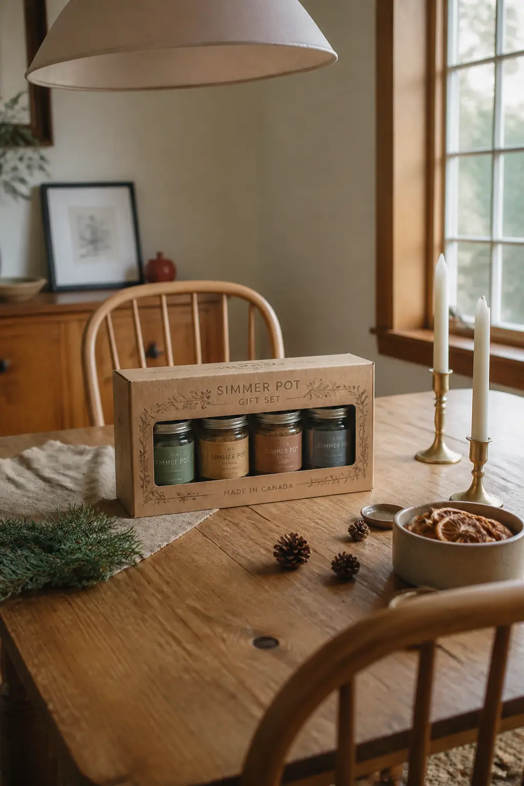
The Four-Jar Set in a Kraft Box Sleeve
Four jars, two by two, slide into a custom-fit kraft box sleeve with no lid. The open top means the jars are visible from above before the sleeve comes off, and the square footprint looks like a boxed set from a specialty retailer.
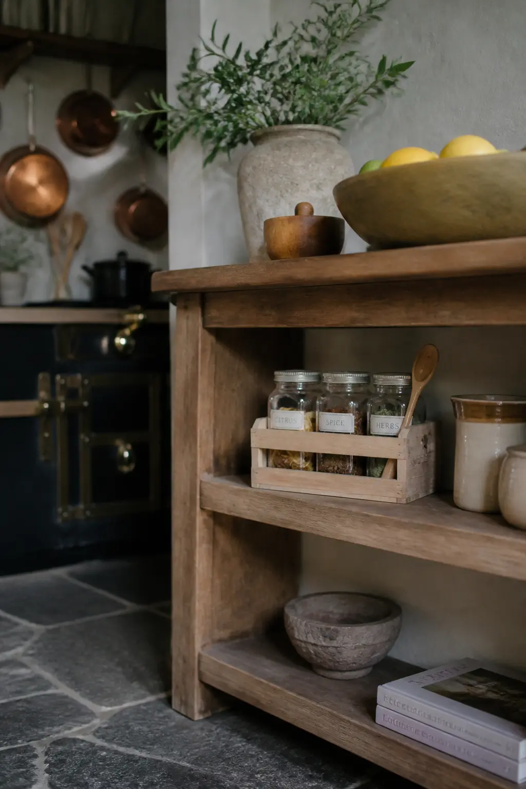
It is a more unusual format than a row, and it photographs well if the recipient ever posts it.
What makes it feel finished: the jars are held snug by the sleeve so they do not rattle. A piece of corrugated card cut to fit between jars stops movement. A single wax seal closes the sleeve at the side rather than tape. The seal is the thing she notices first.
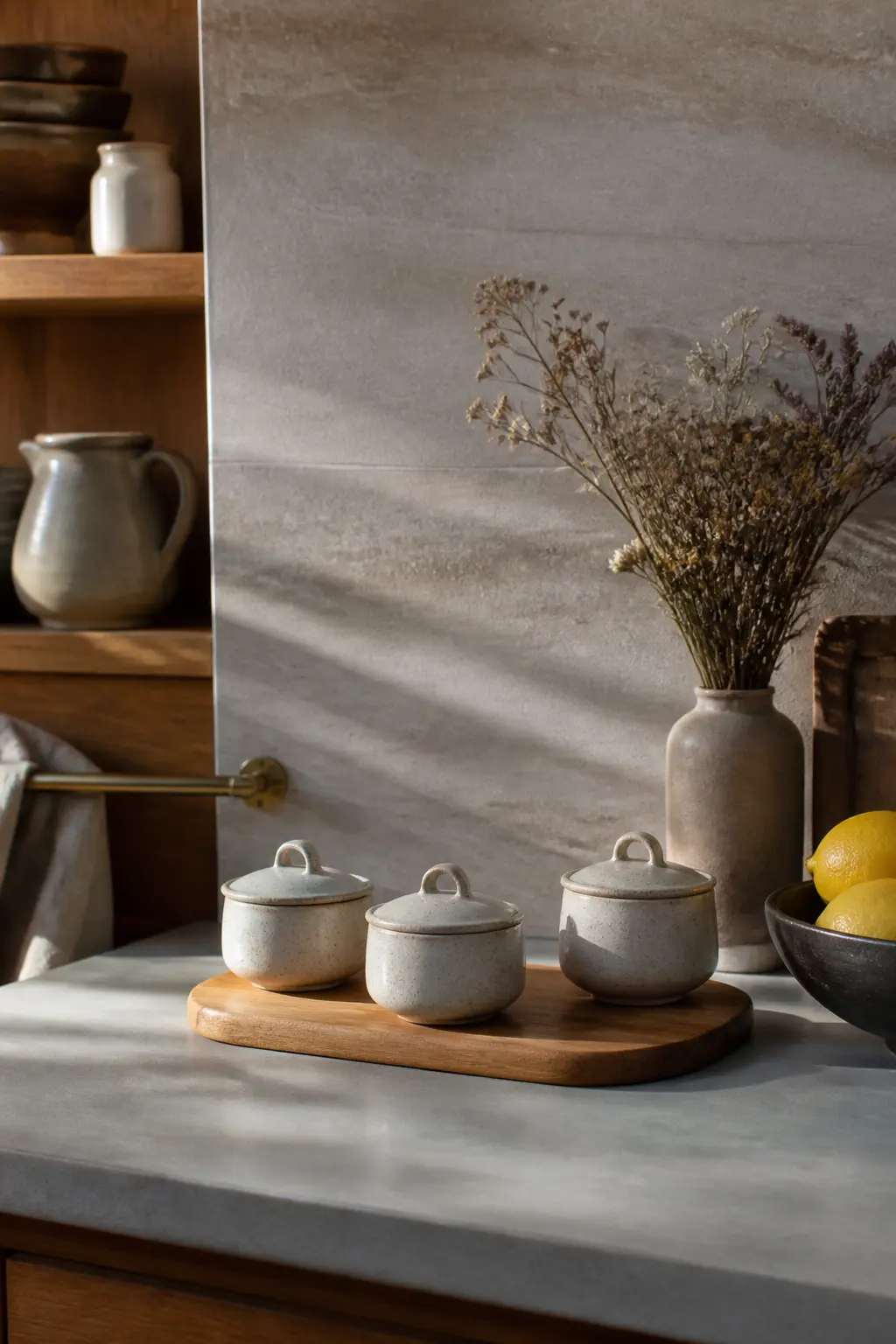
The Matching Ceramic Pinch Pot Set
Three small ceramic pinch pots with matching lids hold one ingredient each. Ceramic reads as intentional and reusable in a way that glass sometimes does not: the recipient knows she will keep the pots after the ingredient is gone. That permanence lifts the perceived value of the whole gift.
What makes it feel finished: all three pots are the same glaze, even if they were bought separately. A wooden board or a small ceramic tray underneath ties them to a single footprint. Nestle a small printed card between the pots that says what each one is and how to combine them.
🛍 Shopping guide
Packed With the Thing It Is Used With
A simmer pot kit that arrives with its own pot, ladle, or trivet is not a bag of spices anymore. It is a starter kit, and the pot itself anchors the gift visually. The recipient sees the vessel first, the ingredients feel like a bonus, and the whole thing reads as intentional rather than assembled from a spice drawer.
The pot does not need to be ceramic or expensive. An enamel saucepan in one colour, a small cast-iron Dutch oven, or even a plain white ceramic bowl with a pour spout all elevate the kit.
Nest the ingredient jars or sachets inside the pot, fill any gap with kraft tissue, and the recipient literally lifts the lid to find the rest of the gift.
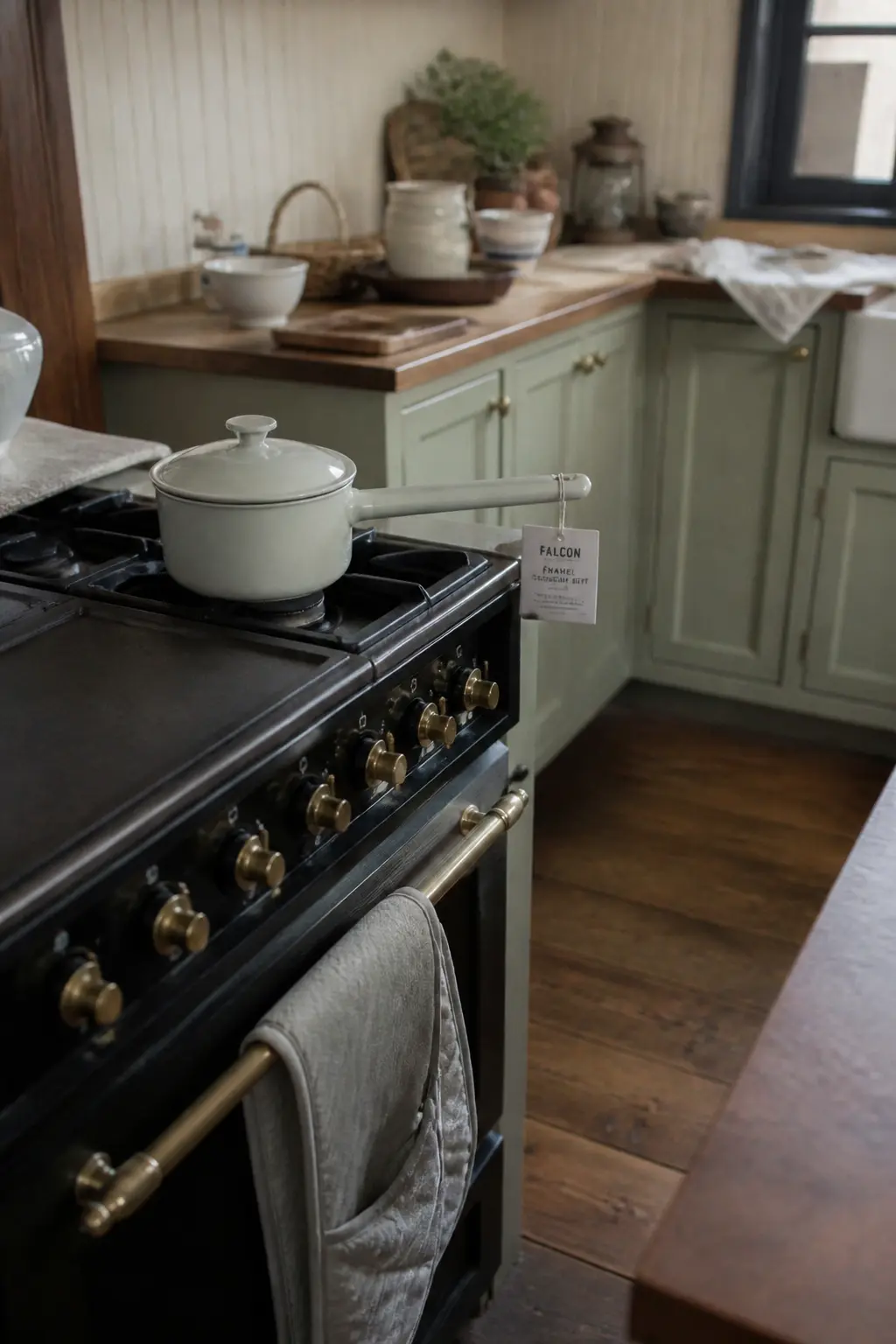
The Enamel Saucepan Kit
The recipient lifts an enamel saucepan, and the ingredient jars are already inside it. The pot is the gift. The spice kit is the bonus. That reversal changes everything about how the gift lands: she is not receiving a simmer pot kit, she is receiving a pot that happens to come with its first batch of ingredients.
What makes it feel finished: a sheet of tissue inside the pot before the jars go in, so the jars sit on something rather than clanking against bare enamel. A cloth tag tied to the pot handle gives the recipe. The lid is on when she receives it, so the first moment is the moment she takes it off.
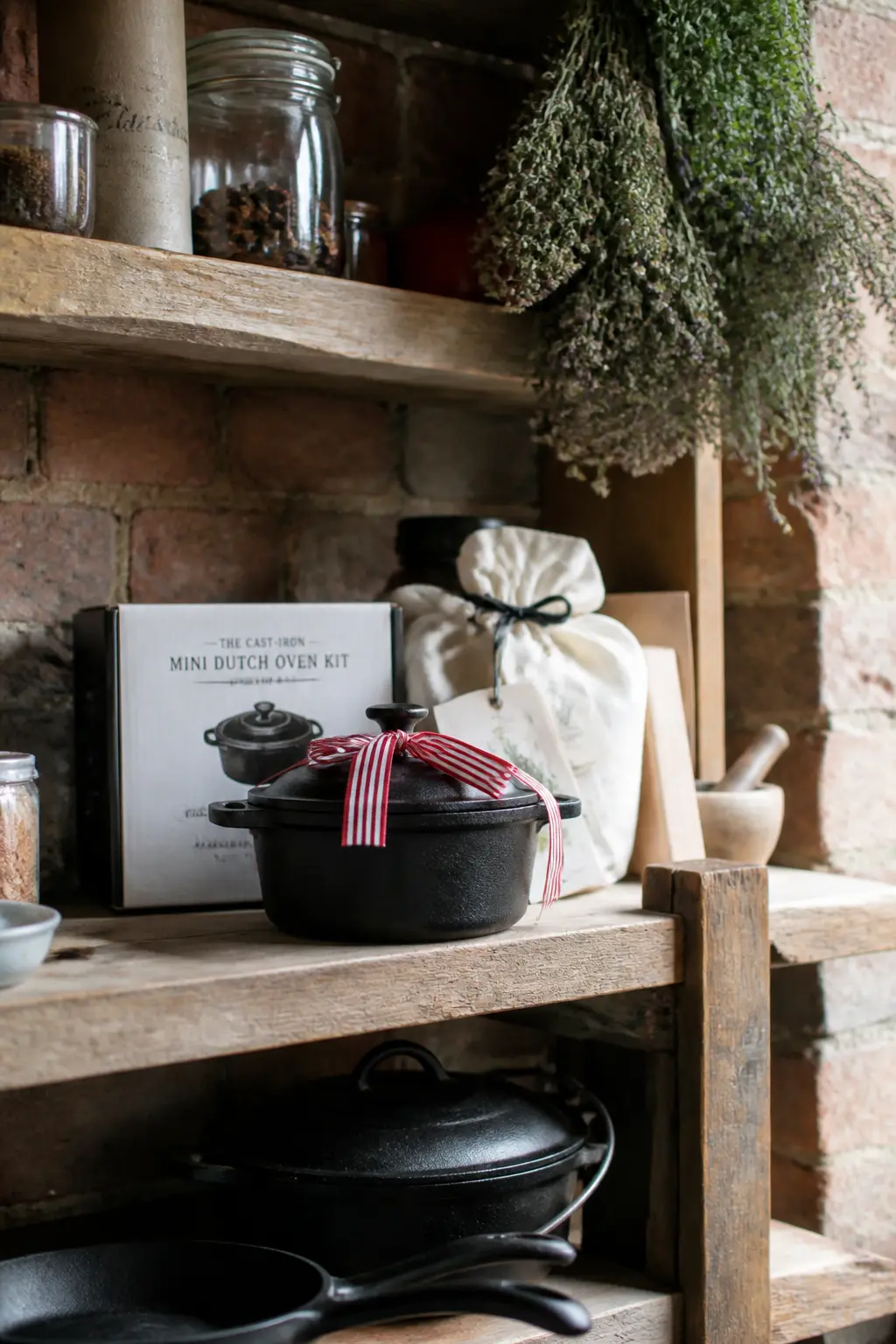
The Cast-Iron Mini Dutch Oven Kit
A mini cast-iron Dutch oven is a gift on its own. Fill it with ingredient sachets, put the lid on, and wrap a length of ribbon around the knob. The recipient receives something heavy, substantial, and permanent-feeling. The fragrance kit inside is a discovery, not the main event.
What makes it feel finished: the sachets inside are muslin drawstring bags rather than open jars, so there is no risk of spillage when she opens the lid. The weight of the pot means she knows immediately this is not a token gift. A small card tucked under the lid edge is the only other element needed.
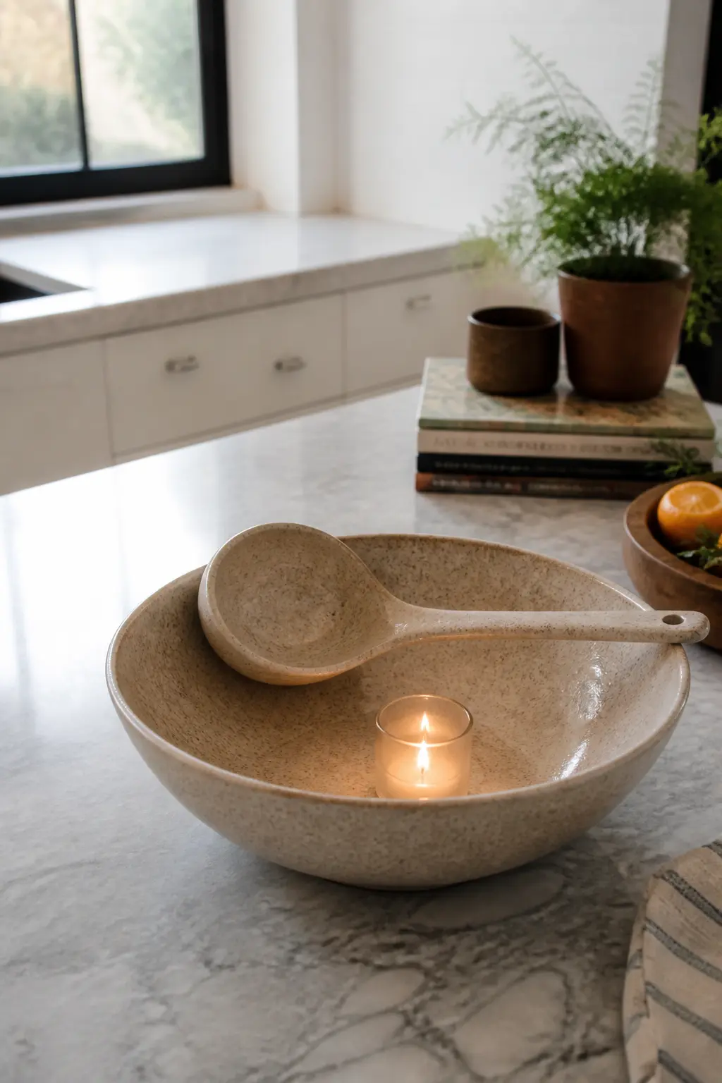
The Ceramic Bowl and Ladle Set
A wide, shallow ceramic bowl with a wooden-handled ladle resting across it looks like kitchenware, not a craft kit. The dried ingredients sit in the bowl, visible but not loose: a small glass votive holds the spices inside the larger bowl so nothing rolls. The recipient sees a vignette, not an assembly.
What makes it feel finished: the ladle handle extends beyond the bowl rim at a deliberate angle. It is not stuffed in, it is resting. A single sprig of dried rosemary across the top of the glass votive signals freshness without being precious about it.
🛍 Shopping guide
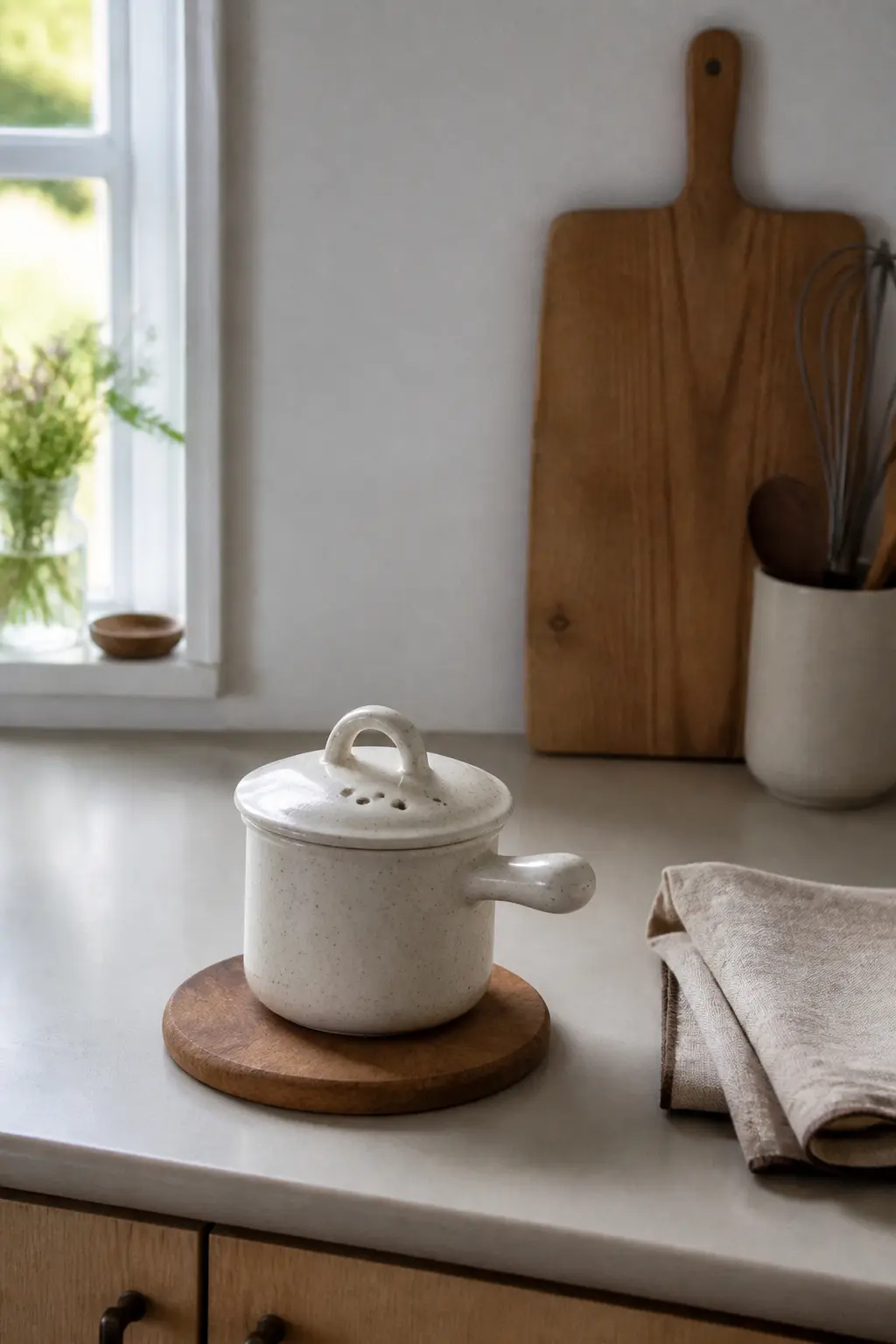
The Stovetop Simmer Pot With Trivet
A small pot sitting on a wooden or stone trivet arrives as a complete still life. The trivet is the base, the pot sits on it, and the ingredient packet is inside the pot.
The trivet makes the pot look like it is already in its place in the recipient’s kitchen, which is a very specific kind of gift fantasy and it works.
What makes it feel finished: the trivet and the pot share a material language. A ceramic pot on a bamboo trivet. A matte enamel pot on a matte slate trivet. Mismatched materials make the pairing look accidental. Matched materials make it look chosen.
Wrapped to Look Like It Came From a Shop
Retail presentation is a learnable trick. A shop does three things that home wrapping usually skips: it uses a consistent colour palette across every element, it hides every raw edge, and it adds one finishing detail that has no function except to look considered.
That last part is the one worth copying: a wax seal on the label, a sprig of dried botanicals under the ribbon, a printed card tucked into the ribbon knot rather than taped to the outside.
The box or bag itself matters as much as what is inside. A rigid gift box with a lid closes the gift. A flat-bottomed kraft bag with tissue keeps it soft. A linen bag with a drawstring reads as reusable and therefore generous. Pick one, commit to it, and resist the urge to add more.
The Branded Kraft Box With Insert Card
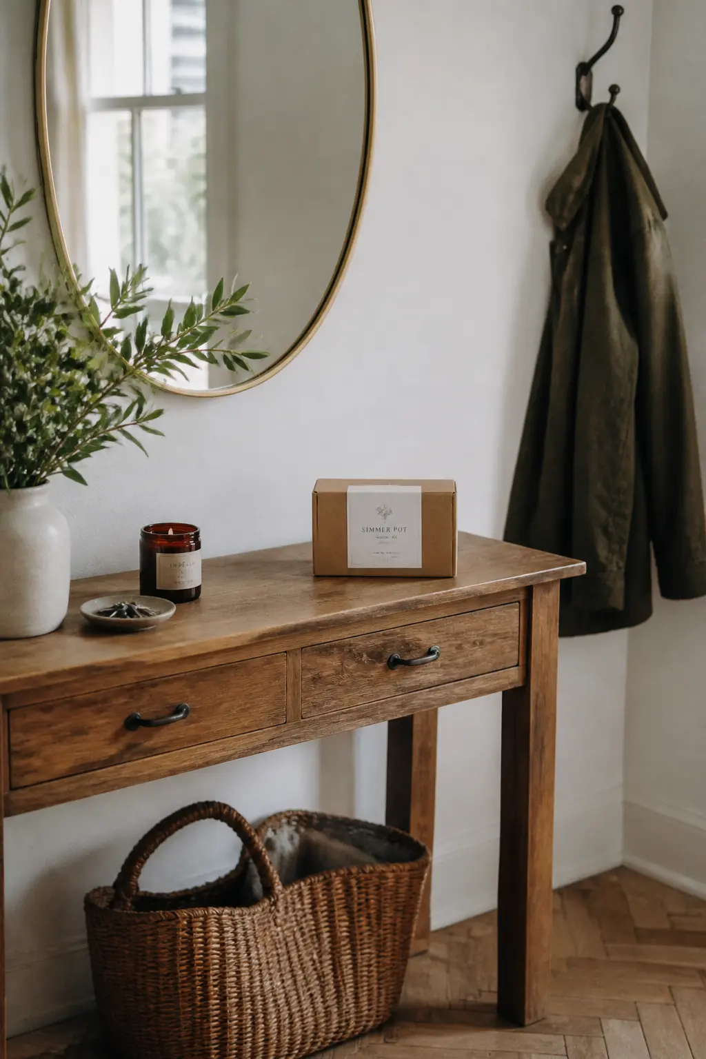
A rigid kraft box, closed with a lift-off lid, holds one jar and a recipe card. The box is the first thing she holds. It has a clean label on the front, a flat surface, and no visible tape. It looks like it was ordered from a small-batch food company, which is a compliment worth engineering.
What makes it feel finished: the lid lifts cleanly because the box is rigid, not a fold-up. The jar inside sits in a circle of shredded kraft filler so it does not move. The recipe card is printed, not handwritten, and sits face-up so it is the first thing she reads when the lid comes off.
The Linen Bag With a Stamped Label
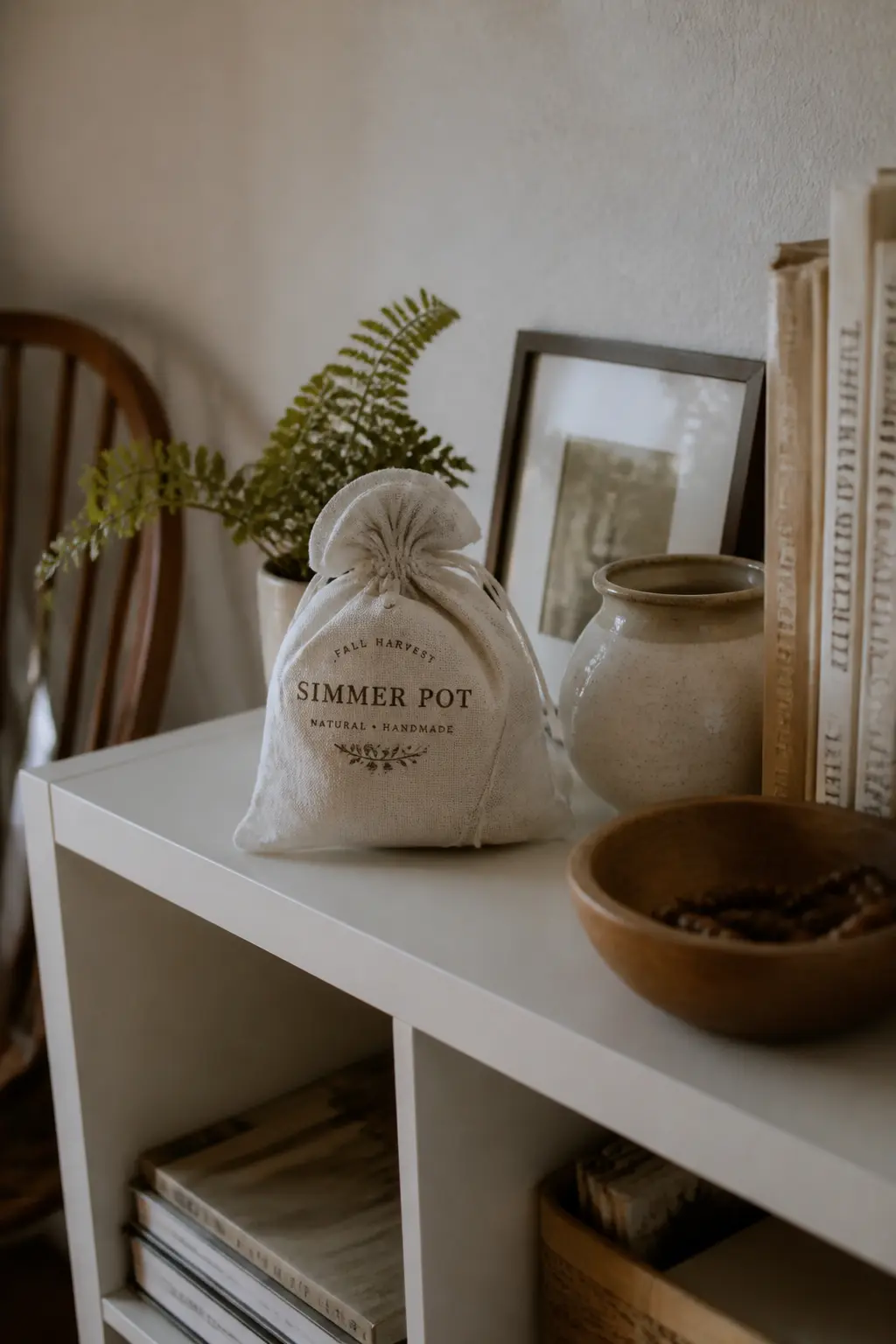
A natural linen drawstring bag holds a single jar, closed at the top with a double knot rather than a bow. The recipient receives a bag she will reuse, and the jar is secondary until she opens it. The texture of the linen is the first sensory experience, not the fragrance.
What makes it feel finished: a small rubber-stamped label on the bag face, in ink that is dark enough to read clearly on natural linen. The stamp replaces a paper tag and means there is nothing flapping. Keep the knot tight and trim the cord ends evenly.
🛍 Shopping guide
The Wax-Sealed Glass Jar
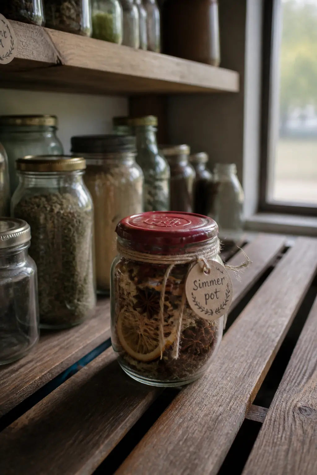
A screw-lid glass jar with a wax seal over the lid looks like it was closed in a factory. The seal hides the lid entirely and transforms a standard jar into something that feels preserved and precious. The recipient has to break it to open the jar, which creates a satisfying first use moment.
What makes it feel finished: the wax is applied to cover the lid fully and drip down the neck of the jar slightly. A partial seal looks like an accident; a full one looks intentional. Choose wax in one colour that matches the jar label palette.
The Grocer-Style Paper Bag With Tissue Top
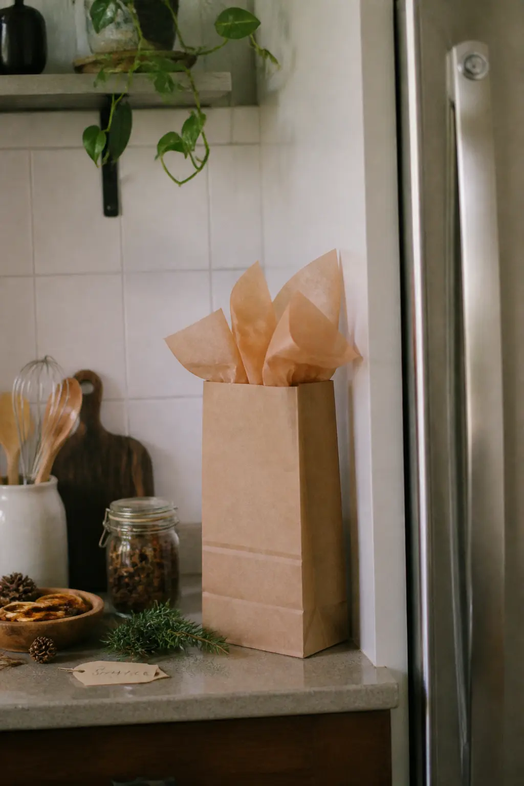
A flat-bottomed brown paper bag, standing upright, with tissue paper folded over the top looks like something from a weekend market stall. The upright format means she carries it by the bag, not by the jar inside, and that changes the physical experience of receiving it.
What makes it feel finished: the tissue folds are deliberate, not scrunched. Two sheets folded in half and tucked inside the bag with the fold at the top, then fanned open slightly. A sticker seal closes the tissue at the front so the contents stay hidden until she reaches in.
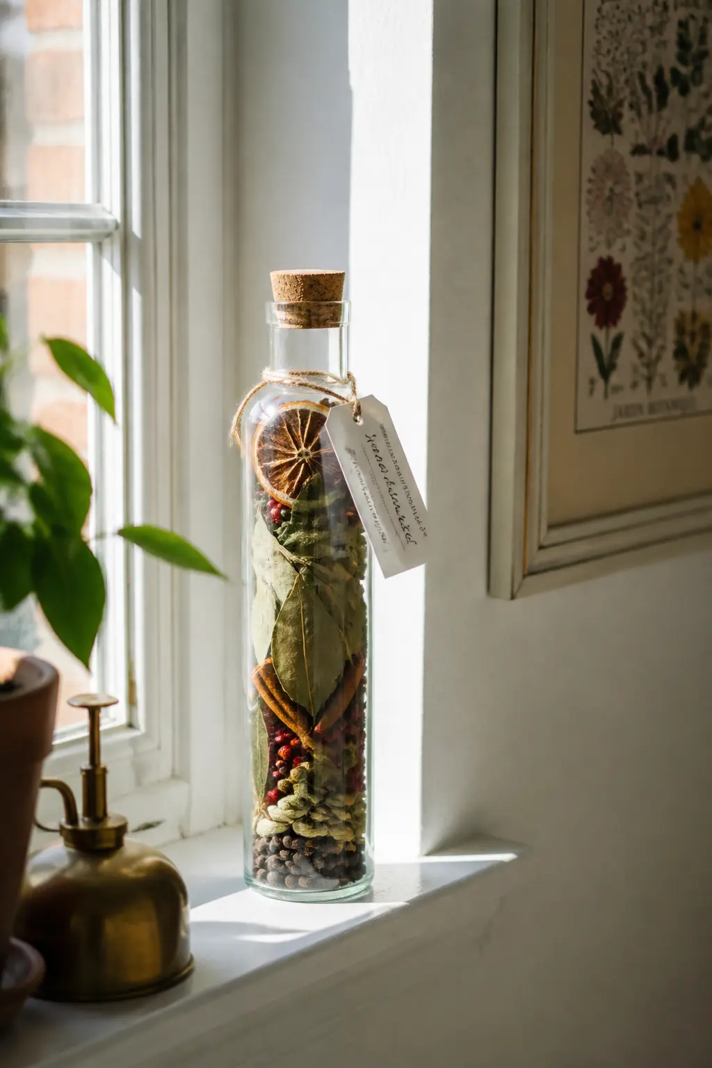
The Glass Bottle With a Cork and Twine Tag
A tall, narrow glass bottle stopped with a cork holds a single concentrated dry blend. The bottle format says apothecary or specialty food, not craft project. Dried spices in a wide-mouth bottle look homemade; the same spices in a narrow glass bottle with a cork look curated.
What makes it feel finished: a small printed tag on twine tied around the neck. The tag has the blend name on the front and the simmer instruction on the back. The twine is tied in one knot, not a bow, and trimmed at the same length on both sides.
🛍 Shopping guide
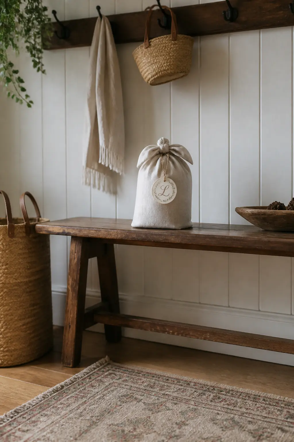
The Monogram-Tagged Jar in a Fabric Wrap
A jar wrapped in a square of linen fabric, furoshiki-style, with the knot tied at the top and a monogram tag slipped under the knot. The fabric replaces the box and the wrapping paper in one step. The recipient unties the fabric and keeps it. The monogram tag makes a generic kit personal without requiring handwriting on the jar itself.
What makes it feel finished: the fabric is cut to exactly the right size for the jar being wrapped. Too much fabric and the knot is bulky; too little and the wrap looks strained. A single initial on a small brass or card tag is enough personalisation.
🛍 Shopping guide
Seasonal Packaging That Feels Timely
A simmer pot gift that matches the season it lands in feels considered rather than generic. The ingredients are not what changes, because orange and cinnamon work in autumn, winter, and a bright January. The container colour, the label font, and the wrapping material are what make it feel like it belongs to this specific moment in the year.
Autumn calls for warm amber glass and kraft labels. Deep winter calls for dark glass, matte black lids, and a single sprig of dried eucalyptus. Early spring calls for pale ceramic and a cotton-twill label. The scent inside is evergreen; the packaging is seasonal. That combination is what makes it feel like a gift rather than a pantry staple.
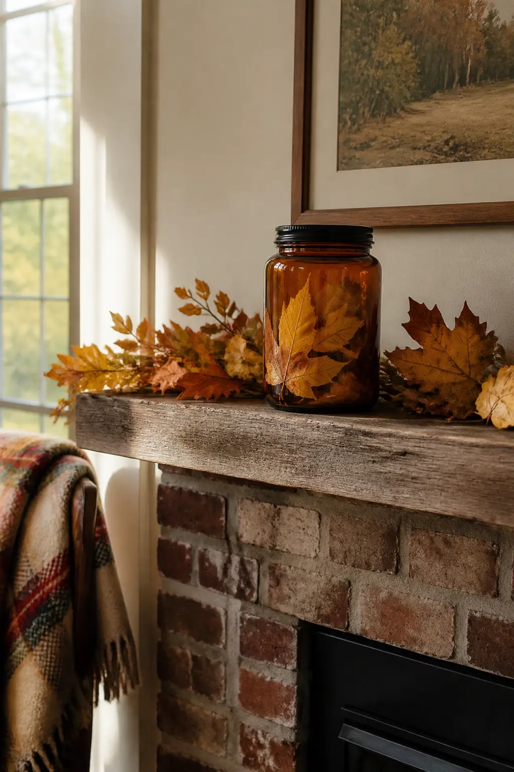
The Autumn Amber Jar With Pressed Leaves
An amber glass jar reads warm before she reads the label. Press two or three dried maple leaves against the inside of the glass before filling with a cinnamon and clove blend, and the jar becomes a seasonal object rather than a spice container. The leaves are visible from outside and look intentional rather than decorative filler.
What makes it feel finished: an amber jar with a matte black lid, a single label in a warm rust font, and a dried leaf tucked under the lid exterior. The exterior leaf is the one detail that moves it from pantry to gift.
🛍 Shopping guide
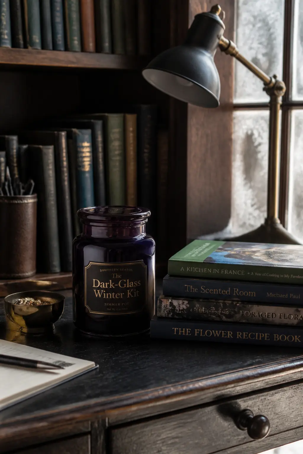
The Dark-Glass Winter Kit
Dark violet or forest-green glass hides the contents and looks expensive in any winter setting. The recipient does not see the blend, she sees a jewel-toned jar that belongs on a shelf. The mystery is part of the appeal, and the label tells her what is inside without the jar needing to show it.
What makes it feel finished: a gold label on dark glass is a high-contrast combination that looks like a small-batch luxury product. A gold-dipped cork finishes the top. The label has the blend name and one line of instruction, nothing more.
The Pale Ceramic Spring Jar
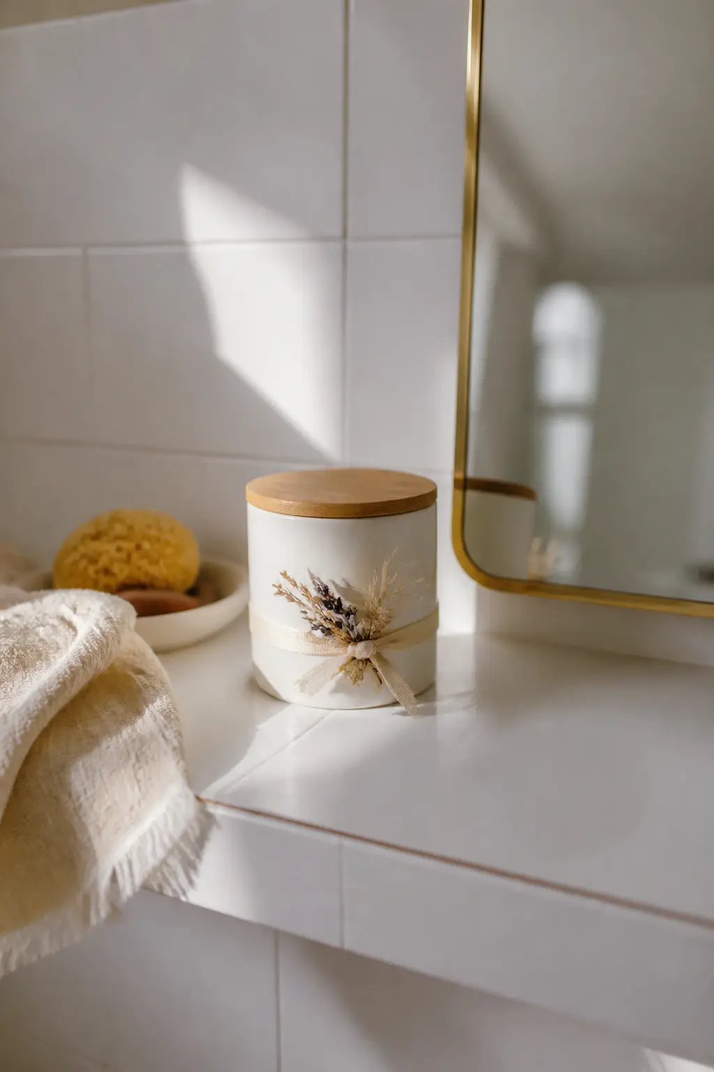
A matte white or pale sage ceramic jar with a bamboo lid reads as spring without any seasonal graphic. The material is enough. Pale ceramics signal fresh, clean, and considered, and the ingredient blend inside does not have to do any visual work.
What makes it feel finished: a thin cotton ribbon in a pale colour tied around the neck of the jar, with a single dried flower tucked under the knot. The flower does not need to be from the garden: a dried chamomile head from a craft supplier is more consistent and looks more deliberate.
🛍 Shopping guide
The Holiday Red-Lid Jar in a Glassine Bag
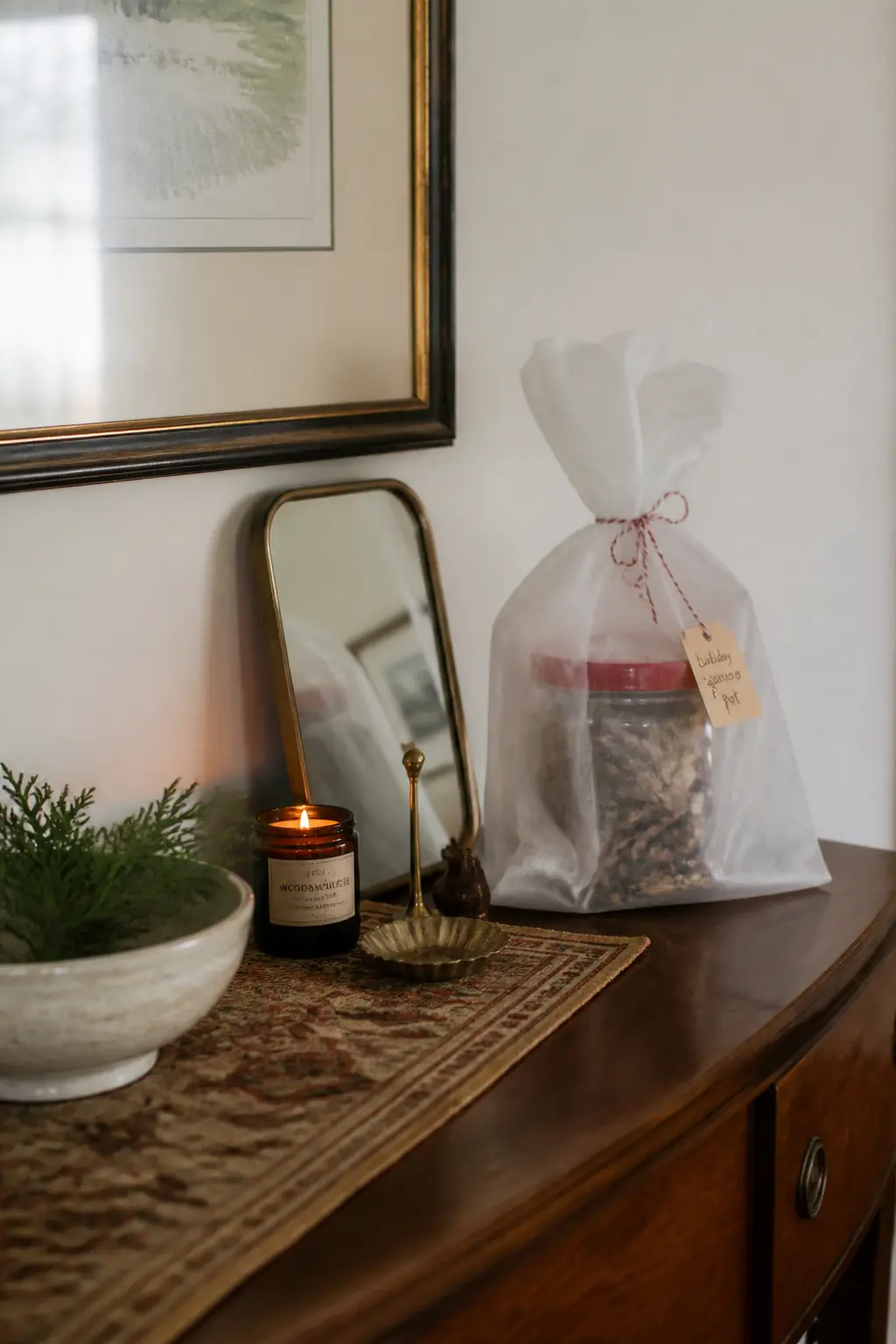
A clear glass jar with a red lid inside a glassine bag tied with a baker’s twine bow is a combination so clean it looks like a product line. Glassine is translucent, so the jar is visible through it, which means the packaging adds a layer without hiding the contents. The bow is the only ornament.
What makes it feel finished: the glassine bag is sized so the jar fits snugly with about three centimetres above the lid. The bow sits at the top of the bag, not on the lid. Baker’s twine in red and white matches the lid colour and turns the packaging into a deliberate palette.
Minimalist Packaging With One Strong Detail
Sometimes the most expensive-looking gift is the one with the least on it. A single wide-mouth jar, a plain white label with clean typography, a matte lid, and one dried citrus wheel pressed against the glass from the inside: that is it. The restraint is the statement.
The one detail has to be genuinely good. A dried blood orange slice pressed against the inside of the glass looks deliberate and beautiful. A single star anise resting on top of the closed jar looks finished.
A wax seal in one colour on the label looks like something from a boutique. Choose one thing and let it do all the work.
The Single Jar With One Clean Label and Nothing Else
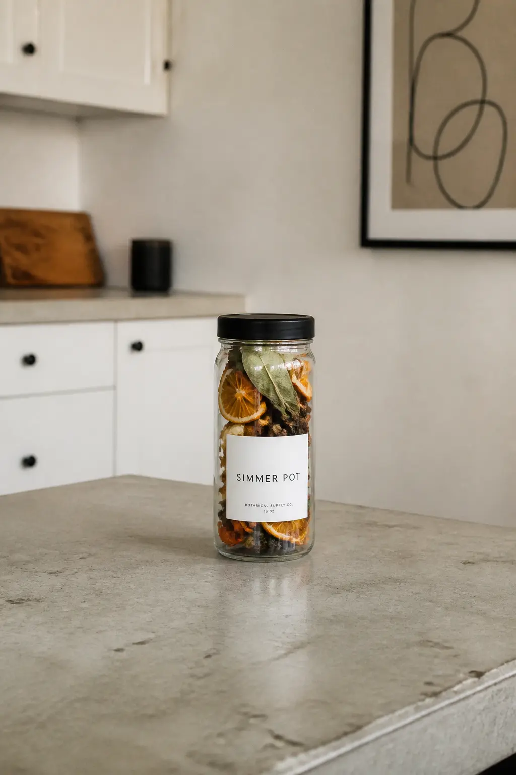
No ribbon. No tag. No dried botanicals on the outside. A tall glass jar with a matte lid, a single well-designed label in one font, and the contents visible through the glass. The restraint is the luxury signal. Over-decorated gifts read as anxious; an undecorated jar with a beautiful label reads as assured.
What makes it feel finished: the label is designed rather than handwritten. Print it on a laser printer onto white matte label stock, cut it cleanly, and apply it straight. Crooked or bubbled labels undo the whole effect.
🛍 Shopping guide
The Jar With an Interior Citrus Wheel and Nothing Outside
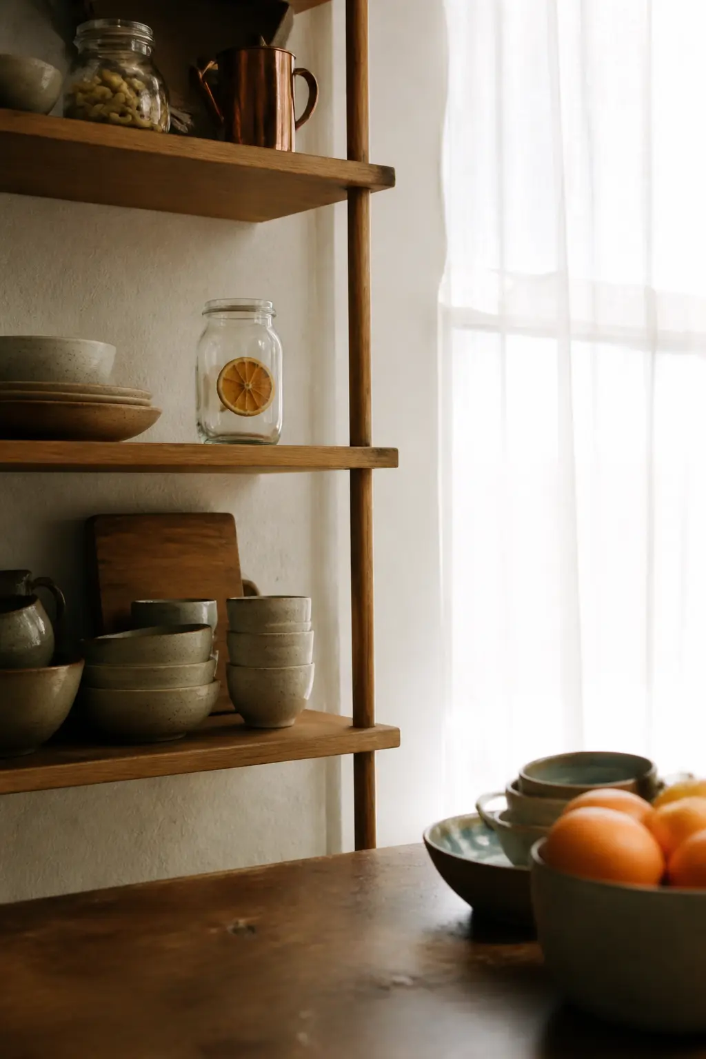
The one detail is inside the glass. A dried blood orange wheel pressed flat against the interior of the jar, visible through the side, turns a plain ingredient jar into something you look at. The outside of the jar is unmarked except for a small label on the base, which means she turns it over to read it.
What makes it feel finished: the citrus wheel must be pressed against the glass, not floating in the centre. Use a long skewer to position it before the jar is filled. Fill around it without disturbing it. The wheel stays in place because the contents hold it against the glass.
🛍 Shopping guide
The Star Anise-Top Jar
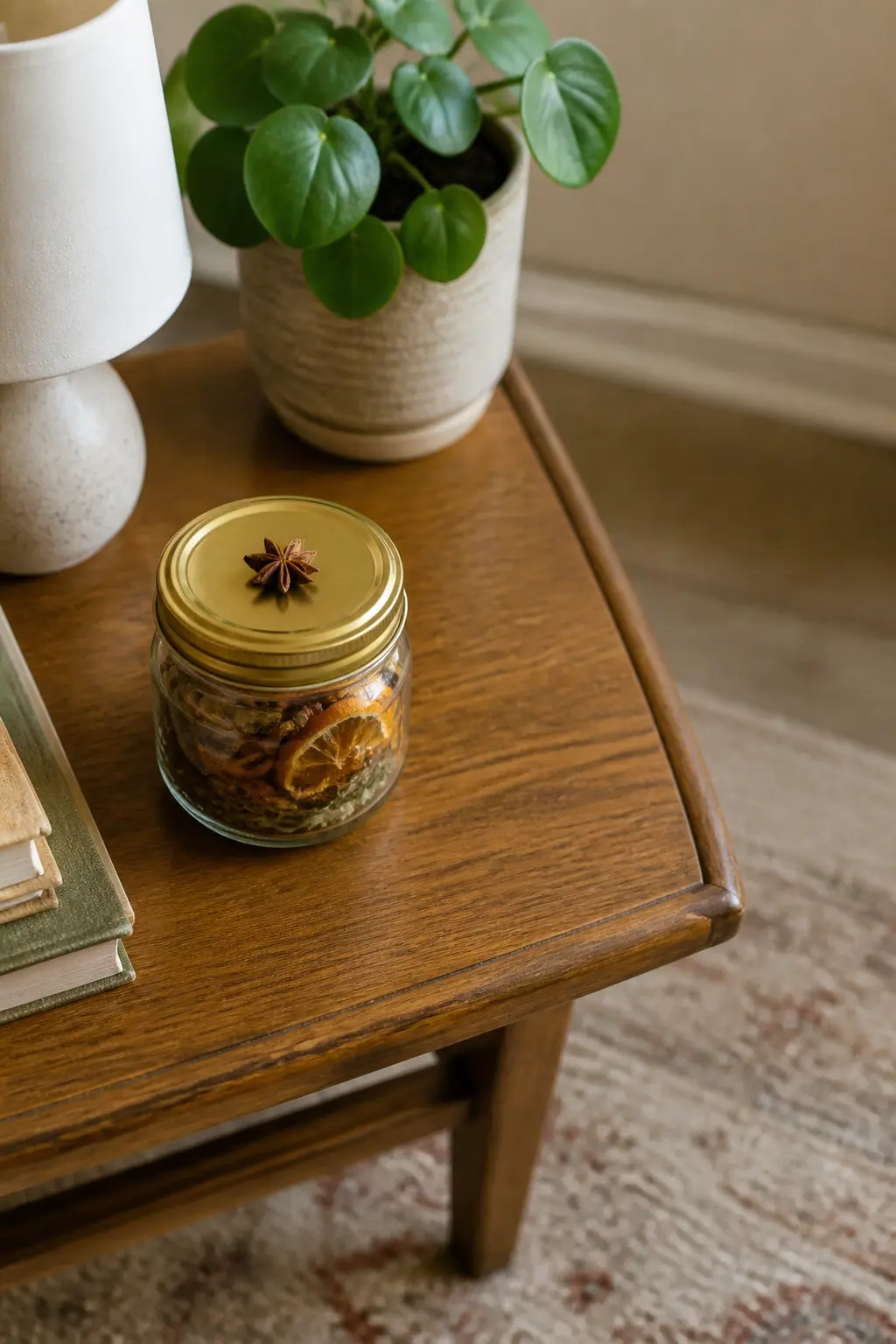
A glass jar filled with a pale blend, lid on, and one whole star anise resting on top of the lid. That is the entire decoration. The star anise is geometric and beautiful, and it costs nothing. The recipient sees a styled object, not a jar someone filled in the kitchen.
What makes it feel finished: the star anise is held in place with a tiny dot of craft glue or a small piece of double-sided tape, so it does not slide off in transit. A plain gold lid underneath the anise completes the visual.
No ribbon, no tag on the jar: the recipe is written on the box or bag that contains it.
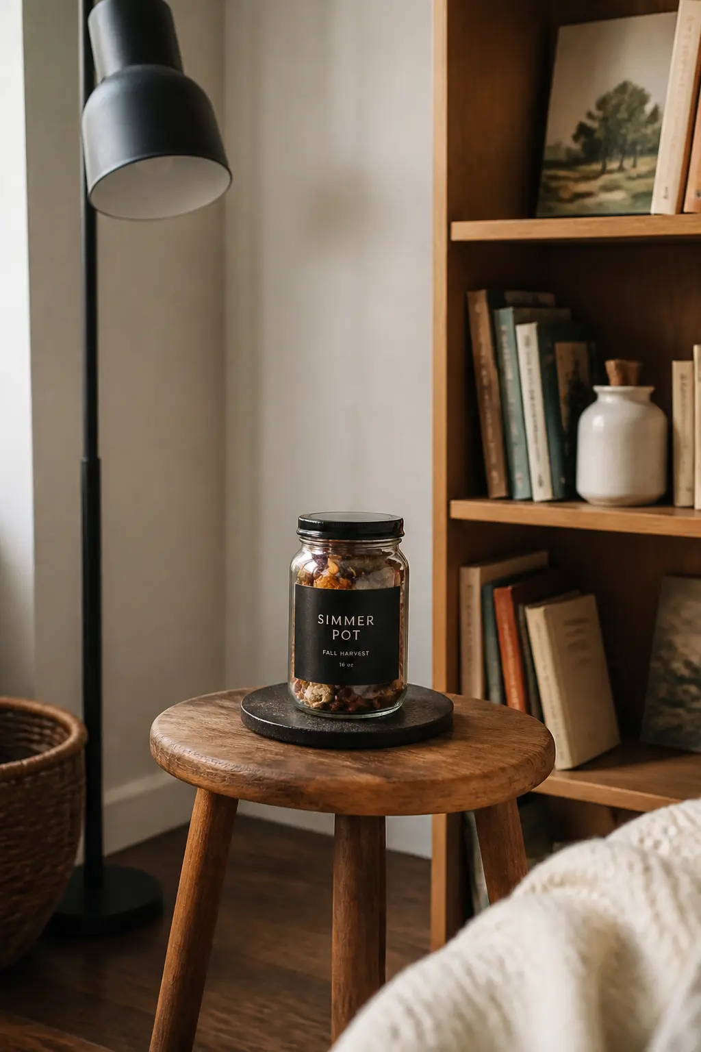
The Black Label Jar on a Dark Cork Coaster
A glass jar with a matte black label sits on a round dark cork coaster. The coaster is not extra packaging, it is a second small gift: she keeps it. The combination of black label, clear glass, and dark cork reads as a deliberate palette and looks like something from a design-forward homewares brand.
What makes it feel finished: the jar is centered on the coaster with a thin rubber band or a ring of ribbon around both to keep them together in transit. Remove the band when presenting it. The coaster looks chosen, not like a jar was placed on it accidentally.
🛍 Shopping guide
Gift-Boxed Sets Ready to Hand Over
A rigid lidded box changes the social transaction. The recipient does not unwrap, she opens, and the contents are revealed in one clean moment rather than unfolded in stages. That is a better experience, and it makes the gift feel more complete. The box also travels well, stacks, and does not require the giver to learn a wrapping technique.
Line the inside of the box before you fill it. Tissue paper, a thin sheet of kraft, or a layer of shredded paper filler all prevent the jars from sliding and make the first look inside feel intentional. A printed insert card resting on top, face up, is the last thing you add and the first thing she sees.
The Rigid Box With a Magnetic Closure
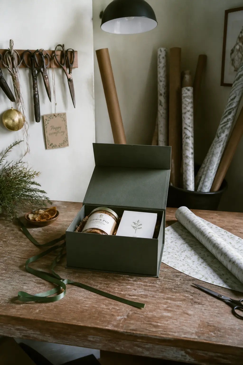
A rigid gift box with a magnetic closure opens like a book. The recipient does not lift a lid: she opens a cover.
The moment feels more significant than a standard box, and the contents are framed by the inside of the box rather than loose inside it. Place the jar, a recipe card, and one dried botanical in the box and the interior looks designed.
What makes it feel finished: the inside of the box is lined with a contrasting colour. A white insert card with printed text sits flat on the surface inside. The botanical sits beside the jar, not on top of it.
The magnet closes the box with a satisfying snap, which is the final detail she notices as she hands it back or sets it down.
🛍 Shopping guide
The Windowbox-Style Kraft Gift Box
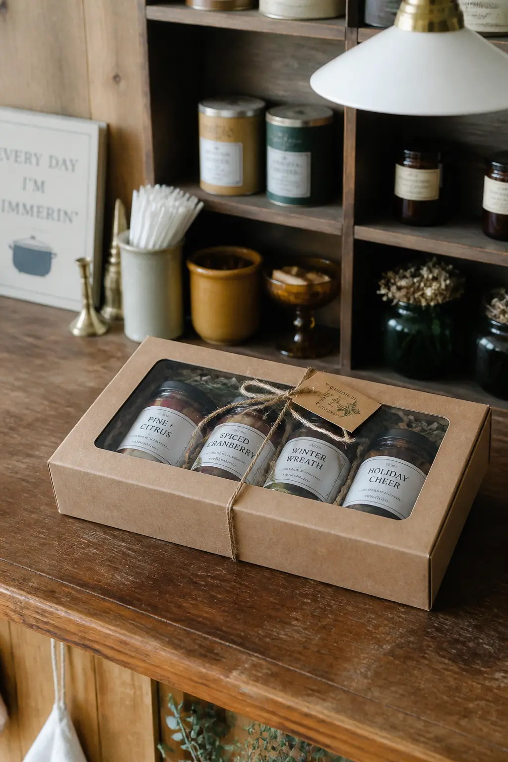
A kraft box with a clear acetate window in the lid shows the contents without opening anything. The recipient sees the jars through the window before the box is opened, which creates a pre-reveal moment that standard packaging skips. Arrange the jars so the most visual element faces up toward the window.
What makes it feel finished: the contents are styled, not just packed. A layer of shredded paper filler below the jars brings them up to the window level. A small sprig of dried greenery between the jars fills the gap and reads as intentional through the acetate.
🛍 Shopping guide
The Crate-Style Wooden Box Set
A small wooden crate holds three jars, a wooden spoon, and a recipe card. The crate is reusable and substantial. The recipient receives something she will use on a shelf or a windowsill after the kit is finished. Wood changes the perceived value of the gift without changing the cost of the ingredients.
What makes it feel finished: the jars are packed tightly enough not to rattle. A strip of cloth ribbon across the top of all three jars, tied at one end, signals that the crate is arranged rather than simply filled.
The wooden spoon handle extends beyond the crate side at an angle, which makes the whole thing look like a market display.
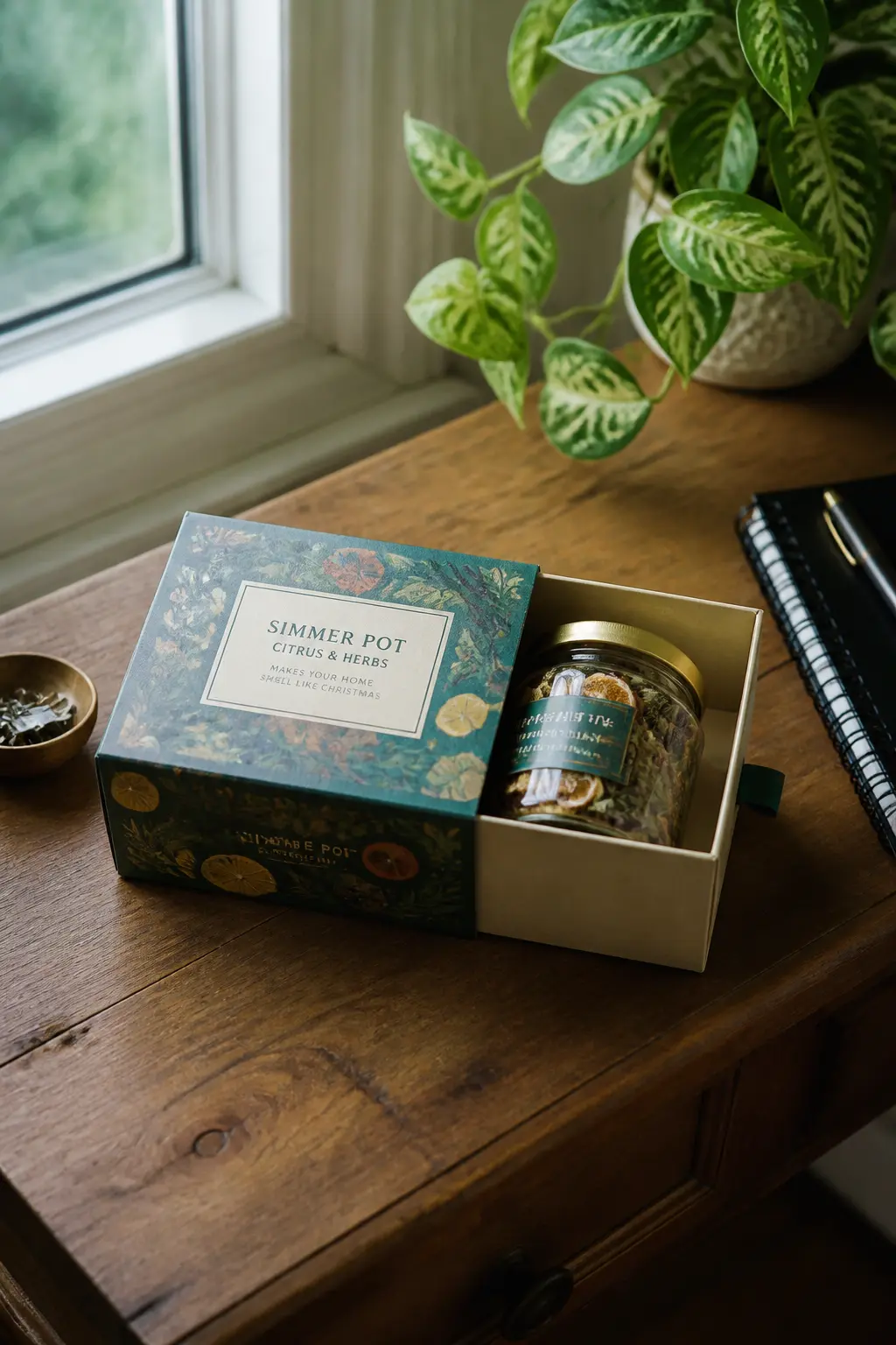
The Slide-Drawer Box With a Printed Sleeve
A slide-drawer box works like a matchbox: the outer sleeve is printed, the inner drawer slides out to reveal the jar. The motion of opening is different from lifting a lid, and that difference makes the gift feel more deliberate. Print the blend name and a simple illustration on the sleeve.
What makes it feel finished: the sleeve fits the drawer with almost no gap.
A tab or a ribbon loop at the end of the drawer makes it easy to pull without struggling, which is a detail that signals the giver thought about the experience of opening it.
The jar inside sits in a paper nest so it does not slide when the drawer opens.
🛍 Shopping guide
The Hinged-Lid Tin With a Printed Interior
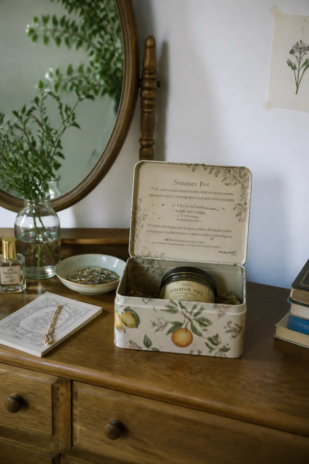
A hinged-lid tin opens to reveal a printed paper lining the interior. The lining can carry the recipe, a short note, or a simple pattern. The recipient sees the tin exterior as one thing and the printed interior as a second layer of design. It is a two-part reveal in one object.
What makes it feel finished: the paper lining is cut exactly to fit the base of the tin. A jar or sachet sits on top of the lining. The hinge is at the back, which means the interior faces forward when she opens it. That orientation is worth checking before packing.
🛍 Shopping guide
Frequently Asked Questions
What goes in a simmer pot gift kit?
The standard kit includes dried citrus slices, whole cinnamon sticks, whole cloves, star anise, and a dried herb such as rosemary or bay leaf. The recipient adds water, brings it to a low simmer, and tops up the water as it evaporates.
The blend is secondary to the packaging in a gift context: choose the vessel and presentation first, then fill it.
How do you make a simmer pot gift look professional?
Three things separate a professional-looking kit from a craft project: a consistent container with a clean lid, a printed label in one font rather than handwriting, and one deliberate finishing detail such as a wax seal, a dried botanical, or a fabric wrap. Resist adding more than one finishing detail: restraint reads as confidence.
What is the best container for a simmer pot gift?
Wide-mouth glass jars work for layered presentations because the contents are visible. Hinged-lid tins or rigid gift boxes work when you want to hide the contents for a reveal. Ceramic jars or enamel pots work when the container itself is the main gift.
Match the container to the occasion: a casual hostess gift suits a linen bag or kraft box, a more significant gift suits a rigid box or a pot.
Can you make a simmer pot gift without a jar?
Yes. Muslin drawstring sachets filled with the blend sit neatly inside a small pot or bowl and travel without any risk of breakage. Flat-bottom kraft pouches sealed with a sticker work for mailing. Both formats look intentional and avoid the craft-store-jar association.
How far in advance can you make a simmer pot gift?
Dried spice blends keep well for several months, so the ingredients themselves are not time-sensitive. The packaging is. Dried botanicals used as decoration, such as rosemary sprigs or citrus wheels pressed against glass, hold their appearance for two to three weeks. Assemble the decorative elements close to the giving date and fill the jars further in advance.
What do you write on a simmer pot gift tag?
Keep it short: the name of the blend, a one-line instruction (“Add to two cups of water, simmer on low”), and the recipient’s name if you are personalising it. A recipe card inside the box or bag can carry more detail. The tag or exterior label should be readable at a glance.
Find the right DIY candles guide for your season, skill level and style, from soy and beeswax recipe
36 easy stone painting ideas grouped by mood, from gold celestial rocks to garden koi ponds, gifts a
24 crochet fall decor pieces small enough to finish in one evening session. Rust, ochre, sage and cr
Leave a Reply