

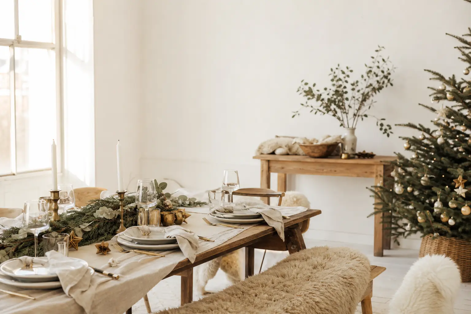
A white christmas goes wrong in one specific way: everything is the same temperature, the same finish, and the same level of light. The room ends up looking like a dental waiting area that someone has strung with fairy lights. The fix is not to add colour. It is to add friction, and one warm metal.
Every scheme below names its texture first, then its metal. The list runs from the coolest white at the top to the warmest at the bottom, so you can find your starting point quickly. Some of these sit inside a broader christmas decor scheme; others stand alone. None of them use glitter, plastic snow, or a cold white LED.
Pick one texture, one metal, and commit. That is the whole method. The twenty-eight schemes below show you exactly what that looks like in practice, room by room.
This post contains affiliate links. If you buy through them, I may earn a small commission at no extra cost to you.
- The Cool End: Chalk and Paper Whites
- The Middle Register: Bone, Ceramic, and Matte
- Textile Whites: Wool, Linen, Cotton, and Knit
- Natural Material Whites: Wood, Stone, Branch, and Grass
- Glass, Ceramic, and Reflective Whites
- The Warm End: Oatmeal, Cream, and Mismatched White
- Edge Cases: Iron, Steel, Shell, and Terracotta
- Frequently Asked Questions
The Cool End: Chalk and Paper Whites
These are the sharpest, most minimal whites on the list. They need the roughest textures to stay alive, and the warmest metals to avoid looking like a showroom. Brass and unpolished wood do the work here.
If your room has a lot of natural light or white-painted walls already, start here. The contrast between a very cool white and a very raw material is what creates interest.
Chalk White with Raw Linen and Brass
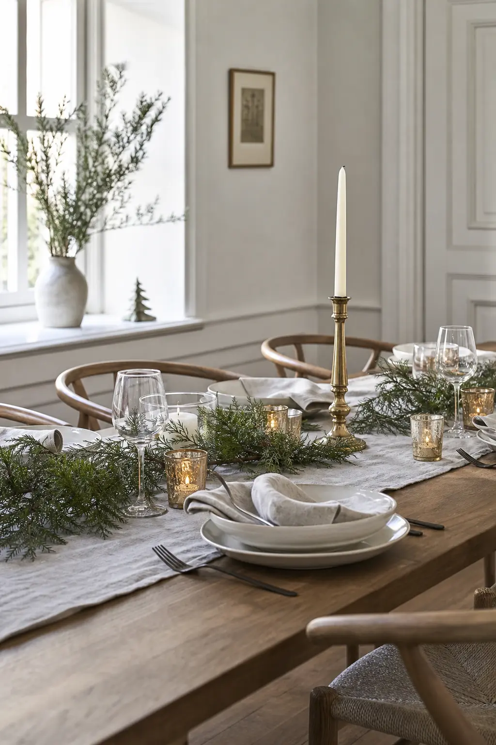
Chalk white is the sharpest, most blue-adjacent white on this list. It needs immediate warmth or it will read as clinical. Raw linen, unwashed and slightly rumpled, provides the friction. Brass provides the heat.
Use chalk-white walls or a chalk-painted dresser as the backdrop, then layer in an unbleached linen table runner or curtain panel. A single brass candlestick, unpolished so it shows its age, does the whole job of warming the space.
Keep every other surface bare. The restraint is the point.
🛍 Shopping guide
Paper White with Brown Card
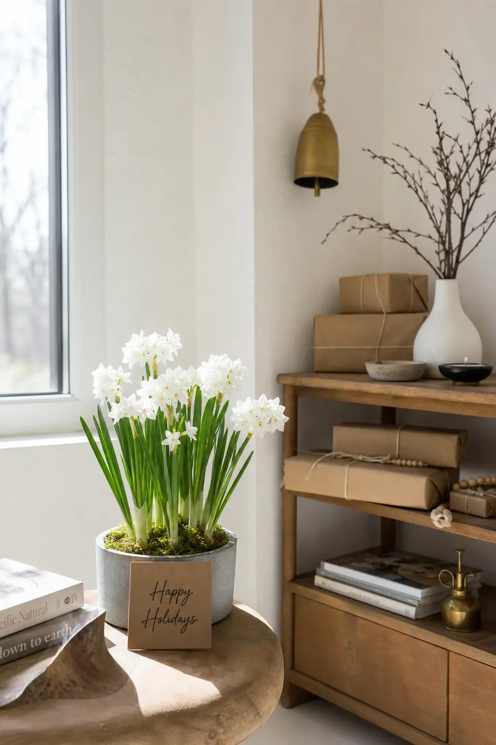
Paper white is the white of a blank sheet held to a window: bright but not harsh, with no obvious undertone. Brown kraft card is its perfect foil because both materials share a similar origin and a very different finish.
Use kraft card gift tags, brown paper wrapped parcels, and card gift boxes stacked under a white-flocked or bare-branch tree. The metal here is brass, but it only needs to appear once, on a single tag stamp or a small bell tied with twine.
This scheme photographs well and costs almost nothing to assemble.
🛍 Shopping guide
Matte White with Rough Plaster
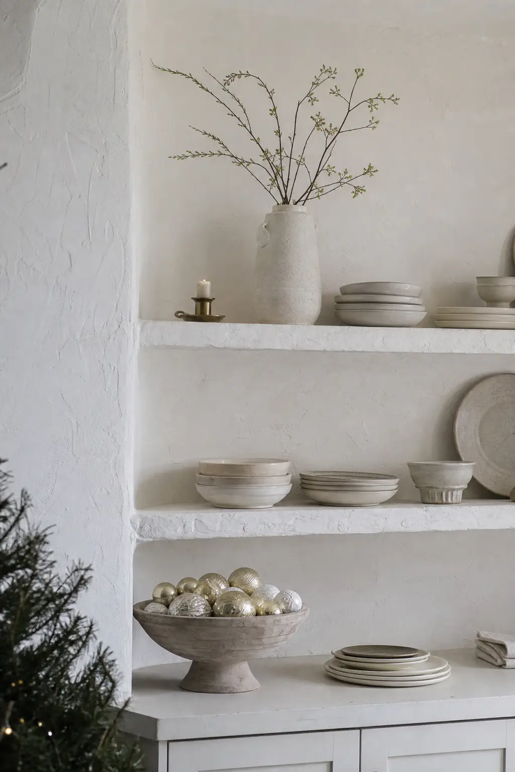
Rough plaster is a texture, not a colour, and on a white wall it creates shadow and depth that no paint finish alone can match. Matte white objects placed in front of a limewash or rough-plaster wall pick up that shadow and immediately read as three-dimensional.
The metal for this scheme is brass, worn and unhurried. A brass pillar holder, a stack of matte white plates, a plaster-finish vase: each one borrows depth from the wall behind it.
This scheme suits apartments and older properties where the walls already have character.
🛍 Shopping guide
White with Waxed Paper
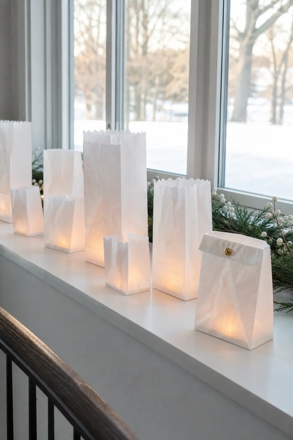
Waxed paper has a translucency that plain paper does not: light passes through it and warms slightly as it does. Wrapped around a jar holding a small candle, or folded into a simple luminaire bag for a windowsill, it adds light without electricity.
The metal is brass, but very small: a brass eyelet in a waxed-paper bag, or a brass map pin used to hang a waxed-paper tag. This is a scheme built from stationery supplies, not homeware departments.
🛍 Shopping guide
The Middle Register: Bone, Ceramic, and Matte
Bone white sits between chalk and oatmeal: it reads as white in photographs but feels gentle in person. Pair it with materials that have visible grain or weave, and copper or pale oak as the warm accent.
This register suits rooms with mixed natural and artificial light. It forgives a little more than chalk white does, and it layers well.
Bone China with Unpolished Wood
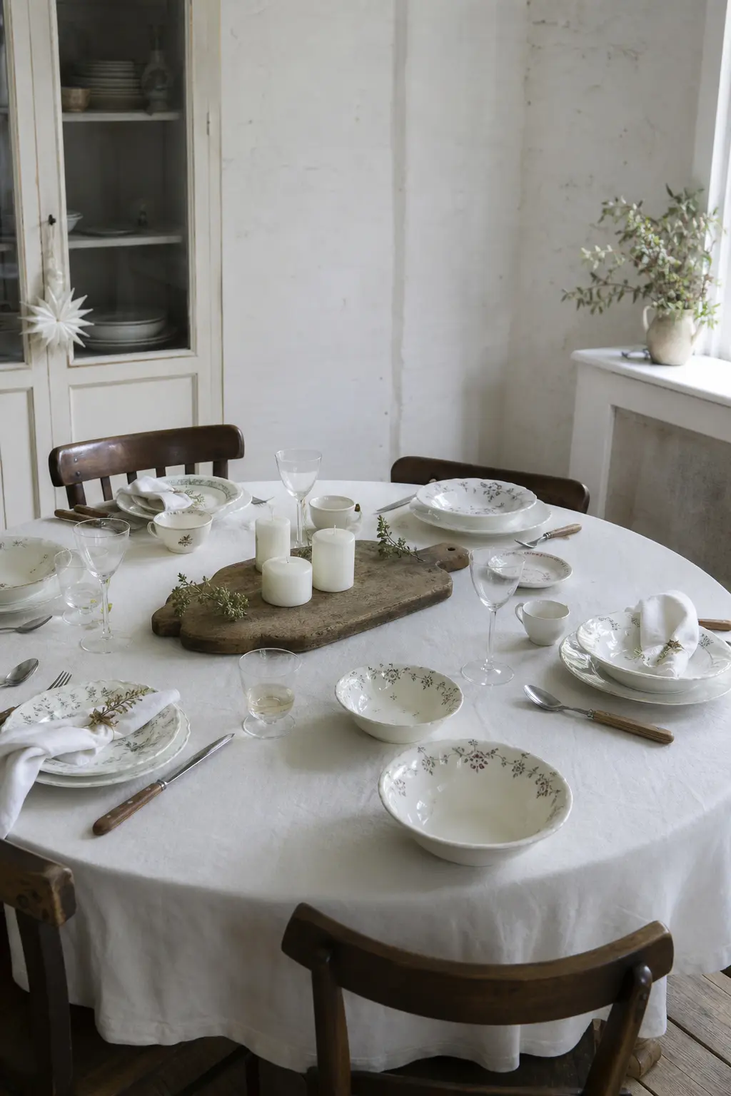
Bone china has a warmth that pure white does not: the ivory undertone comes from its material makeup, not from styling. Place it on unpolished, unsealed wood and the combination reads immediately as considered rather than cold.
A table set with mismatched bone china, wooden-handled cutlery, and a central arrangement of white candles on a raw oak board covers every texture the scheme needs. The metal is brass, appearing only on napkin rings or the candlestick base.
🛍 Shopping guide
White Ceramic with Sheepskin
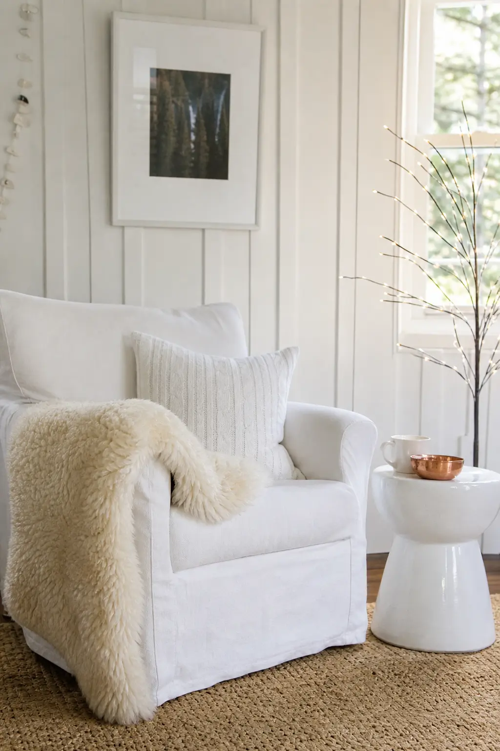
Sheepskin is almost impossibly forgiving as a texture partner for white ceramic: the two materials share no surface quality, so the contrast works immediately. A sheepskin draped over a chair or laid across a bench softens the room before anything else arrives.
The ceramics can be simple: a white ceramic mug, a large bowl holding pine cones in their natural unvarnished state, a set of white ceramic tealight holders. The metal is copper, and it needs to appear only once, perhaps in a small copper bowl or a copper wire star.
🛍 Shopping guide
Oatmeal Wool with Pale Oak
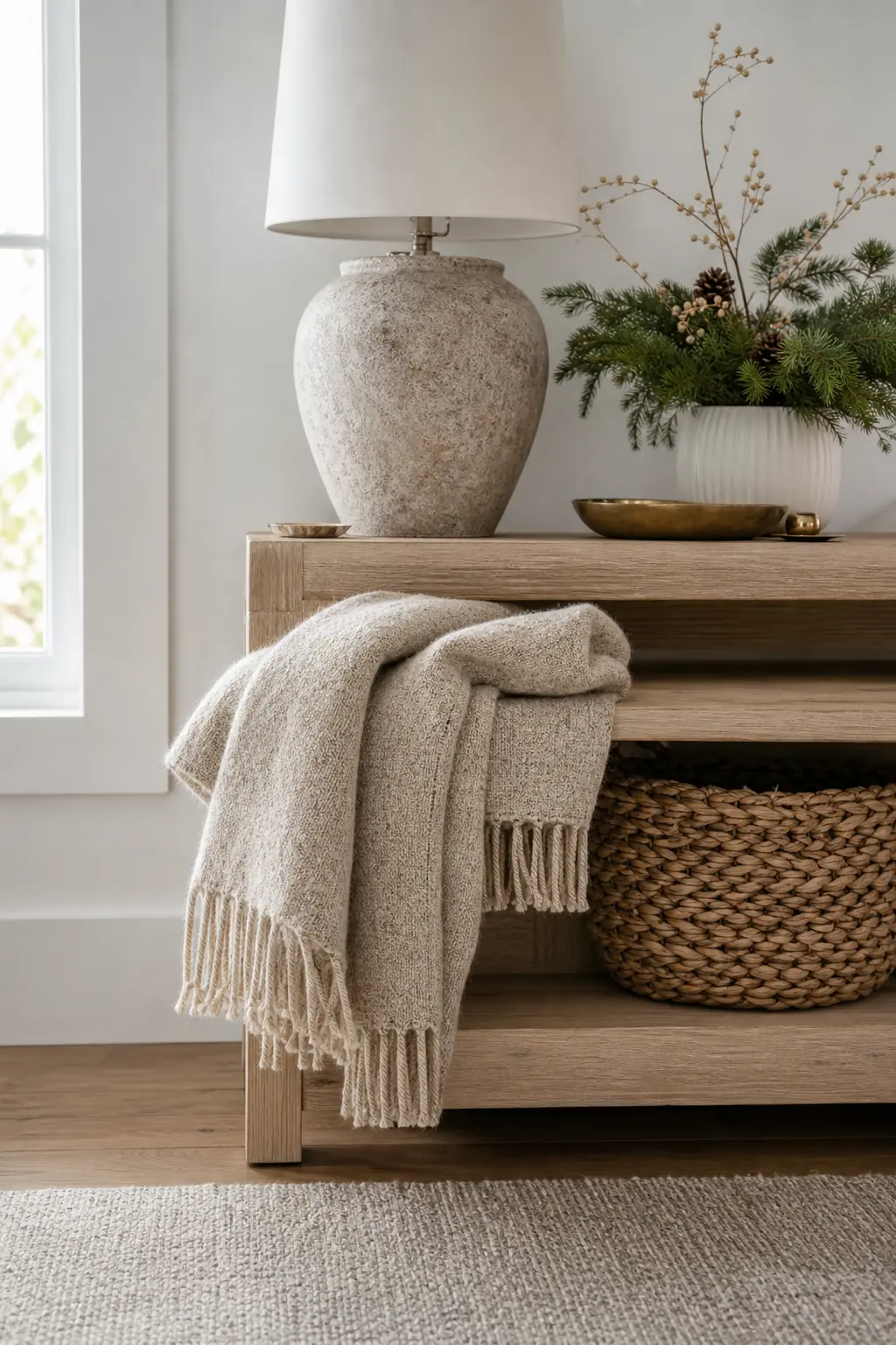
Oatmeal is technically a white with a strong warm-grey undertone, and wool carries that undertone beautifully. Pale oak furniture or flooring in the same warm-grey register creates a tonal scheme that reads as intentionally quiet rather than accidentally monochrome.
Layer an oatmeal wool blanket over pale oak furniture. Add a woven wool basket in the same colour family, and a single brass hook or rail that the blanket can drape from. No other metal, no other colour. The warmth is already built in.
🛍 Shopping guide
White with Dried Grasses
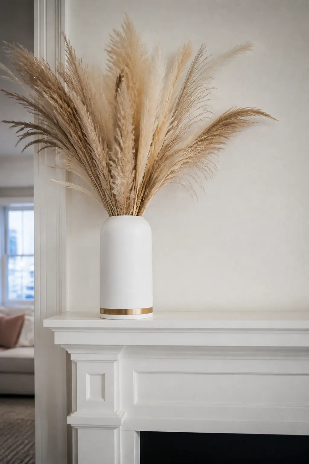
Dried grasses are already warm: pampas, wheat, and bleached rye all carry a honey-to-cream tone that pushes any white surface toward warmth without introducing a new colour. Bundle them loosely in a matte white ceramic vase and leave them tall.
The metal is brass, and the smallest possible application works best: a brass ring around the vase neck, or a brass wire used to bind the bundle. This scheme suits mantelpieces, entrance halls, and dining table centres equally well.
🛍 Shopping guide
Textile Whites: Wool, Linen, Cotton, and Knit
Fabric is the fastest way to add warmth to white without adding colour. The key is to choose fabrics that carry visible texture: waffle weave, loose linen, chunky knit, or raw cotton. A smooth white fabric next to a smooth white surface is no better than a painted wall.
These schemes work particularly well on tables, sofas, and beds styled as part of a whole-room treatment.
White with Unbleached Cotton
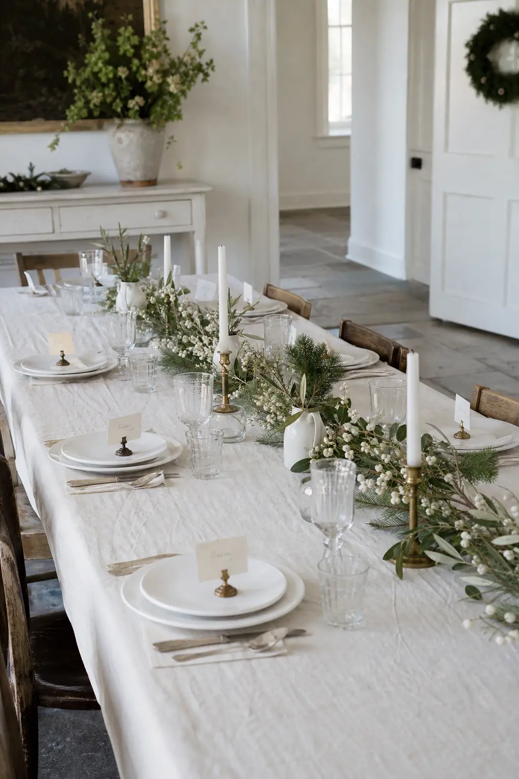
Unbleached cotton is an off-white with a slight warmth and a visible weave. Unlike bright white cotton, it does not compete with white walls or white objects: it sits just slightly warmer, and the difference is legible without being obvious.
Use it as a tablecloth, a napkin, or a simple wrapped bundle. The metal is brass, in the form of a brass clip or a folded brass card used to name a place setting. This is a scheme built for a table that will actually be eaten at.
🛍 Shopping guide
White with Copper
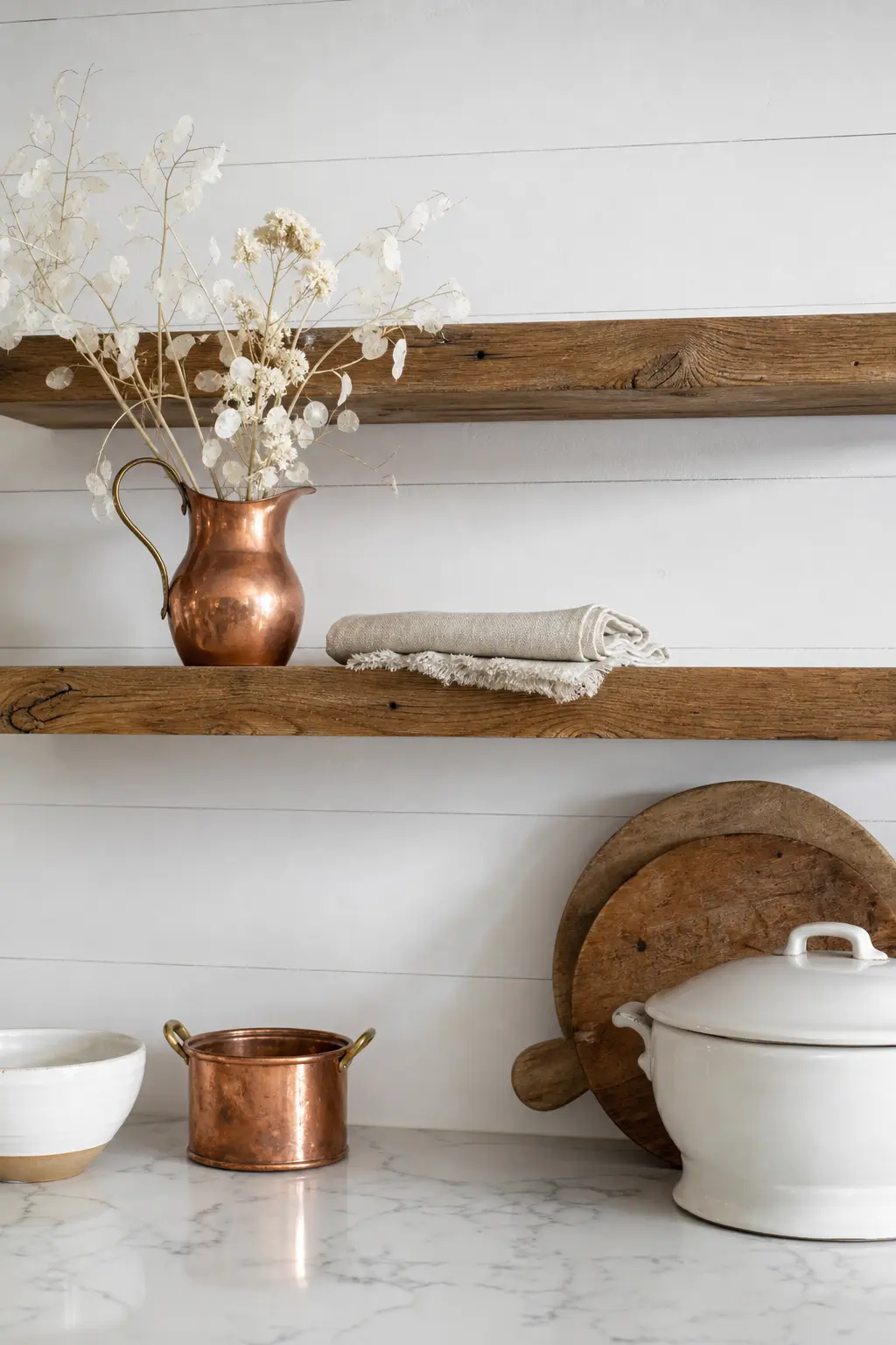
Copper is the warmest metal on this list and the one that does the most work from the smallest presence. A single copper bowl, a copper measuring cup used as a vase, or a copper jug holding dried stems will warm a white room from across the space.
The textile partner here is unbleached linen, because linen has enough visible texture to hold its own next to the visual weight of copper. This scheme is particularly strong in kitchens and dining rooms where copper already appears in cookware.
🛍 Shopping guide
White with Knitted Texture
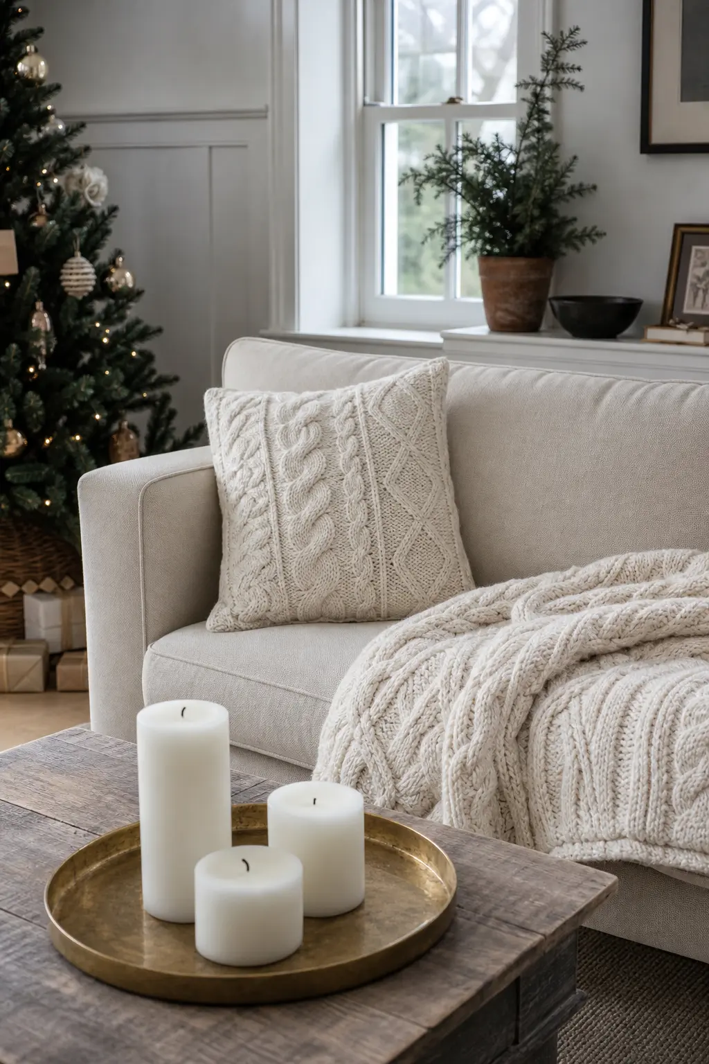
A chunky knit introduces more shadow per square inch than almost any other fabric. The relief pattern catches light and holds dark, and on a white or cream yarn that tonal range is enough to make the textile read as warm on its own.
Use a chunky-knit cushion, a cable-knit throw, or a knitted basket as the central textile in a sitting-room corner. The metal is brass, in a single candlestick or a simple brass tray beneath a group of white candles. Add nothing else.
🛍 Shopping guide
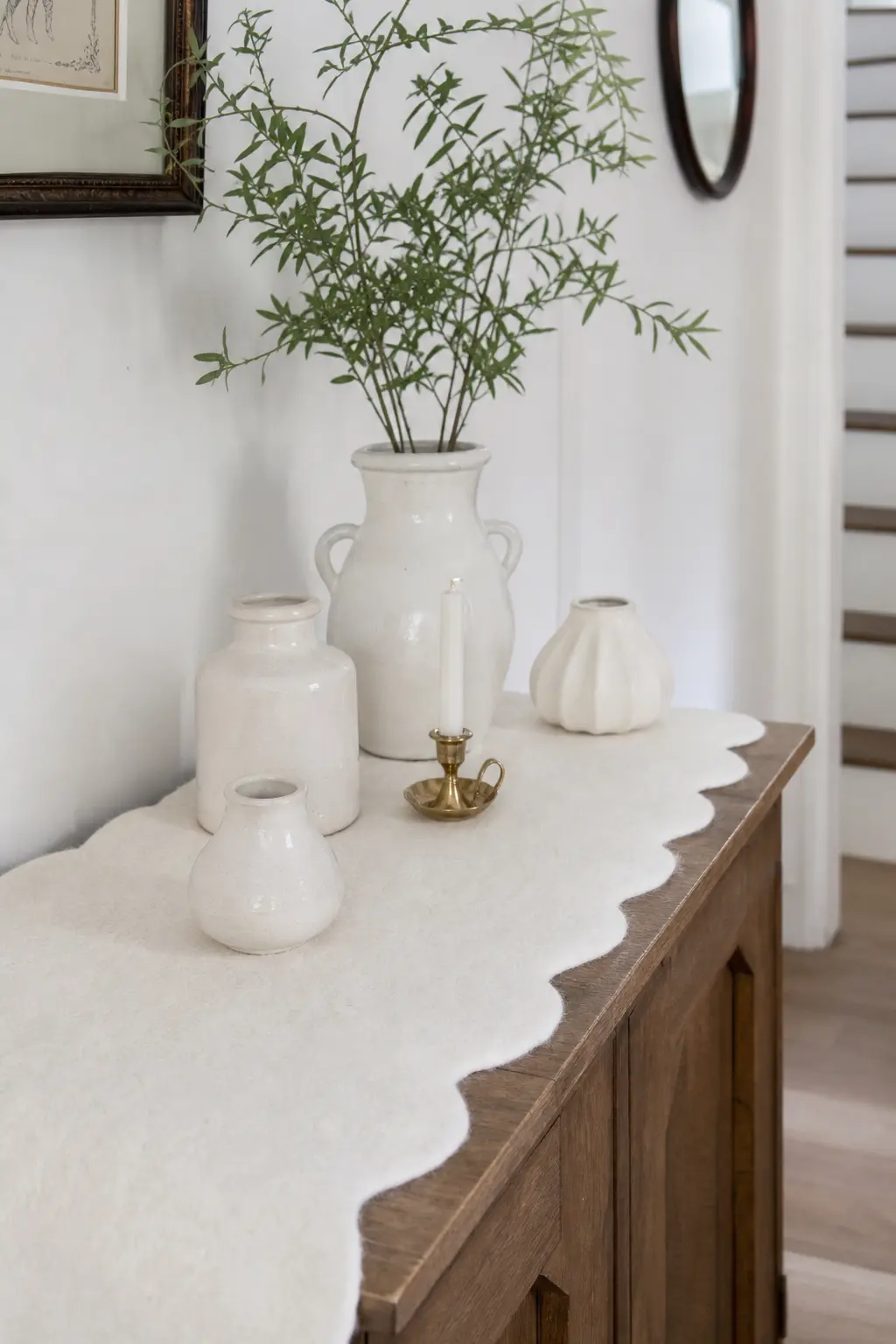
White with Felted Wool
Felted wool is denser and more matte than woven wool, and in white or pale grey it reads almost like a solid surface. That density makes it useful as a base or liner: a felted wool tray liner under ceramic objects, or a felted wool mat under a candle grouping.
The metal is brass, appearing on a single object within the grouping. This scheme rewards close inspection because the felt’s surface is interesting up close, not from across the room.
🛍 Shopping guide
Natural Material Whites: Wood, Stone, Branch, and Grass
Unprocessed natural materials have an undertone of their own, warm or cool, that acts as a second shade without being a second colour. A bare branch is not white; it is grey-brown against white. That contrast is exactly what the room needs.
For more in this direction, the scandinavian christmas decor approach and the country christmas aesthetic both rely on this principle heavily.
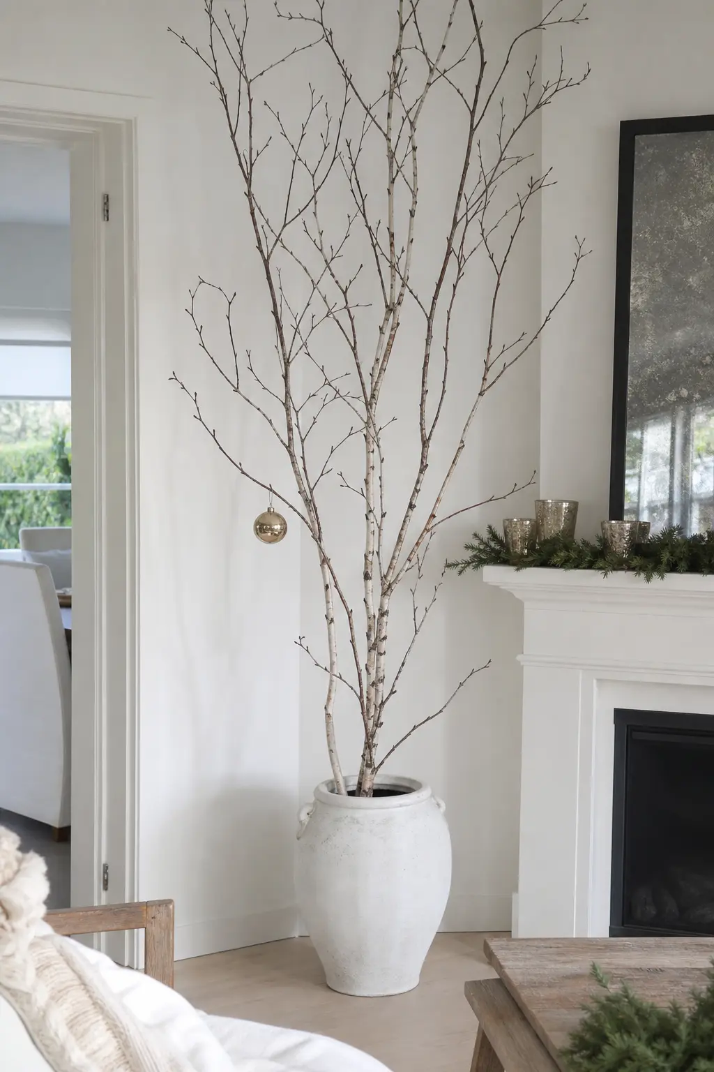
White with Bare Branches
A bare branch in a white room is the most undecorated Christmas tree alternative there is, and it works because the branch’s grey-brown tone and irregular silhouette provide everything white walls and white objects cannot: irregularity, shadow, and natural scale.
Place a large branch or a bundle of smaller birch stems in a heavy white ceramic or stone vessel. The metal is brass, in a single hanging ornament: plain, unglittered, matte-finished. Nothing else on the branch. The negative space is the decoration.
🛍 Shopping guide
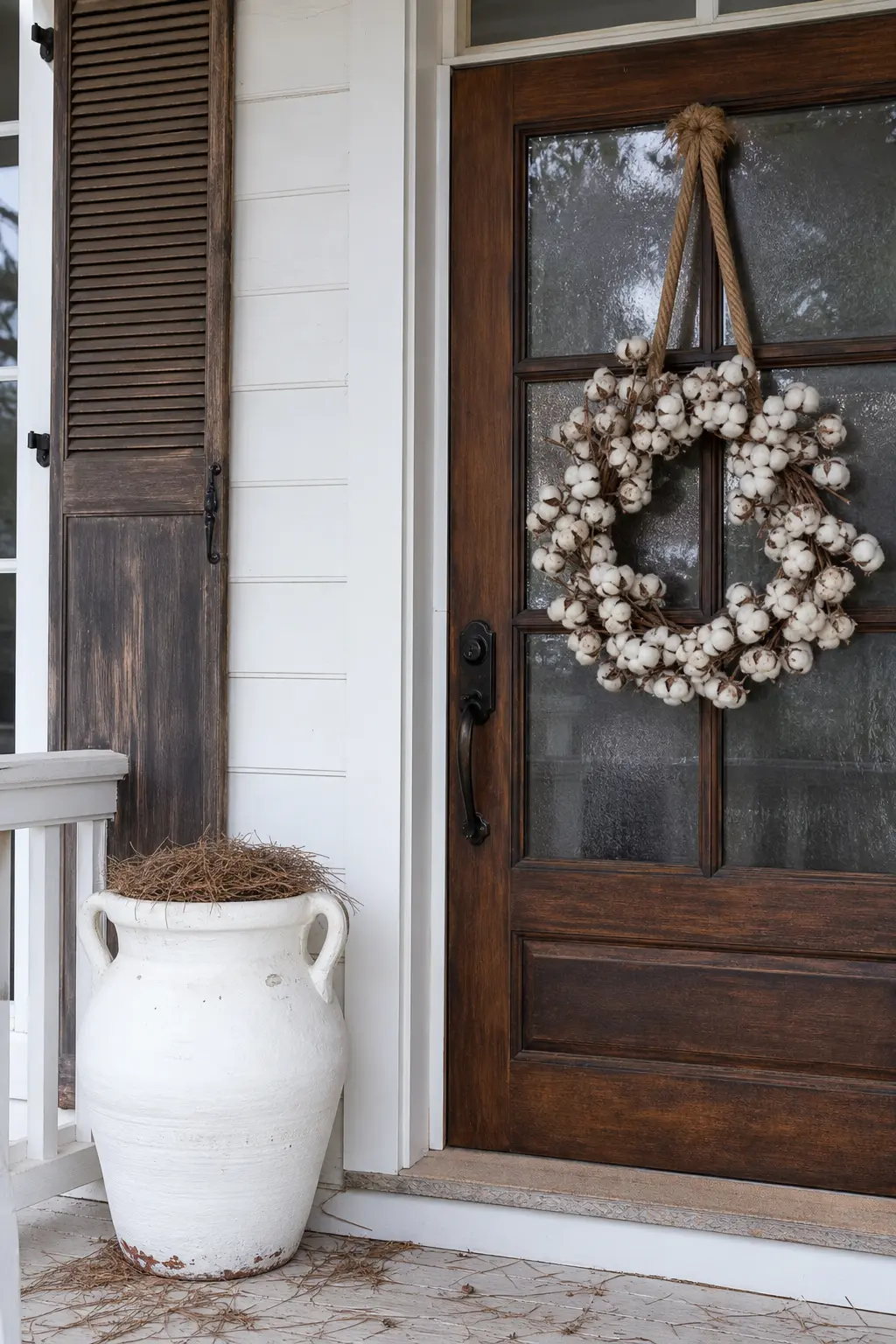
White with Jute Rope
Jute rope is a warm golden-brown and has enough visible fibre to function as texture even in very small quantities. Use it to bind a napkin, to hang a wreath, to tie a bundle of dried herbs, or to coil into a bowl as a base beneath white objects.
The metal is brass, because both jute and brass carry the same warm undertone. This is a scheme you assemble from materials you may already have rather than objects you need to buy.
🛍 Shopping guide
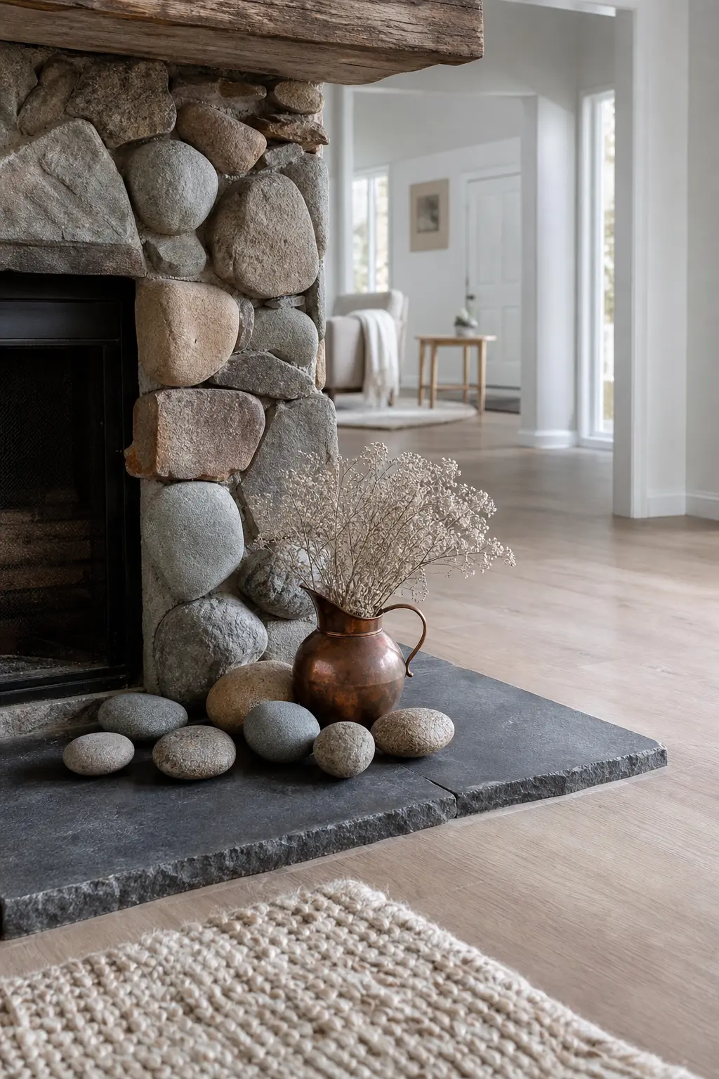
White with Stone and Slate
Stone and slate are grey rather than warm, but they carry weight and texture that warm materials do not, and placed next to white they create a cool-to-warm gradient within the room rather than a uniformly cold surface. Use a slate serving board, a stone mortar, or a river-stone collection as the base of a shelf arrangement.
The metal is copper, because its warmth is necessary to counterbalance the cool of the stone. One copper vessel or copper wire on the same surface is enough.
🛍 Shopping guide
White with Cane and Rattan
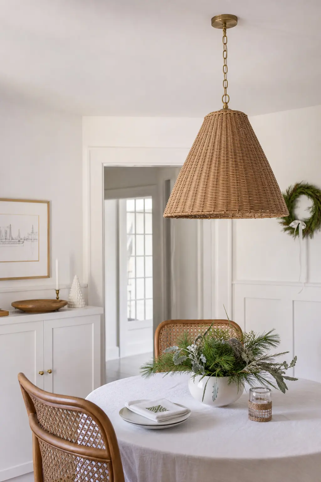
Cane and rattan have a honey tone that sits between oatmeal and pale oak on the warmth scale, and their woven structure provides visible texture at every scale. A cane chair, a rattan pendant shade, or a small woven rattan tray under a candle group will shift a white room’s temperature immediately.
The metal is brass, in a single fitting on the rattan shade or a brass detail on the cane furniture. This is a scheme that reads as expensive when done sparingly and overworked when done in excess.
🛍 Shopping guide
White with One Deep Green Stem
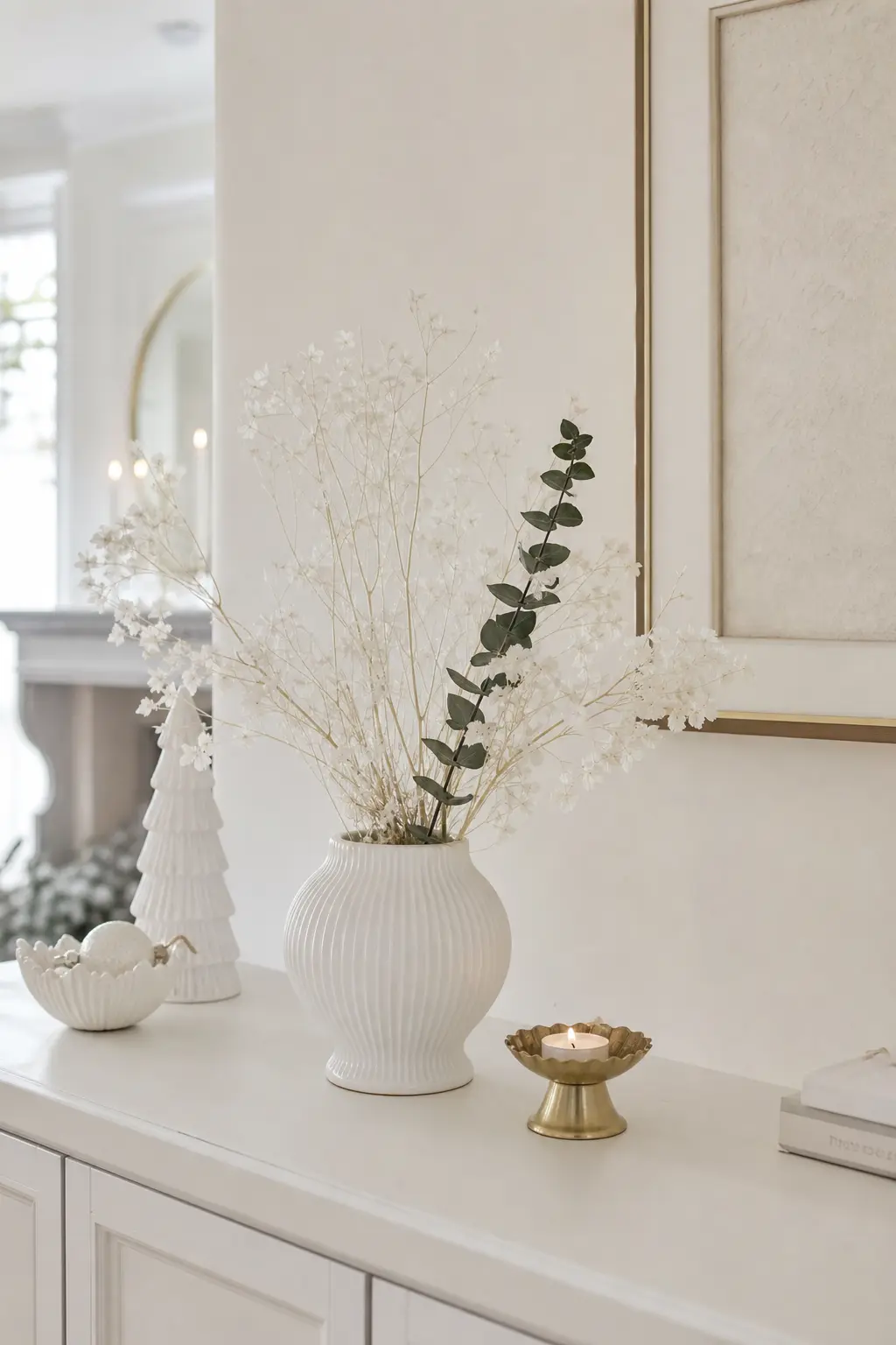
This is the only scheme on the list that introduces a colour, and it earns its place because a single dark green stem against an all-white arrangement is the minimum possible intervention and the one with the most visual impact.
Use a single eucalyptus stem, a sprig of rosemary, or one dark fir branch. Place it in a white ceramic vessel alongside white stems. Do not add more than one. The metal is brass, a single candle holder nearby. This scheme is the one you use when the room feels like it needs breathing, not when you want to introduce a full palette.
🛍 Shopping guide
Glass, Ceramic, and Reflective Whites
Milk glass, clear glass, and pale marble reflect light instead of absorbing it. Used alone they look sterile. But place them next to something matte and porous, and the contrast makes both surfaces more interesting.
Candlelight is the essential partner here. It moves, and movement is the one thing no styled surface can fake.
Milk Glass with Candlelight
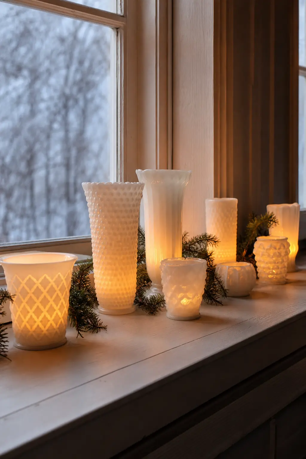
Milk glass is opaque white glass, and when candlelight passes through or reflects off it, it glows rather than shines. That glow is warm. Collect a group of vintage milk glass vessels in varying heights and fill them with plain white or cream candles.
There is no other metal required: milk glass under candlelight generates its own warmth. But if the room feels too monochromatic, one piece of aged brass nearby, a candlesnuffer or a small dish, pulls the scheme together.
🛍 Shopping guide
White with Clear Glass Only
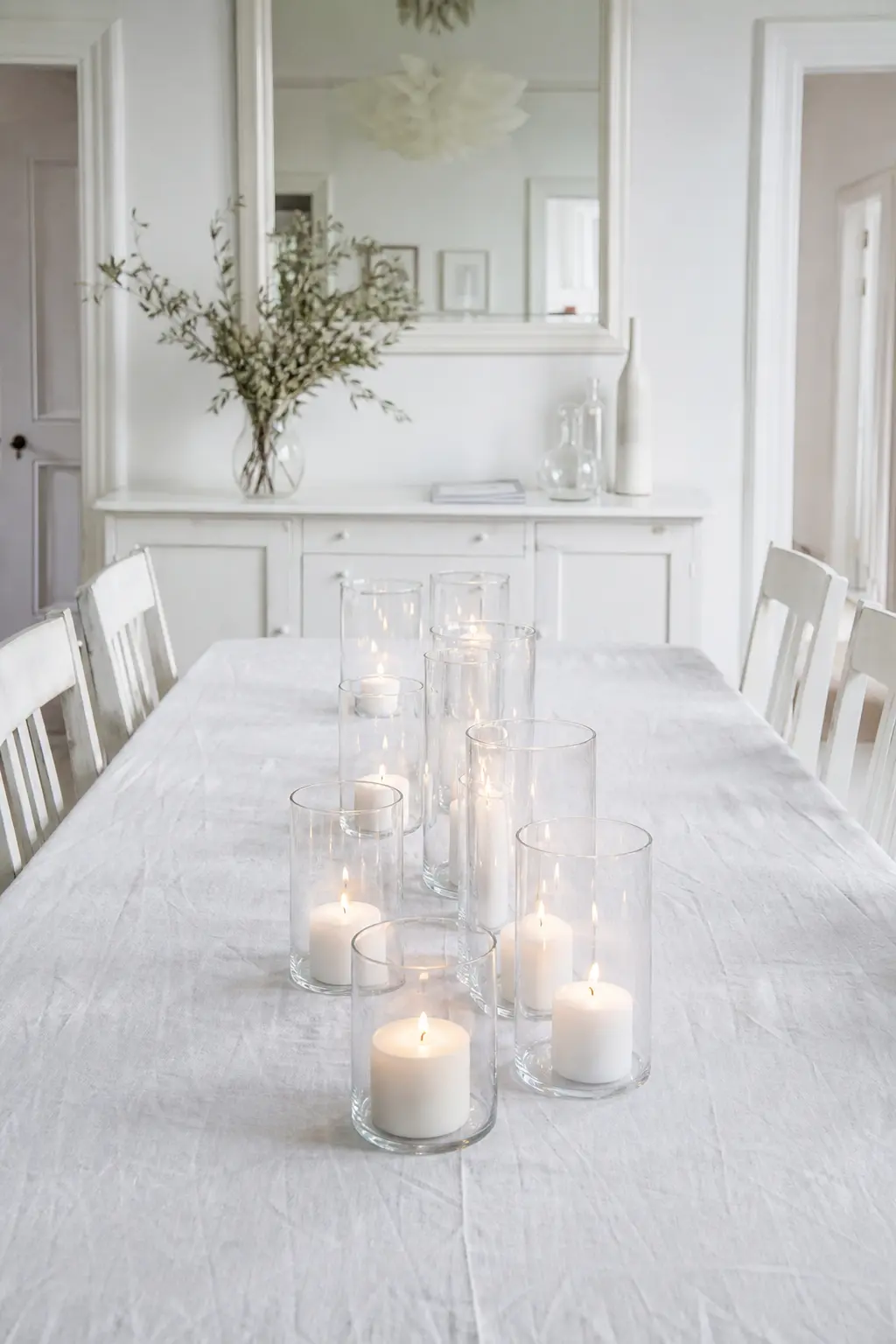
This is the austerest scheme on the list, and it only works with one condition: the candles must be real, and there must be enough of them. Clear glass alone reads as empty. Clear glass full of warm candlelight reads as expensive restraint.
Group clear glass cylinder vases of different diameters. Fill each with a white pillar candle or a cluster of floating candles. The metal, if it appears at all, is brushed steel in the form of a single vessel or tray used to group the glasses.
🛍 Shopping guide
White with Pale Marble
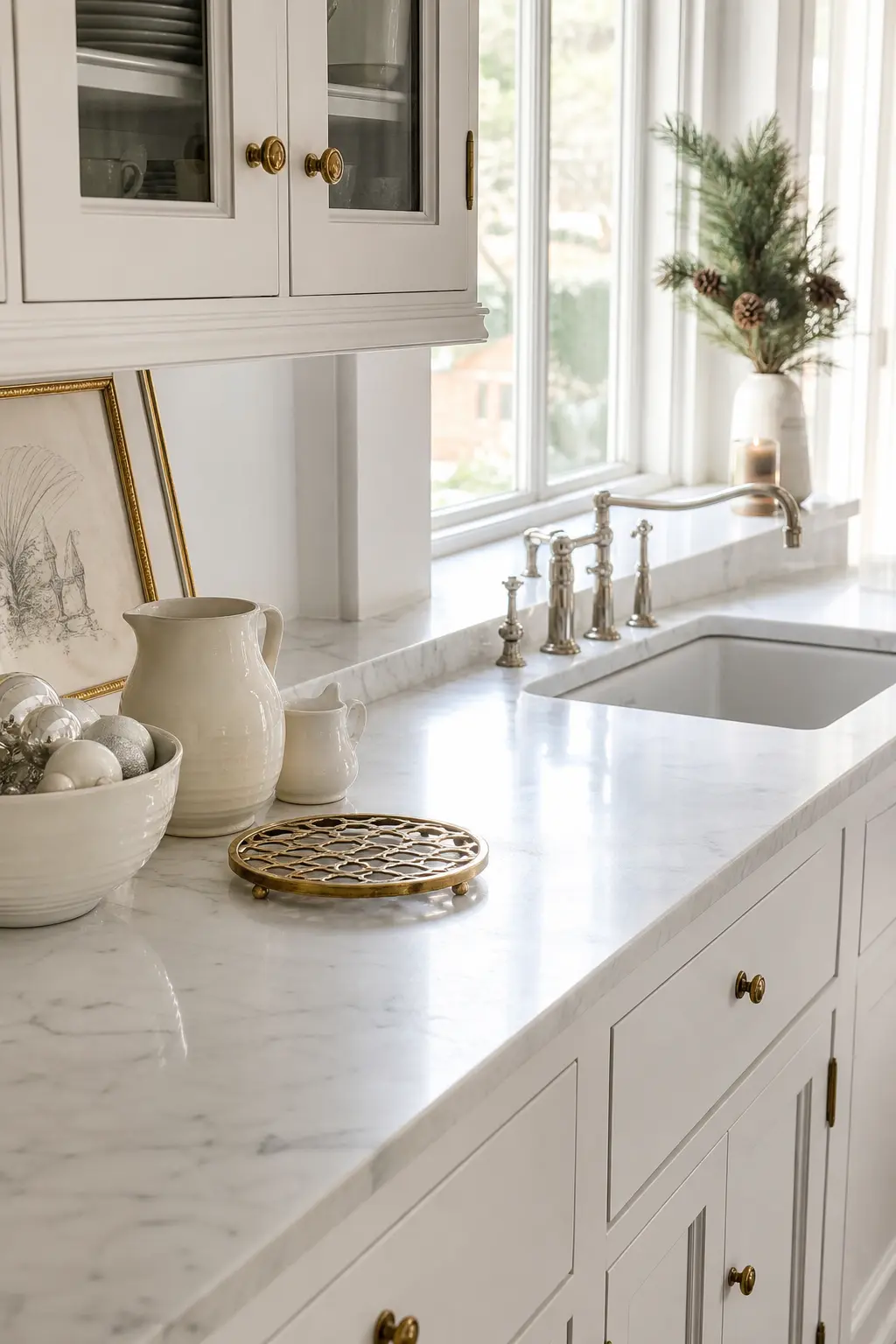
White marble has a grey or warm vein running through it, and that vein does the work. Place white objects on a marble surface or a marble-effect tray and the veining provides the tonal variation the scheme needs without any additional colour.
The metal here is brass, because marble and brass share a history that feels genuinely comfortable. A marble board, a brass trivet, a group of white ceramic objects: this is a kitchen or dining room scheme that works at any scale.
🛍 Shopping guide
White with Candle Wax as Texture
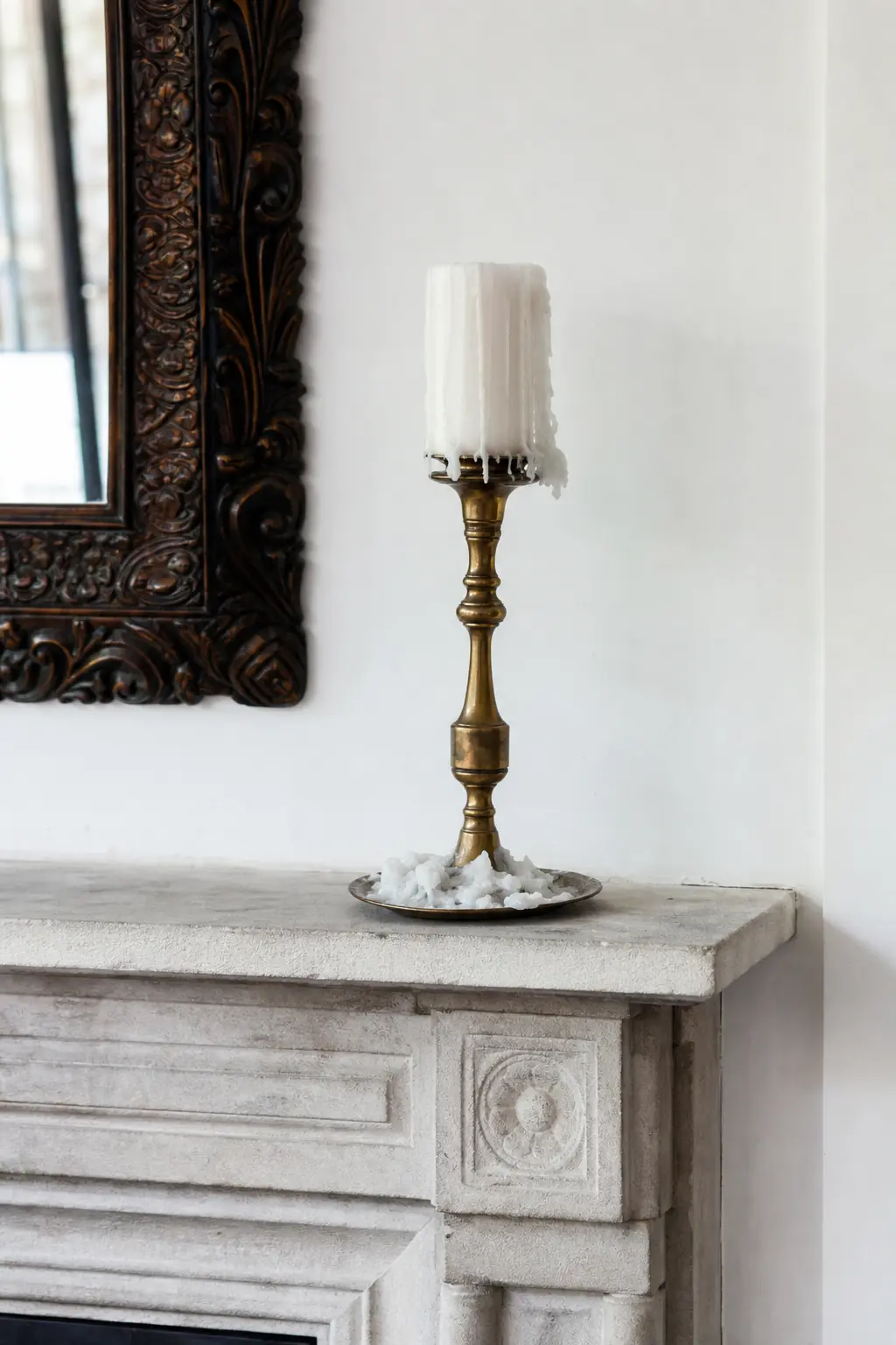
Dripped candle wax is a texture that most people clean off as quickly as possible. Left on a surface deliberately, it creates organic, unrepeatable pattern in white or cream that no manufactured object can replicate. Use a white pillar candle in a brass holder on a slate or stone surface and let the wax run.
The drips become the decoration. On a dark slate surface the white wax reads clearly; on a white surface the shadow in the drip is enough. Either way, this is a scheme built from a single afternoon of burning rather than a shopping trip.
🛍 Shopping guide
The Warm End: Oatmeal, Cream, and Mismatched White
At the warmest end of the list, white starts to shade into cream, unbleached linen, and felted wool. These are the easiest to live with and the hardest to photograph badly. They suit older homes, rooms with wood floors, and anyone who wants the look to feel more like a farmhouse than a gallery.
The vintage christmas decor canon lives almost entirely in this register, and for good reason.
White with Mohair
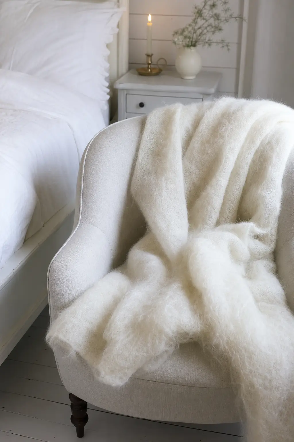
Mohair has a halo, a surface fuzz that catches light and softens any hard edge nearby. In white or very pale cream, a mohair throw over a chair or sofa turns a room into a room you want to sit in. That is the entire goal.
The metal is gold, softer than brass, appearing in a single small frame, a picture rail hook, or a candle holder. This is the warmest-reading textile scheme on the list and requires the least additional effort.
🛍 Shopping guide
White with Cream, Deliberately Mismatched
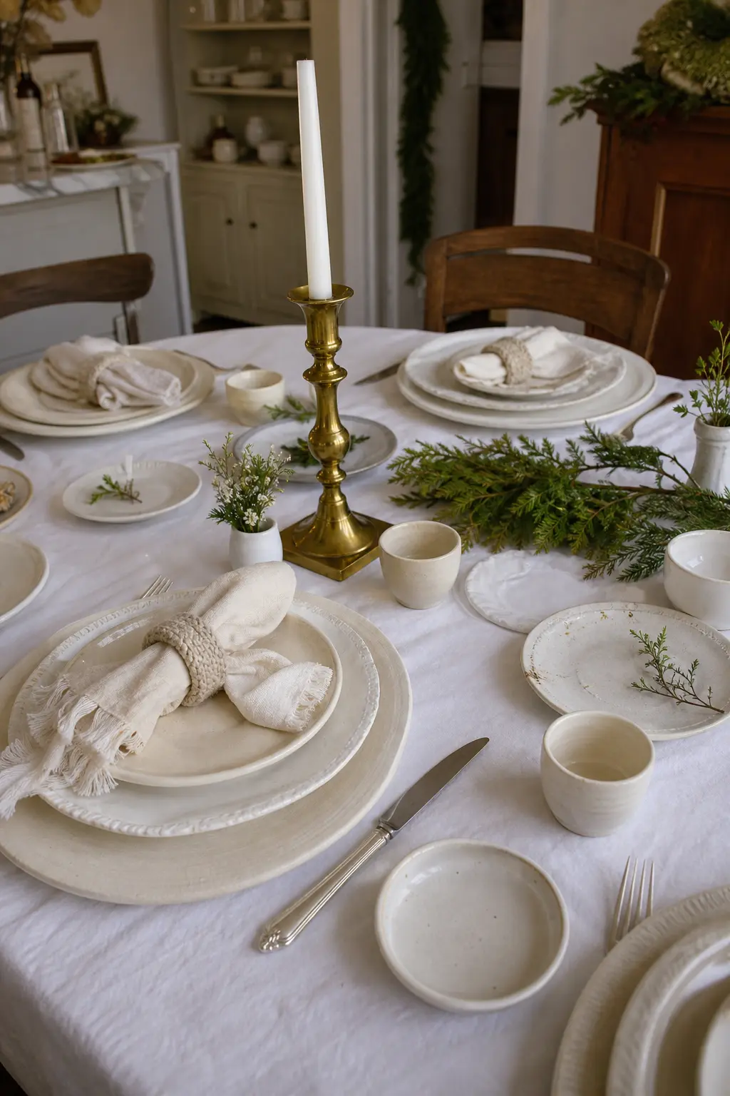
Mixing white and cream is usually treated as an error. Done deliberately, with different textures on each piece, it reads as collected rather than mismatched. The rule is one texture per piece: a chalk-white linen napkin next to a cream ceramic plate next to an oatmeal wool napkin ring.
No two pieces should share both a colour and a texture. The metal is brass, and it appears in a single element to tie the range together. This is the most lived-in scheme on the list and the one that grows over time as you add pieces.
🛍 Shopping guide
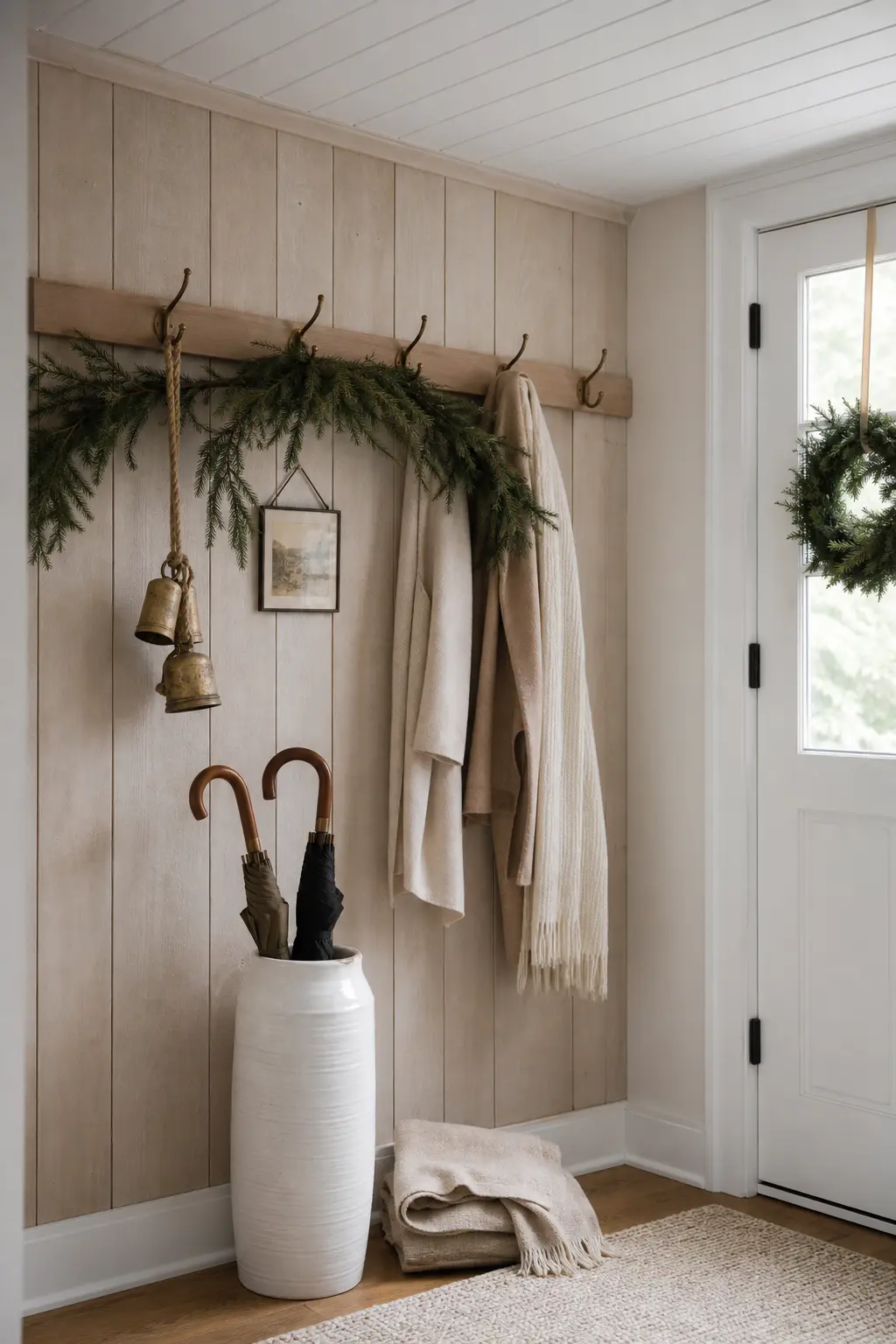
White with Limewashed Timber
Limewashed timber is white and warm simultaneously: the lime sits in the wood grain and the grain shows through. As a wall treatment, a furniture finish, or a reclaimed beam, it gives a white room something to look at without adding colour.
Place simple white objects against a limewashed timber wall or piece of furniture, and let the wood do the tonal work. The metal is brass or aged bronze, in a wall hook, a rail, or a simple fitting.
🛍 Shopping guide
Edge Cases: Iron, Steel, Shell, and Terracotta
These four schemes use a metal or material that most white palettes avoid. Black iron reads as a shadow rather than a colour. Brushed steel is cool but not cold when it sits next to raw texture. Bleached shell and unpainted terracotta both carry warmth in their material history even when they read as pale.
None of these are safe choices, and that is the point. If your room already has warmth from floors or joinery, one of these sharper accents will keep the scheme from going soft.
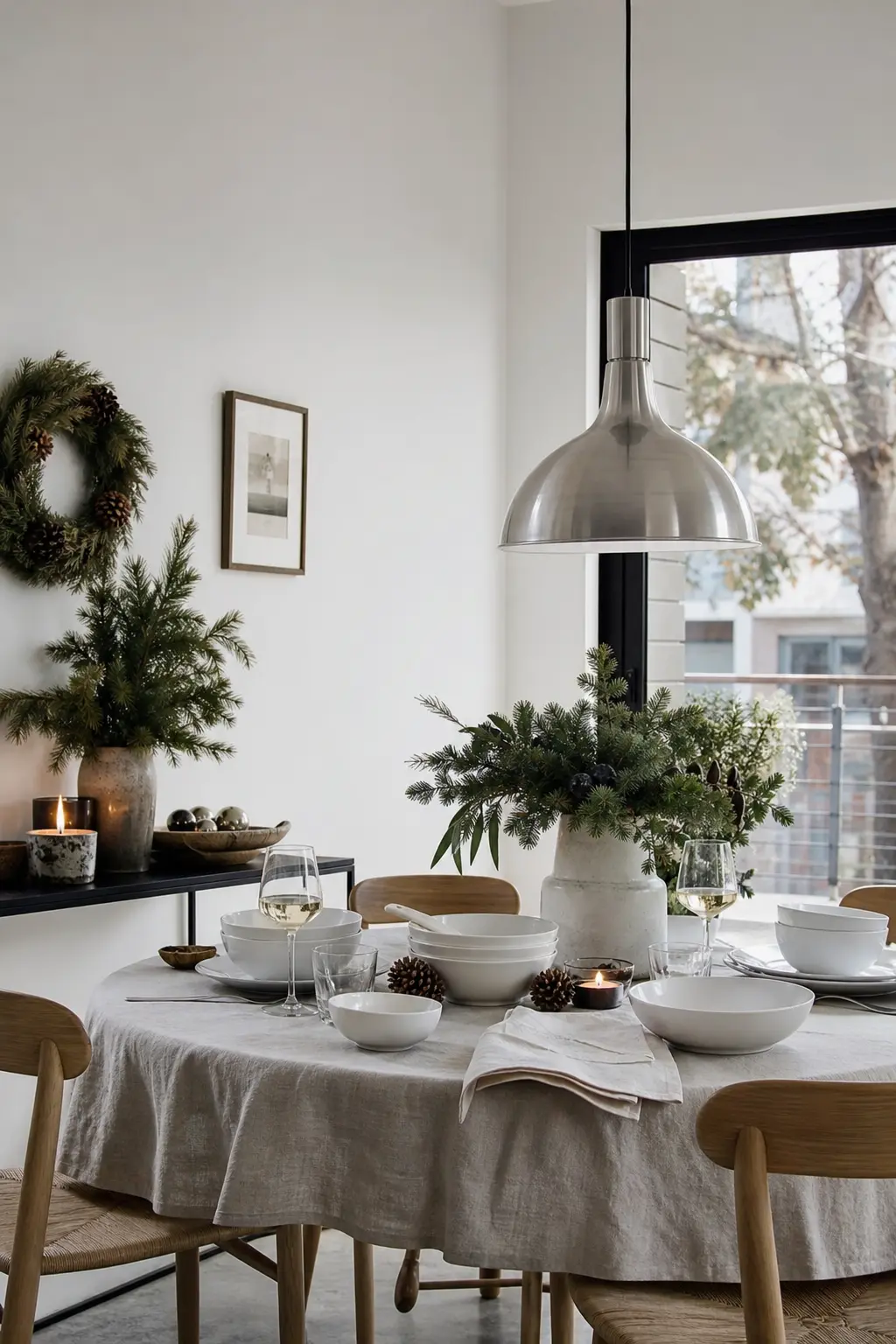
White with Brushed Steel
Brushed steel is not warm. It is the coolest metal on this list, and it appears here because paired with a sufficiently warm white and a rough enough texture, it reads as modern rather than cold. The white must be warm: oatmeal or bone, not chalk.
A brushed steel pendant light over a bone-white table, a steel tray under a group of white ceramic vessels on linen cloth: the steel provides focus while the textile provides warmth. This scheme suits contemporary apartments better than it suits traditional rooms.
🛍 Shopping guide
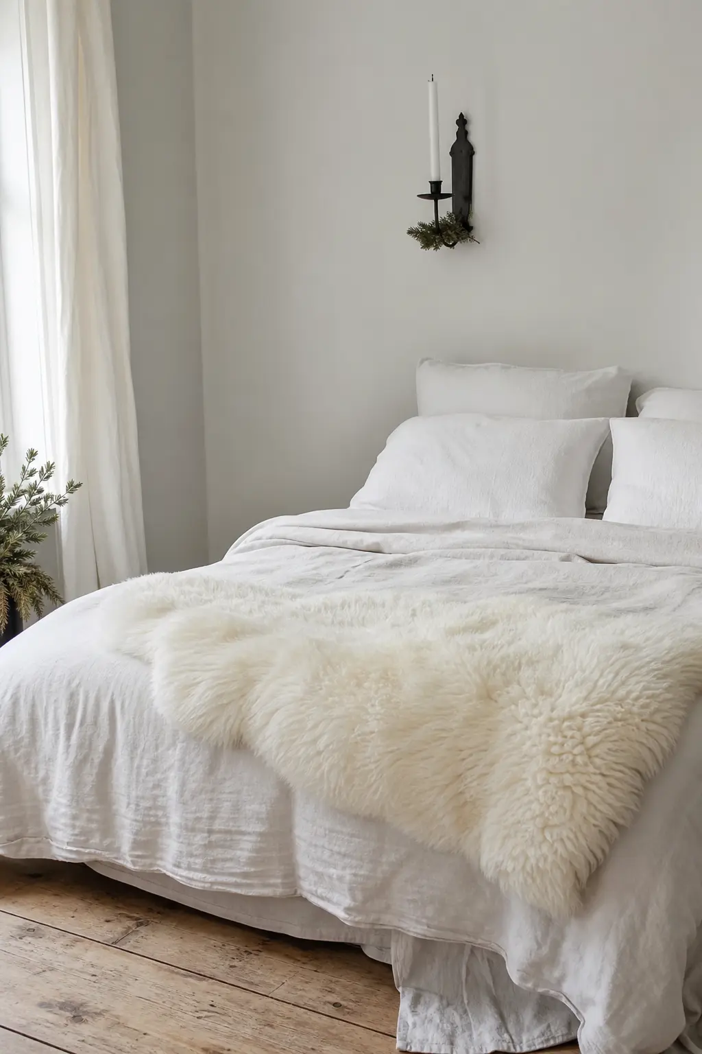
White with Black Iron for Contrast
Black iron is not a warm metal but it functions as a shadow, and shadow gives white depth. A black iron candle holder, a cast-iron trivet, or a black iron curtain rod in a white room creates the visual contrast that reads as depth rather than colour.
Use this sparingly. One black iron element per room surface is enough. More than that and the scheme tips from Scandinavian restraint into something that needs a different name. For the full approach to that aesthetic, scandinavian christmas decor covers it in detail.
🛍 Shopping guide
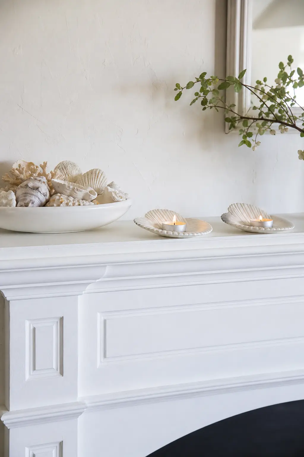
White with Bleached Shell
Bleached shell sits in the same tonal family as chalk white but carries texture and material memory that chalk paint cannot replicate. Group bleached shells in a shallow white bowl, or use large clamshells as tealight holders on a mantelpiece or shelf.
The metal is white gold or pale brass: anything too yellow will fight the shell’s neutral warmth. This scheme works best in a coastal or pared-back interior where the shell does not look like it has wandered in from a bathroom counter.
🛍 Shopping guide
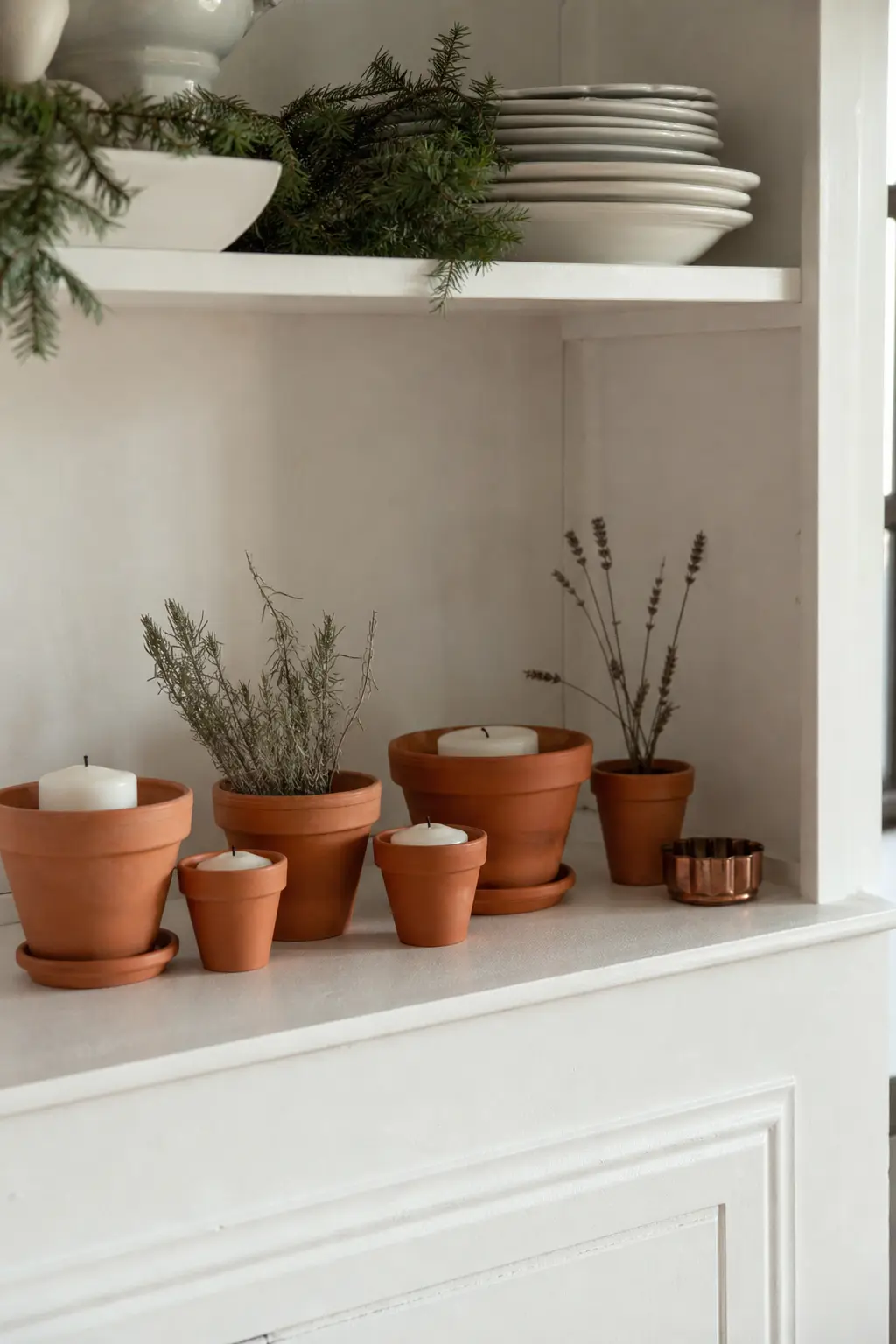
White with Unpainted Terracotta
Raw, unsealed terracotta is one of the warmest materials you can place next to white without introducing colour. Its orange-red tone sits far enough from the white to create genuine contrast while the rough, porous surface adds the texture the scheme needs.
Use unpainted terracotta pots as candle holders, vases, or simple vessels grouped on a white shelf or sill. The metal is copper, barely present: a copper wire holding a label on a pot, or a copper-toned small dish used as a base.
🛍 Shopping guide
Frequently Asked Questions
How do you decorate an all white Christmas?
Choose one texture and one warm metal per surface or zone, and let those two choices do all the work. White on white without a texture break reads as a paint sample, not a decorated room. Use raw linen, chunky knit, rattan, dried grasses, sheepskin, or plaster to introduce tactile contrast, and pick a single metal, brass, copper, or aged bronze, to add warmth. Group objects in odd numbers and leave generous empty space around each grouping so the textures read clearly.
How do I stop white decor looking cold?
Three things create warmth without colour: texture, candlelight, and a warm metal. Texture produces shadow and surface interest; real candles move and flicker where LEDs do not; brass, copper, and unpolished gold all carry undertones that read as warm even in a monochrome room. Avoid cold white LED strip lighting entirely, and avoid any surface that is simultaneously smooth, shiny, and bright white: that combination is what produces the clinical effect. Introduce one rough material, one real flame, and one warm metal and the room shifts immediately.
What metals go with white Christmas decor?
Brass is the most versatile because its yellow undertone sits naturally against every register of white from chalk to cream. Copper is the warmest and works best in kitchen and dining settings where it may already appear in cookware. Aged bronze and unlacquered gold both work in the same way as brass. Brushed steel is the only cool-toned metal that works, and it requires a warm white and a rough textile beside it to avoid reading as cold. Avoid polished chrome and bright silver: both push white further toward clinical rather than warm.
Is white Christmas decor still popular?
White and near-white palettes remain a consistent choice in Christmas decor because they photograph well, they work in any home regardless of existing colour scheme, and they age better across a long season than more trend-specific palettes. The shift in recent years has been away from the all-white-with-silver approach of the early 2000s and toward warm, textural schemes that mix chalk and bone whites with raw natural materials. That direction, toward warmth and texture rather than uniformity, shows no sign of reversing.
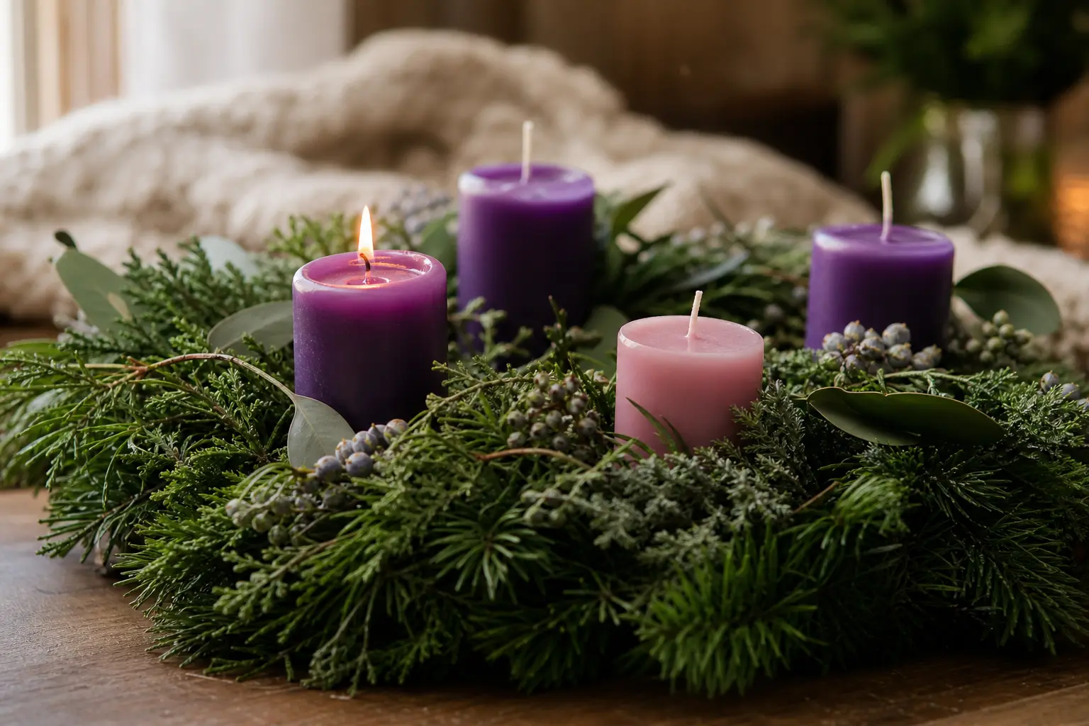
14 advent wreath ideas built around the classic four candles, fresh greenery and a quiet Sunday ritu

18 simple Christmas crafts for kids sorted by age, material and mess level, with steps, timings and
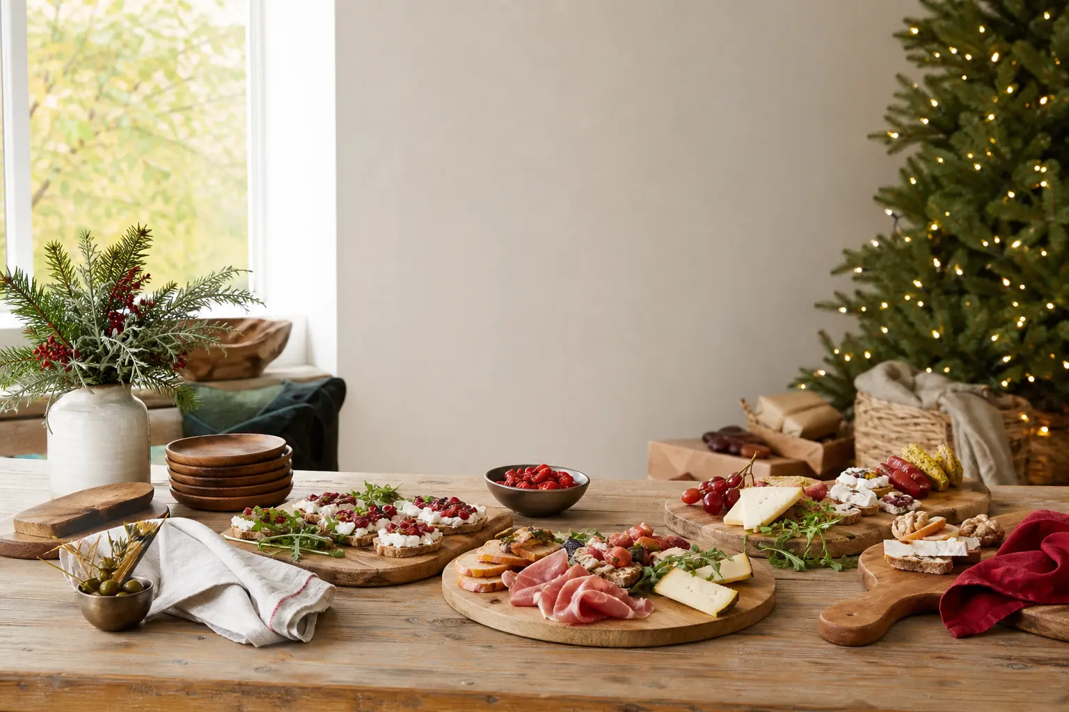
29 christmas recipes appetizers assembled cold, no oven needed. Boards, skewers, spoons and cups eve
Leave a Reply