

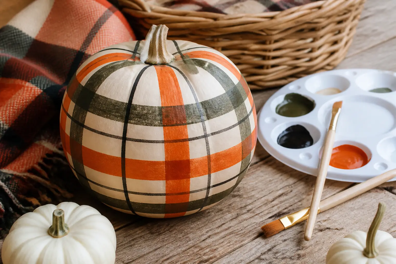
A plaid painted pumpkin looks like it requires a ruler, a steady pulse, and possibly art school. It does not. Every single design here uses painter’s tape to mask the lines, which means the pattern is only as hard as pressing tape into a ridge and waiting for paint to dry.
The 29 ideas below are sorted by plaid family: buffalo check, gingham, tartan, windowpane, and a handful of looser checks that do not fit neatly anywhere else. The last four entries are the method steps, because understanding the order of operations is what separates a crisp grid from a blurry one. If you are new to painted pumpkins, read those four first, then come back to the palette that caught your eye.
Every pumpkin here is fully finished, porch-ready, and photographed close enough to read the paint. None of them involve fabric, carving, or a single freehand stroke.
This post contains affiliate links. If you buy through them, I may earn a small commission at no extra cost to you.
Buffalo Check Pumpkins
Buffalo check is the forgiving entry point into plaid pumpkins. The squares are large, the repeat is simple, and two colours are all you need. Start here if this is your first attempt.
The key is equal stripe width: measure and mark lightly in pencil before taping. On a ribbed pumpkin the tape will lift at the ridges, so press it down hard with a fingernail before you lay the paint. The results below range from the classic red-and-black to softer, more unexpected pairings.
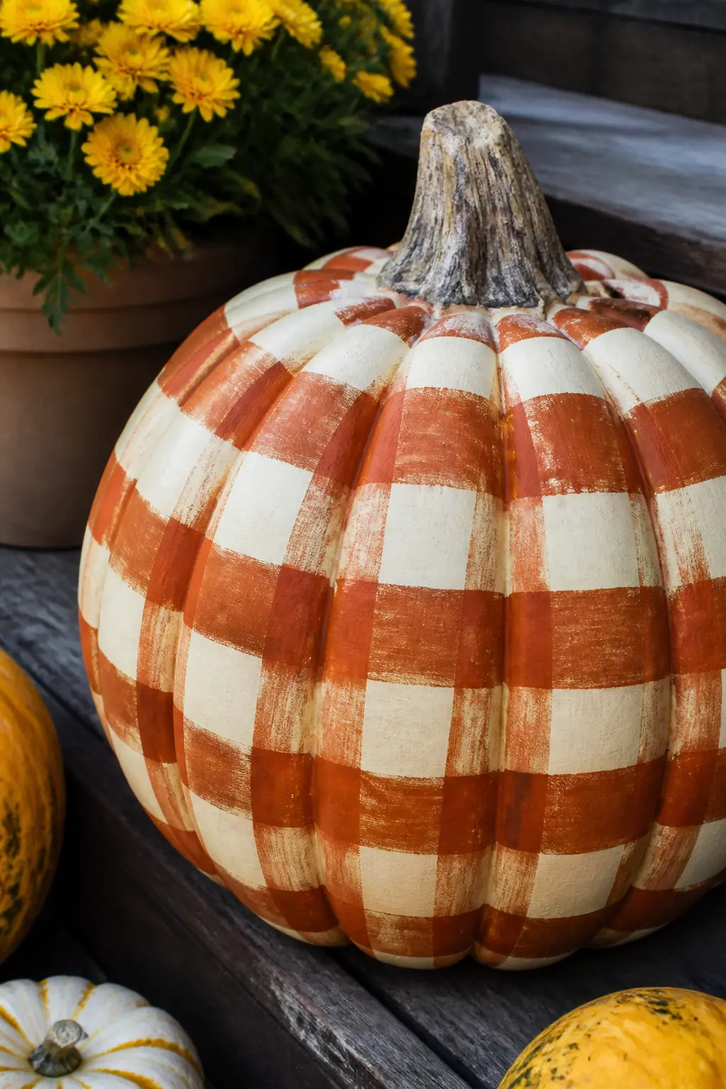
Rust and Cream Buffalo Check on a Cream Pumpkin
A cream base coat keeps this warm rather than stark. Rust stripes taped in equal widths, vertical then horizontal, produce a classic buffalo check where the crossing squares read as deep rust and the open squares stay cream.
This one sits beautifully next to dried grasses or a bundle of wheat. The palette is autumn without being obvious about it.
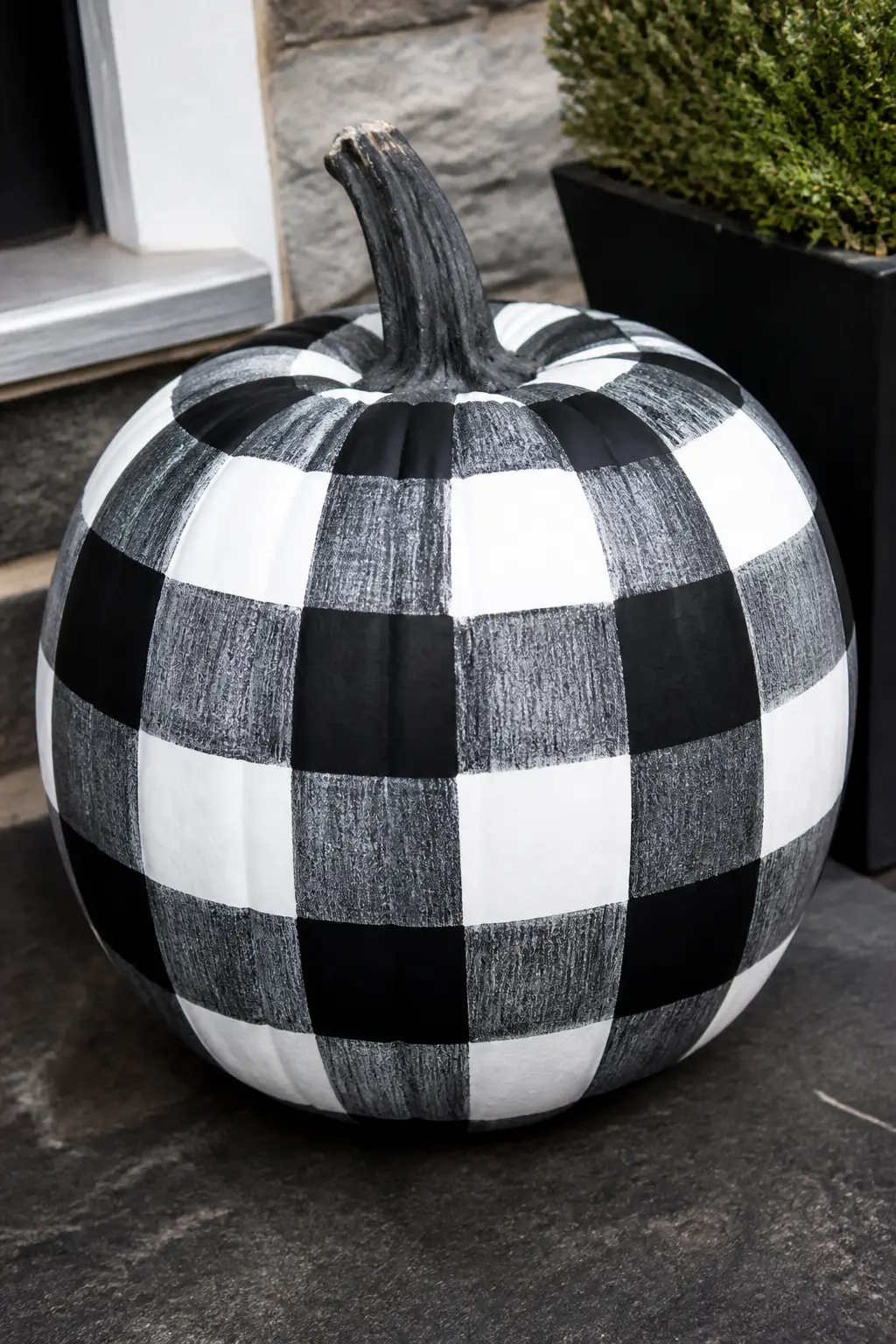
Black and White Buffalo Check on a White Pumpkin
Graphic and high-contrast. A white base, black stripes taped at equal intervals, and the result is a buffalo check that looks intentional from ten feet away. This is the one guests will photograph.
It works for Halloween without being spooky, which means it can go up in early October and stay through the month without feeling out of place.
🛍 Shopping guide
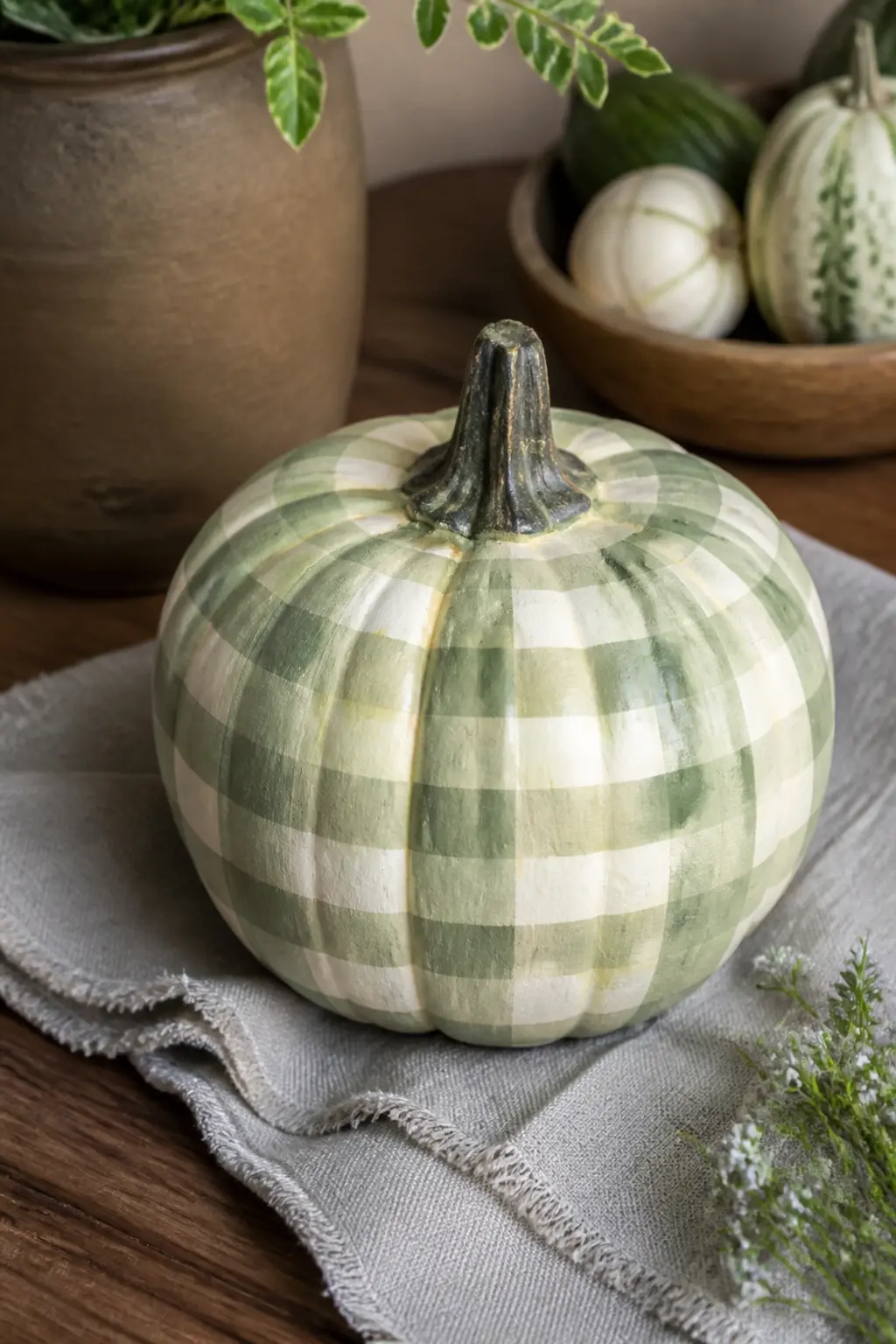
Sage and Cream Buffalo Check on a Cream Pumpkin
Sage green on cream is the quietest buffalo check in this list. It reads as a muted, almost dusty pattern that suits a front porch with green plantings or a console table inside.
Use a sage that leans slightly grey rather than bright green. A pure leafy green will fight the cream and look unfinished. Dusty or eucalyptus-toned sage is the one to reach for.
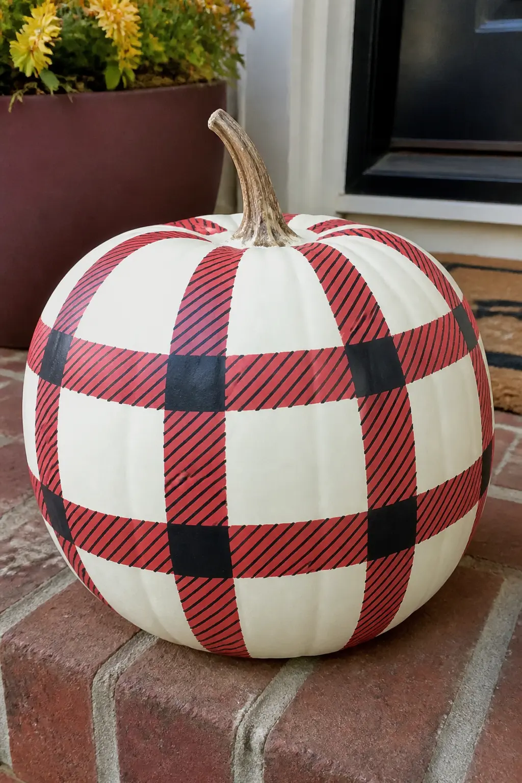
Red and Black Buffalo Check on a White Pumpkin
The classic. Red and black buffalo check on a white base is the pattern that started the whole painted pumpkin trend, and it still earns its place on the porch every autumn.
Tape the black stripes first, paint, let dry, remove, retape for red. The crossing squares will be black where the two layers overlap, which is exactly right for traditional buffalo check.
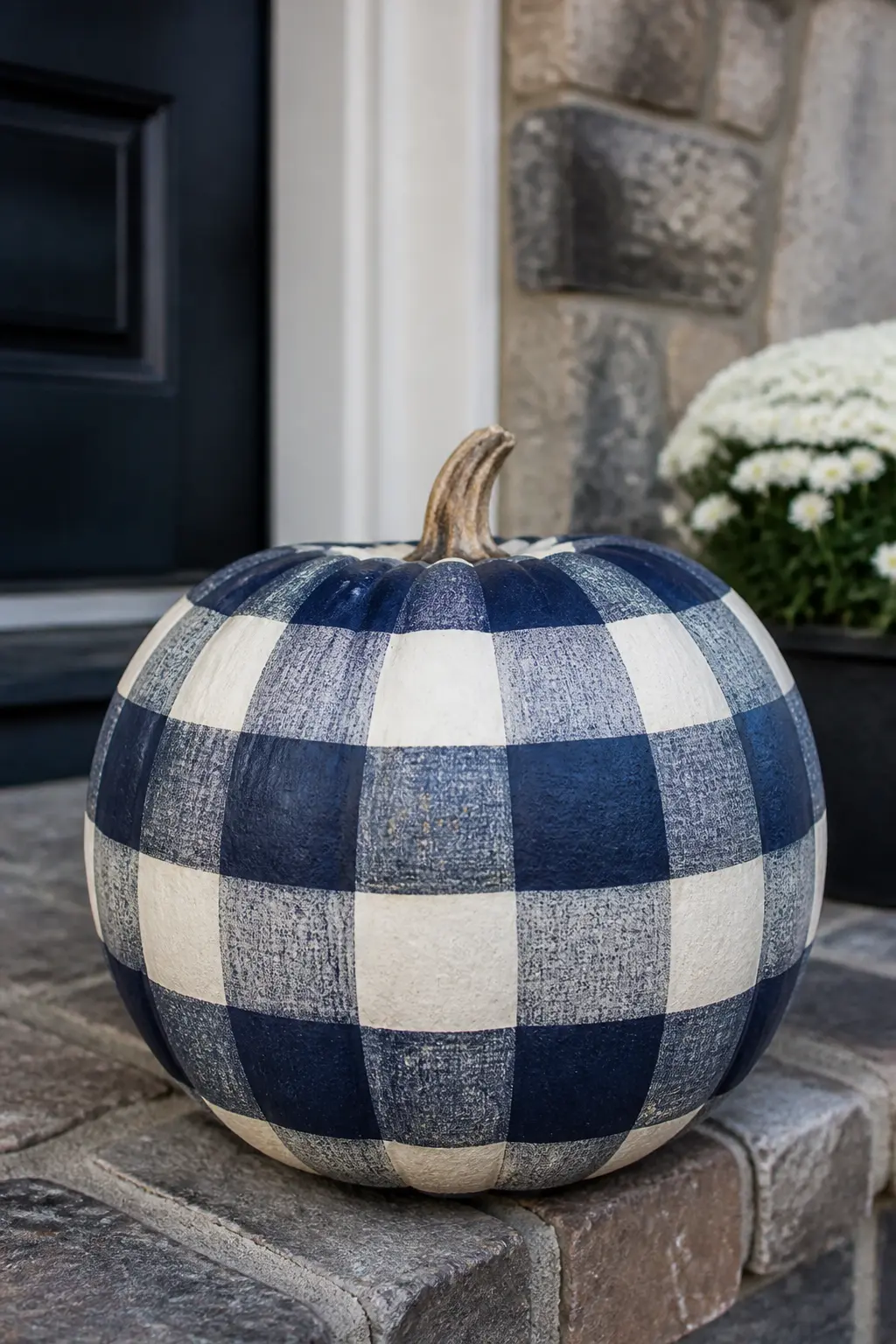
Navy and Cream Buffalo Check on a Cream Pumpkin
Navy pulls the buffalo check palette away from autumn and toward a more year-round nautical-adjacent feel. On a cream base the navy looks rich without being heavy.
This pumpkin carries into Thanksgiving without looking like a Halloween decoration that overstayed its welcome. The crossing squares read as dark navy, and the open squares hold the cream base. Straightforward and elegant.
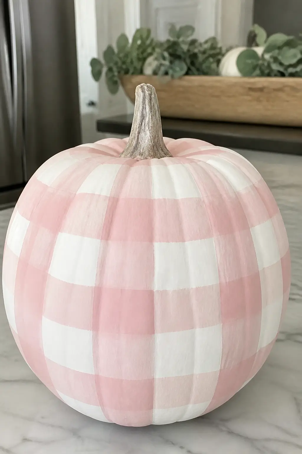
Blush and White Buffalo Check on a White Pumpkin
Blush on white is the lightest, most minimal of the buffalo check options. The contrast is low, which makes the pattern feel soft rather than graphic. It suits a table arrangement more than a porch, where the subtlety would be lost from a distance.
Use a true blush, not a hot pink. A dusty rose with a little white mixed in is the right tone. The finished pumpkin looks expensive on a mantelpiece or a dining table among candles.
Gingham Pumpkins
Gingham reads lighter than buffalo check because the stripes are narrower and the overlapping squares create a third, lighter tone automatically. That third tone is not a separate paint colour: it appears wherever the two stripe colours cross, which is exactly what makes gingham look more complex than it is.
Mini pumpkins are perfect for gingham because the smaller surface suits finer tape widths. Use quarter-inch tape for the neatest result on a small pumpkin.
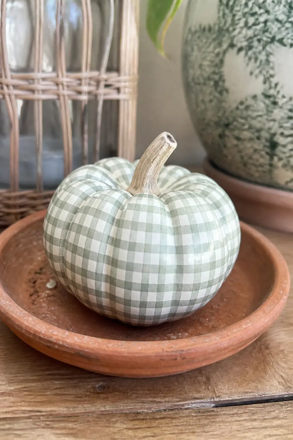
Fine Sage Gingham on a Painted Mini Pumpkin
A mini pumpkin in fine sage gingham looks like a scrap of French fabric wrapped around a pumpkin. The narrow stripes and the automatic third tone created at the crossings do all the visual work.
Use quarter-inch tape for the stripes. Paint the sage stripes vertically, let them dry fully, then tape horizontally and paint again. The overlapping area will naturally read darker, which is exactly the gingham effect you are after.
🛍 Shopping guide
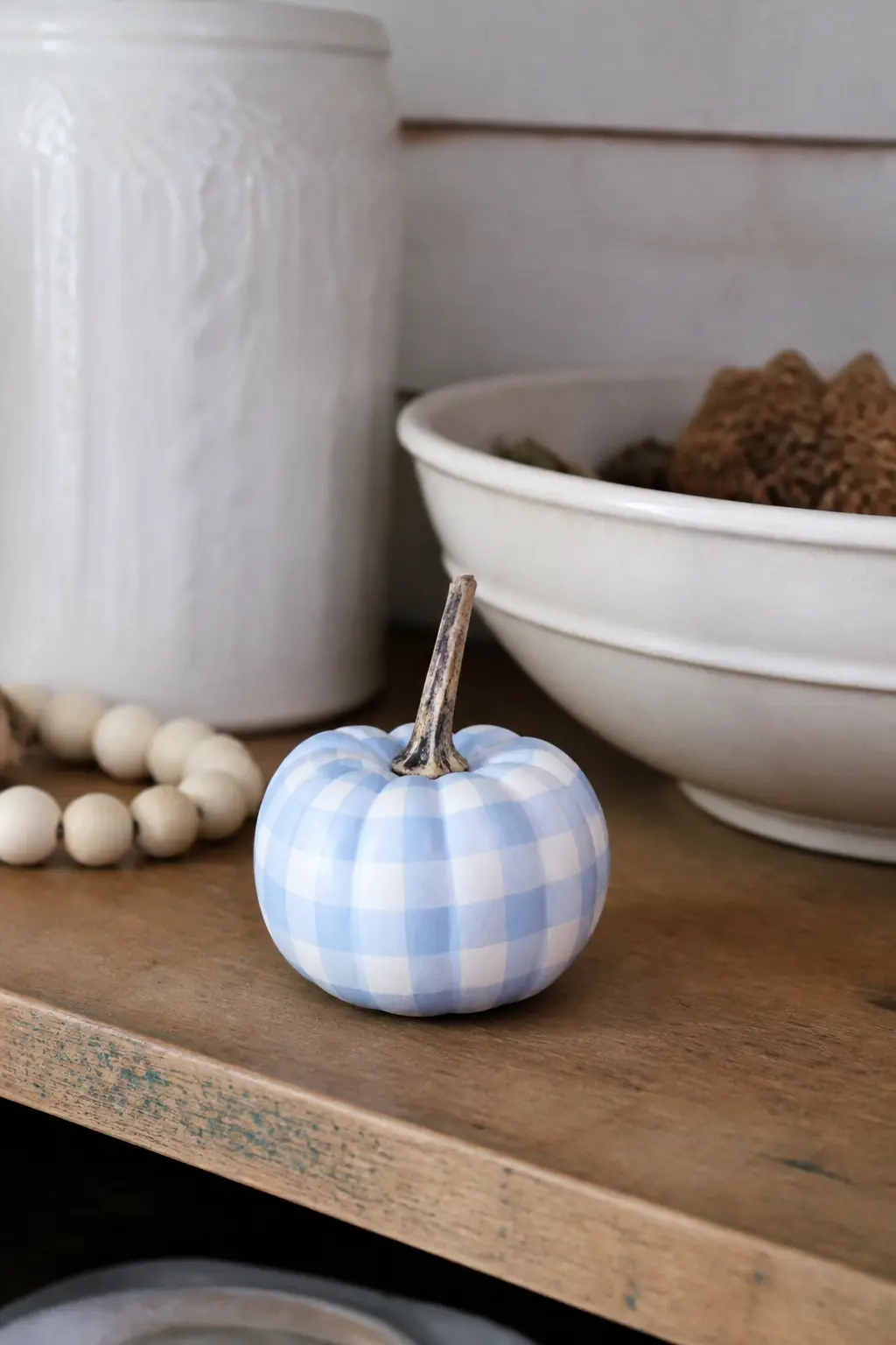
Soft Blue and White Gingham on a Painted Mini Pumpkin
A soft powder blue gingham on a white mini pumpkin is charming enough to live on a kitchen counter all through autumn. It is not aggressively seasonal, which makes it easier to commit to.
Keep the blue pale and slightly milky rather than saturated. The washed-out tone is what gives gingham its nostalgic quality, and a bright blue will tip this into a different look entirely.
Two-Tone Rust Gingham on a Cream Pumpkin
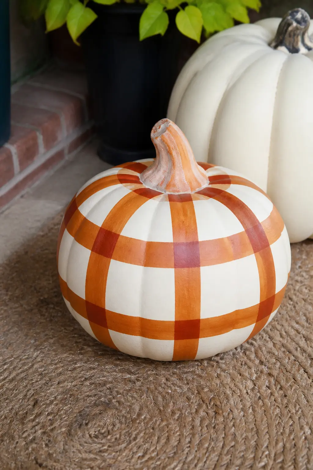
Two-tone rust gingham uses a burnt orange for the stripes and lets the crossing squares create a deeper, almost brick-red third tone. On a cream base, the result is a warm monochromatic pattern that looks considered rather than busy.
This is a good choice if you want a pumpkin that reads as autumnal without any green or black in the palette. It photographs beautifully in warm light.
Pink and White Gingham With a Bow on a Painted Mini Pumpkin
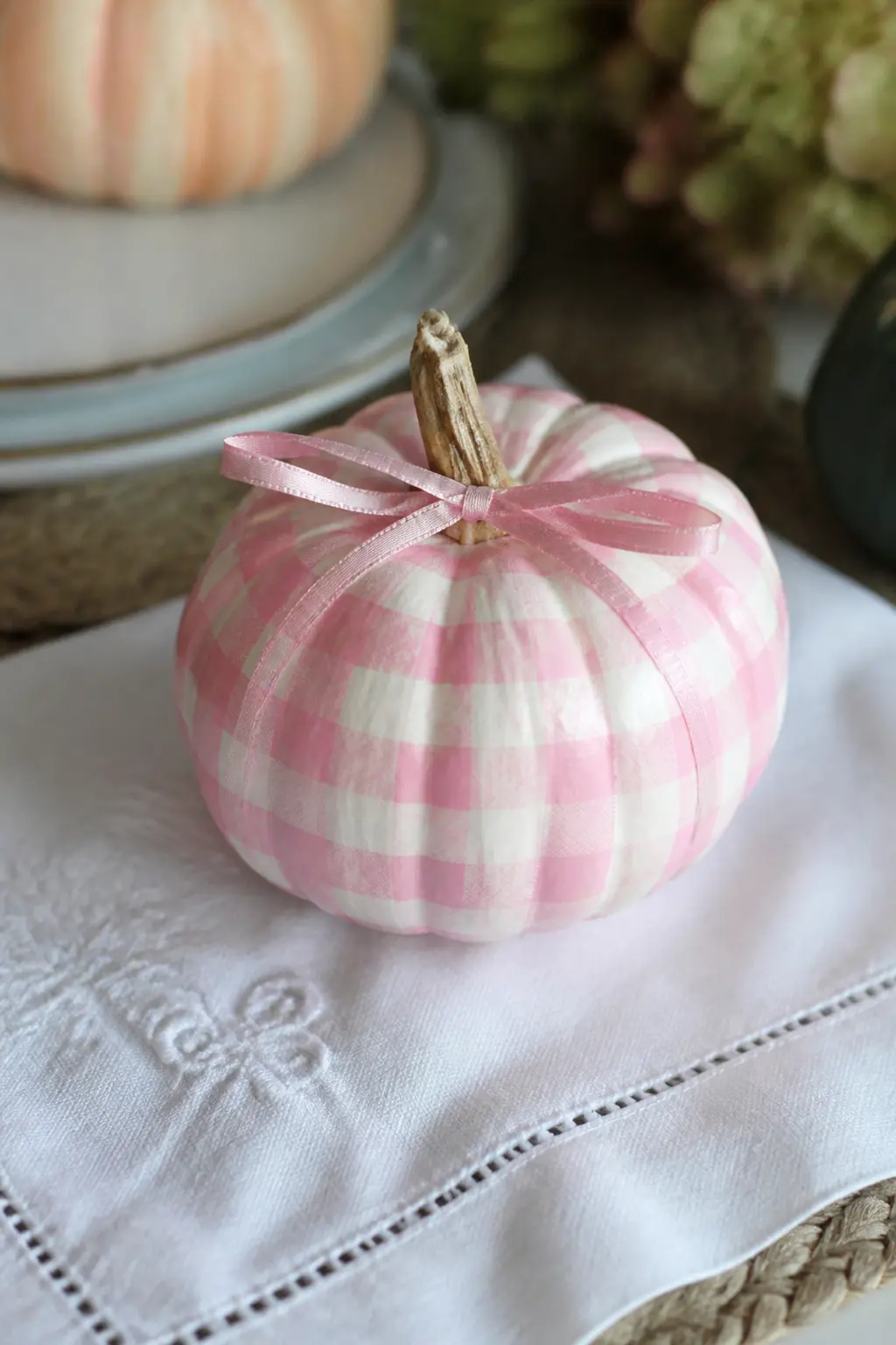
Pink gingham on a white mini pumpkin with a narrow ribbon bow tied at the stem is the kind of thing that looks precious without trying too hard. The bow does not need to be elaborate: a simple half-inch ribbon tied once and trimmed is enough.
This one suits a baby shower table, a gift bag accent, or a place setting at a small autumn dinner. It is finished before the bow goes on, so add the ribbon last, once the paint is fully cured.
Tartan Pumpkins
Tartan looks complicated because it uses three or more colours and includes thin overcheck lines crossing the main grid. In practice, you build it in layers: wide stripes first, then a narrower set of stripes in a second colour, then a single thin stripe of a third colour taped over the top. Let each layer dry before taping over it.
The entries below stay close to autumn palettes so they live happily on a fall porch without looking like a Christmas decoration arrived early.
Three-Colour Tartan in Rust, Mustard and Cream on a White Pumpkin
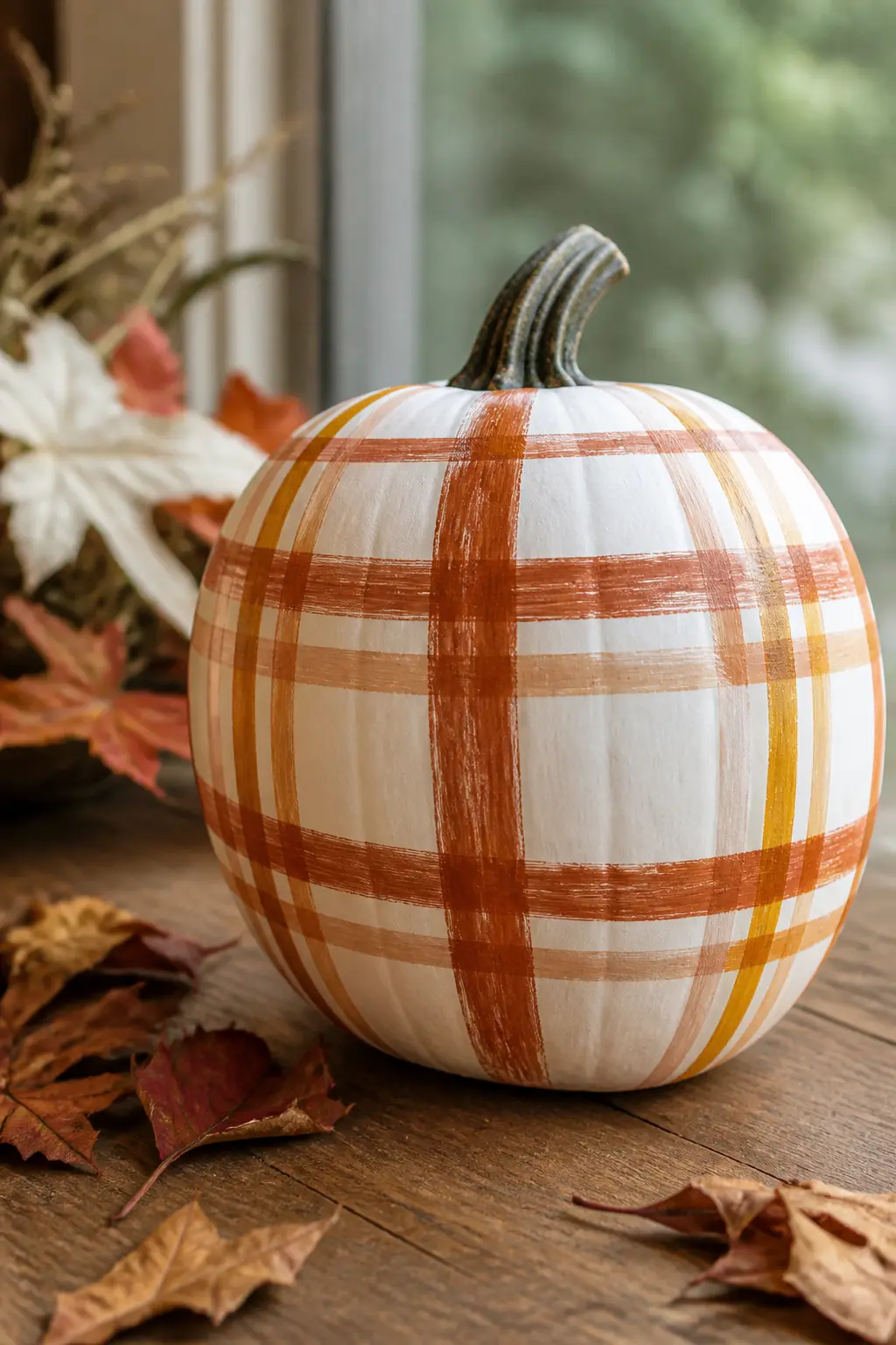
This is the starter tartan. Three colours, no thin overcheck lines, just two sets of wide stripes in rust and mustard crossing over a cream base. The result reads as tartan without asking you to tape anything narrower than half an inch.
Paint the rust stripes first. Once dry, tape them off and add the mustard stripes perpendicular. Where they cross, the colours will mix slightly, which gives the tartan its depth. A very light cream base peeking through the untaped sections completes the effect.
🛍 Shopping guide
Tartan With a Thin Gold Overcheck Line on a Cream Pumpkin
An overcheck line is the thin stripe that runs across the main tartan grid in a contrasting colour. Here it is metallic gold, which elevates the whole pumpkin from craft project to deliberate decor.
Apply the gold line last, over fully dried paint, using an eighth-inch strip of tape as a mask. Gold craft paint works well, but a thin gold paint pen gives the sharpest edge on a small surface.

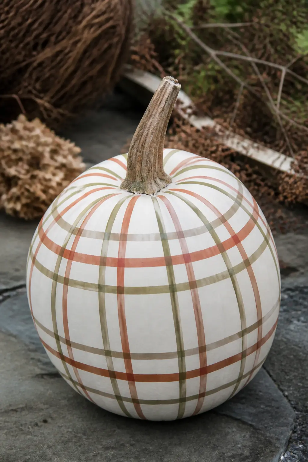
Muted Autumn Tartan in Olive, Rust and Sand on a White Pumpkin
Olive, rust and sand are three colours that live easily together because they are all pulled from the same warm, slightly greyed-down part of the palette. The tartan they produce is earthy and relaxed, nothing like the bright commercial plaids you see in November advertising.
This pumpkin reads as part of a natural grouping: set it near terracotta pots, dried botanicals, or anything with a matte, undyed quality.
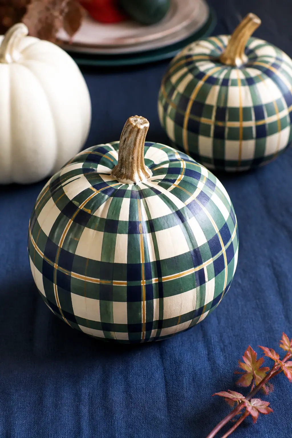
Navy and Green Tartan With a Thin Yellow Line on a Cream Pumpkin
Navy and hunter green tartan is a traditional Scottish clan pattern translated onto a pumpkin. The thin yellow overcheck line is what identifies it as tartan rather than a simple two-colour check.
The yellow line should be narrow, no wider than an eighth of an inch. Any wider and it becomes a third main stripe rather than an overcheck, and the tartan character is lost.
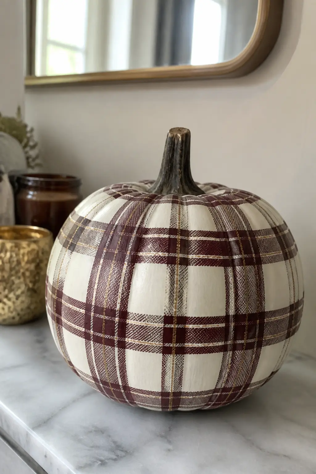
Burgundy and Cream Tartan With Gold on a White Pumpkin
Burgundy and cream is a classic winter tartan palette, but on a pumpkin it reads as late autumn rather than Christmas. The gold overcheck line threads it together and keeps it from feeling too stark.
Let the burgundy stripes dry for at least two hours before taping over them. Burgundy acrylic paint can stay slightly tacky longer than other colours, and taping over it too soon lifts the layer underneath.
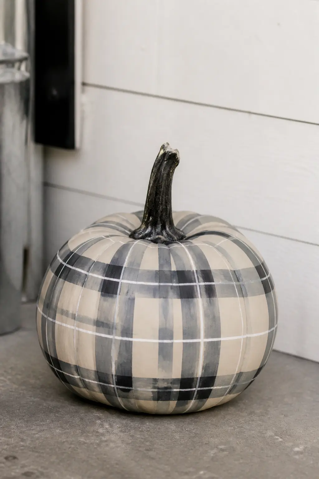
Grey and Charcoal Tartan With a White Line on a Cream Pumpkin
Grey and charcoal tartan is the most subdued pattern in this list. On a cream base with a white overcheck line, it looks almost like a weathered heritage textile. Nothing about it says pumpkin at first glance, which is the point.
This one suits a modern or Scandinavian interior. It sits next to concrete, white ceramics, or bare linen without asking for anything else around it.
Windowpane Pumpkins
Windowpane is the most minimal of the plaid families: a single thin grid on a solid base colour, with wide open squares between the lines. The base colour does most of the visual work, so choosing it carefully matters more here than in any other style.
Wide tape spacing and a bold base colour give these pumpkins a graphic, modern feel that reads well from a distance on a porch step.
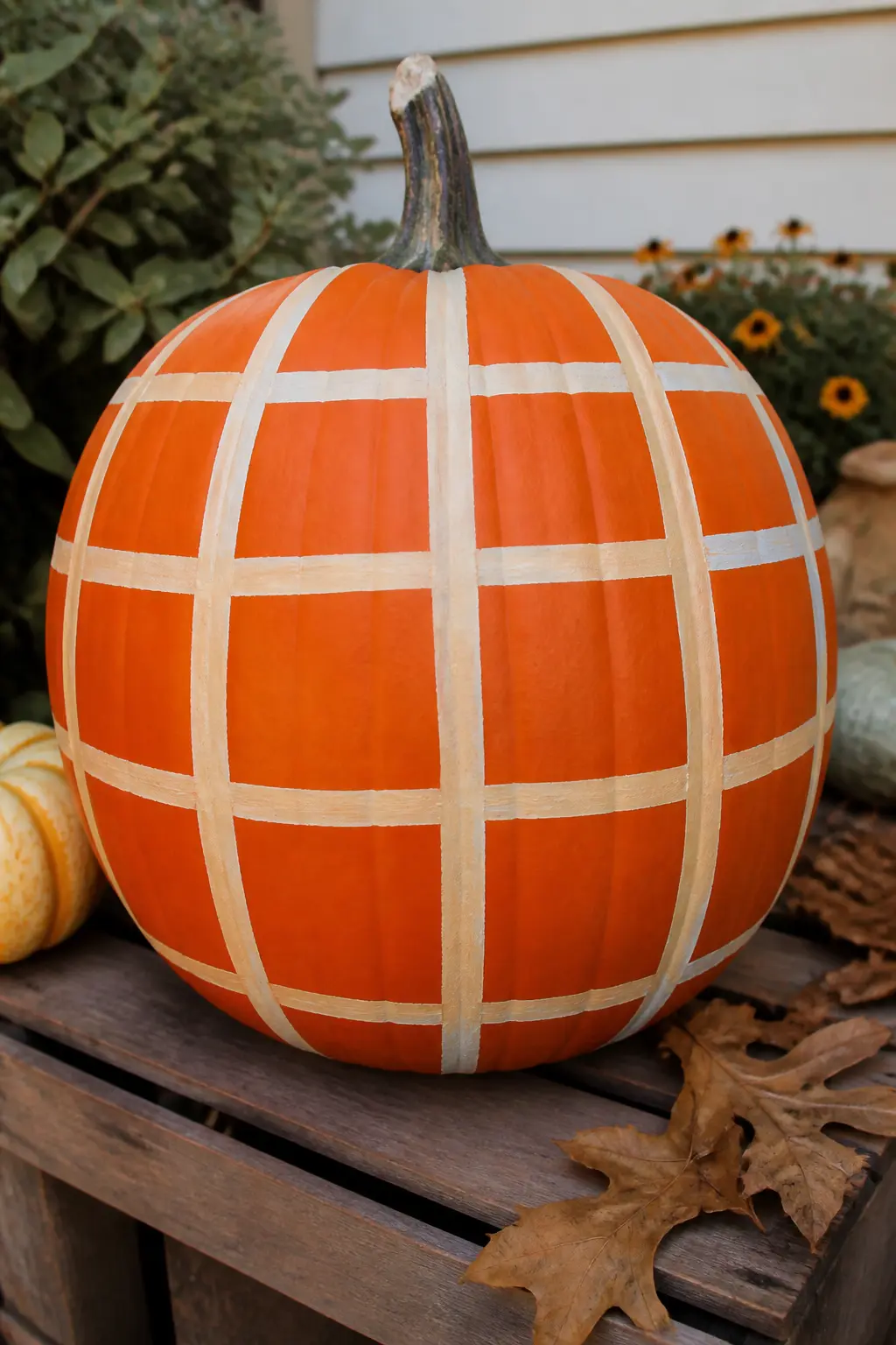
Cream Windowpane Grid on a Painted Orange Pumpkin
A cream windowpane grid on a bright orange pumpkin is the most traditional of the windowpane options: orange base, cream lines, wide open squares between them. It looks like an autumn classic without being predictable.
Space the tape lines at least an inch and a half apart. Windowpane needs that wide open space between the lines to read correctly. A tighter grid becomes something else entirely.
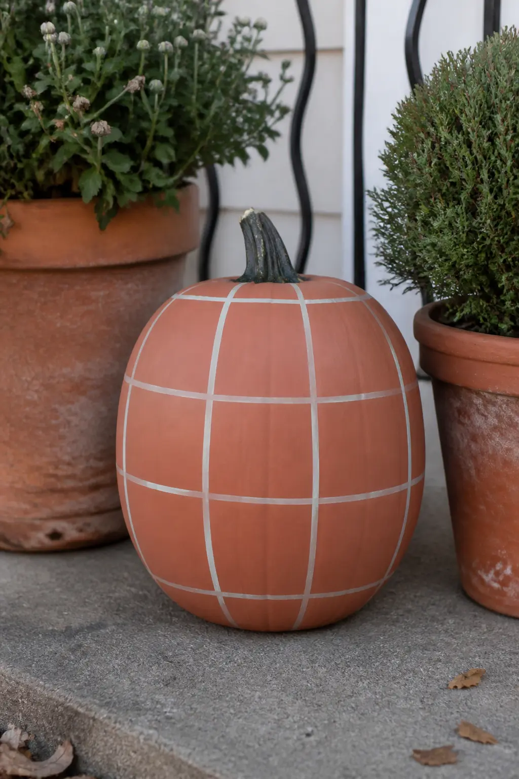
Cream Windowpane Grid on a Terracotta Pumpkin
Terracotta base paint gives this pumpkin a dusty, clay-pot quality that looks natural on a porch with real terracotta planters. The cream windowpane grid sits lightly on the surface without competing with the base colour.
Paint the terracotta base in at least two coats so the colour is even, then tape and add the cream grid. One coat of cream over terracotta is enough because the contrast is gentle and another coat would make the lines too heavy.
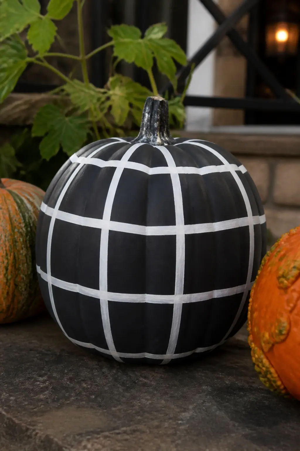
White Windowpane Grid on a Black Pumpkin
Black base, white lines, wide spacing. This is the most graphic windowpane in the list and it reads as Halloween without a single carved face or plastic spider in sight. It is also the most photographable of the windowpane options because the contrast is absolute.
Use a matte black base coat and a matte white for the grid. Gloss on either would reflect light in a way that softens the edge of the lines when photographed.
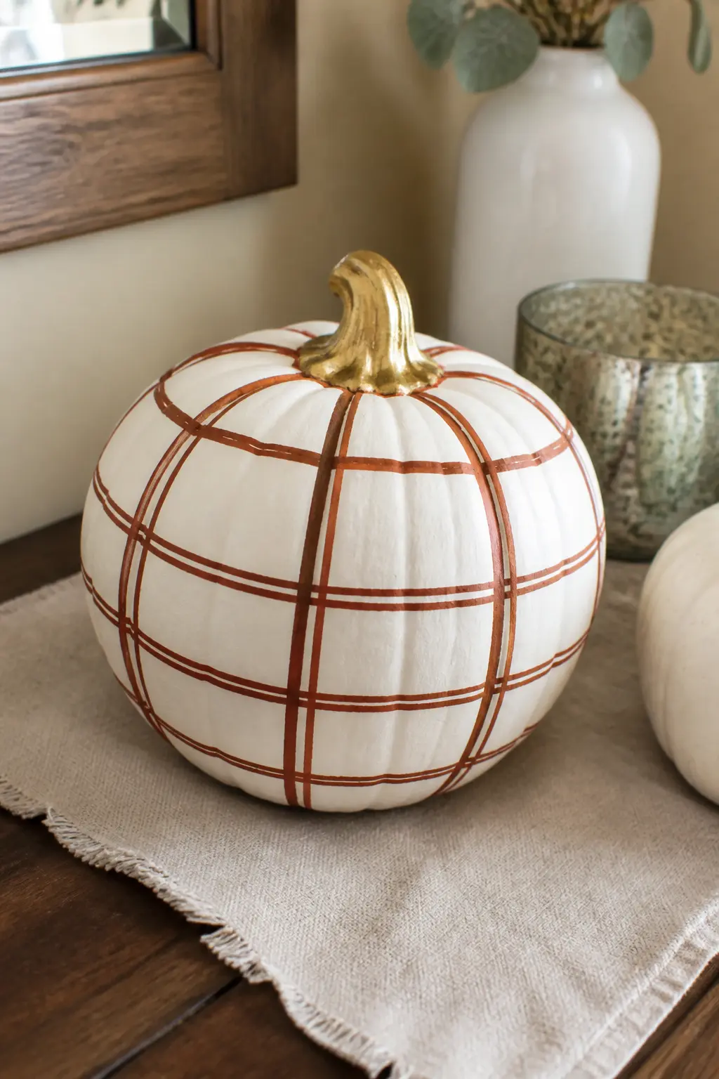
Rust Windowpane Grid With a Gold Stem on a Cream Pumpkin
Rust lines on a cream base are warm and close in tone, so the windowpane pattern here is quiet and decorative rather than bold. The gold stem is the detail that finishes it: paint the stem separately with metallic gold paint once the grid is fully dry.
This pumpkin is styled for indoors. It belongs on a console table, a bookshelf, or a dining table where it can be seen up close.
Looser Checks and Special Finishes
These five entries do not sort neatly into one plaid family. Some combine pattern with a detail at the stem. Some play with where the plaid sits on the pumpkin. One treats three pumpkins as a single display unit. All of them are easier than they look.
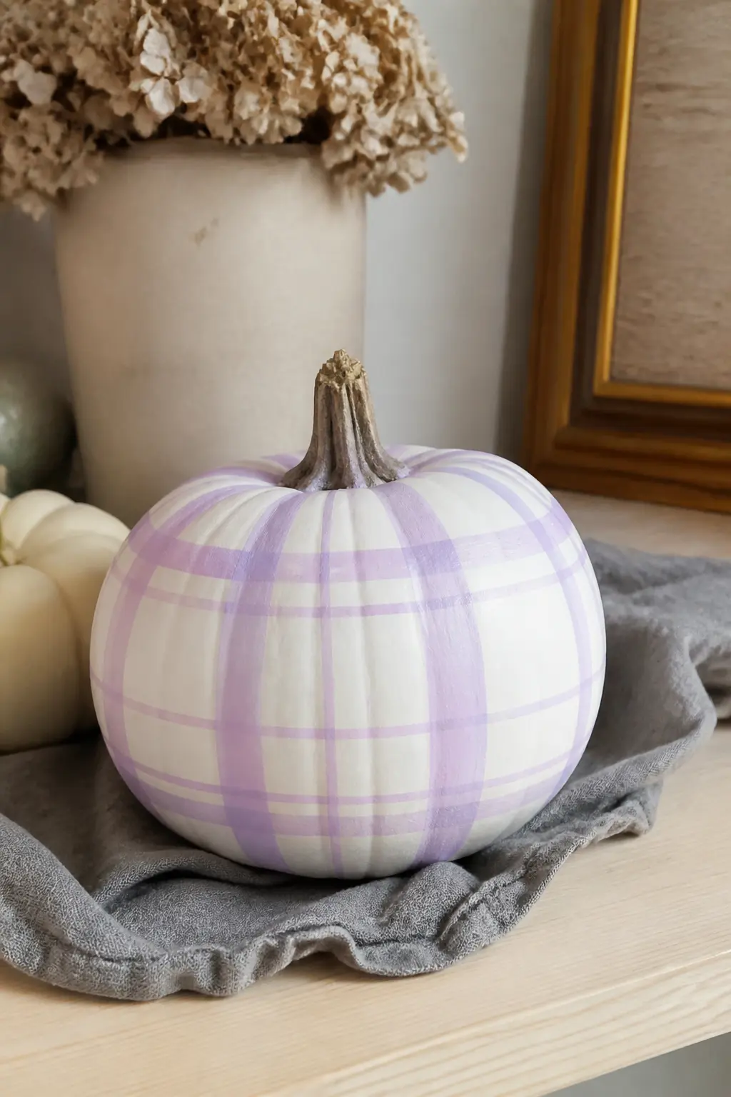
Lilac and White Plaid on a White Pumpkin for a Softer Look
Lilac plaid on a white pumpkin is the one entry here that steps furthest from the traditional autumn palette, and that is exactly why it earns its place. It suits a baby shower in autumn, a pastel-leaning home, or anyone who simply prefers soft purple to orange and rust.
Use a true lilac, which is purple with plenty of white and a hint of grey in it. A bright purple will look harsh against the white base and will not read as plaid so much as a stripe test.
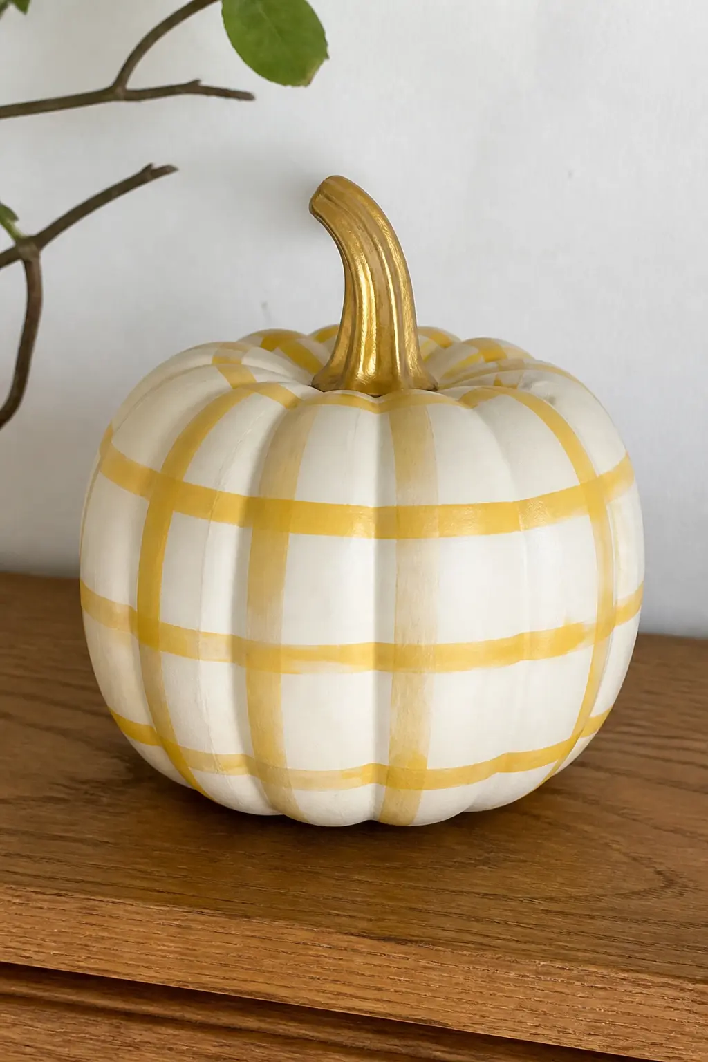
Mustard and Cream Check With a Gold Stem on a Cream Pumpkin
Mustard on cream is low-contrast and warm, which gives this pumpkin a vintage, almost faded-textile quality. The gold stem lifts it from quiet to finished without adding colour.
This sits well in a grouping of other pumpkins because it does not compete. It also works as a solo piece on a shelf where a busier pattern would feel like too much.
🛍 Shopping guide
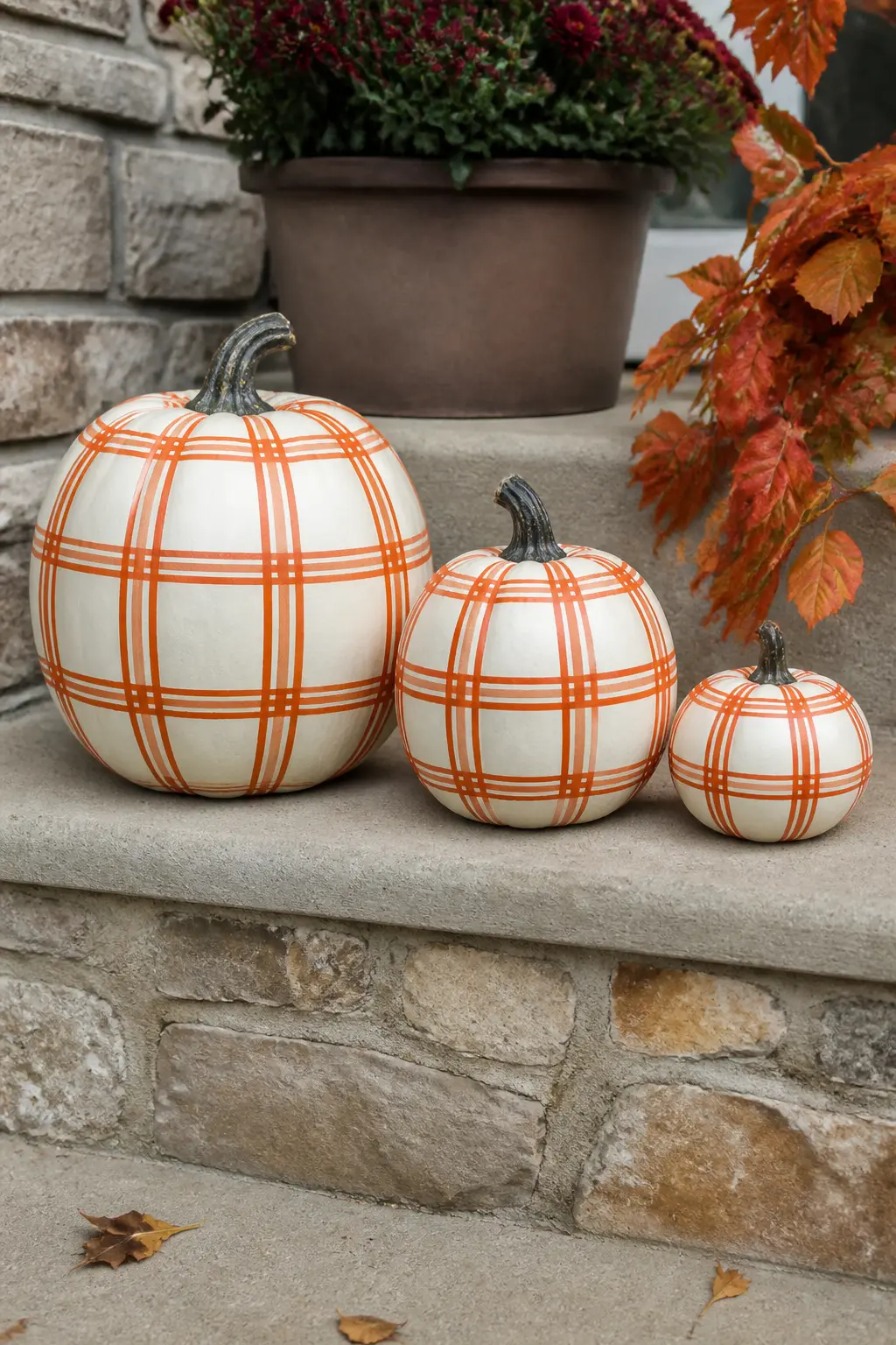
Set of Three Pumpkins in Matching Rust Plaid, Graduated Sizes
Three pumpkins in the same rust plaid, in small, medium and large, work as a single display unit. The pattern repeats across all three but the tape spacing should scale with the pumpkin size: wider stripes on the large one, narrower on the small one, so the check looks proportionate on each.
Line them up by height on a porch step or a table runner. The graduated sizes do the styling for you without requiring any other props.
🛍 Shopping guide
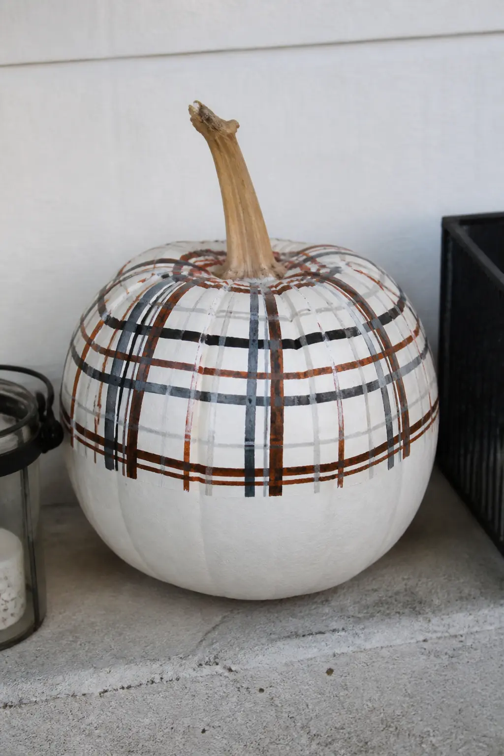
Plaid on the Top Half Only, Plain Below, on a White Pumpkin
This is the most unexpected design in the list. The plaid covers only the upper half of the pumpkin, stopping at an imaginary horizontal line around the equator. The lower half stays plain white. The effect is graphic and modern, like a half-dipped ceramic piece.
Tape around the equator of the pumpkin first to create a clean horizontal boundary. Then tape the plaid grid above it, keeping all the lines within the upper half. Remove both sets of tape at the same time while the paint is still slightly tacky.
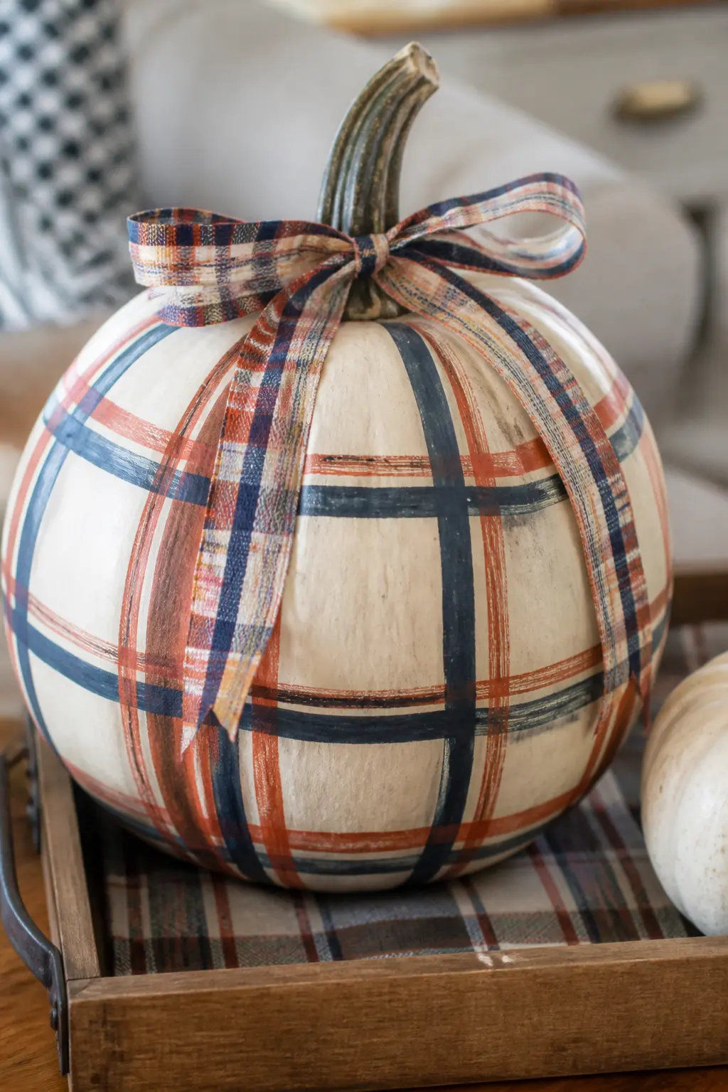
Plaid With a Matching Plaid Ribbon at the Stem on a Cream Pumpkin
A plaid ribbon tied at the stem in the same colour palette as the painted plaid makes this pumpkin look finished in a way that no amount of extra paint can achieve. The ribbon does not need to match exactly: it needs to share at least one colour with the painted grid.
Tie the ribbon in a loose single bow and trim the ends at an angle so they do not fray. A half-inch to three-quarter-inch ribbon width is right for most pumpkin stem sizes.
The Tape Method, Step by Step
Four technique entries follow. They are not decorative ideas: they are the four decisions that determine whether your plaid comes out crisp or bleeds into a blur. Read them in order at least once, even if you have painted pumpkins before.
The method works on foam pumpkins, real dried pumpkins, and faux craft pumpkins. Real fresh pumpkins need a base coat of gesso first so the paint has something to grip.
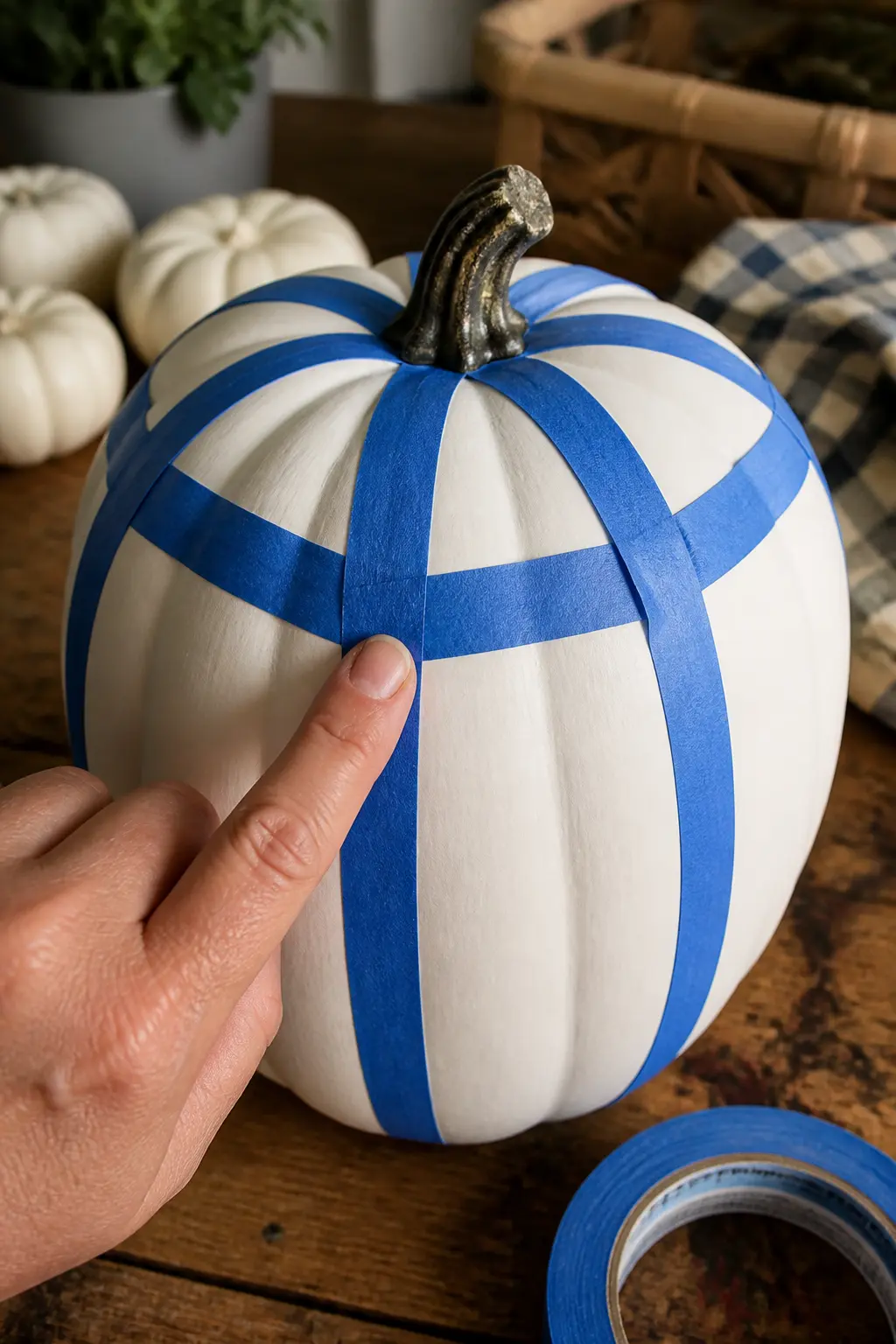
Press the Tape Hard Into Every Ridge Before You Paint
The ridges of a pumpkin are where plaid paint jobs fail. If the tape does not seat fully into each vertical ridge, paint creeps underneath it and the line blurs exactly where the eye expects it to be sharpest.
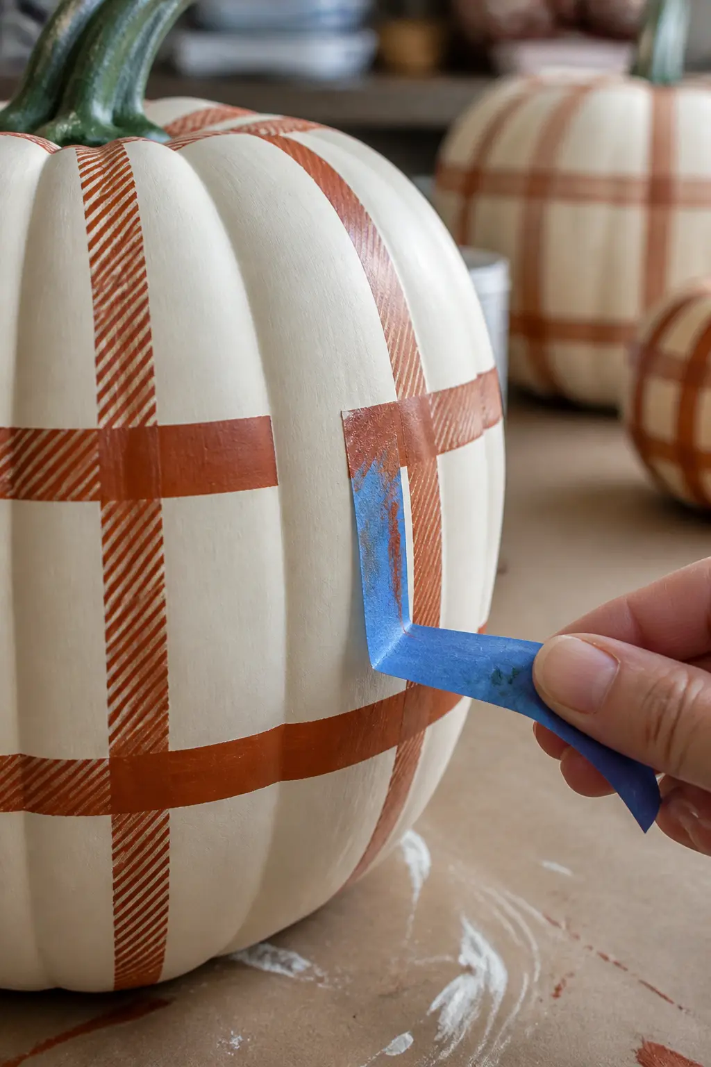
After laying the tape, run a fingernail, a bone folder, or the edge of a credit card firmly along every section of tape that crosses a ridge. You are pressing it into the hollow, not just smoothing the flat sections. Take thirty extra seconds per strip. The payoff is clean edges.
On deeply ribbed pumpkins, consider using narrower tape that follows the curve more easily. Very wide tape on a tight curve will lift no matter how hard you press it.
🛍 Shopping guide
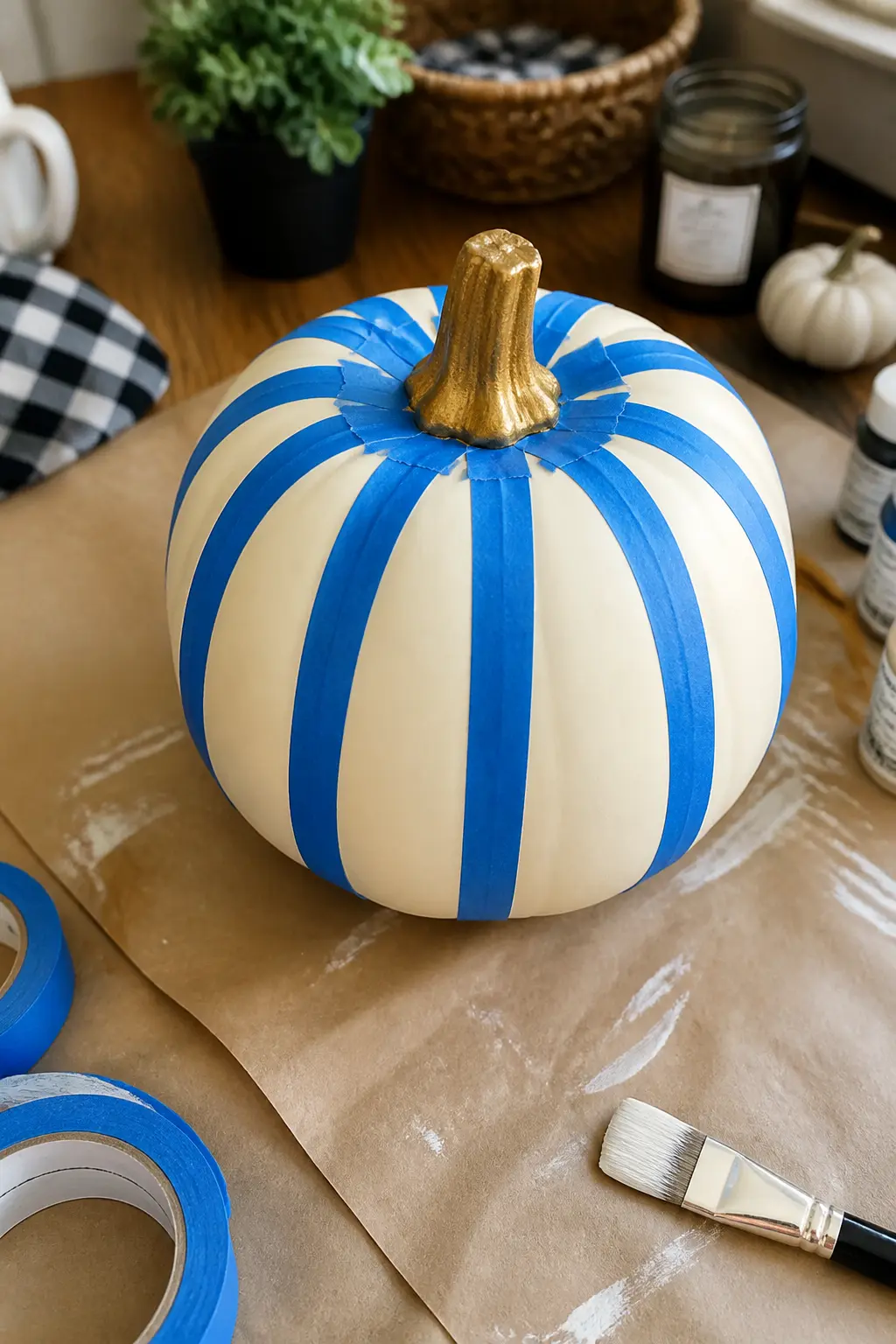
Paint the Base Colour First, Then Tape Over It for the Stripes
A solid, even base coat is the foundation every plaid sits on. The base colour fills the pumpkin completely, including the sections that will later become the lighter squares in the finished grid.
Let the base coat cure for at least four hours before laying any tape over it. Taping over paint that is dry to the touch but not fully cured will pull the base coat when you remove the tape, and the grid edges will look ragged. Two thin coats of base colour cure faster and more evenly than one thick coat.
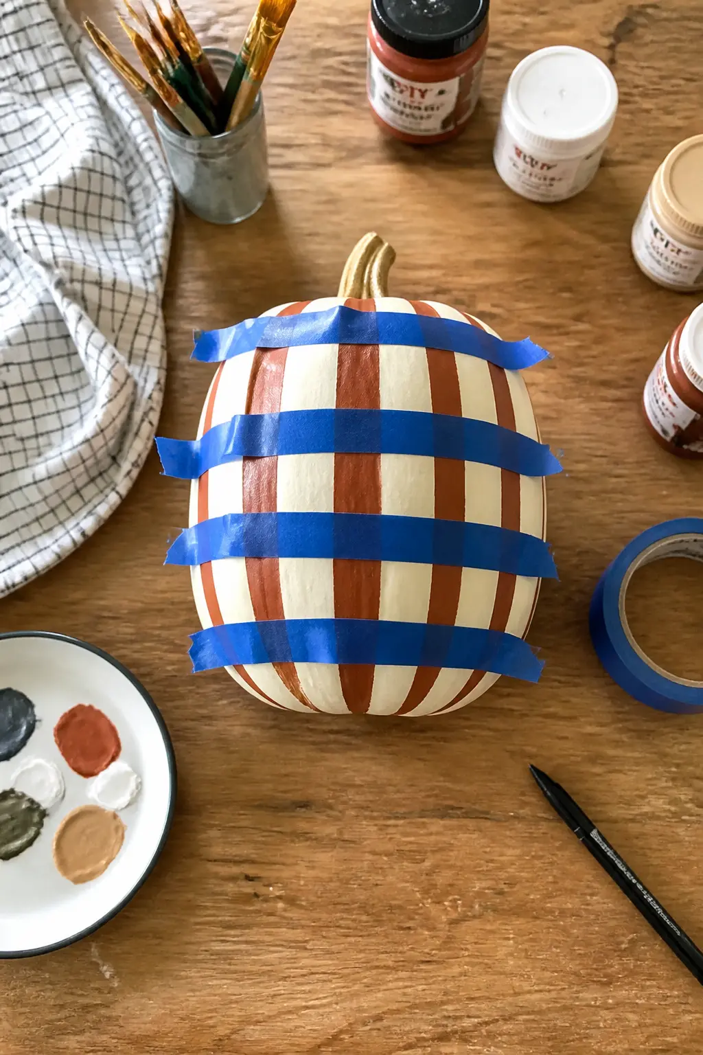
Paint the Vertical Stripes First, Let Them Dry Fully, Then Do the Horizontal
The order of directions matters. Vertical stripes first, then horizontal. If you try to do both at once, you will pull the still-wet vertical paint when you lay the horizontal tape, and the grid will bleed at every crossing point.
Full drying time between directions means a minimum of two hours for standard acrylic craft paint in normal room temperature. Do not use a hairdryer to rush it: fast surface drying from heat leaves a tacky layer underneath that the tape will disturb when removed.
Once the vertical stripes are down and fully dry, tape horizontally and paint. The crossing squares will show both colours overlapping, which is exactly the plaid structure you are building toward.
Peel the Tape While the Paint Is Still Slightly Tacky for the Cleanest Edge
This is the step most people get wrong. Waiting until the paint is completely bone dry before pulling the tape sounds logical, but it is not. Fully dried acrylic paint forms a film that connects the taped edge to the painted surface, and peeling the tape pulls that film with it, leaving a jagged, chipped line.
Pull the tape when the paint is dry to the touch but still very slightly soft: usually thirty to forty-five minutes after the final coat, depending on how thickly you applied it. Pull slowly, at a low angle back over itself, not straight up. If you feel any resistance, stop and wait five more minutes.
Remove all the tape in one session rather than in stages. Leaving some tape while paint on other sections continues to cure creates uneven conditions and inconsistent edges across the grid.
🛍 Shopping guide
Frequently Asked Questions
Do plaid painted pumpkins work on real pumpkins or only faux ones?
Both work, but real pumpkins need a coat of gesso or exterior primer first so the acrylic paint has something to grip. Faux craft pumpkins made of foam or resin accept paint directly. Real pumpkins will also decay after a few weeks outdoors, which limits how long the design lasts.
What paint works best for a plaid painted pumpkin?
Standard acrylic craft paint is the right choice. It dries fast enough to tape over within a couple of hours, adheres to most surfaces with a primer, and comes in the wide colour range you need for tartan and windowpane patterns. Outdoor-formula acrylic lasts longer on a porch.
How do you get the tape to stay on the ridges?
Press the tape firmly into every ridge with a fingernail or the edge of a bone folder before you paint. Narrow tape, a quarter-inch wide, follows curves more closely than wide tape and lifts less. On deeply ridged pumpkins, accept that a small amount of bleed is normal and touch up with a fine brush after the tape is removed.
Can you do a tartan plaid pumpkin as a beginner?
Yes, if you choose a three-colour tartan without an overcheck line and use wide tape widths. The entries numbered 11 and 13 in this list are the most approachable starting points. Build confidence with a buffalo check first, then move to tartan once you have one clean grid under your belt.
How long does a plaid painted pumpkin last outdoors?
A faux craft pumpkin painted with outdoor acrylic and sealed with a matte spray sealant will last the full autumn season and beyond. A real pumpkin painted with indoor acrylic and no sealant may start to fade or peel within two to three weeks in wet conditions.
What is the difference between buffalo check and gingham when painting a pumpkin?
Buffalo check has larger squares and only two colours, with the crossing squares reading as a solid block of the darker colour. Gingham has narrower stripes and the crossing squares naturally create a lighter third tone where the two stripe colours overlap, giving it a softer, more delicate look. Gingham also suits smaller or mini pumpkins better because the finer scale fits the smaller surface.

20 cozy halloween family party games for all ages — active, printable & quiet ideas perfect for a
35 Halloween staircase decorations that actually look good: black, bone, and candlelight ideas sorte

15 gentle toddler Halloween party games with zero scares — just big giggles, easy setup, and free
Leave a Reply