

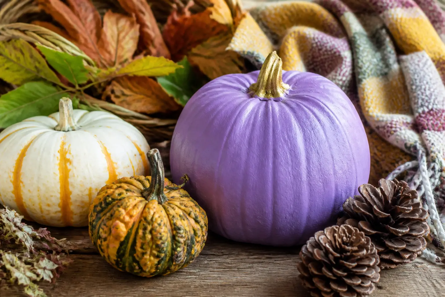
Purple pumpkins have a problem, and you already know what it is. The shade that shows up in every big-box store runs neon and flat, the kind of violet that reads as a costume accessory rather than decor. These 28 versions take a different route entirely, starting at barely-there lavender and moving through lilac, mid purple and plum before landing at a near-black aubergine that looks almost architectural.
Every entry is one real pumpkin, treated one specific way, with a note on what to set beside it. The groups follow depth of shade, so you can pick one tone and work across several entries, or build a graduating set from the first group to the last. Links to more pumpkin craft techniques and homemade Halloween decorations sit at the bottom if you want to keep going after this.
The supplies listed under each entry are the ones that actually matter for that specific finish. No master shopping list, because your pumpkin is not the same as the next one on the page.
This post contains affiliate links. If you buy through them, I may earn a small commission at no extra cost to you.
Lavender Pumpkins
Lavender sits at the cool, grey-leaning end of purple. It reads refined rather than festive, which is exactly the point. Pair it with white, gold, silver or dried naturals and it stays firmly out of costume territory.
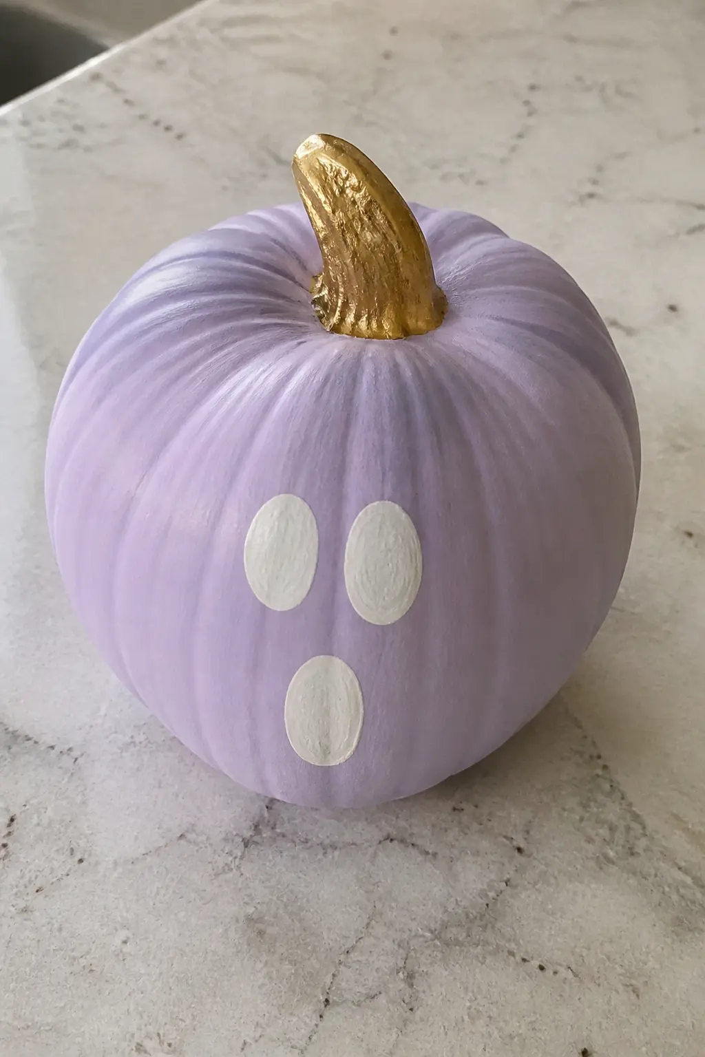
Lavender With a White Ghost Face and a Gold Stem
A lavender base coat already pulls this pumpkin away from standard Halloween orange. The ghost face keeps it seasonal without being loud: two oval eyes and a soft open mouth painted in white chalk paint, slightly imprecise, which reads as hand-done rather than amateur.
The stem gets a coat of gold leaf paint or a quick brush of metallic wax. That one gilded stem does the work of a ribbon or a bow without the fuss. Set this on a white marble surface or a pale linen cloth and leave everything else plain.
🛍 Shopping guide
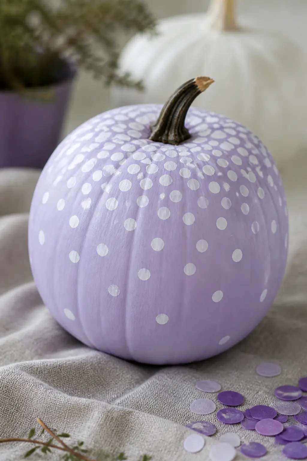
Lavender With White Dots
Dots are the most forgiving pattern on a curved surface. They follow the ridges without needing to align, and an uneven distribution reads as deliberate rather than messy. Use the blunt end of a pencil dipped in white chalk paint for uniform dots, or a fine brush tip for something more varied.
Scatter them densely at the top near the stem and let them trail off toward the base. The gradient of dots does the same visual work as ombre paint but takes a fraction of the time. Pair this pumpkin with a plain white candle in a simple holder beside it.
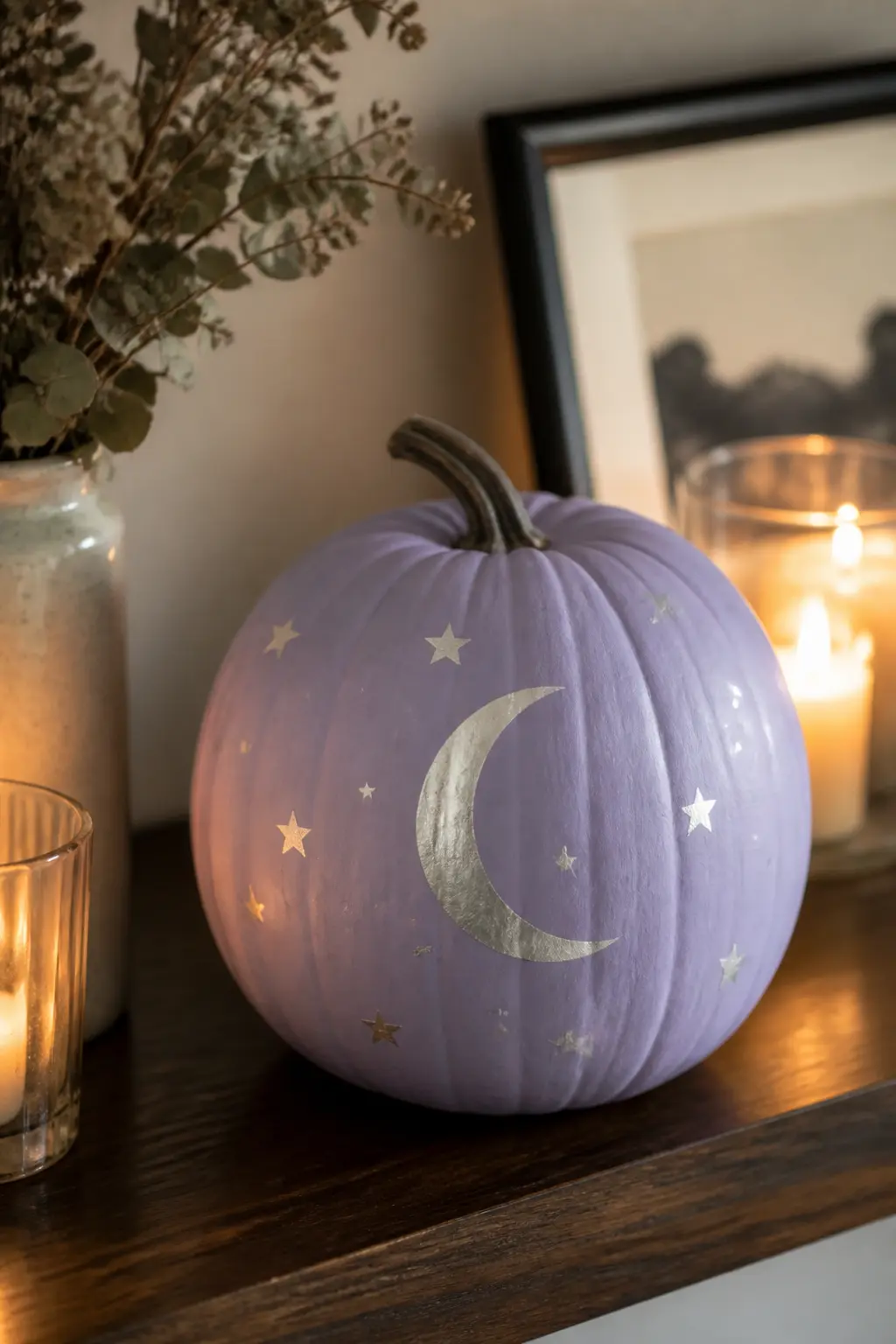
Lavender With Silver Moon and Stars
A crescent moon and a scatter of five-pointed stars in silver paint give this pumpkin a celestial quality that feels more winter-sky than trick-or-treat. Keep the moon on the lower third of the pumpkin face and let the stars drift upward around it.
Silver paint on lavender has more contrast than gold would, so the motifs stay readable without needing an outline. A fine liner brush handles both the crescent and the stars cleanly. This one sits well on a dark wooden shelf or beside a small cluster of silver pillar candles.
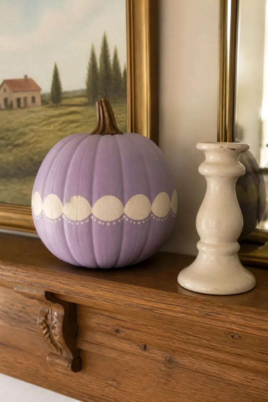
Lavender With a Cream Scalloped Band
A horizontal band of cream scallops painted around the widest part of the pumpkin reads like something between pottery and wallpaper, which is exactly the mood. Use a small round brush to paint each scallop freehand: they do not need to be identical, and slight variation gives it a handmade quality that a stencil cannot replicate.
Cream on lavender is one of the quietest colour combinations in this entire article. It suits a mantelpiece, a bookshelf or a kitchen windowsill better than a front doorstep. Pair it with a small bunch of dried pampas or a cream ceramic candlestick to keep the palette strict.
🛍 Shopping guide
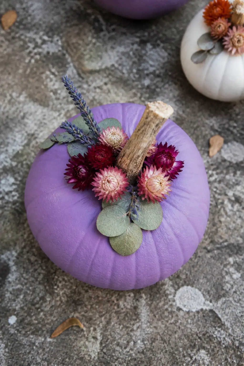
Lavender With Dried Flowers Glued at the Stem
Paint the pumpkin lavender and leave the surface entirely plain. The decoration is all at the stem: a small cluster of dried flowers, dried lavender sprigs and seed pods hot-glued in a low arrangement that rings the base of the stem like a botanical crown.
Dried strawflowers, preserved eucalyptus and dried lavender all hold their colour for the full season. The arrangement should be low and close to the pumpkin skin so it reads as part of the object rather than a craft project sitting on top of it. This is the most botanical-feeling entry in the lavender group.
🛍 Shopping guide
Lilac Pumpkins
Lilac is a step warmer and brighter than lavender, with just enough pink in it to feel alive. It works beautifully with rust, warm white and deeper purples layered above it. These three entries lean into that warmth.
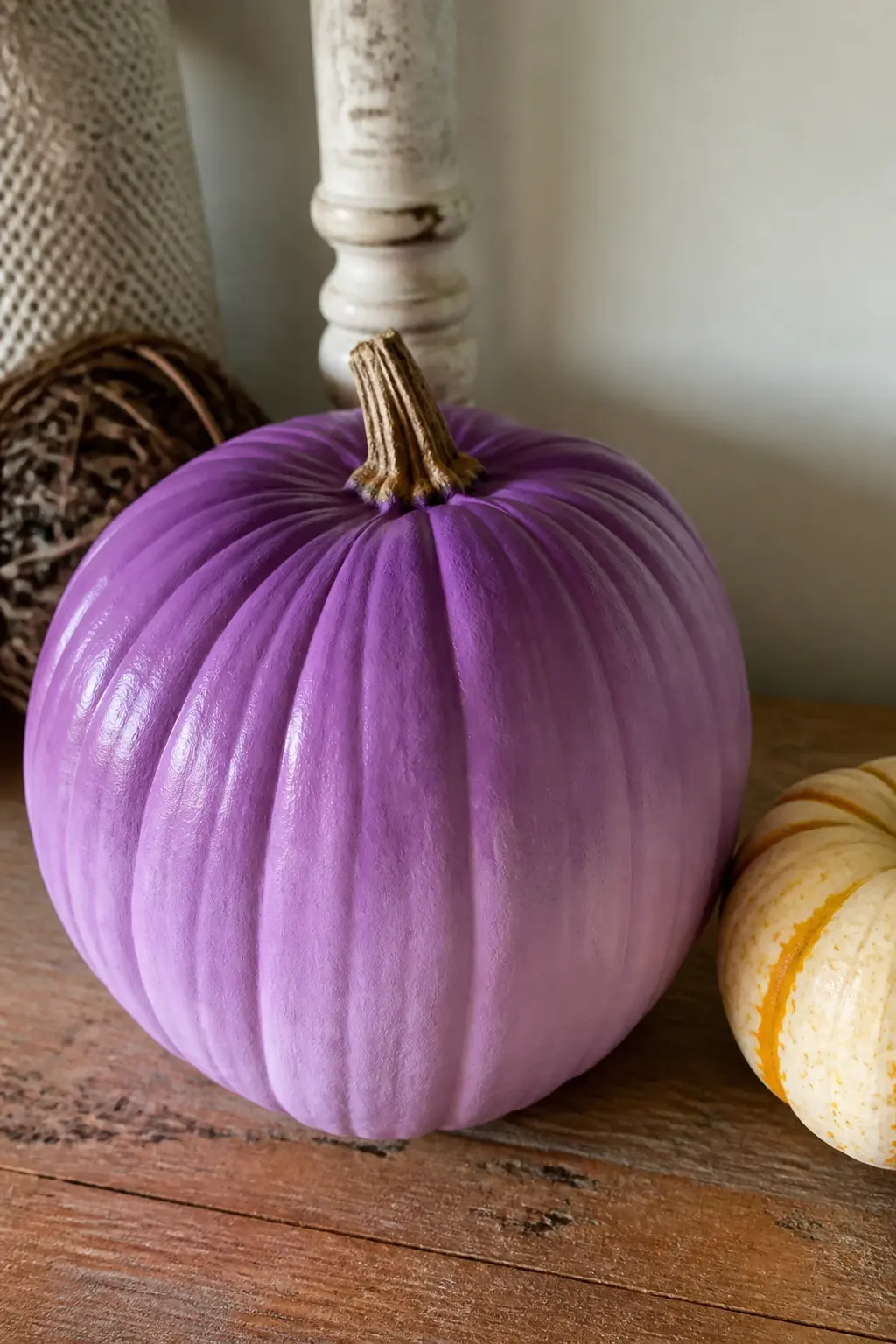
Lilac With a Deeper Purple Fading Upward
Start with a lilac base coat on the whole pumpkin. While the paint is still slightly tacky, work a deeper purple, something close to mid purple or violet, into the upper third with a dry brush in circular strokes. Blend where the two tones meet so the transition has no hard line.
The gradient reads as dimensional, giving the pumpkin a depth that a flat coat never achieves. No additional motif is needed: the colour itself is the decoration. Pair this beside a plain cream or white pumpkin to give the gradient room to register.
Lilac With a Fox Face in White and Rust
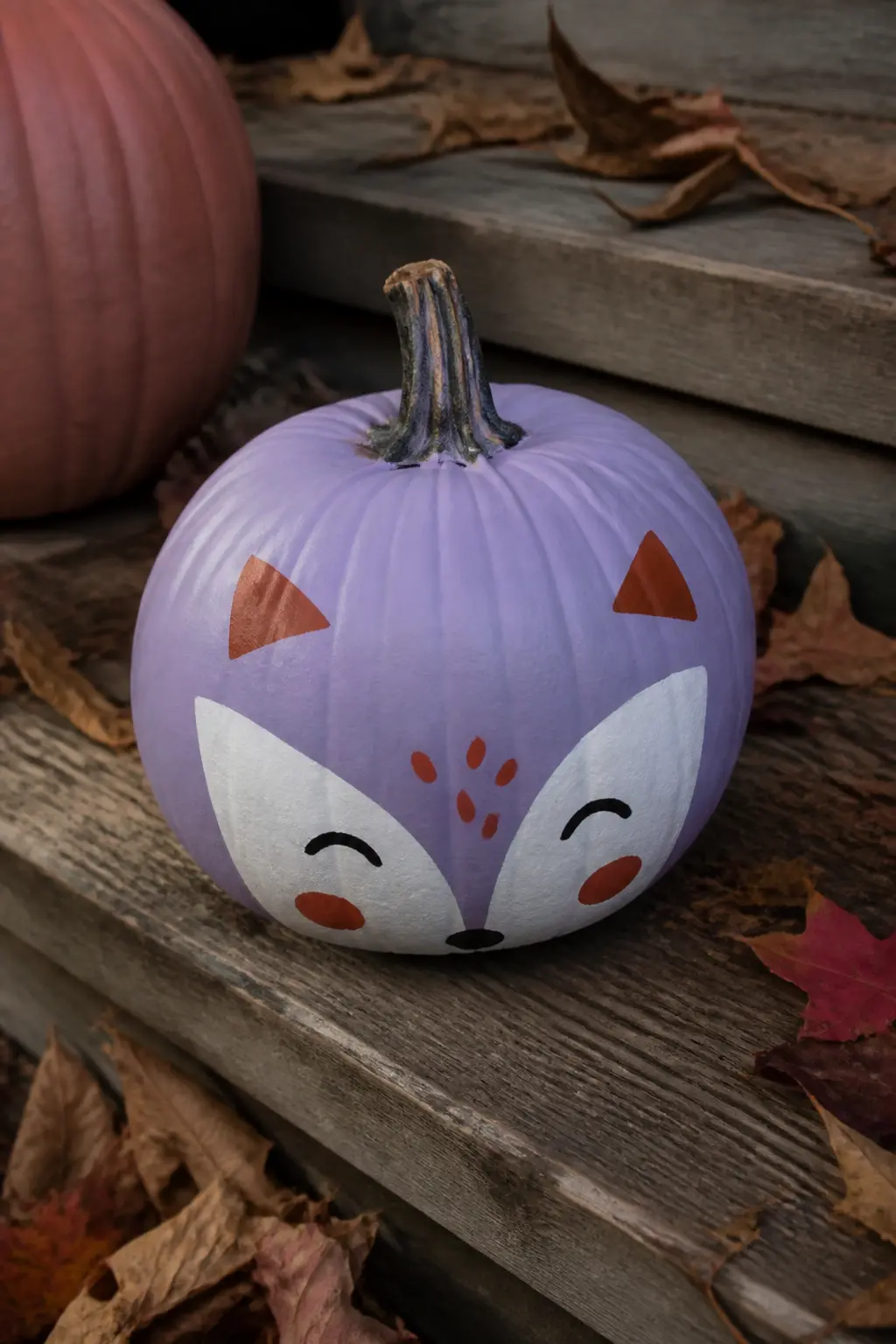
A fox face on a lilac pumpkin sounds like a children’s craft and lands as something entirely different when the palette is controlled. White for the muzzle and ear tips, rust or terracotta for the outer face and ear detail, a black dot for each eye and a small black triangle for the nose.
Keep the face simple and slightly stylised rather than realistic. The lilac ground gives the rust and white more warmth than orange ever would. This one works on a harvest table alongside gourds and walnuts, or sitting alone on a step with a few fallen leaves around the base.
Lilac With a Hand-Lettered Word
Choose a single word: “haunt”, “bloom”, “gather”, “hex” or any word that suits the occasion and the household. Letter it across the widest face of the pumpkin in white or cream paint using a fine brush. Imperfect lettering reads as intentional on a curved surface because the curve itself explains the variation.
Sketch the word lightly in chalk first and wipe it back if the placement is wrong before committing in paint. The word becomes the focal point, so the pumpkin needs no other decoration. Set it where the lettering faces the room rather than the wall.

🛍 Shopping guide
Mid Purple Pumpkins
This is the confident middle ground: a clear, saturated purple that needs no apology and no qualifier. It holds its own against black, gold and white in equal measure. These four entries push in different directions to show how versatile that single base coat actually is.
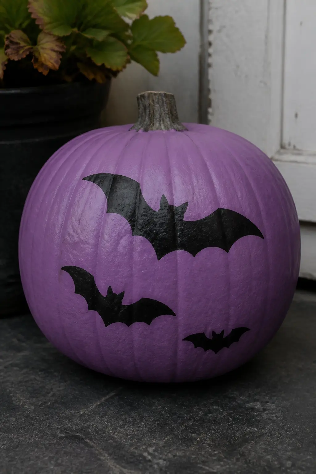
Mid Purple With Black Bat Silhouettes
Black bats on a mid purple ground are the most directly Halloween of all the entries here, and they still avoid looking cheap because the ground colour itself is sophisticated. Paint the whole pumpkin in a clear, saturated purple with no grey or blue lean in it, and let it dry completely before adding the bats.
Cut bat shapes from a piece of card stock and use them as a loose stencil, or paint them freehand with a small flat brush. Three bats in a loose scatter across the front, varying in size, read better than a row. Scale the smallest bat to roughly the size of a thumbnail.
🛍 Shopping guide
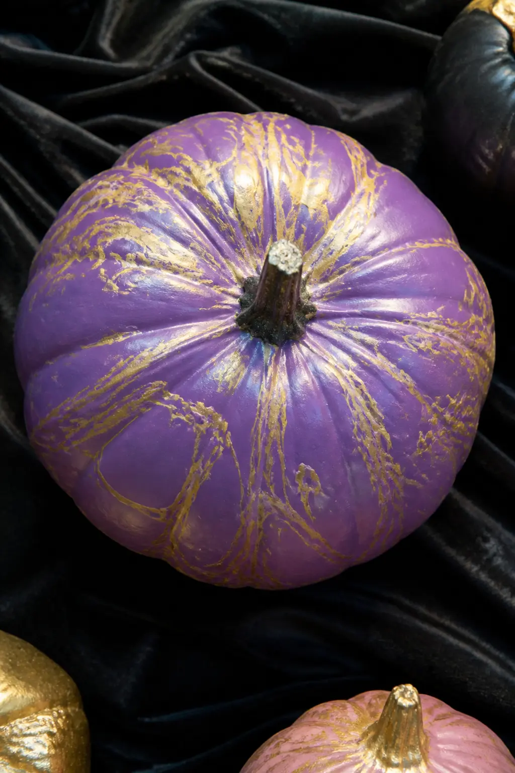
Mid Purple With Gold Marbling Poured Over
Pour marbling uses a watered-down metallic paint drizzled from a spoon or squeeze bottle, then tilted on the pumpkin surface so the paint runs in irregular veins. Gold on mid purple produces something that looks genuinely expensive without any particular skill required.
Hold the pumpkin stem-down over a bowl and drizzle the thinned gold paint in thin streams. Tilt slowly so it travels. Stop before it becomes muddy. One or two passes is enough: restraint is the technique. Let it cure flat before moving it, and seal with a satin spray to lock the marbling in place.
🛍 Shopping guide
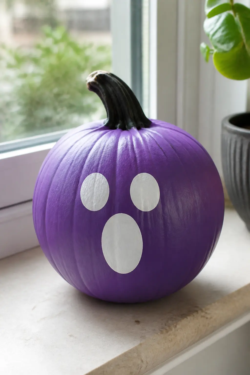
Mid Purple With a White Ghost Face
The same ghost face that appears in the lavender entry reads completely differently here. On mid purple the white has more contrast, so the face pops graphically rather than sitting softly on the surface. Keep the eyes and mouth rounded, slightly naive in shape, which pushes it toward folk-art rather than fright-night.
A mid purple ghost-face pumpkin reads well in a cluster with the lavender version: same motif, two depths of shade, and the visual connection between them turns a pair into a considered set. Add nothing else to either pumpkin and let the colour difference do the work.
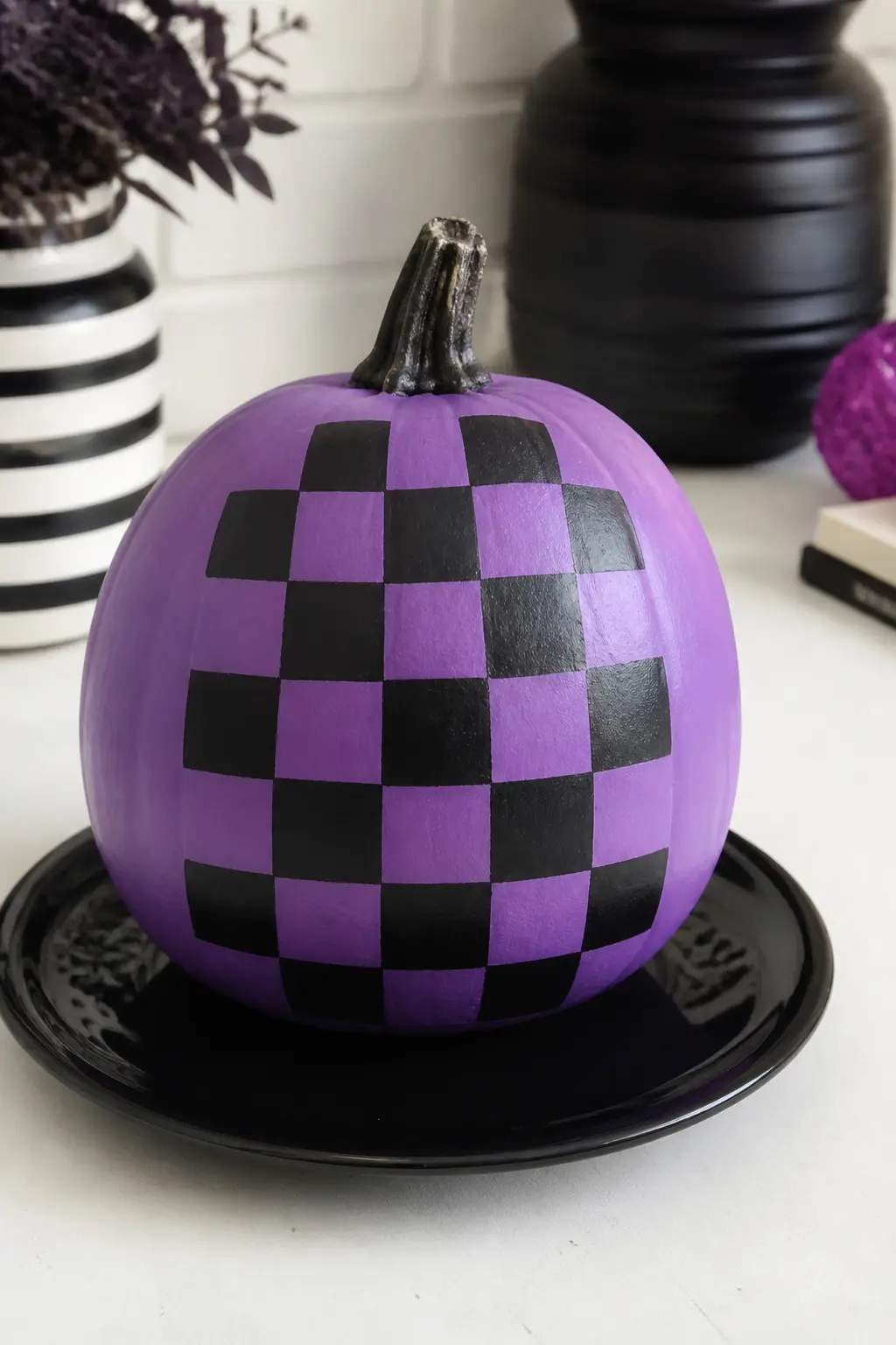
Mid Purple With a Checkerboard in Black
A checkerboard on a curved surface sounds technically difficult. The trick is to paint it on the flat front face only, keeping the grid to a manageable area of roughly 12 to 16 squares. Tape the grid lines with low-tack painter’s tape, paint the alternating squares black, then peel the tape while the paint is still slightly wet for clean edges.
Mid purple and black checkerboard has a graphic energy that suits a more contemporary Halloween display. Pair it with a solid black pumpkin beside it and nothing else. The pattern handles all the visual interest without any help.
🛍 Shopping guide
Plum Pumpkins
Plum is purple with red warmth and enough depth to read almost jewel-like. Metallic finishes land differently here than they do on pale shades: copper and gold both glow against plum in a way that looks earned rather than added. These four entries make the most of that.
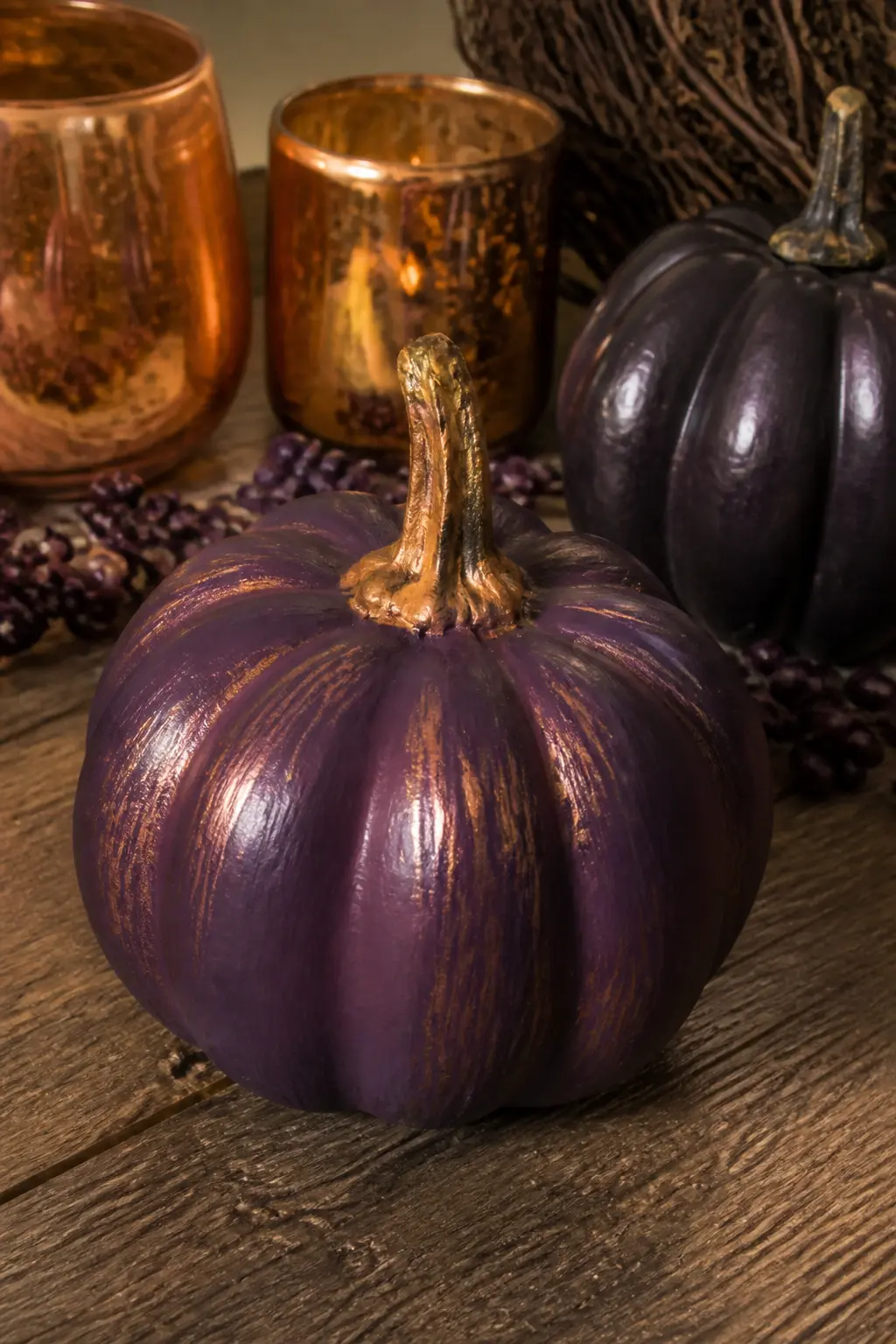
Plum With Copper Dry-Brushed on the Ridges
Dry-brushing is the technique where you load a brush lightly with copper metallic paint and drag it quickly across the raised ridges of the pumpkin, depositing colour only on the highest points of the surface texture. On plum, the result looks like the pumpkin has caught a warm side-light permanently.
No planning needed. Load the brush, wipe most of the paint off on a paper towel, then sweep lightly across the ridges from top to bottom. Two passes maximum, then stop. It is easy to overdo and impossible to undo, so less is always the better first choice.
🛍 Shopping guide
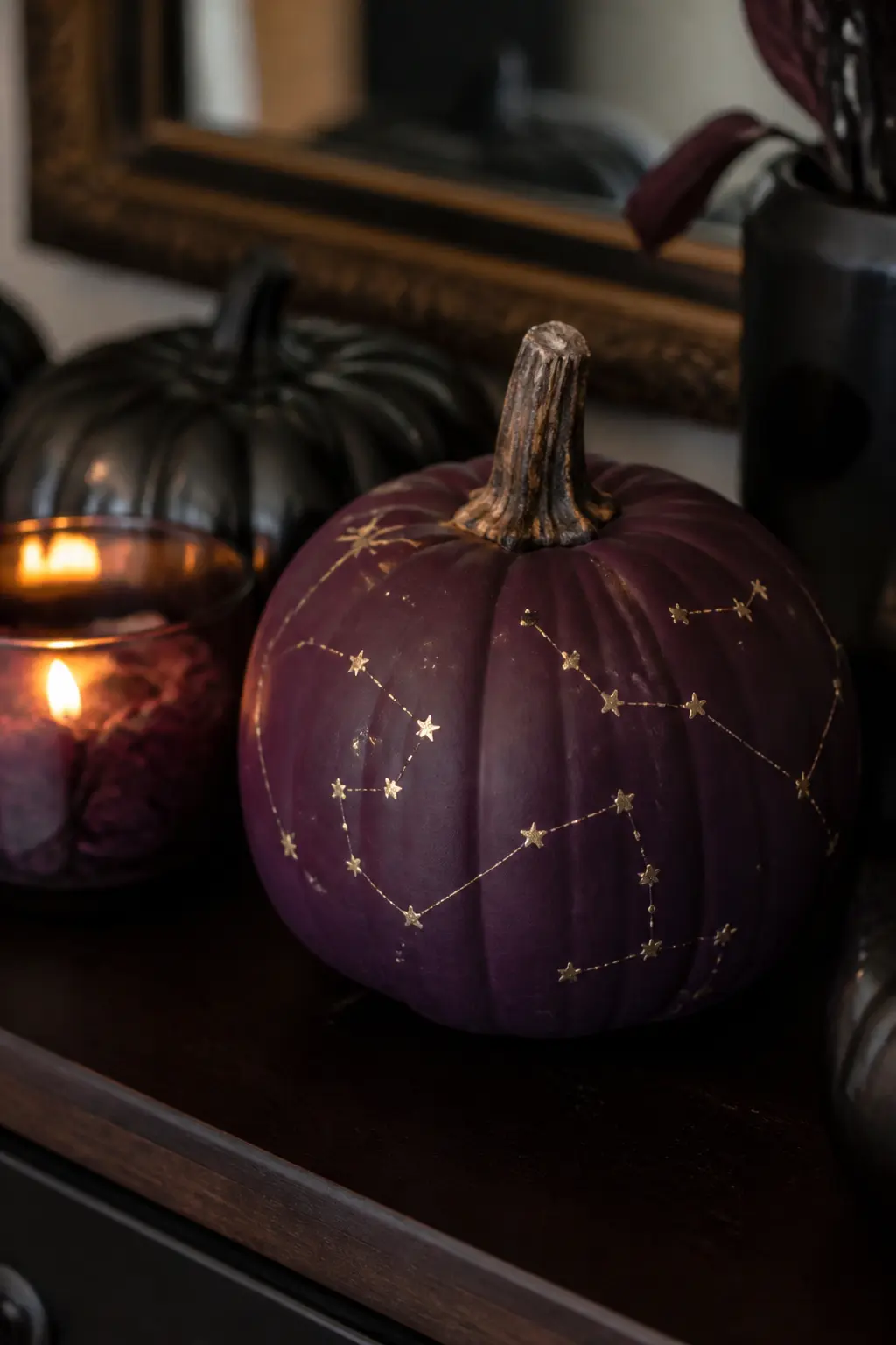
Plum With Gold Constellation Dots
Dot constellations with a fine dotting tool or toothpick dipped in gold paint: the dots represent the stars, and fine connecting lines drawn with a liner brush or a gold paint pen join them into recognisable shapes. Orion, Cassiopeia and the Big Dipper all translate to a pumpkin surface cleanly because they use relatively few points.
Space the constellations around the pumpkin so there is breathing room between them. Plum absorbs light rather than reflecting it, so the gold dots read like actual points of light against a night sky. Set this pumpkin on a shelf or a mantelpiece where candle light can catch the gold.
Plum With a Black Lace Overlay
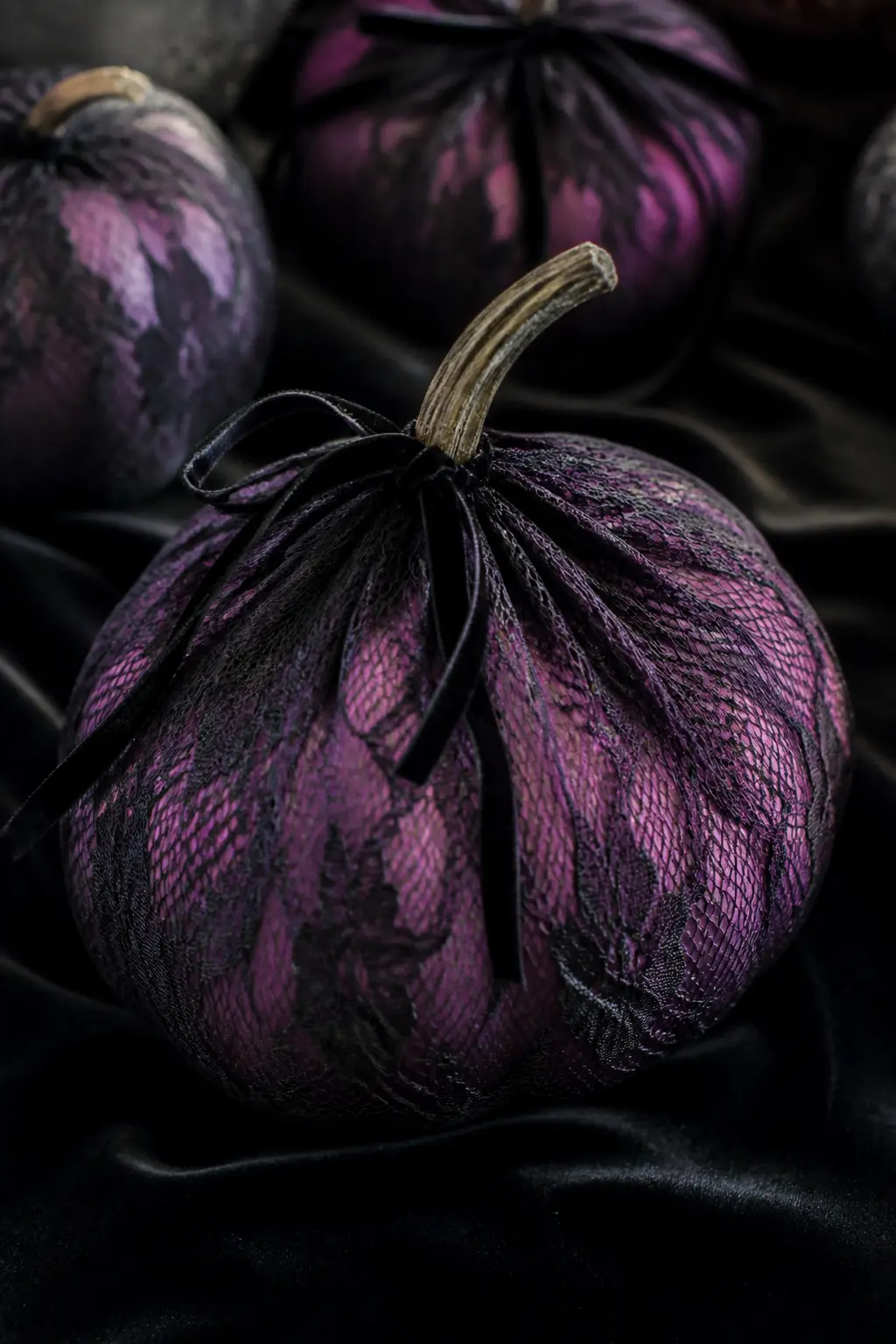
Wrap a plum pumpkin in a rectangle of black lace fabric, gathering it at the stem and securing with a thin black velvet ribbon tied in a loose knot, not a bow. The lace sits against the surface without glue, which means it comes off cleanly and the pumpkin underneath is undamaged.
The lace creates a moiré effect where it follows the pumpkin’s curves, doubling the surface interest without a single brushstroke. Choose a lace with a mid-scale pattern, neither very fine nor very large, so it reads clearly at close range and across a room. This is the most gothic entry in the plum group, and it earns it.
🛍 Shopping guide
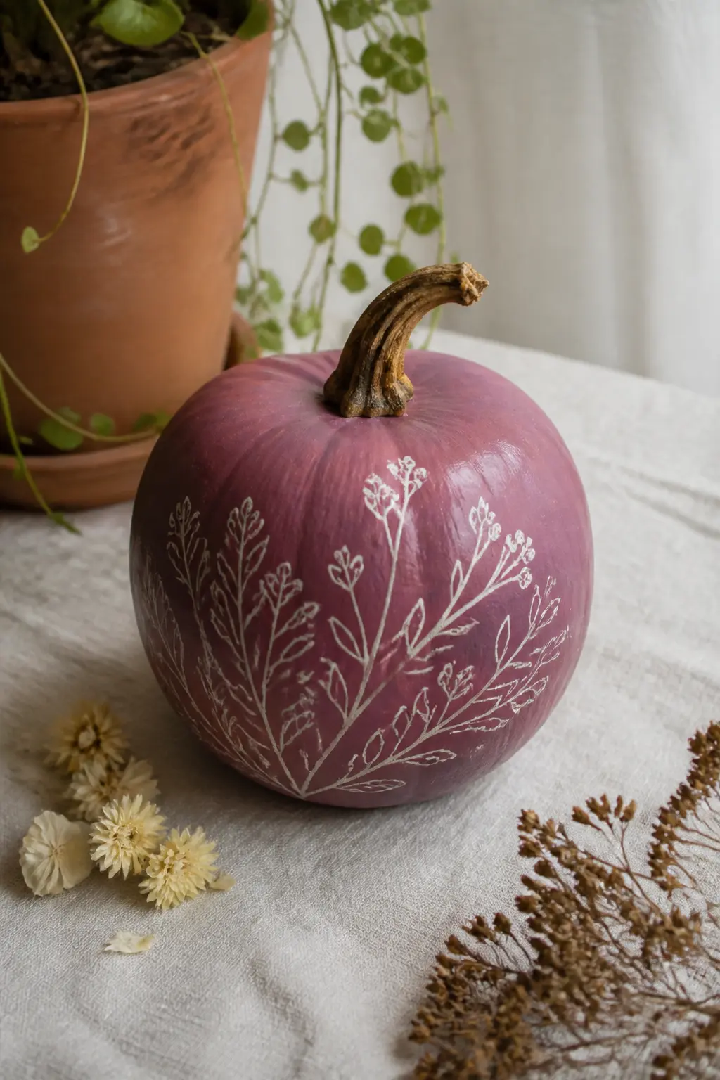
Plum With Cream Botanical Line Work
Draw botanical motifs in cream paint or a cream paint pen: a single stem with small leaves, a sprig of berries, a simple florette. The motifs sit on the pumpkin as if engraved, line work only with no fill, which gives the whole surface a quality closer to a printed fabric than a painted Halloween prop.
Cream on plum is a quieter combination than white, with more warmth in the contrast. Keep the line work to one or two sprigs rather than covering the whole surface: negative space is part of the composition. This pumpkin works in any room in the house, not just the entrance hall.
🛍 Shopping guide
Aubergine Pumpkins
Aubergine is the darkest stop on this list, a near-black purple that photographs beautifully and looks genuinely sophisticated on a doorstep or a shelf. Anything light placed on or beside it lifts with real contrast. These five entries range from graphic to delicate.
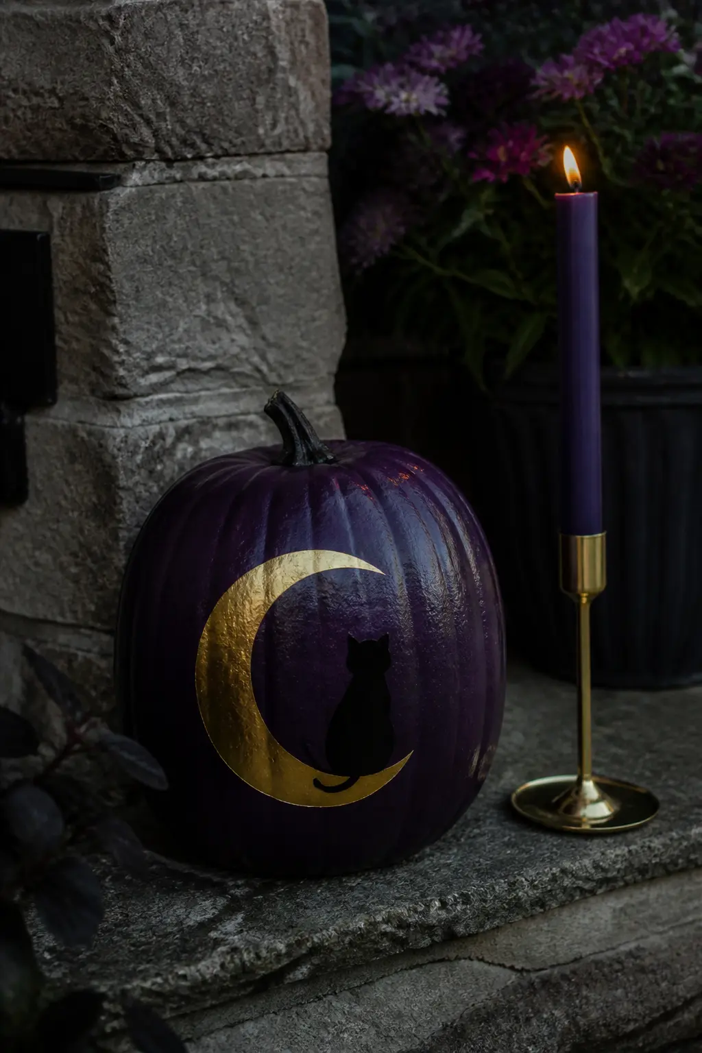
Aubergine With a Gold Crescent Moon and a Black Cat Sitting on It
The composition places the crescent moon in the lower half of the pumpkin face, curved horns pointing upward, with a small silhouette of a sitting cat centred on the curve of the moon. Both motifs are painted in gold, so the cat reads as part of the moon design rather than a separate illustration sitting in front of it.
Transfer the shapes with a chalk sketch first, then fill in with a small flat brush and gold paint. The aubergine ground makes this look like a woodblock print on dark paper: high contrast, deliberately composed. Set it on a stone step or a dark shelf and leave a tall taper candle in a thin holder just beside it.
🛍 Shopping guide
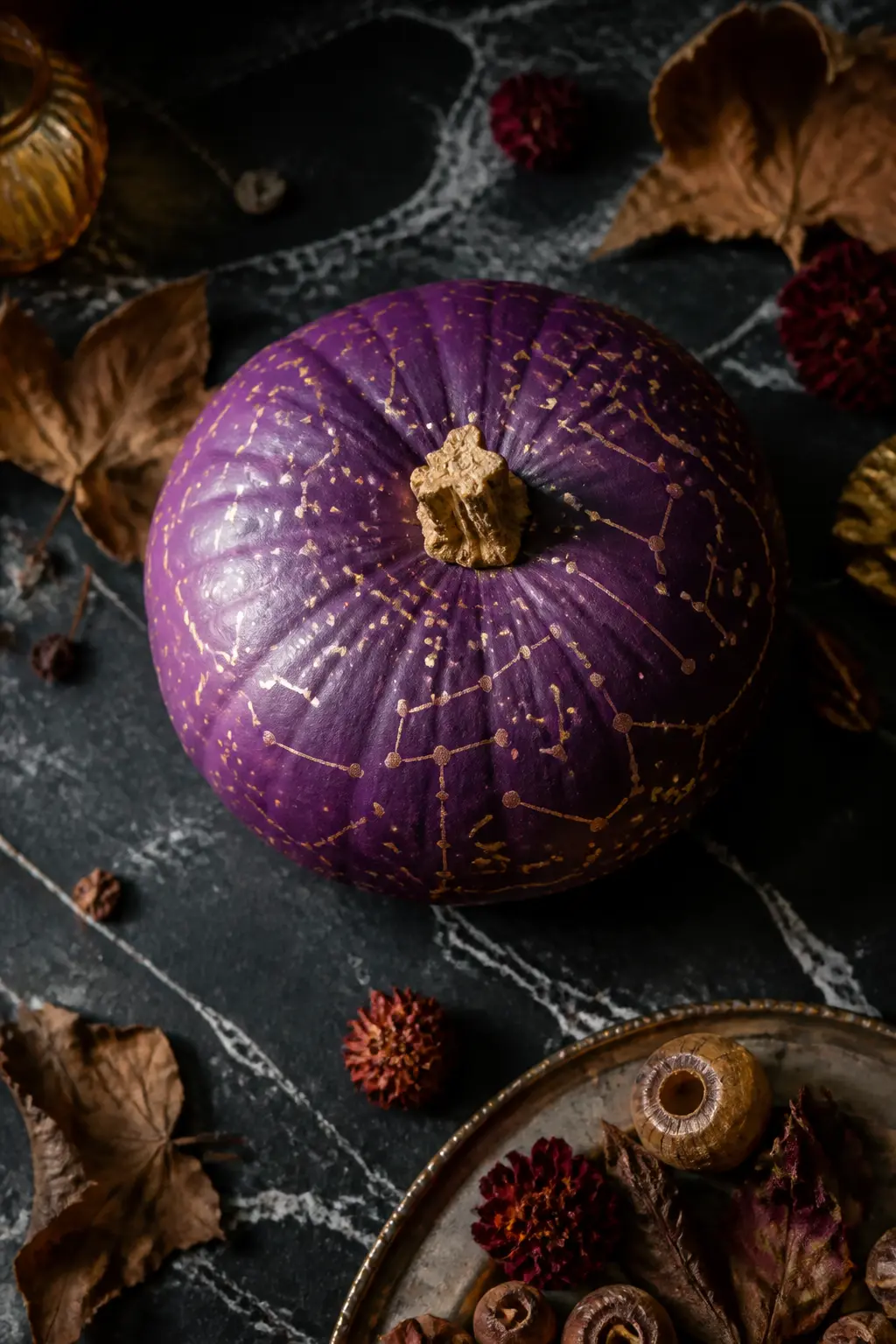
Aubergine With Gold Constellations Joined by Fine Lines
This is a denser and more elaborate version of the plum constellation entry. On aubergine, the gold reads with maximum contrast, almost luminous, so the constellations can wrap further around the pumpkin without the design becoming muddy. Join every star dot to its neighbours with fine gold lines, and add a second ring of fainter dots around some of the star points to suggest the glow of a distant star cluster.
Work slowly with a liner brush or a very fine gold paint pen. This is the one entry in the article that genuinely rewards patience. The finished result looks like a printed celestial map on a very dark ground.
🛍 Shopping guide
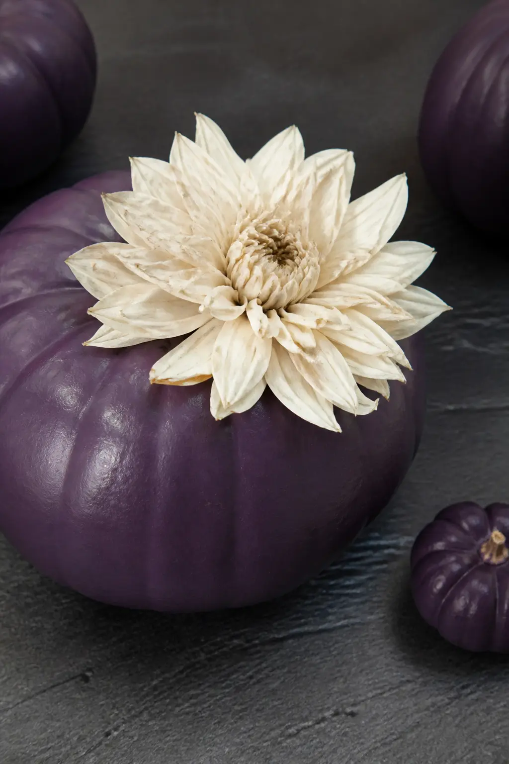
Aubergine With a Single White Bloom Glued On
One large dried or preserved flower, a white peony, garden rose or dahlia, hot-glued at the base of the stem. That is the entire decoration. The contrast between the near-black pumpkin and the white bloom is enough: adding a second flower or a ribbon would reduce rather than increase the impact.
Choose a bloom that holds its shape when dried, which typically means dahlias, strawflowers, or preserved roses. Fresh flowers look magnificent for the first day and look finished by the third. A preserved or dried bloom holds the season. Set this pumpkin alone on a dark surface and resist the urge to add anything beside it.
🛍 Shopping guide
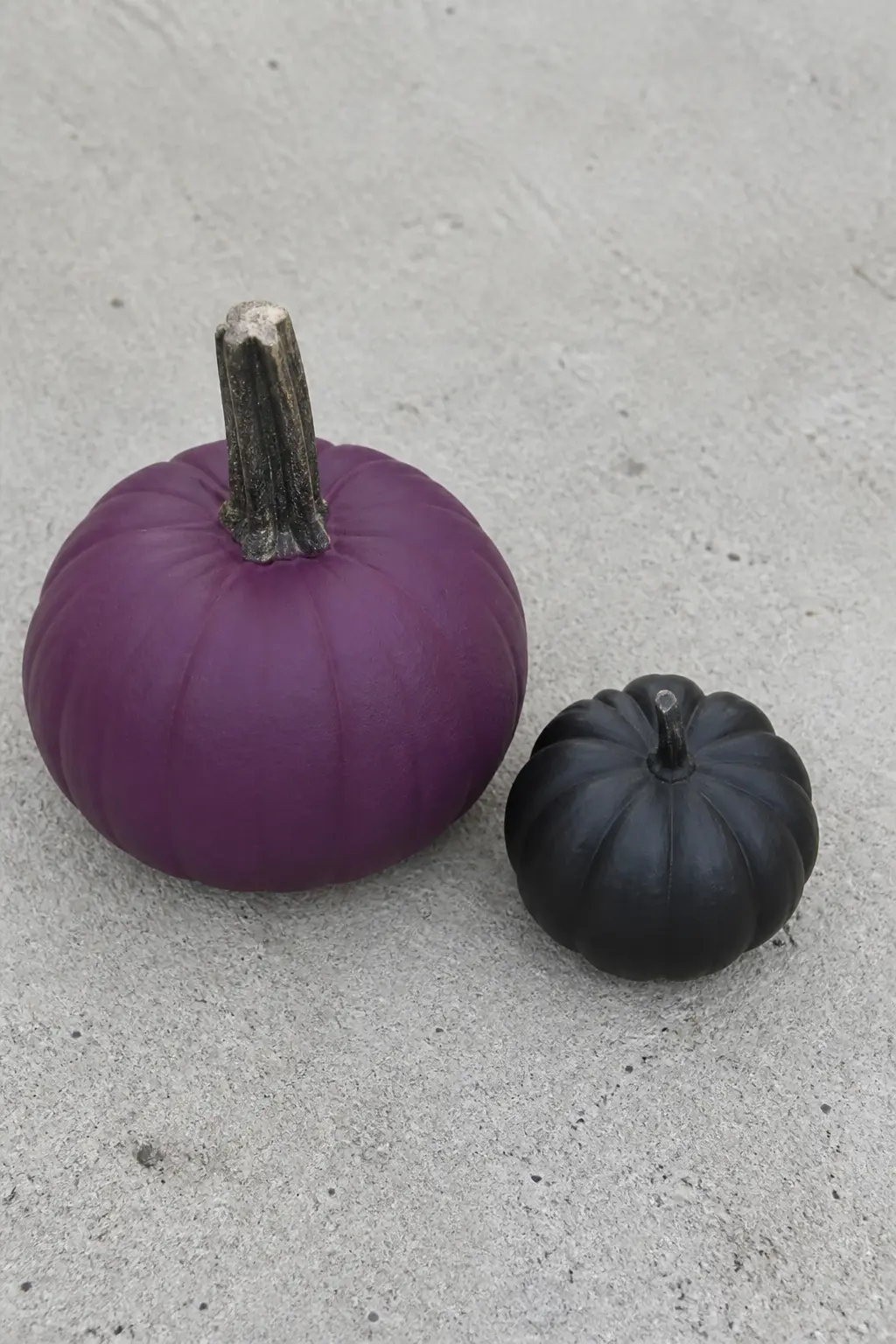
Aubergine Paired With a Black Pumpkin as a Set
Paint one pumpkin aubergine and one completely black, both with the same matte finish. Set them side by side on the same surface, slightly different sizes if possible. No motifs on either one.
The visual interest comes from the tonal difference between a near-black purple and a true black: they are close but not the same, and that distinction reads as deliberate when the two sit together. Add nothing else. This is the most minimal entry in the article and that is what makes it work in a modern interior that other Halloween decor never quite suits.
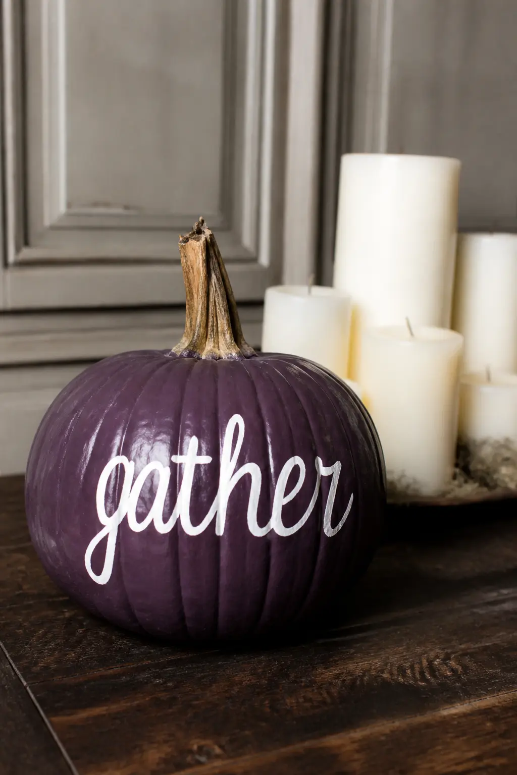
Aubergine With White Lettering Across the Front
Maximum contrast lettering: white paint on aubergine, either a single word or a short phrase. “All Hallows”, “wander”, “hex” or a family name all work. The dark ground makes white letters glow rather than simply sit on the surface, which is the key difference from the lilac lettered entry earlier in the article.
Sketch in chalk first, then paint over in white with a round brush. The letters can be serif, sans-serif or script depending on the mood, but script on a curved surface needs a steadier hand than block letters do. A white paint pen gives a consistent line width if freehand brushwork feels risky.
🛍 Shopping guide
Sets of Purple Pumpkins
A single painted pumpkin is a nice object. Three or five together become a moment. These three set ideas each follow a clear logic, so the grouping looks considered rather than collected at random.
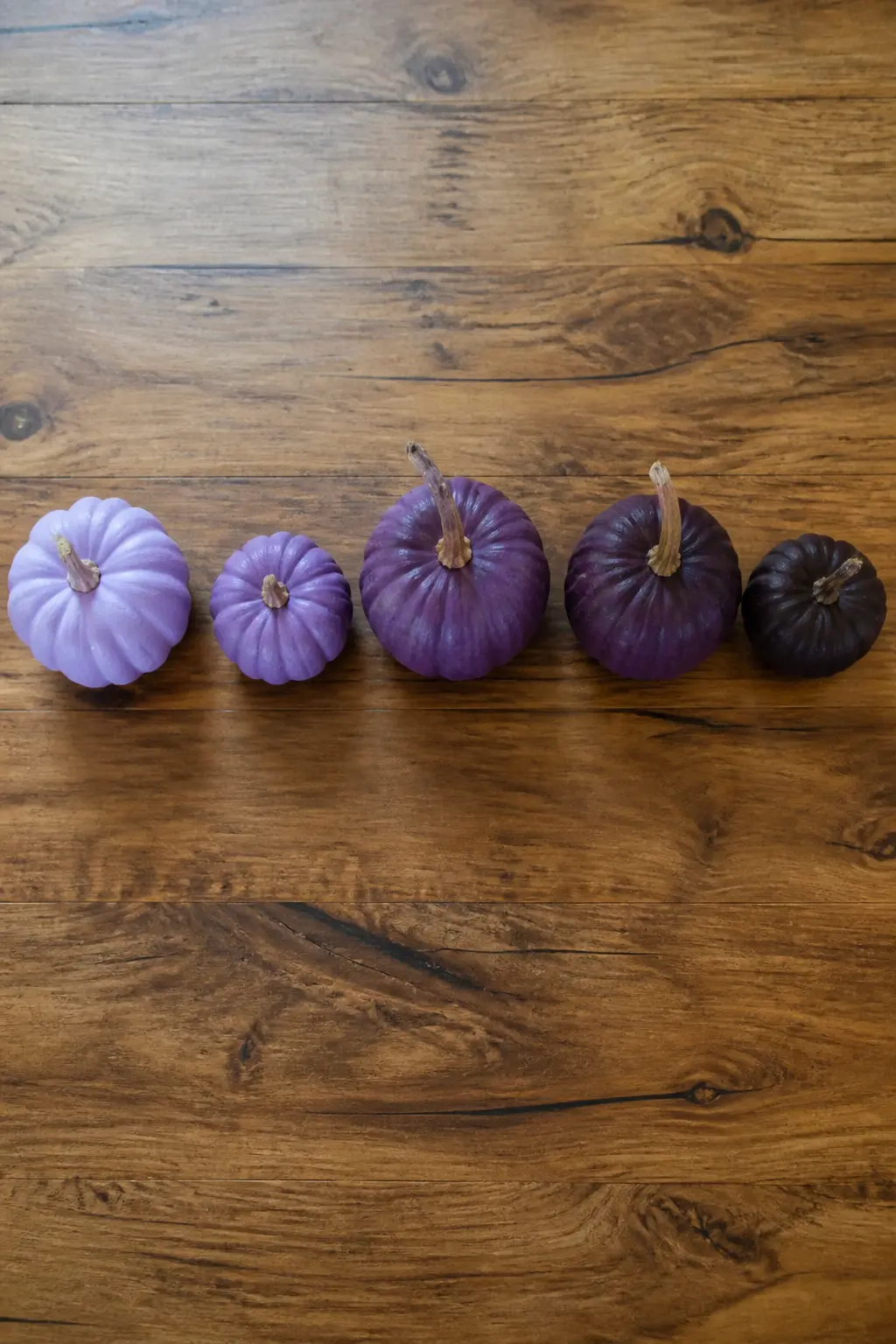
Five Pumpkins Graduating Pale to Dark
Buy five pumpkins in graduating sizes or at least in a spread of sizes that feels unforced. Paint each one a successive shade of purple: lavender, lilac, soft mid purple, plum and aubergine. Keep the finish identical on all five, whether that is matte chalk paint or satin spray, so the set reads as a family rather than five unrelated objects.
Arrange them in a line from light to dark, or cluster them in a loose grouping with the lightest at the front and the darkest at the back for depth. This set works as a centrepiece on a long dining table, a doorstep display or a fireplace hearth. No other decor is needed on the same surface.
🛍 Shopping guide
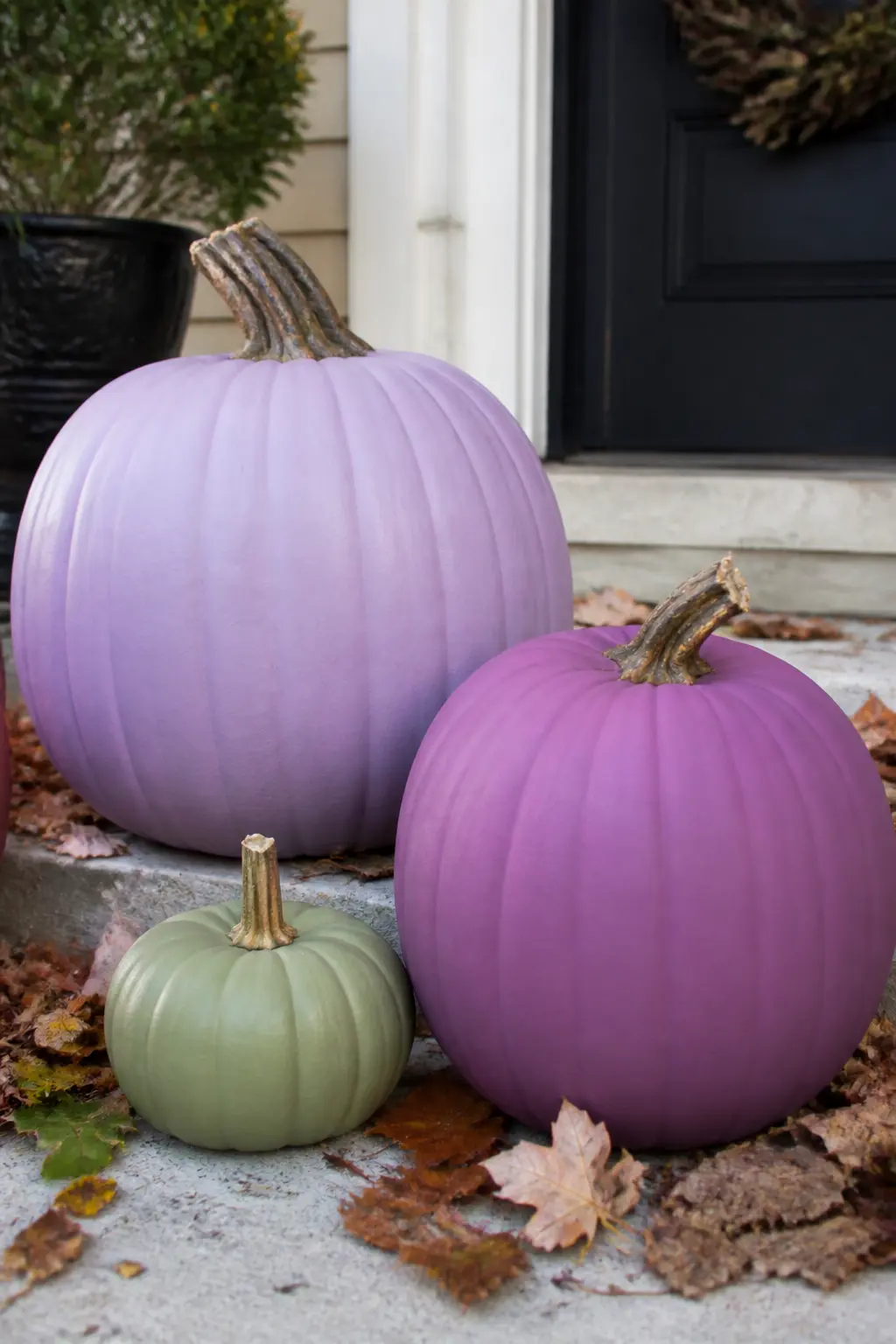
Purple With One Green Pumpkin to Lift It
Green is purple’s direct complement on the colour wheel, which means it makes every shade of purple around it look more saturated and more alive.
The green pumpkin should be the smallest or the largest, not a middle size, so it acts as an accent rather than competing for equal standing. This is the set to choose for an outdoor display where you want the arrangement to read from a distance as well as up close.
🛍 Shopping guide
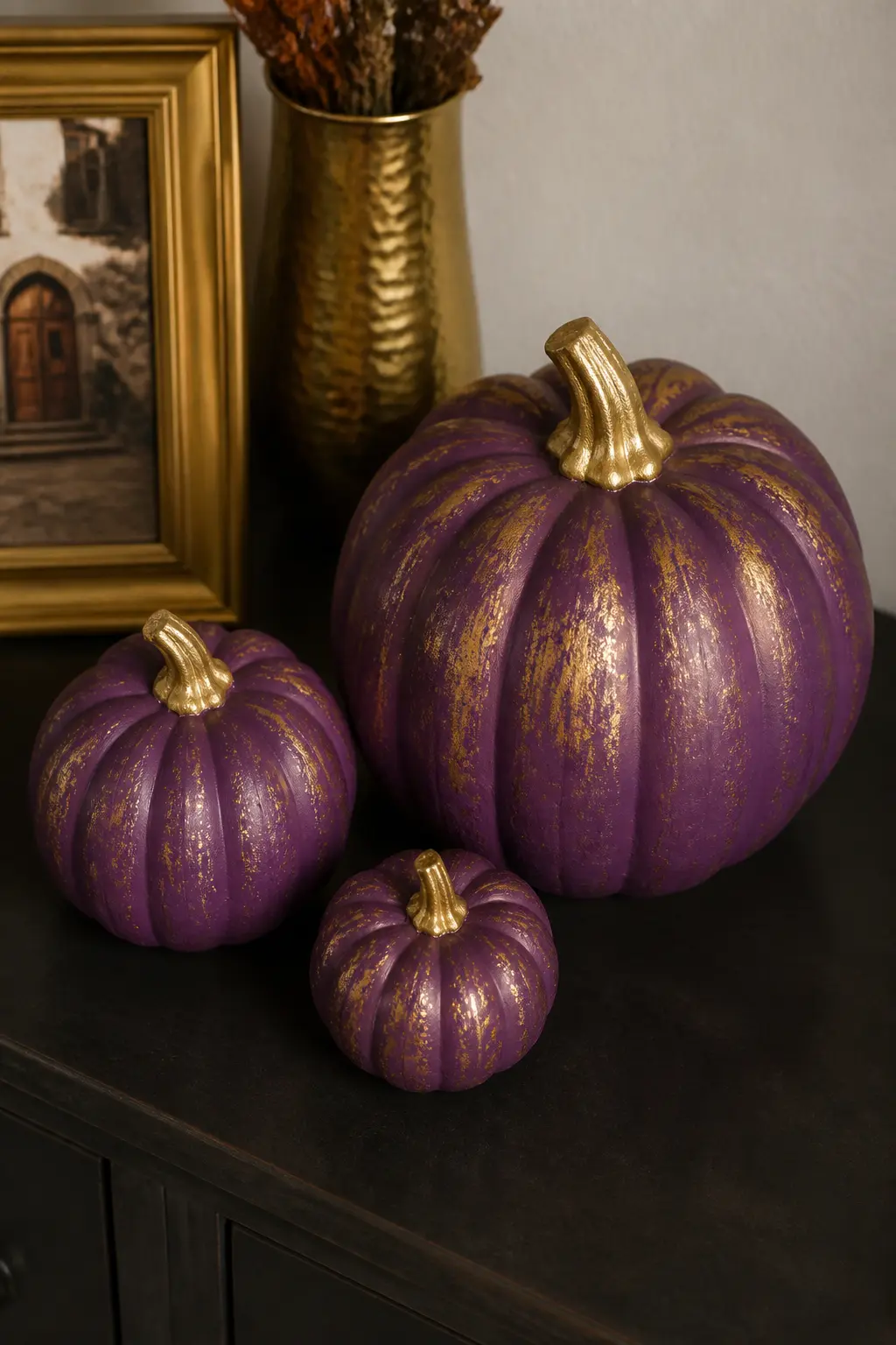
Purple and Gold Only, in Three Sizes
Three pumpkins: small, medium and large. Paint all three purple, any single shade you like, and add only gold accents, whether that is a gilded stem, a pour of gold marbling or a handful of constellation dots. All three pumpkins get the same gold treatment so the set is cohesive.
Group them in a tight triangle with the largest at the back centre. Gold and purple is a formal combination that suits a dining table centrepiece or a console table in an entrance hall. It needs no foliage, no ribbon and no additional props to look finished.
Colour Pairings for Purple Pumpkins
Purple is not a solitary colour. What you place beside it determines whether the whole display reads witchy, botanical, romantic or simply modern. These four pairing entries treat the companion colour as seriously as the purple itself.
Purple With Sage Green
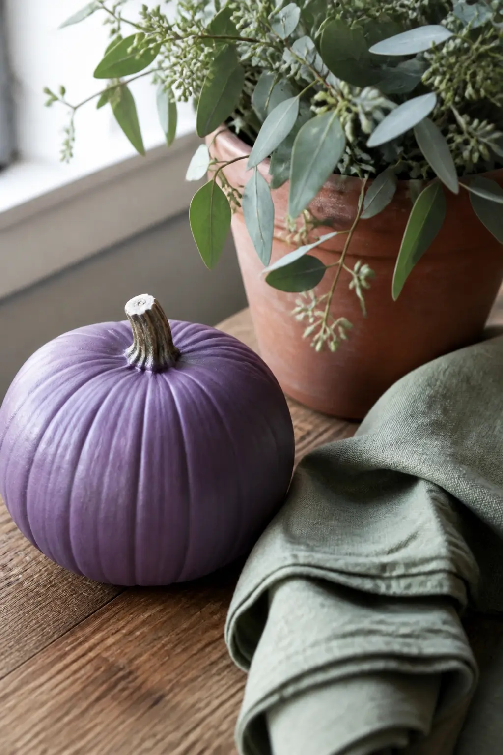
Sage green is muted enough to companion any shade of purple without fighting it. Place a purple painted pumpkin beside sage green foliage (eucalyptus, olive branches or preserved fern) or beside a sage green ceramic object. The combination reads immediately as botanical and autumnal rather than Halloween in the costume sense.
On a table: one mid purple or plum pumpkin, a small bunch of sage eucalyptus in a terracotta vessel, a green linen napkin folded flat. Nothing else. The three textures, painted pumpkin, dried foliage and woven fabric, do all the work across the palette.
🛍 Shopping guide
Purple With Copper
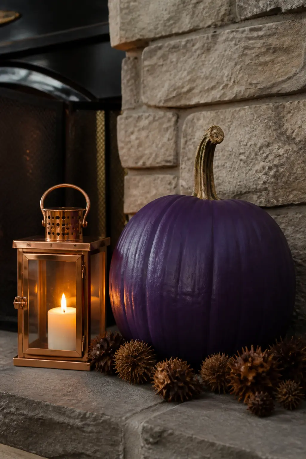
Copper warms every shade of purple it sits beside, pulling the cool tones forward so they read as richer. The pairing works across all depths: a lavender pumpkin beside a copper lantern, a plum pumpkin with copper-dry-brushed ridges beside a copper bowl.
For a display: one purple pumpkin, one copper lantern with a real or battery candle inside, a handful of copper-toned dried leaves or seed pods gathered at the base. The warm glow of the lantern does double duty as decor and as the light source that photographs the pumpkin from the inside out.
🛍 Shopping guide
Purple With Dusty Pink
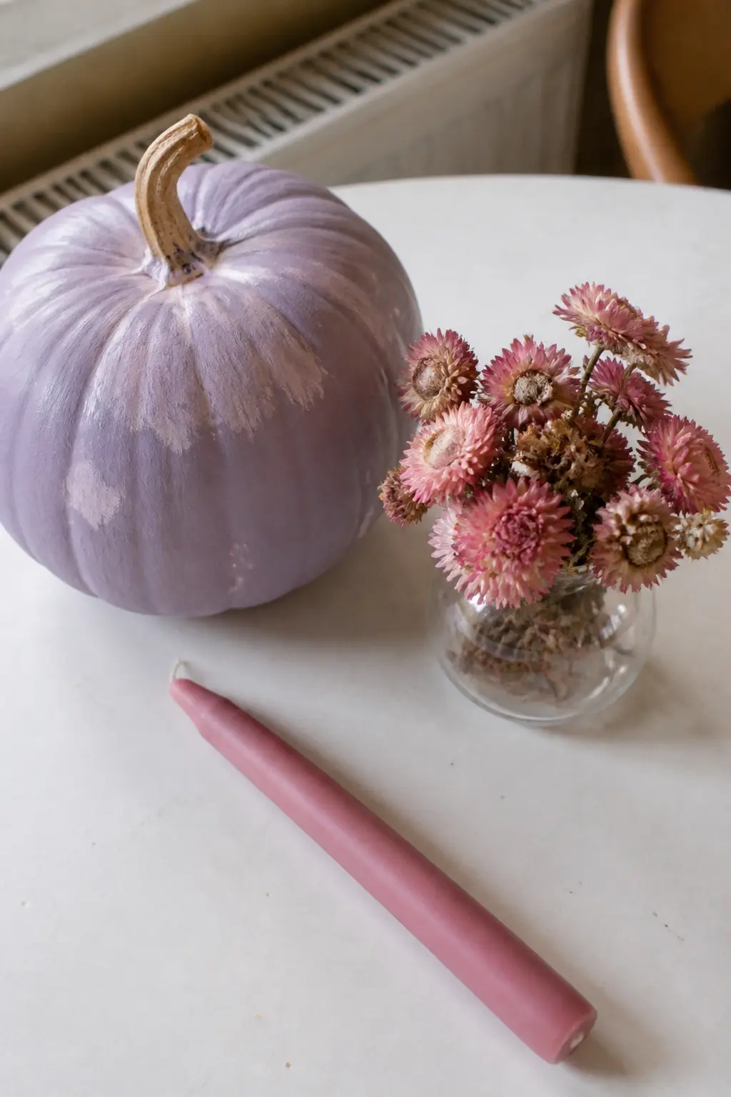
Dusty pink and purple share a base and that shared warmth makes them easy to combine without the result looking confused. The pairing skews romantic rather than gothic, which suits a table setting, a birthday display or a baby shower as easily as it suits Halloween.
For a display: one lilac or lavender pumpkin, a small vase of dried pink pampas or dried pink strawflowers, a dusty pink taper candle in a simple holder. The whole palette stays within the warm neutral-to-soft-purple range and reads cohesive at any scale.
🛍 Shopping guide
Purple With Cream and Nothing Else
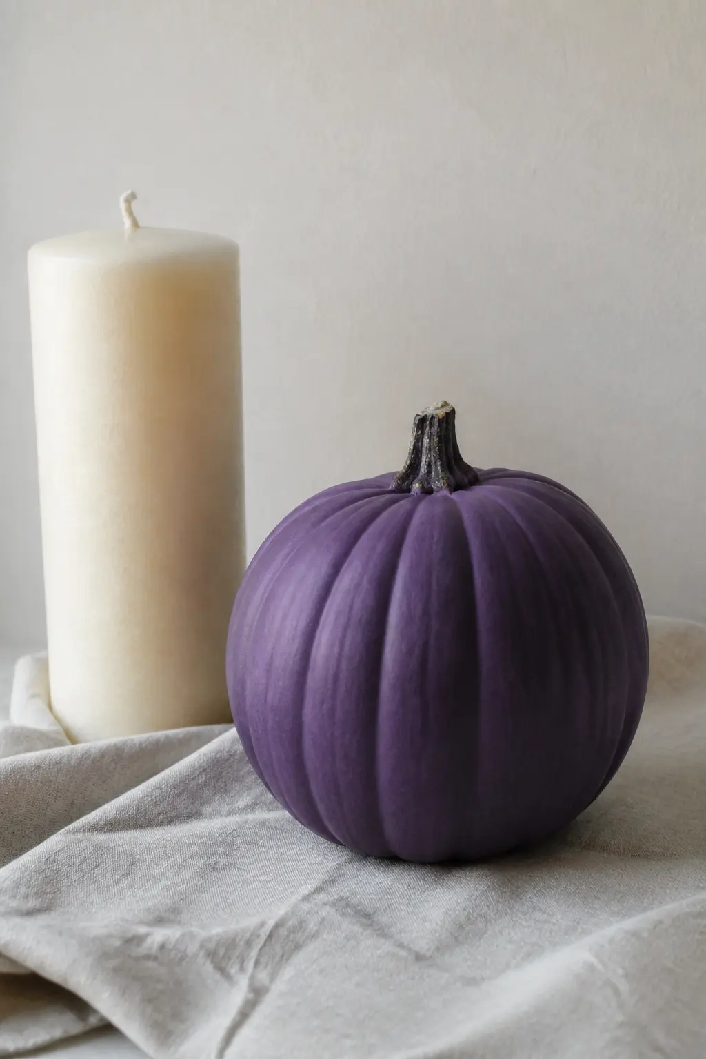
One purple pumpkin, any shade, beside a cream object: a cream church candle, a cream ceramic bowl, a folded cream linen cloth. Nothing else on the surface.
The discipline of limiting to two colours and two objects is where this pairing gets its power. There is no competition for the eye, which means the depth of the purple reads at its fullest and the cream provides just enough contrast to define it. This works equally well with lavender and aubergine, which is a rare quality in a pairing.
🛍 Shopping guide
Before You Start Painting
A chalk paint or matte craft paint grips a pumpkin surface without primer on most smooth varieties. Ribbed or textured skins benefit from one light coat of white chalk paint first, dried fully, before the purple goes on. Two thin coats beat one thick one every time: thick paint cracks as the pumpkin shifts with temperature.
Seal every finished pumpkin with a matte or satin spray varnish. It protects the surface, deepens the colour slightly, and stops the paint lifting if the pumpkin sits outside on a damp morning. Skip the gloss varnish unless the entry specifically calls for a sheen, because gloss on a painted pumpkin reads cheap in a way that matte simply does not.
Frequently Asked Questions
What paint do you use on a real pumpkin?
Chalk paint or matte acrylic craft paint both grip a smooth pumpkin skin without primer. For textured or ribbed varieties, one thin coat of white chalk paint as a base helps the colour go on evenly. Always seal the finished pumpkin with a matte or satin spray varnish to protect the surface and deepen the colour slightly.
How do you stop painted pumpkins from going mouldy?
Keep the pumpkin dry and out of direct sun. Mould begins from the stem end, so if you notice softening there, spray the stem with a light coat of spray varnish and move the pumpkin indoors or under cover. A pumpkin stored in a cool, dry place typically lasts four to six weeks after painting.
What is the best purple paint for a sophisticated Halloween look?
Avoid bright neon violets and anything labelled ‘Halloween purple’ in craft stores, as these tend to read as costume-adjacent. Instead, look for chalk paints or mineral paints in shades labelled lavender, lilac, plum, aubergine or ‘dusty violet’. The grey or red undertone in those shades is what separates them from plastic-looking bright violet.
Can you paint a pumpkin gold over purple?
Gold marbling poured over mid purple, gold constellation dots on plum or aubergine, and gold dry-brushed on ridges all work because gold has enough opacity to show up clearly on a dark ground. Use a metallic acrylic or metallic wax, not a glitter-based paint, for a finish that reads refined rather than craft-fair.
How do you get a gradient or ombre effect on a pumpkin?
Apply the lighter base coat first and let it dry. Load a stiff dry brush lightly with the darker shade, wipe most of it off on a paper towel, then work the darker colour into the upper portion of the pumpkin in circular strokes. Blend at the border while the paint is still slightly tacky. Two thin applications blend more cleanly than one heavy one.
Do purple pumpkins work for occasions other than Halloween?
Absolutely. The key is choosing a soft shade and pairing it with cream, sage or dusty pink rather than black.
18 halloween crafts for adults that look intentional on a shelf or mantel: matte black bottles, wax-
14 Halloween charcuterie board for kids ideas that look wildly spooky and take under 30 minutes to a
39 Halloween door decorations for classroom doors built entirely from paper, organized by theme so t
Leave a Reply