

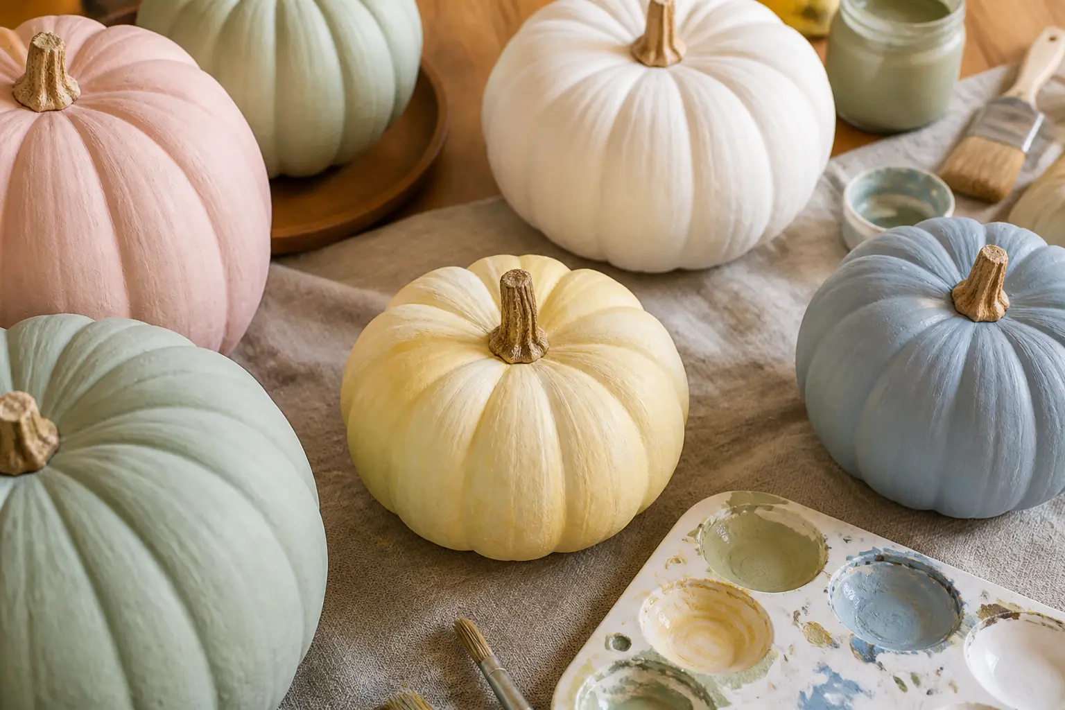
Pink gets all the credit, and the rest of the palette sits ignored. These 31 designs prove that mint, lilac, butter yellow, peach, sage and powder blue each hold their own, and that a display built around one colour family reads far more considered than a random handful of pretty pumpkins.
Every entry here uses a matte finish, because matte is what makes a painted pumpkin look deliberate rather than craft-fair. Gold is the only metallic allowed. The entries are sorted by colour so you can shop one colour at a time, mix two families intentionally, or build a complete five-colour set using the grouping ideas at the end.
For more ways to go beyond the basic autumn display, the pumpkin crafts round-up and the Thanksgiving centrepiece guide both sit well alongside this one.
This post contains affiliate links. If you buy through them, I may earn a small commission at no extra cost to you.
Mint Pumpkins
Mint is the coolest tone in this palette and the one most people overlook entirely. It reads fresh rather than sweet, which makes it the easiest family to carry into a tablescape that is not obviously autumnal.
Pair it with cream and white for a clean result, or bring in a single gold accent to warm it up without losing the crispness.
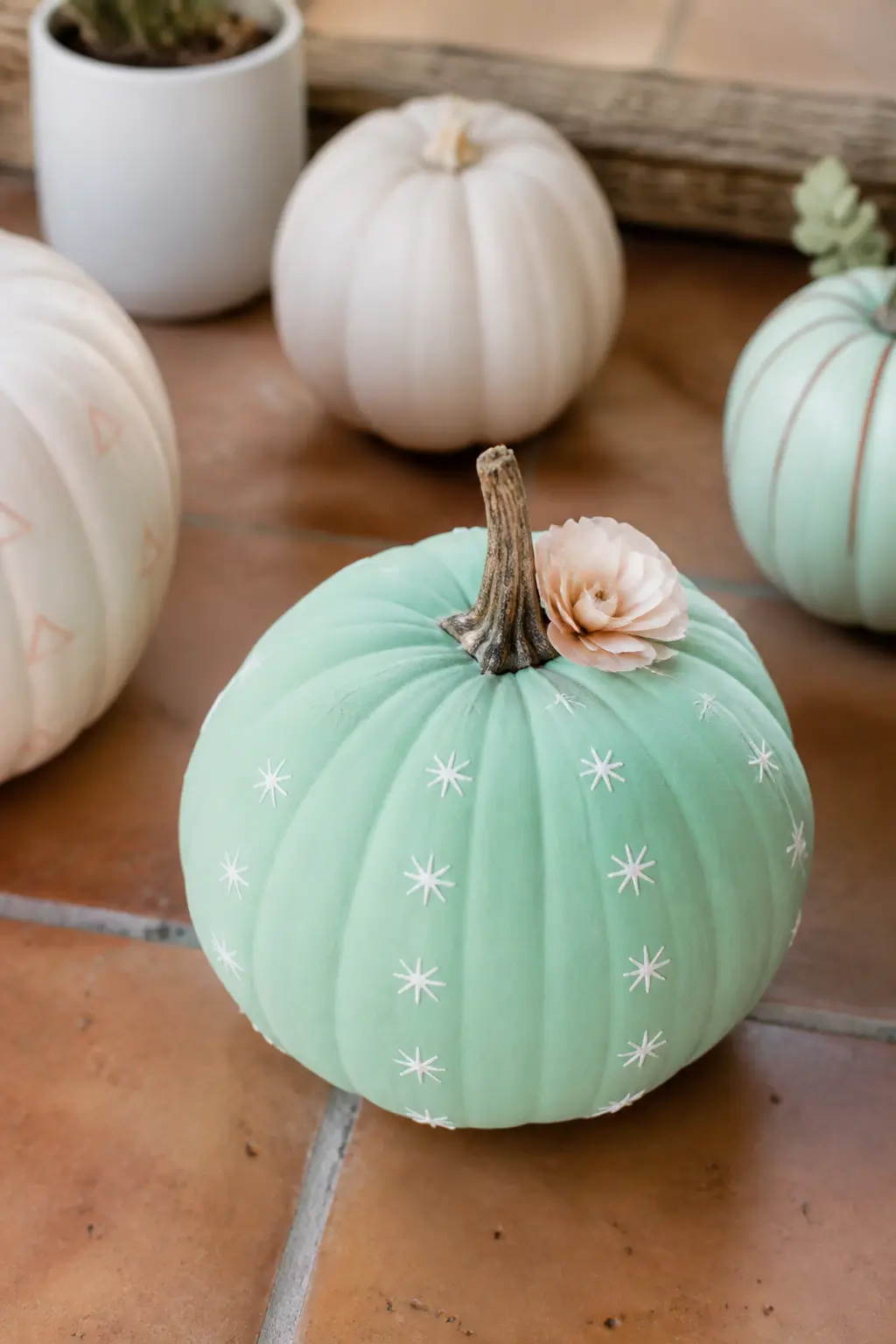
Mint Cactus Pumpkin With Paper Flower
Paint the whole pumpkin in flat matte mint and let it dry completely. Use a fine brush and white paint to draw short radiating spines along each ridge, keeping them irregular so they read natural rather than mechanical.
The spines do not need to cover every ridge: two or three sections of dense spines with gaps in between look more like a real cactus than a full coverage approach.
Finish with a small paper flower pressed into the top near the stem. A single crepe paper bloom in pale coral or white anchors the design without competing with the mint base.
This is the one entry that uses a paper element, and it works because the flower sits at the top where it reads immediately, not tucked into a corner where it disappears.
🛍 Shopping guide
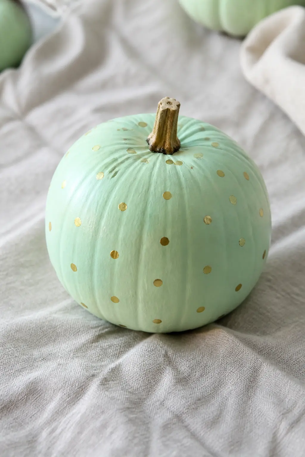
Mint Pumpkin With Gold Dots
This is the most restrained mint entry and, for that reason, the easiest to live with in a mixed display. Paint the pumpkin in flat matte mint.
Once dry, scatter evenly spaced gold dots across the surface using a dotting tool or the blunt end of a skewer dipped in gold craft paint. Even spacing matters more than perfect circles: take a minute to eyeball the grid before you start dotting.
The gold reads warm against the cool mint and connects this pumpkin to any other gold-accent piece on the table. Keep the dots small, no larger than a pencil eraser, so the mint surface stays dominant and the dots read as pattern rather than polka dot novelty.
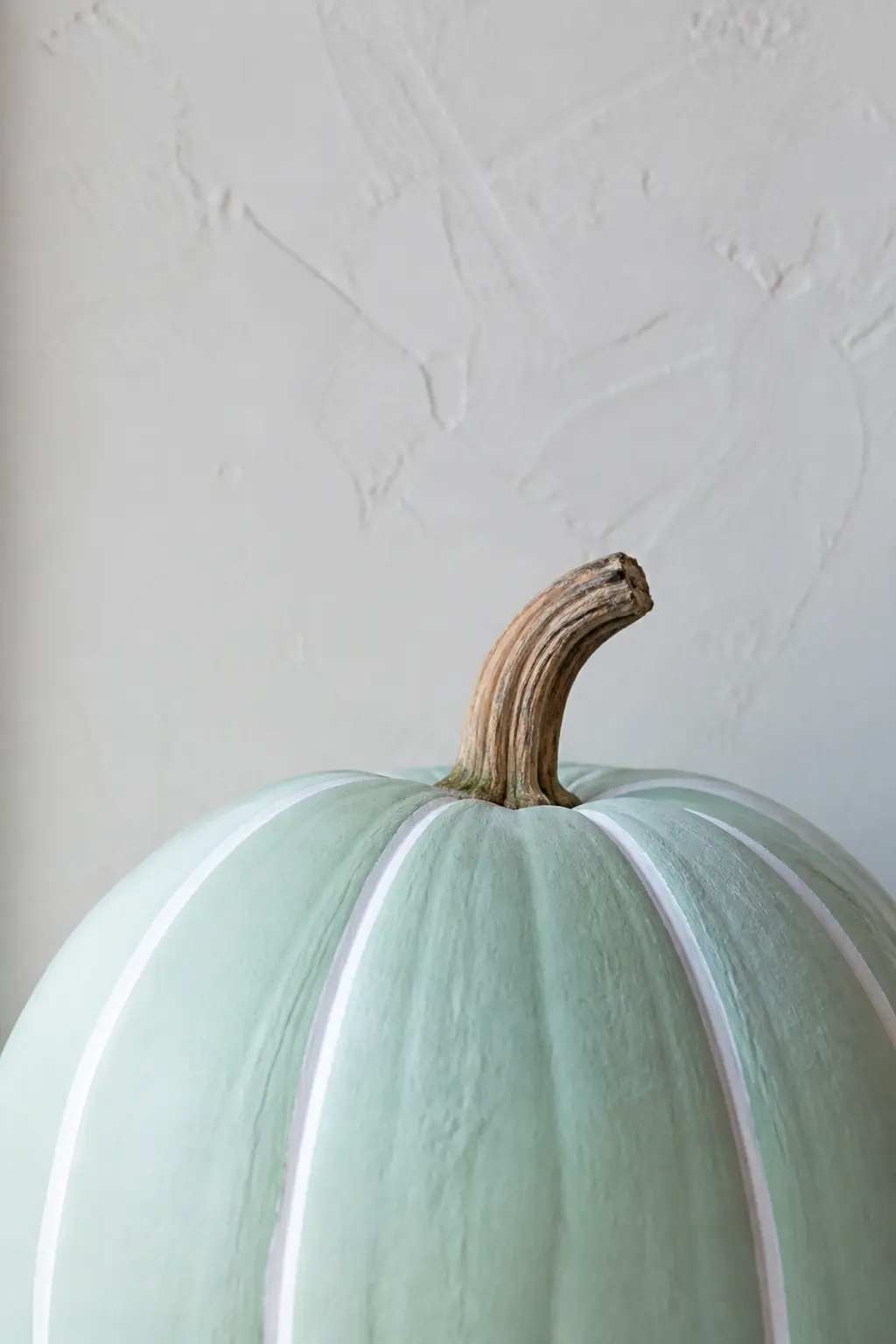
Mint Pumpkin With White Ridge Stripes
The ridges of a pumpkin are a built-in guide. Paint the body in matte mint and, once dry, run a thin line of white paint along the centre of each ridge from top to base. A flat shader brush used on its edge gives you a consistent line without masking tape, which would lift the chalk paint beneath it.
The result is graphic without being geometric. From a distance it reads as a striped pumpkin. Up close the stripes follow the natural shape of the gourd, which is what makes this one interesting rather than just striped. It photographs particularly well from slightly above.
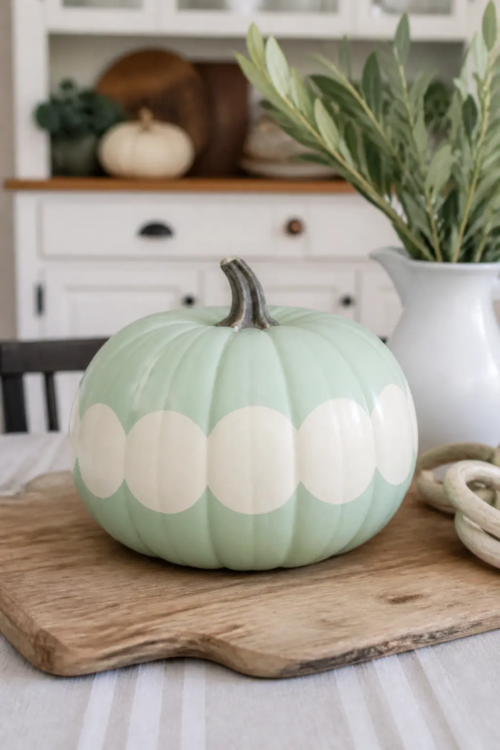
Mint Pumpkin With Cream Scalloped Band
A scalloped band painted around the widest part of the pumpkin takes one steady hand and about ten minutes. Paint the base in matte mint. Mark the centre line lightly in pencil, then use a round brush to paint overlapping half-circles in cream along that line, working your way around the circumference. The overlap is what creates the scallop shape.
This entry sits closest to a classic decorated cake in feel, which makes it the right choice for a birthday table in autumn or a baby shower that happens to fall in the harvest season. The cream against mint reads fresh rather than rustic, and the band breaks the pumpkin into two clean sections that photograph beautifully.
🛍 Shopping guide
Lilac Pumpkins
Lilac sits between pink and blue, which means it bridges the two halves of the palette without committing to either. Flat matte lilac with nothing added is already enough. Add gold and it tips elegant. Add white and it tips soft. Fade it to deeper purple at the base and suddenly it looks like it belongs in a still-life painting.
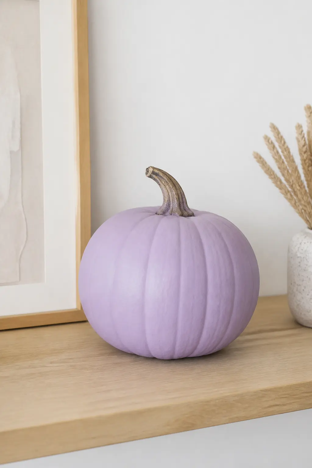
Flat Matte Lilac Pumpkin
No pattern. No detail. Just one coat of matte lilac chalk paint, two if the coverage is thin, and a natural unpainted stem. The restraint is the point. A flat matte lilac pumpkin in a display full of painted detail reads like a rest beat in music: it makes everything around it more visible.
The colour on its own, in matte, looks expensive in a way that a glossy version never does. Place it beside a lilac with tiny gold stars and the plain one does more work than the decorated one. This is the entry to buy in bulk if you want to fill a display fast without committing to a single pattern.
🛍 Shopping guide
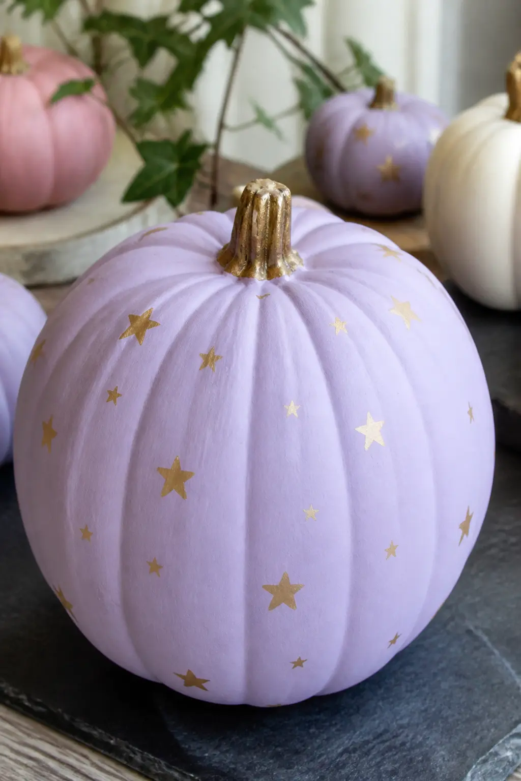
Lilac Pumpkin With Tiny Gold Stars
Paint the pumpkin in flat matte lilac. Once it is fully dry, use a fine liner brush and gold craft paint to scatter five-pointed stars across the surface. Keep the stars small and vary the spacing slightly so the pattern reads handmade rather than stamped.
Three sizes work well together: a handful of large ones, twice as many medium, and small ones filling the gaps.
This entry pairs naturally with the flat matte lilac for a two-pumpkin grouping that requires almost no effort to look intentional. The gold stars catch light differently from the matte base, which gives the surface visual movement without adding any shine.
🛍 Shopping guide
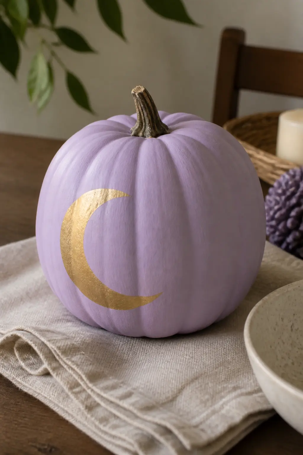
Lilac Pumpkin With a Crescent Moon
Paint the pumpkin in flat matte lilac. On one side, centred and facing left or right, paint a crescent moon in gold.
A clean crescent is easier than it looks: paint a full circle first, then paint a slightly offset second circle over it in the same base lilac to knock out the crescent shape. Clean up the edge with a fine brush.
The moon is on one side, not centred on the front, which means the pumpkin has a direction. Face it inward in a grouping so the moon is visible from the main viewing angle. This is the entry that works hardest in a celestial-themed display, and it connects naturally to the powder blue moon phase pumpkin later in the article.
🛍 Shopping guide
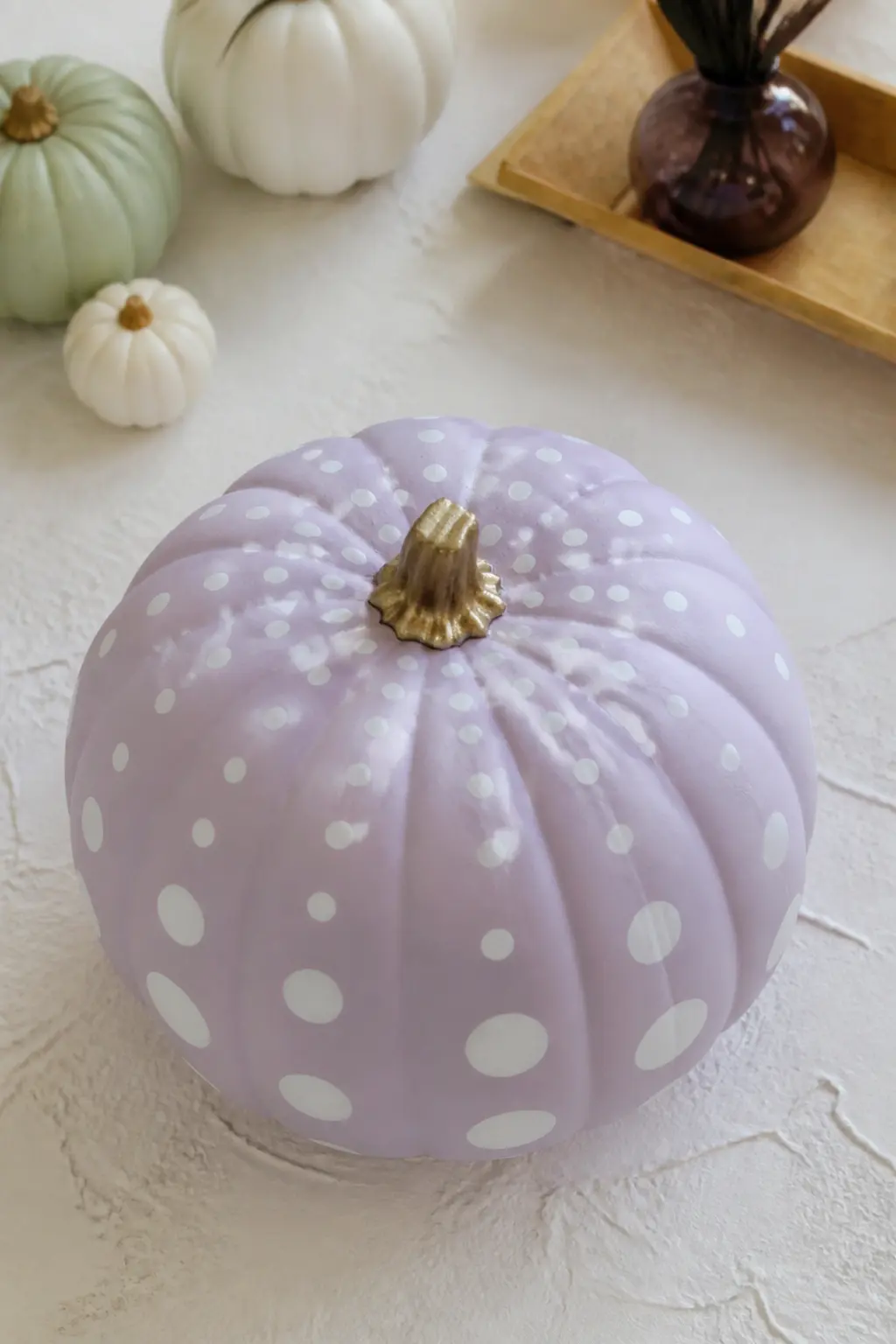
Lilac Pumpkin With White Dots in Graduated Sizes
The dots here are not random and not a uniform polka dot grid. They graduate: large dots near the stem, shrinking as they spread down toward the base. This creates a sense of movement and makes a simple dot pattern feel designed.
Use a dotting tool set in three sizes and keep the largest dot no bigger than a shirt button.
Matte white on matte lilac is a very quiet contrast, which is exactly what makes this pumpkin easy to place. It does not compete with anything around it. Put it beside the flat matte lilac and the gold star version for a three-pumpkin lilac set that has rhythm without repetition.
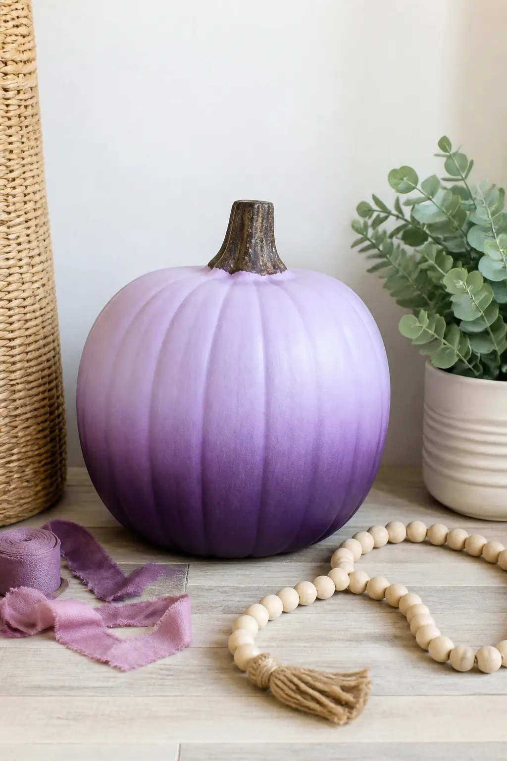
Lilac Pumpkin With Deep Purple Fade at the Base
This is a wet-blend technique applied to a surface most people think of as flat.
Paint the bottom third of the pumpkin in a deeper matte purple while the lilac base is still slightly tacky, then use a dry brush to work the boundary upward in short strokes until the transition disappears.
The fade covers only the lower third: above that is flat matte lilac.
The result looks almost like the pumpkin is sitting in shadow, which gives it more dimension than any surface pattern could. It is the most artistic-feeling entry in the lilac section and the one that photographs best against a light background where the gradient is fully visible.
🛍 Shopping guide
Butter Yellow Pumpkins
Butter yellow is warm enough to read autumn but pale enough to stay in the pastel family. It is the entry point for anyone nervous about colour, because it sits naturally beside orange gourds and dried grasses without any styling effort.
The bee designs in this group push it further and give a display a clear visual theme without any additional props.
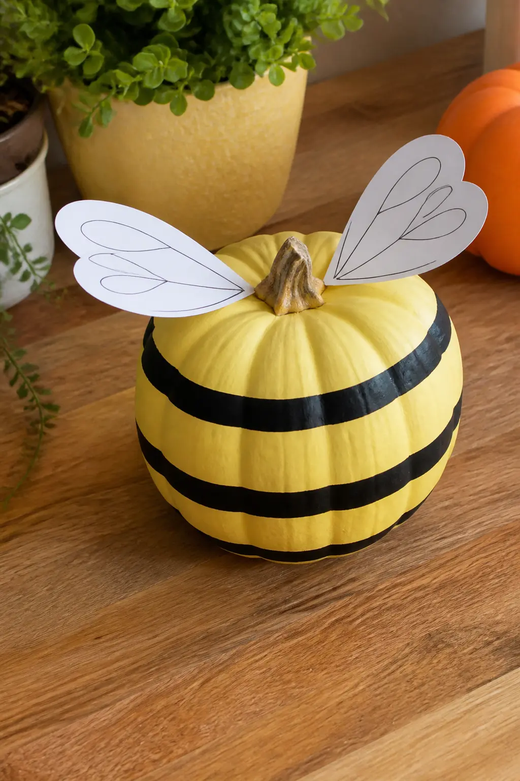
Butter Yellow Bee Pumpkin With Paper Wings
Paint the pumpkin in flat matte butter yellow. Add three or four horizontal black bands around the body with a medium flat brush, keeping them slightly uneven so they read hand-painted. The bands do not need to go all the way around: stopping them where they meet at the back keeps the front face clean and the design bold.
Attach two paper wings cut from white or cream cartridge paper to the top of the pumpkin, anchored behind the stem. Shape them into a rounded teardrop and leave them flat rather than arching them upward.
Flat wings stay on longer and catch the eye more directly. This is the showiest entry in the butter yellow section and the one to put at the centre of a grouping.
🛍 Shopping guide
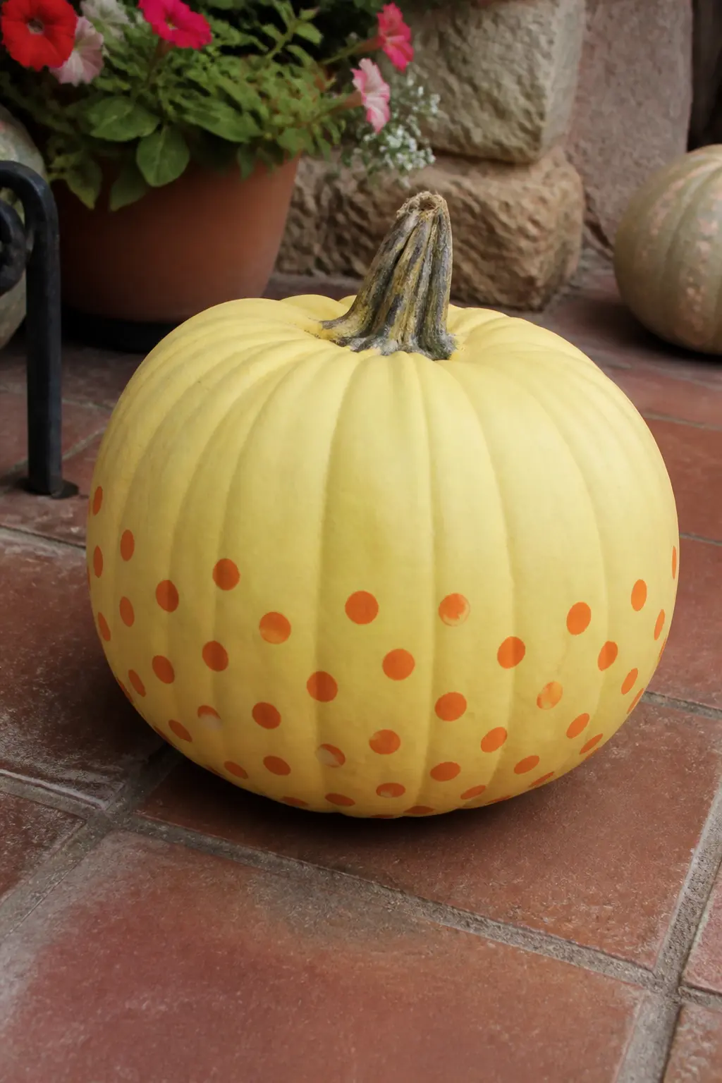
Butter Yellow Pumpkin With Orange Dots
This is the warmest entry in the entire article, and the only one that deliberately echoes the orange of a traditional pumpkin. The butter yellow base keeps it pastel; the orange dots push it toward autumn without committing to the full seasonal look.
Use a medium dotting tool and scatter the dots loosely, with more density toward the lower half of the pumpkin.
Place this one beside the flat matte lilac or a sage pumpkin to balance the warmth. It does not need a partner in the same colour family: the orange dots already contain enough contrast to carry the pumpkin on its own.
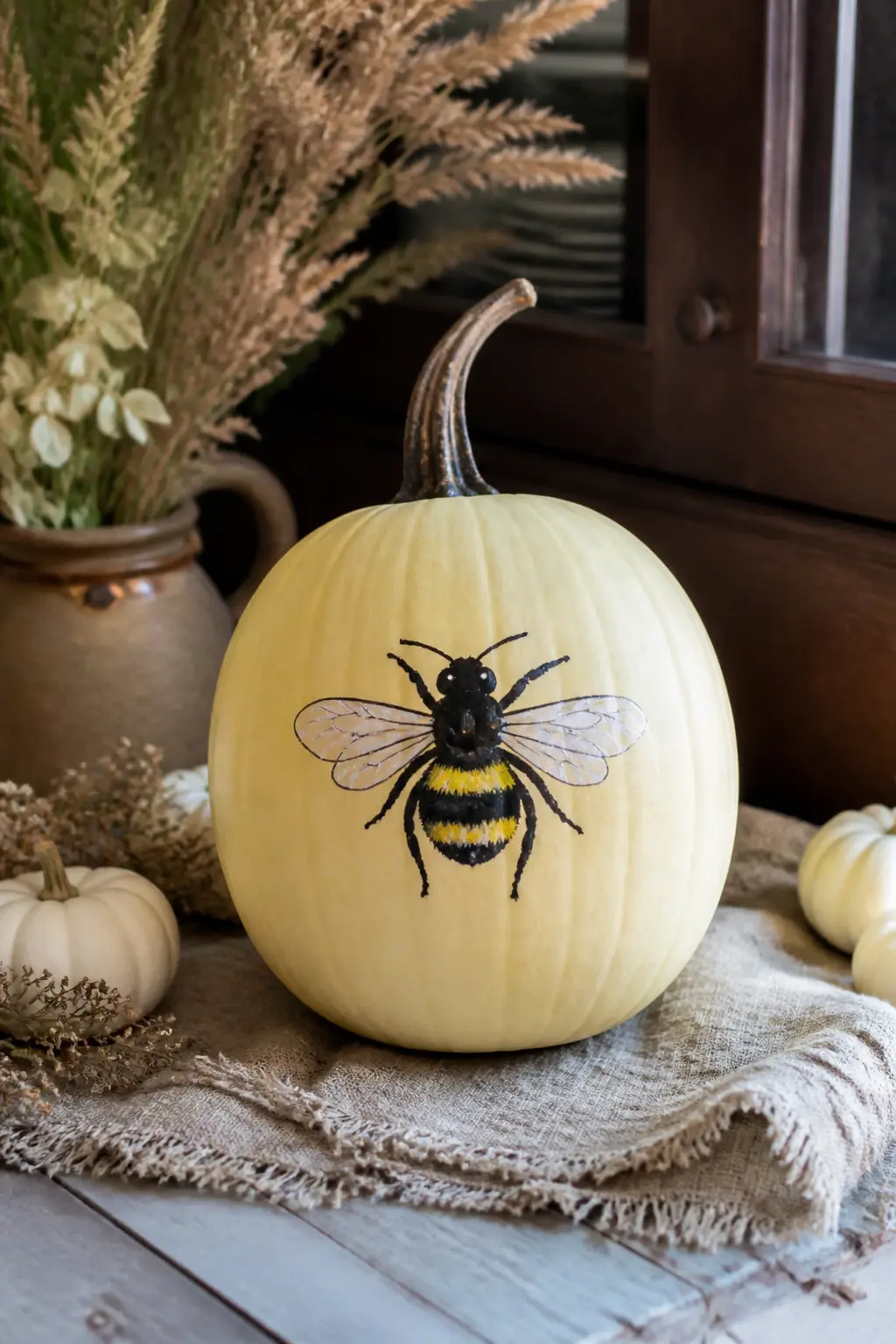
Butter Yellow Pumpkin With a Painted Bee
This entry is the painted version of the bee concept, no paper elements. Paint the pumpkin in matte butter yellow. On the front, paint one large bee in black and white: a striped oval body, two rounded wings above it in white, and two thin antennae. Keep the bee centred and large enough that it reads from across a table.
The bee sits on the pumpkin as though it has landed there. It is simpler than it sounds because a bee is essentially three shapes: an oval, two teardrops and two lines. Any brush control beyond beginner level is enough.
This pairs well with the paper-wing bee version for a two-pumpkin bee display that reads as a set without being identical.
🛍 Shopping guide
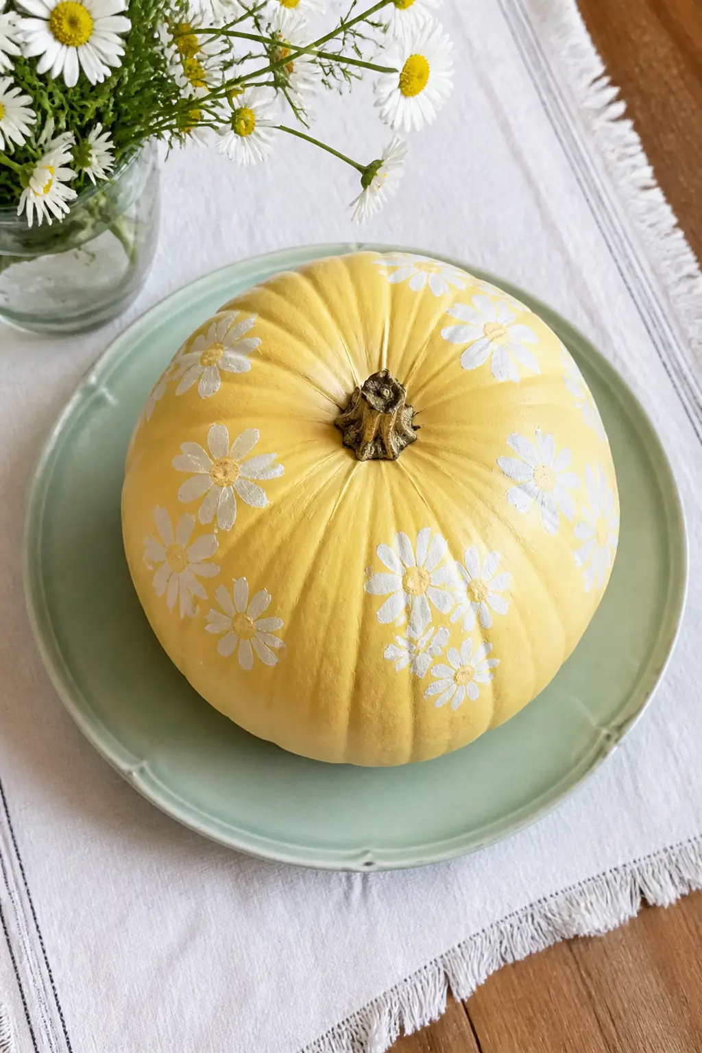
Butter Yellow Pumpkin With White Daisies
Paint the base in flat matte butter yellow. Using a small round brush and white paint, dot clusters of five-petal daisies across the surface, leaving plenty of yellow visible between clusters. Add a single small yellow dot at the centre of each flower.
The daisies do not need to be perfect: a slightly irregular petal reads more charming than a stamped version.
This is the softest entry in the butter yellow section and the one that works hardest at a garden party or a spring-adjacent autumn table. It sits well beside the sage with cream leaves for a botanical grouping that crosses colour families without any clash.
Peach Pumpkins
Peach is the bridge between butter yellow and terracotta, and it is the one colour here that nods to the season without leaning into it. The terracotta fade entry in particular requires almost no skill: two colours and a dry brush.
The ice cream design is the most ambitious in the article, but the waffle pattern is just a crosshatch done with a fine brush, and the result earns every comment.
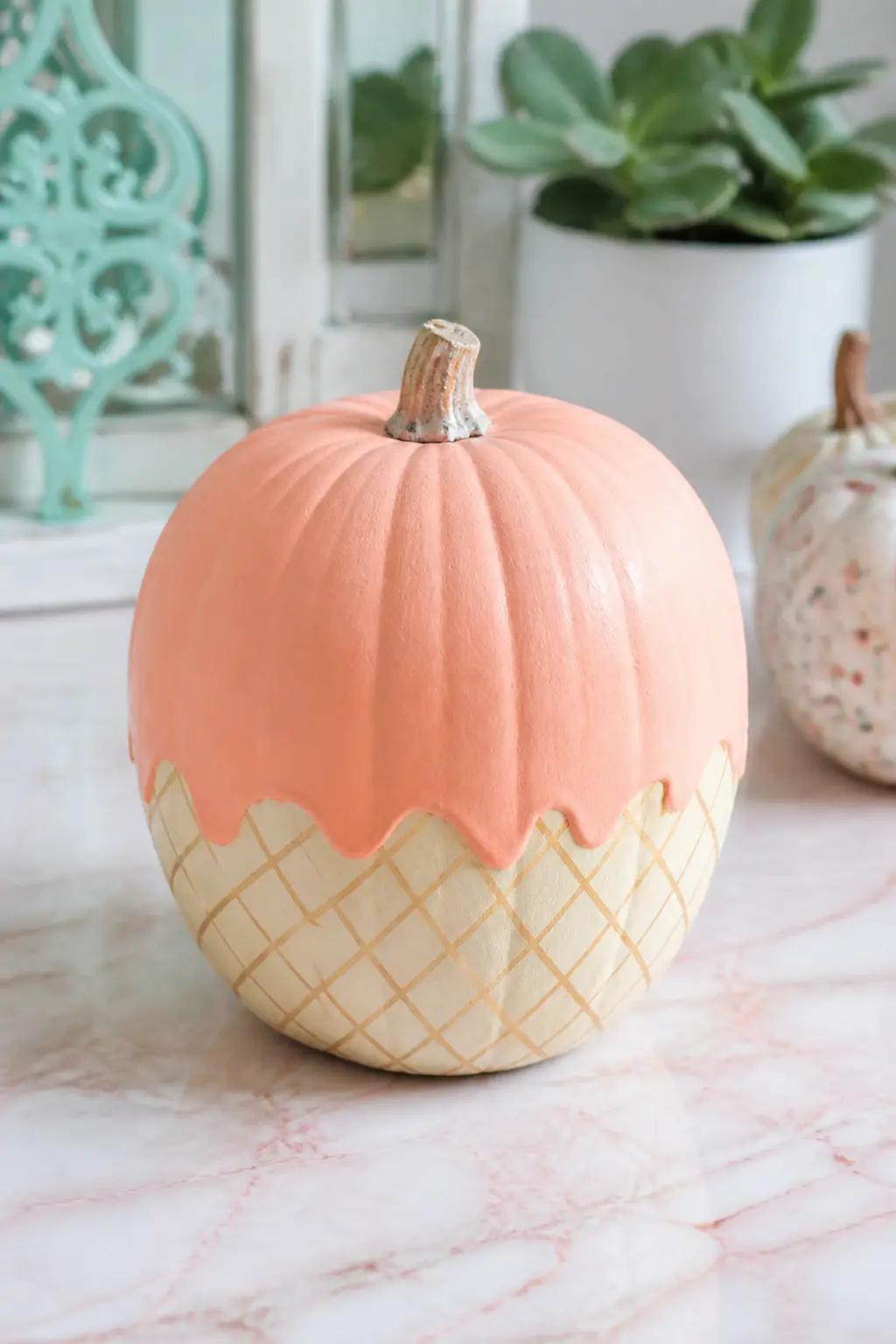
Peach Ice Cream Cone Pumpkin
Paint the upper two thirds of the pumpkin in matte peach. Paint the lower third in a warm cream or biscuit tone and add a crosshatch grid over that lower section in a slightly darker tan to create the waffle cone texture.
The boundary between the peach scoop and the cone base should be a gentle curve, not a hard line.
Finish with a small cherry or a single painted dot at the very top if the stem is short. This is the most whimsical entry in the article and the only one that requires two clearly distinct sections of colour on the same pumpkin.
It earns its place because the concept lands immediately: nobody needs to explain it, and the reaction at a table is reliable. Use a real pumpkin with a rounder shape for the best result.
🛍 Shopping guide
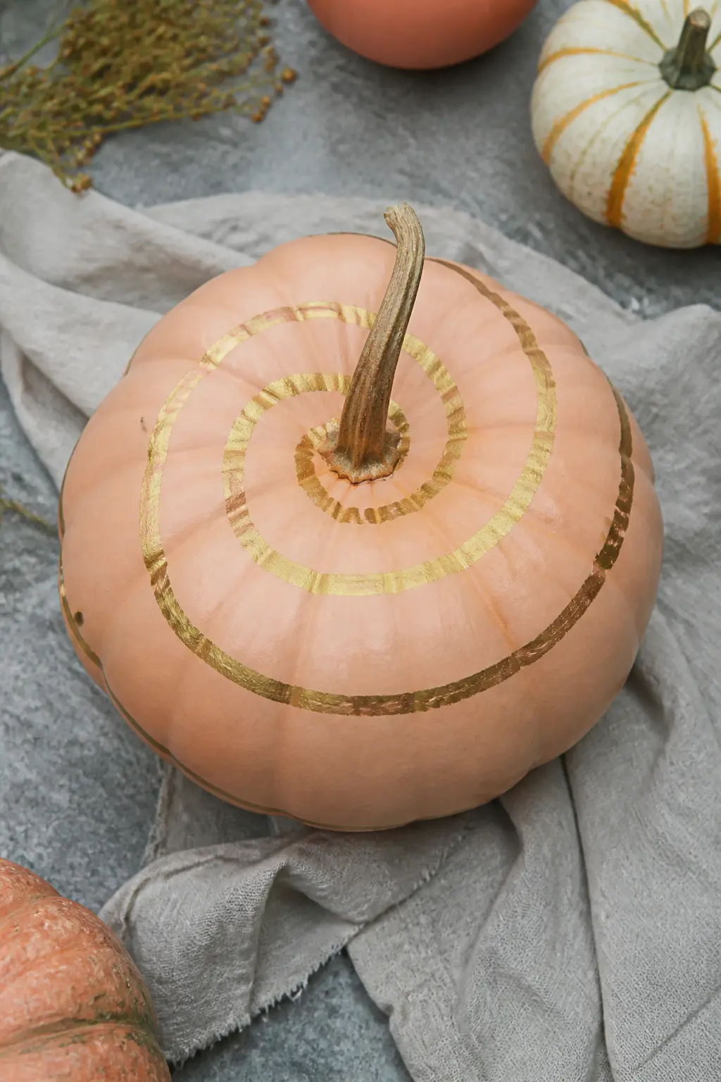
Peach Pumpkin With a Gold Spiral
Paint the pumpkin in flat matte peach.
Once dry, use a fine liner brush and gold craft paint to paint a single spiral beginning at the base of the stem and winding down the front of the pumpkin toward the bottom, loosening and widening as it descends.
The spiral follows the natural curve of the pumpkin rather than cutting straight across the ridges.
One spiral, not several. The restraint is the point. It makes the pumpkin feel like a found object from a ceramics studio rather than a craft project. This is the entry that photographs best in a styled flat lay beside dried flowers and a simple linen cloth.
🛍 Shopping guide
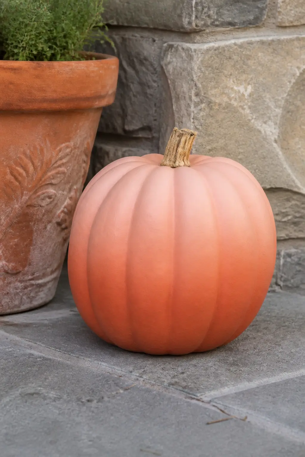
Peach Pumpkin With Terracotta Fade
Paint the full pumpkin in matte peach. While the paint is still slightly wet at the base, work in terracotta paint with a dry brush using short upward strokes, covering the lower quarter of the pumpkin and feathering the edge until the transition is invisible. Allow to dry fully before adding a second pass if the fade feels abrupt.
This is the entry closest to a natural pumpkin in feel, because terracotta is already an autumn colour. The peach above it keeps it in the pastel register.
The whole effect takes under twenty minutes and no particular skill, which makes it the best starting point for anyone who has never painted a pumpkin before. It also ages well: as the chalk paint settles over time the fade softens further.
🛍 Shopping guide
Sage Pumpkins
Sage is a muted, grey-green that photographs beautifully and holds its own in low light. It is the most neutral family here, which makes it the safest choice if you want to mix two colour groups together.
The cream botanical designs painted on sage feel genuinely grown-up, and the hand-lettered entry is the one to reach for if you want something personal without buying anything extra beyond a fine brush and some cream paint.
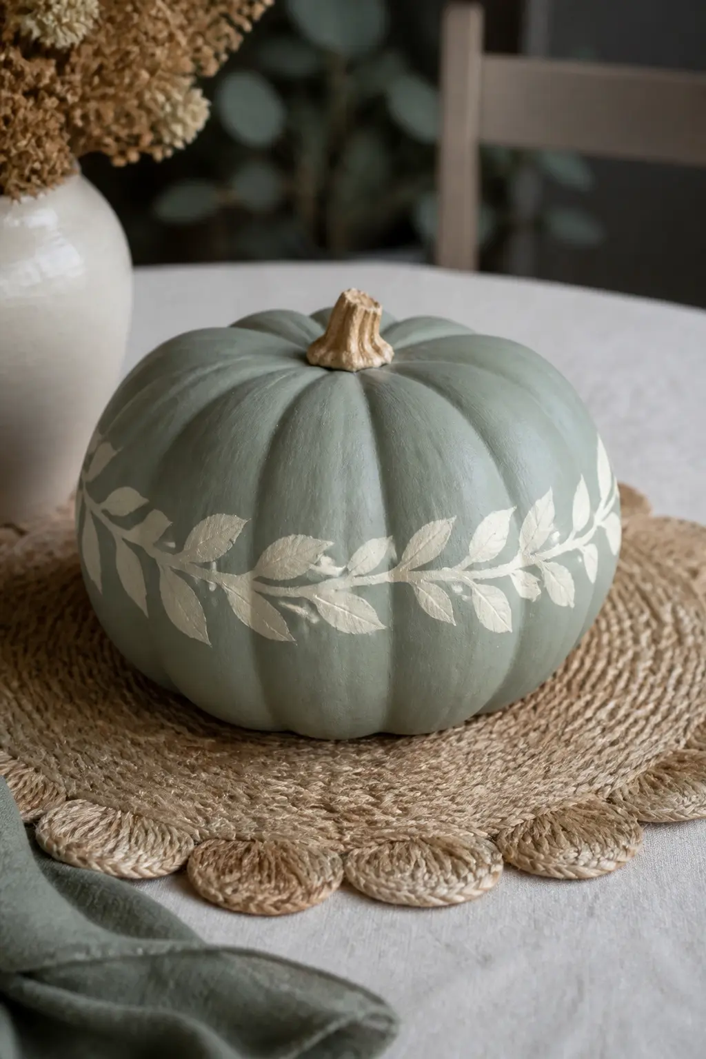
Sage Pumpkin With Cream Leaves
Paint the pumpkin in flat matte sage. Around the widest part, paint a ring of stylised leaves in cream: simple pointed ovals with a single centre vein, placed so they overlap slightly and face outward from the equator of the pumpkin. Vary the leaf sizes slightly to keep the wreath feeling natural.
It reads botanical, mature and considered. This pumpkin works in any room style from farmhouse to contemporary, and it is the one most likely to be kept out well past the autumn season because it does not read as a seasonal object at a glance.
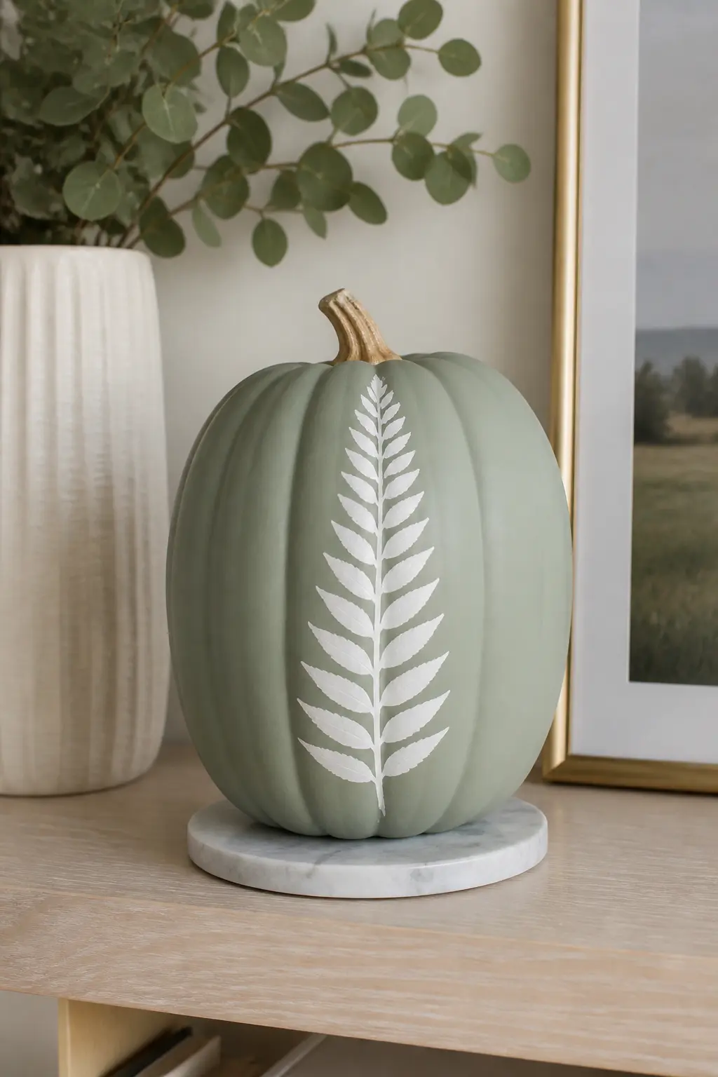
Sage Pumpkin With a White Fern Frond
Paint the base in matte sage and allow it to dry. Using a fine liner brush and white paint, paint a single fern frond from base to stem along the front face of the pumpkin.
A fern frond is a central spine with alternating small oval leaflets branching off each side, each leaflet slightly smaller toward the tip. Work from the base upward so each leaflet overlaps slightly with the one below it.
One frond, centred. It covers about two thirds of the pumpkin height. The composition is vertical, which makes this pumpkin the right choice as a tall accent piece in a horizontal arrangement. It pairs naturally with the sage cream leaves version for a botanical two-pumpkin grouping.
🛍 Shopping guide
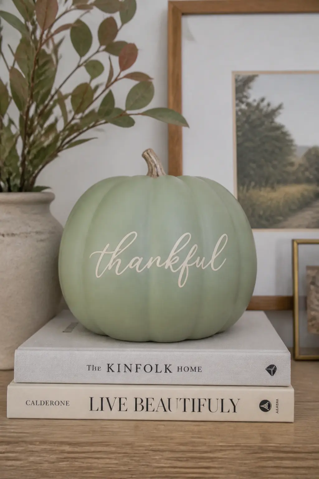
Sage Pumpkin With a Hand-Lettered Word
Paint the base in flat matte sage. Once dry, write a single word in cream on the front using a fine brush. Choose something short: a season, a feeling, a name. Two syllables maximum reads well at the scale of a pumpkin.
Script lettering works better than block capitals on a curved surface because it flows with the curve rather than fighting it.
Practice the word on paper first and count the letters so you can start in the right position to centre it. A word that trails off to the right because you ran out of space is the one lettering mistake that cannot be fixed easily.
This is also the entry where a paint pen in cream gives a more consistent result than a brush for anyone whose lettering confidence is low.
🛍 Shopping guide
Powder Blue Pumpkins
Powder blue is the furthest from a conventional autumn palette, which is exactly why it works so well as a statement piece in a mostly-neutral display. The cloud design is the simplest entry in this entire article.
The gold moon phase sequence is the most graphic, and the deer face with paper antlers is the one that earns the most attention at a party table.
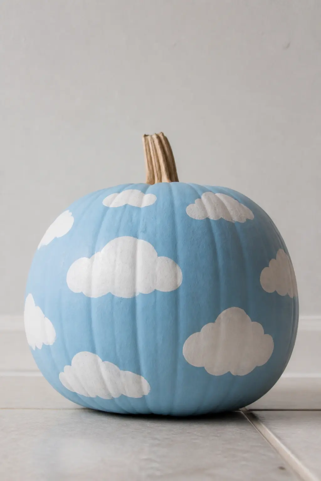
Powder Blue Pumpkin With White Clouds
Paint the pumpkin in matte powder blue. Using a small round brush and white paint, add three or four cumulus cloud shapes scattered at different heights around the pumpkin. Each cloud is a cluster of overlapping rounded bumps, larger at the base and smaller at the top. No outlines, just the filled white shapes against the blue.
This is the simplest entry in the powder blue section and the one with the highest success rate for a first-time pumpkin painter. The clouds do not require any particular brush skill, and an irregular cloud reads more realistic than a perfect one.
Place this pumpkin where it sits at eye level or slightly above so the cloud shapes read correctly.
🛍 Shopping guide
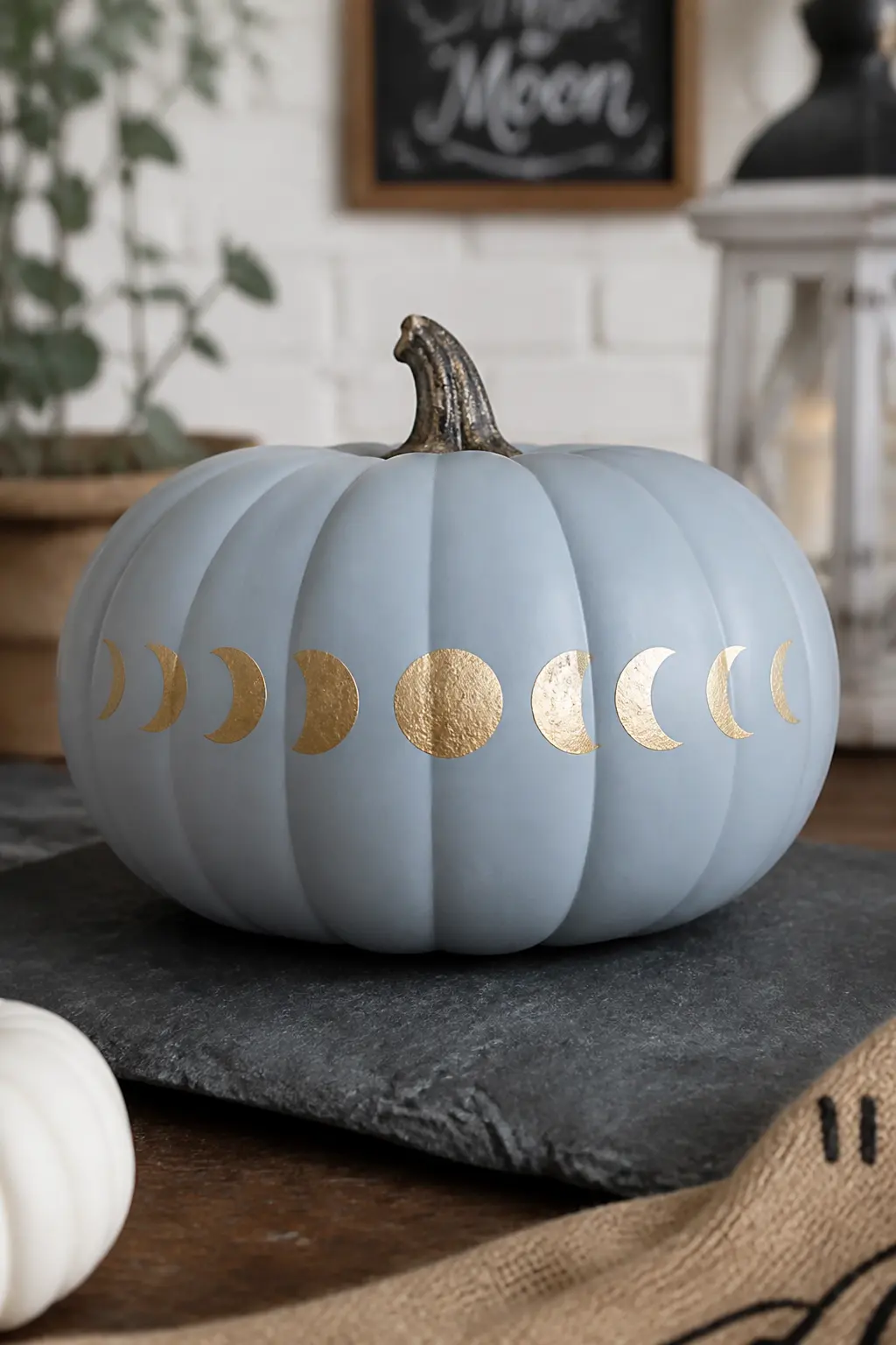
Powder Blue Pumpkin With Gold Moon Phase Sequence
Paint the pumpkin in flat matte powder blue. Around the equator, paint a sequence of moon phases in gold: new moon as a circle outline, waxing crescent, quarter, gibbous, full moon as a filled circle, then the same in reverse.
Space them evenly so they wrap the full circumference. Keep each phase small enough that the full sequence fits without crowding.
The gold on powder blue is the strongest colour contrast in the entire article. It reads graphic and intentional from across a room. This is the entry that belongs at the centre of a display, not tucked into a corner. It pairs naturally with the lilac crescent moon pumpkin for a celestial grouping that crosses colour families cleanly.
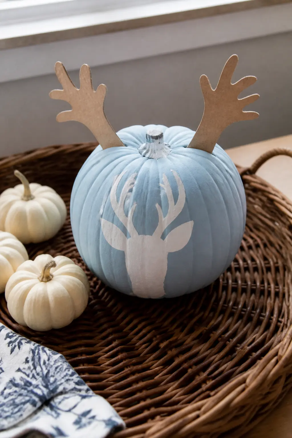
Powder Blue Pumpkin With a White Deer Face and Paper Antlers
Paint the base in matte powder blue. On the front, paint a simplified deer face in white: a rounded triangular muzzle, two almond eyes above it, and two small oval ears at the sides. Keep the style flat and graphic rather than realistic.
Above the stem, attach two antler shapes cut from natural kraft paper or thin cardboard, branching upward like a small rack.
The antlers are the element that earns this pumpkin its reaction. They give the pumpkin a silhouette change that reads from across the room before anyone has seen the painted face.
Secure them with a small piece of floral wire twisted around the stem, which holds them upright without glue and makes them adjustable. This is the most three-dimensional entry in the article.
🛍 Shopping guide
Sets and Groupings
A single beautiful pumpkin is a prop. Three or more with a deliberate relationship become a display.
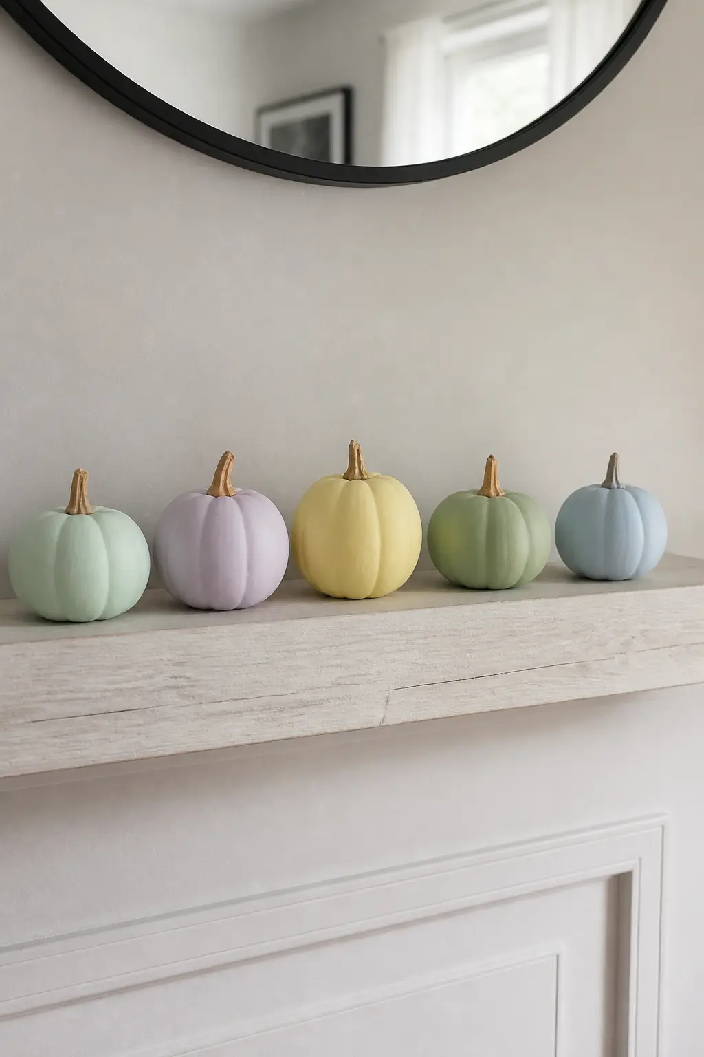
Five-Pumpkin Set: One Pastel Per Colour Family
One pumpkin in each of the five colour families: mint, lilac, butter yellow, sage and powder blue. All the same finish (flat matte, no pattern), all the same general size, and all with natural unpainted stems.
The set reads as a collection rather than a random pile because the colours are spaced across the spectrum and the finish is identical across all five.
Arrange them in a loose arc or a straight line from coolest to warmest: powder blue, mint, sage, lilac, butter yellow. This order creates a smooth visual transition that the eye follows naturally. Add one decorated pumpkin from another entry in the article at the centre if you want a focal point without disrupting the set logic.
Three-Size Set: One Colour, Graduated Depth
Three pumpkins, all in the same colour family, but the shade deepens with the size. The smallest is the palest, the largest is the deepest. In lilac: the smallest might be a barely-there lavender, the medium a true lilac, the largest a dusty mauve. All matte.
This is the easiest set to style because the grouping logic is obvious: stack them by size with the largest at the back. No additional props needed. The depth graduation keeps the set from reading as three identical pumpkins in a row, and it gives the large pumpkin a reason to anchor the back without looking dominant.
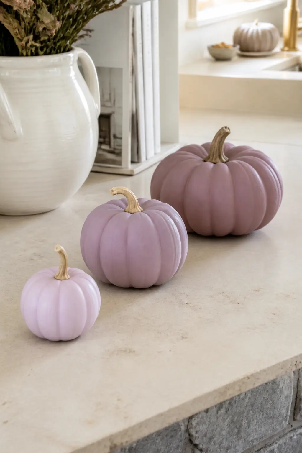
Set With All Stems Gilded to Match
Take any group of pastel pumpkins and paint every stem in the same gold. Use a small brush and gold craft paint, covering the stem fully and allowing it to dry before handling.
The gilded stem does two things: it connects pumpkins that might otherwise look arbitrary, and it lifts the eye to the top of each pumpkin where the stem acts as a small accent piece.
This works for any set of two or more, and it is the fastest way to turn a group of pumpkins bought at different times into something that reads as a set.
The gold thread through the stems echoes any other gold details in the display, whether that is a gold-dot pumpkin, a moon phase pumpkin, or simply a gold candle holder nearby.
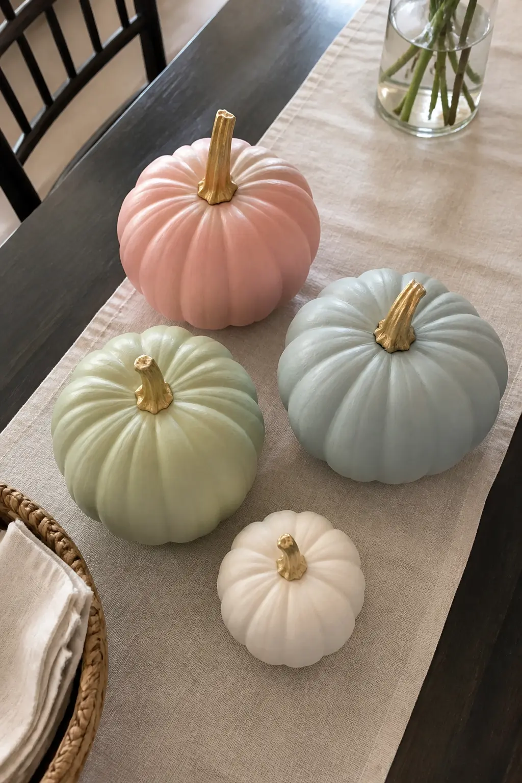
Pastel Set With One White Pumpkin
Add one white pumpkin, flat matte and unpainted, to any pastel group. The white pumpkin acts as a visual pause. It keeps the pastels from reading as a colour block and gives the eye a place to rest between decorated or coloured pumpkins. It also bounces light in a way that makes the pastels beside it look more saturated.
A white pumpkin between a mint and a powder blue reads as a cloud. Between a butter yellow and a peach it reads as cream.
It is the most versatile purchase in any pastel display, and a small white faux pumpkin costs almost nothing if you already have the paint for the rest of the set.
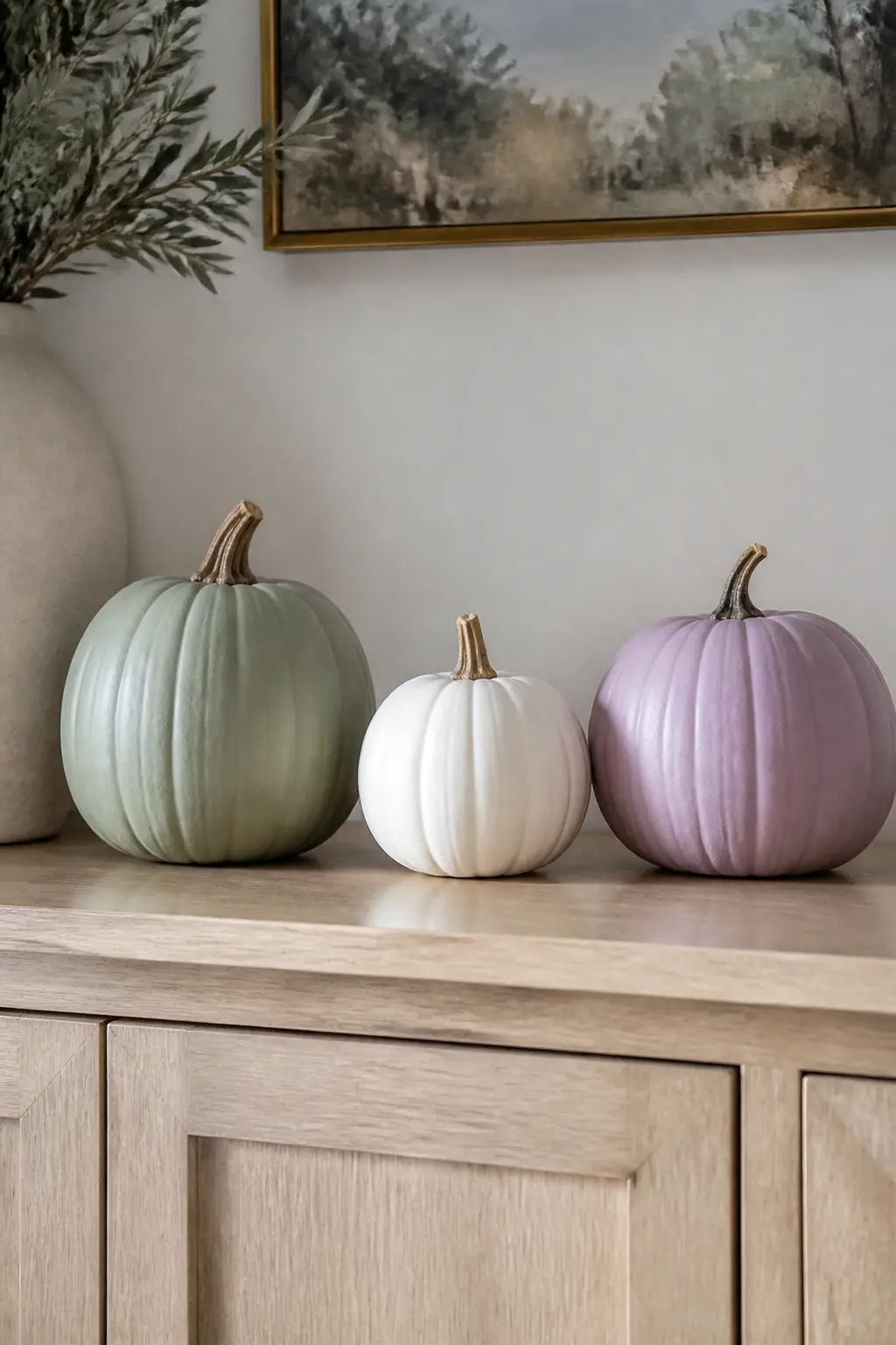
🛍 Shopping guide
Finishes and Details
The difference between a pumpkin that looks expensive and one that looks craft-table often comes down to finish, not design.
These five entries are about the surface rather than the pattern: how to sand chalk paint for depth, when to let one glossy pumpkin into a matte set, and two small details that lift an otherwise plain pumpkin without adding much time or cost.
Matte Finish Throughout
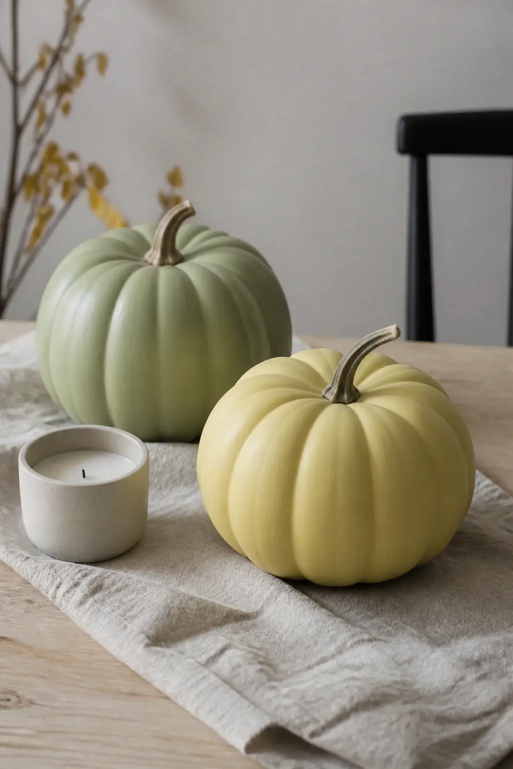
Matte is the default finish for this entire article, and it earns its place. A flat matte surface absorbs light rather than reflecting it, which makes colour read deeper and more considered. The same lilac in gloss looks craft-store; in matte it looks like a decision. Chalk paint gives matte as a default without any extra step.
The finish also hides application inconsistencies better than gloss does. A second thin coat, applied in the opposite direction from the first, gives even coverage on a ridged pumpkin surface without pooling in the grooves. No sealer is required for indoor display, but a single coat of matte sealer spray extends the finish through a full season without dulling it.
🛍 Shopping guide
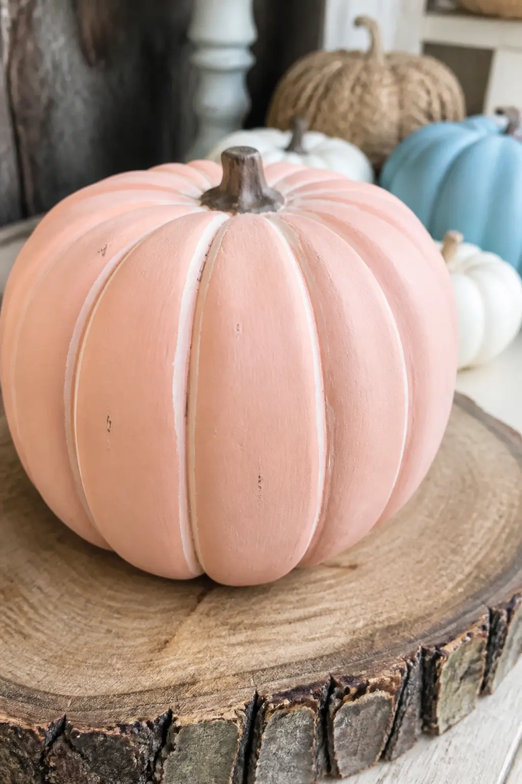
Chalk Paint Sanded at the Ridges
Apply chalk paint in any pastel shade and allow it to dry fully.
Then take fine-grit sandpaper and very lightly sand along the ridges of the pumpkin, just enough to reveal a trace of the pumpkin’s original surface or a slightly lighter layer beneath the paint.
The result is a faintly worn look on the highest points of the ridges, which adds depth without adding any extra colour.
This technique works best on a real pumpkin where the ridges have some texture to catch the sandpaper, but a high-quality faux pumpkin with defined ridges works nearly as well.
Use the sanded pumpkin at the front of a grouping where the ridge detail is visible.
🛍 Shopping guide
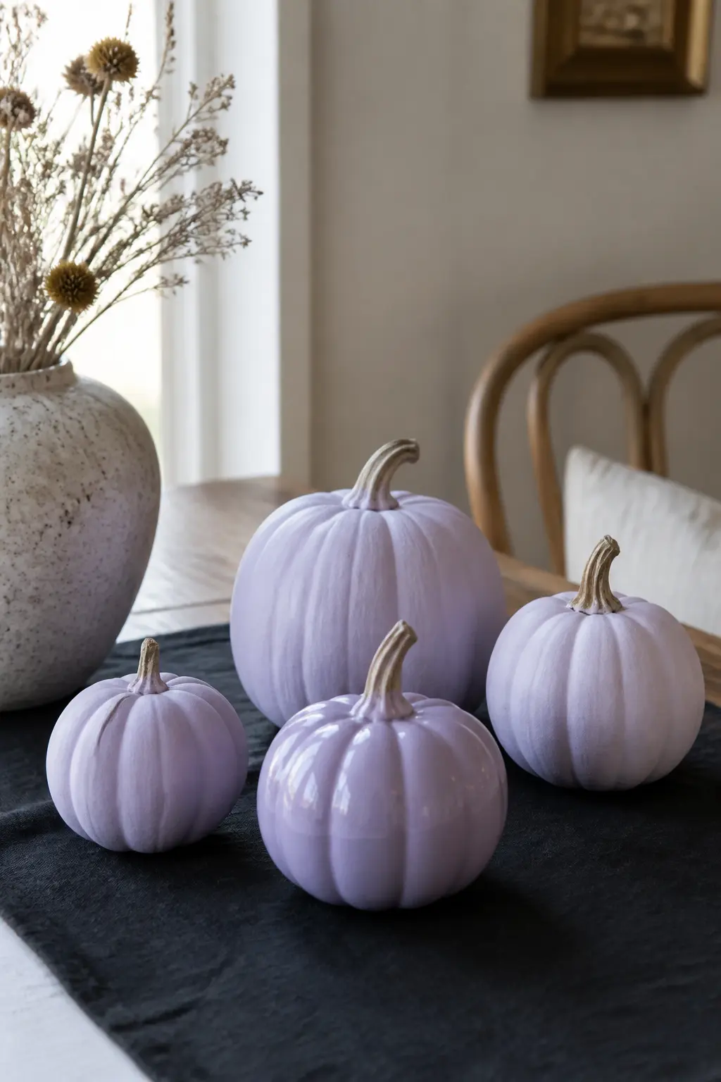
One Gloss Pumpkin Among Matte Ones
This one is gloss, and it earns its place precisely because of that contrast. Paint one pumpkin in the same pastel shade as two of its matte neighbours, but seal it in a clear gloss finish.
The colour matches; the surface does not. The glossy pumpkin catches light differently and draws the eye as the focal point of the group.
The rule is one gloss pumpkin per display. More than one and the contrast reads as inconsistency rather than intention. Place the gloss pumpkin at the centre or at the front-centre of the arrangement where the light hits it most directly. A candle or lamp nearby amplifies the effect without any extra effort.
🛍 Shopping guide
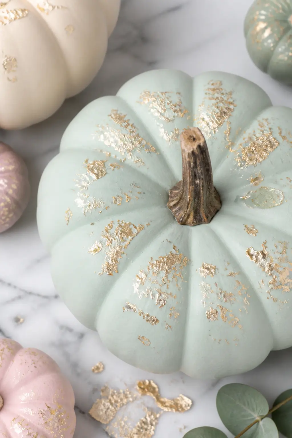
Gold Leaf Flecks on a Pale Base
Apply matte chalk paint in any pale pastel shade and allow it to dry.
Brush a thin layer of size (the adhesive used for gold leaf) over the sections where you want the flecks, then press torn fragments of gold transfer leaf onto those areas and brush away the excess with a soft dry brush.
The flecks settle where the size was applied and leave the rest of the matte surface untouched.
The result is not a polished gilt effect: it is a broken, organic shimmer that sits on the surface like flecks of light. Irregular application is correct here. Concentrate the flecks near the top of the pumpkin and let them thin out toward the base.
This is the most tactile finish in the article, and it photographs best in natural light where the gold catches unevenly and reads as depth rather than shine.
🛍 Shopping guide
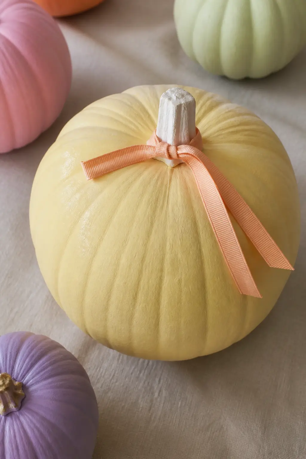
A Ribbon in the Next Pastel Along
Take any painted pumpkin and tie a ribbon in the adjacent pastel shade around the base of the stem. If the pumpkin is mint, the ribbon is lilac. If the pumpkin is butter yellow, the ribbon is peach. The adjacent pastel creates a near-match rather than a contrast, which reads more sophisticated than a complementary colour tie.
Use a matte grosgrain or a cotton ribbon rather than satin: a shiny ribbon on a matte pumpkin undoes the finish work. Tie it in a simple knot rather than a bow if the stem is short.
A knot reads more considered than a bow in a grown-up display. This is the fastest detail in the article and requires no paint at all.
🛍 Shopping guide
How to Display Your Set
Group by colour family first, then vary the heights. A stack of books under a linen cloth gives you a riser for free.
Tuck in a few dried stems, eucalyptus or cotton, at the back and let the pumpkins sit at the front where the detail can be seen.
Avoid clustering all your gold-accent pumpkins together: spread them so the metallic reads as a thread through the whole display rather than a pile in one corner.
If you are building a mantel display, odd numbers read better than even. Five works. Three works. Two pumpkins side by side always look like they are waiting for a third.
For a table centrepiece, keep the tallest pumpkin lower than eye level so people can see across the table, and face the decorated side of each pumpkin toward the nearest chair rather than toward the room.
Store painted pumpkins out of direct sun between uses. Matte paint chalks faster in sunlight, and a chalked surface loses the finish that makes these look considered. A light coat of matte sealer applied before display adds weeks to the surface and costs almost nothing.
Frequently Asked Questions
What paint works best for a pastel painted pumpkin?
Chalk paint gives a matte finish directly, needs no primer on a real pumpkin and dries fast enough to add a second coat the same day. Matte acrylic craft paint is a close second and comes in more shades. Avoid gloss acrylic unless you are deliberately using the one-gloss-among-matte technique described in entry 29.
How do I get an even matte finish on the ridges?
Apply paint with a flat brush using short strokes that follow the ridge rather than crossing it. A second thin coat in the opposite direction fills any gaps without pooling in the grooves. Let the first coat dry fully before adding the second, which takes about thirty minutes with chalk paint indoors.
Can I use faux pumpkins instead of real ones?
Yes, and for painted displays a faux pumpkin is often the better choice because the surface is consistent, the stem stays intact, and the finished pumpkin can be stored and reused each year. Sand the surface lightly with fine-grit sandpaper before painting to help the chalk paint grip.
How do I keep the gold detail from looking metallic and shiny?
Use a gold that is described as matte or satin rather than a high-gloss metallic. Craft paint labelled simply as gold is often satin when dry, which sits close enough to the matte base without looking like foil.
Test on paper first: if it is too shiny, mix a very small amount of your base paint colour into the gold to dull it slightly.
How do I build a set that looks intentional and not random?
Choose one unifying rule and apply it to every pumpkin in the group. It can be the finish (all matte), the metallic (gold only), the stem treatment (all gilded or all natural) or the size relationship.
Two rules applied consistently across five pumpkins will always read as a set. The five-pumpkin entry and the three-size entry in the Sets section both explain this in more detail.
Do I need to seal a painted pumpkin?
For indoor display on a shelf or table, sealing is optional if you use chalk paint. A single coat of matte sealer spray will extend the finish through a full season and prevent chalking or chipping if the pumpkin is handled often.
Always use a matte sealer, never a satin or gloss, to preserve the finish that makes these look expensive.
Pick the right Halloween kids crafts by age and effort, from toddler-safe paint projects to printabl
21 no-bake halloween treats ideas sorted by where they live on the party table. Ghost strawberries,
15 pumpkin crafts for every skill level, from classic carving to painted patterns and glow-in-the-da
Leave a Reply