

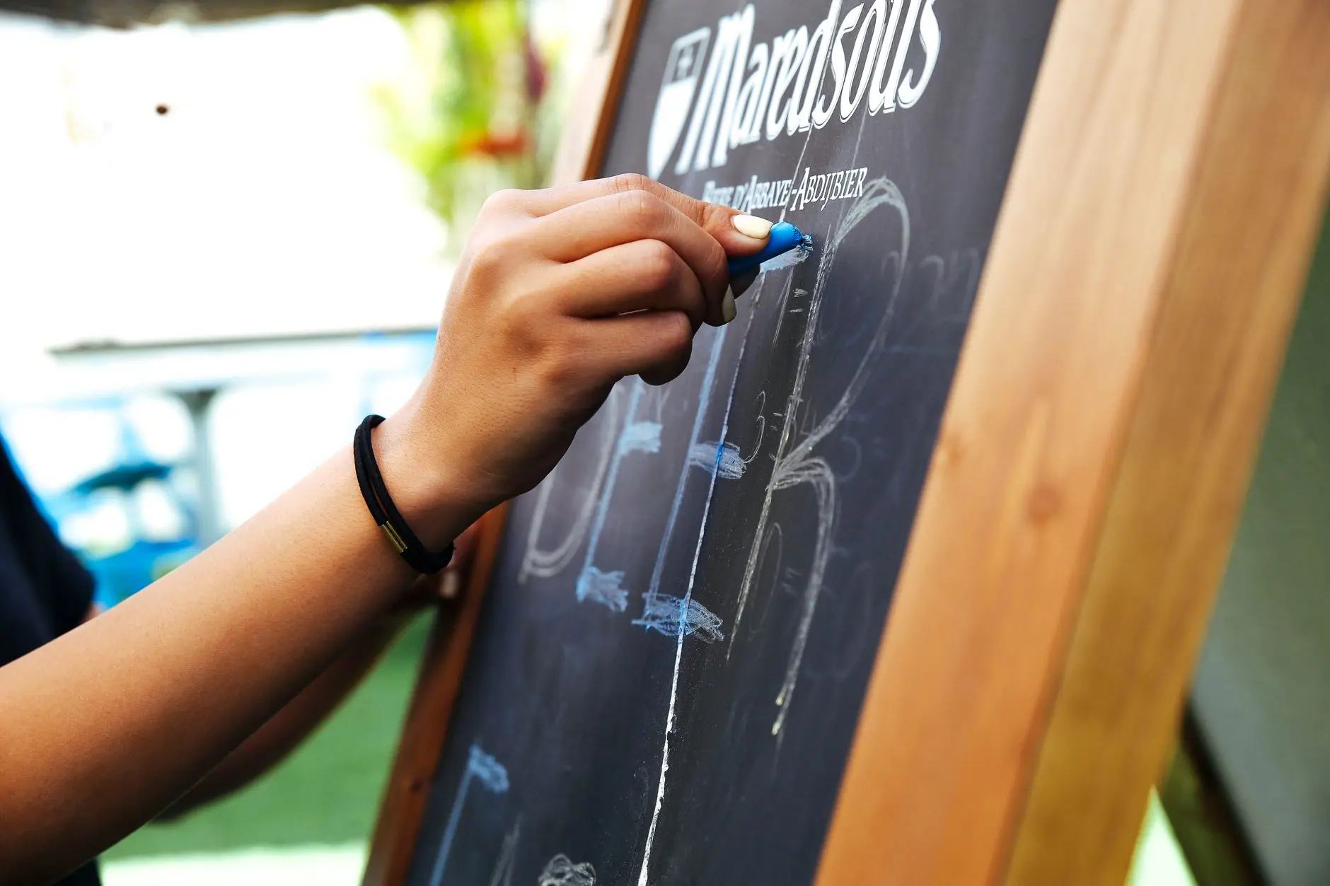
A chalkboard sign is probably the easiest thing in your home to change, and it is also the one thing most people leave blank from September straight through to January. These 12 ideas fix that.
Each sign is tied to a specific mood of the season, written out with a phrase you can copy, a lettering style that suits the board you already own, and a handful of props to set beside it so the whole thing photographs well.
The four groups move in order: the quiet confidence of early harvest, the full-throttle colour of late October, the warmth of Thanksgiving table-setting, and finally that still, bare-branch feeling of early December before winter properly arrives.
Swap the sign as the season changes and your entryway or mantel keeps pace with the weather outside. If you want something to do around the table while the board is up, this list of Thanksgiving day games pairs well with the November group.
This post contains affiliate links — if you buy through them, I may earn a small commission at no extra cost to you.
Harvest and Gratitude (September through Mid-October)
September and early October call for signs that feel unhurried: warm but not loud, seasonal but not kitschy. These three boards work on a slate tile, a raw-wood plank, or anything you already have on the wall.
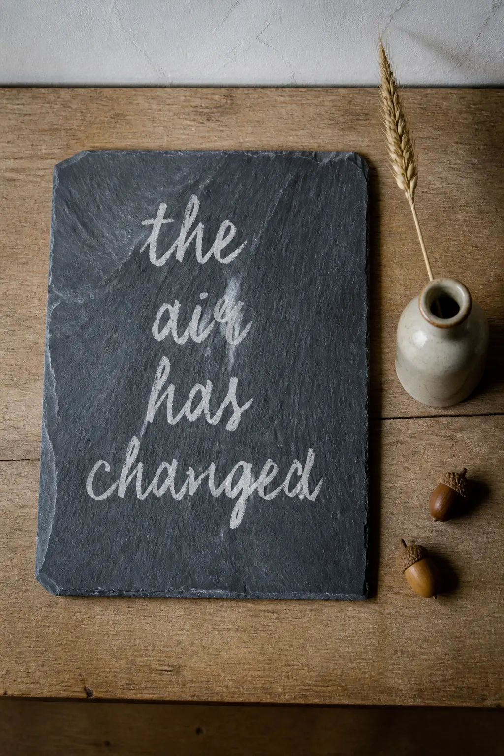
‘The Air Has Changed’ Slate Entryway Sign
Write “the air has changed” in a loose, unhurried brush script across the centre of a natural slate tile, keeping the letters slightly uneven so they read as hand-done rather than printed.
Slate has a fine-grained surface that takes standard chalk cleanly and wipes off with a damp cloth, making it ideal for a sign you plan to change every few weeks.
According to Chalkola’s buyer guide, slate gives that traditional classroom feel and is one of the most durable surfaces for repeated erasing and redrawing. Lean the tile against the wall on a small wooden ledge or prop it on a console table.
For props, keep it minimal: a single stem of dried wheat in a stoneware bottle and two or three walnut-coloured acorns scattered on the ledge beside it.
The phrase is vague enough to feel personal without being precious, and it works whether your entryway is modern or farmhouse.
Practical tip: rub the slate with the side of a white chalk stick before you start lettering, then wipe it clean with a dry cloth. This conditions the surface so your lettering doesn’t ghost when you erase it later.
If you’re recreating this
⏱ Twenty-minute version
- Buy a pre-primed slate tile from a hardware store — no framing needed
- Use a chalk marker for faster, crisper lettering than loose chalk
- Skip the prop hunt: one dried wheat stem from a grocery store florist is enough
🏠 Small-space fix
- A 20×25 cm slate tile fits on any floating shelf
- Lean it against a mirror on the shelf to double its visual weight
- Skip the console table entirely — the tile stands on its own edge
🛍 Shopping guide
‘Gather Here’ Reclaimed Wood Sign
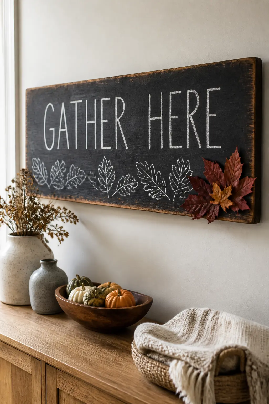
A wide plank of reclaimed or rough-sawn wood painted with two coats of chalkboard paint makes a warmer, more textured surface than a factory board.
According to New York Blackboard’s framing guide, wooden frames bring natural warmth to any space and suit both farmhouse and contemporary rooms equally well.
Write “gather here” in tall, confident capitals across the upper third of the board, then add a thin hand-drawn border of oak leaf outlines along the bottom edge using the sharp tip of a chalk marker.
The raw wood grain shows through the paint at the edges, which is part of the appeal.
Hang this one horizontally above a sideboard or kitchen shelf, and set a small cluster of dried orange and burgundy maple leaves at one corner of the board’s lower edge.
If you want the leaves to stay put without wilting, Apartment Therapy recommends using a clear acrylic craft spray on natural leaves to preserve their colour through the whole season.
Practical tip: sand the wood face lightly before painting so the chalkboard paint adheres without bubbling.
If you’re recreating this
💝 Keep it forever
- Seal the finished lettering with a light mist of hairspray so it doesn’t smudge when touched
- Photograph the finished board each year before erasing — a simple record of how your style evolves
- Store the plank flat wrapped in kraft paper so the chalk surface doesn’t scratch
🛍 Shopping guide
‘Count the Good Things’ Gratitude Ledge Sign
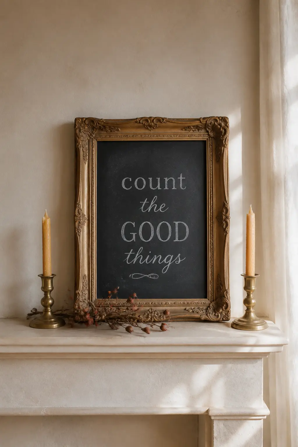
This one lives on a mantel ledge or a deep shelf and reads almost like a small painting. Use a vintage gilt-edged picture frame, remove the glass and backing, and paint the exposed MDF insert with chalkboard paint.
The ornate gold frame against the matte black surface is a strong contrast that makes even simple lettering look considered.
Write “count the good things” in a mix of styles: the word “count” in chunky serif capitals, “the good” in fine running script beneath it, and “things” in the same serif again.
Mixing serif and sans-serif styles on the same board creates visual rhythm and stops the eye from sliding off a single-font composition.
Set the framed board upright on the mantel with two beeswax taper candles in brass holders on either side, and tuck a few dried rosehip stems at its base.
The warm gold of the frame, the amber of the candles, and the rust-red of the rosehips all sit in the same colour family, so the whole vignette holds together without any effort.
Swap the phrase to “give thanks” in November and the same frame does double duty.
If you’re recreating this
⏱ Twenty-minute version
- Use a thrift-store gilt frame — check the frame section, not the art section
- Buy pre-cut chalkboard-painted MDF to fit rather than painting your own
- Skip the rosehips: two taper candles on their own are enough
🏠 Small-space fix
- A 20×25 cm gilt frame sits neatly on a windowsill or bathroom shelf
- Use a single taper candle instead of two to keep the footprint narrow
🛍 Shopping guide
Peak Autumn (Late October)
By late October the colour outside is at its most intense, and your chalkboard should keep up. These three signs lean into that energy with bolder lettering, deeper contrasts, and props that match the drama of the trees.
‘Peak Colour’ Hand-Lettered Leaf Map Sign
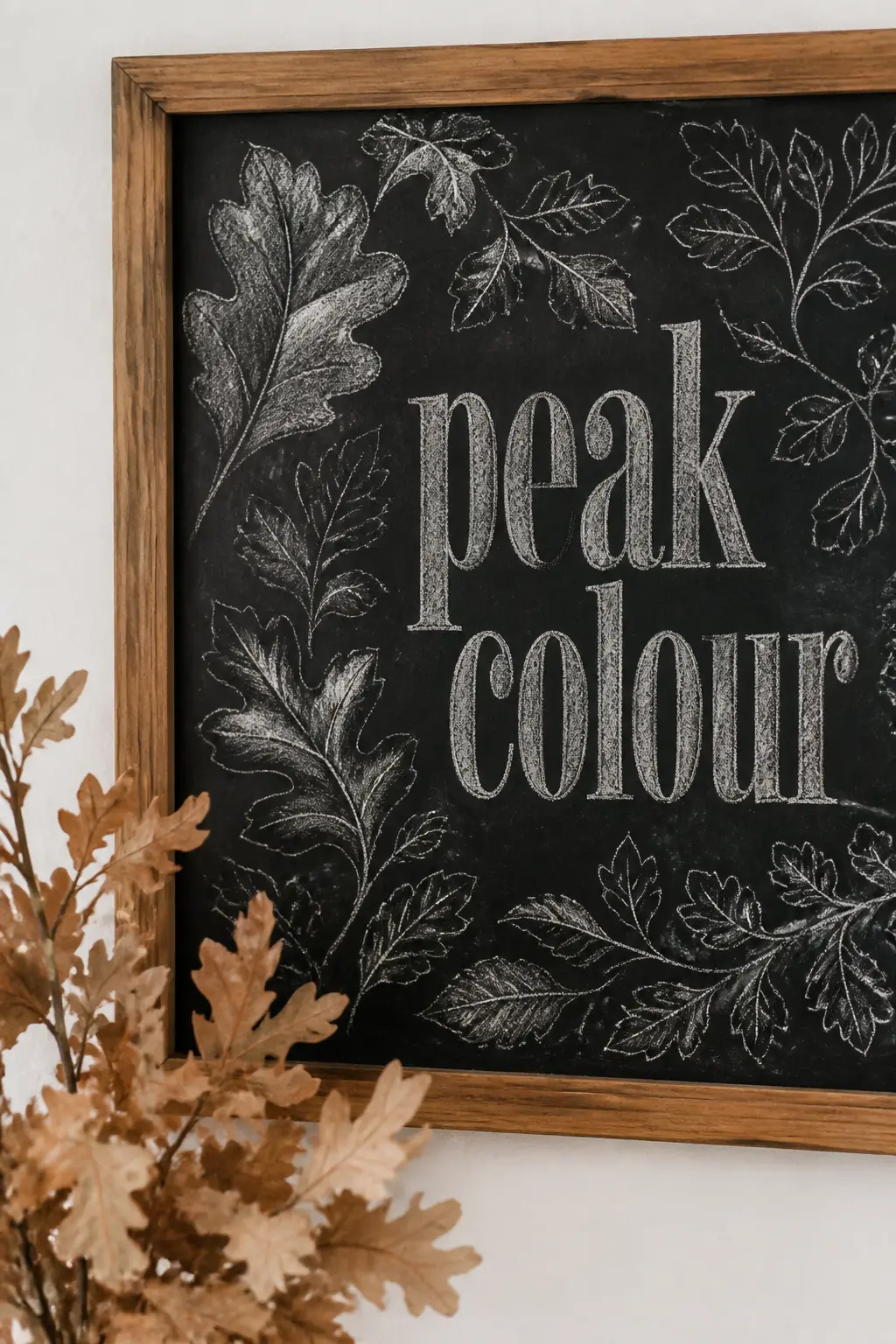
Late October asks for something with more presence. Take a large wooden-framed chalkboard (24 x 36 inches is a good working size) and fill it with a loose ink-style map of leaf shapes radiating outward from a centre phrase that reads “peak colour”.
The letters are large and bold, set in a condensed serif, and the leaf sketches around them are drawn in varying pressures so some read dark and heavy while others barely register as outlines.
This layering technique, described in detail in Valerie McKeehan’s book The Complete Book of Chalk Lettering, involves building letters from skeleton shapes and then thickening the downstrokes for contrast and dimension.
Hang it on a bare wall with nothing else nearby. The board is busy enough on its own. Lean a bundle of dried oak branches against the wall beside its base, the kind with leaves still attached that have dried to a papery amber.
That single prop connects the drawn leaves on the board to something real and three-dimensional without cluttering the composition. If you’re planning a gathering around the same time, these one-minute party games are an easy addition that needs no extra table space.
🛍 Shopping guide
‘October, You Beauty’ Vintage Frame Chalkboard
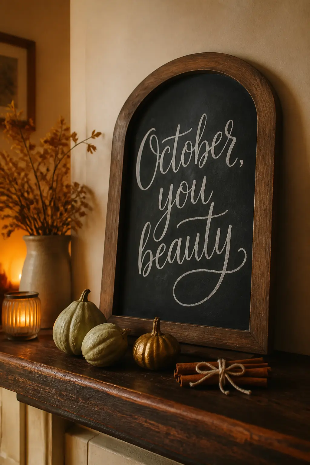
This sign is unabashedly affectionate about the month. Write “October, you beauty” in a tall, swirling brush script that fills the full height of a vintage oval or arch-topped frame, with the comma sitting right where the script curves.
The oval or arch shape softens what would otherwise be a very declarative phrase, making it feel warm rather than showy.
Creative Market’s guide to chalk lettering describes this style as a “hand-drawn textured chalk” approach, where the irregular edges of each letter are part of the character rather than something to correct.
Set the framed board on a deep wooden shelf with two or three gourds in muted green and gold placed in front of it, and add a handful of cinnamon sticks tied with a cotton string at the corner.
The smell is part of the styling: when someone walks past and catches a faint cinnamon scent, the sign becomes a multi-sensory moment rather than just a visual one.
Practical tip: an arch-topped frame is often easier to find at a thrift store than online, usually in the mirror or picture frame section.
If you’re recreating this
⏱ Twenty-minute version
- Source an arch-topped mirror at a charity shop and paint the glass with chalkboard spray paint
- Use three grocery-store gourds in one colour family to keep styling decisions fast
- Pre-write the phrase on paper to check the lettering flow before committing to the board
🛍 Shopping guide
‘Sweater Weather is Here’ Kitchen Peg Board Sign
A small chalkboard hung on a kitchen peg rail or beside the back door is one of the most practical spots in the house for a seasonal sign, because it gets seen every morning.
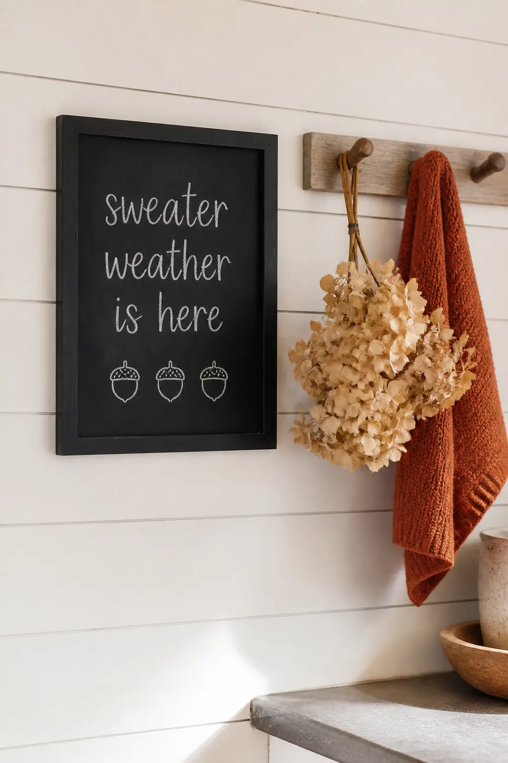
Write “sweater weather is here” in a casual, slightly bouncy lowercase script, the kind where each letter sits at a slightly different height.
This is sometimes called a “bounce lettering” style, and it reads as relaxed and spontaneous even when it took twenty minutes to plan.
The phrase itself has been a popular chalkboard choice for years: The Melrose Family’s round-up of fall chalkboard art lists it as one of the most-copied phrases for autumn home boards, surrounded by hand-drawn leaves and acorns.
Below the text, sketch three small acorn outlines in a row using the pointed tip of a chalk marker, spacing them evenly. On the peg rail itself, hang a small bunch of dried hydrangea heads and a knitted hand towel in rust or oatmeal.
The combination of a soft phrase, a tactile prop, and a kitchen setting makes this feel lived-in rather than staged. It is also one of the easiest signs on this list for a beginner to try first.
If you’re recreating this
🏠 Small-space fix
- A 20×30 cm board on a single peg hook takes almost no wall space
- Use a command strip adhesive hook if you can’t drill into tile or plaster
- Replace the hydrangea bunch with one dried stem in a small wall-mounted bud vase
💝 Keep it forever
- Dried hydrangea heads last two to three seasons stored in a paper bag in a dry cupboard
- Photograph the peg rail setup as a record of your seasonal styling year to year
🛍 Shopping guide
Thanksgiving (November)
A Thanksgiving chalkboard does real work: it sets the tone before guests sit down, it holds a dinner menu so nobody has to ask, and it gives the table something to look at. These three signs cover all three roles.
‘Give Thanks, Then Eat’ Dinner Menu Board
A Thanksgiving dinner menu board does two things at once: it tells guests what is coming and it looks intentional enough to become a table focal point.
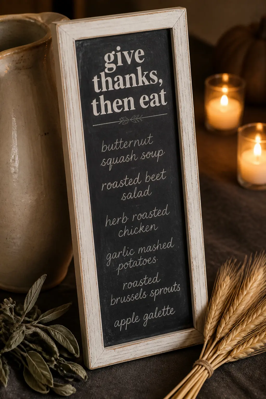
Use a tall, narrow board (roughly 12 x 24 inches) in a distressed white-painted wood frame, which feels less formal than a black frame and suits the cream-and-amber palette of a Thanksgiving table.
Write “give thanks, then eat” as a header in a bold serif, then list the courses in a lighter running script below: soup, salad, the main, sides, dessert.
Keeping the hierarchy clear (bold for the header, lighter for the list) is a core principle of chalkboard lettering: as one lettering guide explains, using larger or bolder strokes for focal words while supporting text stays smaller creates visual hierarchy that guides the eye naturally down the board.
Stand the board on the table propped against a stoneware pitcher, or clip it to a small easel at the end of the sideboard. Tuck a few sprigs of dried sage and a short bundle of wheat stalks under the easel’s foot.
The board updates each year with whatever is actually on your menu, so it never feels like a stock prop. For games to run before and after the meal, the Thanksgiving games list here covers 40 options for any size group.
🛍 Shopping guide
‘Grateful for This Table’ Gratitude Wall Board
This sign goes on the wall behind or beside the dining table and stays up for the whole of November.
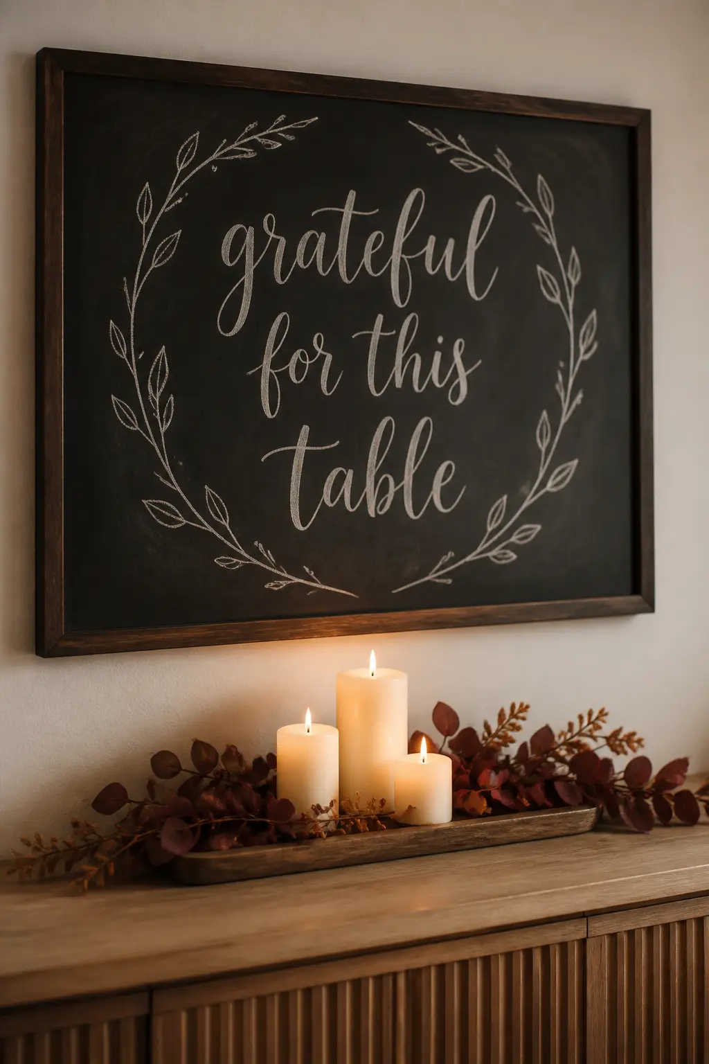
Write “grateful for this table” in a large, confident brush-script that fills most of a 24 x 36 inch board, then add a simple wreath outline drawn in chalk around the phrase: bare branches with a few leaf shapes at the top, nothing fussy.
The wreath border pulls the eye to the phrase without competing with it.
Chalkola’s board guide notes that large wall-mounted boards work best for visibility in dining and living spaces, which is exactly the role this sign plays: it is meant to be read from across the room, not leaned over.
Hang it at eye level on the wall above a sideboard, and dress the sideboard below with a row of pillar candles in varying heights on a wooden tray, with dried burgundy and amber foliage arranged loosely around them.
The board holds the vertical and the candle tray holds the horizontal, and together they fill the whole wall section without any other artwork needed.
Practical tip: sketch the wreath outline in pencil on paper first, then transfer it to the board using the back-trace method so the proportions are right before you touch chalk to the surface.
If you’re recreating this
💝 Keep it forever
- Photograph the finished board and sideboard together as your annual Thanksgiving ‘before guests arrive’ photo
- Store dried foliage in a kraft paper bag with a label so it is ready to reuse next November
🏠 Small-space fix
- Use a 16×20 inch board instead and hang it above a console table rather than a full sideboard
- Replace the pillar candle tray with a single tall taper in a brass holder — same warmth, half the surface area
🛍 Shopping guide
‘The Menu Board’ Thanksgiving Farmhouse Chalkboard
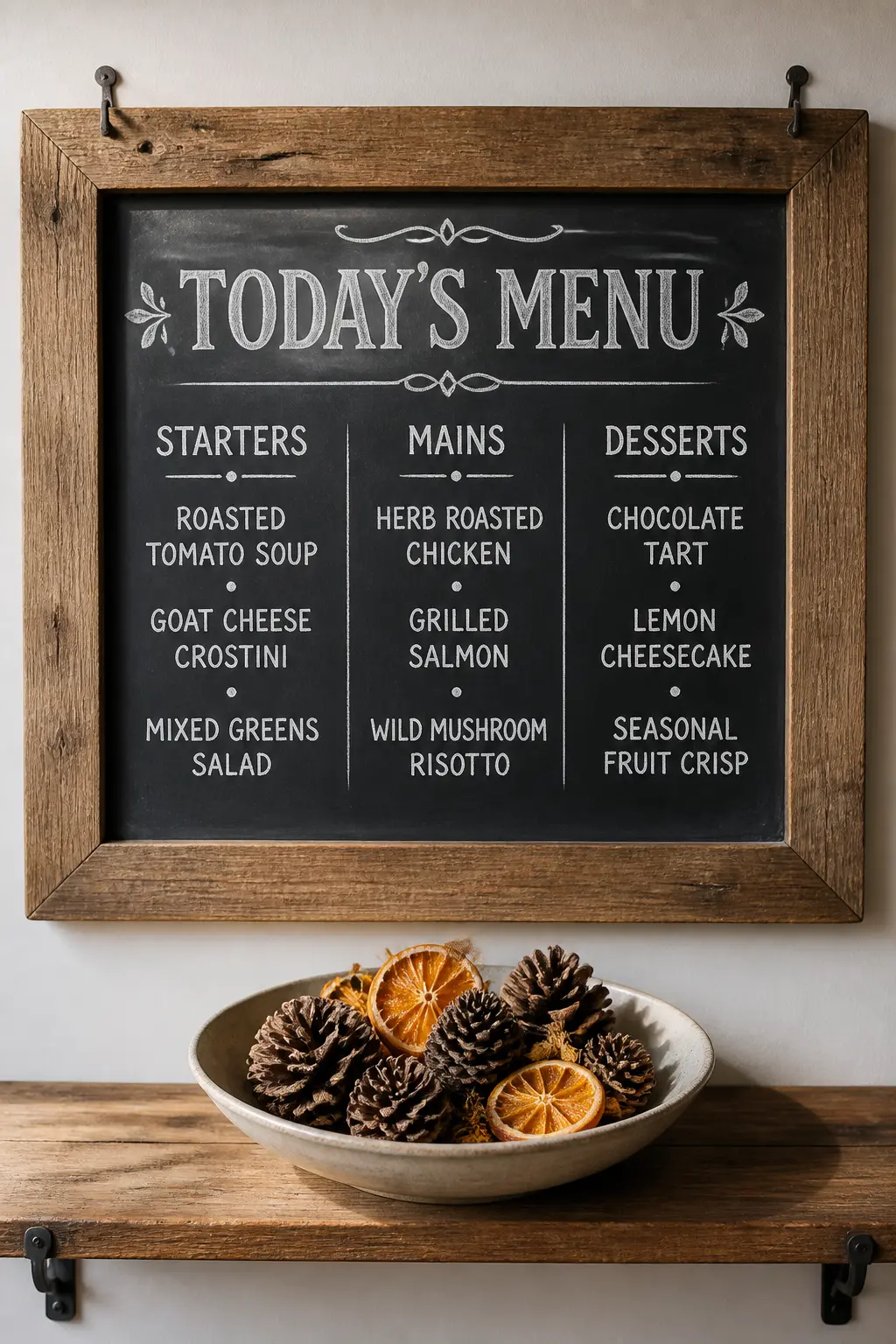
A proper menu board is wider than it is tall, because a horizontal layout lets you arrange the dishes in columns: starters on the left, mains in the centre, desserts on the right.
It reads the way a restaurant specials board reads, and that is exactly the feeling you want. Write a decorative header using old-fashioned slab-serif capitals, the kind that feel like type from an early-twentieth-century advertisement.
Chalkboard lettering guides note that vintage typography achieves its effect through ornate details like curls, shadows, and letter-spacing that echoes early hand-painted signage. Beneath the header, list each dish in a clean, legible sans-serif so nothing is misread at the table.
Mount this on a sliding barn-door track or simply hang it horizontally on two nails. Prop it at an angle slightly away from the wall so it catches the light rather than sitting flat.
On the shelf below, place a simple arrangement of pinecones and dried orange slices in a wide shallow bowl. The bowl grounds the board without blocking it.
This is the one sign on this list that genuinely earns its keep as a functional object: guests refer to it, hosts update it year to year, and it makes a dinner feel like an occasion without any extra ceremony.
If you want ideas for keeping guests entertained while the food is finishing, these funny Thanksgiving games work well in a living room while the menu board is still on display in the dining room.
If you’re recreating this
⏱ Twenty-minute version
- Lay the board flat on a table to letter it, then hang it: far easier than lettering on a vertical surface
- Use a ruler and chalk to mark light column guides, then erase them after the ink dries
- A bag of grocery-store pinecones in a thrifted bowl is the whole prop budget
🛍 Shopping guide
Winter Threshold (Early December)
Early December is its own mood, separate from the holidays: bare branches, grey mornings, the first real cold. These three signs capture that threshold feeling with spare lettering and props that read as the season, not any specific occasion.
‘First Frost’ Bare-Branch Minimalist Sign
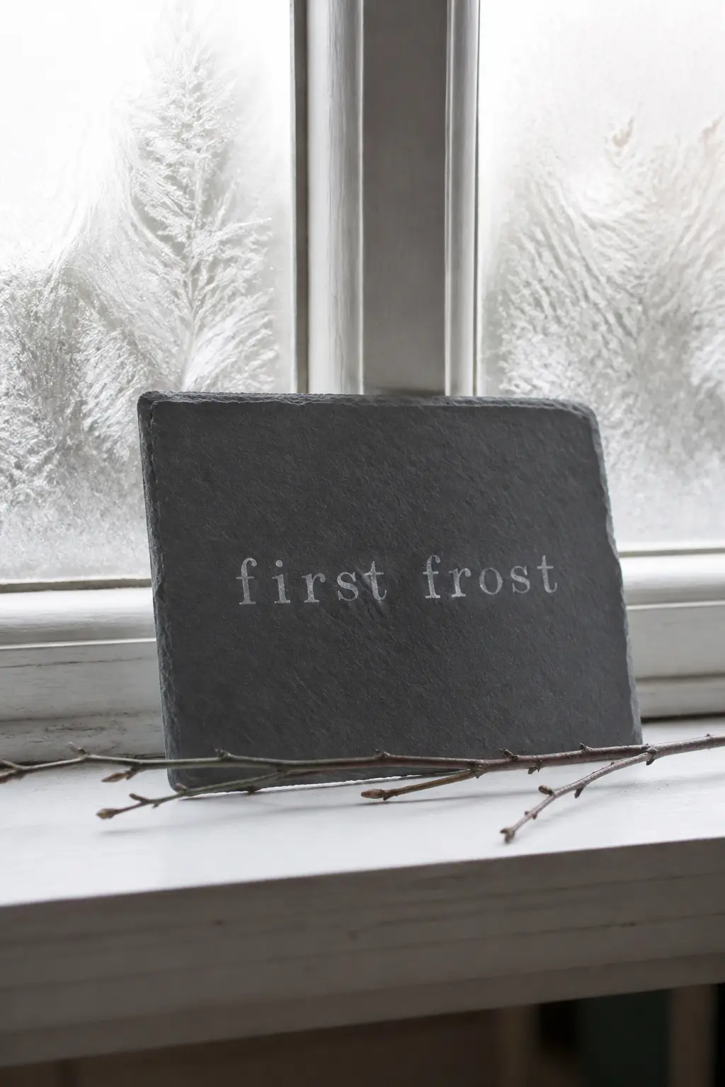
Early December has its own distinct feeling: the leaves are gone, the mornings are sharp, and the season has shifted into something quieter. A sign that says “first frost” in a spare, upright serif with wide letter-spacing captures that mood exactly.
Use a small slate tile (about 20 x 28 cm) with no frame, no border, no decorative doodles. Just the two words centred in the middle third of the slate with generous white space above and below. The restraint is the point.
Slate’s naturally textured surface adds enough visual interest that minimal lettering reads as intentional rather than unfinished.
Set the tile on a window ledge or a bathroom shelf with a single bare branch laid horizontally in front of it. That is the whole arrangement. No candles, no foliage cluster, no props in multiples.
The bare branch mimics the trees outside, and the small scale of the tile means the sign works in any room without commanding too much space. Practical tip: wide letter-spacing on a short word like “frost” takes more time to plan than to execute.
Write out the letters on paper first with equal gaps between each one, then use that spacing as your guide on the slate.
If you’re recreating this
🏠 Small-space fix
- A 15×20 cm slate tile sits on any windowsill or bathroom counter with no wall damage
- One bare branch found outdoors costs nothing and needs no vase
- This setup works in a bathroom, bedroom, or kitchen with equal effect
‘The Season Turns’ Vintage Oval Frame Sign
An oval frame gives a December sign a slightly formal quality that a rectangular board doesn’t have.
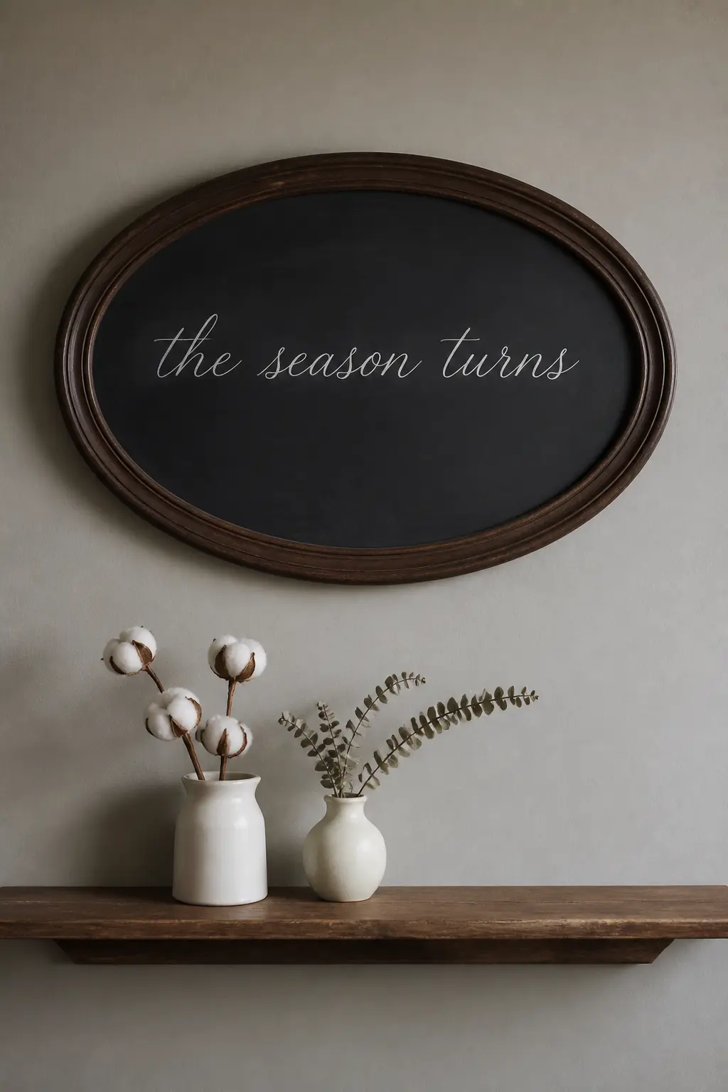
Find a wide oval frame with a dark walnut or ebony finish, fill it with a chalkboard-painted panel cut to fit, and write “the season turns” in a fine, elegant italic script.
Italic lettering on an oval panel has a natural visual logic: the slant of the letters follows the curve of the frame, so the composition feels unified.
Design Work Life describes a dry-brush script style as perfect for display purposes with handwritten characteristics, which is close to what you are aiming for here: controlled but not mechanical.
Hang the oval board on a hallway or bedroom wall at eye level.
Below it on a narrow shelf, place two small ironstone or matte ceramic vessels: one holding a few sprigs of dried cotton stems (the fluffy white kind), the other holding a couple of dried eucalyptus branches still on their stems.
The white cotton against the dark board and the pale grey of eucalyptus keeps the palette cool and quiet, which matches the mood of early December.
This is a sign you could reasonably leave up through the whole of the month without it feeling tied to any specific occasion.
If you’re recreating this
💝 Keep it forever
- Dried cotton stems last indefinitely stored upright in a paper bag
- The oval board works as a Valentine’s Day sign in February with a new phrase — store and reuse
⏱ Twenty-minute version
- Use chalkboard spray paint directly on the back of a piece of glass removed from a thrift-store oval frame
- Buy pre-bundled cotton stems from a florist supply shop rather than assembling individually
🛍 Shopping guide
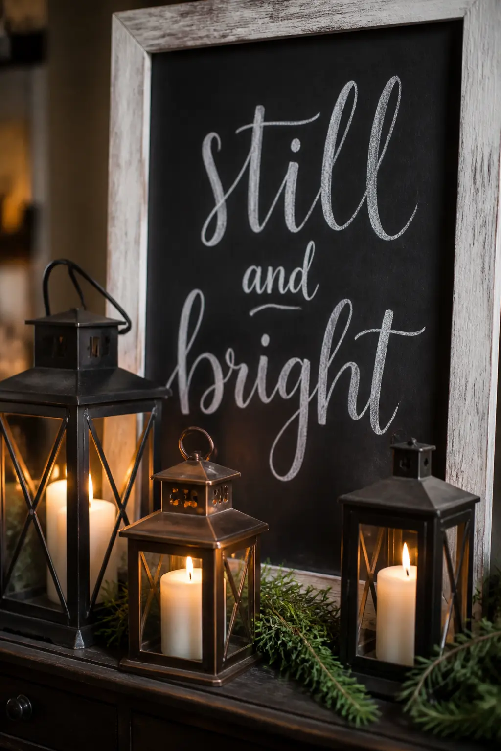
‘Still and Bright’ Candle-Lit Sideboard Sign
The phrase “still and bright” has a quiet, non-specific quality that feels right for early December without pointing at any holiday in particular.
Write it in a wide, unhurried lowercase brush script across a medium-sized board (about 18 x 24 inches) in a thick barnwood or whitewashed frame. Use a slightly thicker chalk marker rather than a fine-tip one so the letters have some weight.
As American Farmhouse Style explains, brush lettering creates its character through thick downstrokes and thin upstrokes, and that contrast reads especially well in a larger format like this.
Place the board on a sideboard or a wide shelf and position three lanterns of varying sizes in front of it, each holding a pillar or taper candle.
The lanterns cast moving light across the chalkboard surface, which makes the lettering feel almost luminous in the evening.
Add a few sprigs of fresh rosemary tucked between the lanterns: it smells like the season without referencing any specific holiday, and it stays green for at least a week at room temperature.
This is a sign that works as well for a dinner party as for a quiet Tuesday evening at home. For inspiration on extending the season into a full festive gathering, these fall candle recipes are worth reading alongside your styling plan.
🛍 Shopping guide
Frequently Asked Questions
What type of chalkboard is best for seasonal home decor?
It depends on how often you plan to change the design. Slate is the most durable and has a classic texture, but it is heavy and works best wall-mounted.
Wooden-framed boards painted with chalkboard paint are lighter, easier to hang, and the most common choice for home use.
If you plan to use chalk markers rather than stick chalk, choose a non-porous surface (slate, porcelain, or a sealed melamine board): chalk marker ink soaks into porous painted boards and can leave permanent ghosting that is very hard to remove.
How do I get my chalk lettering to look neat without an art background?
The transfer method is the most reliable shortcut. Print your phrase in a font you like, rub the back of the paper with a stick of chalk, position it face-up on the board, and trace firmly over the letters with a pencil.
When you lift the paper, a faint chalk outline remains on the board and you trace over it with a chalk marker. The result looks hand-lettered because it is, but the proportions and spacing are already sorted for you.
How do I stop chalk from smudging once a sign is finished?
For signs you want to keep up for several weeks, trace over the lettering with a chalk marker once the design is complete. Chalk markers dry to a semi-permanent finish that resists casual contact.
Alternatively, a light mist of hairspray from about 30 cm away sets loose chalk without visibly changing its appearance. Neither method makes chalk fully permanent, but both significantly reduce the risk of a sleeve smudging the letters when someone walks past.
Can I reuse the same board for all four seasonal groups?
Yes, and that is the whole point. One good board in a frame that suits your room does the work of twelve if you are willing to erase and redraw as the season moves.
Wipe with a damp cloth to erase stick chalk; for chalk markers, you may need a Magic Eraser on a non-porous surface.
What props work alongside a fall chalkboard without overwhelming it?
Keep the prop count low and the colour palette narrow. One or two natural elements in the same tone family as the board (dried wheat, a single bare branch, a few dried leaves, a small stoneware vessel) are enough.
Matching the prop material to the frame material also helps: a barnwood frame pairs well with rough dried botanicals, while a gilt or vintage frame suits something more refined like rosehips or cotton stems.
As a general rule, if you have to move three things to dust the shelf, you have one prop too many.
How long does it take to create one of these signs from scratch?
The more complex designs (the leaf map board, the vintage-frame gratitude sign) take closer to an hour including planning time.
Bare-minimum versions of any sign can be done in under 20 minutes: write the phrase freehand in a simple script, add one prop, and photograph it.

Discover 20 fun back to school party games perfect for primary-age kids, including printable sheets,

20 sleepover games for kids perfect for a first big-girl slumber party — active, quiet & lots of p

18 engagement party games that celebrate the couple and break the ice between both families. Fun, fr
Leave a Reply