

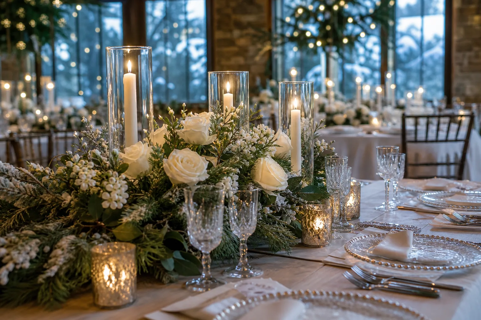
Winter weddings get called moody before anyone has seen a single flower, and there is a reason for that. Deep colour simply reads better once the light outside turns grey, and a reception room dressed in the right pair of tones looks considered rather than default.
Every palette below works because it repeats: two or three colours, carried across the tablecloth, the napkins, the flowers and the candle wax, so a guest reads it as one decision instead of six separate ones made under pressure in the last week.
Match the palette to the actual room before you fall for a photograph. A scheme built for a mirrored ballroom will sulk in a barn, and a scheme built for exposed beams will look thin under a chandelier.
This post contains affiliate links. If you buy through them, I may earn a small commission at no extra cost to you.
Table of Contents
Ballroom and Hotel Reception Palettes
A ballroom already does half the work with its mirrors and its height, so the palette needs enough weight to hold the room rather than vanish into it. These six lean on metallic shine and deep saturation, the two things that read clearly from forty feet away under a chandelier.
If the evening runs on past dinner, 10 Best Wedding Games for Every Celebration gives the dance floor somewhere to go before the band’s last set.
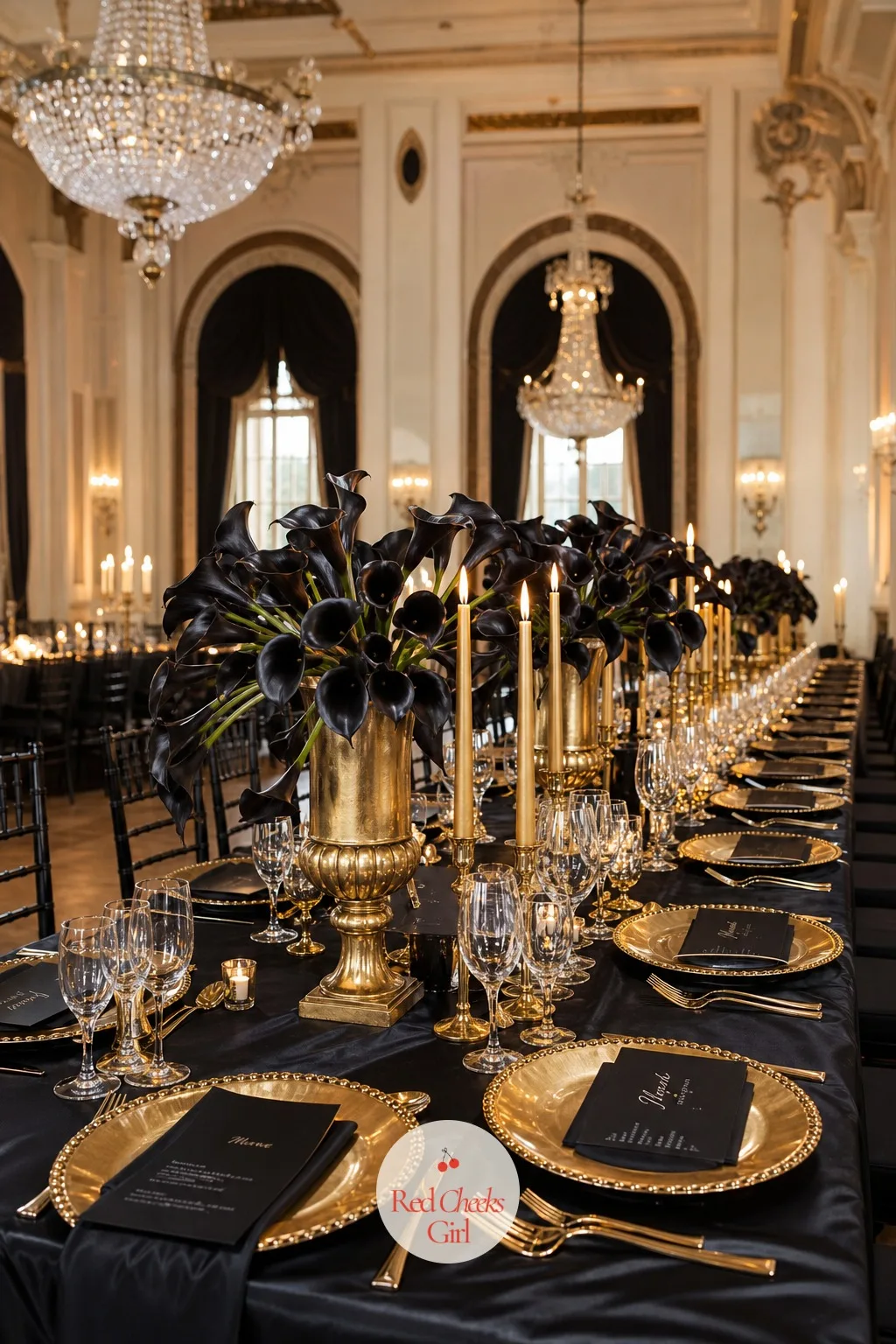
Black and Gold
Black on a reception table sounds like a funeral until gold hits it, and then it is the most expensive-looking room you will host all year. This is the palette for the couple who want drama without a single pastel in sight.
Set a black satin cloth under a gold charger at each place, with ink-black calla lilies and gold-dipped eucalyptus in low urns so sightlines stay open across the table. Gold taper candles in black ceramic holders and black napkins folded flat finish it without extra fuss.
It suits a ballroom with a mirrored wall or a chandelier already doing the sparkling for you. If black feels heavy for the room, swap the cloth for charcoal satin and keep the gold exactly as it is.
🛍 Shopping guide
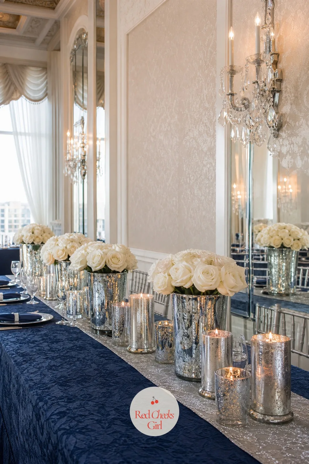
Navy and Silver
Navy reads as formal without the stiffness of black, and silver keeps it from going flat under evening light. Together they look like a room that was planned months in advance, even when it was planned in three weeks.
Dress the table in a navy jacquard cloth with a silver organza runner down the centre, white and silver-dusted roses in mercury glass vases, and silver pillar candles at staggered heights. Navy linen-look napkins tied with a thin silver ribbon keep the place settings from feeling bare.
This one belongs in a hotel ballroom with a marble fireplace or fluted columns behind it. For a smaller room, drop the runner and let the navy cloth carry the whole table on its own.
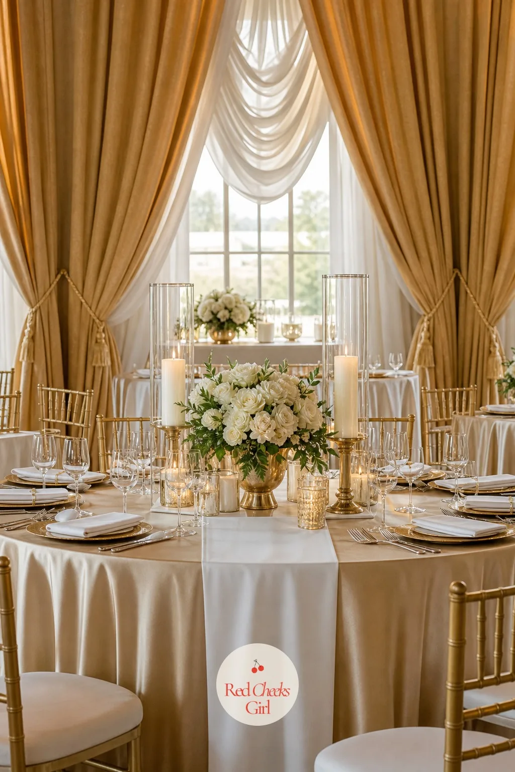
Champagne and White
This is the palette for the bride who wants the room to look like it is lit from the inside, not decorated at all. Champagne satin catches candlelight in a way plain white never does.
Layer a champagne satin cloth under a white pressed-cotton runner, white garden roses with a few champagne-toned ranunculus in low glass bowls, and ivory pillar candles in champagne-rimmed glass hurricanes. Keep the napkins white and simply folded so the shine stays on the cloth.
It works best in a ballroom with gilt drapery or a coffered ceiling already doing the gold for you. If the venue is plainer, add a second row of candles down the table to pull in more light.
Plum and Champagne
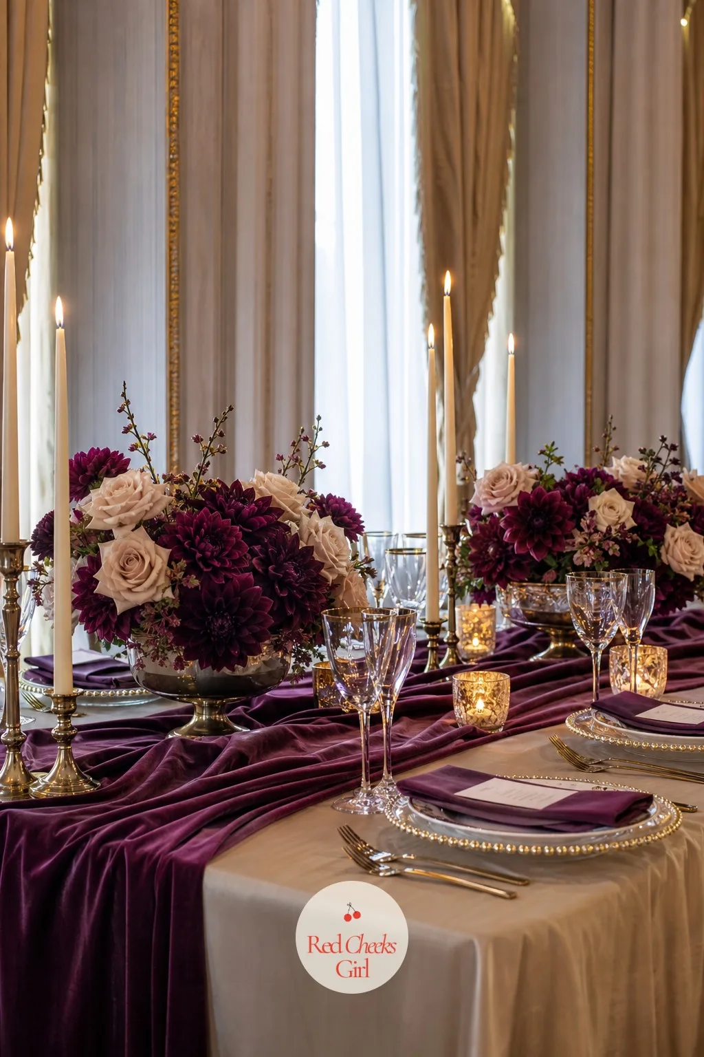
Plum does something champagne cannot do alone: it gives the palette a mood, something closer to velvet theatre curtains than a bridal shower. This pairing suits a couple who like a little weight in the room.
Use a plum velvet runner over a champagne satin base cloth, deep plum ranunculus and dahlias mixed with champagne roses in low compotes, and champagne taper candles in brushed gold holders. Plum napkins with a champagne ribbon tie the place settings together.
An art deco ballroom with fluted columns suits this palette especially well. For a daytime reception, lighten the mix with more champagne blooms and less plum.
Dusty Blue and Silver
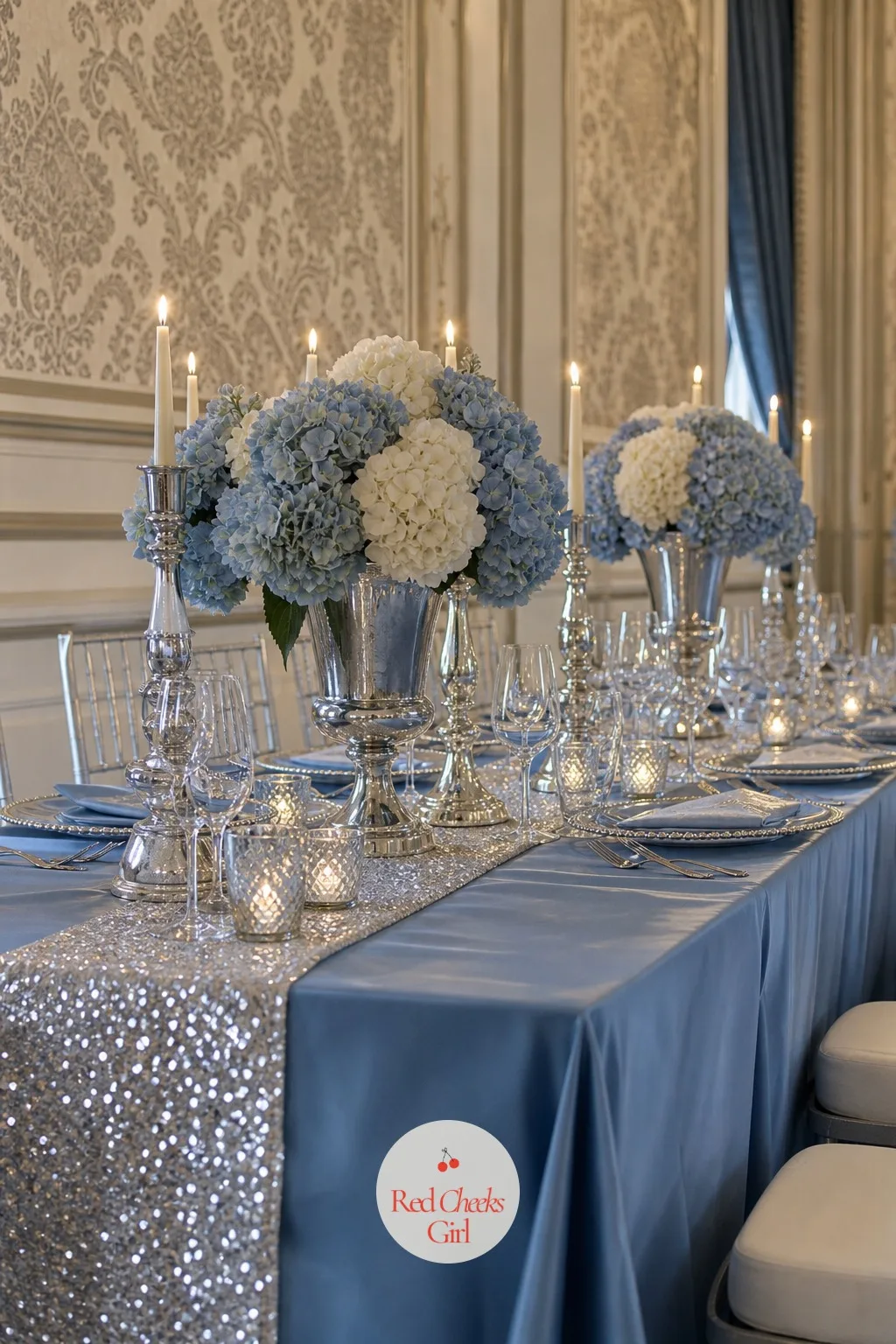
Dusty blue is the colour for a couple who want winter elegance without anything that reads as cold. It sits softer than navy and warmer than icy blue, which makes it easy to live with across a whole room.
Set a dusty blue satin cloth with a silver sequin runner, white and dusty blue hydrangea in silver urns, and silver taper candles in simple glass sticks. Dusty blue napkins folded into a loose knot keep the setting relaxed rather than stiff.
It reads beautifully under a ballroom’s silk damask wallpaper or against drapery in a similar tone. Swap the sequin runner for a plain silver satin one if sparkle feels like too much.
Amethyst and Silver
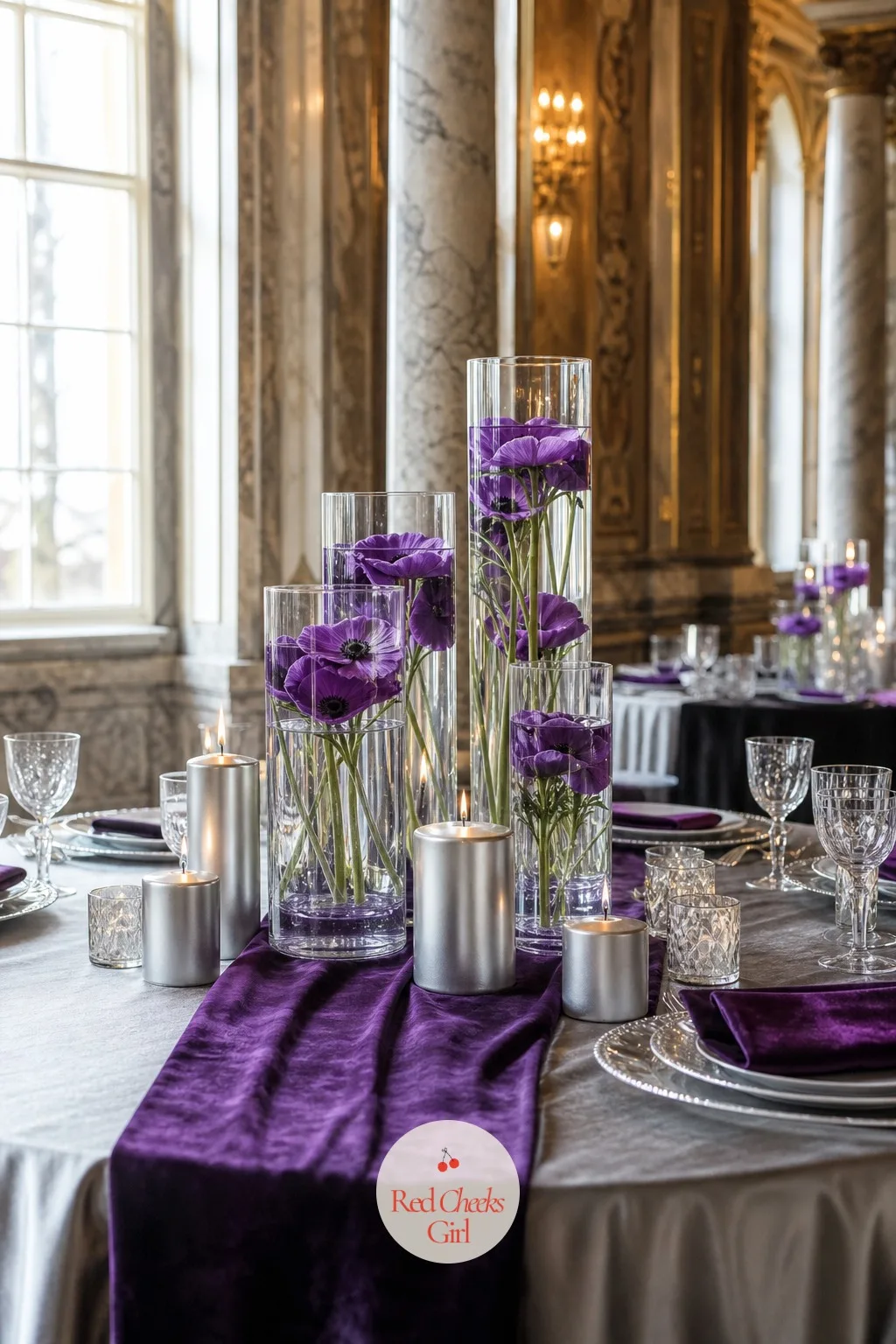
Amethyst is the unexpected choice at a winter wedding, and that is precisely its appeal: a purple with enough grey in it to read as sophisticated rather than girlish. Silver keeps it anchored to the season.
Dress the table in a silver satin cloth with an amethyst velvet runner, deep purple anemones and silver-dusted eucalyptus in glass cylinders, and silver pillar candles of varying heights. Amethyst napkins folded simply let the flowers stay the loudest thing on the table.
This suits a ballroom with marble columns or a crystal chandelier overhead. If purple feels too bold for the room, trade the velvet runner for amethyst satin instead.
🛍 Shopping guide
Barn and Rustic Venue Palettes
Exposed beams and bare bulbs want warmth, not polish, so these six pull from rust, cognac and old brass rather than anything that reads formal. A barn forgives a lot, which is exactly why the colour has to do more of the talking.
If the entrance needs a photo moment that is not a florist’s bill, 34 Wedding Balloon Arch Ideas for a Reception That Is Not in a Hotel is built for a room exactly like this one.
Evergreen and Gold
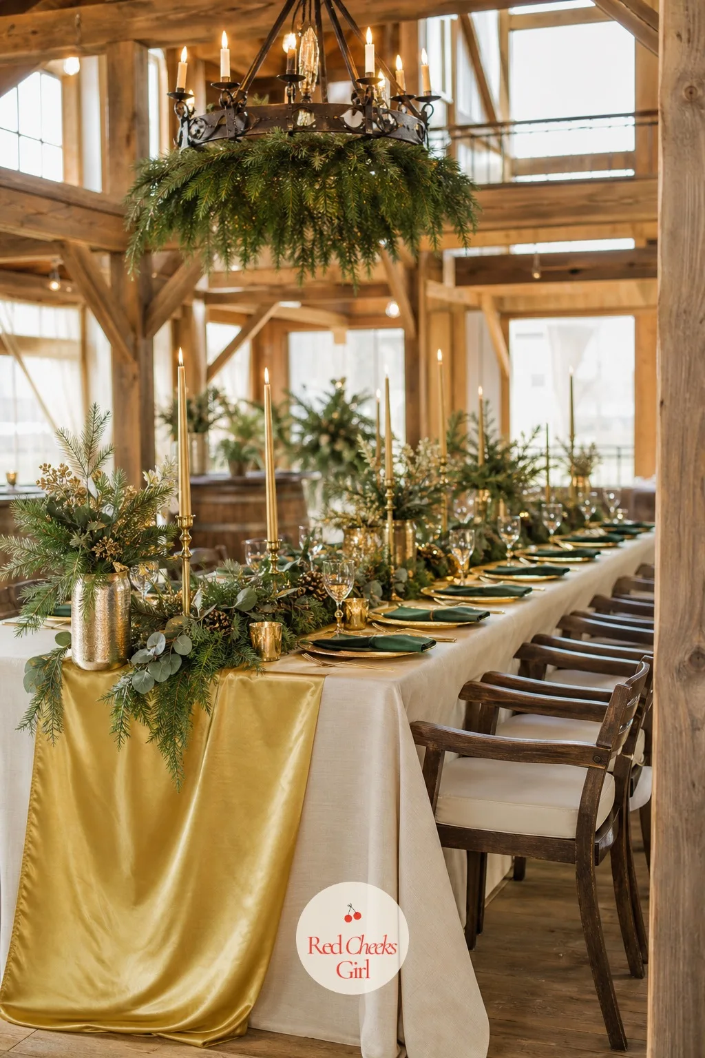
This is the palette that turns up in every barn wedding gallery for a reason: evergreen reads as the season itself, and gold stops it from looking like a Christmas tree lot. It is also forgiving if your florist substitutes greenery at the last minute.
Run a gold satin runner down a cream pressed-cotton cloth, cluster pine and cedar sprigs with gold-dipped eucalyptus in low wooden boxes, and gold taper candles in simple brass holders. Deep green napkins tied with thin gold cord finish each setting.
It belongs in a timber barn with an iron chandelier overhead. For a smaller budget, skip the wooden boxes and let the greenery run loose along the runner instead.
🛍 Shopping guide
Burnt Orange and Evergreen
Burnt orange against evergreen looks like the last good light of a late autumn afternoon stretched into winter, which is exactly the mood a barn wedding is usually going for. It is warm in a way pure red never quite manages.
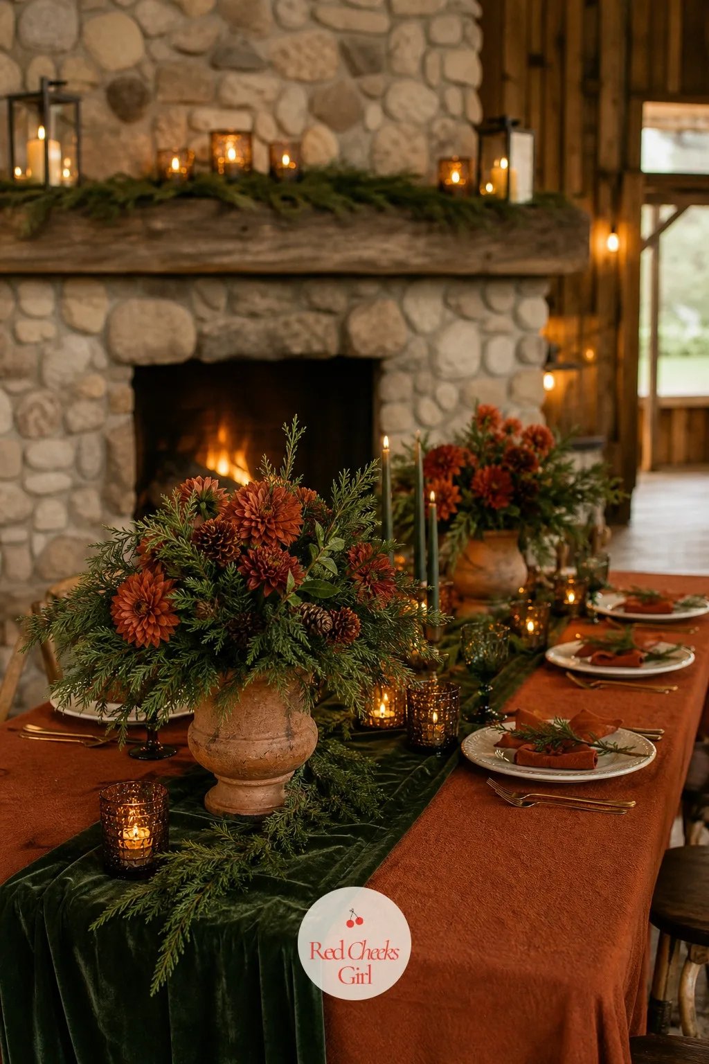
Layer a burnt orange cotton cloth with a deep green velvet runner, rust-toned dahlias and ranunculus mixed with cedar sprigs in low clay urns, and amber glass candle holders with warm ivory candles. Evergreen napkins with a rust ribbon finish the setting.
A barn with a working stone fireplace suits this palette especially well. If dahlias are out of season where you are, chrysanthemums in the same rust tone do the same job.
Forest Green and Copper
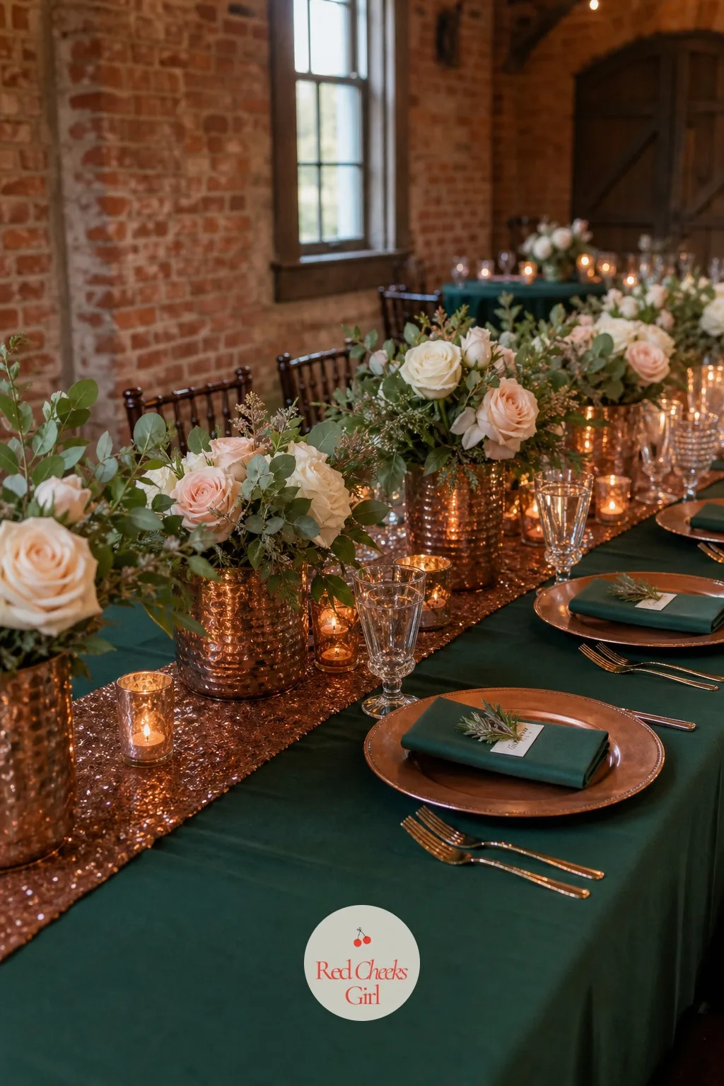
Copper has a warmth gold does not, something closer to firelight, and against forest green it makes a barn table feel properly lived-in rather than styled overnight. This is the pairing for a couple who want rustic without anything twee.
Set a forest green cotton cloth with a copper sequin runner, dark green eucalyptus and burgundy-edged roses in hammered copper vessels, and copper mercury glass candle holders down the centre. Forest green napkins tied with copper wire complete the look.
It suits a barn with exposed brick or a hay loft overhead. Where copper vessels are hard to source, copper spray paint on plain glass jars gets most of the way there.
Rust and Navy
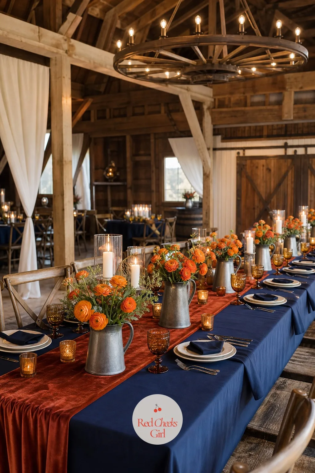
Rust and navy together feel like a well-worn tweed jacket, which is exactly the point: rich, a little masculine, nothing precious about it. It is an unusual enough pairing that guests will actually comment on it.
Dress the table in a navy cotton cloth with a rust velvet runner, burnt orange ranunculus and navy-dyed thistle in low pewter jugs, and amber candles in simple glass votives. Rust napkins with a navy ribbon finish each place setting.
A post-and-beam barn with a wagon wheel chandelier is the natural home for this one. If velvet is out of budget, a rust cotton runner in the same tone carries the look just as well.
Cognac and Forest Green
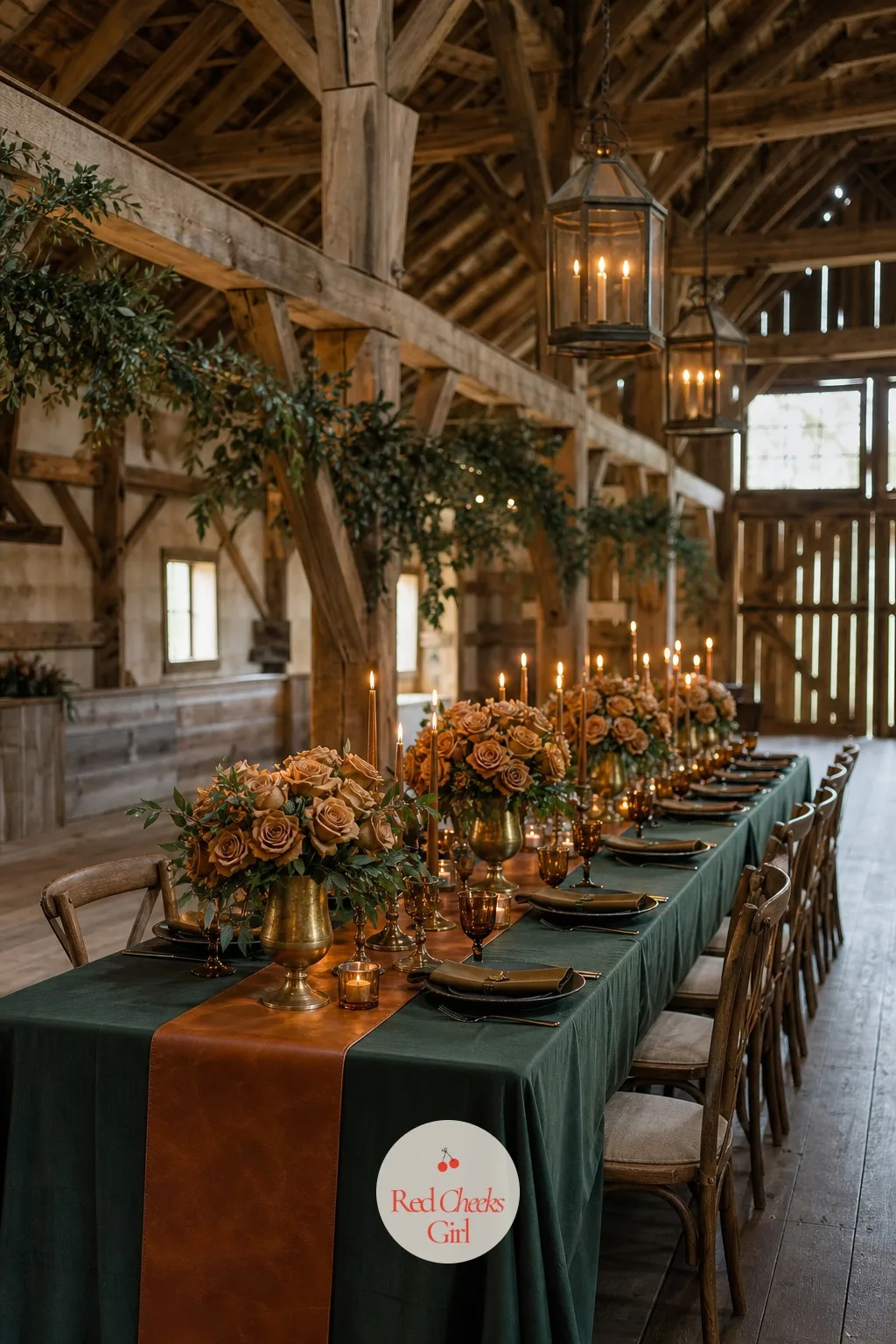
Cognac is the colour of the drink that gives it its name, warm and a little smoky, and against forest green it makes a barn table look like it belongs to a hunting lodge rather than a catering tent. Nothing about it looks temporary.
Use a cognac leather-look runner over a deep green cotton cloth, dark green foliage with cognac-toned roses in antiqued brass urns, and amber taper candles in brass holders. Forest green napkins tied with leather cord finish it.
It belongs in a restored dairy barn with timber trusses overhead. Where leather-look runners are hard to find, a plain cognac-coloured cotton runner reads almost the same from across the room.
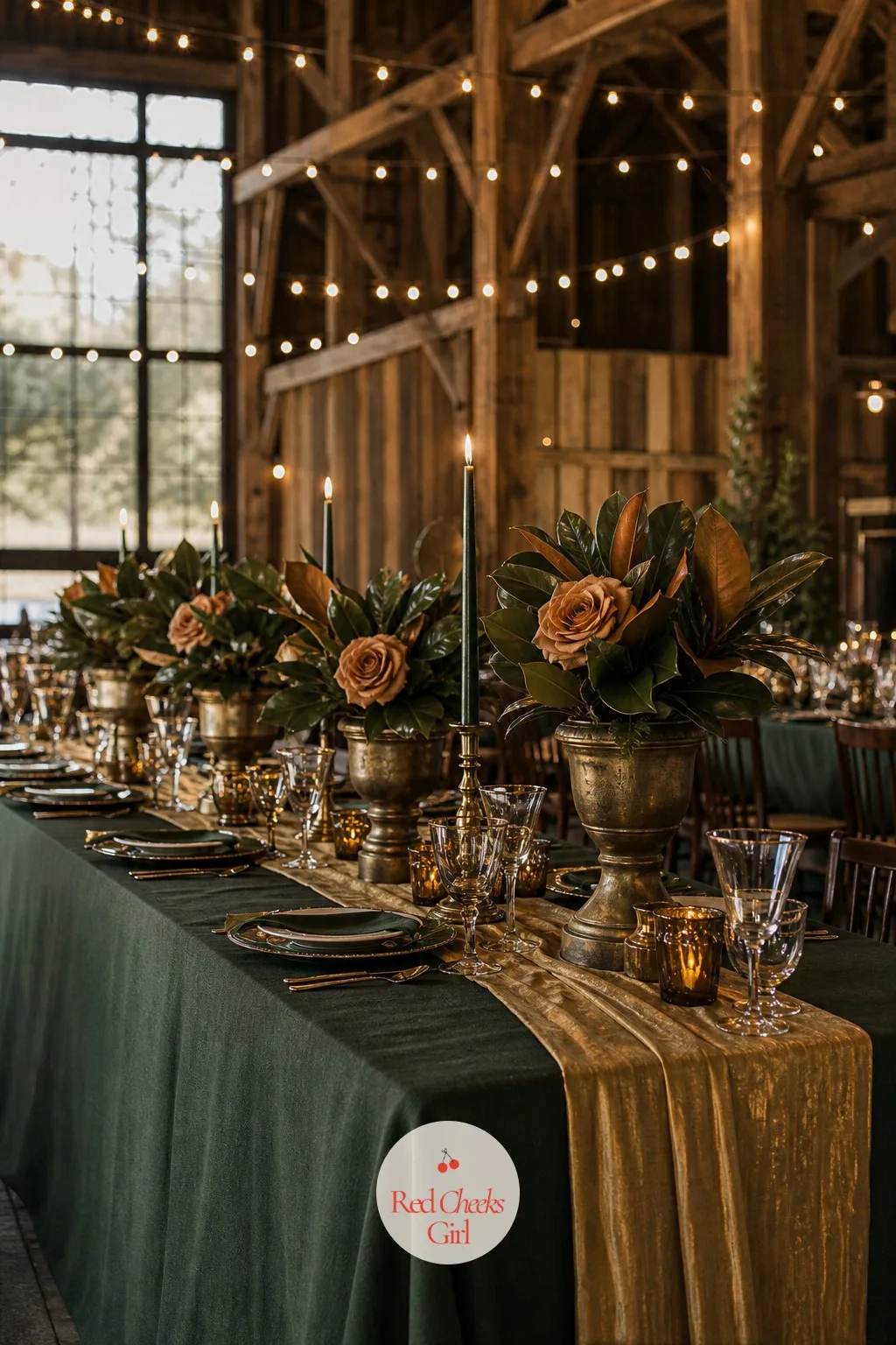
Hunter Green and Antique Brass
Hunter green sits a shade darker and dustier than evergreen, and against tarnished brass rather than polished gold it reads older, like the palette has been handed down rather than bought for the occasion. That is exactly the charm of it.
Set a hunter green cotton cloth with an antique brass sequin runner, dark green magnolia leaves and amber roses in weathered brass urns, and brass candlesticks holding deep green candles. Hunter green napkins with a thin brass ribbon finish the setting.
A barn with iron hardware and bare bulb string lights suits this palette’s slightly aged feel. If brass sequin fabric is hard to find, a plain antique gold satin runner is a close stand-in.
Garden and Greenhouse Venue Palettes
Winter does not close the garden, it just moves the wedding under glass or string light instead of open sky. These six stay soft and a little cool, so bare branches and frosted air feel intentional rather than like bad timing.
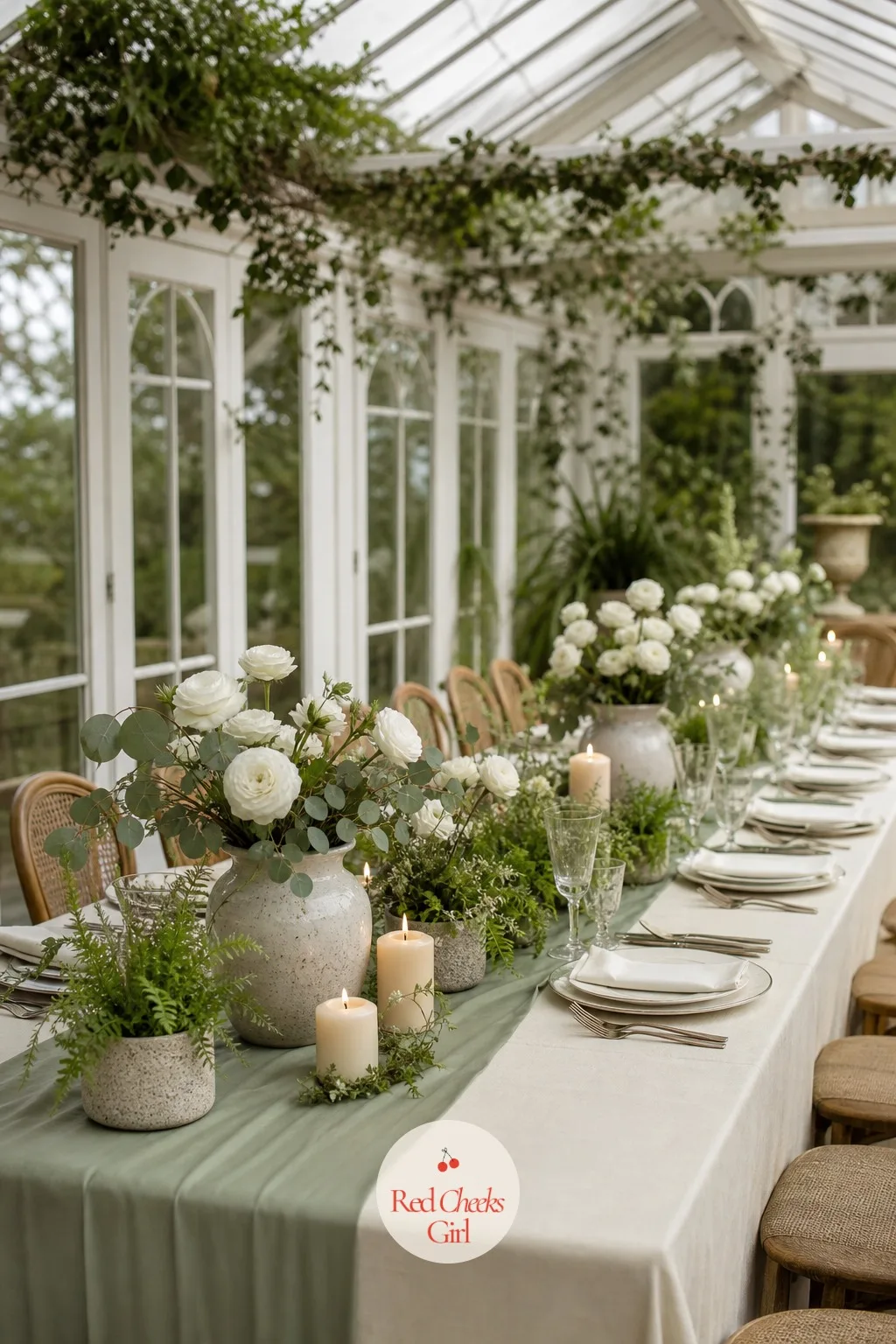
Sage and Cream
Sage and cream is the palette for a couple who want winter softness without a single jewel tone in sight. It photographs like a watercolour, which makes it a favourite for anyone marrying under glass.
Layer a cream pressed-cotton cloth with a sage satin runner, white ranunculus mixed with pale eucalyptus in low ceramic jugs, and cream pillar candles in glass hurricanes. Sage napkins with a cream ribbon finish each place setting.
It belongs in a glass conservatory with potted ferns and winter light coming through the panes. Where ranunculus is out of season, white tulips give the same soft effect.
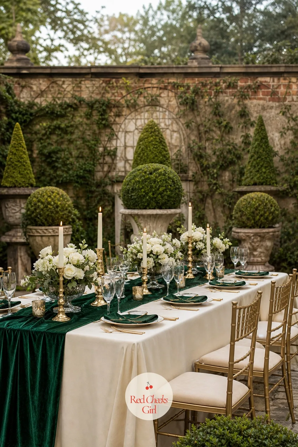
Emerald and Ivory
Emerald is the one true jewel tone that still feels like a garden rather than a ballroom, especially against ivory rather than stark white. It gives a winter garden wedding a little more saturation without losing the romance.
Use an ivory satin cloth with an emerald velvet runner, ivory garden roses and deep green foliage in low glass compotes, and ivory taper candles in brass holders. Emerald napkins finished with a thin ivory ribbon complete the table.
A walled garden terrace with clipped topiary either side suits this palette especially well. If velvet feels heavy for an outdoor terrace, an emerald satin runner does the same work with less weight.
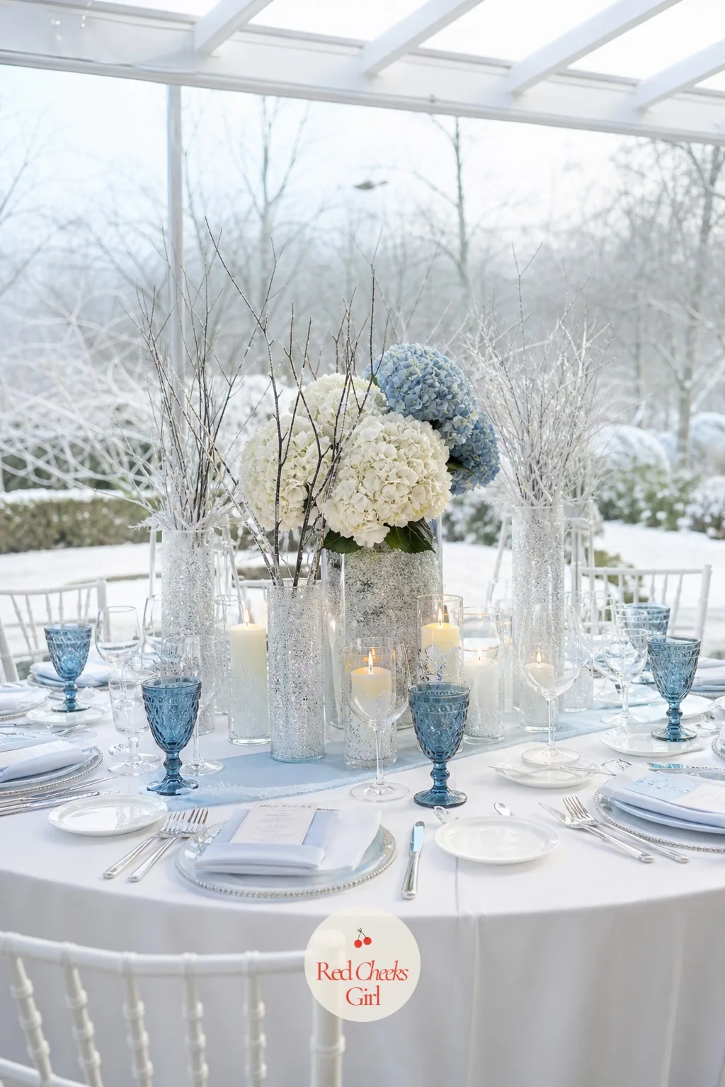
Icy Blue and White
Icy blue is the one colour that actually looks better the colder it gets outside, and paired with white it turns a winter garden into something closer to a snow scene than a decorating choice.
Dress the table in a white pressed-cotton cloth with an icy blue satin runner, white and pale blue hydrangea in frosted glass vases, and white pillar candles in icy blue glass holders. White napkins tied with a thin silver-blue ribbon finish each setting.
It suits a frosted garden pavilion with bare branches visible through the glass. Where fresh blue flowers are hard to source, silk hydrangea in the same tone work just as well in the photograph.
Mauve and Grey
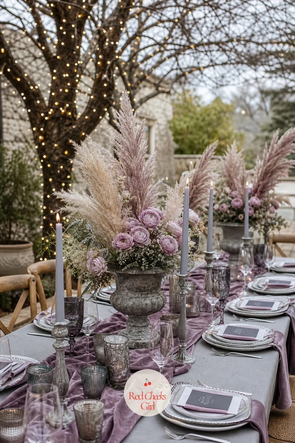
Mauve and grey together feel a little bohemian and a little bit moody, closer to dried flowers than fresh ones, which makes this the palette for a couple who like texture more than shine.
Set a grey cotton cloth with a mauve velvet runner, dusty pink ranunculus mixed with pampas grass and dried foliage in low stone urns, and grey pillar candles in simple glass holders. Mauve napkins tied with grey cord finish each place.
A winter garden courtyard with bare trees and fairy lights suits this earthy mix especially well. Where pampas grass feels overdone, dried eucalyptus in the same grey tone is a quieter substitute.
Pine Green and Rose Gold
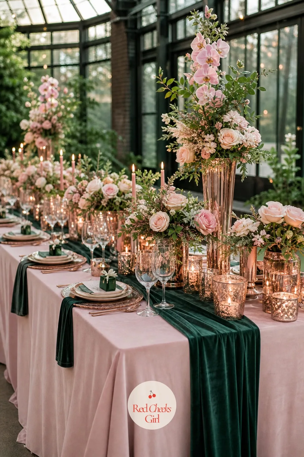
Rose gold softens pine green in a way regular gold does not, giving the palette a slightly younger, more romantic feel. It is the pairing for a bride who wants a garden wedding but still wants some shimmer on the table.
Layer a pale pink satin cloth with a pine green velvet runner, blush roses and pine foliage in rose gold vases, and rose gold mercury glass candle holders with ivory candles. Pine green napkins tied with a blush ribbon finish each setting.
A botanical glasshouse with orchids in the corners suits this combination well. If rose gold vessels are hard to find, rose gold spray paint on plain glass gets the same shine.
Slate Blue and Cream
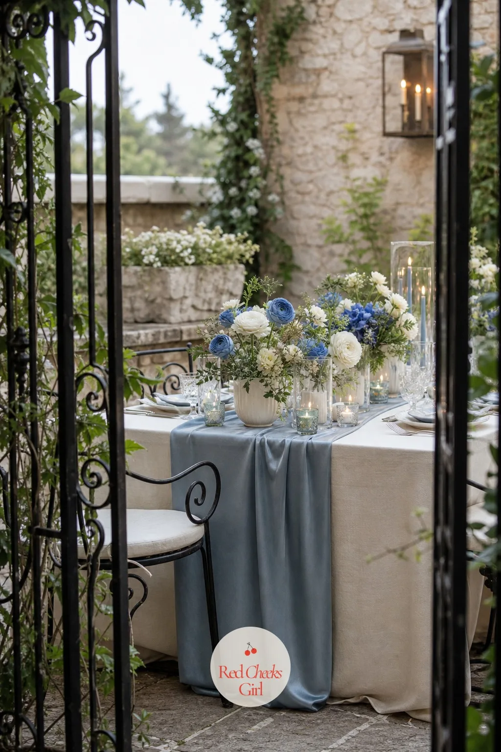
Slate blue is quieter than navy and cooler than dusty blue, which makes it the palette for a couple who want winter blue without any of the drama. Cream keeps the whole table soft rather than stark.
Dress the table in a cream cotton cloth with a slate blue satin runner, white and pale blue ranunculus in low cream ceramic vessels, and cream pillar candles in simple glass holders. Slate blue napkins with a cream ribbon finish each place setting.
A stone garden terrace behind iron gates suits this muted palette well. Where ranunculus is unavailable, white and blue anemones give almost the same effect.
Restaurant and Intimate Dinner Palettes
A restaurant reception is already dressed by someone else’s architecture, so the palette only has to sit on the table: the cloth, the candles, the small vase at each place setting. These six skew darker and richer, built for close-up light rather than a room you need to fill.
Long dinners stall around the second course, and 20 Winter Party Games for a Festive Cold-Weather Gathering fixes that without anyone leaving the table.
Merlot and Marigold
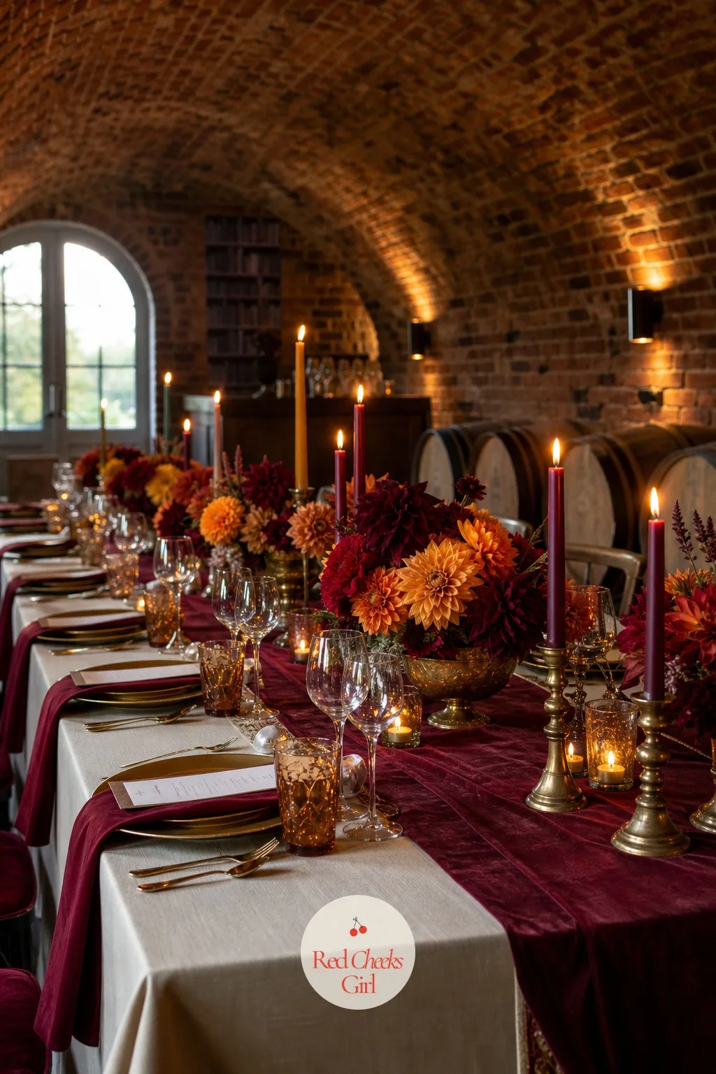
Merlot gives this pairing its depth and marigold gives it its spark, and together they feel like a dinner party that has been thrown by someone with excellent taste in wine and flowers both. It suits a smaller, closer guest list.
Set a merlot velvet runner over a cream satin cloth, marigold ranunculus and burgundy dahlias mixed in low brass compotes, and amber glass candles down the centre. Merlot napkins tied with a thin marigold ribbon finish each place.
A wine cellar restaurant with brick vaults overhead is the natural home for this palette. Where marigold flowers are out of season, orange ranunculus is the closest substitute.
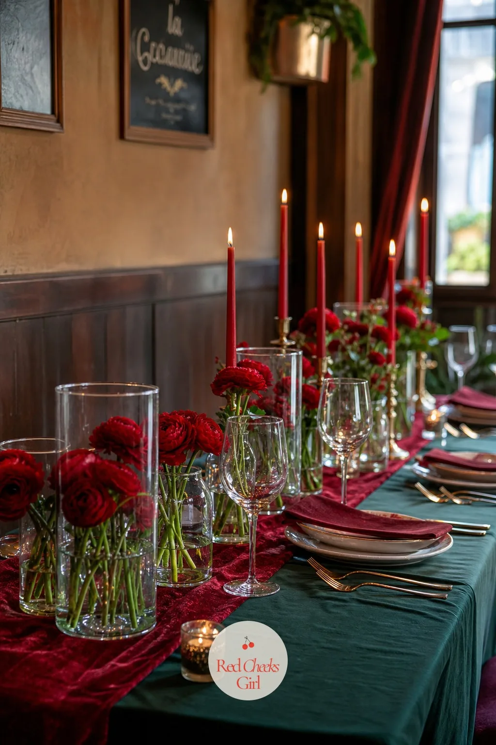
Deep Red and Green
Deep red and green is the classic holiday pairing taken down a register, dark red instead of fire-engine red, forest instead of Christmas-tree green, so it reads as elegant rather than seasonal decoration.
Layer a deep green satin cloth with a deep red velvet runner, red ranunculus and dark green foliage in low glass cylinders, and red taper candles in brass holders. Deep green napkins tied with red ribbon finish each setting.
An intimate trattoria with dark wood panelling suits this richer palette especially well. If velvet feels too formal for the room, a deep red satin runner carries the same colour with less weight.
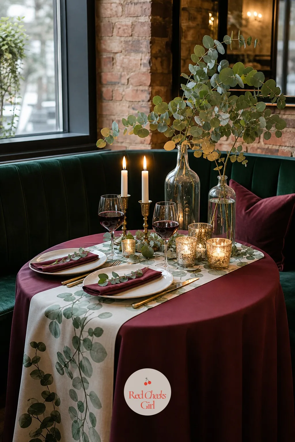
Wine and Eucalyptus
Wine against eucalyptus green is quieter than deep red and green, more sophisticated dinner than holiday party, and it suits a couple who want the palette to feel like it belongs to them rather than the calendar.
Dress the table in a wine satin cloth with a eucalyptus-print cotton runner, trailing eucalyptus and wine-toned ranunculus in low glass bottles, and wine coloured candles in simple glass holders. Wine napkins tied with a sprig of real eucalyptus finish each setting.
A candlelit bistro with velvet booths along the wall suits this intimate palette well. Where fresh eucalyptus is unavailable, the silk version holds its shape and colour just as well on the table.
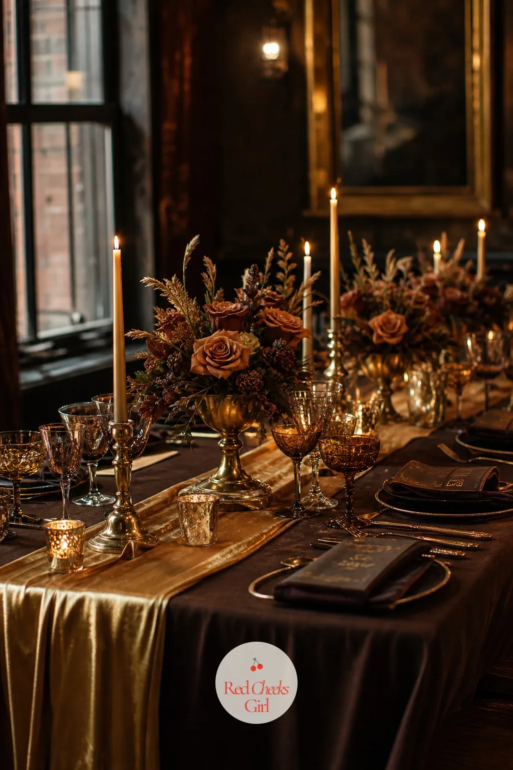
Espresso and Gold
Espresso brown reads as warmer and more modern than black, and against gold it gives a restaurant reception a speakeasy feel without a single prop that says 1920s. It is an easy palette to live with long after the wedding too.
Set a gold satin runner over an espresso brown cotton cloth, amber roses and dark foliage in low brass urns, and gold taper candles in brass holders. Espresso napkins tied with gold cord finish each place setting.
A speakeasy-style restaurant with brass fixtures and low lighting is the natural home for this one. If brown cloth is hard to source, a deep charcoal cloth with the same gold accents reads almost identically.
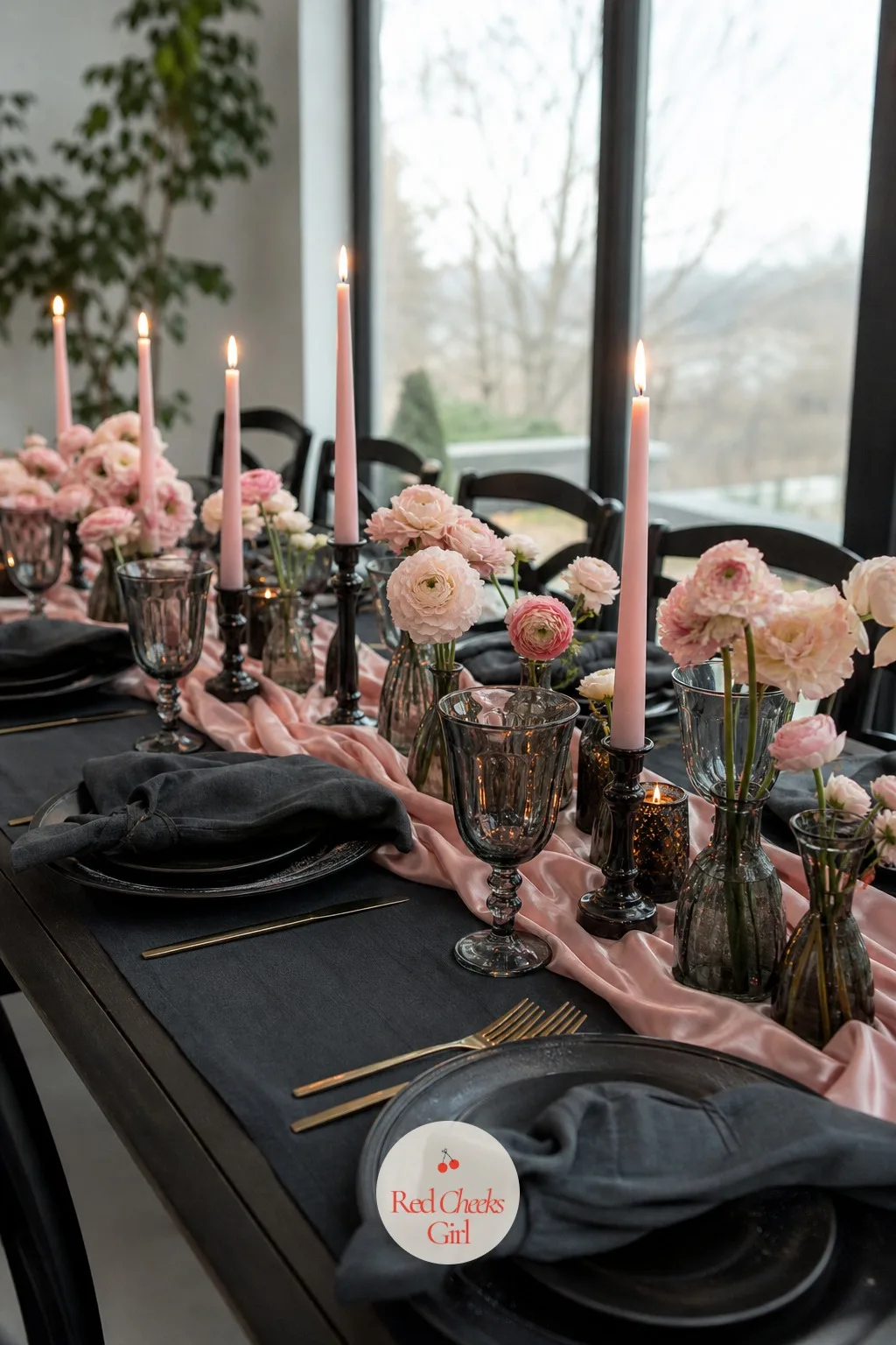
Charcoal and Blush
Charcoal keeps blush from tipping into spring wedding territory, giving the pairing enough weight to sit comfortably at a winter dinner instead of a bridal shower. It is a favourite for a couple who want soft without looking young.
Layer a charcoal cotton cloth with a blush satin runner, dusty pink ranunculus and silver dollar eucalyptus in low smoked glass vases, and blush pillar candles in charcoal holders. Charcoal napkins with a blush ribbon finish each place setting.
A supper club with a dark wood bar along one wall suits this moody pairing well. Where smoked glass is hard to find, plain glass with a few drops of grey candle dye gives a similar tint.
Berry and Gold
Berry sits between burgundy and magenta, brighter and a little more playful than either, and against gold it gives an intimate dinner some real energy without losing the winter feel. It suits a couple who find plain burgundy a bit too safe.
Dress the table in a gold satin cloth with a berry velvet runner, raspberry ranunculus and dark foliage in low gold compotes, and gold taper candles in simple glass sticks. Berry napkins tied with gold ribbon finish each setting.
A private dining room with art on the walls suits this richer, brighter palette especially well. If berry velvet is hard to source, a deep magenta satin runner is a close and cheaper stand-in.
Historic Estate and Manor Palettes
Oil paintings, damask wallpaper and a working fireplace do not need much help, and these seven know it. The palette sits a little more muted here, closer to the colours already on the walls, so the room and the table read as one idea rather than two competing ones.
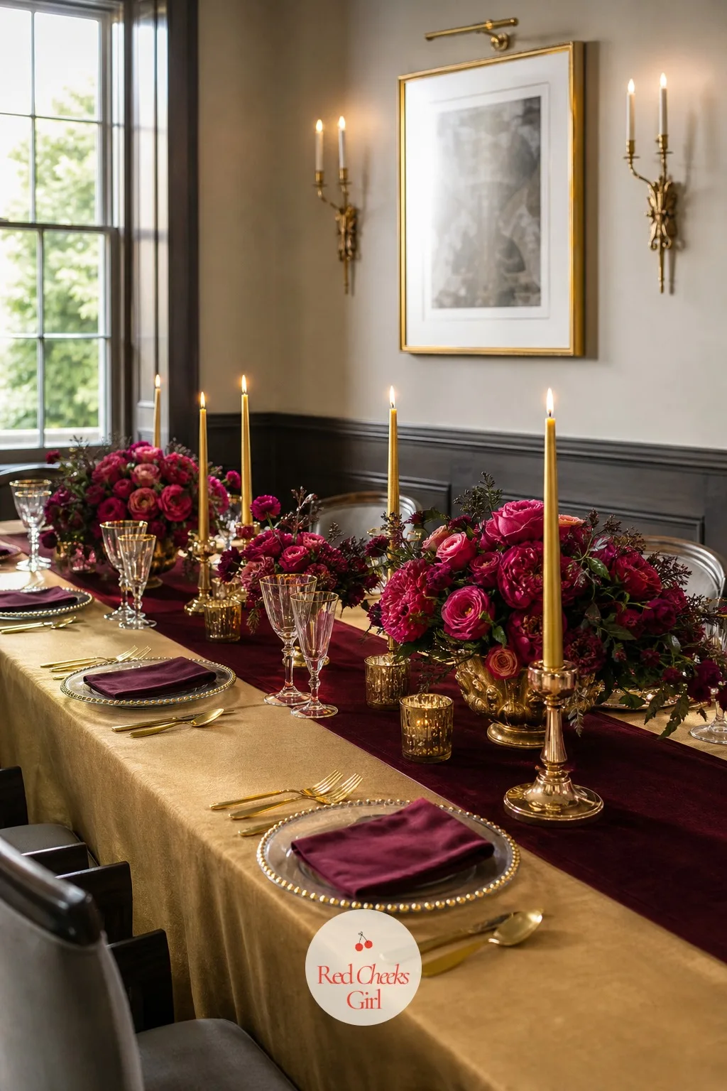
Burgundy and Blush
Burgundy and blush is the palette everyone recognises from a winter wedding gallery, and it earns that popularity by working in almost any room, though it looks best against something a little grand. A manor drawing room gives it that.
Layer a blush satin cloth with a burgundy velvet runner, blush garden roses and burgundy ranunculus in low gold compotes, and burgundy taper candles in brass holders. Blush napkins tied with a thin burgundy ribbon finish each setting.
An estate drawing room with damask wallpaper and a working fireplace suits it especially well. If the full velvet runner is too much for the budget, a burgundy satin ribbon running the length of the table does the same job in miniature.
Cranberry and Sage
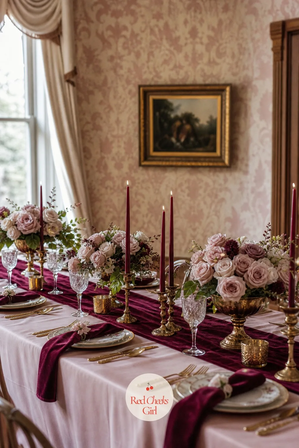
Cranberry is brighter and a touch more playful than burgundy, and against sage it stops short of looking like a Christmas card, landing instead on something closer to a well-dressed country house dinner.
Set a sage satin cloth with a cranberry velvet runner, cranberry ranunculus mixed with sage eucalyptus in low ceramic urns, and cranberry taper candles in brass holders. Sage napkins tied with cranberry ribbon finish each place.
A grand hall with tapestries along the walls suits this richer, earthier pairing well. Where cranberry ranunculus is unavailable, deep pink ranunculus reads almost the same under candlelight.
Chocolate Brown and Ivory
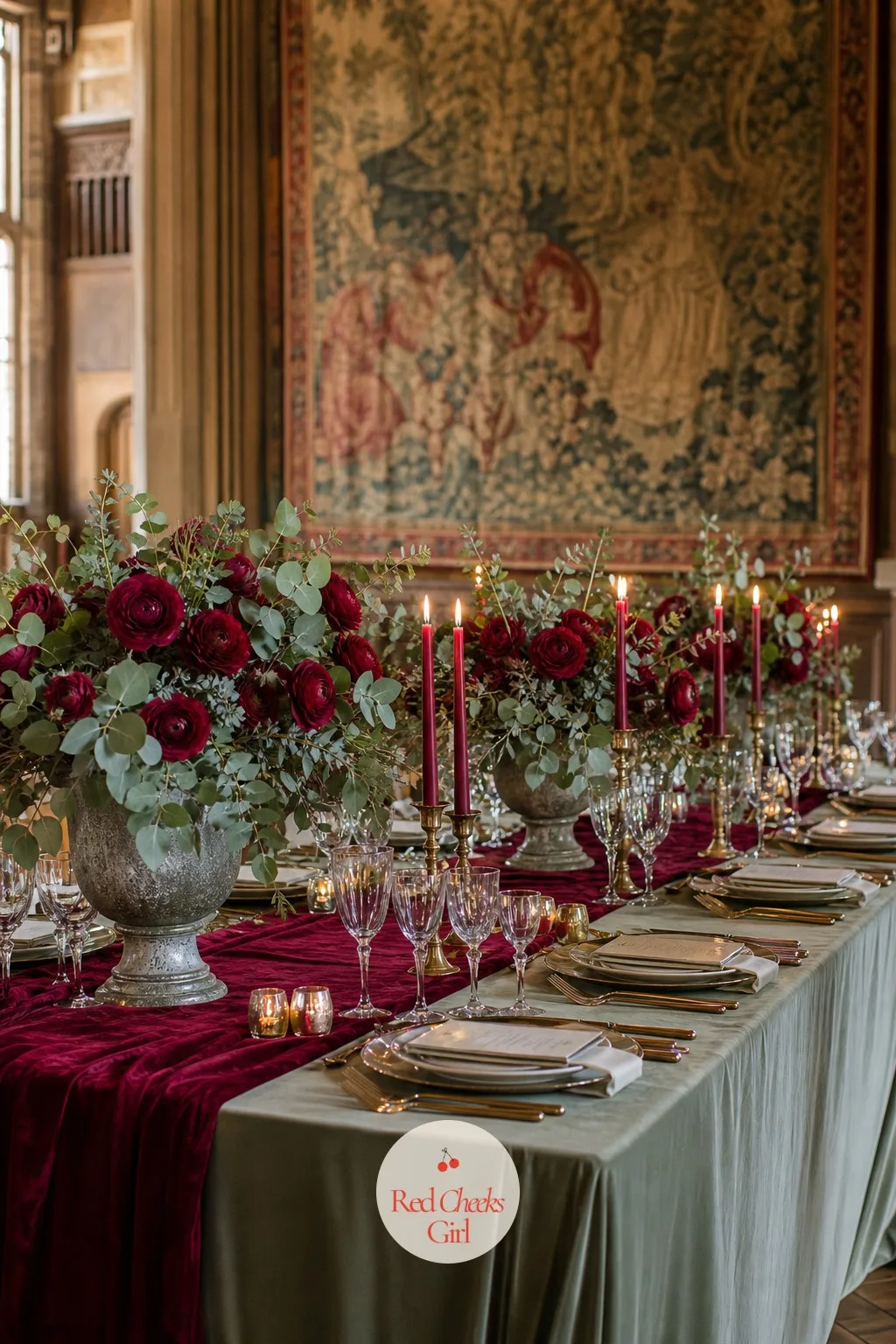
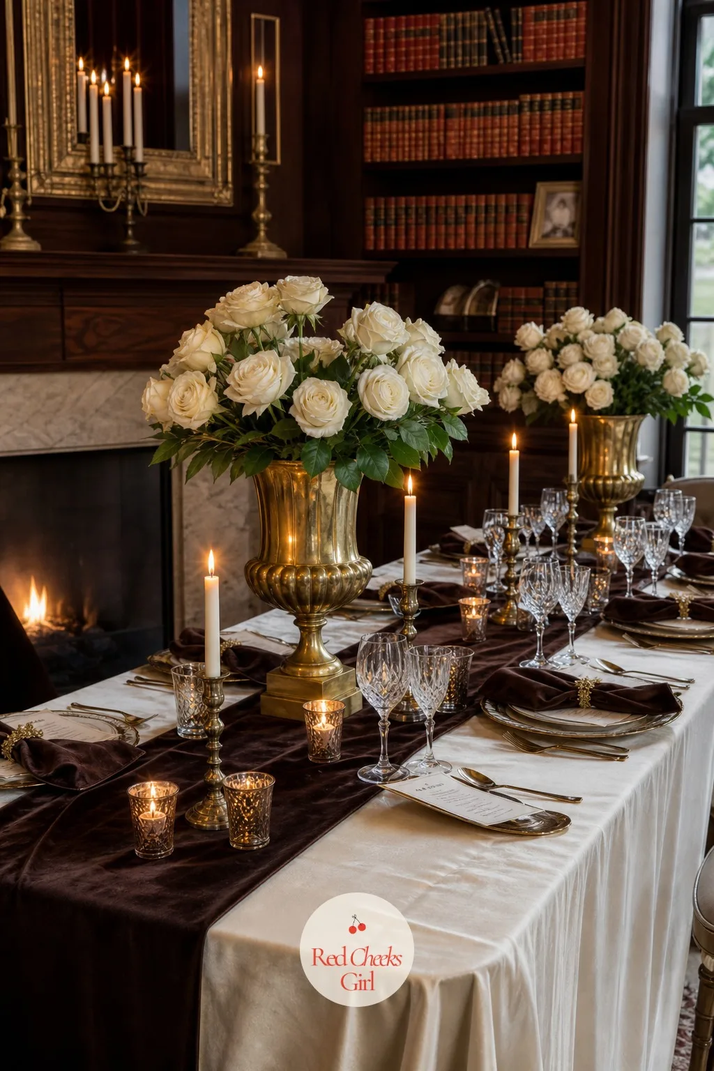
Chocolate brown gives the palette a warmth that black and navy both lack, and against ivory it looks like an old library rather than a decorated venue, which is exactly the appeal for a couple marrying somewhere with real history.
Dress the table in an ivory satin cloth with a chocolate brown velvet runner, ivory roses and dark foliage in low brass urns, and ivory taper candles in brown glass holders. Chocolate napkins tied with ivory ribbon finish each setting.
A manor library with leather-bound books and a working fireplace is the natural setting for this pairing. If brown velvet is hard to find, a chocolate satin runner carries the same warmth with less weight on the table.
🛍 Shopping guide
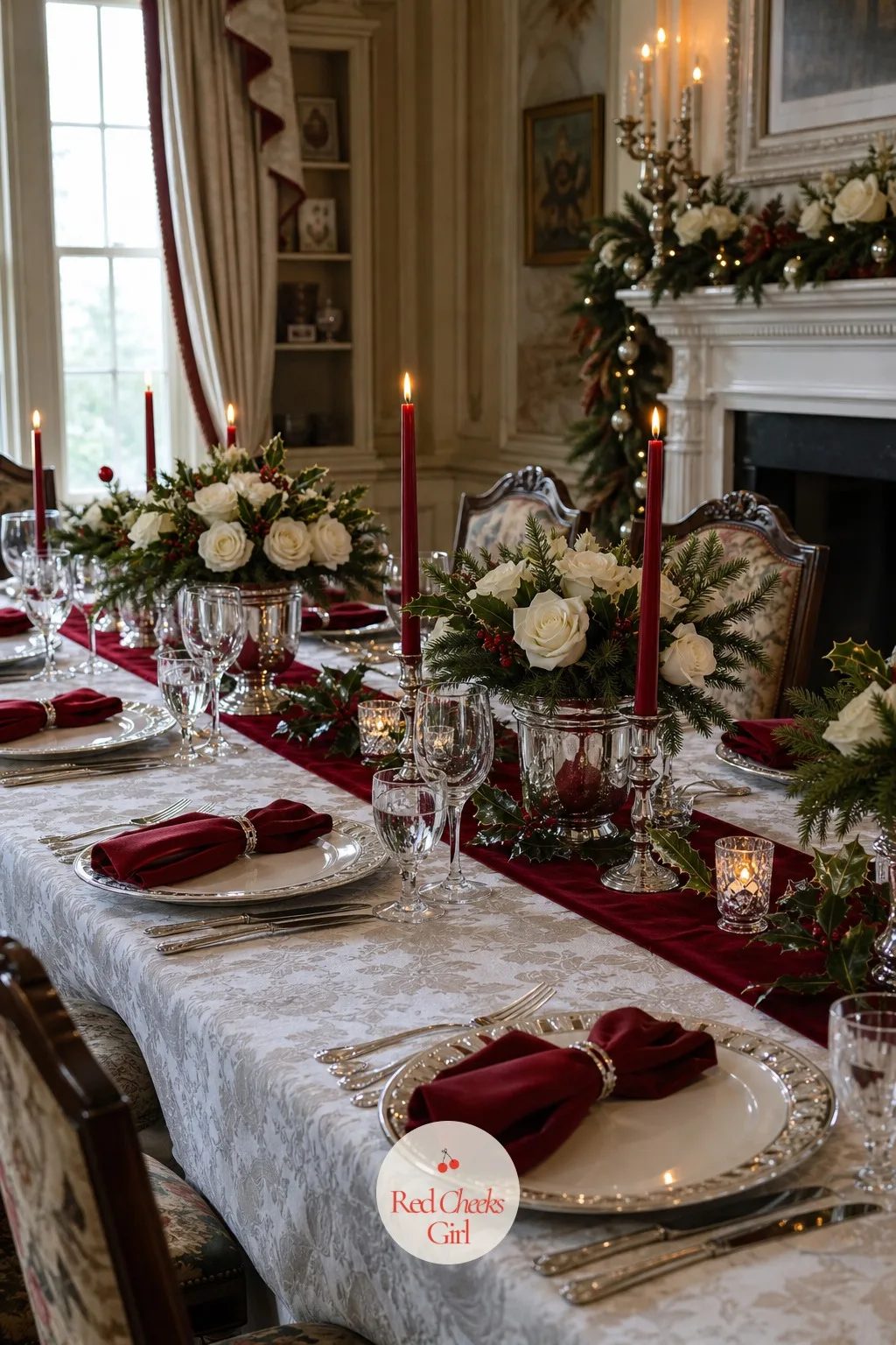
Holly Red and Frosted White
Holly red is brighter and a little more cheerful than burgundy or merlot, and against frosted white it gives a manor reception a festive lift without tipping fully into Christmas party territory. It suits a couple marrying close to the holidays.
Layer a frosted white satin cloth with a holly red velvet runner, white roses with a few sprigs of real holly in low silver urns, and red taper candles in frosted glass holders. White napkins tied with red ribbon finish each setting.
An estate dining room with oil paintings along the walls suits this bright, seasonal palette well. Where real holly is unavailable, the silk version with painted red berries looks just as convincing on the table.
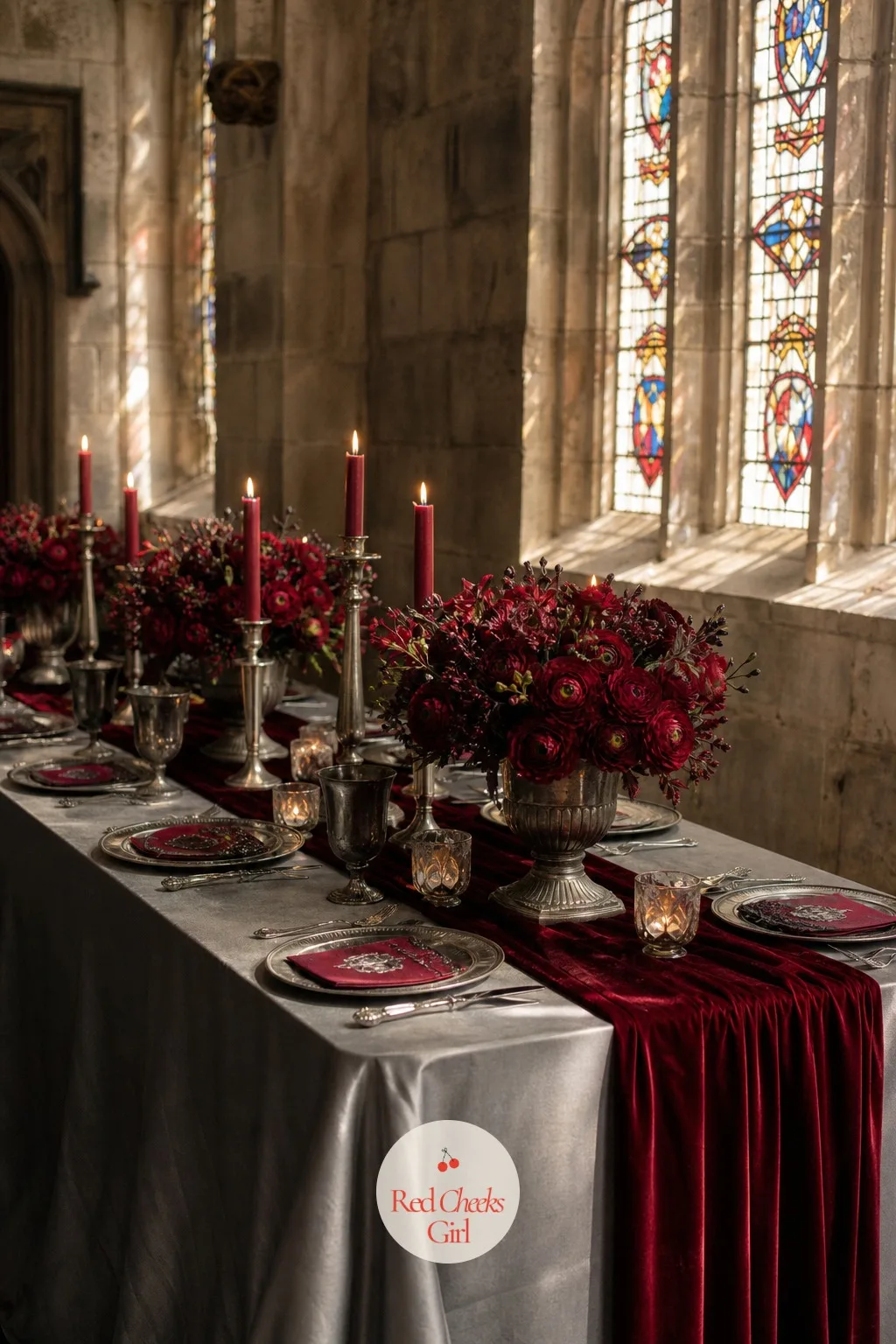
Pewter and Cranberry
Pewter is quieter than silver, with more grey in it, and against cranberry it gives the palette an older, more formal feel, as if the table setting has been in the family for decades rather than rented for the day.
Set a pewter satin cloth with a cranberry velvet runner, cranberry ranunculus and grey-toned foliage in low pewter urns, and cranberry taper candles in pewter holders. Pewter grey napkins tied with cranberry ribbon finish each place setting.
A stone great hall with stained glass windows suits this muted, formal palette especially well. If pewter linens are hard to find, a soft grey satin cloth gives nearly the same effect.
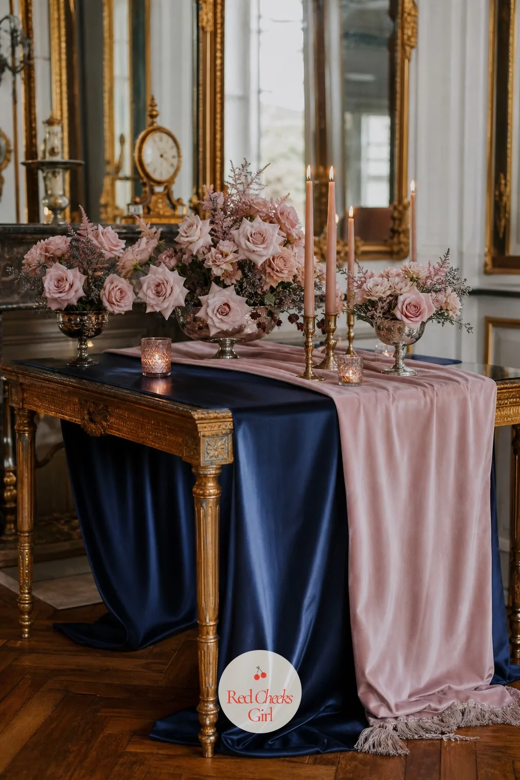
Midnight Blue and Blush
Midnight blue is darker and cooler than navy, close enough to black to read as formal, and against blush it gives a manor parlour a softness that stops the whole room feeling too serious. It is a favourite for an evening ceremony.
Dress the table in a midnight blue satin cloth with a blush velvet runner, blush garden roses in low silver compotes, and blush taper candles in silver holders. Midnight blue napkins tied with a blush ribbon finish each place setting.
A Georgian manor parlour with gilt mirrors suits this pairing especially well. Where blush velvet is out of budget, a blush satin runner reads almost the same under warm lamp light.
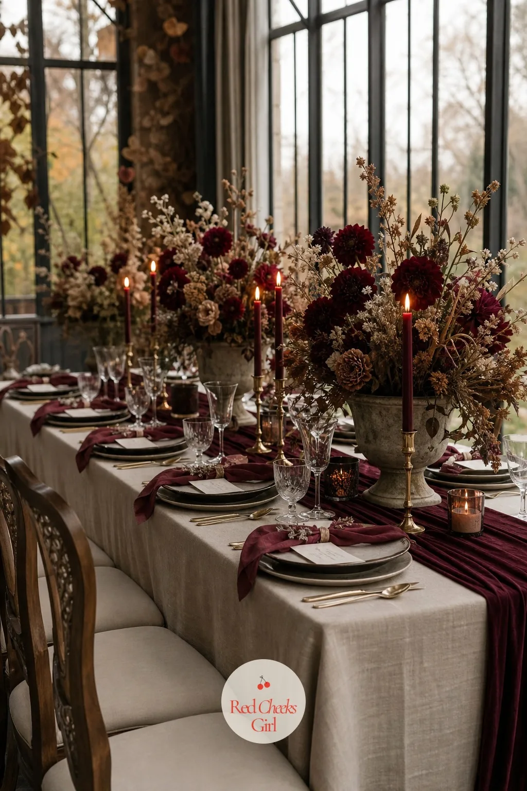
Taupe and Wine
Taupe is the neutral that actually photographs warm, and against wine it gives a manor reception a quiet, grown-up palette that leans on texture rather than colour contrast to do the work.
Layer a taupe cotton cloth with a wine velvet runner, wine-toned dahlias and taupe-dried foliage in low ceramic urns, and wine coloured candles in brass holders. Taupe napkins tied with wine ribbon finish each place setting.
A country house orangery with winter light through tall windows suits this quiet palette well. Where fresh dahlias are unavailable, wine coloured ranunculus gives almost the same depth of colour.
Frequently Asked Questions
What are good colors for a winter wedding?
Rich jewel tones such as burgundy, emerald, navy and plum paired with metallics like gold or silver are the classic choices. Seasonal colors, such as red, burgundy, emerald green, and navy blue are some of the most popular winter wedding colors, adding richness and glamour to decor.
What colors should you avoid for a winter wedding?
Bright, summery shades tend to clash with the season. The only colors that may not be suitable for a winter wedding are bright, summer-y shades, such as turquoise, bright pink, and lime green.
Do you have to use traditional winter wedding colors?
No, there is no rule that forces a red, green or metallic palette. Since it’s your wedding, there’s no right or wrong answer, most importantly you should use the colors you love the most.
How many colors should a wedding palette have?
Most planners suggest keeping it tight so the room reads as one decision rather than a clash. Limit your palette to three or four main colors to avoid an overwhelming or disjointed look, sticking to one dominant color, one complementary color, and one or two accent shades.
Which colors photograph best at a winter wedding?
Deep jewel tones and metallics tend to hold up best under indoor and evening lighting. Jewel tones photograph gorgeously in winter lighting, emerald, ruby, sapphire, and amethyst create stunning depth, while metallic colors like gold, bronze, and champagne catch light beautifully.
Should the wedding colors match the venue?
Yes, the room itself should guide the palette rather than fight it. A rustic barn may pair better with earthy tones like brown and berry, while a modern ballroom suits sleek palettes like navy and silver.
16 she found her honey bridal shower ideas: honeycomb decor, amber glass tables, a honey bar and fav
20 boots and bubbly bridal shower ideas, from a paisley arch to boot vases, favors and the invitatio
33 round table wedding centerpieces sized for 60 and 72 inch rounds: low, tall, candlelit and non-fl
Leave a Reply